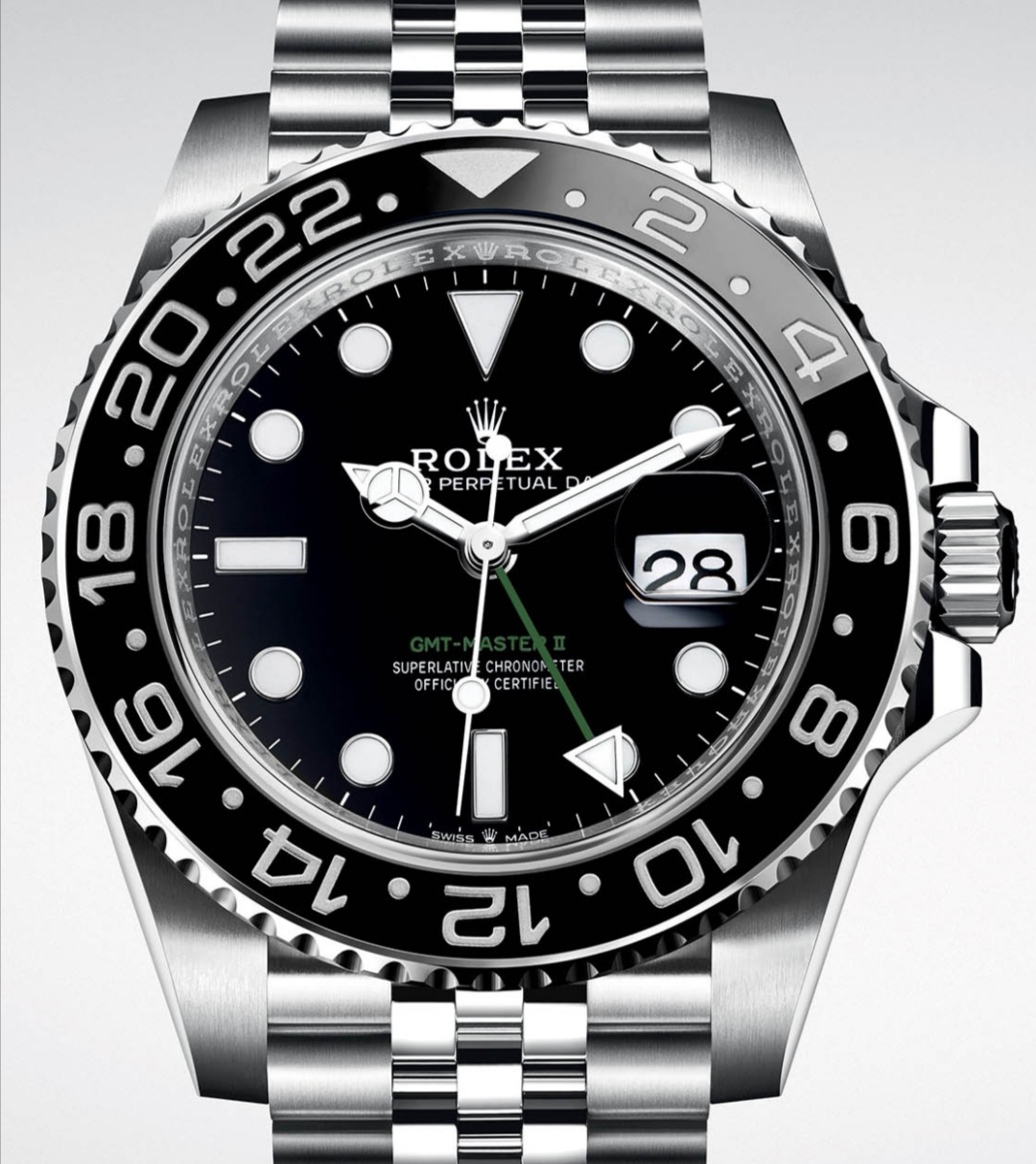
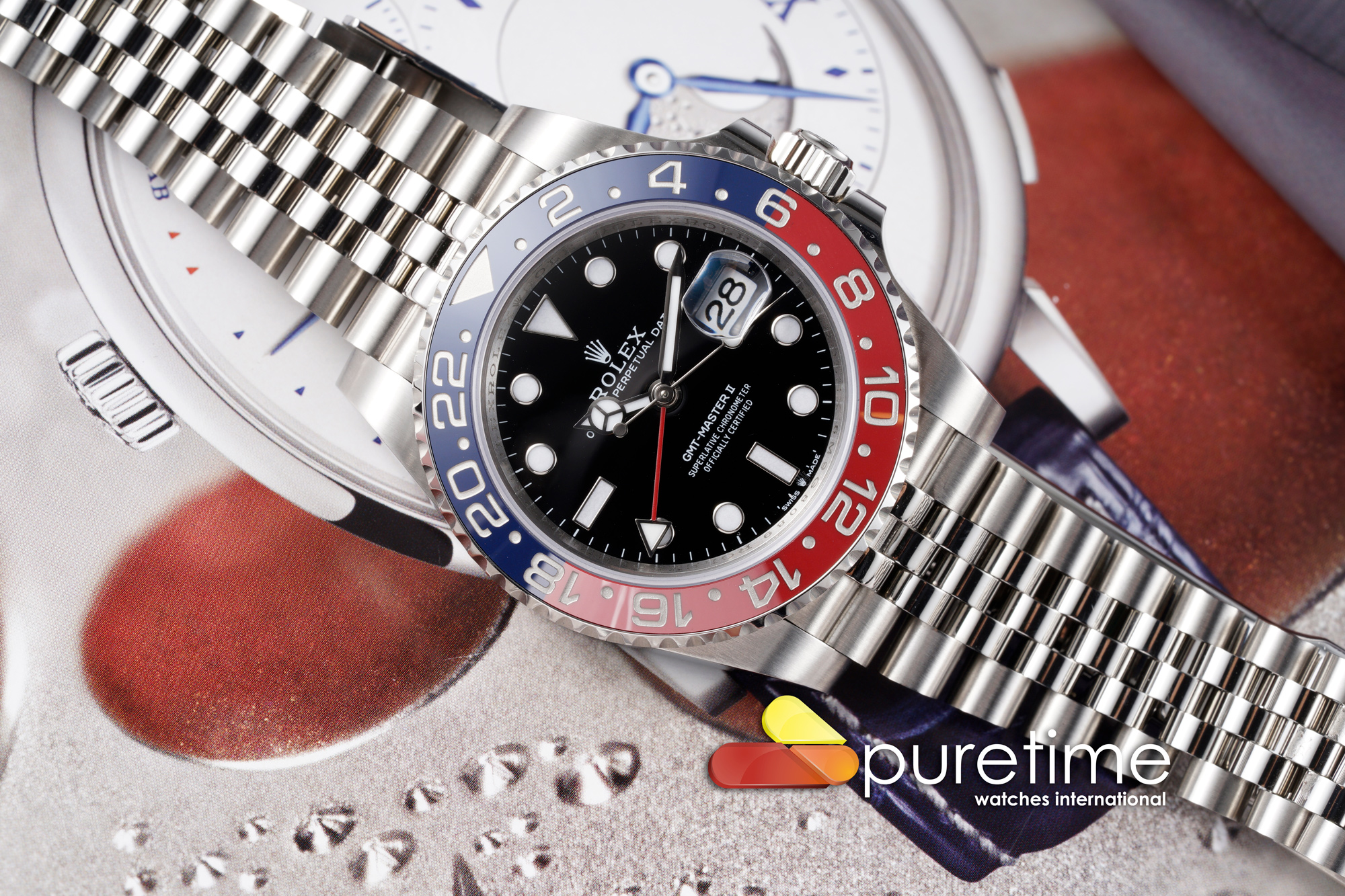
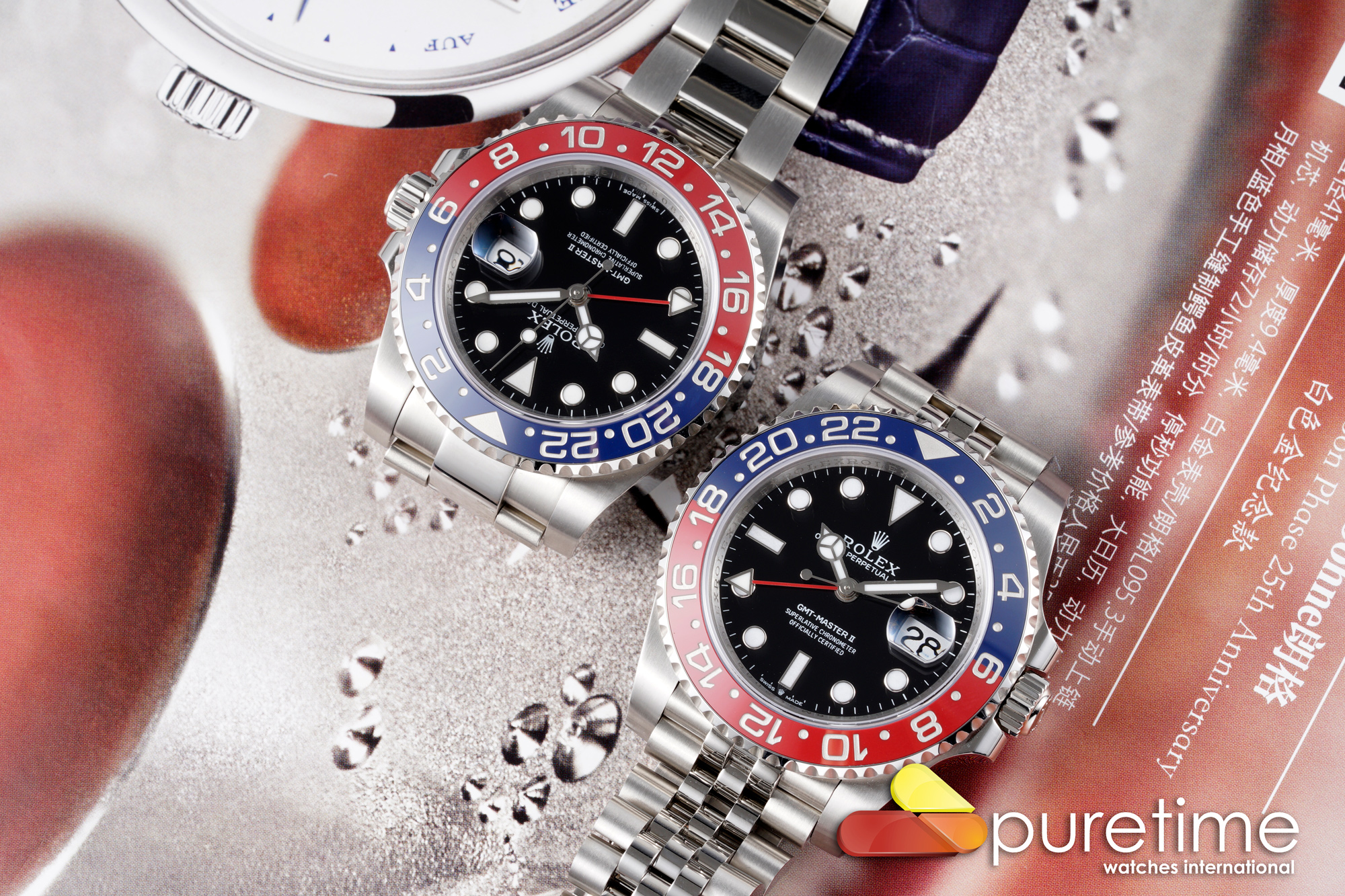
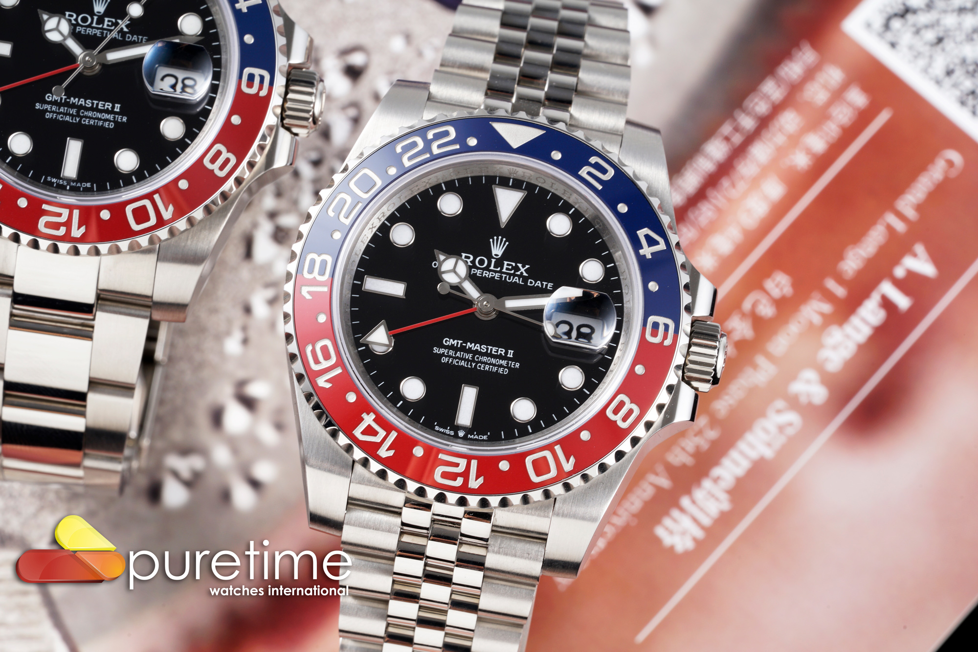
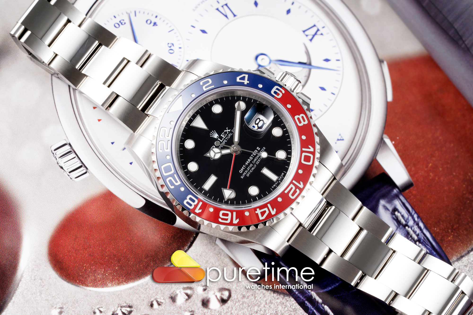
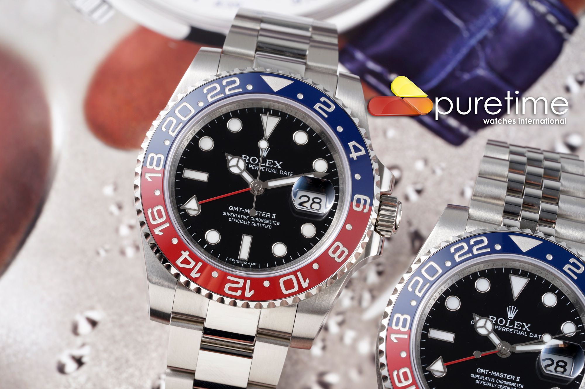
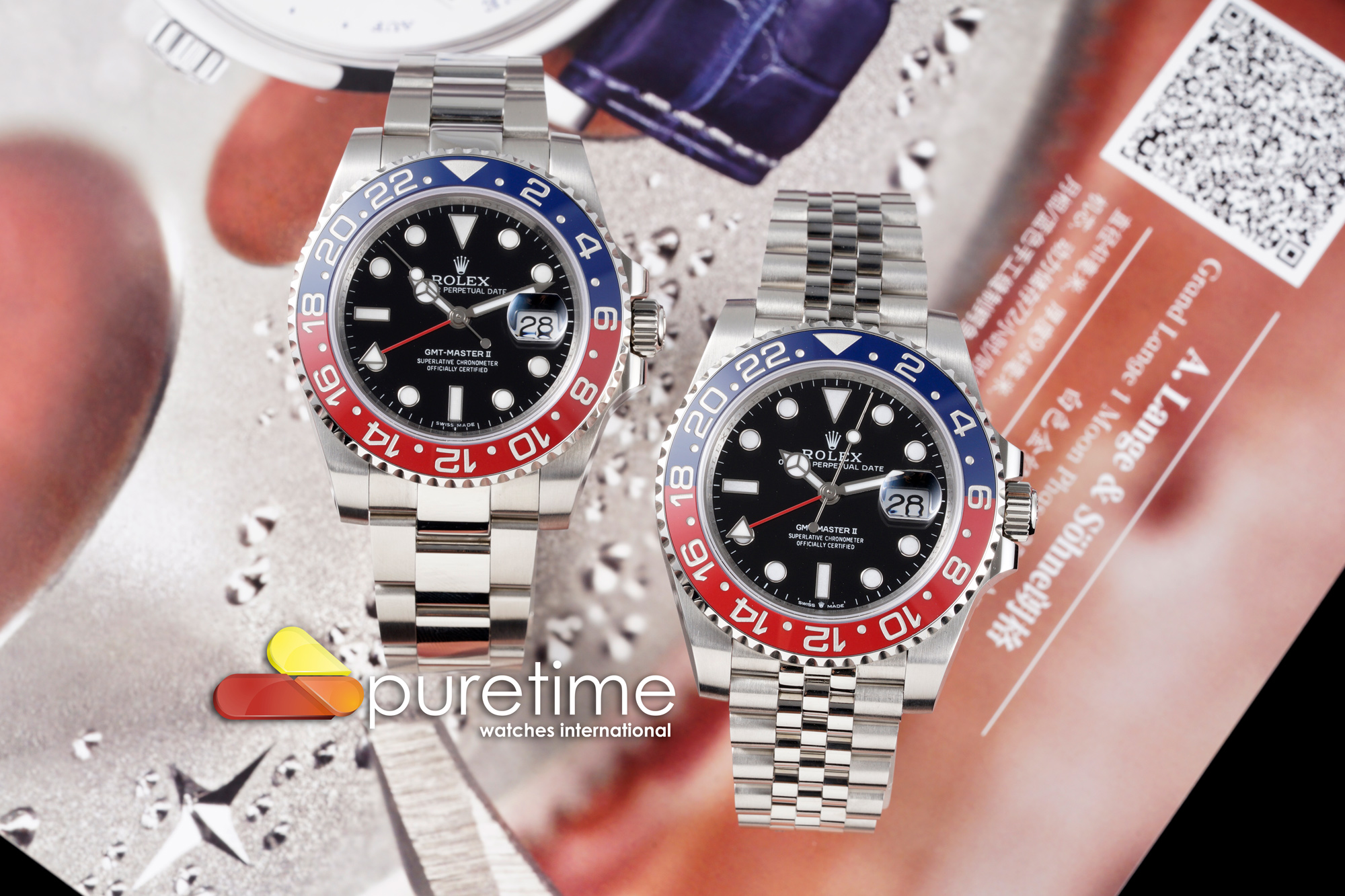
As far as it seems those speedbumps do differ on each piece, some are more significant, others are not that visible. Honestly it should not be a big issue unless you look at close-ups. The colors look on-spot, at least from these images. I'm really curious about those QC's.
-
Tired of adverts on RWI? - Subscribe by clicking HERE and PMing Trailboss for instructions and they will magically go away!
You are using an out of date browser. It may not display this or other websites correctly.
You should upgrade or use an alternative browser.
You should upgrade or use an alternative browser.
New VRF Pepsi GMT Max
- Thread starter rockdaytona
- Start date
rocketman1
Known Member
- 1/10/18
- 157
- 94
- 28
- 14/3/18
- 2,023
- 1,112
- 113
Not saying anything new , if that 6 speed bump is typical am out. That is an eye sore and negates whatever good there is as it sticks out like a sore thumb
Surely Spongebob could fix that, guys a genius!
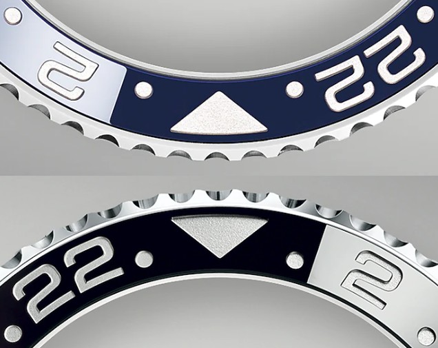
The biggest problem on this rep is the actual bezel profile. The Pepsi does not share the same bezel as the Batman/black model.
Pepsi has a more shallow bezel with different teeth shape and a thicker lip profile(noob got this correct actually) which also gives the crystal a raised profile compared to other GMT’s. Pic below shows this pretty well. Unfortunately VRF have simply used a standard gmt bezel.

Sent from my iPad using Tapatalk
Pepsi has a more shallow bezel with different teeth shape and a thicker lip profile(noob got this correct actually) which also gives the crystal a raised profile compared to other GMT’s. Pic below shows this pretty well. Unfortunately VRF have simply used a standard gmt bezel.

Sent from my iPad using Tapatalk
Navigator H4
Getting To Know The Place
- 16/5/20
- 75
- 20
- 8
Navigator H4
Getting To Know The Place
- 16/5/20
- 75
- 20
- 8
srhoque
Respected Member
- 28/11/18
- 3,259
- 2,467
- 113
Spoke with Li, VRF insert in NOT made by CF (as claimed on Intime site). I hope CF is working on one as well
Keen eyes, mate! I've never noticed that detail...The biggest problem on this rep is the actual bezel profile. The Pepsi does not share the same bezel as the Batman/black model.
Pepsi has a more shallow bezel with different teeth shape and a thicker lip profile(noob got this correct actually) which also gives the crystal a raised profile compared to other GMT’s. Pic below shows this pretty well. Unfortunately VRF have simply used a standard gmt bezel.
Last edited:
immortalchef
Active Member
- 10/12/06
- 2,835
- 1,094
- 113
That speed bump is so hard to unsee once you know it's there especially @ 6 o'clock....They really nailed the color though...
- 12/3/18
- 35,716
- 71,458
- 113
The red is Ferrari red in those pics - way too bright for a match to any gen MK. It's pretty, maybe Rolex should have used these colors. Looks like the 5 digit Pepsi colors.
The datewheels on these samples look horrendous but that may be due to a bad crystal/cyclops. The distortion in the cyclops is so apparent at even slight angles that these crystals would not even be usable. An embarrassment to be seen with.
The datewheels on these samples look horrendous but that may be due to a bad crystal/cyclops. The distortion in the cyclops is so apparent at even slight angles that these crystals would not even be usable. An embarrassment to be seen with.
- 19/1/16
- 4,412
- 5,074
- 113
How about this Pepsi insert
https://trustytime.io/index.php?main_page=product_info&cPath=352&products_id=22282
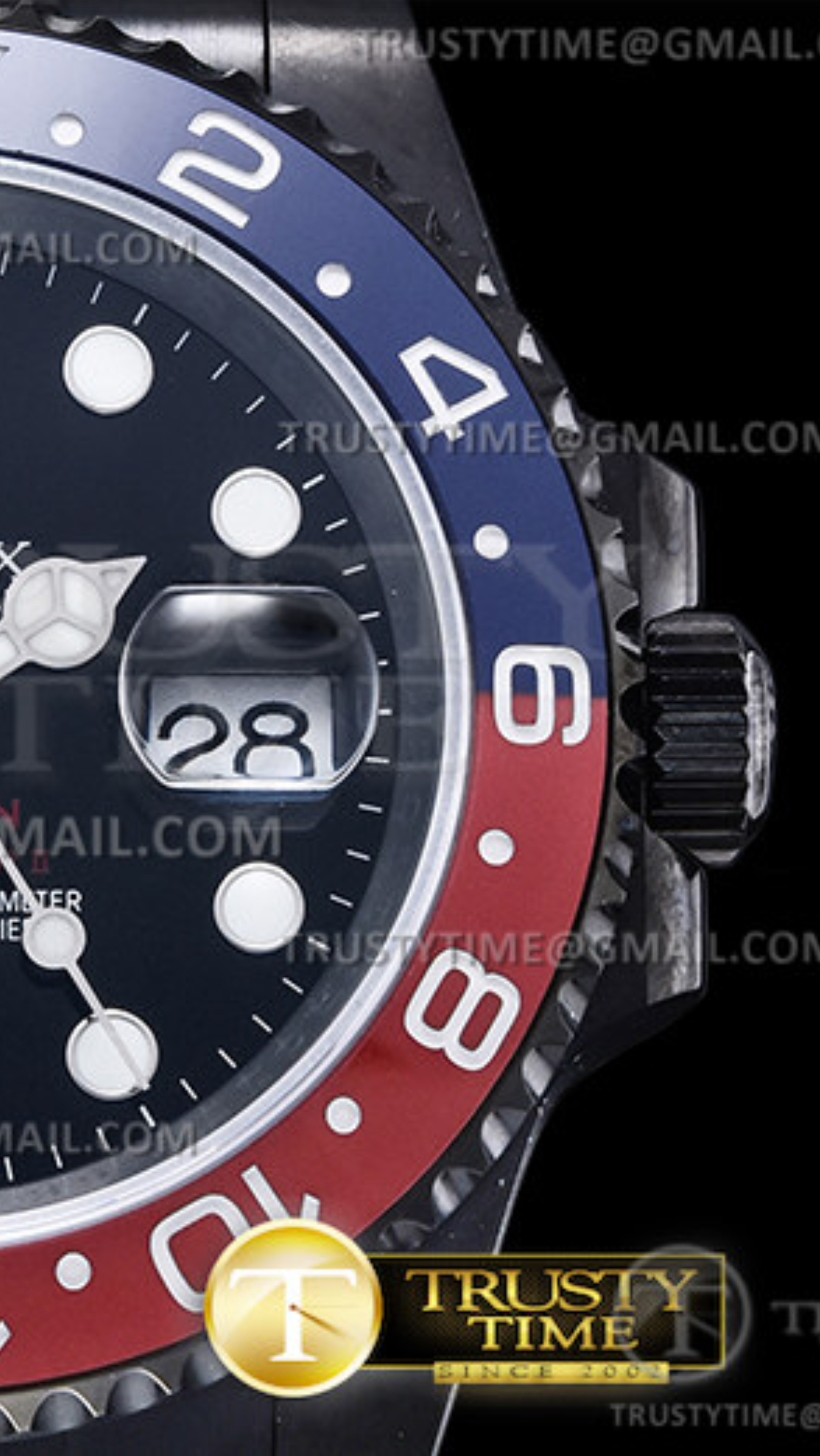
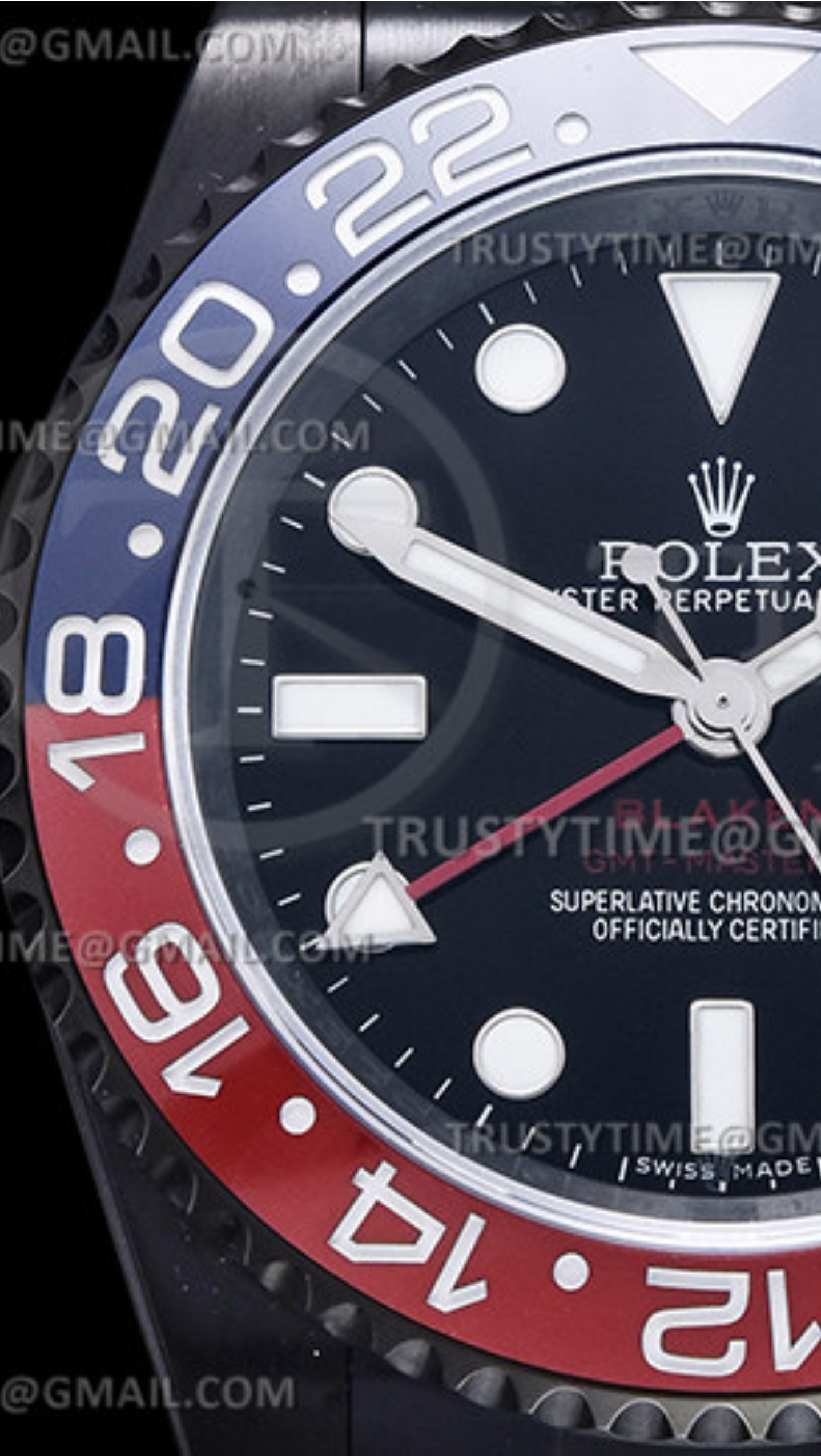
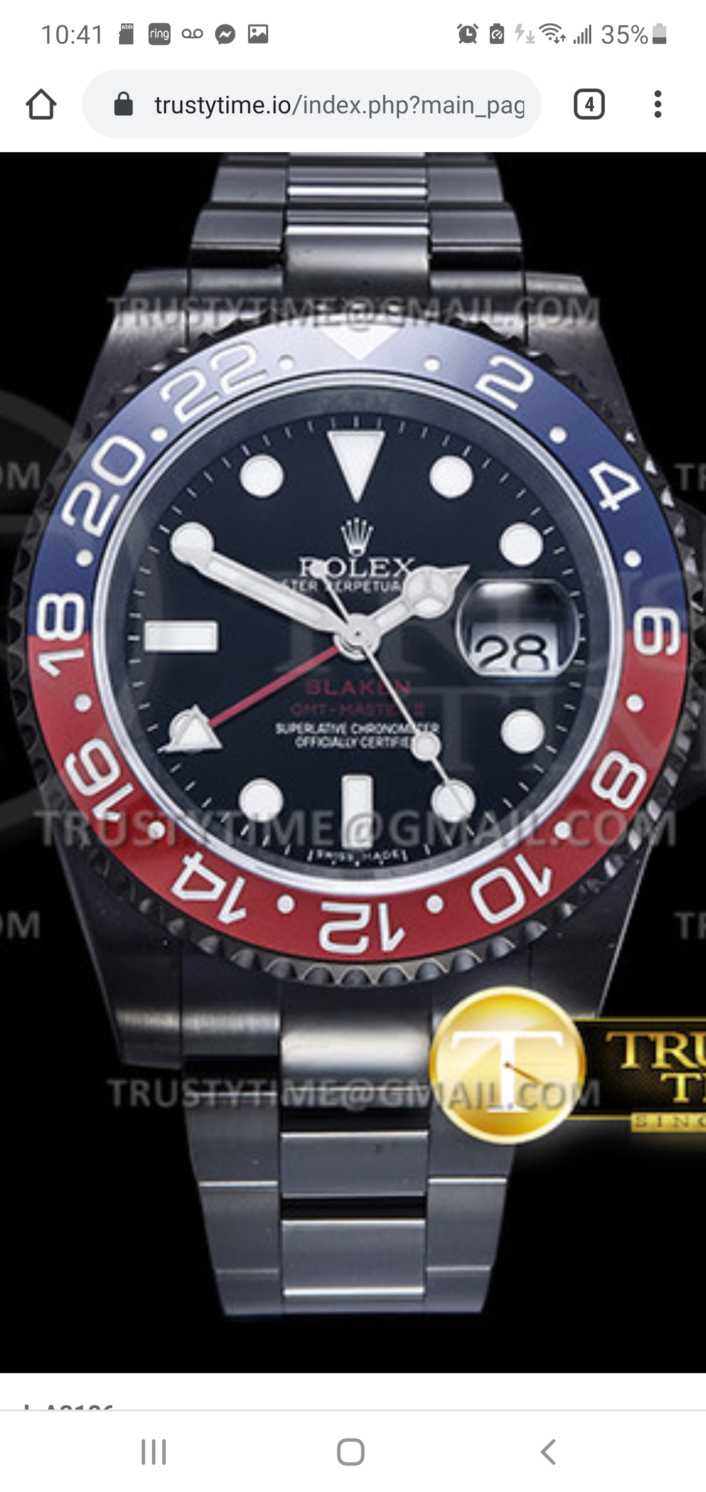
https://trustytime.io/index.php?main_page=product_info&cPath=352&products_id=22282


Fervid
I'm Pretty Popular
That speed bump is so hard to unsee once you know it's there especially @ 6 o'clock....They really nailed the color though...
THIS !!!!! so much progress
- 19/1/16
- 4,412
- 5,074
- 113
^ That looks like the GMF, bad font
But they did nice job connecting both colors and can't see any bump there.
Wondering if they ever going to be able to make a "perfect" one hehe
Fervid
I'm Pretty Popular
But they did nice job connecting both colors and can't see any bump there.
Wondering if they ever going to be able to make a "perfect" one hehe
Well hopefully with this VRF release it might pressure Noob into something, whether that be lowering the price of their current timebomb, upgrading to the VR3185 or both!
- 12/3/18
- 35,716
- 71,458
- 113
How about this Pepsi insert
[/url]
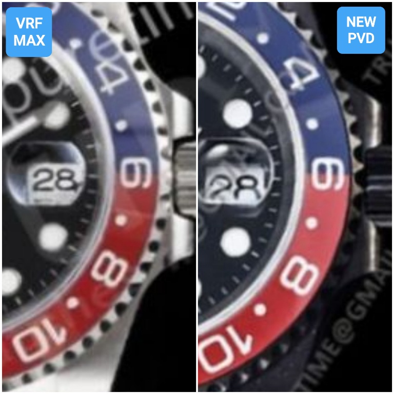
The red looks even lighter than the VRF MAX in TD pics, which is pretty bright red as we've seen. Plus the 1 serifs are wrong. Don't see any speed bumps and the transition points are good. Cyclops distortion is there at only a slight angle off, too bad.
Last edited:
srhoque
Respected Member
- 28/11/18
- 3,259
- 2,467
- 113
^ That looks like the GMF, bad font
+1 It's a GMF. No Serif font in 1
Hi, what exactely speed bumps means?I like the color of insert a lot but that speed bump just kills it....hopefully they can come out with improved version without the bump soon.
Inviato dal mio SM-N770F utilizzando Tapatalk


