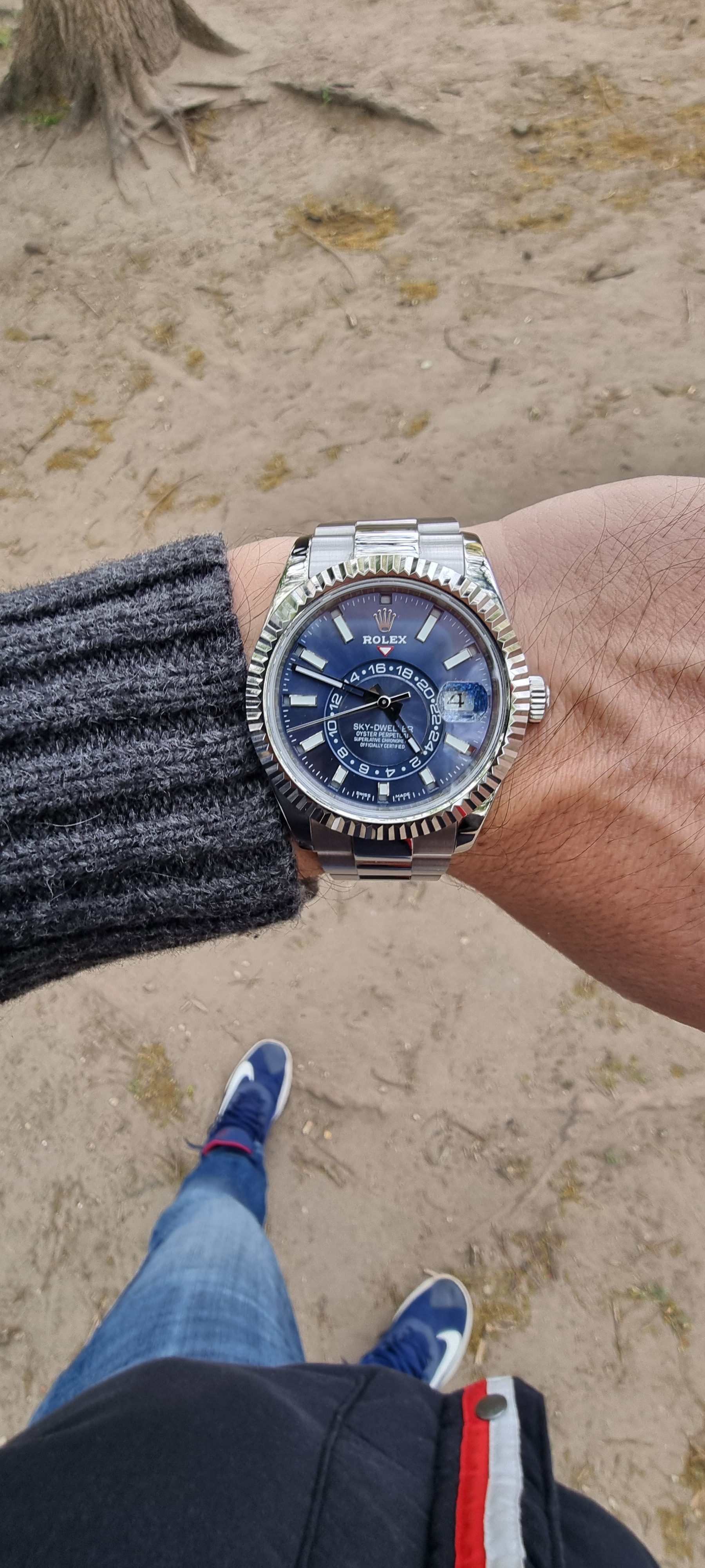
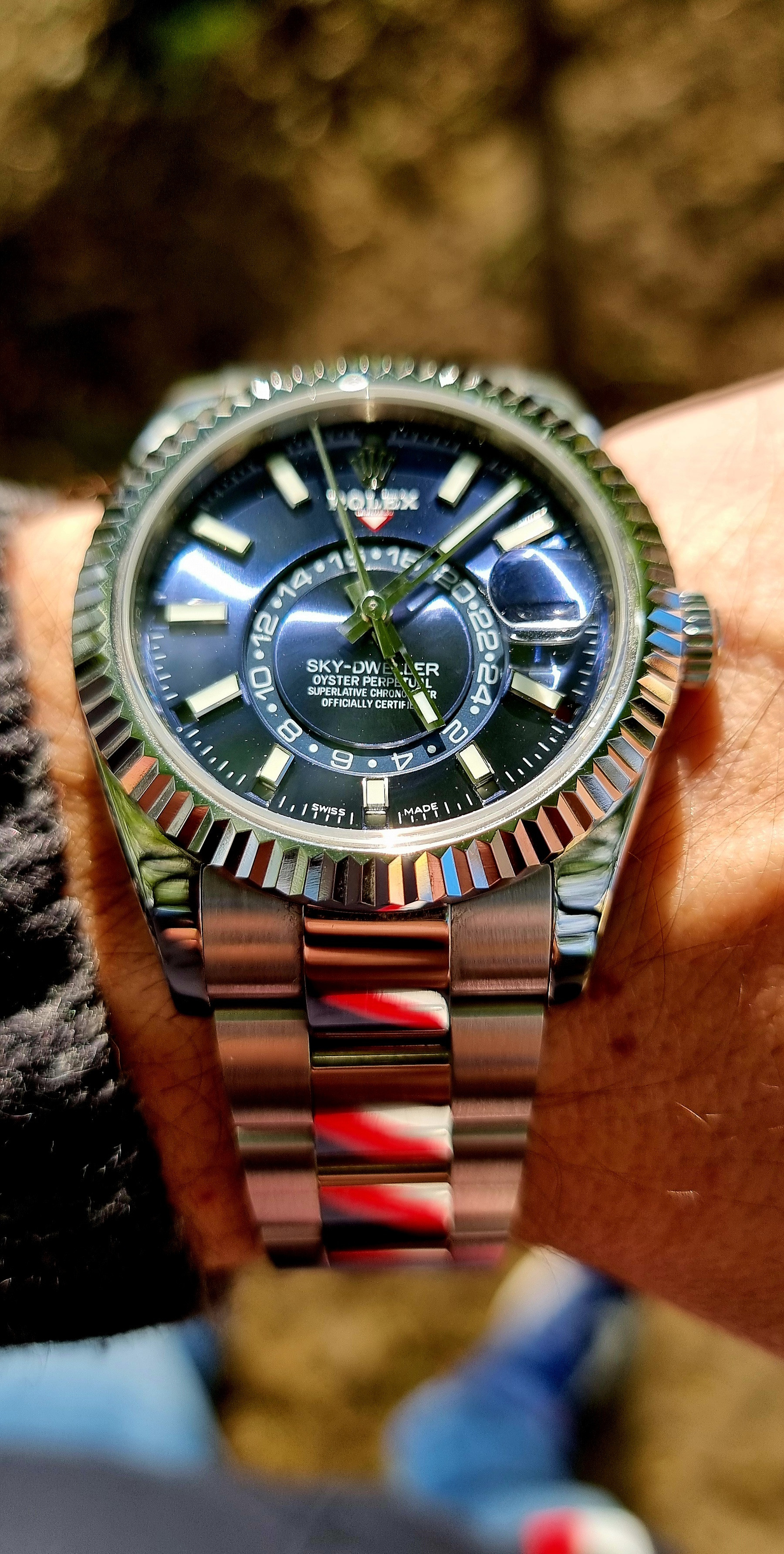
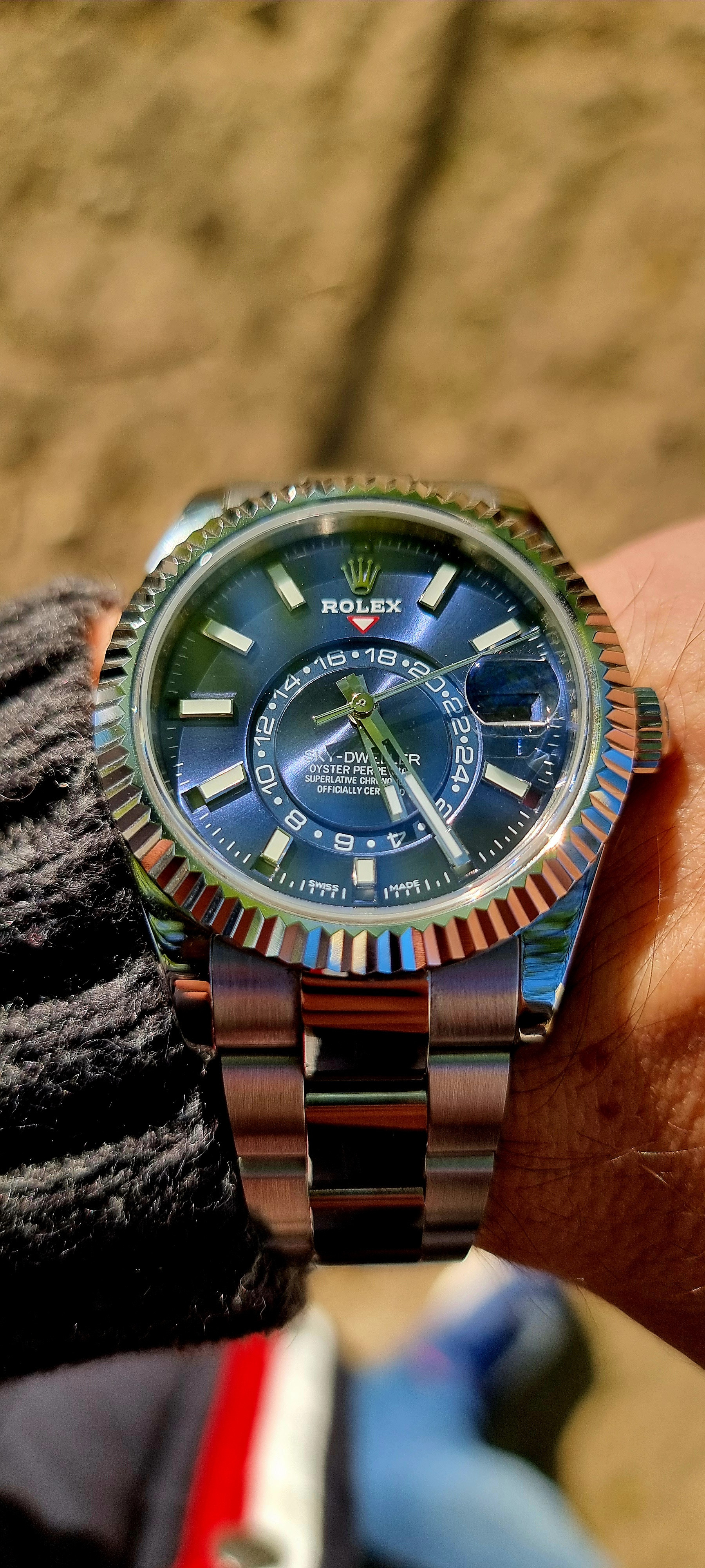
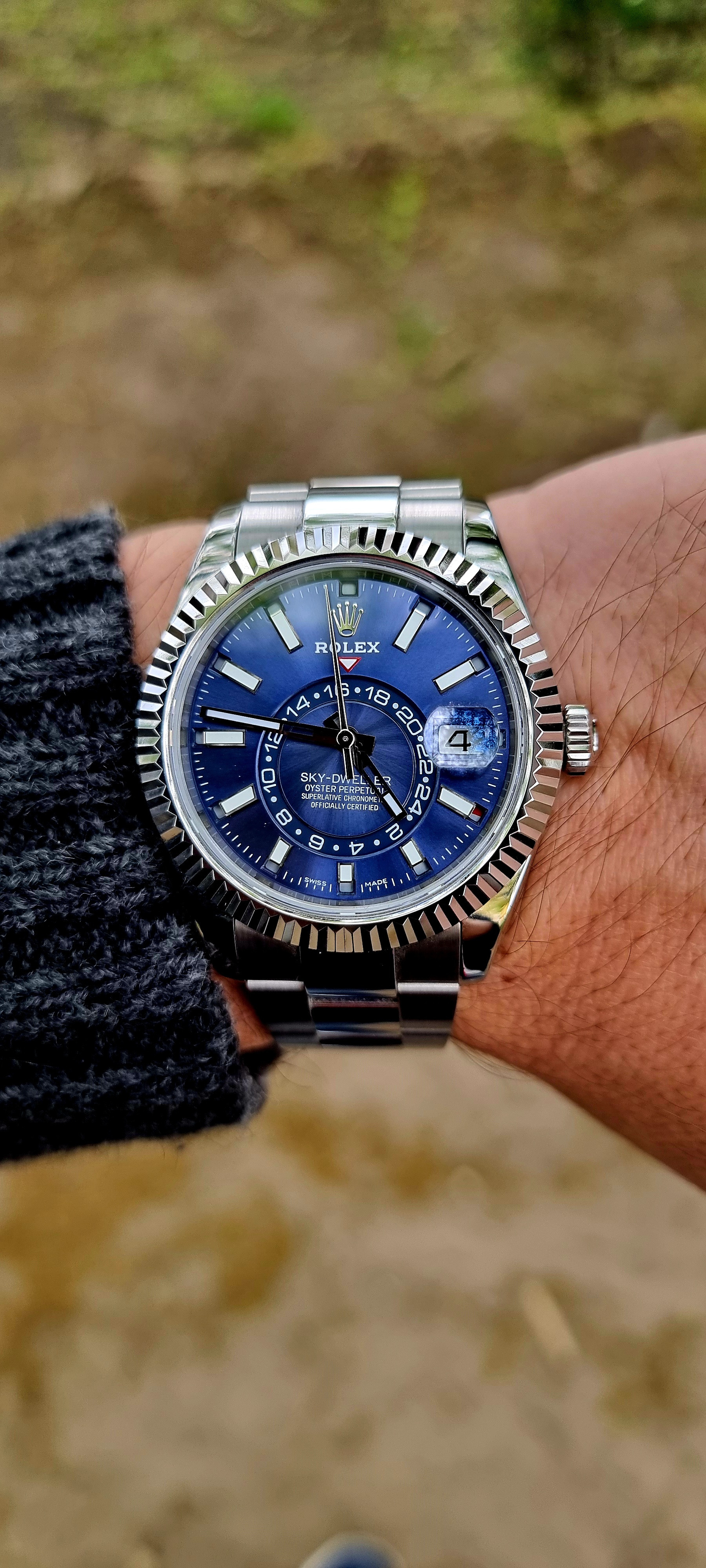
Steve sells a "FNF" version and I wish I knew what the quality was like. See below:
-
Tired of adverts on RWI? - Subscribe by clicking HERE and PMing Trailboss for instructions and they will magically go away!
New Release: Noob Skydweller
- Thread starter Stuvetjee
- Start date
- 12/3/18
- 37,543
- 80,259
- 113
Regarding color, the original Noob blue is very close to gen and whatever difference there is can easily be overlooked as it is quite beautiful in it's own right.

Regarding the bolder and taller date fonts I too initially preferred the original rep DW even to the gen.
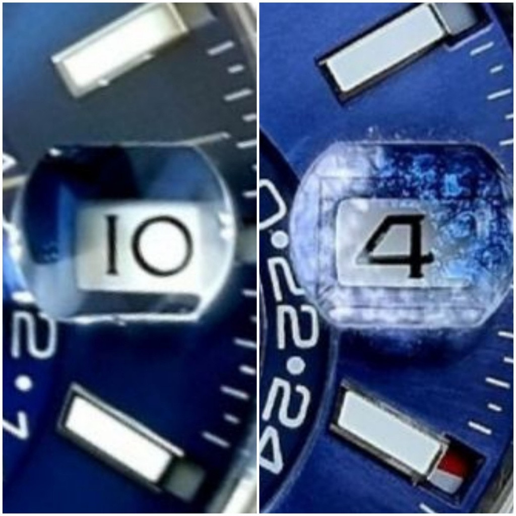
But since owning a gen I have acclimated to the unique DW configuration and now view my Noob's DW with some disdain. It's an instant tell. The Noob date window is far too wide and the skinny short font looks sparse in the space by comparison. I'm sure Rolex made the Sky-Dweller date window narrow due to space constraints because of the GMT wheel. The bolder fonts were likely a way to offset the narrower window. It is different to be sure but it works quite well for me. I wouldn't change it if I could.

Last edited:
- 12/3/18
- 37,543
- 80,259
- 113
Only because it's different and we are completely predisposed to the 31xx and 32xx datewheels. Once you know what is gen for the 9001/9002 movement, a 3xxx DW in it should be what looks fake.funny you mentioned the DW, on the gen the DW almost looks fake because the font is so different than the other watches
tripwire759
Time Is a Thief
- 3/11/23
- 75
- 86
- 18
I have had a few TDs tell me to stay away from this model no matter which factory makes it. They don't feel the quality is there just yet if that tell you anything.
this is kind of true. the quality is not the same. case size is wrong, dial size is wrong, lugs are wrong....theres a ton of things wrong with this that are easy tells up close....not to mention the movement being nearly impossible to copyI have had a few TDs tell me to stay away from this model no matter which factory makes it. They don't feel the quality is there just yet if that tell you anything.
- 28/11/18
- 289
- 254
- 63
Well if the disdain towards the Noob SD ever becomes unbearable, please sell that blue one to meRegarding color, the original Noob blue is very close to gen and whatever difference there is can easily be overlooked as it is quite beautiful in it's own right.
Regarding the bolder and taller date fonts I too initially preferred the original rep DW even to the gen.
But since owning a gen I have acclimated to the unique DW configuration and now view my Noob's DW with some disdain. It's an instant tell. The Noob date window is far too wide and the skinny short font looks sparse in the space by comparison. I'm sure Rolex made the Sky-Dweller date window narrow due to space constraints because of the GMT wheel. The bolder fonts were likely a way to offset the narrower window. It is different to be sure but it works quite well for me. I wouldn't change it if I could.
I have had a few TDs tell me to stay away from this model no matter which factory makes it. They don't feel the quality is there just yet if that tell you anything.
@KJ2020
Can you confirm the presence of all these errors?
Thank you
go through his posts, he's the person that identified all the errors
tripwire759
Time Is a Thief
- 3/11/23
- 75
- 86
- 18
I really do like the gen, but agree that there is just too much wrong for it. Maybe one day someone will get it close (besides the movement).this is kind of true. the quality is not the same. case size is wrong, dial size is wrong, lugs are wrong....theres a ton of things wrong with this that are easy tells up close....not to mention the movement being nearly impossible to copy
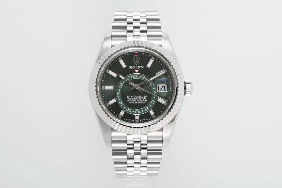
Anybody know anything about factory Jetfly? Have you ever heard about that factory? Got offer for this watch, and they are telling me it's from their factory
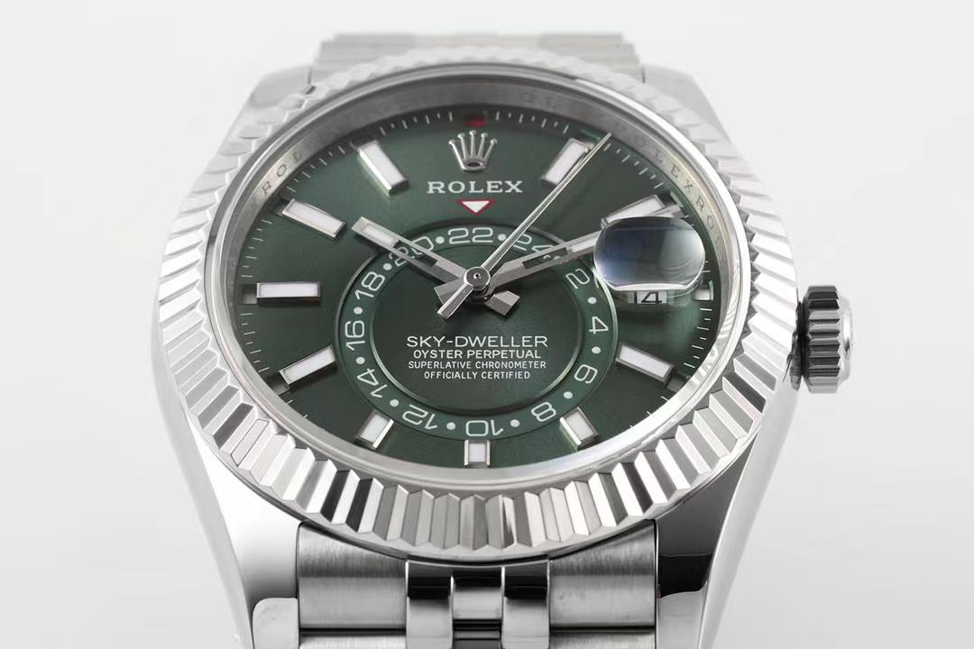
 clickpix.org
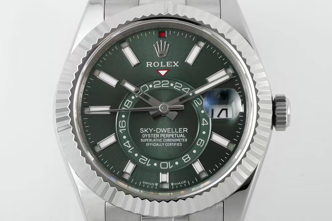
 clickpix.org
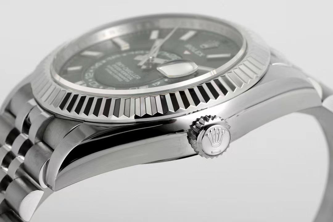
 clickpix.org
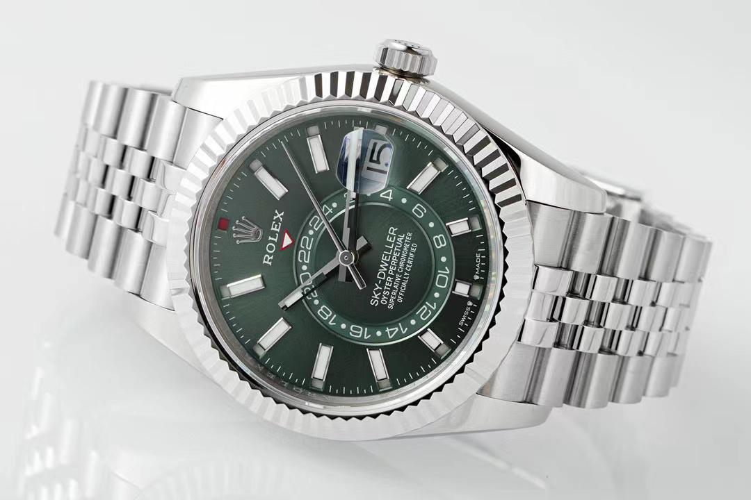
 clickpix.org
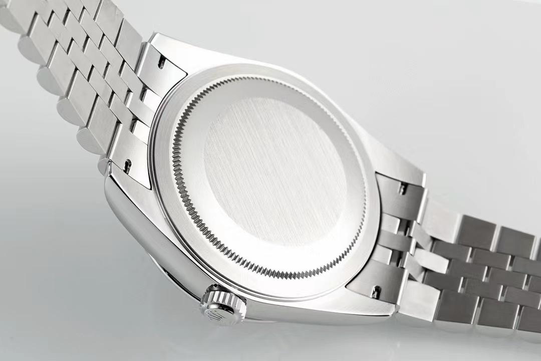
 clickpix.org
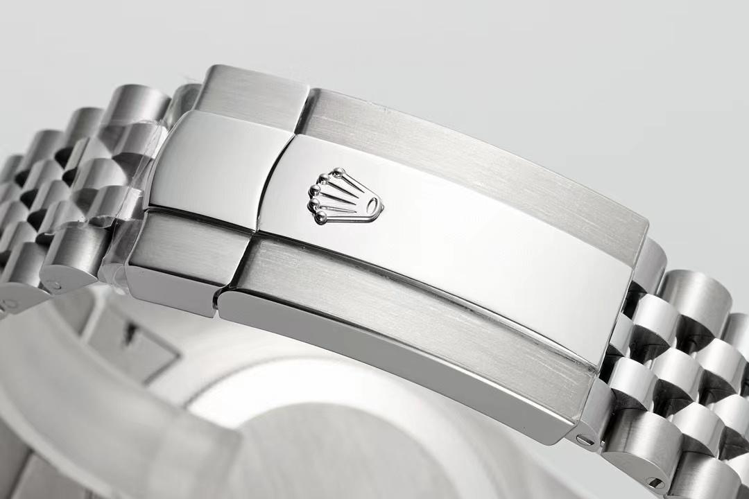
 clickpix.org
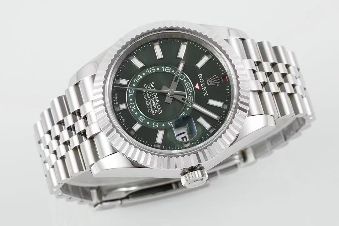
 clickpix.org
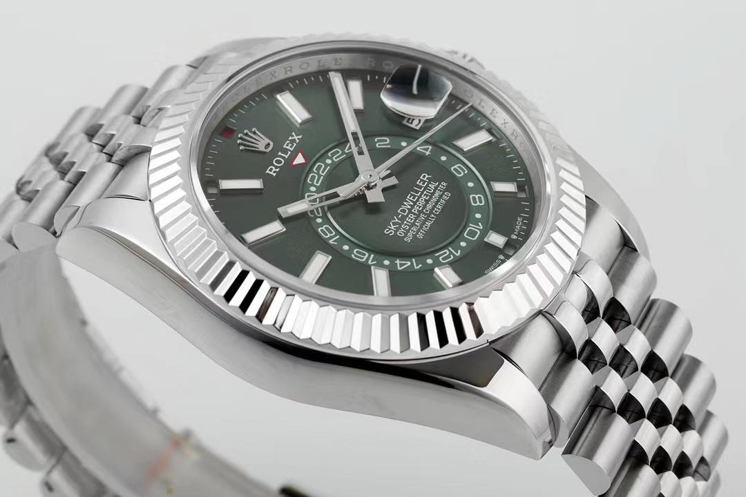
 clickpix.org
 clickpix.org

viber image 2024 03 30 06 44 44 270
Image viber image 2024 03 30 06 44 44 270 hosted in ClickPix.org

viber image 2024 03 30 06 44 44 293
Image viber image 2024 03 30 06 44 44 293 hosted in ClickPix.org

viber image 2024 03 30 06 44 44 309
Image viber image 2024 03 30 06 44 44 309 hosted in ClickPix.org

viber image 2024 03 30 06 44 44 534
Image viber image 2024 03 30 06 44 44 534 hosted in ClickPix.org

viber image 2024 03 30 06 44 44 549
Image viber image 2024 03 30 06 44 44 549 hosted in ClickPix.org

viber image 2024 03 30 06 44 44 612
Image viber image 2024 03 30 06 44 44 612 hosted in ClickPix.org

viber image 2024 03 30 06 44 44 626
Image viber image 2024 03 30 06 44 44 626 hosted in ClickPix.org

viber image 2024 03 30 06 44 44 729
Image viber image 2024 03 30 06 44 44 729 hosted in ClickPix.org

viber image 2024 03 30 06 44 44 737
Image viber image 2024 03 30 06 44 44 737 hosted in ClickPix.org
Love the gen, so bought the rep (JNF). DOA 2813 bullshit movement.I have had a few TDs tell me to stay away from this model no matter which factory makes it. They don't feel the quality is there just yet if that tell you anything.
- 12/3/18
- 37,543
- 80,259
- 113
New ZF yes bro? I saw in a video that the hour hand jumps. Is that true and if so is the jumping tied to date changes? Looks good!
@Neon
Last edited:
No zf bro, its the old noob version, same as yoursNew ZF yes bro? I saw in a video that the hour hand jumps. Is that true and if so is the jumping tied to date changes? Looks good!
@Neon
- 12/3/18
- 37,543
- 80,259
- 113
Oh nice, score for you. Congrats!No zf bro, its the old noob version, same as yours
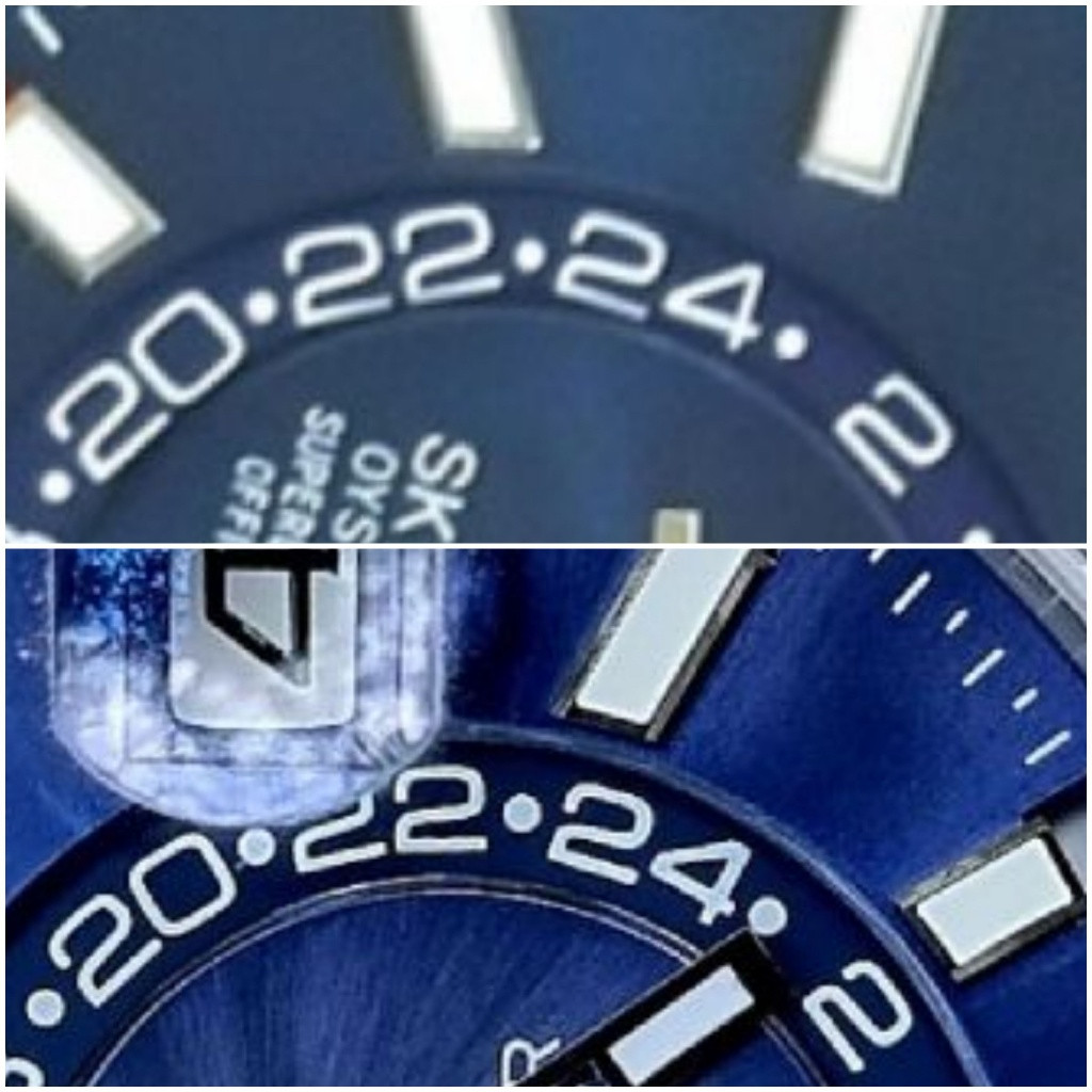
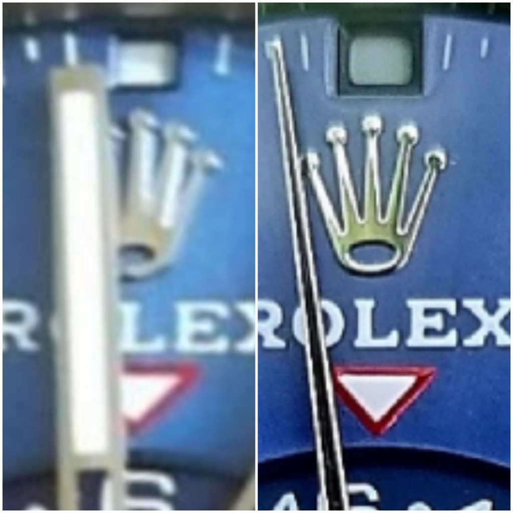
Yours is a post Noob raid version though (unless it was modded). The real Noob never put one out with a corrected GMT wheel like you have, or with the larger, bolder gen-like datewheel. Also the spacing above the red triangle is better on yours. Three big improvements you got.
Last edited:
thats definitely not a pre-raid noob. im wearing mine now looking at yours and its a night and day difference. maybe its the lighting in your photos but yours looks off. 24 disc and month indicators look way too sunk in. blue color looks wrong too, darker
Ah cool, thx!Oh nice, score for you. Congrats!
Yours is a post Noob raid version though (unless it was modded). The real Noob never put one out with a corrected GMT wheel like you have, or with the larger, bolder gen-like datewheel. Also the spacing above the red triangle is better on yours. Three big improvements you got.


I was told its a Noob, which ultimately is true lol
Just checked the version I have based on the info you provided and yes, should be a Noob v2 as the clasp code is C5J corresponding to the respective release, so thx for the clarification.
I don't know if you had this one in hand, its a stunner I must admit:
weight is 170grms
build is absolutely solid, bracelet is class, 0 play, genilke closing tic, winding up is smooth, crown positions are firm, bezel turn is prompt, I'm fully ok with the SEL especially in light of my vintage stuff lol
Dial colour matter is very similar with the GMT pepsi bezel eternal returning debate
Always wanted to try out this version and I'm more than pleased about what I see on my wrist.
Last edited:
Yeah, KJ just elucidated this as per above.thats definitely not a pre-raid noob. im wearing mine now looking at yours and its a night and day difference. maybe its the lighting in your photos but yours looks off. 24 disc and month indicators look way too sunk in. blue color looks wrong too, darker
I wouldn't say its darker, its actually the opposite imo, slightly lighter than the v1, but as I mentioned above its a matter of light conditions and what I see with different sources its hot to my taste lol
FYI
- Inside, arificial light unprocessed
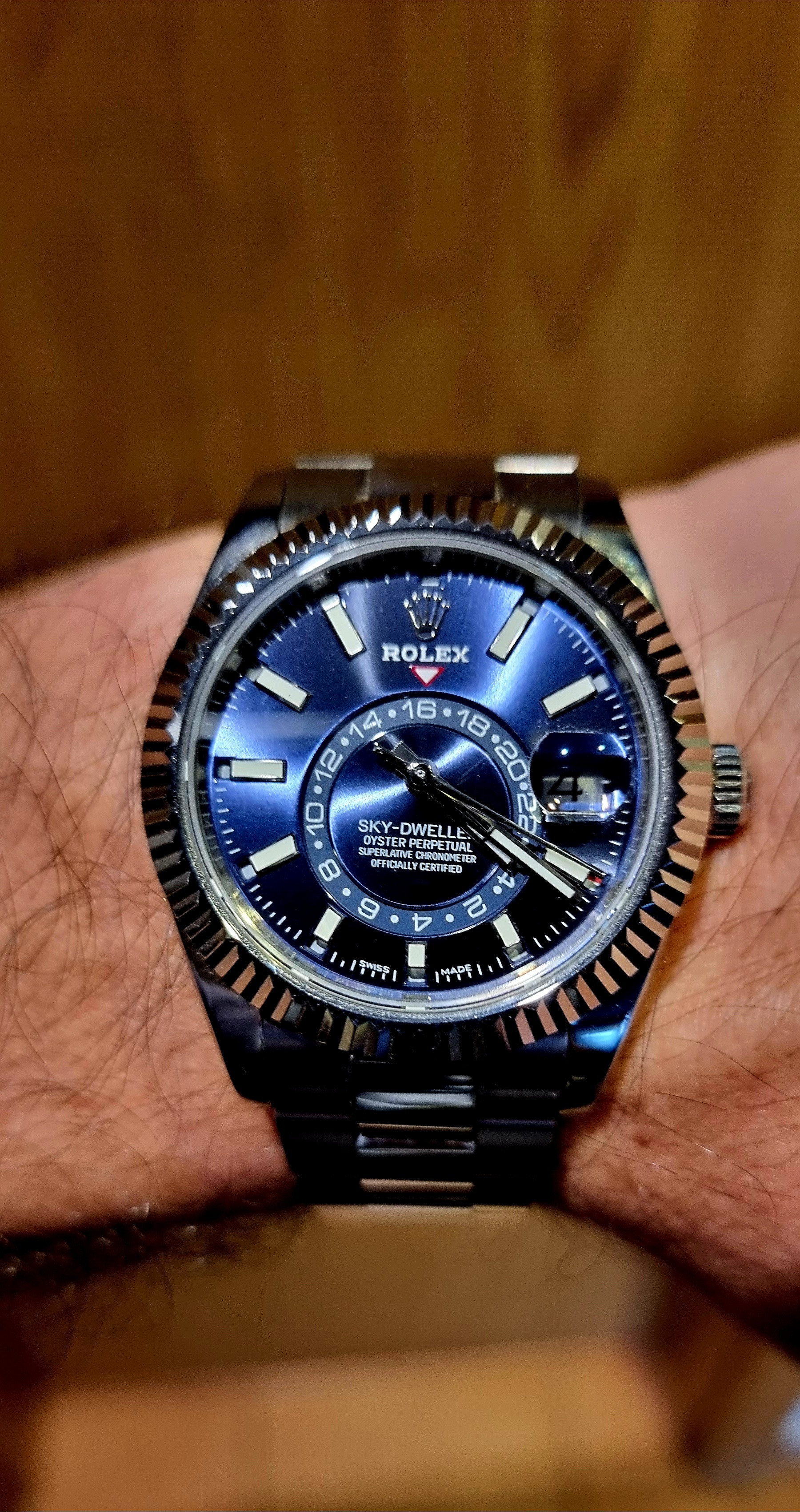
- inside natural light
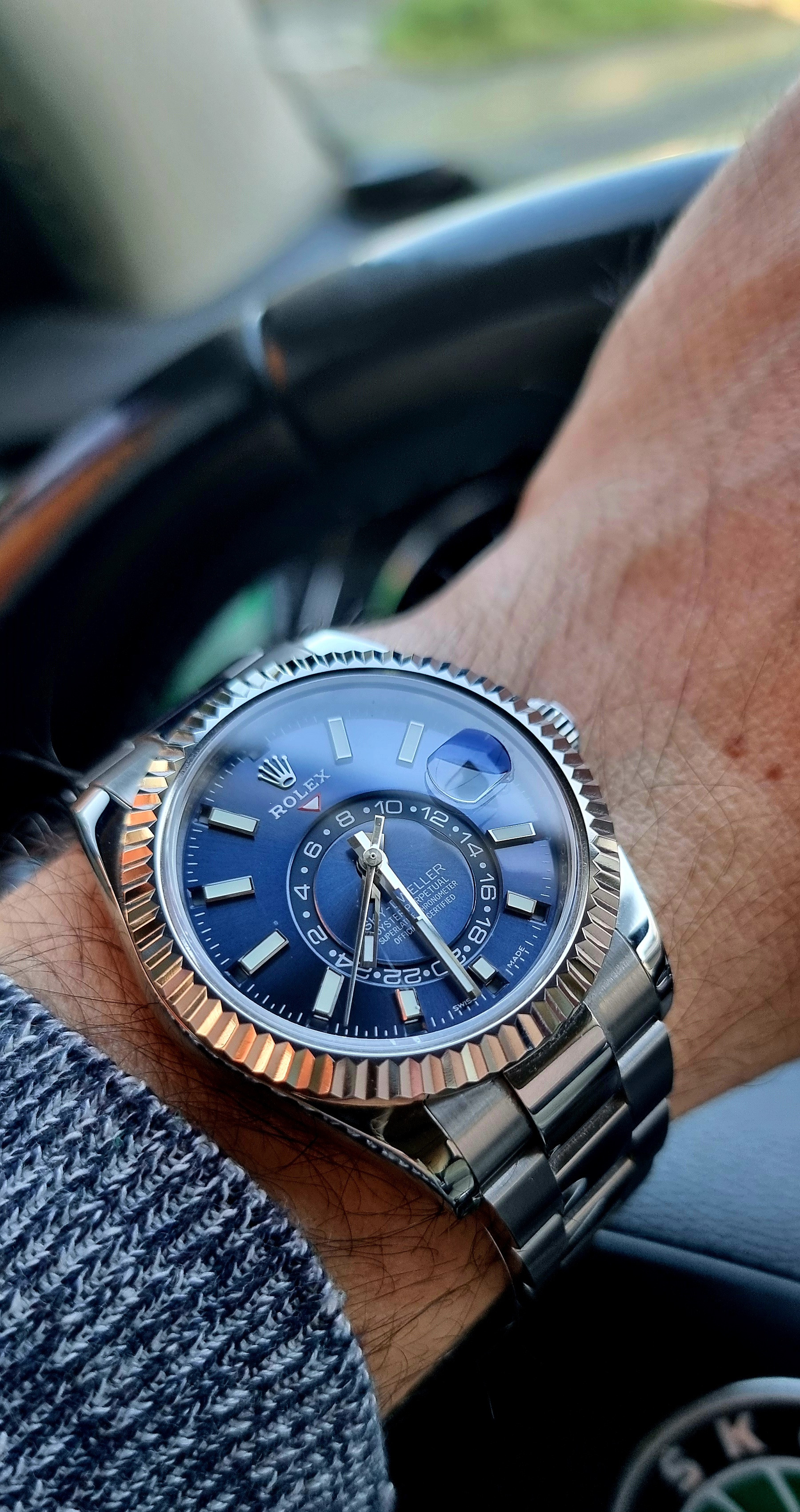
- Outside, natural light
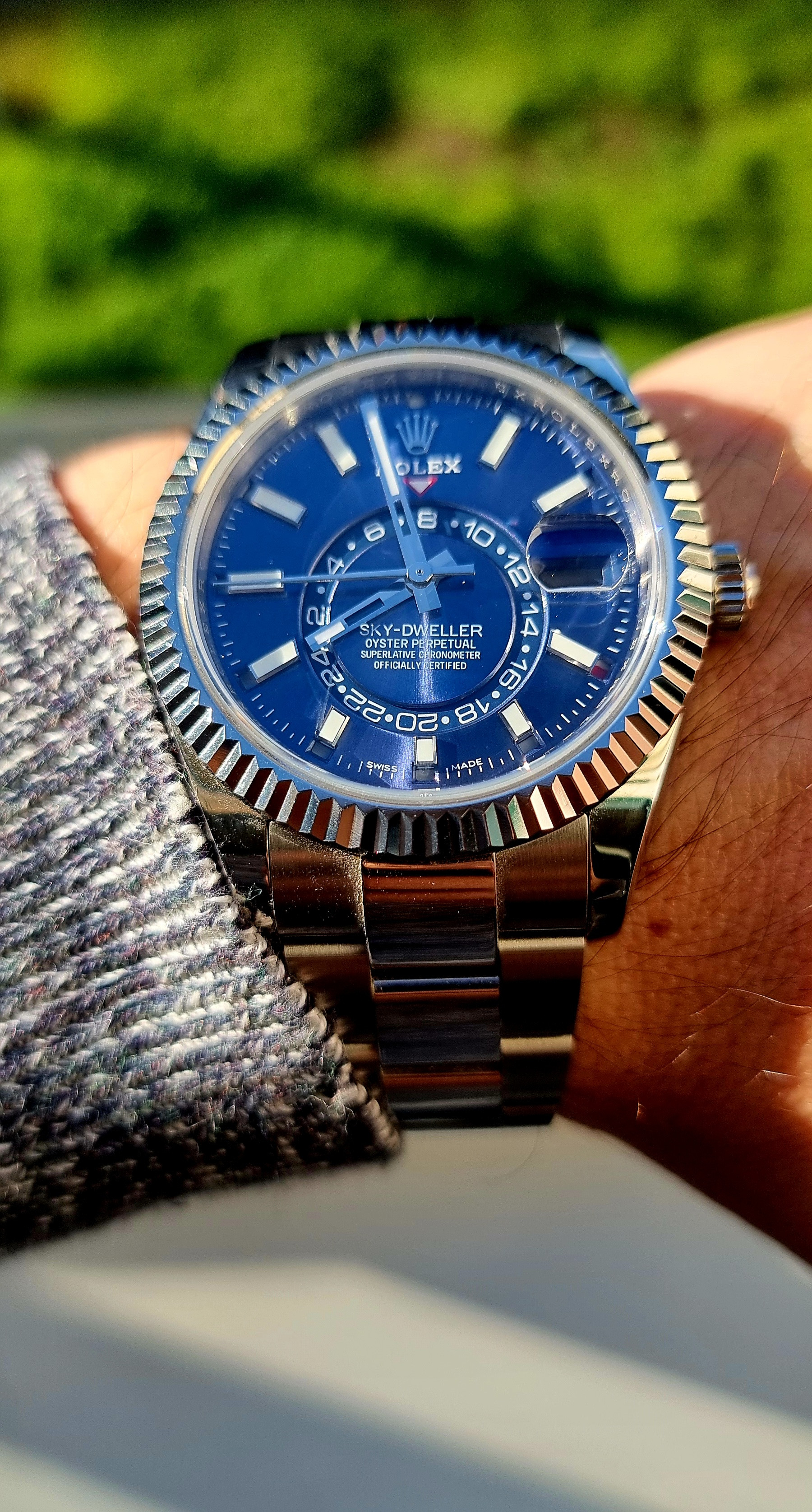
Outside, direct sunlight
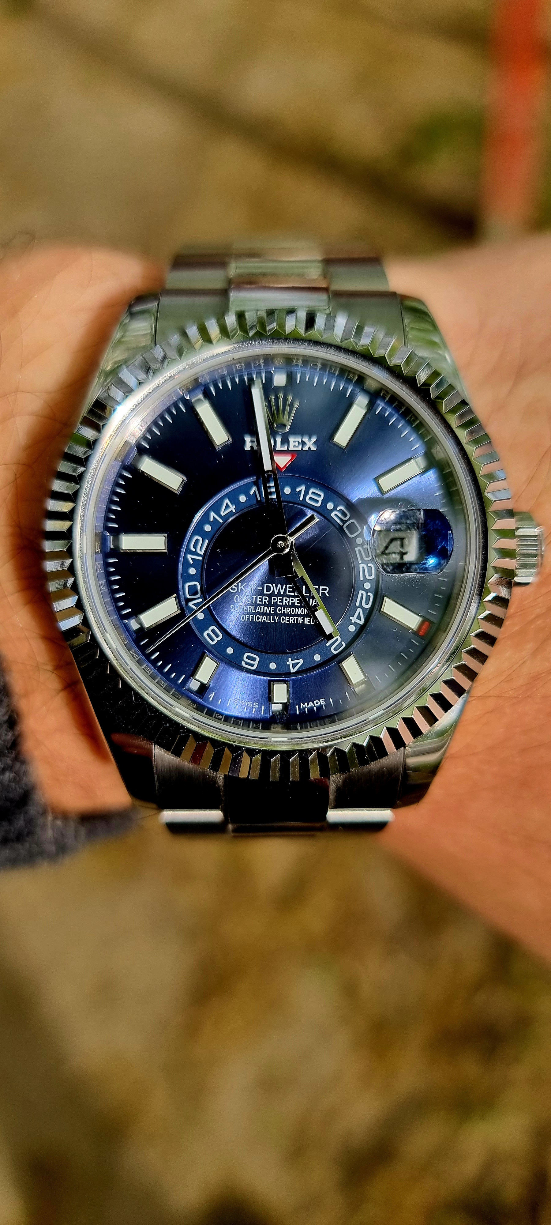


Here’s a v1 vs a v2*. Lighting definitely plays a difference with the blue dial as you can see in these two pics, but I think the v1 is much much closer to gen blue dial. Everything else maybe better on v2. So the lesson is get a v2 and not in blue maybe?
I find the dial and bezel sizes/proportions very different between the two. Never sure which is better, but @KJ2020 knows best since he uses calipers!
* My v2 has a crystal upgrade, and some other work like rehaut and bracelet polishing, so take that in mind

