-
Tired of adverts on RWI? - Subscribe by clicking HERE and PMing Trailboss for instructions and they will magically go away!
You are using an out of date browser. It may not display this or other websites correctly.
You should upgrade or use an alternative browser.
You should upgrade or use an alternative browser.
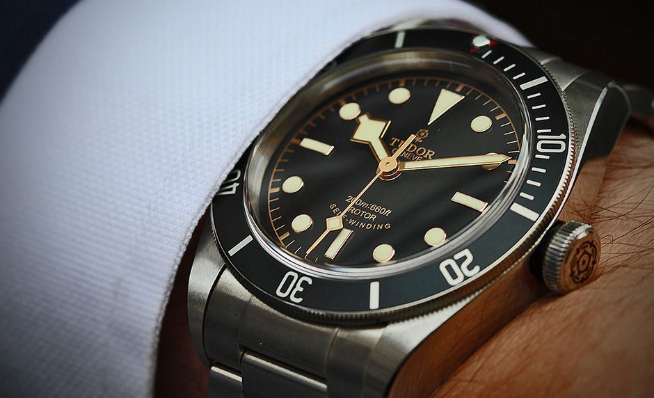
New Black Bay Black pics
- Thread starter sharrkey
- Start date
thanks for the pics Aromatik!
The triangle doesn't look that bad in the second picture. Lacks the pop on the gen but not bad.
The triangle doesn't look that bad in the second picture. Lacks the pop on the gen but not bad.


Just got mine. I had a red one already (ZF V3). Pearl is much better, dial printing and lume application slightly better. Overall it's an amazing rep, I guess the red triangle could have been a little bit brighter but that's a small detail...
Desmosidici
Getting To Know The Place
- 22/10/15
- 62
- 3
- 8
I'm getting my red V3 today from Ryan. I def want this and make a His & Hers just to make the wifey happy but ever since someone pointed out the red triangle, I can't get it off my head and think I should wait.
Looks solid, with a gen in the same type of lighting, the lume looks extremely close. It's only useful comparing pictures with similar lighting, as it can really throw off the shade.

[MENTION=99603]Aromatik[/MENTION] You've got a stunning example there, the lume looks well applied, and the gold hands/indices have a great finish!

[MENTION=99603]Aromatik[/MENTION] You've got a stunning example there, the lume looks well applied, and the gold hands/indices have a great finish!
- 17/2/14
- 1,091
- 0
- 0
Hi guys, this looks pretty darn good. No disrespect meant here, just answering the question based on my limited knowledge.
The texture on the insert is not as refined and the fonts look a little thinner. Pearl and triangle look pretty good but on the gen, the pearl actually sits below the metal surround and appears opaque. Texture on the dial is similar to the insert in that it is close but not as "textured/refined" as the gen. Lume plots on the gen are flatter/cleaner and more creamy white. Rose gold versus yellow gold on the indices and hands. Bevels slightly more pronounced on the gen. The SEL middle ridge is sharper on the gen.
All very nitpicky, this looks like a very nice rep to me. I will put up some macos I took the other day with my phone here in a second.
- 17/2/14
- 1,091
- 0
- 0
Guicamarao
Active Member
- 17/2/14
- 408
- 181
- 43
Anyone know where to buy gen tudor nato straps for the black bay? AD has them for 180 for strap and 180 for hardware ... 260 total ... Abit ridiculous.
The black bay black would look amazing on a gen nato.
Sent from my iPhone using Tapatalk
You mean 360 total


