• Tired of adverts on RWI? - Subscribe by clicking HERE and PMing Trailboss for instructions and they will magically go away!

Incorrect Lettering Colour on PAM 312 KW ?

ztealth

Active Member
11/8/13
298
41
28
Mine is at the Post Office here in Dallas, I'll get it tomorrow but in the meantime here's some pics
The first one is from my QC

The second one is a gen "O" series from a recent sale at Risti

It is impossible to have a real comparison because the light, angle,and camera settings but clearly the font color is a very similar ecru.


Thanks for your post!
That's what I thought at first but once your receive it you will see it is blatantly off.
It is way too dark and no matter what lighting conditions you are under.
I respect's ALE's opinions but he seems to be the only one who can attest to the fact that KW's coloring is accurate.

Here is a photo I just took.
The brown seems to be similar to that of the cardboard even under the flash.
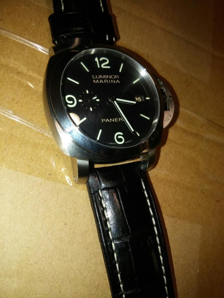


That's why I want to hear from more of you guys because potential 312 KW buyers would love to know!!!
 

kilowattore

Sales Moderator / Section Moderator
Staff member
Moderator Sales
Section Moderator
Certified
11/5/13
14,143
6,826
113
Italy
Maybe it's my eyes, but I haven't seen a single pic in this thread that made me think the color is WAY off. Maybe a little different, but it could easily be the different lights in the pics.

The two pics posted by granvino are quite eloquent to me: I see an accurate color with slight variations due to different light.

Just my 0.02 of course ;)
 

takoxavy

I'm Pretty Popular
8/3/14
1,341
25
38
Just wear it with confidence!


Sent from my iPhone using Tapatalk
 

PaMister

Known Member
19/5/14
192
0
0
20140625_121550.jpg


This just came in. Lightning and angle makea a big difference.
 

ernien

Renowned Member
Supporter
Certified
23/9/12
801
199
43
Canada
Here are pics of the KW 312 next to the gen (no strap) that KW used to replicate. Even in the bright lights you can see a difference with the KW being more brown.
3y9utepu.jpg

y9y2avez.jpg


Sent from my iPad using Tapatalk
 

ztealth

Active Member
11/8/13
298
41
28
:(:(:(
Here are pics of the KW 312 next to the gen (no strap) that KW used to replicate. Even in the bright lights you can see a difference with the KW being more brown.
3y9utepu.jpg

y9y2avez.jpg


Sent from my iPad using Tapatalk
that's what I'm talking about.
once you put it beside a gen in real life it puts the kw one to shame.
so disappointed that they didn't get the color right!
the watch would have been perfected!
 

PaMister

Known Member
19/5/14
192
0
0
20140625_134318.jpg


Another one. I will take better pics with real camera when I'm back home.

Text is indeed a bit brownish, but still a great watch and one needs to be an expert to tell from that.
 

sweden

I'm Pretty Popular
10/6/13
1,041
13
38
:(:(:(
that's what I'm talking about.
once you put it beside a gen in real life it puts the kw one to shame.
so disappointed that they didn't get the color right!
the watch would have been perfected!

So harsh..You pay ~3% of the gen price and you expect "perfect"?
When I see the rep besides gen I'm very impressed what they have done, even if the colour is a little bit off.
 

kilowattore

Sales Moderator / Section Moderator
Staff member
Moderator Sales
Section Moderator
Certified
11/5/13
14,143
6,826
113
Italy
:(:(:(
that's what I'm talking about.
once you put it beside a gen in real life it puts the kw one to shame.
so disappointed that they didn't get the color right!
the watch would have been perfected!

Guys if this is the HUGE difference we're talking about I call myself out :)
A slightly darker cream color and the tip of the CG lever are the only differences I can see in the pic.
The difference that is not in the pics is the price: do you really expect a rep that costs 258 usd to be EXACTLY 1:1 with a 8,000 usd watch? Really?

To me that's a stunning replication and for sure one of my next PAMs.
The only person that could spot that difference is one of the guys reading this thread.
 

ALE7575

Section Mod
Section Moderator
Certified
18/1/11
19,846
423
83
I repeat that gen is also creamy or ecru or brownish or whatever you want
Mine is almost the same as gen (I cannot say it is darker or more brownish)

ALE
 
D

d4m.test

Guest
:(:(:(
that's what I'm talking about.
once you put it beside a gen in real life it puts the kw one to shame.
so disappointed that they didn't get the color right!
the watch would have been perfected!

Dear sir, may I suggest some more run time studying, gathering knowledge, and building perspective on these here replicas.

it is astounding to me that you can view this picture of rep versus gen and say the gen puts it to shame. While I do agree that based on picture evidence, there seems to be a color differnce with the gen being more creamy colored and the rep being more of a tan color, It still feels like we are beating a dead horse with its own horse shoes. The KW, especially with a properly flushed CP, is a damn fine replica...one of the best around.
 

ztealth

Active Member
11/8/13
298
41
28
Dear sir, may I suggest some more run time studying, gathering knowledge, and building perspective on these here replicas.

it is astounding to me that you can view this picture of rep versus gen and say the gen puts it to shame. While I do agree that based on picture evidence, there seems to be a color differnce with the gen being more creamy colored and the rep being more of a tan color, It still feels like we are beating a dead horse with its own horse shoes. The KW, especially with a properly flushed CP, is a damn fine replica...one of the best around.

Do not get me wrong.This is a fine replica and there is definitely no doubt. But you know what, this is why i am bringing this into discussion. How would they miss the coloring when they got everything else great accuracy?
And it is funny how it is okay to critique something more sophisticated like the caseback movement, but not okay when I am discussing the colors, which is something that is easier to get right.
Everyone criticizes me for expecting it to be a perfect watch when I am only paying a fraction of a price. I am not expecting it to be perfect whatsoever. And the reason I am posting this is to see if others notice this too because as ALE mentions, there is no color discrepancies at all between the gen and rep.
 
D

d4m.test

Guest
No, it is always okay to bring any critique you wish to the table. That's what makes this the best Panerai rep forum in the hobby. I enjoy your comments, I just think that half a shade of color difference is not enough to knock down a rep like the 312. It is stunning in its details. Add to it the fact that KW offers probably the best case finish of any maker and you have just too many factors that outweigh the slight print difference.
 

PaMister

Known Member
19/5/14
192
0
0
Few more pics. Untouched straight from the camera with correct white balance. On proper display you shoud see how it looks in real life at cloudy day. (Works at least on my Samsung syncmaster, Ipad Air and Imac 2009 screens.)
From darkes "brown" to lightest "brown".

P6250015.JPG


P6250019.JPG


P6250024.JPG


Watch itself is a great piece. Nothing much to complain, crown could work better. Now it's a bit sticky to rotate but getting better while use, I'm sure. I would not recommend hand winding with this movement. If one must hand wind this to give a kick start then it shoud be done very carefully. Winding gears aspect ratio seems to be quite high and one can easily break gears if winding is done too roughly. Also I don't know if AR is "gen like" but it could be better. Chrystal is nicely domed and perfectly fitted as is the whole watch. I don't think that there is any better finished gens on the market at this price point. Real "bang for a buck"

BTW QC pics showed -14sek/day but this has done now +4-5 sek/22h so no need to regulate, at this point anyway. I'm happy.
 

ztealth

Active Member
11/8/13
298
41
28
Few more pics. Untouched straight from the camera with correct white balance. On proper display you shoud see how it looks in real life at cloudy day. (Works at least on my Samsung syncmaster, Ipad Air and Imac 2009 screens.)
From darkes "brown" to lightest "brown".

P6250015.JPG


P6250019.JPG


P6250024.JPG


Watch itself is a great piece. Nothing much to complain, crown could work better. Now it's a bit sticky to rotate but getting better while use, I'm sure. I would not recommend hand winding with this movement. If one must hand wind this to give a kick start then it shoud be done very carefully. Winding gears aspect ratio seems to be quite high and one can easily break gears if winding is done too roughly. Also I don't know if AR is "gen like" but it could be better. Chrystal is nicely domed and perfectly fitted as is the whole watch. I don't think that there is any better finished gens on the market at this price point. Real "bang for a buck"

BTW QC pics showed -14sek/day but this has done now +4-5 sek/22h so no need to regulate, at this point anyway. I'm happy.
Wonderful photos!

That is the exact color letterings you see in real life.
Looks better with the brown strap!
 

Burrogs

Getting To Know The Place
17/8/12
16
1
0
Yours may look a but more tannish than mine. Here's my KW from the first batch...

ty3ahudu.jpg
 

Fiddo

-------
Patron
Certified
16/2/09
8,330
4,493
113
In a Causal Loop
I think the OP brings up a good discussion point...just a valid as Tudor BB hand color etc..

Plus, always cool to look at more watch pictures. :)
 

Teddyfigo

Do not accept unsolicited offers
18/7/12
13
0
0
Well another picture or two won't kill now right ?:)

2ezazege.jpg


4yrunaza.jpg


Sent from my iPhone using Tapatalk
 

Teddyfigo

Do not accept unsolicited offers
18/7/12
13
0
0
A gen for sell , the font looks pretty dirty brown to me

9a6u2ana.jpg


Sent from my iPhone using Tapatalk