-
Tired of adverts on RWI? - Subscribe by clicking HERE and PMing Trailboss for instructions and they will magically go away!
You are using an out of date browser. It may not display this or other websites correctly.
You should upgrade or use an alternative browser.
You should upgrade or use an alternative browser.
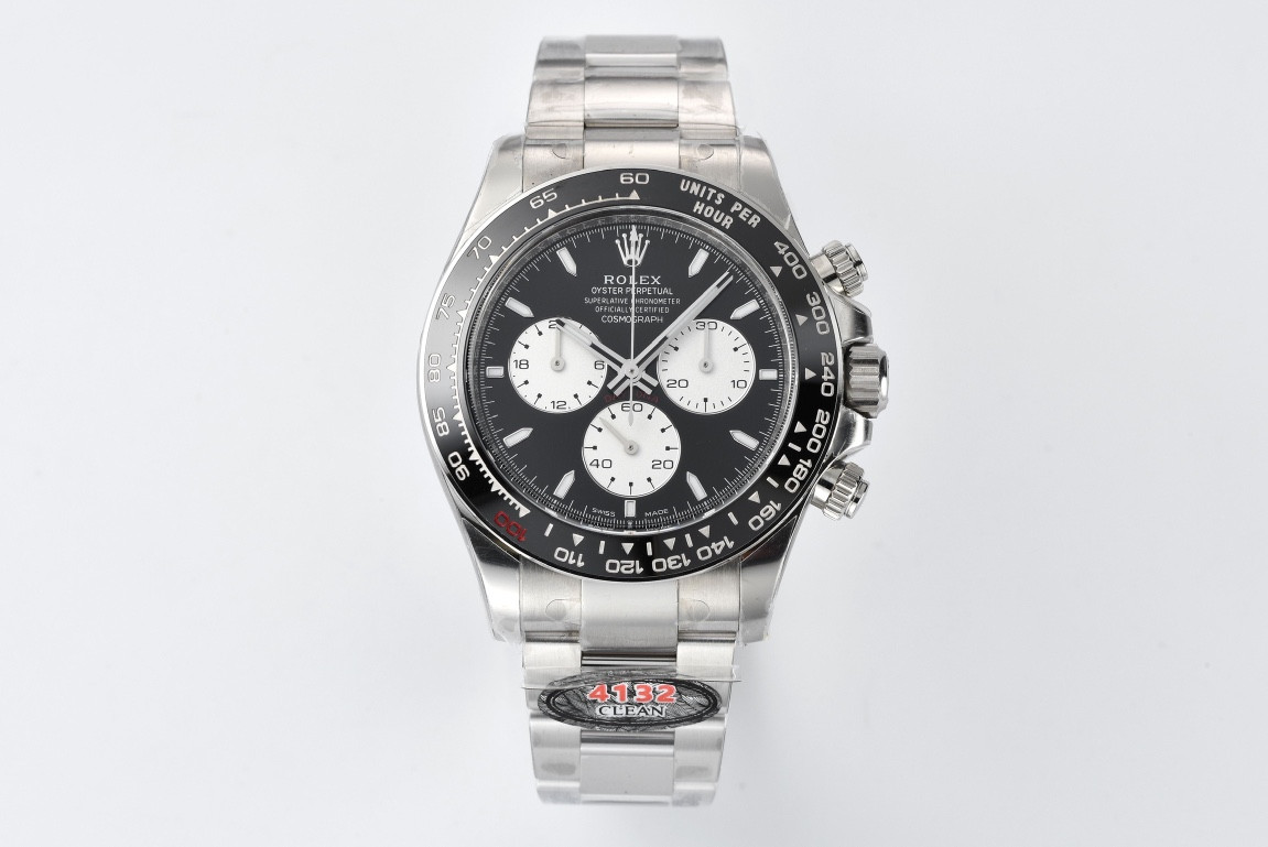
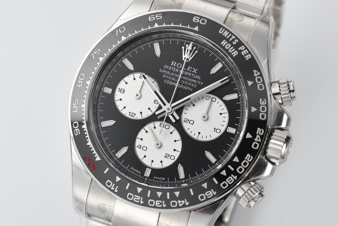
Clean new 126529LN 'Le Mans' release [actual photos]
- Thread starter CTime
- Start date
The text close to the bezel has been present from clean in the past. In seems in some recent QCs for the 126500 they've fixed it.First photos show the flawed bezel with text too close to the edge. No excuse for this,.how can they stuff it up again. And it looks like the red daytona text on dial is too dark just like they messed up on 126519LN. Dammit really wanted to get this or the 126519LN baby lemans.
@CTime you have been made aware of these 2 flaws previously i would hope to think you have some way of getting the feedback to CF.
The colour of the Daytona text could just be the lighting. You're always going to deal with some flaws, it's just which you can tolerate more. If you don't like Clean, you can always go with QFs.
DarthVader1
If you want the ultimate, you've to pay...(Bodhi)
- 14/11/23
- 45
- 23
- 8
I must say that you are right.
My QF 126629 S/S looking close with a 20x it has those very thiny concentric rings.
Let's hope CF didn't make the same mistake
DarthVader1
If you want the ultimate, you've to pay...(Bodhi)
- 14/11/23
- 45
- 23
- 8
happyguy1688
Getting To Know The Place
happyguy1688
Getting To Know The Place
- 25/9/22
- 8,287
- 23,057
- 113
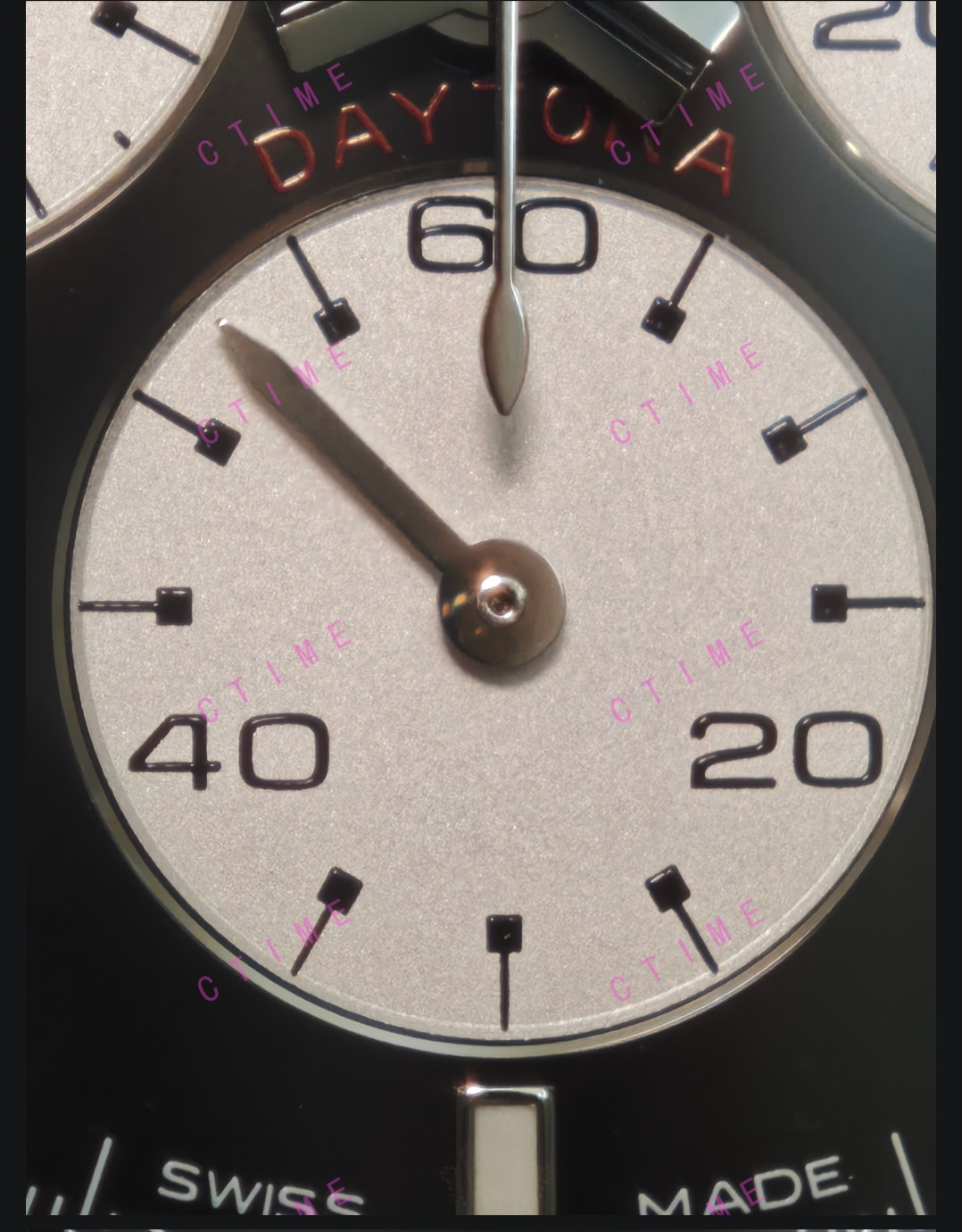
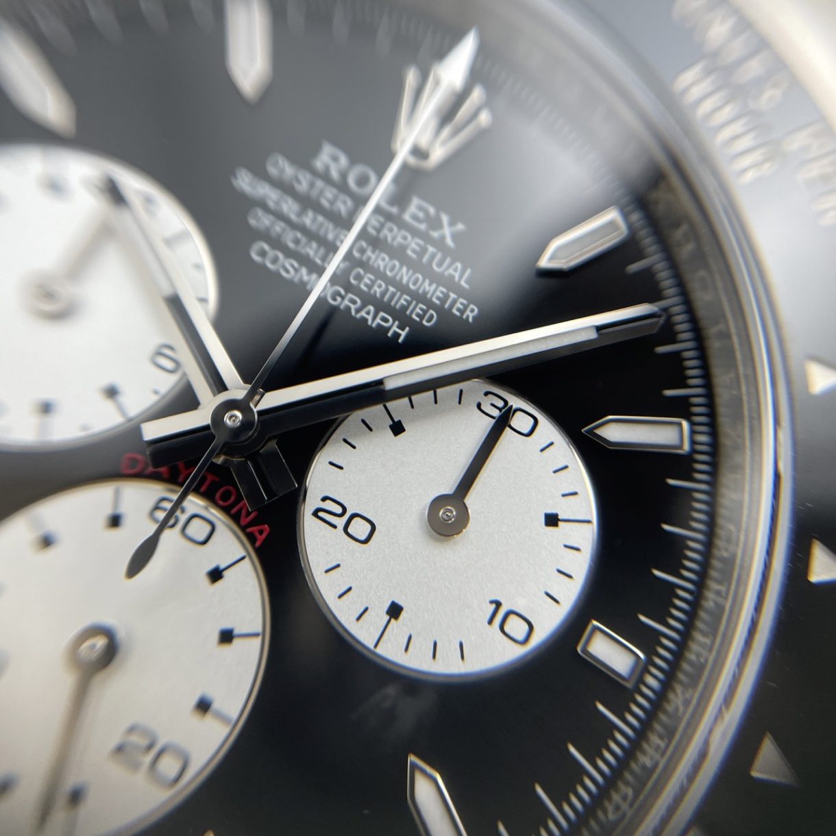
"30" and "24" the same issue
In this pic, the "60" is clearly too close to edge of sub-dial

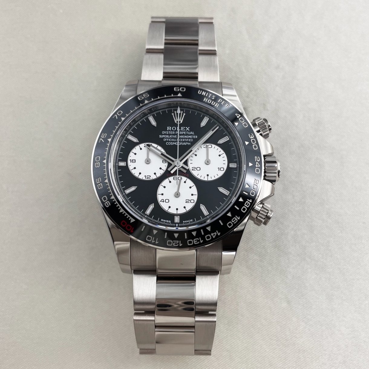
Le Mans Daytona 126529LN-0001
Step into the world of horological excellence with the Rolex Le Mans Daytona 126529LN-0001, a timepiece that celebrates two monumental anniversaries..
 k2luxury.ch
Compare to gen macro they look 90% similar, can see it on 20x zoom but not on a normal shot.
Last edited:
- 25/9/22
- 8,287
- 23,057
- 113
What can I say, i was top of my middle school school class in where's waldo and spot the differenceI must say that you are right.
My QF 126629 S/S looking close with a 20x it has those very thiny concentric rings.
Let's hope CF didn't make the same mistake
Jokes aside it's the small details I always appreciate clean for focusing on, I jerk them off alot but here we see the full strength of Clean dials and detail focus. Details we really dont focus on until you look upclose.
happyguy1688
Getting To Know The Place
much more obvious than the 20X co-centric circles I suppose
Le Mans Daytona 126529LN-0001
Step into the world of horological excellence with the Rolex Le Mans Daytona 126529LN-0001, a timepiece that celebrates two monumental anniversaries..k2luxury.ch
Compare to gen macro they look 90% similar, can see it on 20x zoom but not on a normal shot.


- 25/9/22
- 8,287
- 23,057
- 113
Don't think it's that obvious if you look at the macro shots of gen they look very close to the edge as well.much more obvious than the 20X co-centric circles I suppose
But you dont have to buy it if it bothers you! There is always QF.
Edit : btw the photos i sent above : gen, rep, rep, gen. The numbers look identical in these press release photos compared to the original CTime photos
Last edited:
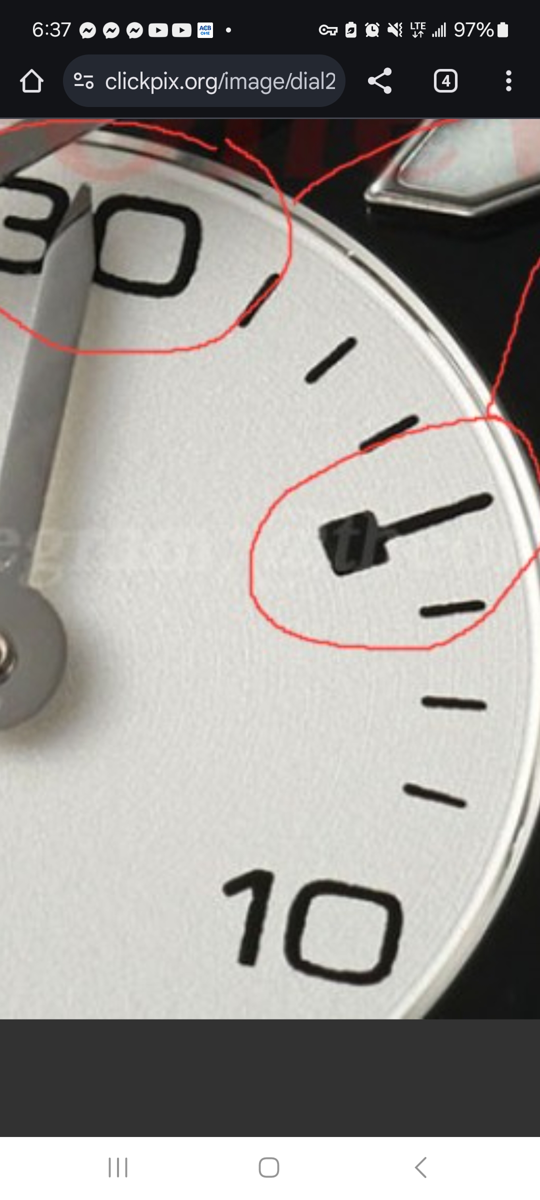
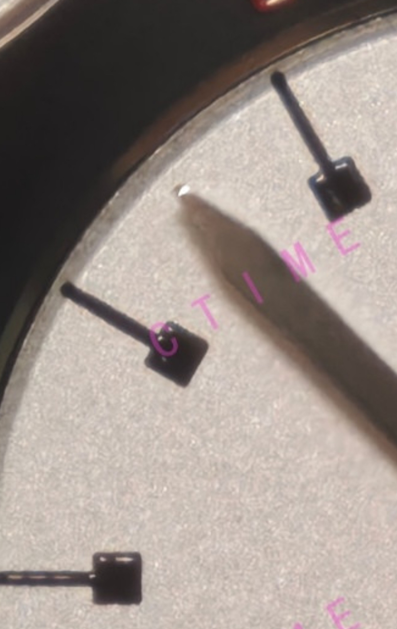
Also the original and the QF version do not have a edge step up between the outer sub dial and the silver ring. I can’t really see why the Clean is better but it may be worse.The bezel is a lose for me over QF but also the Clean sub register stalk lines actually cross onto the silver ring which the originals do not, thatquite an instant tell.
Can you point out what you're referring to? I'm looking at the subdials but I don't see lines that are crossing onto the ring.Clean sub register stalk lines actually cross onto the silver ring which the originals do not, thatquite an instant tell.
muiramas
Aristocrat
- 18/1/17
- 6,059
- 7,991
- 113
What can I say... I jerk them off alot.

But also here.
https://clickpix.org/image/IMG-3984.2iwI4P https://clickpix.org/image/IMG-3985.2iwOgW
One is original one is Clean
https://clickpix.org/image/IMG-3984.2iwI4P https://clickpix.org/image/IMG-3985.2iwOgW
One is original one is Clean
Try againBut also here.
https://clickpix.org/image/IMG-3984.2iwI4P https://clickpix.org/image/IMG-3985.2iwOgW
One is original one is Clean
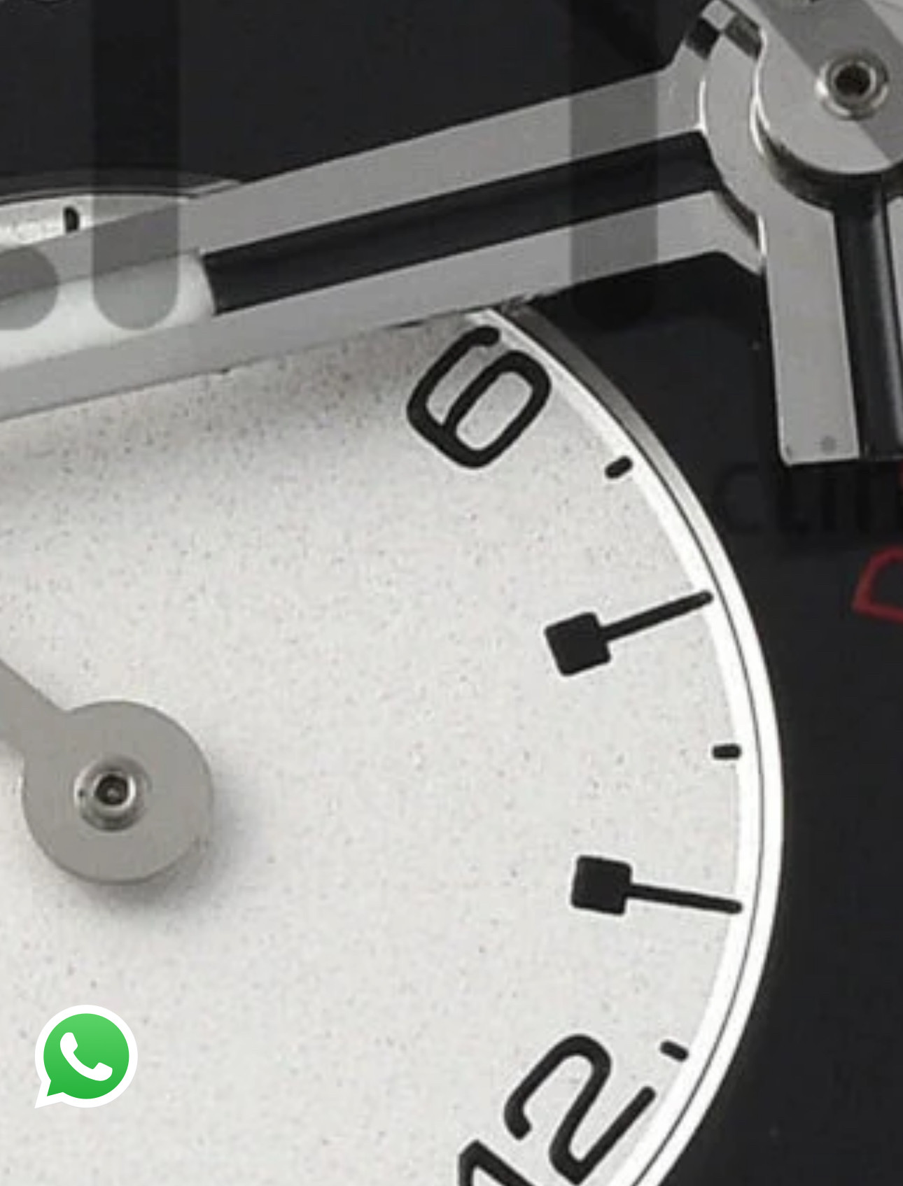

That’s a reflection from the shiny part of the subdial ring

