-
Tired of adverts on RWI? - Subscribe by clicking HERE and PMing Trailboss for instructions and they will magically go away!
You are using an out of date browser. It may not display this or other websites correctly.
You should upgrade or use an alternative browser.
You should upgrade or use an alternative browser.
Clean Factory New 4130 Daytona Dial Pictures Leaks
- Thread starter jtimewatch
- Start date
.....
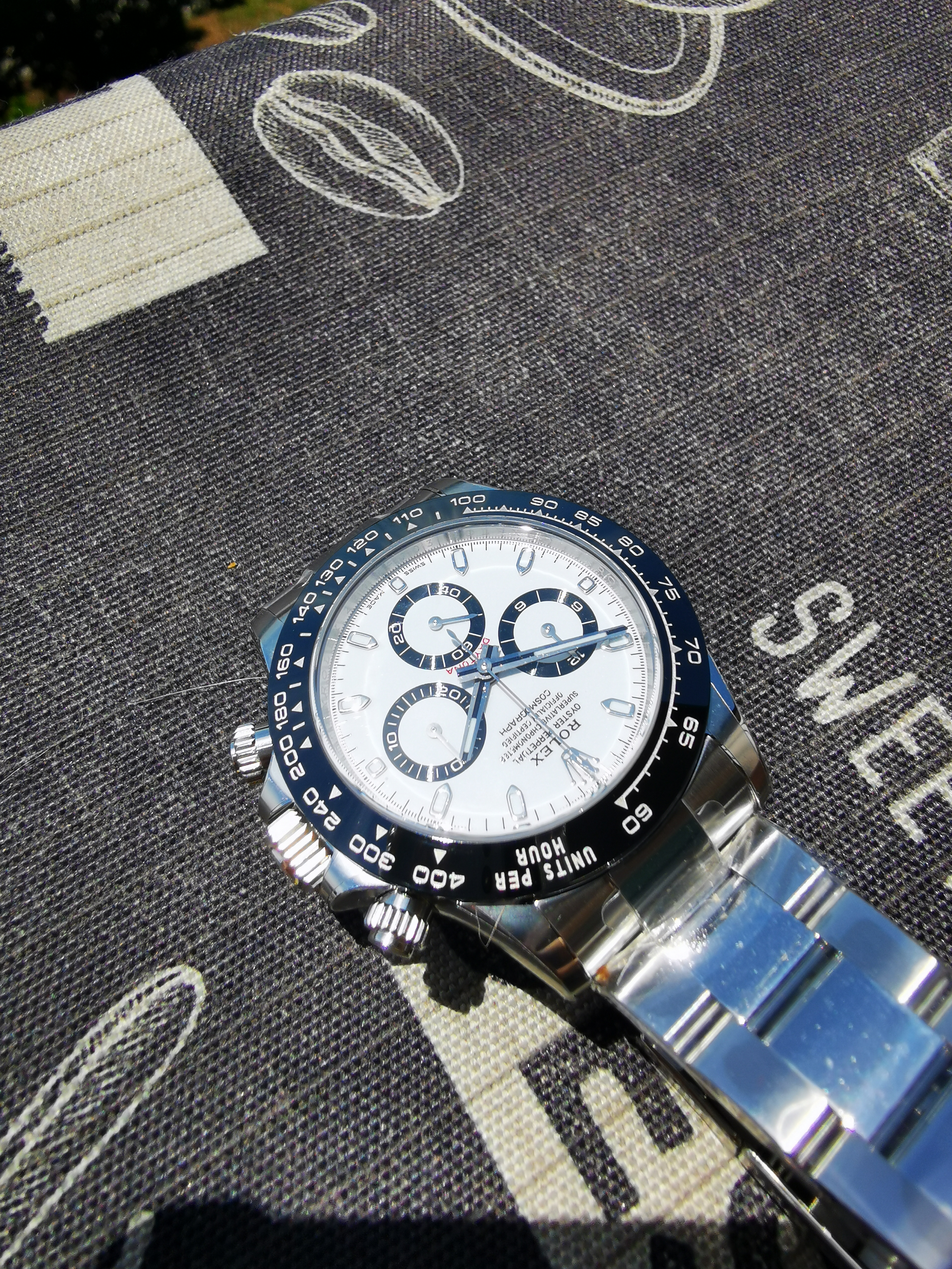
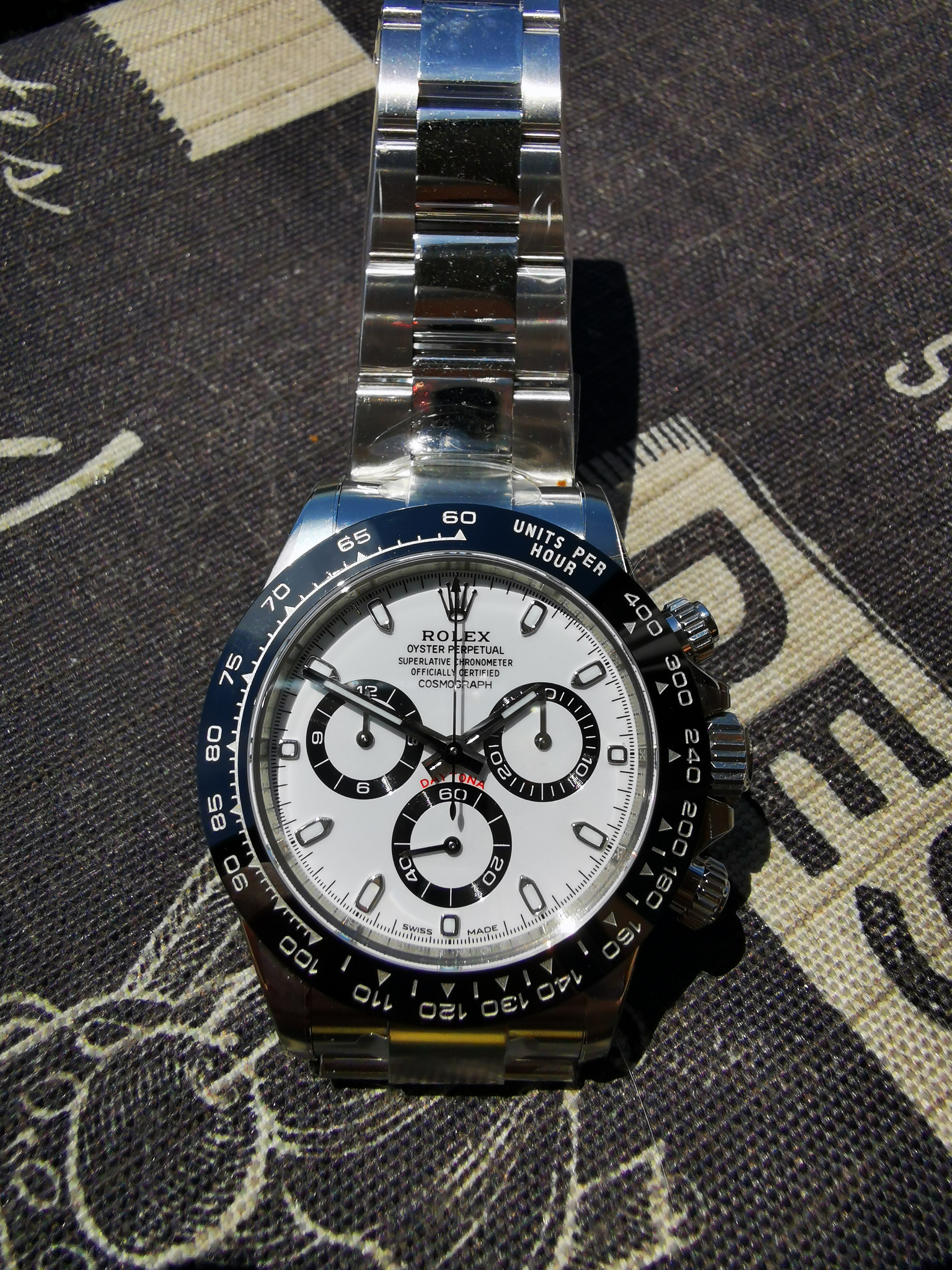
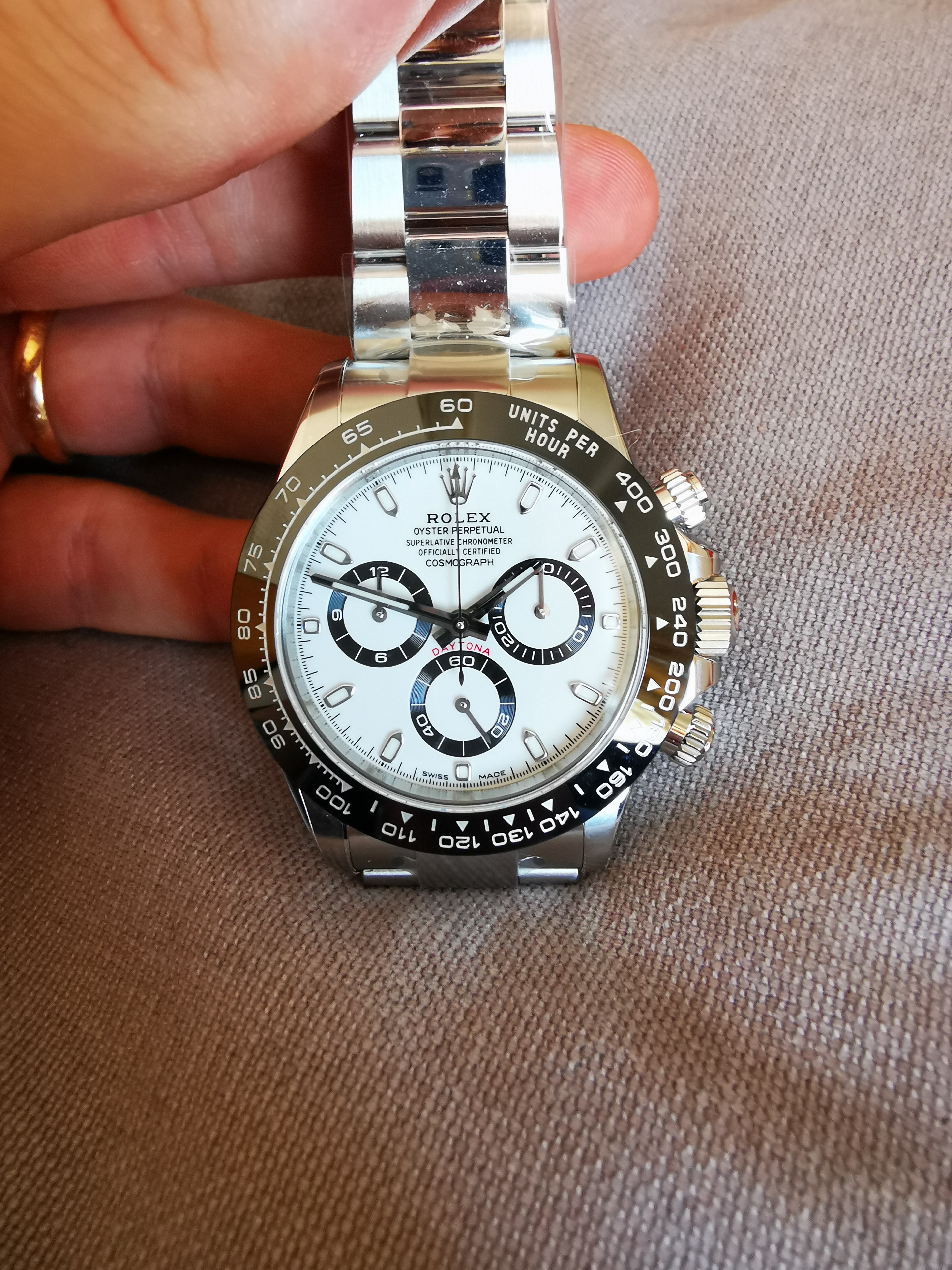
What a charming couple. I wouldn't know which to choose. Good job we have 2 wrists LOL! Some gens look more creamy and others more icey blue also.
Tijdwijzer
Renowned Member
ill stick with the V1 dial, with a good aftermarket crystal will remove the blue tint from the clean crystal. not sure which aftermarket crystal ill use.
Also are ther more people having problems with screwing in the crown? thread is a bit short on the CF.
Also are ther more people having problems with screwing in the crown? thread is a bit short on the CF.
Bobi01
Respected Member
- 2/2/19
- 3,941
- 3,492
- 113
ill stick with the V1 dial, with a good aftermarket crystal will remove the blue tint from the clean crystal. not sure which aftermarket crystal ill use.
Also are ther more people having problems with screwing in the crown? thread is a bit short on the CF.
I still think that blue hue isnt from crystal, the crystal is just little less clear than gen
Btw i will install v2 dial on my v1 watch ( i think i will not swap the crystal) and will compare it with v1 dial without crystal and let you all know what is the truth
Tijdwijzer
Renowned Member
Bobi01
Respected Member
- 2/2/19
- 3,941
- 3,492
- 113
Bobi01 Also when you have the V1 dial out the watch, photograph the dial to see if ther is some blue tint in it.. Same like you did with the V1 V2 comparison you just uploaded.
Yes that i will do
but dont know the timeline because watchmaker is overbooked, rep world - waiting for a years haha
JohnnyDangerous
Known Member
- 29/3/19
- 179
- 279
- 63
I still think that blue hue isnt from crystal, the crystal is just little less clear than gen
Btw i will install v2 dial on my v1 watch ( i think i will not swap the crystal) and will compare it with v1 dial without crystal and let you all know what is the truth
I received the clean dial and it has a very (very) slight blue tint, only noticeable at some angles in some light situations... It is NOT the crystal, as it's able to be seen out of the watch
Bobi01
Respected Member
- 2/2/19
- 3,941
- 3,492
- 113
I received the clean dial and it has a very (very) slight blue tint, only noticeable at some angles in some light situations... It is NOT the crystal, as it's able to be seen out of the watch
Exactly
Björn_Ironside
I'm Pretty Popular
I understand that workers mount non-stop, without a tomorrow, without looking. but I would say that certainly someone in the clean factory will have deepened by going to look at the detail of the dial or the crystal.
we are still here discussing the hypothetical cause of the crystal ... nonsense. is the hue of the dial v1. that's why they toned in v2.
we are still here discussing the hypothetical cause of the crystal ... nonsense. is the hue of the dial v1. that's why they toned in v2.
Bobi01
Respected Member
- 2/2/19
- 3,941
- 3,492
- 113
I understand that workers mount non-stop, without a tomorrow, without looking. but I would say that certainly someone in the clean factory will have deepened by going to look at the detail of the dial or the crystal.
we are still here discussing the hypothetical cause of the crystal ... nonsense. is the hue of the dial v1. that's why they toned in v2.
Logical
I still think that blue hue isnt from crystal, the crystal is just little less clear than gen
Btw i will install v2 dial on my v1 watch ( i think i will not swap the crystal) and will compare it with v1 dial without crystal and let you all know what is the truth
+1
Time_and_again
Getting To Know The Place
- 29/4/22
- 41
- 25
- 18
I can promise you that the printing on the CF is not identical to the gen
I just finished putting together a white dial 116500 for my wife, and we ended up using the ARF dial over the CF, mainly because of the white/blue color, and the to thin text print.
There is variations in both rep and gen. But posting several pics, from the internet, with different levels of white balance is just nonsense.
the CF dial is a pretty good dial. Is it identical to a gen, No, is it to blue in the hue, Yes. End of story
interesting you mention the text print on the CF is too thin.
I found the CF v2 print too thick compared with v1. Is the v2 text thickness then more accurate to gen?
Björn_Ironside
I'm Pretty Popular
interesting you mention the text print on the CF is too thin.
I found the CF v2 print too thick compared with v1. Is the v2 text thickness then more accurate to gen?
the white / blue dial, as defined, relates to the v1. v2 is a warmer color. same thing for too thin writings (problem also related to btf as far as I'm concerned)
Time_and_again
Getting To Know The Place
- 29/4/22
- 41
- 25
- 18
the white / blue dial, as defined, relates to the v1. v2 is a warmer color. same thing for too thin writings (problem also related to btf as far as I'm concerned)
Just to clarify you’re saying that v1 has too thin writing compared with v2 right?
my question is- quoting 2841- if the v1 is also too thin compared with gen?
From my comparisons I’ve seen from pics it seems the nice v1 12 o clock text writing is actually NOT similar to gen, and the thicker less preferable one is more gen like. Would you agree?
Last edited:
Björn_Ironside
I'm Pretty Popular
Björn_Ironside
I'm Pretty Popular
if you want to evaluate, personally and with your personal preferences, the differences between v1 and v2 can be found in the many comparisons posted by other friends here
Björn_Ironside
I'm Pretty Popular
Björn_Ironside
I'm Pretty Popular
Björn_Ironside
I'm Pretty Popular
I love it!
I .. more!
now 12 hours of bathing in baby oil, and it's ready for summer! :bull:


