- 8/2/11
- 3,502
- 718
- 113
I've seen the actual watch. You can go ahead and buy it if you like it. I'm just stating facts.For these two things do you judge a bad quadrant, without having seen any actual QC?? ....Bah....
I've seen the actual watch. You can go ahead and buy it if you like it. I'm just stating facts.For these two things do you judge a bad quadrant, without having seen any actual QC?? ....Bah....
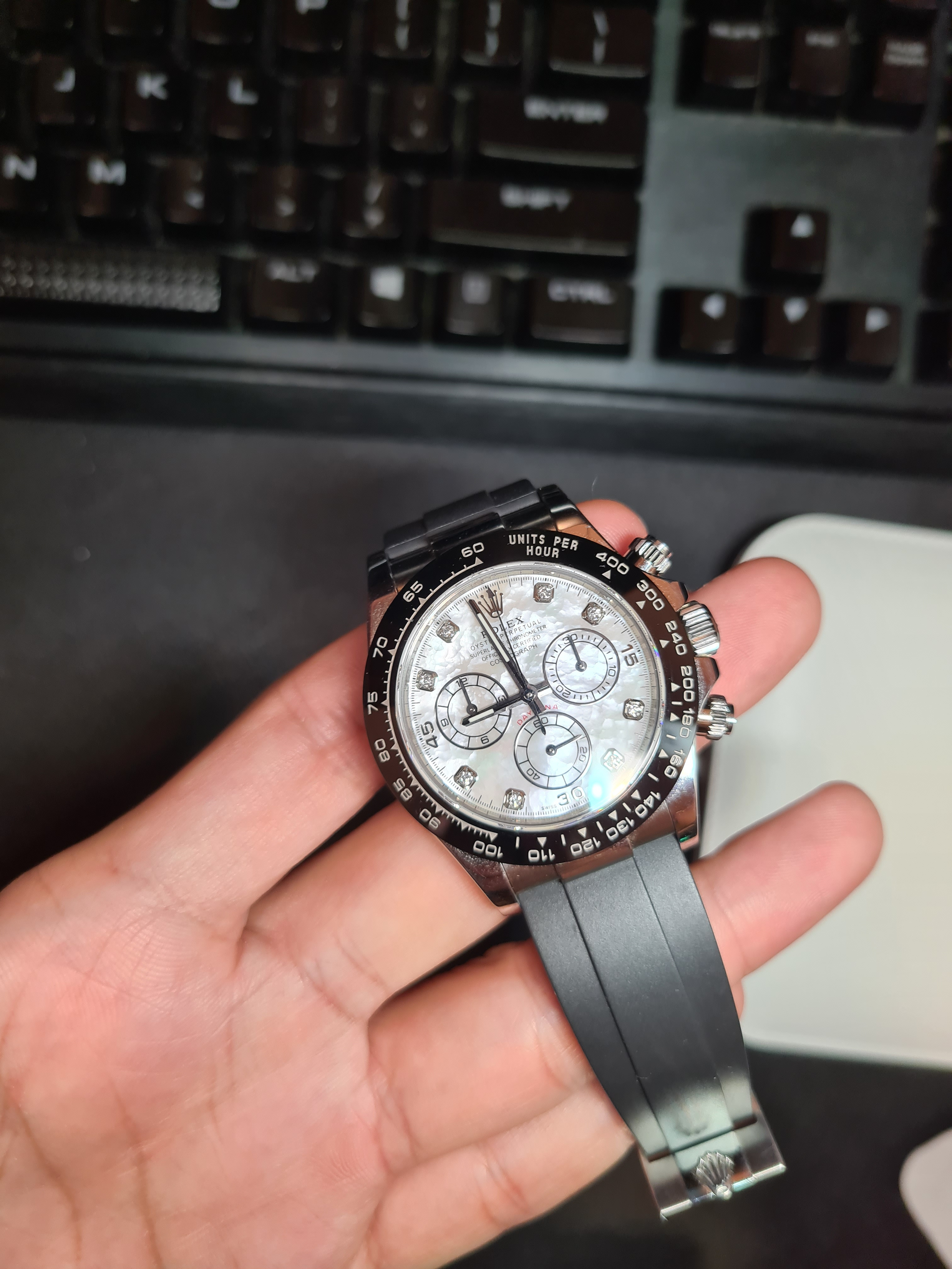
https://jtime.io/us/daytona-116519-...y-dial-on-oysterflex-rubber-strap-sa4130.html (there are also other detail pics, with closeups of the subdials)
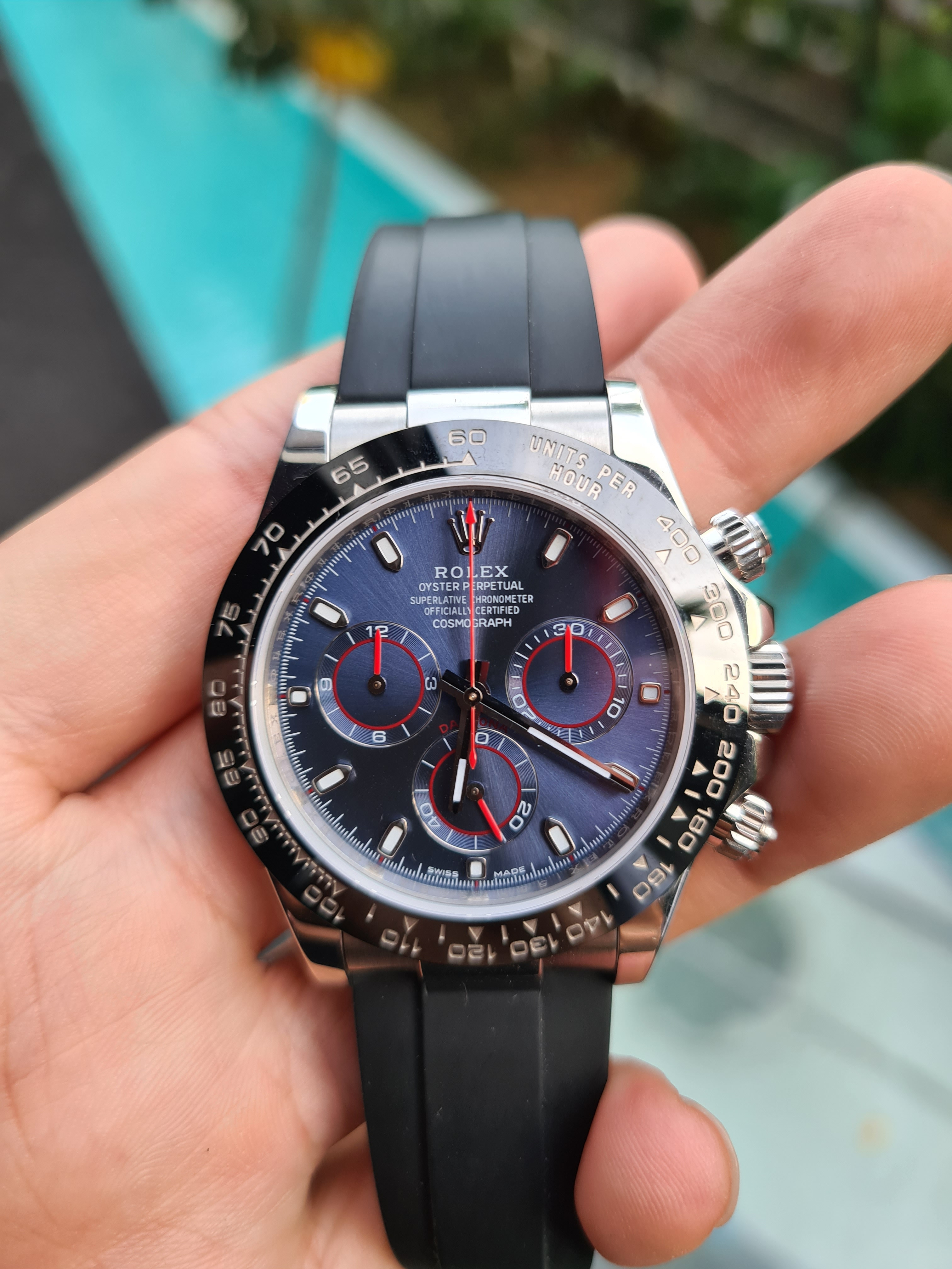
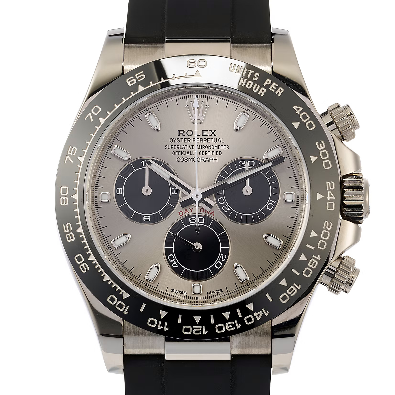
... this is the actual BTF version
And it's not bad, but at first glance I could spot a few issues with the numbers of the subdials:
- subdial six position: numbers (20, 40, 60) seem a bit too big and are more placed to the outer ring of the subdial, while it should be placed more to the inner ring.
- subdial three position: again numbers seem a little bit too big(?!) and too close to the outer ring
- subdial nine position: again numbers too big, 3, 6, 9 (and 12 I guess too) almost touch the outer ring of the subdial, on gen there's definitely some space there.
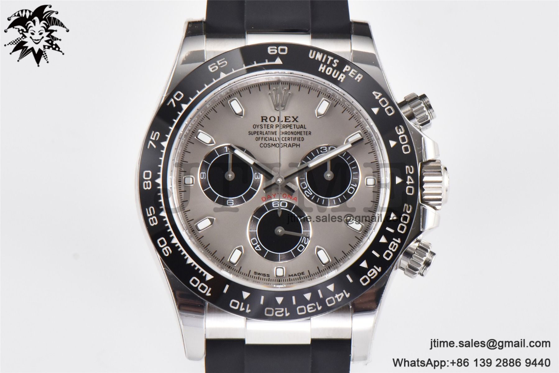
Here the gen (from chronext.com) for comparison:
I’ve always been interested in getting a 116519, but I have a pretty small wrist. If the rubber strap doesn’t fit am I basically SOL? I assume it can’t be cut smaller like can be done on a Patek 5167?
")
The “Daytona” text looks reddish-brown on the gen. A bit too bright red on the replica in my opinion.
Sent from my iPhone using Tapatalk
I just GL'ed mine from JTime. I will admit the subdial texts do kind of bug me. Had the same slightly off bezel alignment all the BTF's do. Rehaut alignment was pretty good. Hard to get a real sense of the color the overall dial as it looks differently in everyones picture based on lighting/camera angles. But I still think i'll enjoy it. I remember being really bugged by the "floating m" on my Sub based on forum threads and then in person I could barely tell when looking for the flaw so i'm hoping this will have a similar story with the subdials. I'll realign the Bezel myself when it arrives.
The dials look garbage.
Wait for the clean version of these
you mean the sheen of the dials?
of the fat numbers on the sundial that are too high?
I mean that the 116519 doesn't look at all like the real thing, the indices are wrong, they look too white, the sunburst is wrong, the sheen of the outer ring of the subdials shouldn't be that pronounced and the subdials themselves are a tad too small. The color of DAYTONA looks orange rather than dark red.
And don't get me started on the rose gold version of this.
The price increase on these is bullshit considering that the dials are still garbage or even worse than the ones Noob used to do
Ok was totally going to go for the 116515LN sundust dial but you put me off haha.
the pics So far show the indices are not floating, sheen looks acceptable (hard to copy I assume).
agree on the Color of Daytona.
Really agree on the price increase.
looks good to me
i'd wait for clean's release
Hey mate, you can't cut them, so the only option is to get another strap.
My wrist is only 15.5cm, so I'll always order an extra 50-50 strap when I purchase an oflex Daytona
These oyster flex straps look way better. The Noob ones are awful, I have a fairly modded RG with chocolate dial, but rarely wear it because of the strap.
Without going gen is there a good option out there? There is too much space where the SEL connection would be, and the rubber is too shiny. These do look better - what are options out there right now for OF straps that are good?