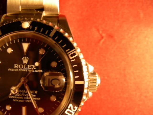
• Tired of adverts on RWI? - Subscribe by clicking HERE and PMing Trailboss for instructions and they will magically go away!

[16610] Comparison of two different reps of the same watch

JohnnySac

Active Member
10/9/06
367
1
0
saskwatch said:
My thoughts on the two 16610 reps:

Watch A is nice. Cant see much to critisize. :wink:

Watch B on the other hand OMFG !!! :shock: :shock: :shock:
What a piece of xxxx !

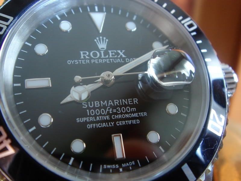
1. Writing on the dial is wrong, Font size & letters.
2. swiss made misplaced
3. pearl is horrible
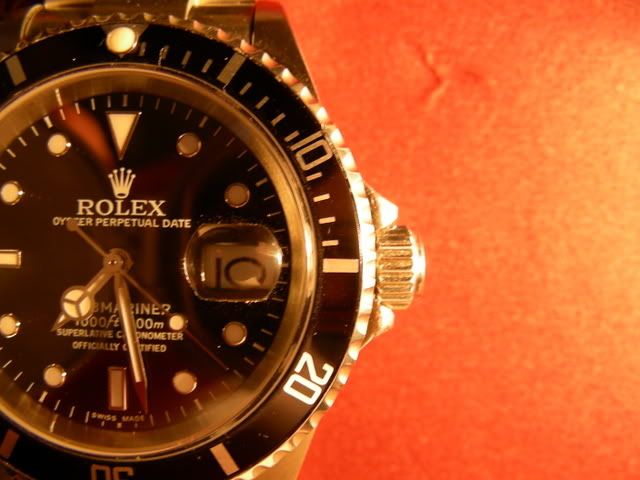
4. the coronet on the bracelet..... the WORST I have ever seen. :shock:
5. the datemag and placing are BAD

Sorry chap! :cry:

You asked for an opinion..... just my 0.2 cents.

I don't know if I'd call an MBW a piece of XXXX but I now wonder just EXACTLY

what kind of "QC visual inspection" if any was utilized concerning the OP's 350.00 MBW?
I understand too far left or right but damn! Touching the bottom? Completely unaccpetable!!!
 

The Chap In The Boot

Known Member
9/5/07
124
0
0
ok, it's time to say which is which.

Before my comments about these watches

I) WATCH A is smaller in diameter and lighter than WATCH B. I dunno which is more similar to the gen;
II) Rehaut profondity seems equal in both watches, what differs is slope. I guees WATCH B has better rehaut.
III) Imho WATCH B bezel is better;
IV) WATCH B clasp is really awful. It's easily fixable with a new one, and I know you've to mod that watch, but what a pity a so bad clasp on a so expensive rep. WATCH A bracelet and clasp seem good to me.
V) WATCH B has an awfuld date characters' alignment. Some numbers are correct, some others not at all. So I guess it's not a badly placed datewheel problem. Could be the mechanism ? I dunno. How to fix that ???
I am seriously asking. I'll be glad of your advise.

WATCH A was purchased last month by Homer. 220 USD. ETA. He had a King QC sticker on it, so I guess it's an old Kingwatch (but I'm not sure. Shots from the new kingwatch sub show a different watch imho. Could it be the last version even better ? I dunno). I asked yesterday night more infos to Homer but he hasn't yet replayed.

WATCH B is the just arrived (the day of my post) BMW TTK.

That's all folks.

--
When I'll have more infos about watch A I'll attach this latter conclusion to the first post.
 

vmena

Active Member
9/4/06
481
0
0
Other pics of TTK's MBW

I don't see this dial is so wrong from genuine and so far in quality from others like noob or vip mariners... maybe it's me:

DSC01049.jpg
 

cybee

Legendary Member
23/11/06
11,134
30
48
Re: Other pics of TTK's MBW

vmena said:
I don't see this dial is so wrong from genuine and so far in quality from others like noob or vip mariners... maybe it's me:

Except for the datewheel I think dial on watch B looks good. Now after looking at the gen pic I think the datewheel even looks OK. :?
 

cskent69

Getting To Know The Place
29/6/06
51
0
0
@vmena

Not having my MBW 16610 in hand yet - i can only make judgements from the pictures. The only big tell that i can see readily is the "Swiss Made". On the genuine's the minute markers come up about half way on both sides of the "Swiss Made" word.

On the MBW - the "Swiss Made" has the minute markers come all the way up to the top of the word. That kind of spacing was correct on the old "Swiss - T < 25" dials.

The other smaller one is the spacing between "SUPERLATIVE CHRONOMETER" and "OFFICIALLY CERTIFIED" which looks a little too big.

But no normal person is going to see these things.
 

The Chap In The Boot

Known Member
9/5/07
124
0
0
Re: Other pics of TTK's MBW

cybee said:
Except for the datewheel I think dial on watch B looks good. Now after looking at the gen pic I think the datewheel even looks OK. :?

Me too I think dial is good. It's the date font alignment the issue. The gen is well centered.
Watch B not at all. And I dunno if it's the datewheel, because with certain numbers this doesn't happen. Could it be the movement ?

This was yesterday:

DSCN0432.jpg


THIS IS TODAY 10. Please NOTICE that it's not the way you make the shots. This is a thing strinking at fist sight. I was careful to be aligned, and notice also that in some of these shots I'm even slightly higher, so that the flaw is less noticeable, while in others slightly lower, and it's more noticeable. Indeed in either cases it is very clear.

I'd like to fix that. How ?


DSCN0444.jpg


DSCN0438.jpg
 

ken1

Active Member
18/3/07
302
0
0
taking the caseback off, removing the movement, removing the dials+hands, then take off datewheel and glue it back on centered. that's all i can think of.
 

The Chap In The Boot

Known Member
9/5/07
124
0
0
ken1 said:
taking the caseback off, removing the movement, removing the dials+hands, then take off datewheel and glue it back on centered. that's all i can think of.

My worry is about the fact that non all the numbers have that problem. Some in high twenties are perfectly aligned. What I'm afraid about it could be the mechanism. Do you picture that sudden snap when date changes ? Why otherwise some numbers are Ok and others no ?
 

cybee

Legendary Member
23/11/06
11,134
30
48
The Chap In The Boot said:
ken1 said:
taking the caseback off, removing the movement, removing the dials+hands, then take off datewheel and glue it back on centered. that's all i can think of.

My worry is about the fact that non all the numbers have that problem. Some in high twenties are perfectly aligned. What I'm afraid about it could be the mechanism. Do you picture that sudden snap when date changes ? Why otherwise some numbers are Ok and others no ?

Maybe just a flaw in the datewheel itself, numbers not printed and centered properly from the factory. That happens sometimes.
 

The Chap In The Boot

Known Member
9/5/07
124
0
0
cybee said:
in that case you can just get a new datewheel

Maybe just a flaw in the datewheel itself, numbers not printed and centered properly from the factory. That happens sometimes.

I hope cybee. That would be more easy to fix and with a good rehaut and bezel like that it could become a great watch. Thank you.
 

vmena

Active Member
9/4/06
481
0
0
But no normal person is going to see these things.

Exactly. I have made many experiments and even a wise from a wrist view is not able to tell the differences.

But the datewheel is sh***t. I will post later pics of the MBW datewheel after I removed it. I will install the datewheel from the TTK's noobmariner or another aftermarket I have. In MBW's DW font is too bold and in many numbers with two digits one has a different bolding than the other. I'll post pics later on after recharging my camera.
 

vmena

Active Member
9/4/06
481
0
0
That would be more easy to fix and with a good rehaut and bezel like that it could become a great watch.

If the DW I'm trying (not the noob's) works fine, I may have one additional to sell to any one that need it.
 

The Chap In The Boot

Known Member
9/5/07
124
0
0
vmenano n said:
But the datewheel is sh***t. I will post later pics of the MBW datewheel after I removed it. I will install the datewheel from the TTK's noobmariner or another aftermarket I have. In MBW's DW font is too bold and in many numbers with two digits one has a different bolding than the other. I'll post pics later on after recharging my camera.


Thanks. I would appreciate that very much
 

The Chap In The Boot

Known Member
9/5/07
124
0
0
vmena said:
If the DW I'm trying (not the noob's) works fine, I may have one additional to sell to any one that need it.

I cannot imagine who could be interested :lol:

Tell me in the case.
My only problem I've not yet even the case opener.
I was thinking to give the TTK to a modder.
 

saskwatch

Known Member
13/4/07
168
0
0
pugwash said:
saskwatch said:
2. swiss made misplaced
:shock:

Are you sure about that?

pretty sure, if its a MODERN 16610 Submariner each word of "swiss" and "made" should be over 2 minute markers.
but decide yourself....

vmena said:
I don't see this dial is so wrong from genuine and so far in quality from others like noob or vip mariners... maybe it's me:

DSC01049.jpg


vmena said:
[/quote]


The Chap In The Boot said:
cybee said:
Except for the datewheel I think dial on watch B looks good. Now after looking at the gen pic I think the datewheel even looks OK. :?

Me too I think dial is good. It's the date font alignment the issue. The gen is well centered.
Watch B not at all. And I dunno if it's the datewheel, because with certain numbers this doesn't happen. Could it be the movement ?

This was yesterday:

DSCN0432.jpg

DSCN0444.jpg


DSCN0438.jpg

I dont know about the font alignement exactlc but dont you agree that for 350$ its more a project watch.... change pearl, change datewheel, change bracelet..... dont know about QC
sorry if I offended anyone, meant to say piece of....... cake ....of course :D

This might be a genuine, dunno buts from reliable source :wink:
See how each word "swiss" and "made" go over 2 minute markers?
And the 6 and 9 markers are bigger/bolder In fact all hour markers look bigger. The hands on the watch b look smaller than on gen.
and the second block of writing is closer to the 6 marker and not so far up.
And the word "date" under the "rolex" beginns after the x and not beneath it. Also on vmenas mbw- gen shots you can see that difference...
And the spacing between "oyster" "perpetual" and "date" looks bigger on the gen. On mbw rather close together.

I could be wrong though, I aint the expert here...


I wish I knew how to post pics like you guys....properly in the right size....but so you can open in a seperate window and compare side by side...
 

The Chap In The Boot

Known Member
9/5/07
124
0
0
saskwatch said:
pretty sure, if its a MODERN 16610 Submariner each word of "swiss" and "made" should be over 2 minute markers.
but decide yourself....

I dont know about the font alignement exactlc but dont you agree that for 350$ its more a project watch.... change pearl, change datewheel, change bracelet..... dont know about QC
sorry if I offended anyone, meant to say piece of....... cake ....of course :D

This might be a genuine, dunno buts from reliable source :wink:
See how each word "swiss" and "made" go over 2 minute markers?
And the 6 and 9 markers are bigger/bolder In fact all hour markers look bigger. The hands on the watch b look smaller than on gen.
and the second block of writing is closer to the 6 marker and not so far up.
And the word "date" under the "rolex" beginns after the x and not beneath it. Also on vmenas mbw- gen shots you can see that difference...
And the spacing between "oyster" "perpetual" and "date" looks bigger on the gen. On mbw rather close together.

I could be wrong though, I aint the expert here...


saskwatch, from the shots it seems to me you're right. I appreciated your observations.
 

futureace

Getting To Know The Place
22/4/07
19
0
0
Sask,

Your comments are in regard to the LV submariner picture your posted just above. I think you are forgetting that the LV has the "Maxi-Dial", which by design has larger hour markers and hands. Because of this, the text will appear different as well.

Though casually they look the same, it's often difficult to remember that the LV and the regular 16610 have different dials.

I catch myself forgetting this difference all the time. :)