-
Tired of adverts on RWI? - Subscribe by clicking HERE and PMing Trailboss for instructions and they will magically go away!
You are using an out of date browser. It may not display this or other websites correctly.
You should upgrade or use an alternative browser.
You should upgrade or use an alternative browser.
ZF PAM127
- Thread starter takoxavy
- Start date
tom_cat
I'm Pretty Popular
- 4/7/13
- 1,071
- 34
- 48
I dont want a 127. I need a 127!
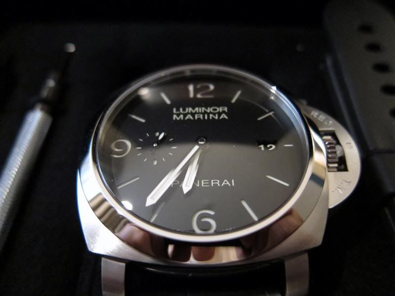
I just ordered a 312 for now...
which version did you order (ZF or V6F)? i really wanted one of those 312 as well but those too creamy letters on V6 version really put me off
which version did you order (ZF or V6F)? i really wanted one of those 312 as well but those too creamy letters on V6 version really put me off
V6F v2 Miyota. The creamy letters are not that bad. Gens have variation in color as well...
tom_cat
I'm Pretty Popular
- 4/7/13
- 1,071
- 34
- 48
V6f is nicer imo preferred option, don't forget to post some pics when u get them ") enjoy and wear it good health mate
enjoy and wear it good health mate
Sent from my iPhone using Tapatalk
enjoy and wear it good health mateV6F v2 Miyota. The creamy letters are not that bad. Gens have variation in color as well...
Sent from my iPhone using Tapatalk
V6f is nicer imo preferred option, don't forget to post some pics when u get them
Sent from my iPhone using Tapatalk
Will do! Still waiting for QC, first time Ryan makes me wait hahah
tom_cat
I'm Pretty Popular
- 4/7/13
- 1,071
- 34
- 48
The gen-like appearance of KW-V6Fac version can hide all colours differences (if they exist)
Really impressive. Maybe one of the best
ALE
mmmmmmm i have to get me one of them V6F 312 then
Paneristina
Known Member
- 30/4/15
- 170
- 0
- 0
mmmmmmm i have to get me one of them V6F 312 then
x2! I would be first in line for a 127, but I think it's just too big for my wrist (and plenty of guys' writsts!). Going to pull the trigger on the 312 to round out the Luminor base, 1950, and Radiomir. Now to choose a 1940....
- 18/1/11
- 19,846
- 423
- 83
mmmmmmm i have to get me one of them V6F 312 then
You will not get disappointed !!
ALE
- 18/1/11
- 19,846
- 423
- 83
x2! I would be first in line for a 127, but I think it's just too big for my wrist (and plenty of guys' writsts!). Going to pull the trigger on the 312 to round out the Luminor base, 1950, and Radiomir. Now to choose a 1940....
But bear in mind that 1950 44mm wears quite more than a Luminor Bettarini 44mm !!
Maybe due to the shaope and the thickness
You should consider a PAM 390, really nice for women liking big watches
ALE
The gen-like appearance of KW-V6Fac version can hide all colours differences (if they exist)
Really impressive. Maybe one of the best
ALE
ALE I appreciate your opinions but I must disagree strongly with you in this matter. Nothing can hide that colour difference. It is a instant tell to me from a distance. It's very noticeable and disturbing. I have handled three different gens and they were all similar together and very different from KW rep. Colour in letters and indexes is same in gen under artifical indirect light (at least), when lume is not charged and that is not to case with KW rep. Other than that it's a great watch and very gen like. However I had problems with CG screws (bad threads in case) but that was just a one watch. Also CG screws are smaller than gen. witch should be mentioned.
And to make it clear, I will buy another one in a flash as soon as they got the colour right.
This one was mine. Sold it because I could not live with those letters...

a gen:
- 18/1/11
- 19,846
- 423
- 83
ALE I appreciate your opinions but I must disagree strongly with you in this matter. Nothing can hide that colour difference. It is a instant tell to me from a distance. It's very noticeable and disturbing. I have handled three different gens and they were all similar together and very different from KW rep. Colour in letters and indexes is same in gen under artifical indirect light (at least), when lume is not charged and that is not to case with KW rep. Other than that it's a great watch and very gen like. However I had problems with CG screws (bad threads in case) but that was just a one watch. Also CG screws are smaller than gen. witch should be mentioned.
And to make it clear, I will buy another one in a flash as soon as they got the colour right.
This one was mine. Sold it because I could not live with those letters...
Of course, I respect your opinion about that
As always : It is a taste matter
ALE
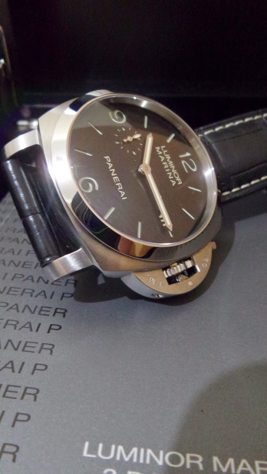
PaMister, I have had my V6 312O next to a 312Q series and they looked the same on the wrist. If there is a difference in the dial print and lume color between the v6 and gen, it wasn't noticeable in the real world. You may have handled 312's in the past, but OP made changes to the 312 since it's introduction. The 312N and earlier versions had white print, which matched the lume indices and a polished caseback. The O-series saw a change from white lettering to "acrue" (spelling?), which is a cream color, and OP introduced a brushed caseback on the 312. The lettering color is NOT the same as the lume color on the dial of the 312 O and later series.
Here's a few gen pictures:
312M-series (front and back)

Here's the gen 312 Q-series (from the official site):


And here's the V6F 312O

Here's a few gen pictures:
312M-series (front and back)
Here's the gen 312 Q-series (from the official site):
And here's the V6F 312O
- 18/1/11
- 19,846
- 423
- 83
I have said that many times but I don't know why some people are saying always that KW PAM 312 are really inaccurate
From O-series O.PANERAI includeD a new colour in inscriptions changing to a ecru or brownish
I should say that maybe there are some reps with a more dark colour, since rep specifications are not so strict as gen are.
I have made the same comparison as set2374 and the differences were no noticeable
Bear in mind that Mehmet (kuvarslt owner) bought a PAM 312 O-series gen to make the rep. He was always proud with the colour got in his rep inscriptions.
That gen was used sometimes for some dealers to show comparison pics
ALE
PaMister, I have had my V6 312O next to a 312Q series and they looked the same on the wrist. If there is a difference in the dial print and lume color between the v6 and gen, it wasn't noticeable in the real world. You may have handled 312's in the past, but OP made changes to the 312 since it's introduction. The 312N and earlier versions had white print, which matched the lume indices and a polished caseback. The O-series saw a change from white lettering to "acrue" (spelling?), which is a cream color, and OP introduced a brushed caseback on the 312. The lettering color is NOT the same as the lume color on the dial of the 312 O and later series.
Here's a few gen pictures:
312M-series (front and back)
Here's the gen 312 Q-series (from the official site):
And here's the V6F 312O
Dear Set2374
Those Official web site "pics" your're referring are just a renderings, not real. Their purpose is to show people that the watch also has a lume...or they at least are showing the watch with glowing lume.
Here is the very same model in a real life pic.

Everyone can compare it to my pic or that intime's pic your're showing above.
I'm just trying to save people from dissapointment, and now I'm done with it.
- 18/10/11
- 7,771
- 432
- 83
x2! I would be first in line for a 127, but I think it's just too big for my wrist (and plenty of guys' writsts!). Going to pull the trigger on the 312 to round out the Luminor base, 1950, and Radiomir. Now to choose a 1940....
But bear in mind that 1950 44mm wears quite more than a Luminor Bettarini 44mm !!
Maybe due to the shaope and the thickness
You should consider a PAM 390, really nice for women liking big watches
ALE
+1 ALE
Here is 390 on my gf's wrist

Is this the new PAM127? Just got posted I think
http://watch-station.co/pam127-e-sf-black-dial-on-brown-leather-strap-a6497.html
http://watch-station.co/pam127-e-sf-black-dial-on-brown-leather-strap-a6497.html
gqsince1985
Active Member
- 27/7/10
- 487
- 2
- 18