- 4/1/20
- 26
- 29
- 13
Here is my promised ZF vs APS 15400 comparison. This is my first review and posting pictures so forgive me if my information is scattered.
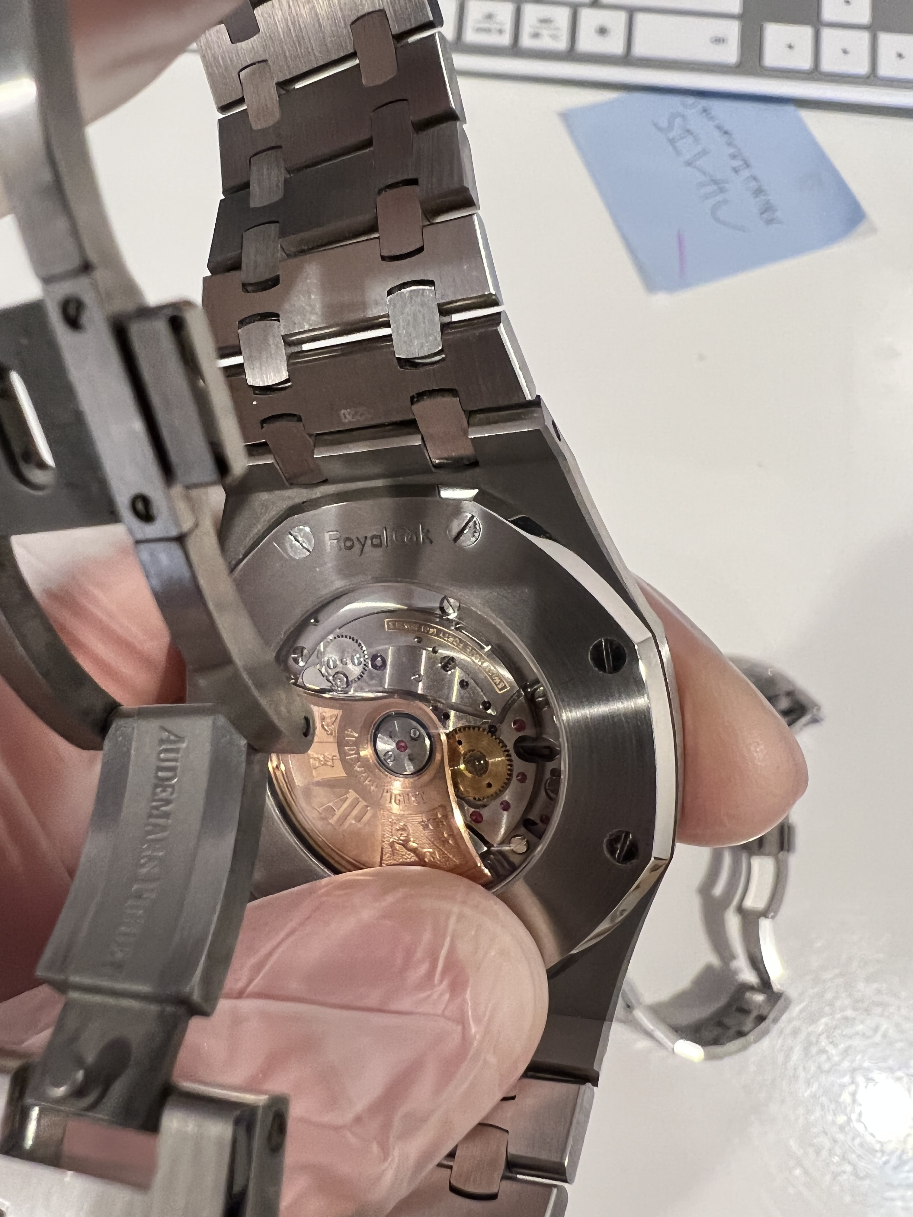
My photos are pretty bad but I will describe any differences I see among the dial, hands, logos, bracelet and finish.
Full disclosure: I do not own a gen 15400, so any questions regarding how close it looks to the gen, the answer will always be "I don't know" because from my reading of posts here there have been many variations of the 15400 throughout the years in terms of how matte/bright the dial is, the sunburst, etc.
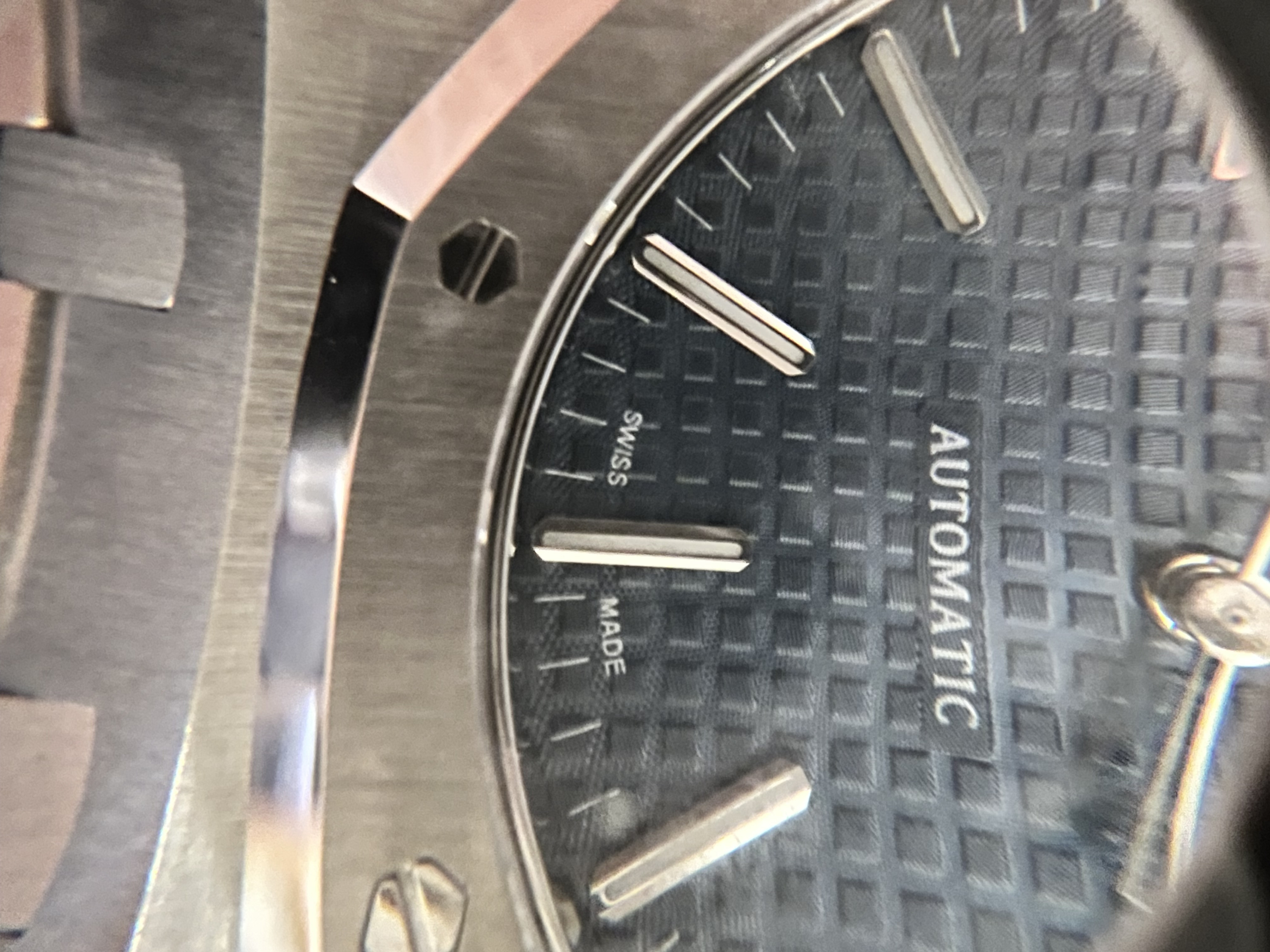
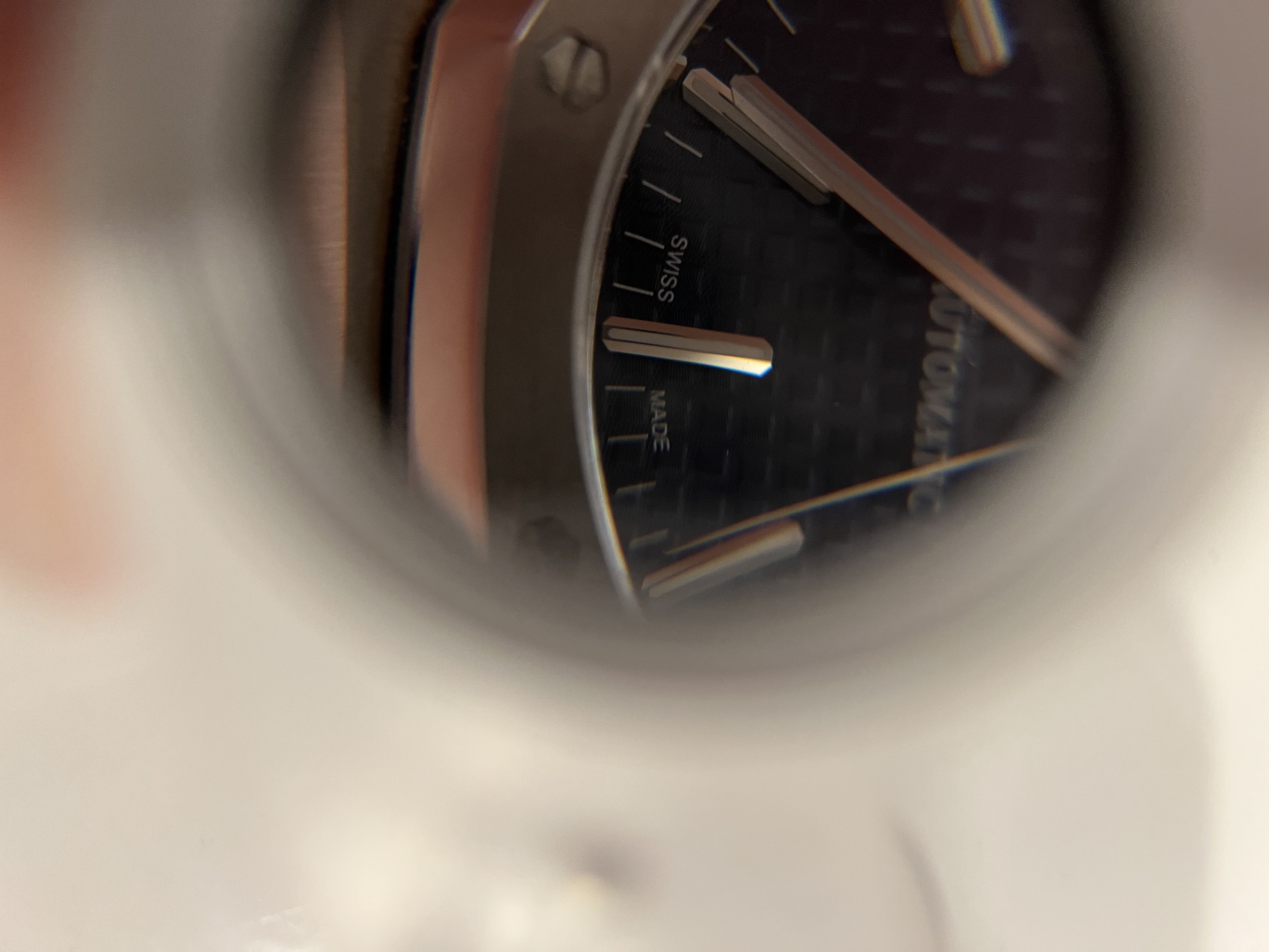
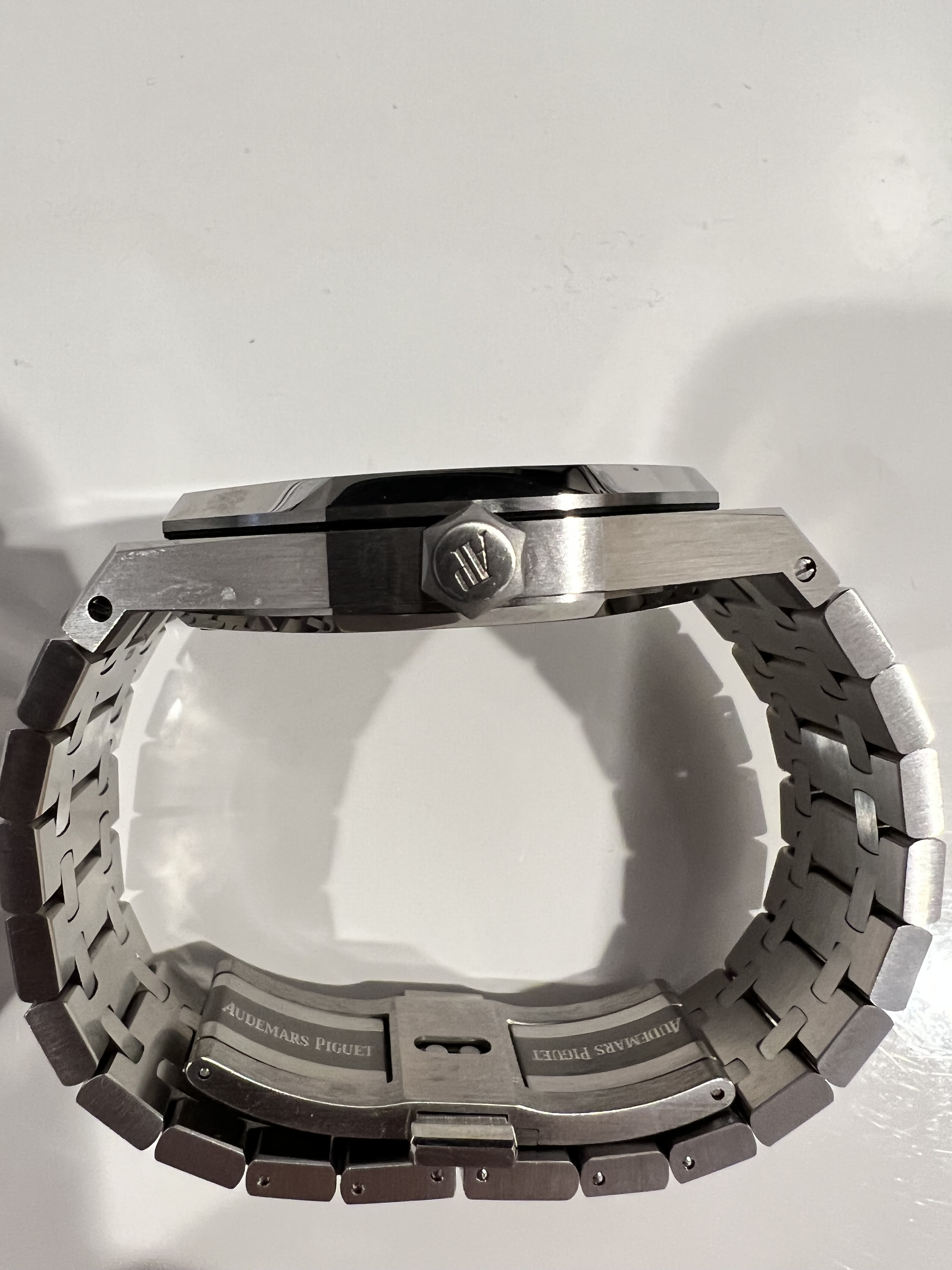
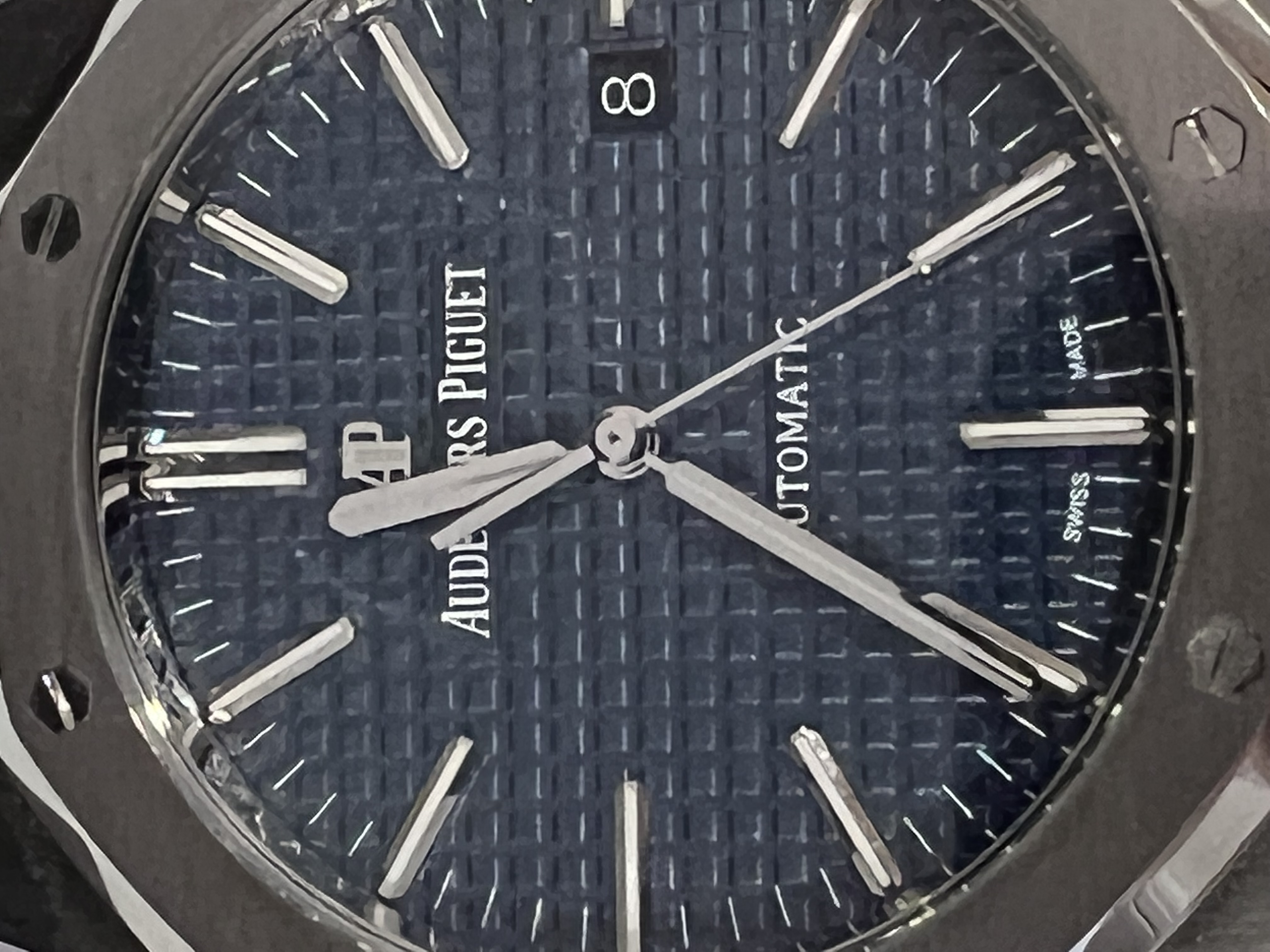
Photos from the top:
Swiss Made Logo - ZF looks a little cleaner in terms of printing. This was with a loop. It was really hard to tell from the naked eye the difference.
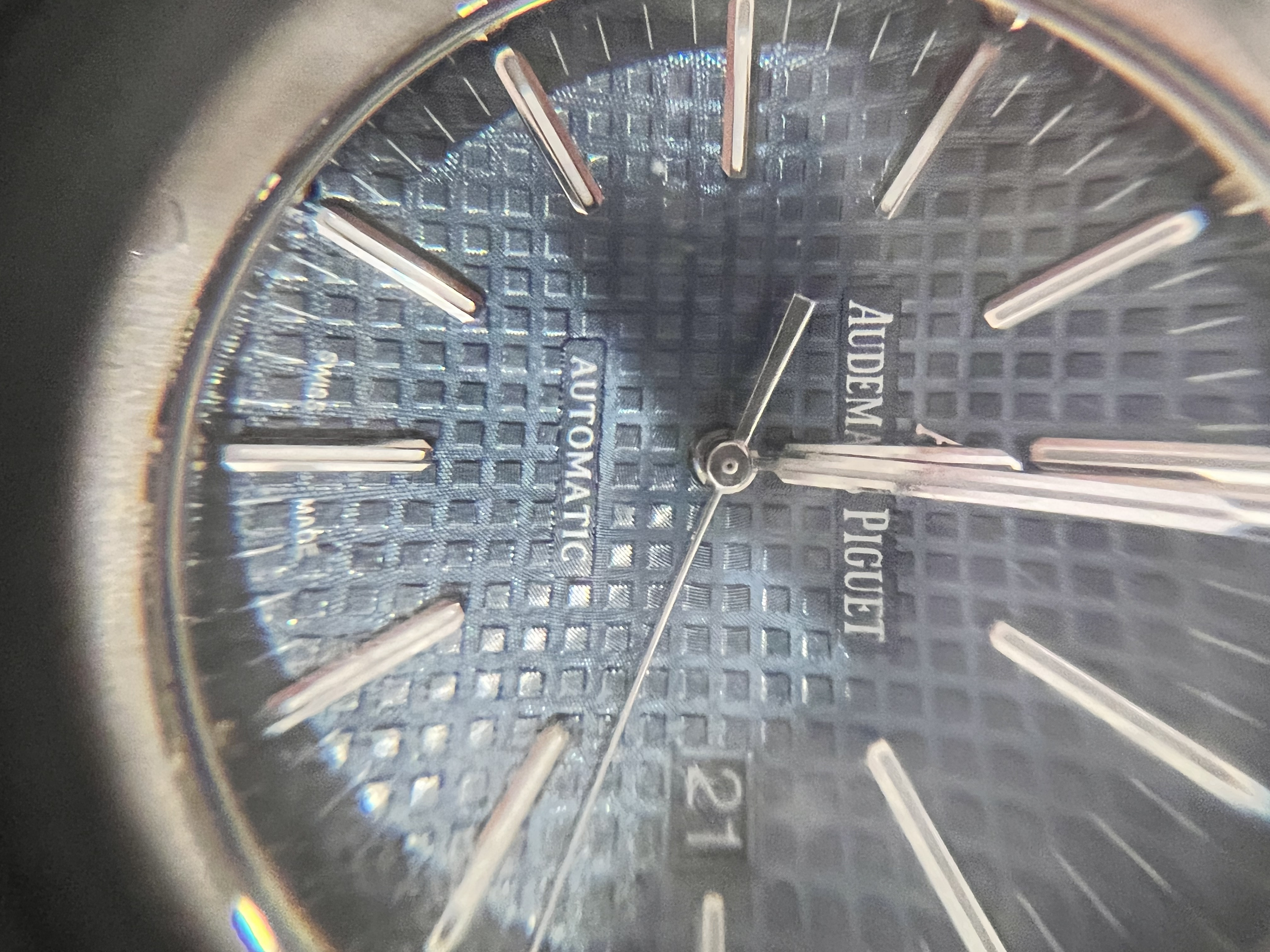
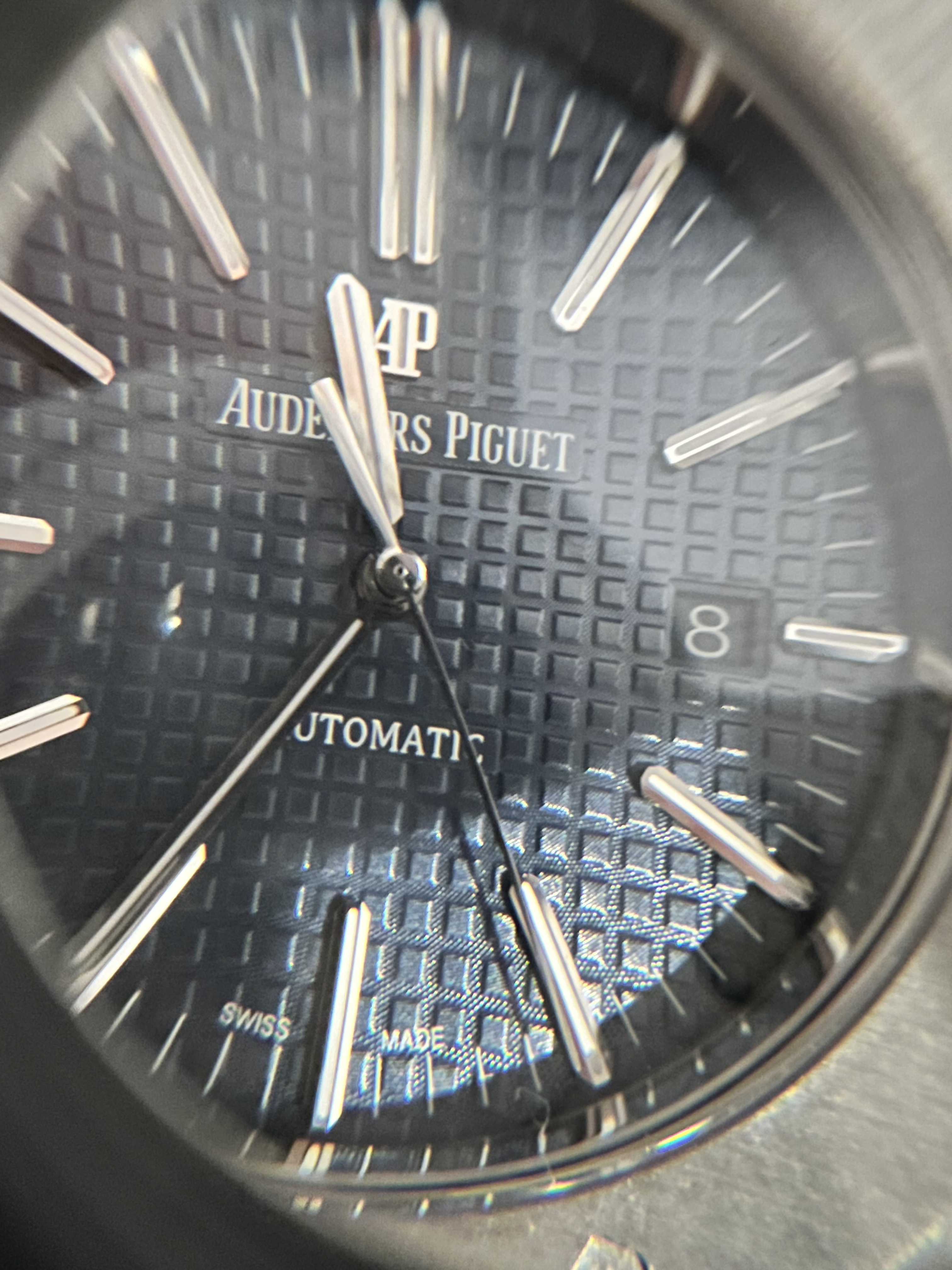
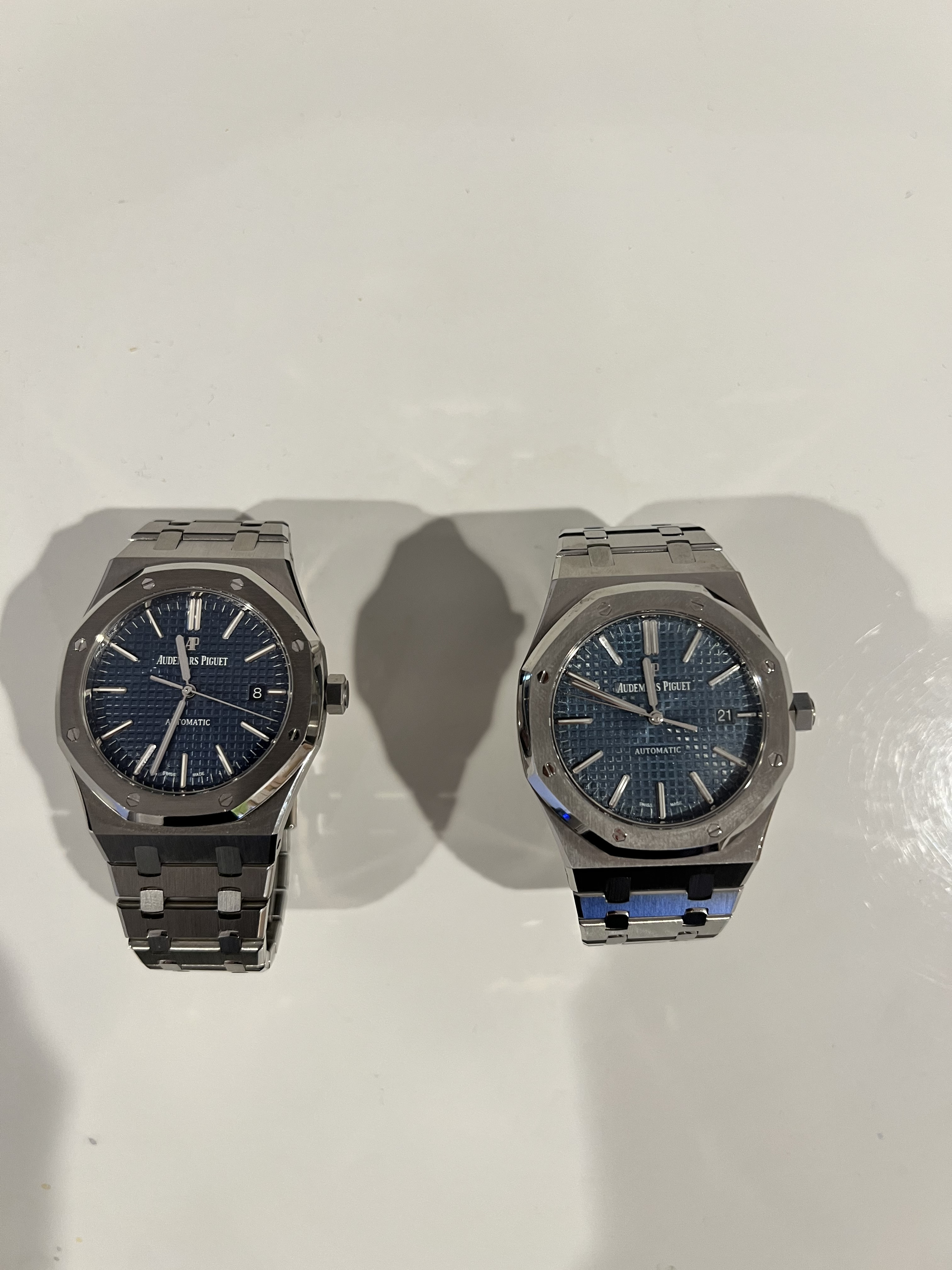
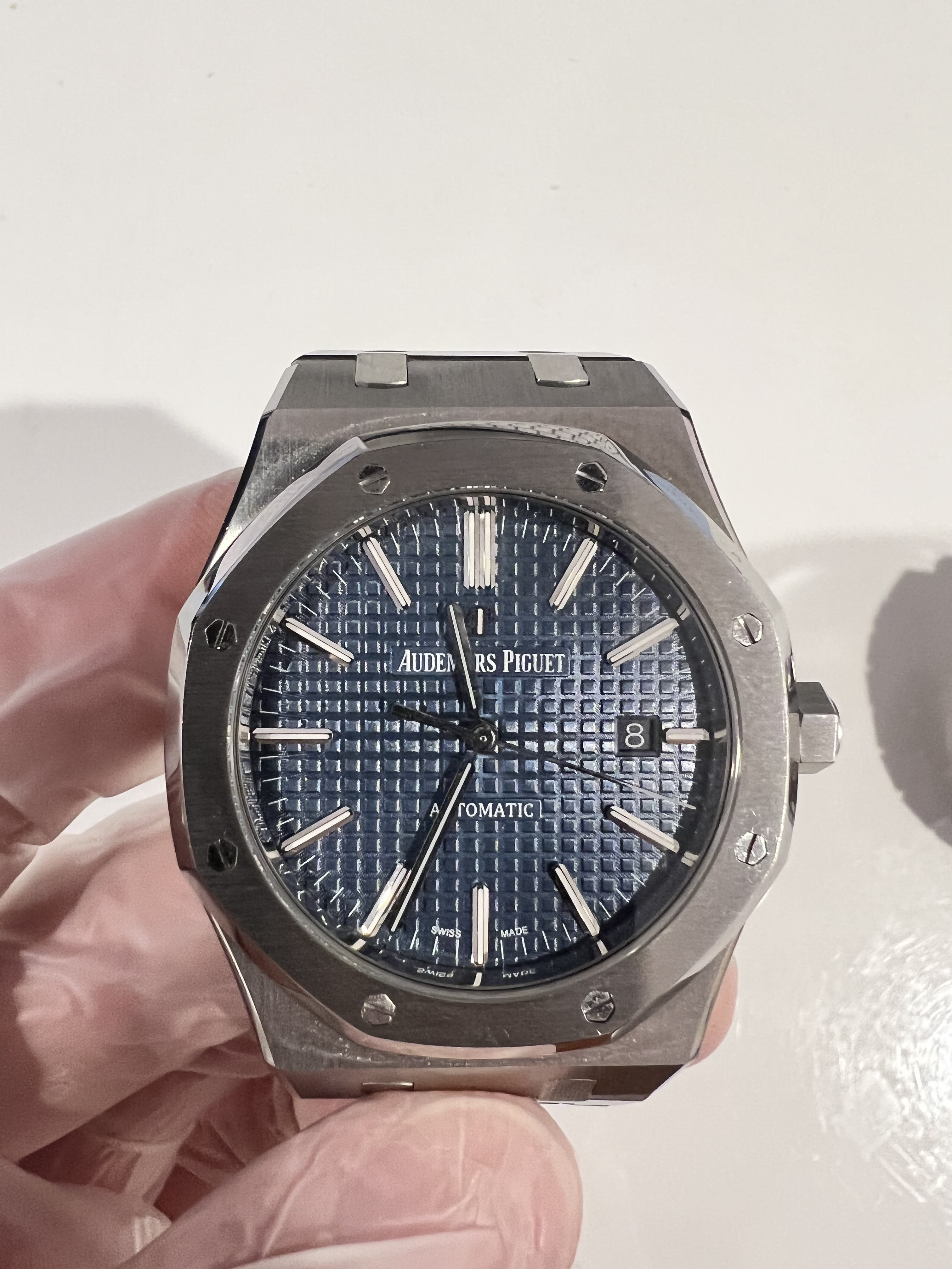
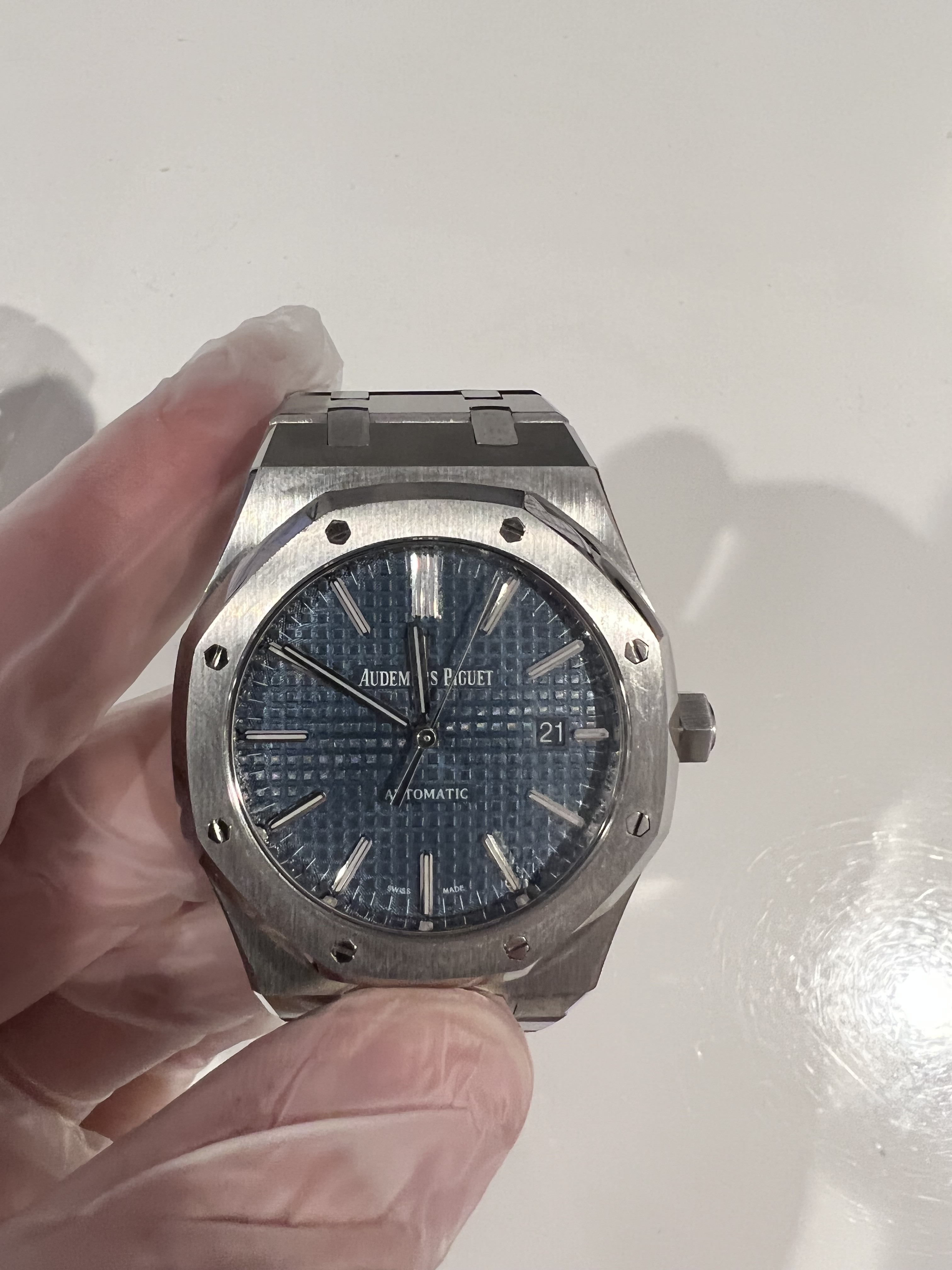
Dial Color - APS is closer to JF V5 in terms of the "blue". ZF has a darker more "navy" like dial imo.
Dial Tap - The APS tapisserie seems more of a nice circular through the dial. Meaning the as you get closer to the center of the dial the circle is smaller, but still a circle nonetheless. The ZF dial seems to be more of a vertical oval which brings me to how the light reflects off of it. From the photos you seem to get the desired "sunburst"? with the APS but with the ZF it doesn't look as consistent.
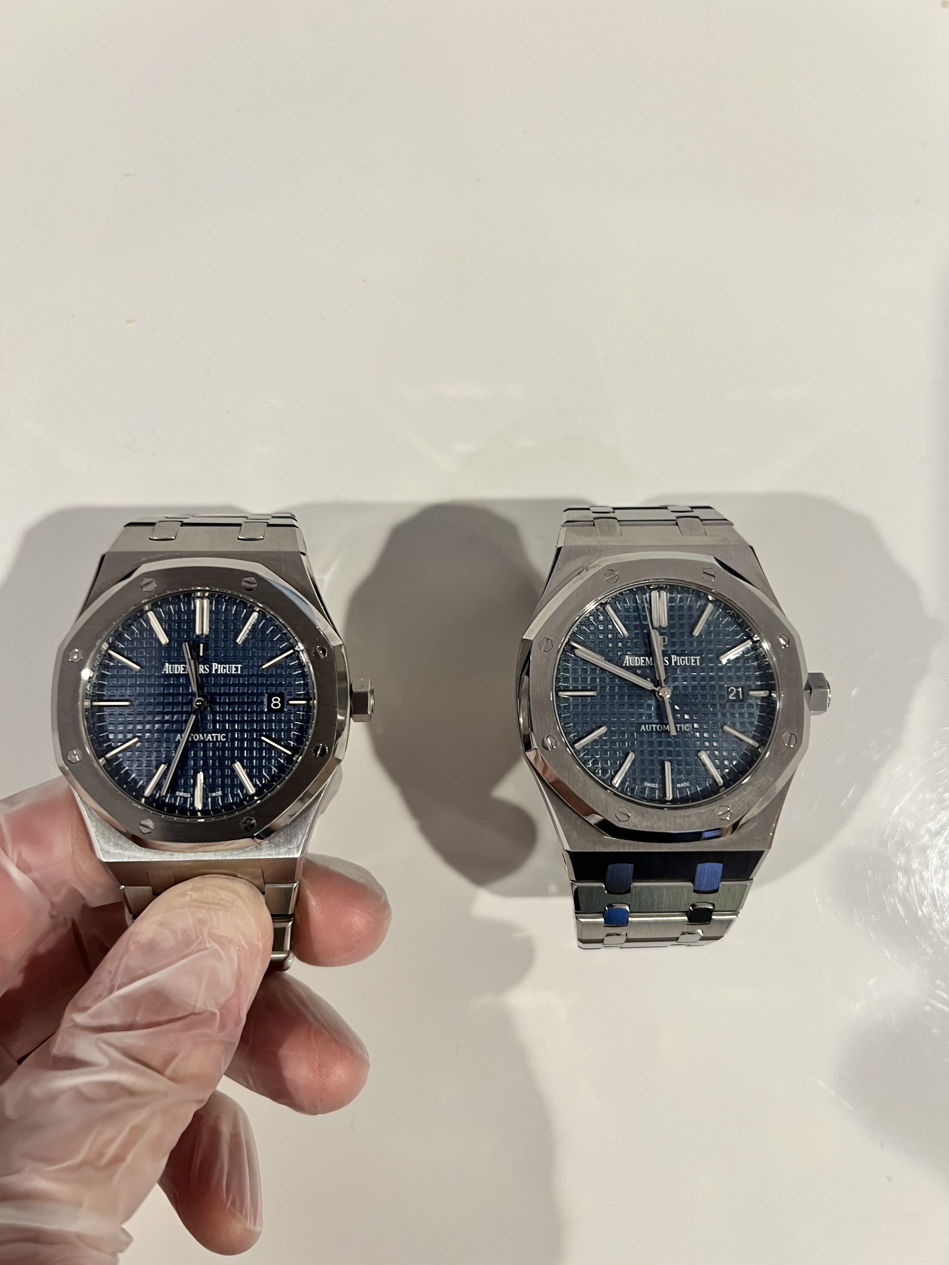
For the side by side comparison photos, the ZF is on the left and APS is on the right.
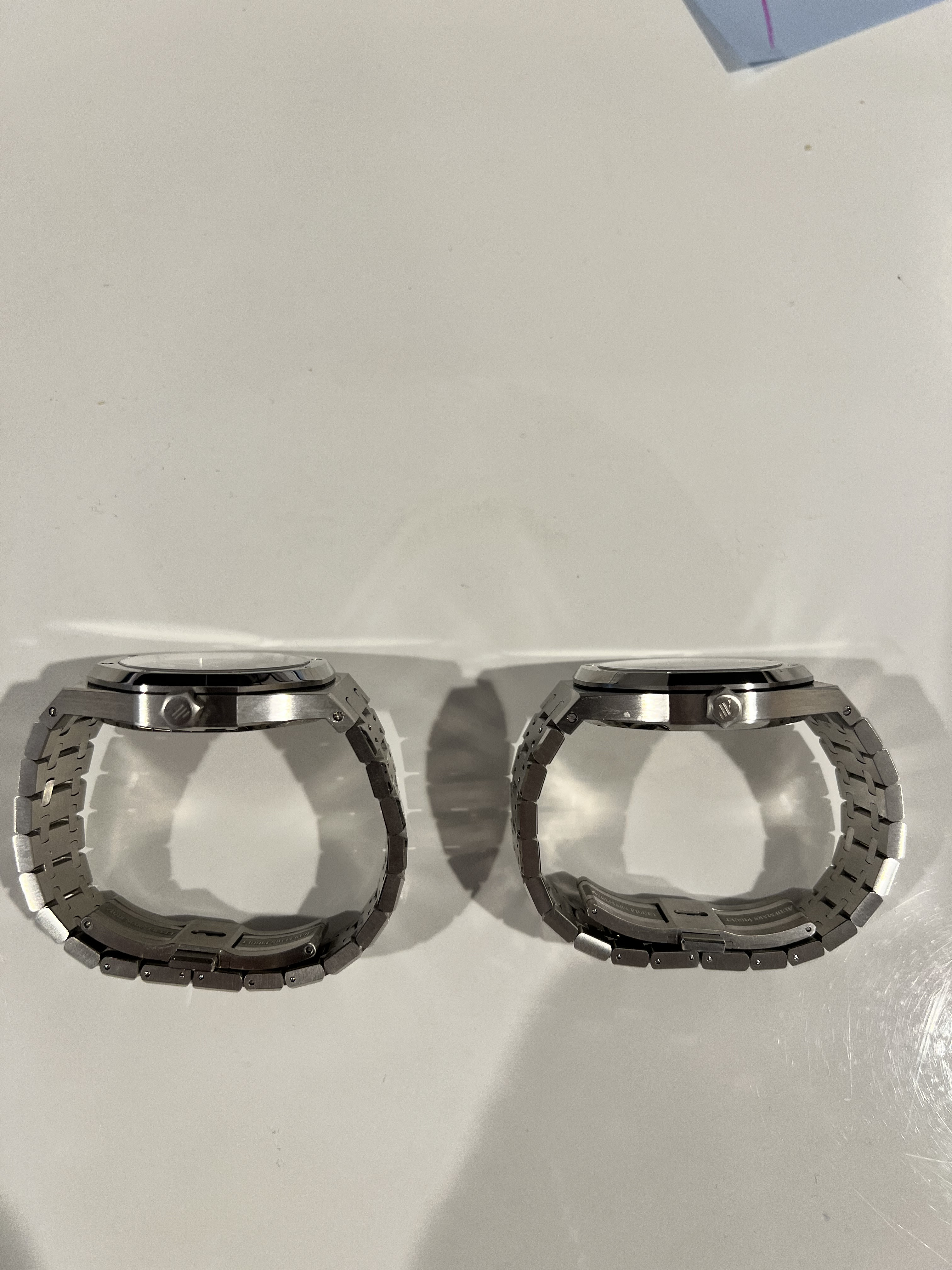
First picture of the crown is ZF and 2nd picture of crown is APS.
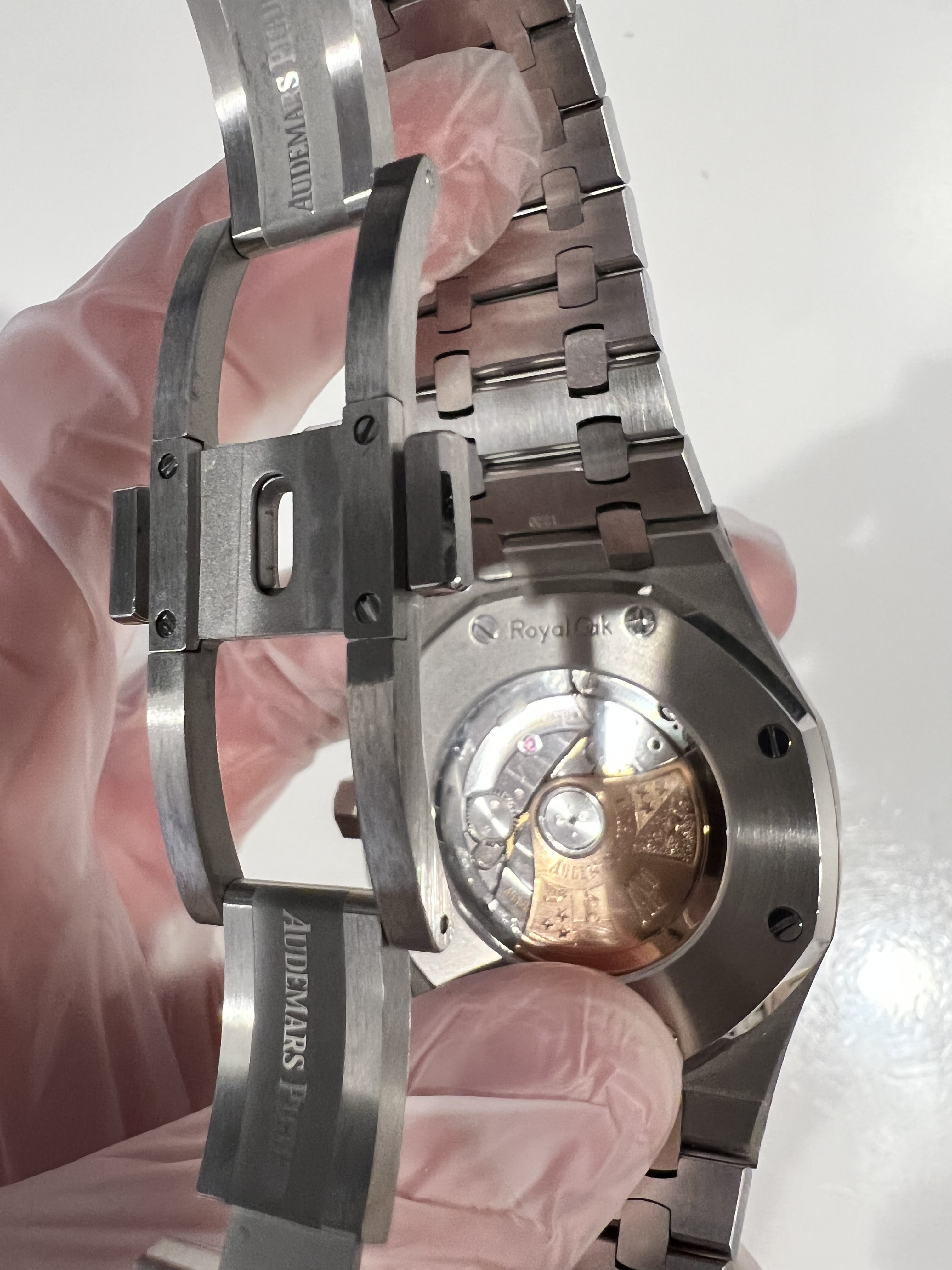
The gasket is between the bezel and the watch is also thicker on the APS vs the ZF.
My photos are pretty bad but I will describe any differences I see among the dial, hands, logos, bracelet and finish.
Full disclosure: I do not own a gen 15400, so any questions regarding how close it looks to the gen, the answer will always be "I don't know" because from my reading of posts here there have been many variations of the 15400 throughout the years in terms of how matte/bright the dial is, the sunburst, etc.
Photos from the top:
Swiss Made Logo - ZF looks a little cleaner in terms of printing. This was with a loop. It was really hard to tell from the naked eye the difference.
Dial Color - APS is closer to JF V5 in terms of the "blue". ZF has a darker more "navy" like dial imo.
Dial Tap - The APS tapisserie seems more of a nice circular through the dial. Meaning the as you get closer to the center of the dial the circle is smaller, but still a circle nonetheless. The ZF dial seems to be more of a vertical oval which brings me to how the light reflects off of it. From the photos you seem to get the desired "sunburst"? with the APS but with the ZF it doesn't look as consistent.
For the side by side comparison photos, the ZF is on the left and APS is on the right.
First picture of the crown is ZF and 2nd picture of crown is APS.
The gasket is between the bezel and the watch is also thicker on the APS vs the ZF.
Last edited:
