- 22/1/20
- 32
- 18
- 0
Note: if Noob sends me a better version I am happy to amend this review!
Hi Guys,
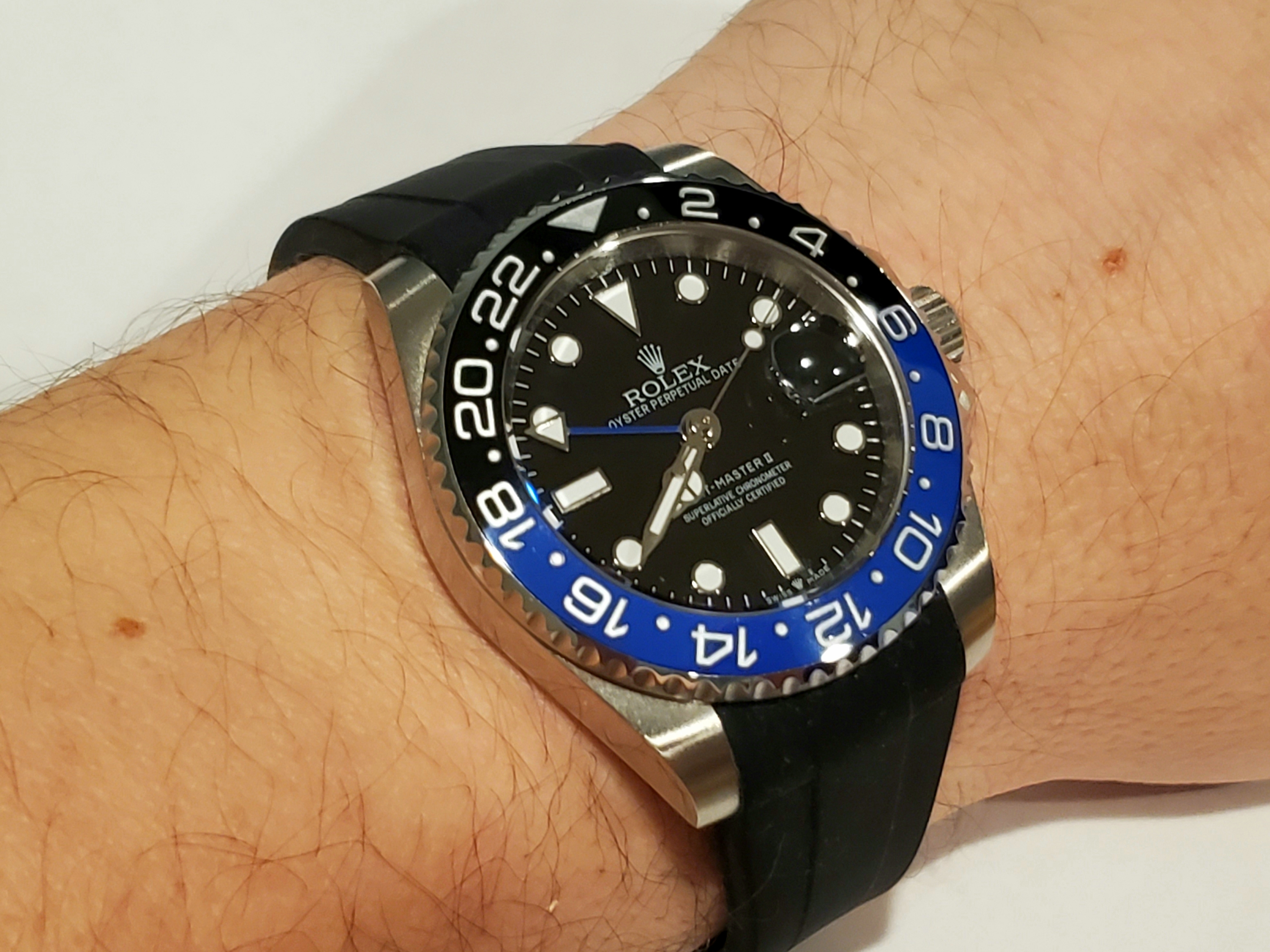
I have finally received my 126710BLNR that I ordered only a few weeks ago. Its the Noob version with the clone A3285 movement. Before I dive into the details that I do not like, I'd like to give you an overall impression of the watch.
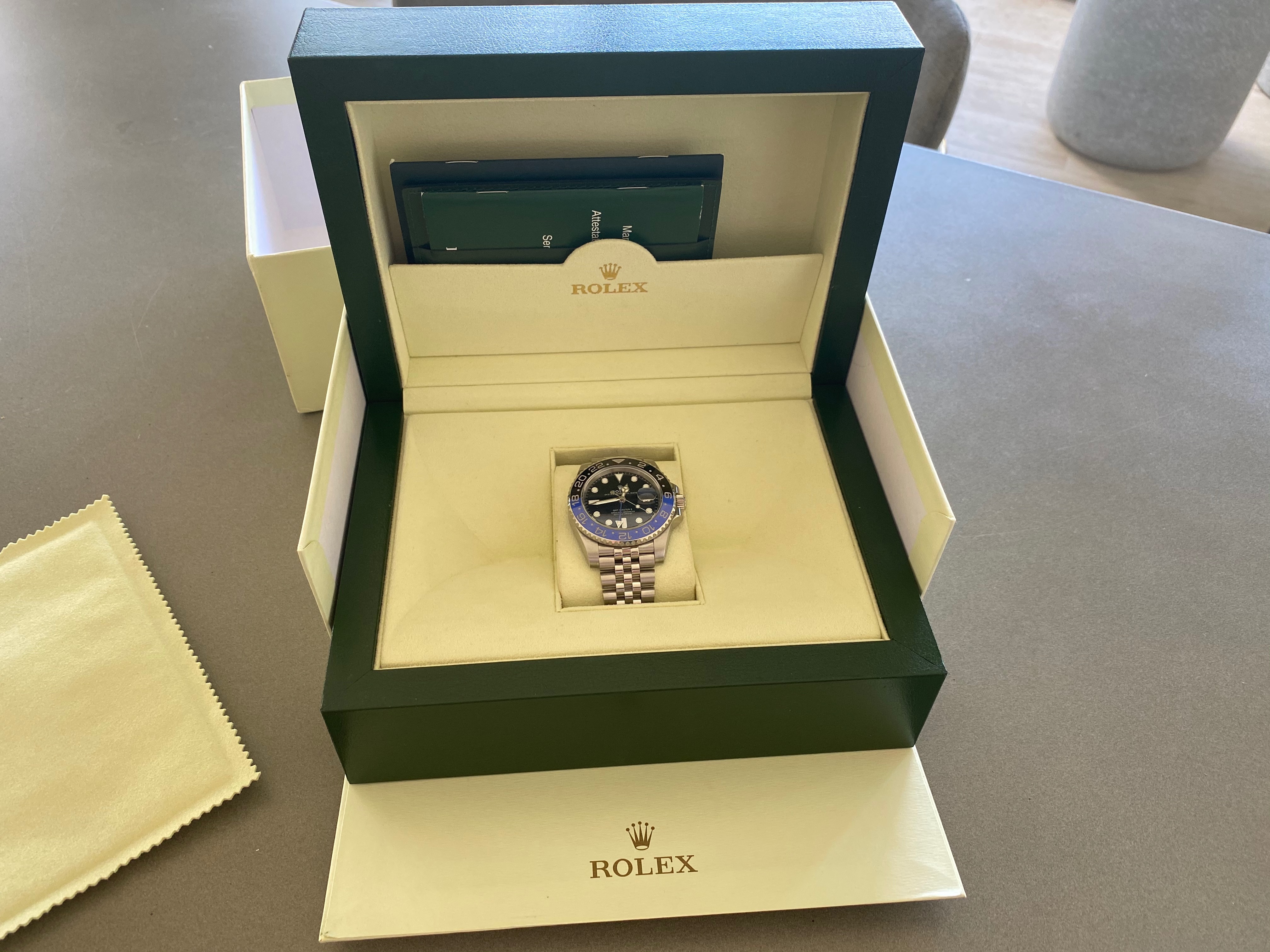
The watch came well packed with a nice bezel protector, all the stickers on and my first impression was very positive. The weight was spot on, and the overall feel to it was immaculate.
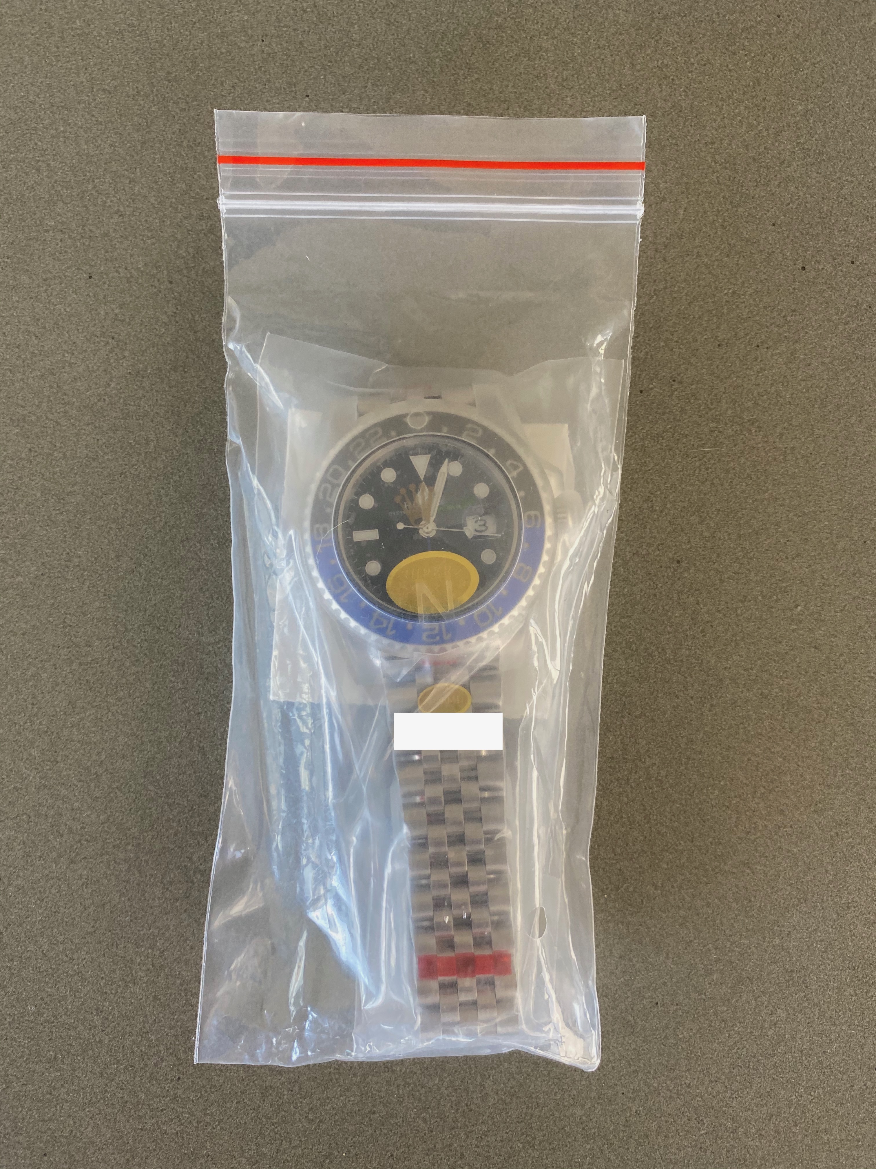
It makes a very good impression in a genuine Rolex box (although it is the pre 2016 version), doesn't it?
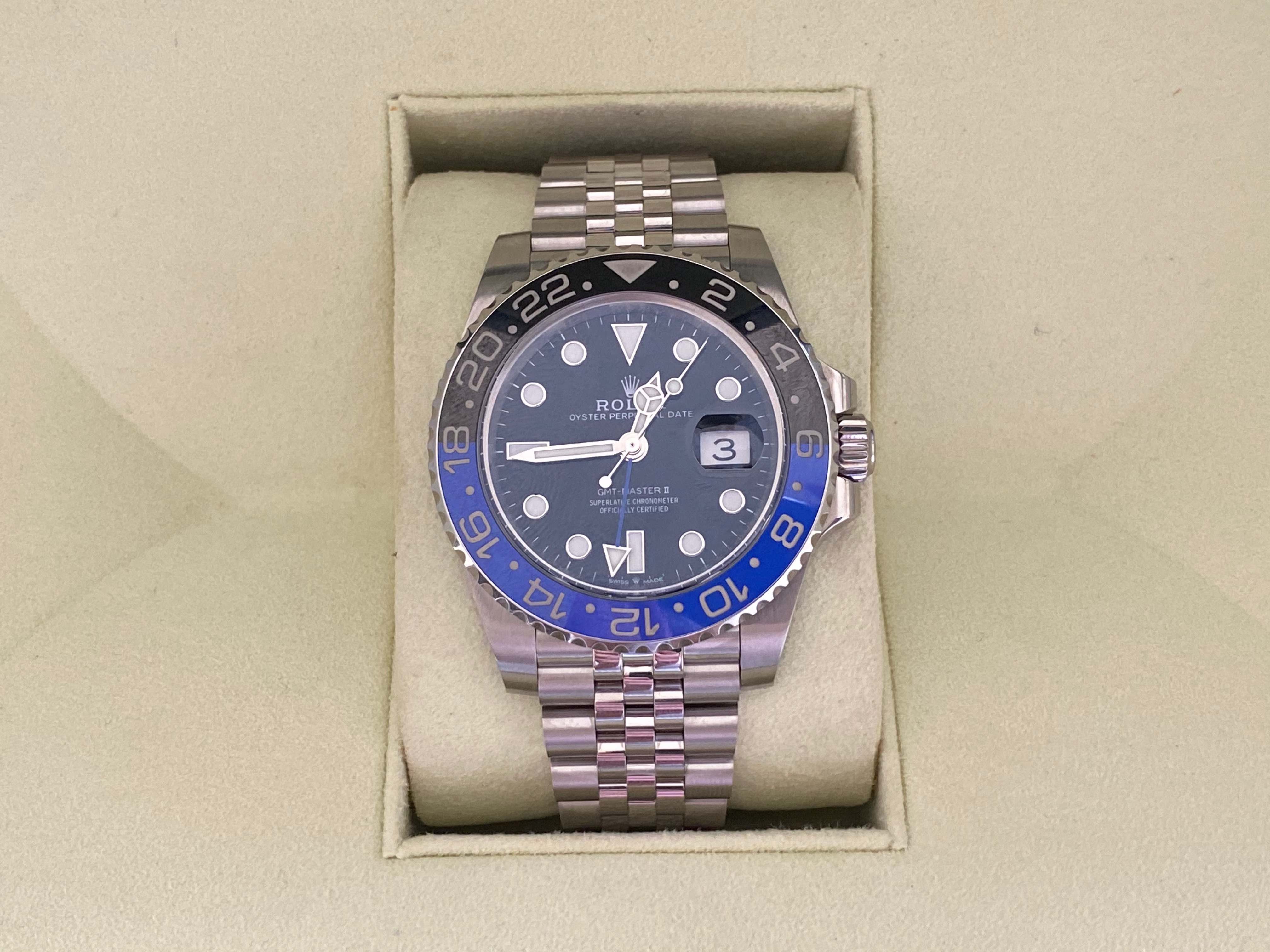
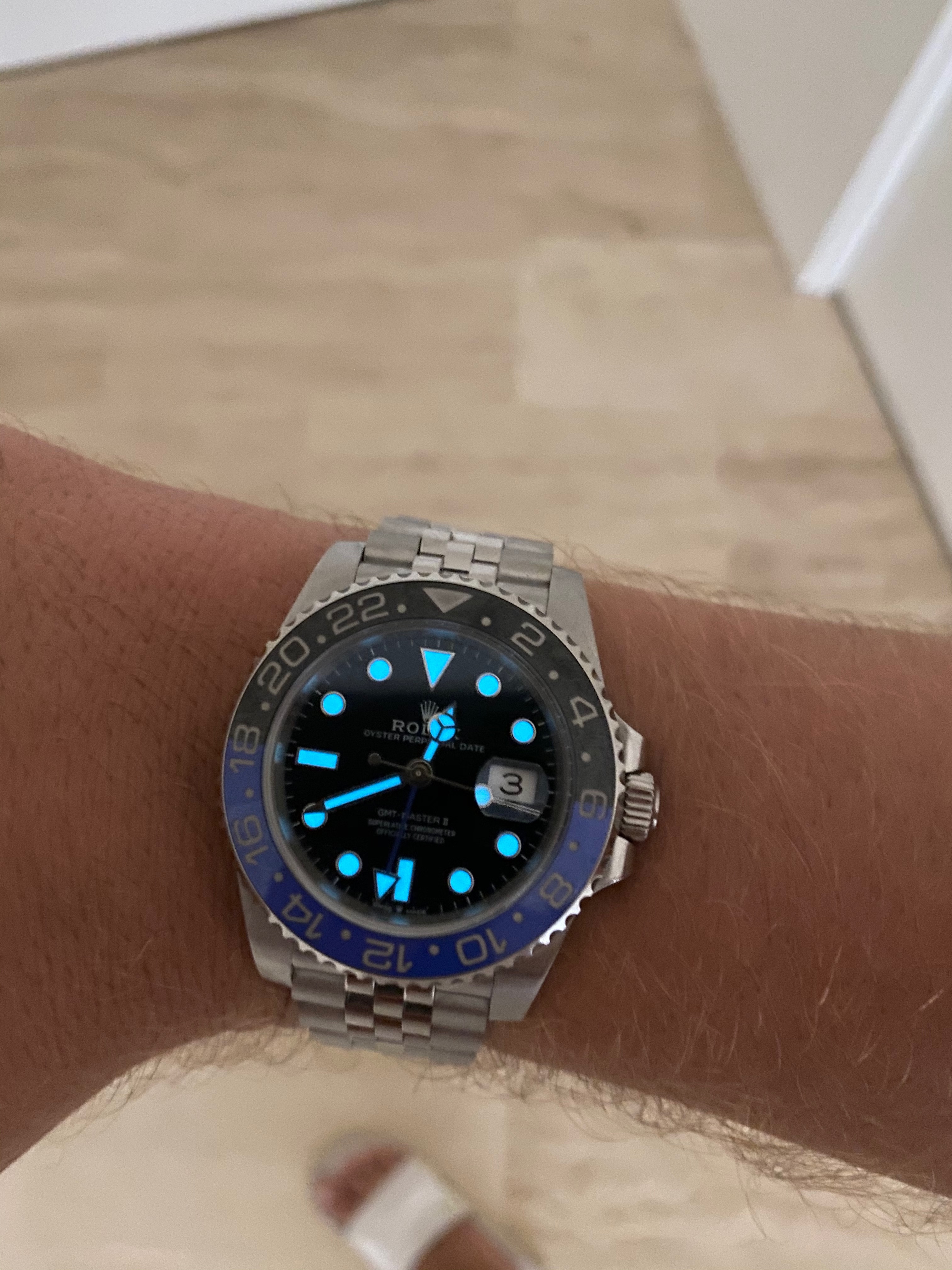
I first conducted a quick lume check - spot on - and it holds its luminescence for a reasonable amount of time:
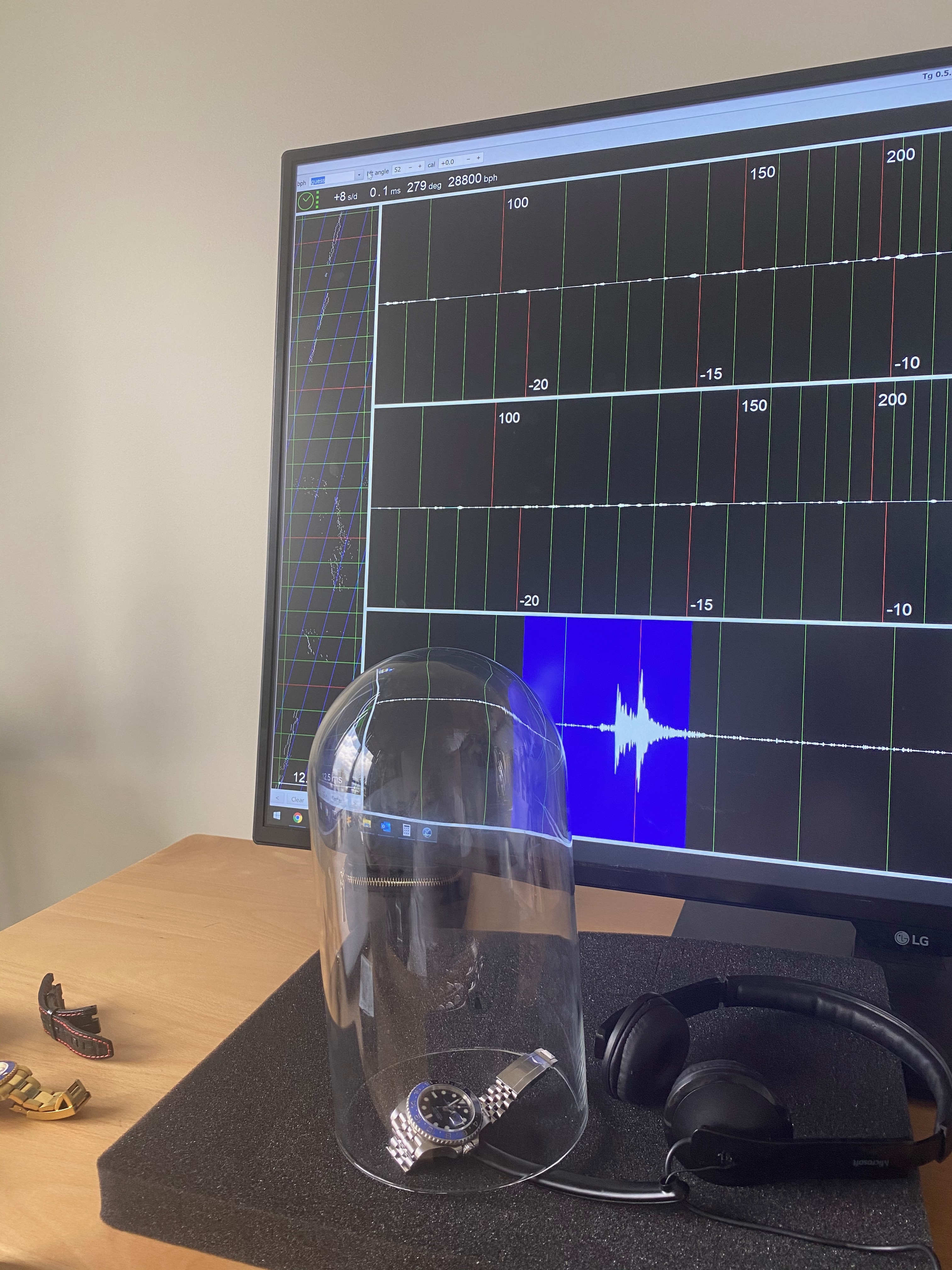
Next thing I did was to hook it up to my amateurish timegrapher which isn't that amateurish after all since it's matching the results I have seen on a more sophisticated device before.
+8s a day, beat error of 0.1ms and an amplitude 279deg is very unsatisfying but hey ... I will service the movement anyway. Let us see how well it runs then:
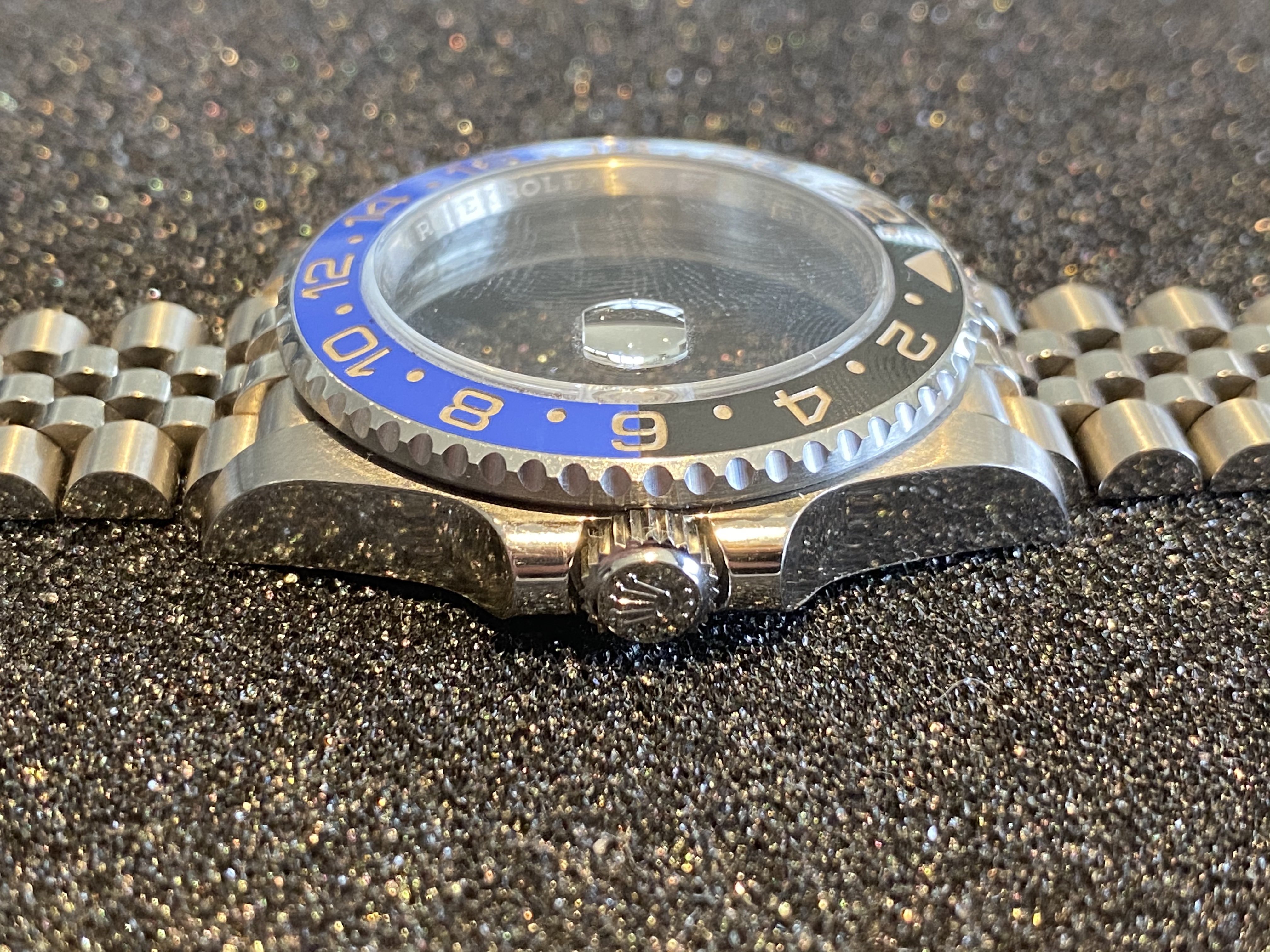
When I took a closer look at the watch, I got this awkward canal street feeling. Lets focus on the bezel for now. It is feral, and I can't think of any way they could have make it look worse.
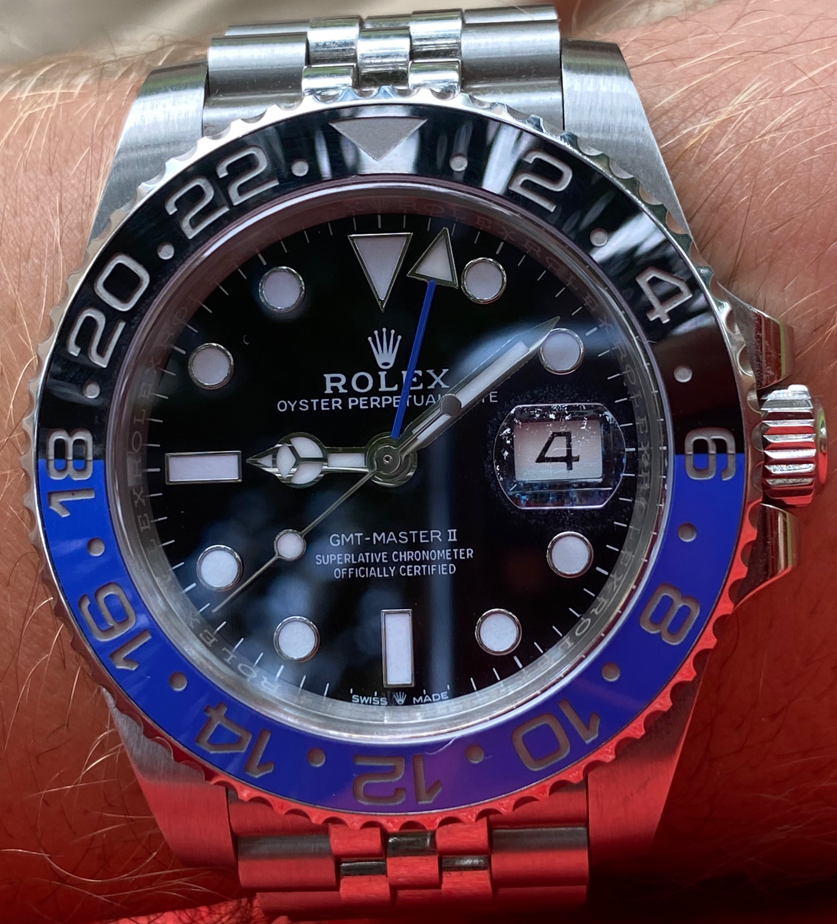
Do you see the weird "gaps" or "lines" where the blue and the black parts join? Also, when you take a look at the "18" ... you see that the blue is kind of penetrating the inside of the 8? This is not how it should look and in my eyes resembles the worst quality Canal St has to offer:
GEN is left, Canal St is right:
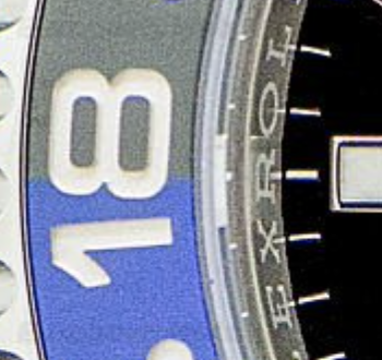
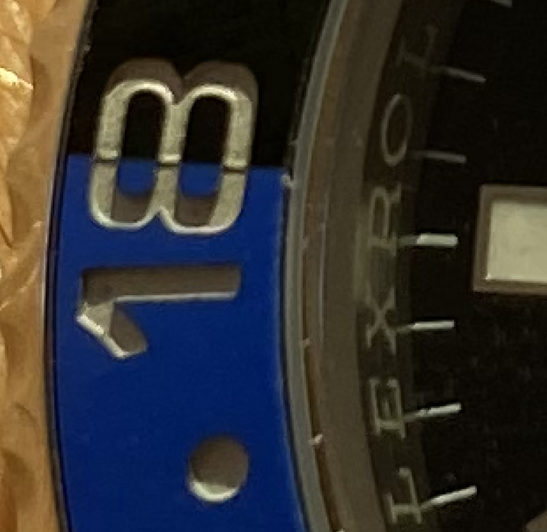
In this photo, you can also see the bad alignment of the rehaut - the markers line up perfectly with the middle of the R's on the Gen, yet are crooked on the Noob.
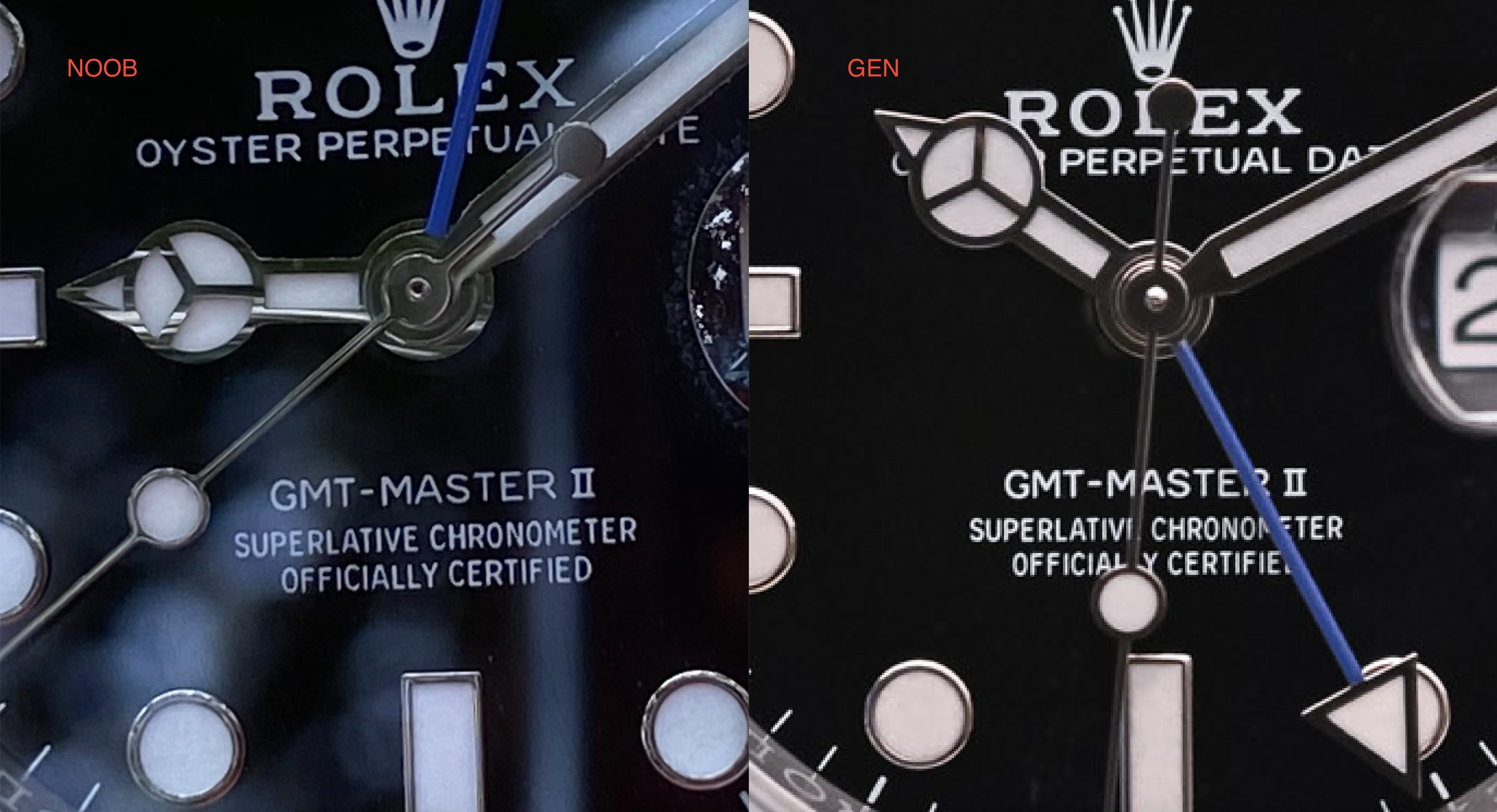
The dial isn't any better either. It has a completely different font and the gaps between the letters are way off:
- in "Officially Certified" the "O" is too high and not aligned with the rest of the text
- In "GMT Master" the "TER" in Master is too high (or its an optical illusion and the S is too low), for whatever reason - maybe a shaky hand when hand painting?
- Font is way thinner on the Noob
The Hands are not any better - in fact they are just as Canal St as the Bezel:
In the hour hand for example, you see the "Mercedes" triangle. On the Gen, this part is way thinner than the outer white gold frame of the hand. Not so much in the Noob version,. the thickness is the same. Furthermore, the second hand pin is hollow on the Noob and solid/curved on the gen.
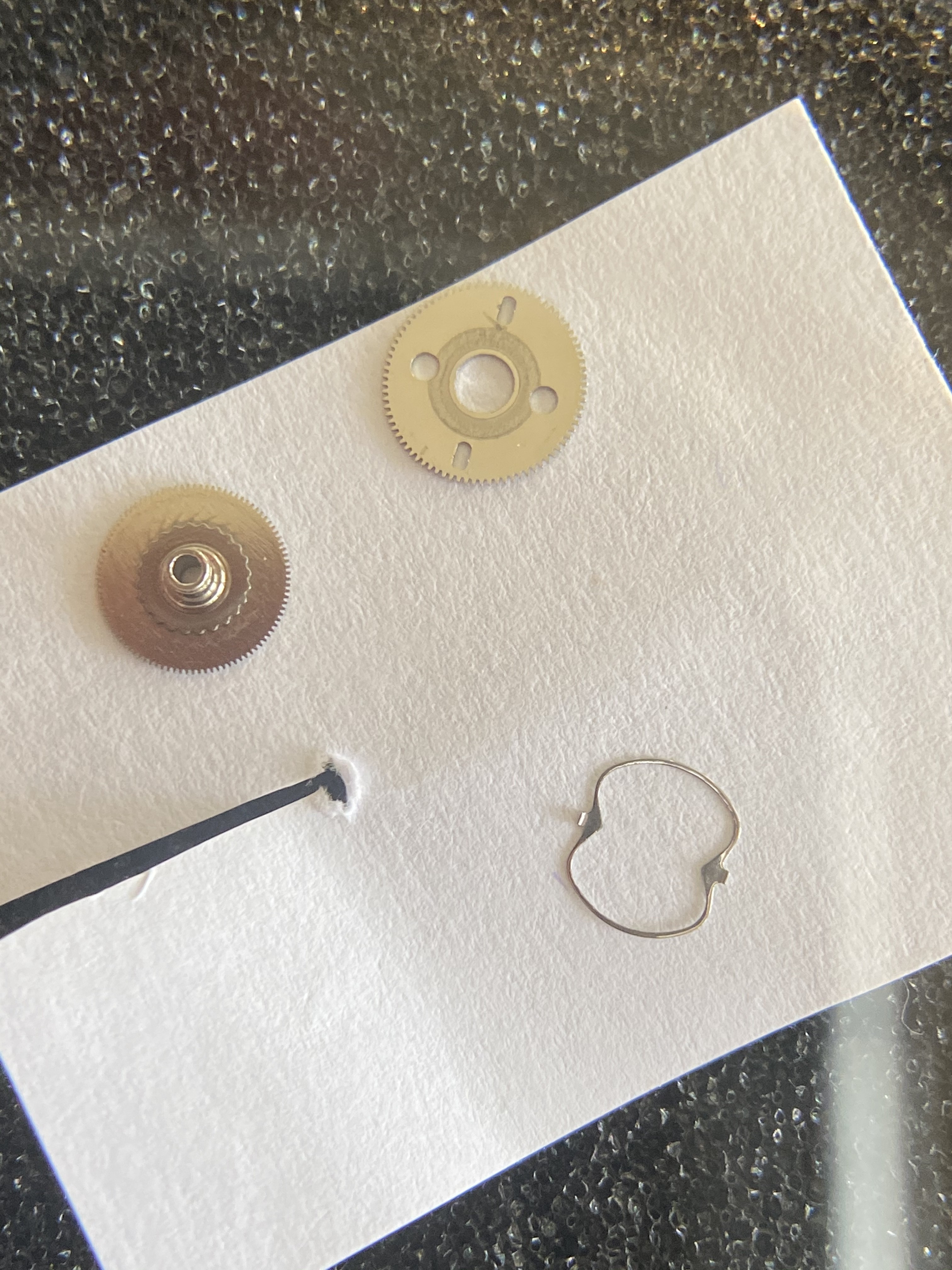
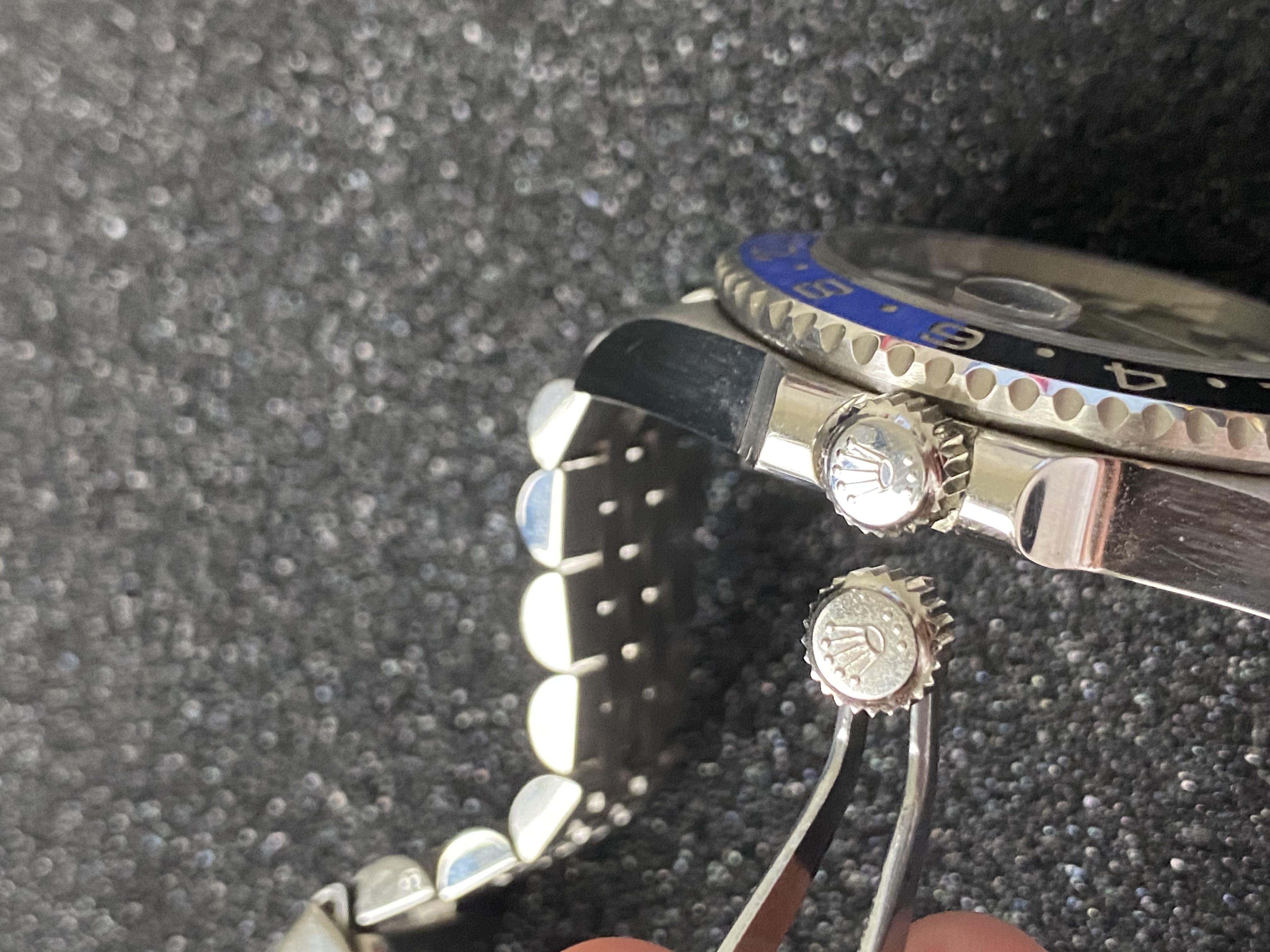
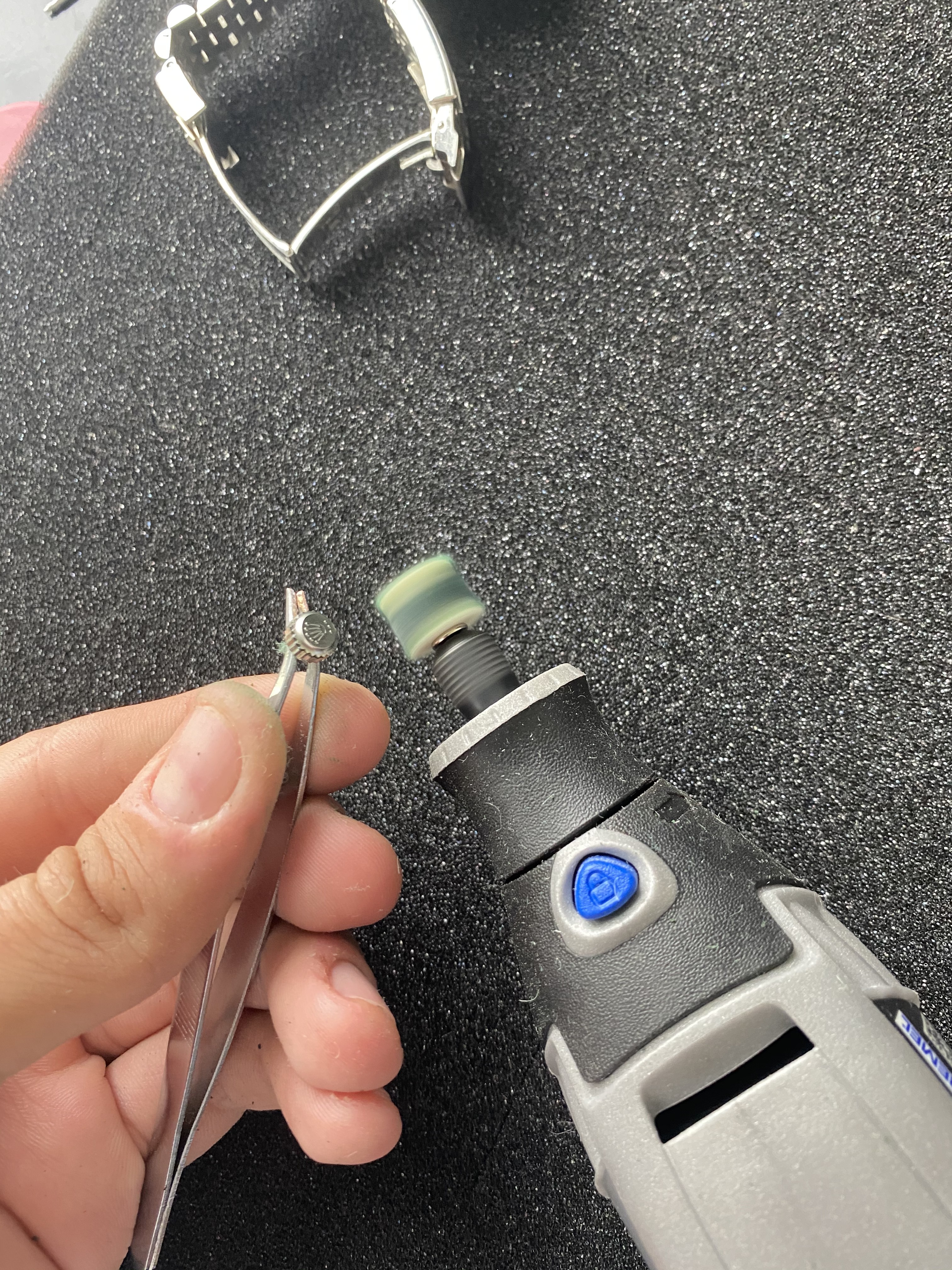
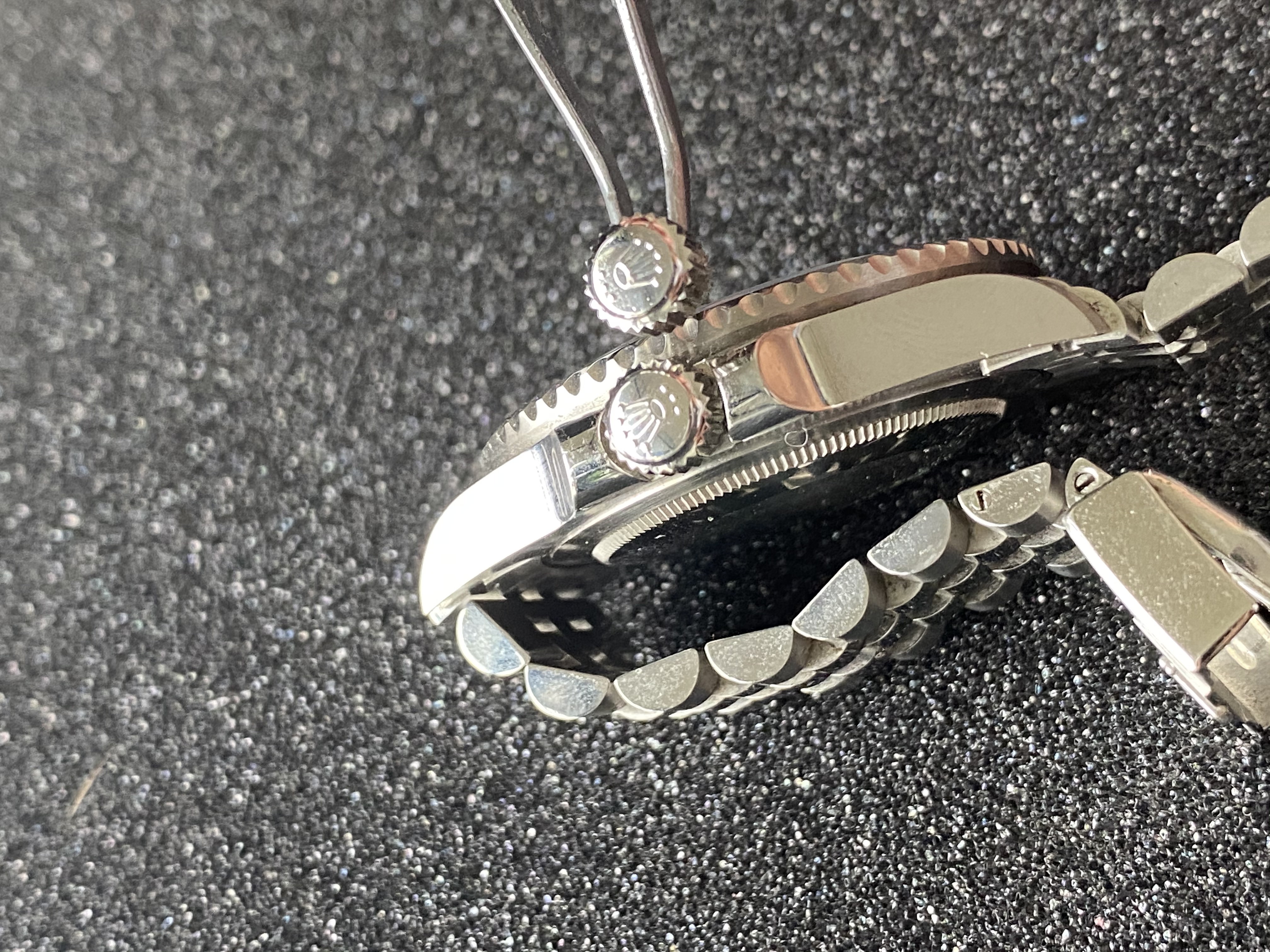
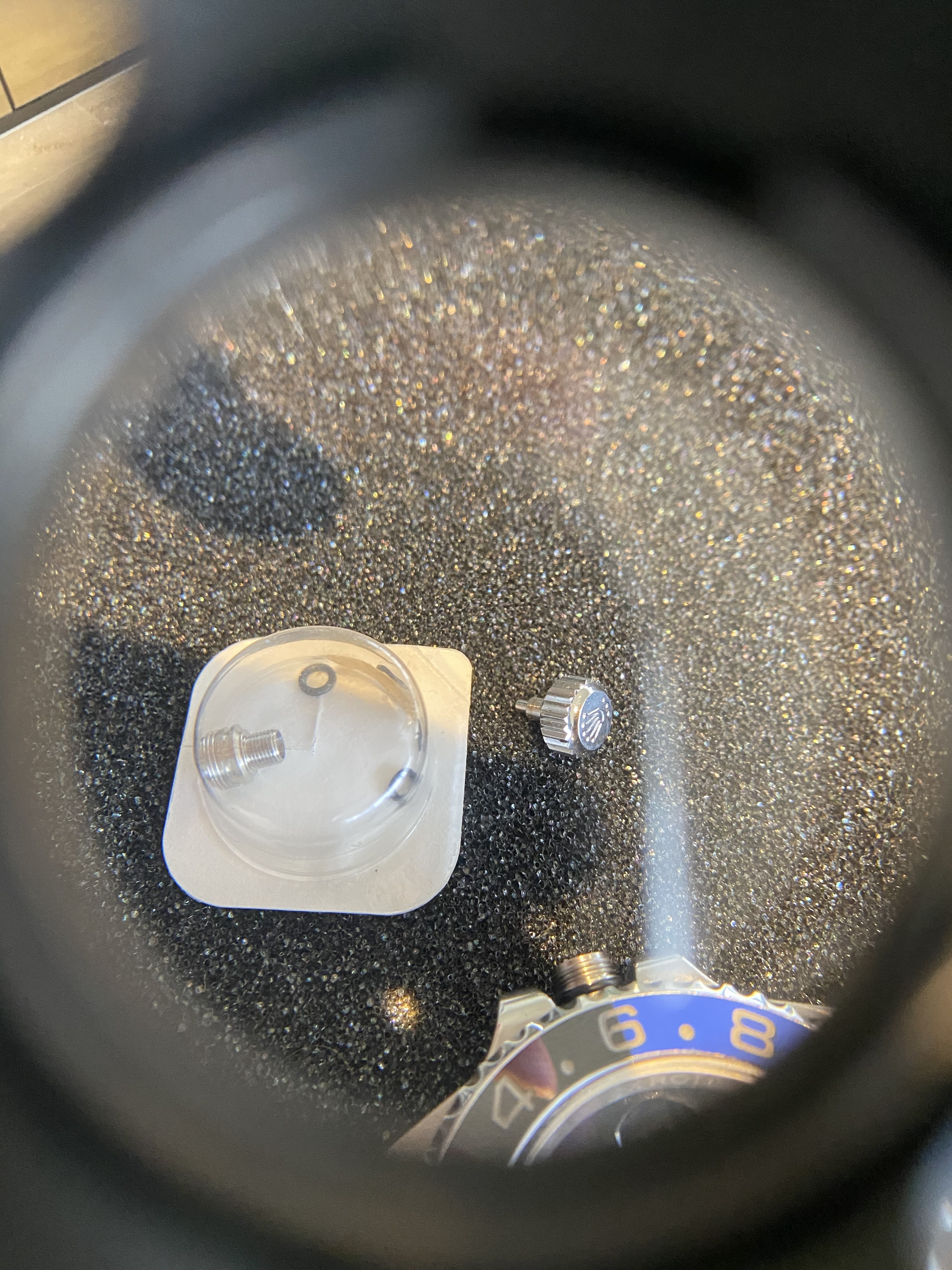
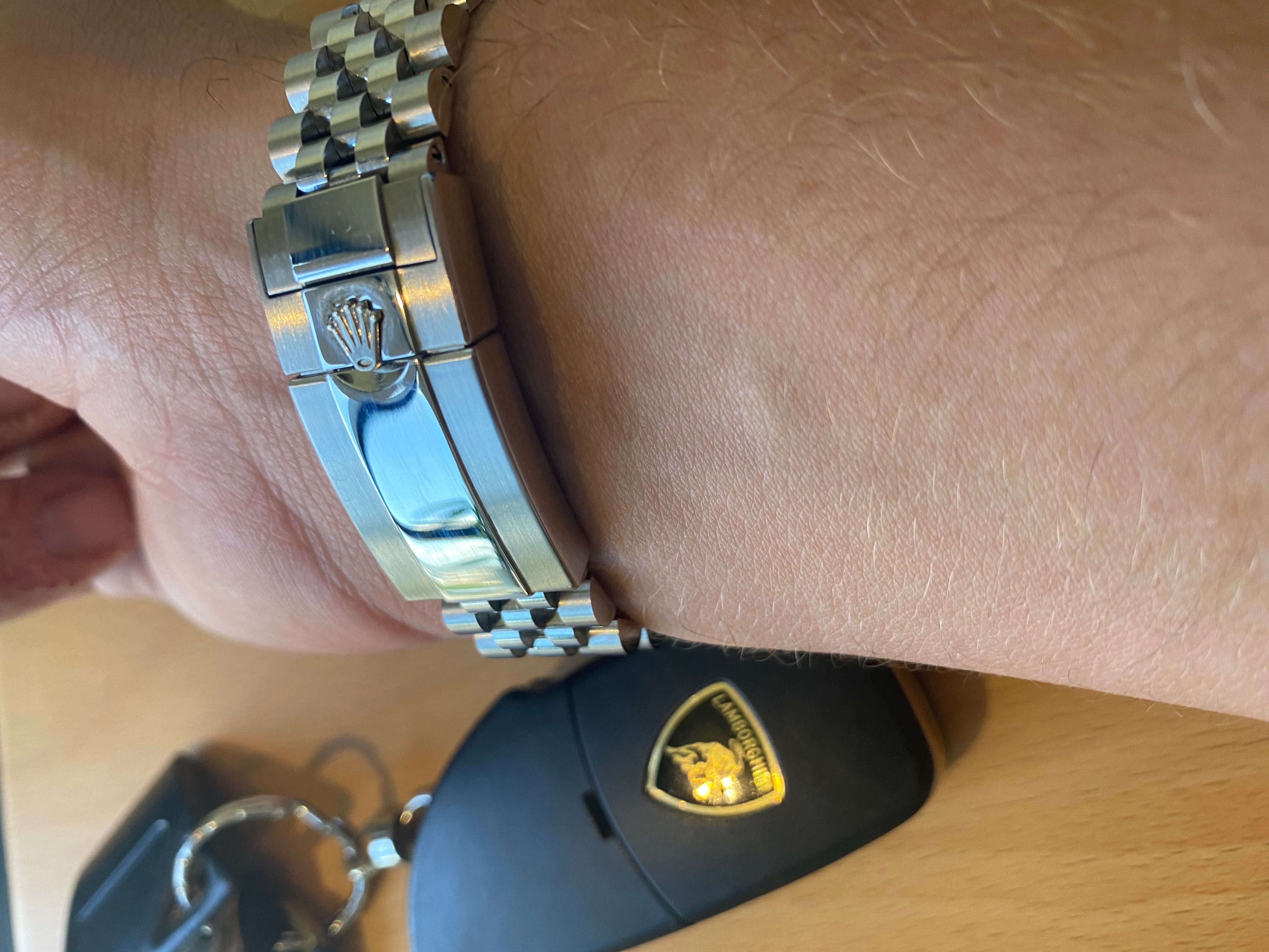
Clasp is alright, but under magnification you see that the crown has been welded on:
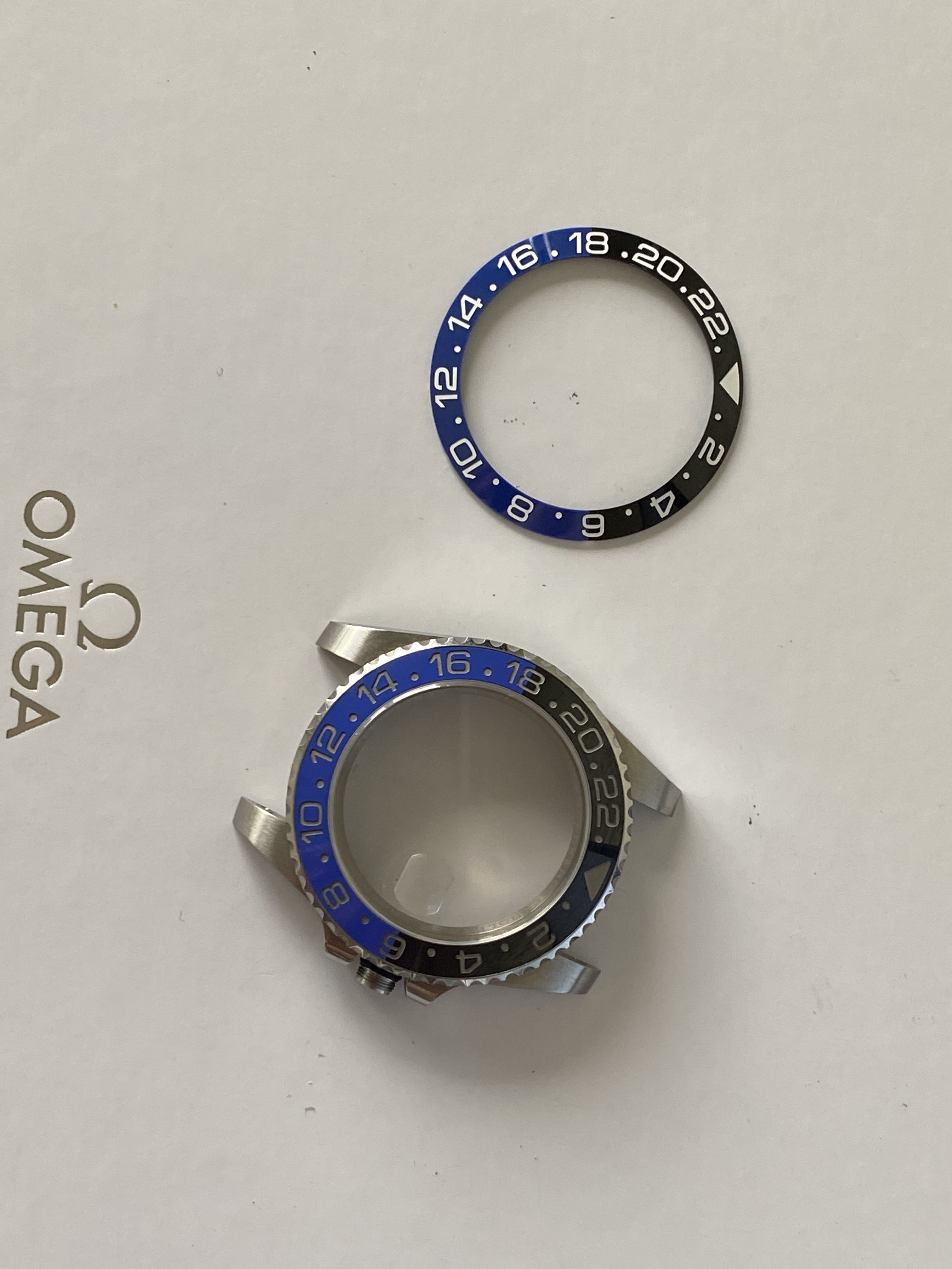
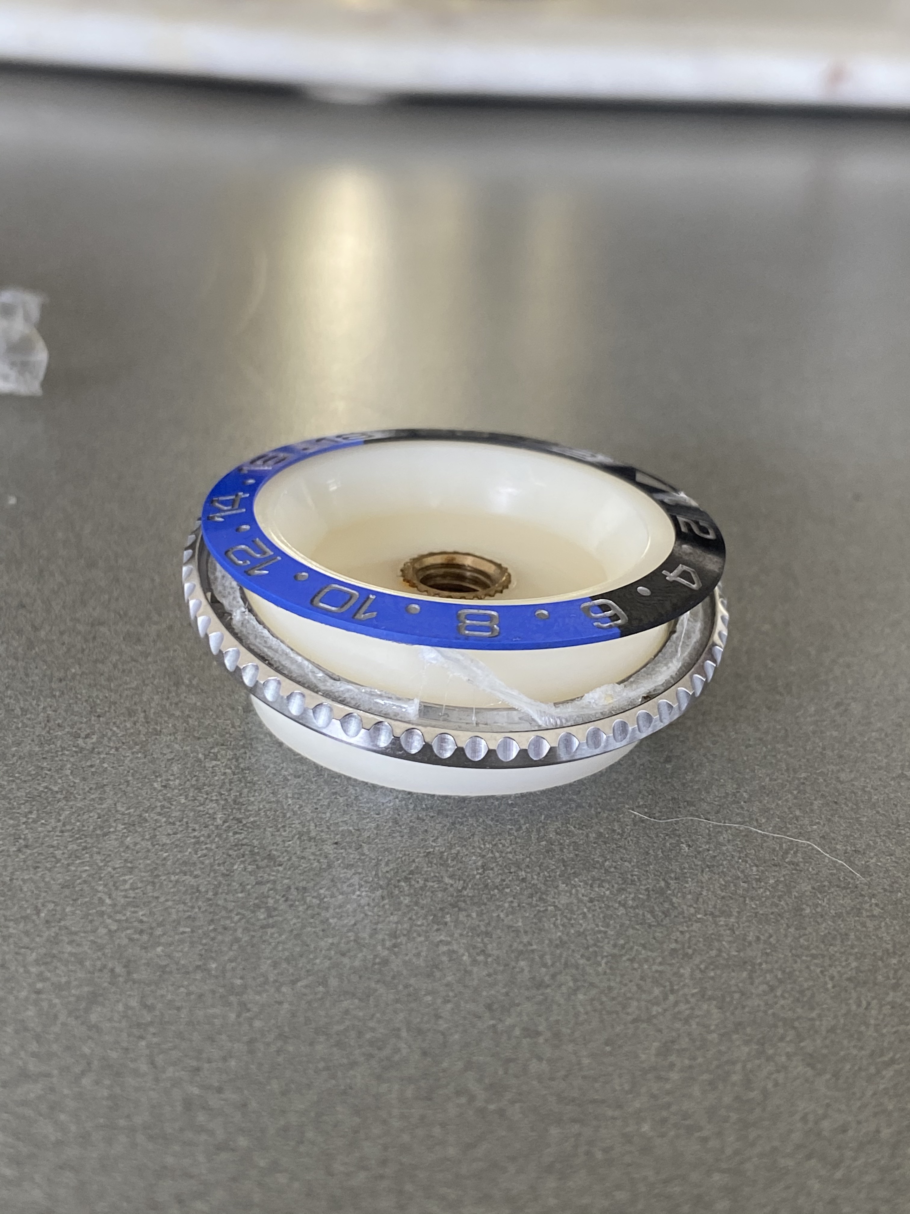
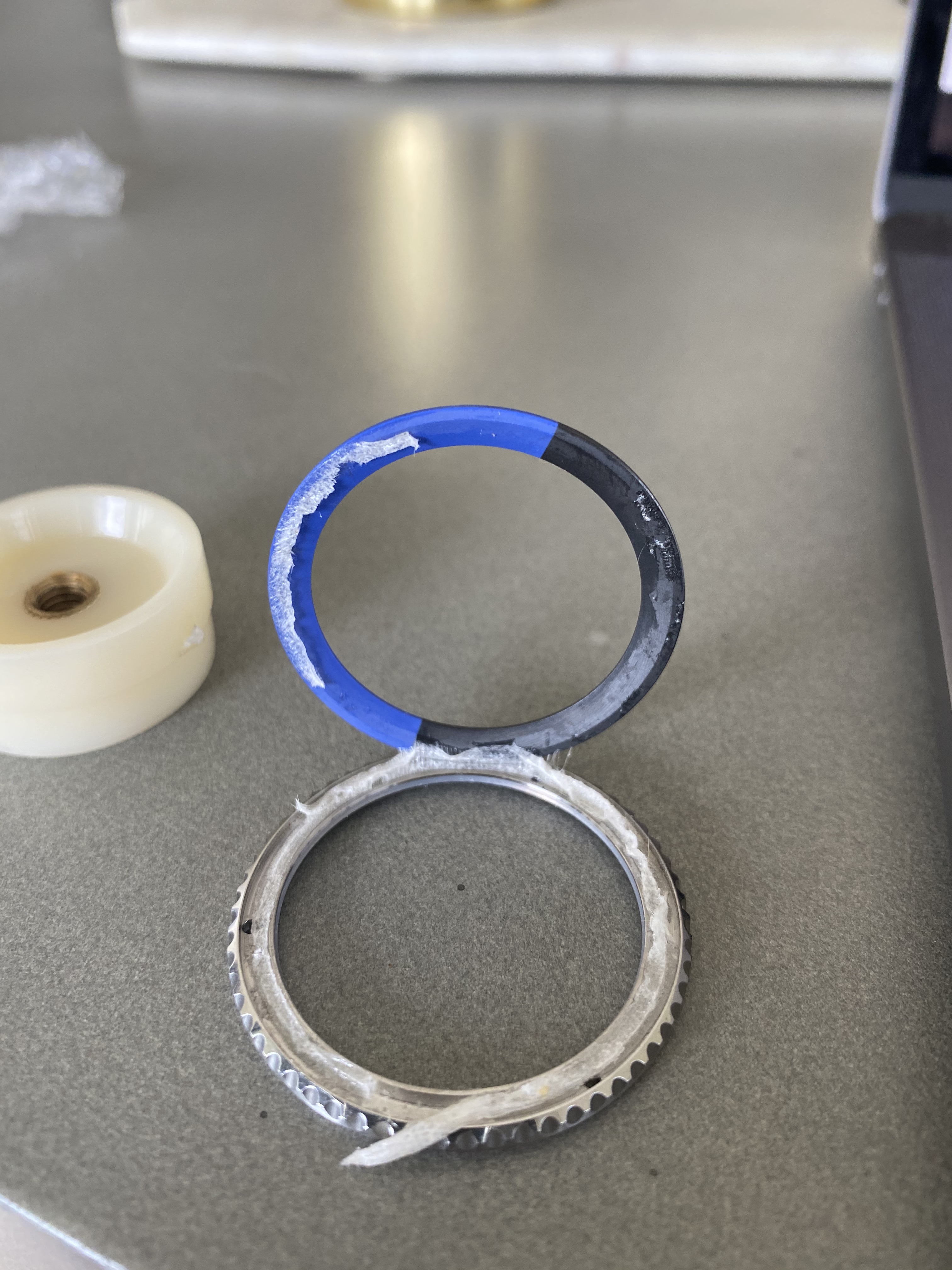
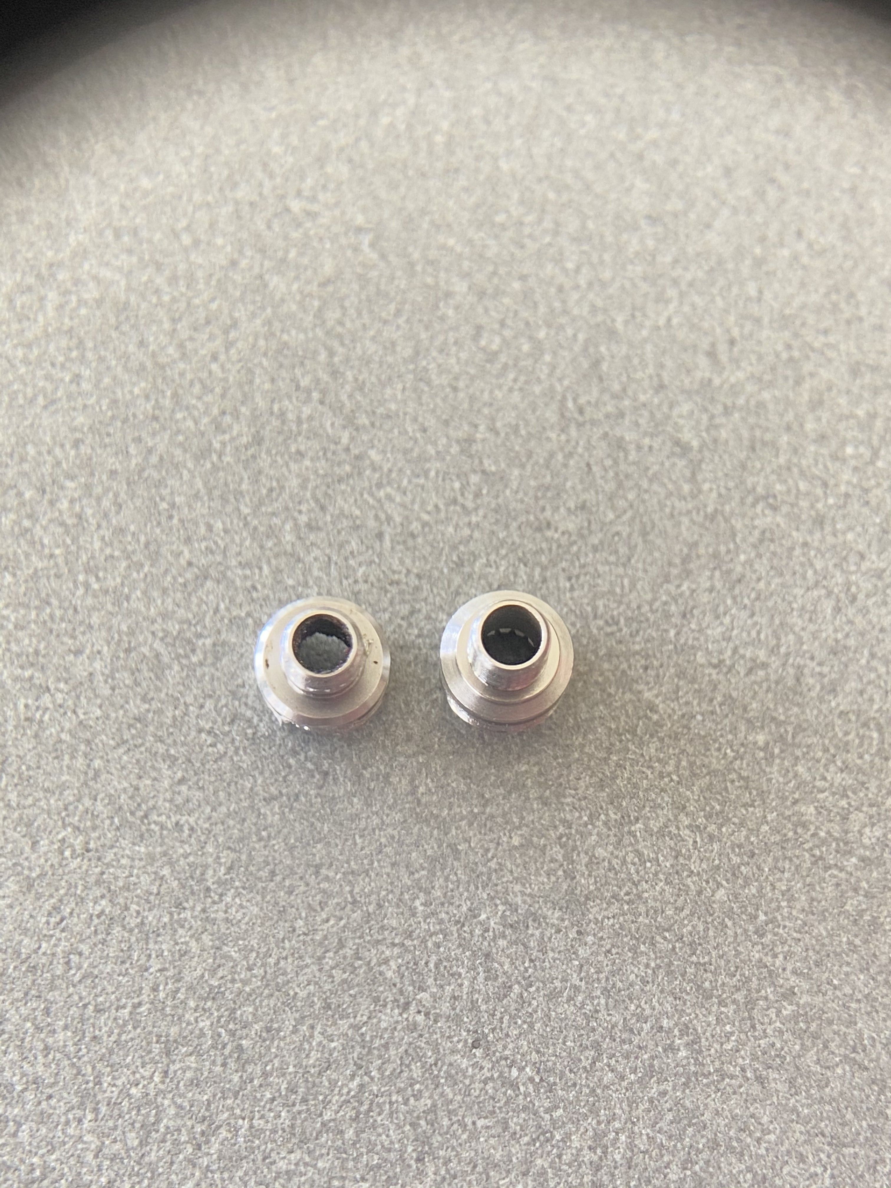
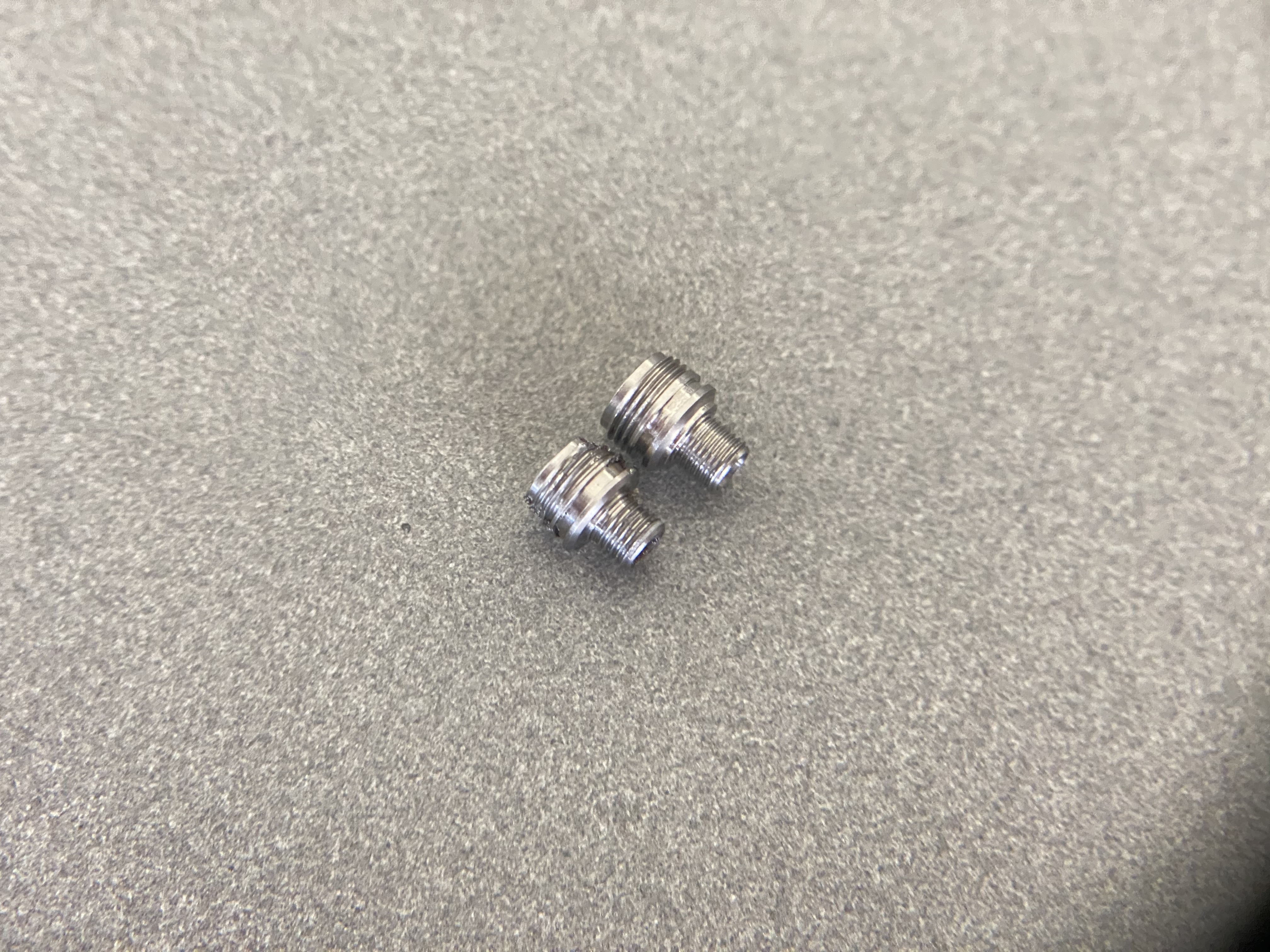
All in all a nice watch, but with heaps of flaws. For around 650$ too many flaws for my liking. My conclusion is: if you value resemblance with the genuine thing, you have to Franken it it with a better dial, gen hands and a proper bezel. I will Franken out all parts that have Rolex markings on them and swap them for the genuine thing, plus a gen Bezel insert and a proper Trilock crown tube for better waterproofing.
Hi Guys,
I have finally received my 126710BLNR that I ordered only a few weeks ago. Its the Noob version with the clone A3285 movement. Before I dive into the details that I do not like, I'd like to give you an overall impression of the watch.

The watch came well packed with a nice bezel protector, all the stickers on and my first impression was very positive. The weight was spot on, and the overall feel to it was immaculate.

It makes a very good impression in a genuine Rolex box (although it is the pre 2016 version), doesn't it?

I first conducted a quick lume check - spot on - and it holds its luminescence for a reasonable amount of time:

Next thing I did was to hook it up to my amateurish timegrapher which isn't that amateurish after all since it's matching the results I have seen on a more sophisticated device before.
+8s a day, beat error of 0.1ms and an amplitude 279deg is very unsatisfying but hey ... I will service the movement anyway. Let us see how well it runs then:

When I took a closer look at the watch, I got this awkward canal street feeling. Lets focus on the bezel for now. It is feral, and I can't think of any way they could have make it look worse.

Do you see the weird "gaps" or "lines" where the blue and the black parts join? Also, when you take a look at the "18" ... you see that the blue is kind of penetrating the inside of the 8? This is not how it should look and in my eyes resembles the worst quality Canal St has to offer:
GEN is left, Canal St is right:


In this photo, you can also see the bad alignment of the rehaut - the markers line up perfectly with the middle of the R's on the Gen, yet are crooked on the Noob.
The dial isn't any better either. It has a completely different font and the gaps between the letters are way off:
- in "Officially Certified" the "O" is too high and not aligned with the rest of the text
- In "GMT Master" the "TER" in Master is too high (or its an optical illusion and the S is too low), for whatever reason - maybe a shaky hand when hand painting?
- Font is way thinner on the Noob
The Hands are not any better - in fact they are just as Canal St as the Bezel:
In the hour hand for example, you see the "Mercedes" triangle. On the Gen, this part is way thinner than the outer white gold frame of the hand. Not so much in the Noob version,. the thickness is the same. Furthermore, the second hand pin is hollow on the Noob and solid/curved on the gen.

Clasp is alright, but under magnification you see that the crown has been welded on:

All in all a nice watch, but with heaps of flaws. For around 650$ too many flaws for my liking. My conclusion is: if you value resemblance with the genuine thing, you have to Franken it it with a better dial, gen hands and a proper bezel. I will Franken out all parts that have Rolex markings on them and swap them for the genuine thing, plus a gen Bezel insert and a proper Trilock crown tube for better waterproofing.
Last edited:

