• Tired of adverts on RWI? - Subscribe by clicking HERE and PMing Trailboss for instructions and they will magically go away!

QC’s for New VSF 116610LN

muiramas

Aristocrat
18/1/17
6,013
7,862
113
ZHzD22.jpg


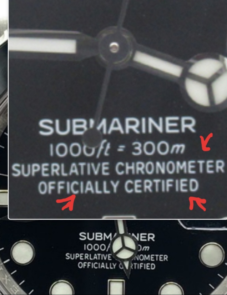
Look closely at some gen dials, they have it too. The rep dial makers have tried to copy these anomalies exactly.


Best not to get too hung up on these details. Rolex certainly doesn't.

In no other luxury brand will you find such a mashup of logos, brand marks, and fonts combined with such a sloppy, slapdash approach in using them.

Yo Rolex, your graphic designers all suck. My daughter could do a better job of typesetting that dial using MS Paint. And she's 7.
 
Last edited:
  • Like
Reactions: stufuse and KJ2020

KJ2020

Time Traveler
Supporter
12/3/18
35,565
70,860
113
I noticed this after reading your post about the uneven text.
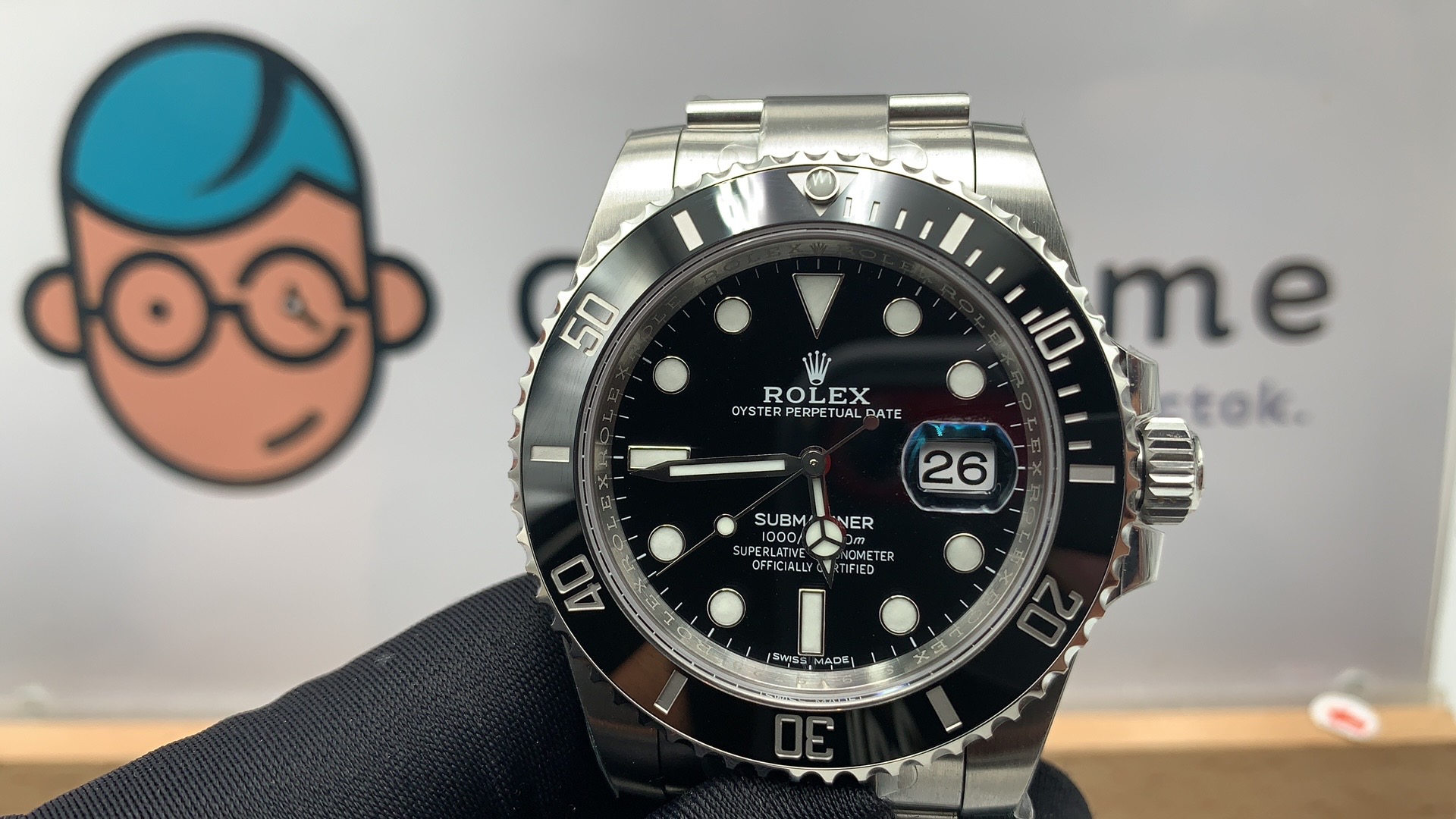
Wondering if there are different batches of the VSF, as there are two different dials.
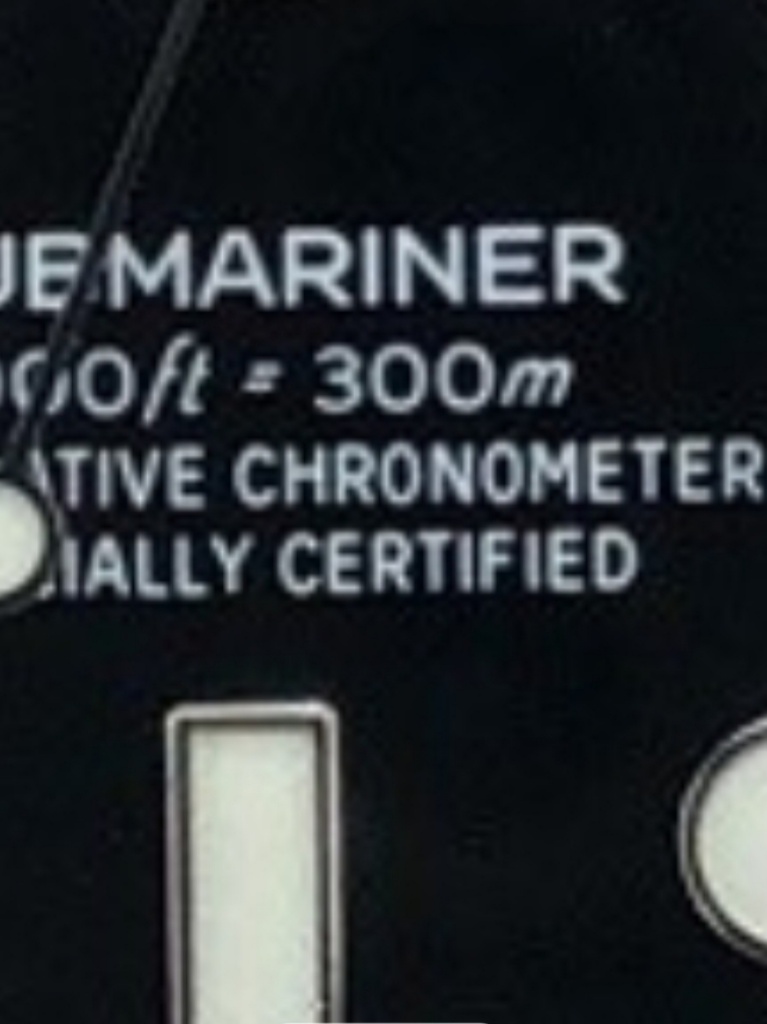
Jtime's QC looks more evenly spaced and no weird height difference for the 'C' and 'ED' letters.

ZHzVVR.jpg


I don't see that Jtime's QC dial is substantially different. Even with the second hand in the way I can tell the C is larger, and it's quite apparent to me that the ED is larger. Compare the spacing of the final ER in CHRONOMETER to the spacing between the RO.

You can't worry about this stuff. My gen GMT from 1990 has the large C and ED so this has been going on for a long long time.
 
  • Like
Reactions: DR Russell

mcchicken

Known Member
22/5/20
130
39
0
True, not trying to get hung up on the details.
The fact that they have two dial variations is making me nervous and raises some questions for me (and maybe others as well).

Is one dial variation better than the other, are there different batches, did they source the dial from a different factory, is it a different watch altogether, etc...

No thanks to Rolex...
 
Last edited:
  • Like
Reactions: DR Russell

qChella

Getting To Know The Place
11/3/18
53
6
8
EU
I think these look very good. I still prefer my RXF taking price into account, but these are very nice certainly.

Are there any Gen hands experts subscribed to this thread? If so, are these hands a bit flat maybe?

Im wondering about that too
 

mcchicken

Known Member
22/5/20
130
39
0
I don't see that Jtime's QC dial is substantially different. Even with the second hand in the way I can tell the C is larger, and it's quite apparent to me that the ED is larger. Compare the spacing of the final ER in CHRONOMETER to the spacing between the RO.

You can't worry about this stuff. My gen GMT from 1990 has the large C and ED so this has been going on for a long long time.

True, I am probably digging too much into the details.
No one will see it, that's for sure.
 
  • Like
Reactions: KJ2020

mariot

Active Member
22/2/19
309
209
43
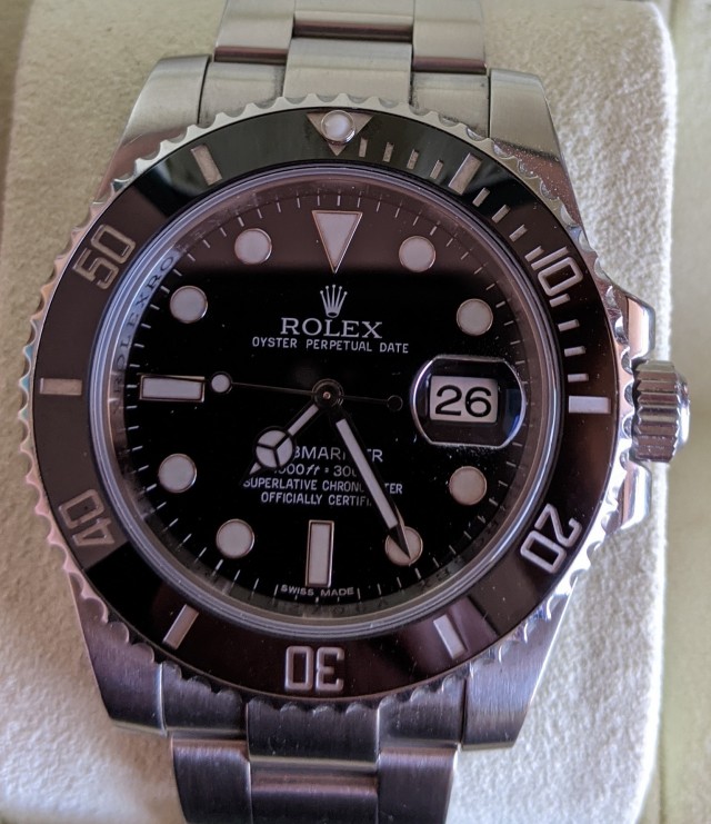
Date window and cyclops are not crooked. There is a little more white showing on the right side of the date numerals. This is as it should be at the view angle used. See post below for explanation.

Are my eyes deceiving me?

IIRC, dials with bold SUBMARINER text should have the little space before the Y in OFFICIALLY.

I try not to get too wrapped up in that anomaly, especially after seeing the other anomalies in those two lines of text.

I don't recall ever seeing this discussion in any Sub threads, but it was recently talked about in a GMT thread. There is uneven letter spacing near the end of CHRONOMETER. The letter C in OFFICIALLY and the letters ED in CERTIFIED are TALLER that the other letters. Also the letter F and even the last I in CERTIFIED look taller on many dials.

ZHzD22.jpg


Look closely at some gen dials, they have it too. The rep dial makers have tried to copy these anomalies exactly.

wrong post sorry..
 
Last edited:

mariot

Active Member
22/2/19
309
209
43
ZHjGZX.jpg


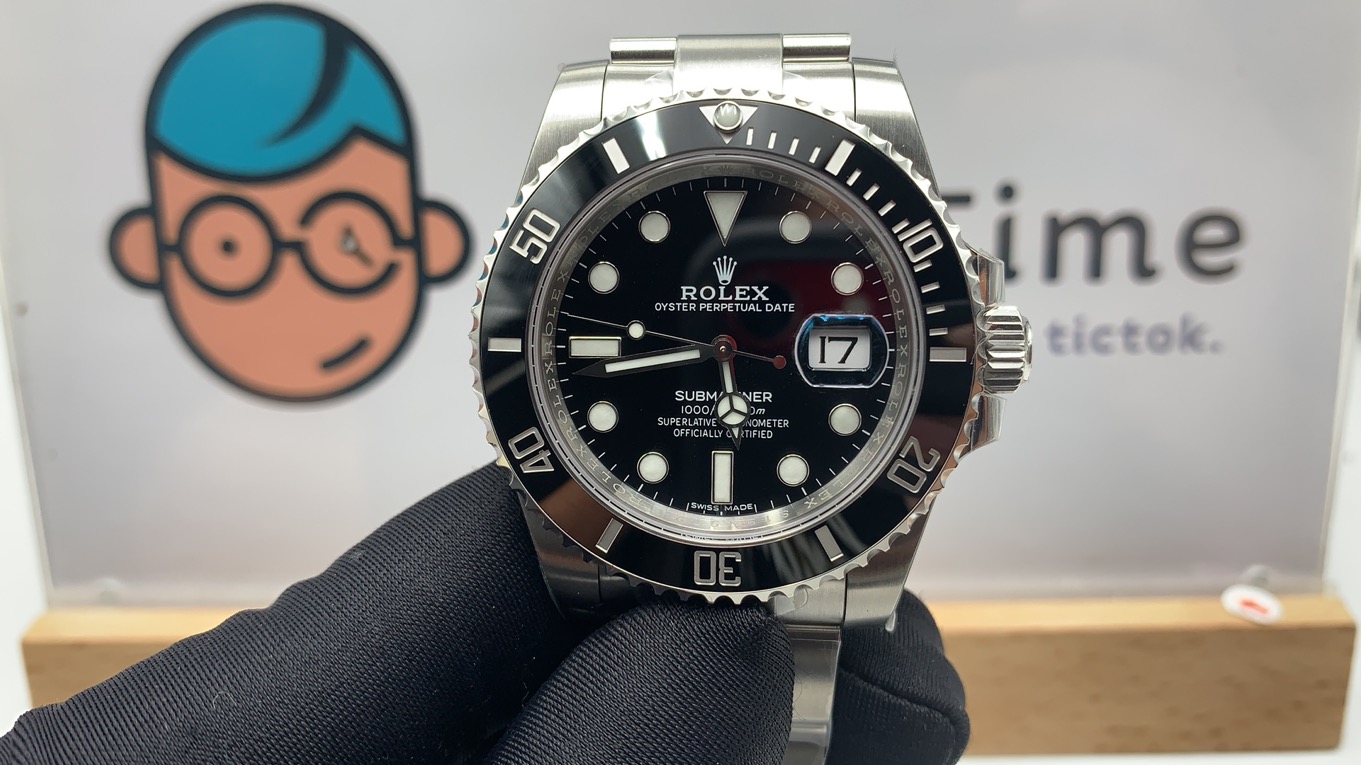
Does the date window and cyclops look crooked to you guys, and is the date left justified?
Is the text supposed to appear as OFFICIALLY or OFFICIALL-Y?
The last few QC pics that we've seen (namely from GeekTime) show the former and yet on his website his product images shows the latter.
OP has QC shooing the latter.

bold date wheel
 

mariot

Active Member
22/2/19
309
209
43
I have had gens with this bold date wheels...so we are good with this iteration of DW:)

for me the 26 is very bold. i have had more than 10 gens. trust me I'm not wrong about that

28-C00-BE8-5-EBA-49-F6-BD2-D-584-F0-EEEC334.jpg
 
Last edited:

stufuse

Respected Member
22/10/17
3,659
2,455
113
UK
better yes, but not right. look the 26 how bad is...


The light on the right is direct on the dial. The Dealer Pic is from Above fonts appear different & thinner in direct light.


Sent from my iPhone using Tapatalk
 

Substar

Active Member
16/9/20
302
343
0
Here is ‘26’ on my gen dw fitted to my arf 16610. Vsf is close enough. Older gen dw’s pre2015 tended to be thicker than current versions.
91707f7af31b0ee1c505a0b3be368e6d.jpg


Sent from my iPad using Tapatalk
 
  • Like
Reactions: KJ2020

stufuse

Respected Member
22/10/17
3,659
2,455
113
UK
Here is ‘26’ on my gen dw fitted to my arf 16610. Vsf is close enough. Older gen dw’s pre2015 tended to be thicker than current versions.
91707f7af31b0ee1c505a0b3be368e6d.jpg


Sent from my iPad using Tapatalk

The vsf is noticeably thicker


Sent from my iPhone using Tapatalk
 

beanvatan

Renowned Member
26/8/18
599
355
63
United States
I just pulled the trigger on this watch with Trusty. I will wait and see how mine looks. But, I am thinking to replace the VSF DW with the Gen DW later. Rip my wallet! Lol


Sent from my iPhone using Tapatalk
 

SS72

I'm Pretty Popular
Supporter
Certified
27/9/12
2,963
10,151
113
Australia
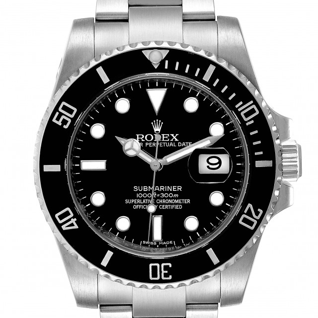
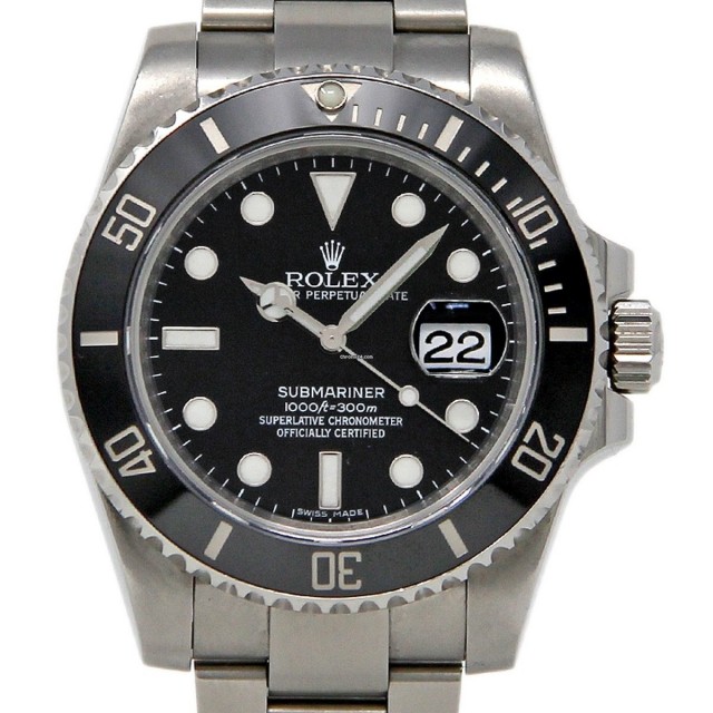
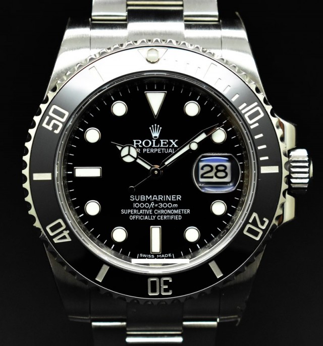
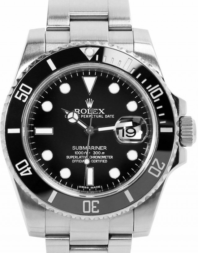
I've found a handful of images of what I believe to be gens, one of which I think is a stock Rolex image. (I'm certainly no expert and happy to be corrected.) They all appear to have fat DW font which is similar to the VSF. The Sub at the very bottom is my gen 2010, which also appears to be quite fat in the font.
ZHIIlj.md.jpg

ZHIqW1.md.jpg

ZHIidK.md.jpg

ZHIaI8.md.jpg

ZHIy2I.md.jpg
 
Last edited:

Heyterre

Known Member
Certified
17/8/20
130
45
28
Date window and cyclops are not crooked. There is a little more white showing on the right side of the date numerals. This is as it should be at the view angle used. See post below for explanation.

Are my eyes deceiving me?

IIRC, dials with bold SUBMARINER text should have the little space before the Y in OFFICIALLY.

I try not to get too wrapped up in that anomaly, especially after seeing the other anomalies in those two lines of text.

I don't recall ever seeing this discussion in any Sub threads, but it was recently talked about in a GMT thread. There is uneven letter spacing near the end of CHRONOMETER. The letter C in OFFICIALLY and the letters ED in CERTIFIED are TALLER that the other letters. Also the letter F and even the last I in CERTIFIED look taller on many dials.

ZHzD22.jpg


Look closely at some gen dials, they have it too. The rep dial makers have tried to copy these anomalies exactly.


Surprisingly Some Gen shows no space before the Y in OFFICIALLY, the rep factory copied exactly from gen
 

Heyterre

Known Member
Certified
17/8/20
130
45
28
Date window and cyclops are not crooked. There is a little more white showing on the right side of the date numerals. This is as it should be at the view angle used. See post below for explanation.

Are my eyes deceiving me?

IIRC, dials with bold SUBMARINER text should have the little space before the Y in OFFICIALLY.

I try not to get too wrapped up in that anomaly, especially after seeing the other anomalies in those two lines of text.

I don't recall ever seeing this discussion in any Sub threads, but it was recently talked about in a GMT thread. There is uneven letter spacing near the end of CHRONOMETER. The letter C in OFFICIALLY and the letters ED in CERTIFIED are TALLER that the other letters. Also the letter F and even the last I in CERTIFIED look taller on many dials.

ZHzD22.jpg


Look closely at some gen dials, they have it too. The rep dial makers have tried to copy these anomalies exactly.
KJ2020