Awesome work bro. You could use your vector files as they are, especially since they are being printed on irregular uneven surfaces. Your work is really close to the gen.
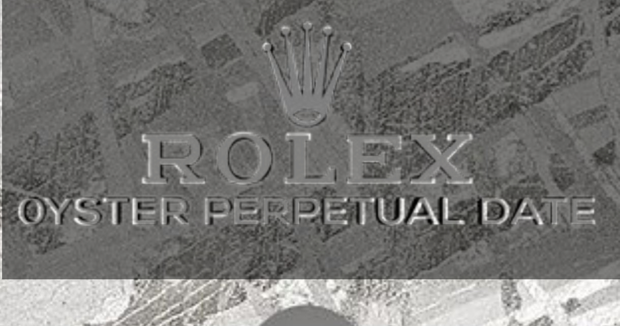
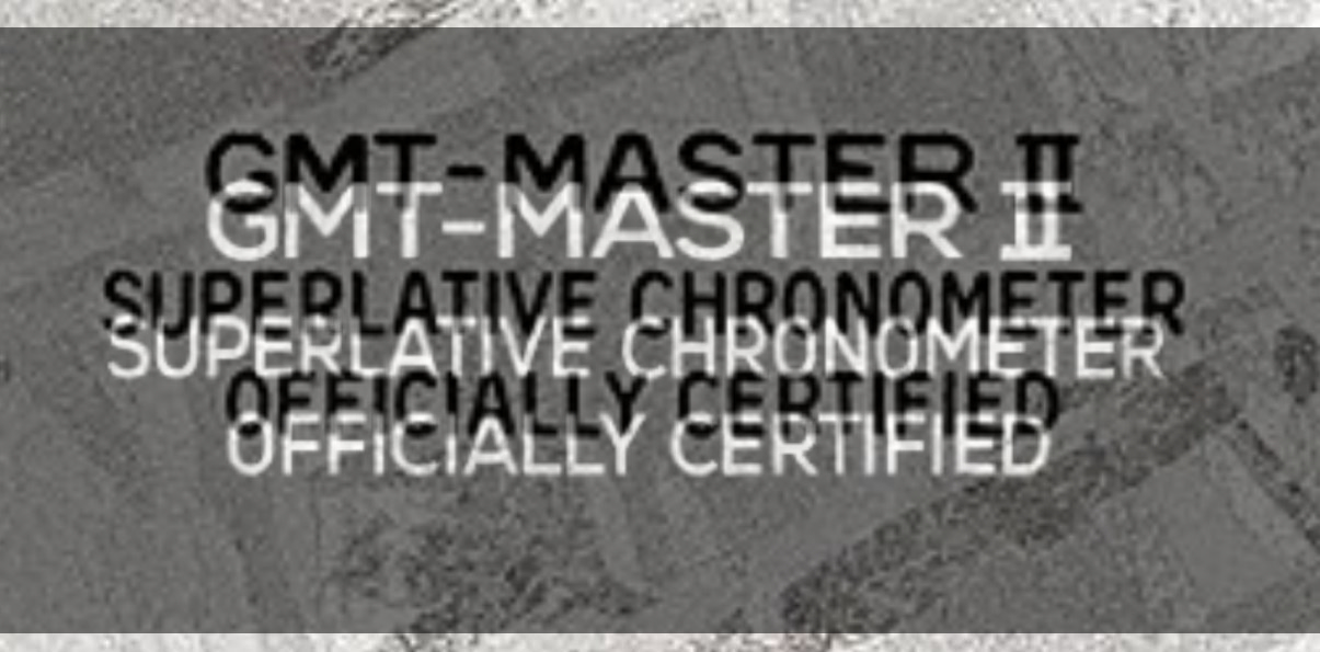
If you do want to tweak it it a little, here's what I see. I inverted your images so your text is white, and at 50% transparent you can see the gen next to and underneath it.
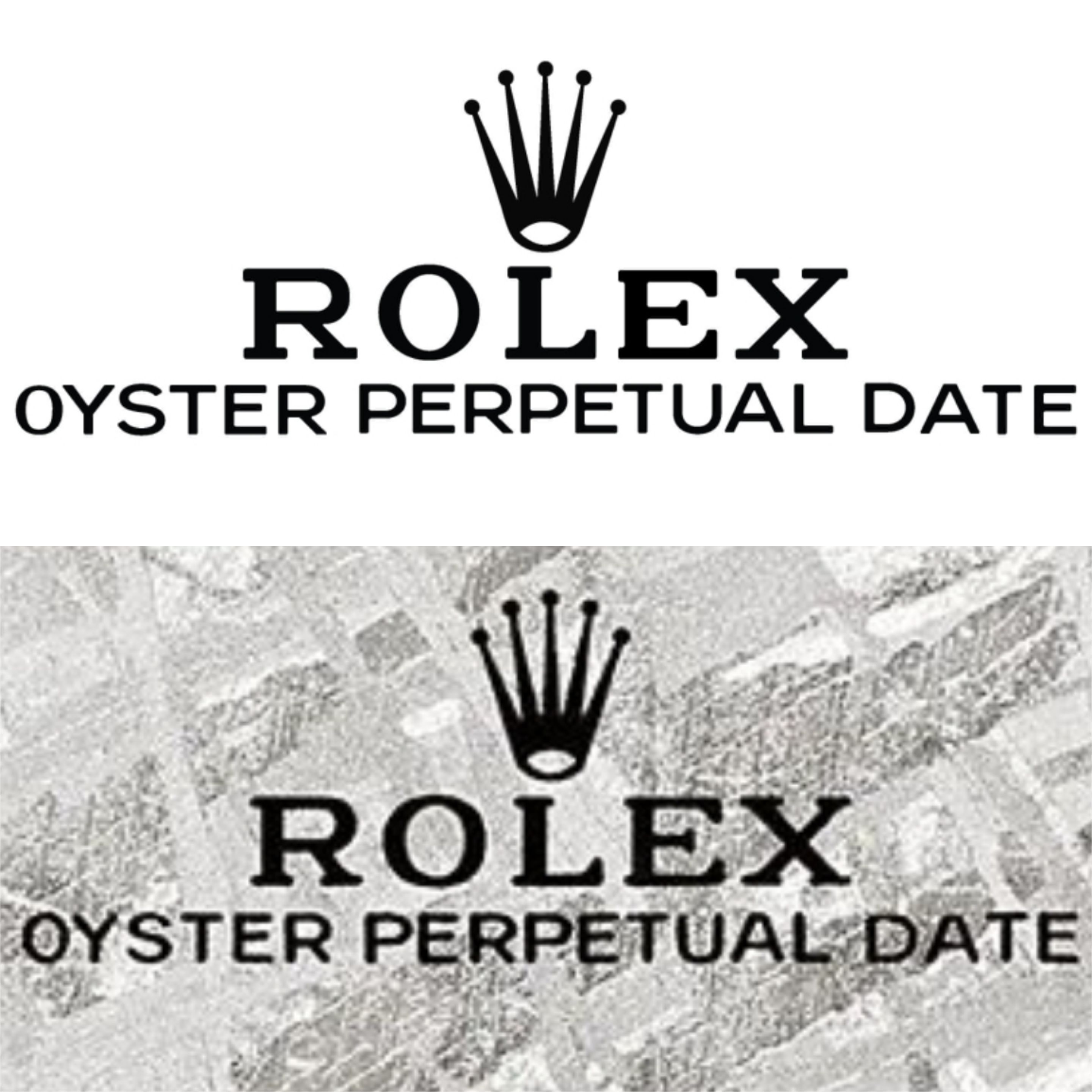
First two pics:
Some minor spacing issues near the end of PERPETUAL and in DATE
Also your fonts are perfect and symmetrical, the gen fonts are not. On the gen, the following are notable differences
T - shorter top bar
E - middle bar is top justified
P - top curved opening is top justified
A - top has a longer bar
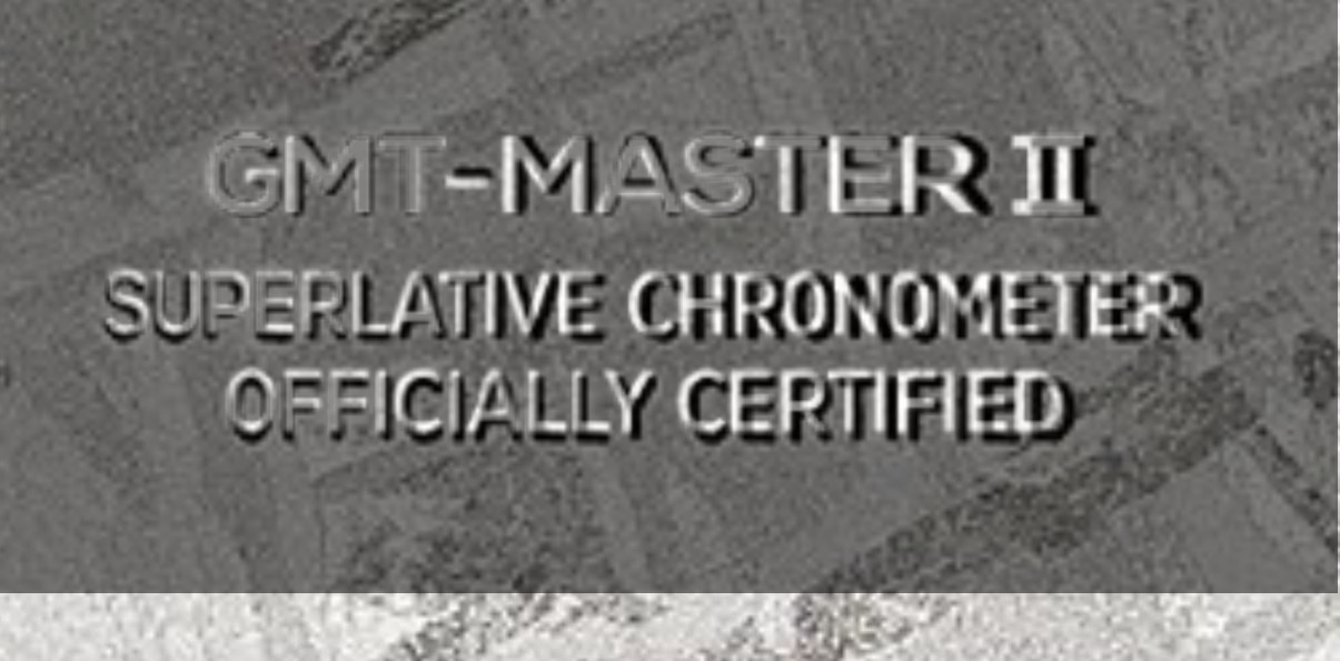
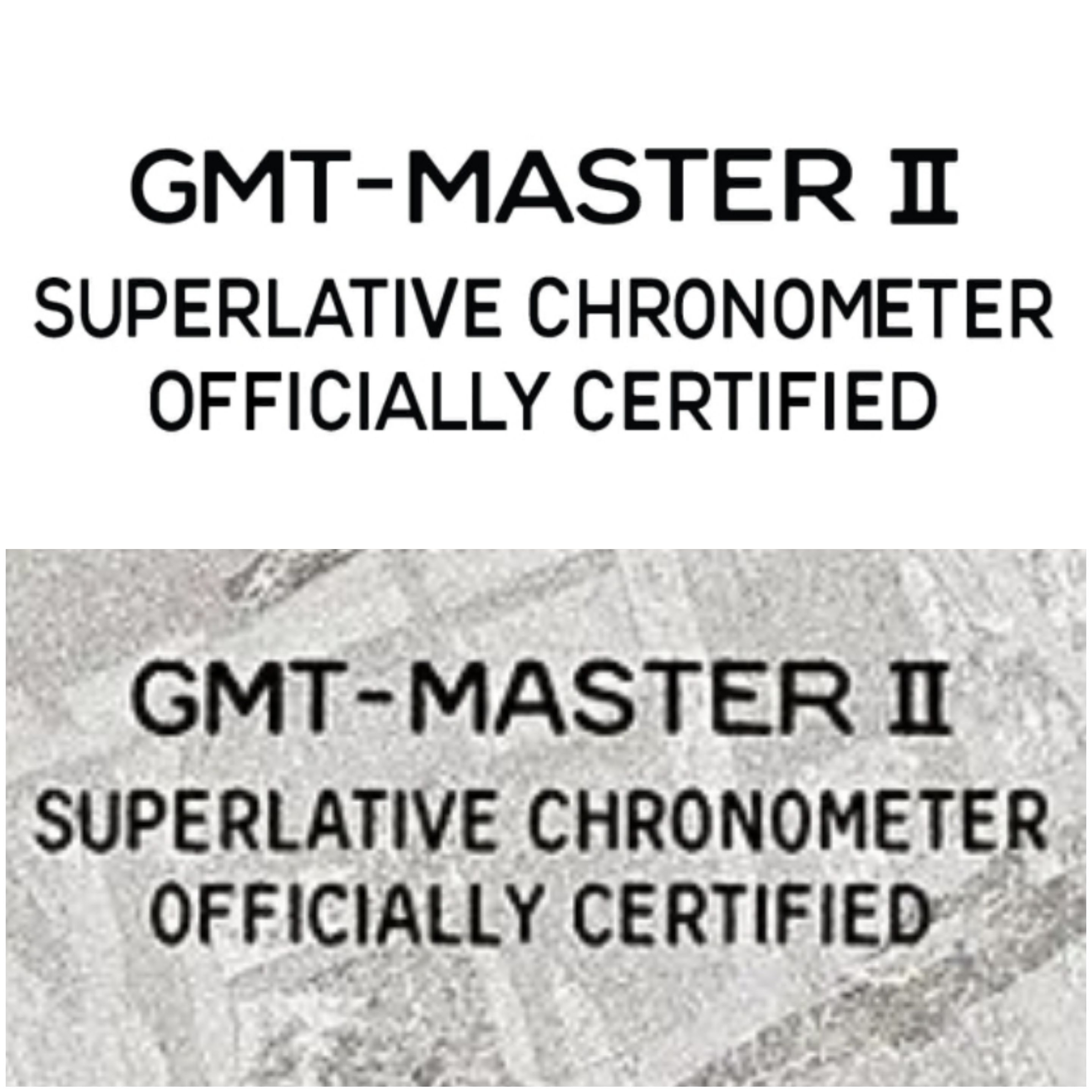
Next two pics:
Again minor spacing issues toward the end of the lines, last line of text minor vertical spacing issue.
Same slight font differences, also the C's are more noticeably different since Rolex has a very distinct letter C in these text lines.
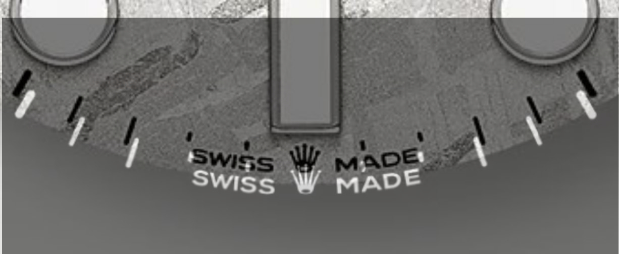
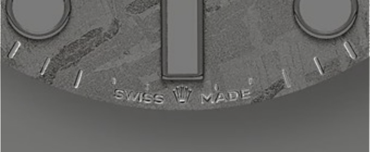
Next two pics:
Looks fine really, the A and D in MADE are a little different - fat D on the gen
Again like I said you could roll with it, I'm being picky but that's what we do here right? If you only did two things I would fix the spacing and the letter C's in the bottom lines of text. Those would have to be done individually by stretching the vector points rather than using a set font letter. But It would be worth it IMO, those letters have been like that on Rolex dials forever and a normal C just doesn't look right there.
