There are several threads, bits, thoughts and pictorials on RWI, RWG and Repgeek, but I couldn’t find a proper review on the 5205. One of the good threads is from _DC_ from 2016 on RWG on the version released back then.
I apologize to the gentlemen who have written their thoughts already and shared their pictures in the thread here. But this is one of Patek’s special watches, and I think it deserves its own review thread.
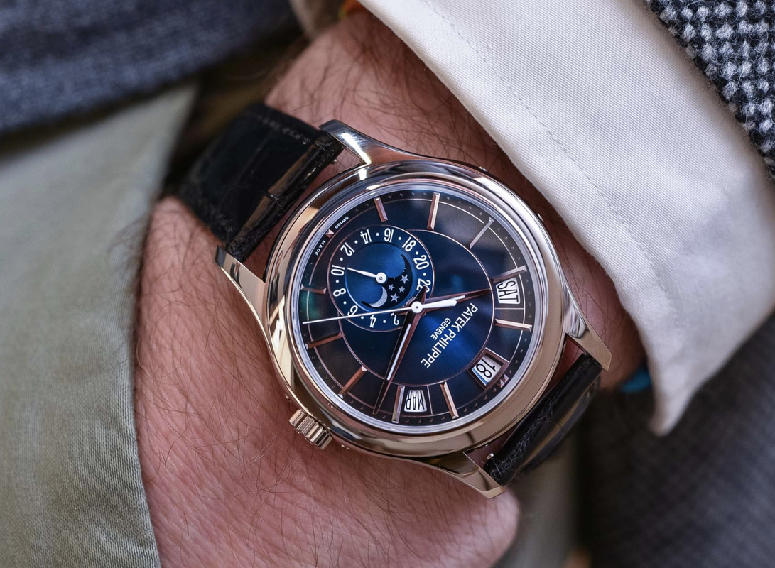
The modern gentleman
Every one of us is surrounded by technology nowadays. We use computers at our jobs, our smartphone brings the work home, we are flooded by social media. The big tech corporates make us dependent on devices we didn’t know we needed. Could we even breath before there was a smart watch or a tablet?
Our smartwatches and smartphones can easily tell us the time and date. Even more precise than a mechanical watch ever will.
However, there are those among us, who cherish mechanical things. Who dislike the constant disturbance of devices and social media. Who like to control their presence in the now and being in control of using the devices to their benefit, and not let themselves be consumed by them.
The watch in question here is made for that modern gentleman, who needs a practical watch.
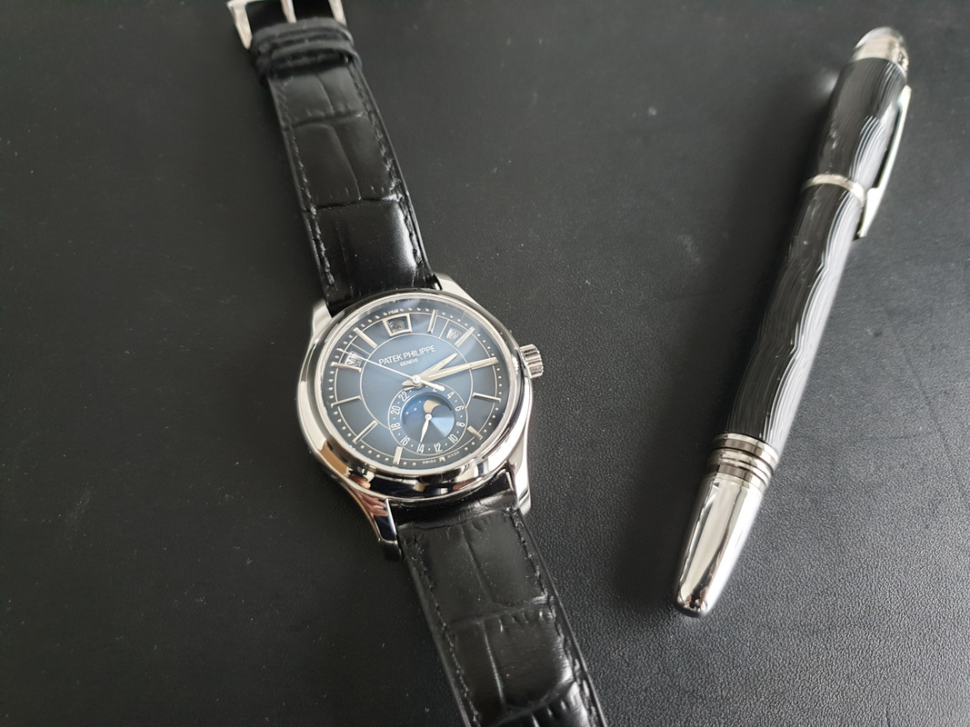
And this watch is a very practical annual calendar. It shows you the seconds, minute, hours, day, date and month. And it has a 24-hour GMT function and a moon phase display. And it does it in such a style, that no gismo made to date can keep up.
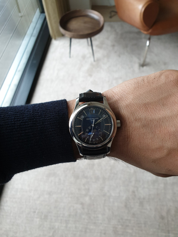
Patek Philippe and the annual calendar
Patek Philippe is known for complex watches and inventions. In 1996 Patek Philippe invented the annual calendar, which only requires adjustment in February every year. It accounts for the variations in length of months. The perpetual calendar can take leap years into account and only requires adjustment in year 2100, because the Gregorian calendar exceptionally will ignore the leap year on that year.
With the annual calendar, Patek gave watch enthusiasts the option of a practical watch, which is more affordable than a perpetual calendar.
The 5205 line was introduced in 2010; the ref 5205G-001 in white gold and the 5205G-010. In 2013 the 5205R-001 and 5205R-010 where added. And the latest addition was the 5205G-013 in 2018.
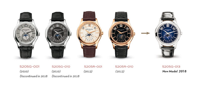
The gen
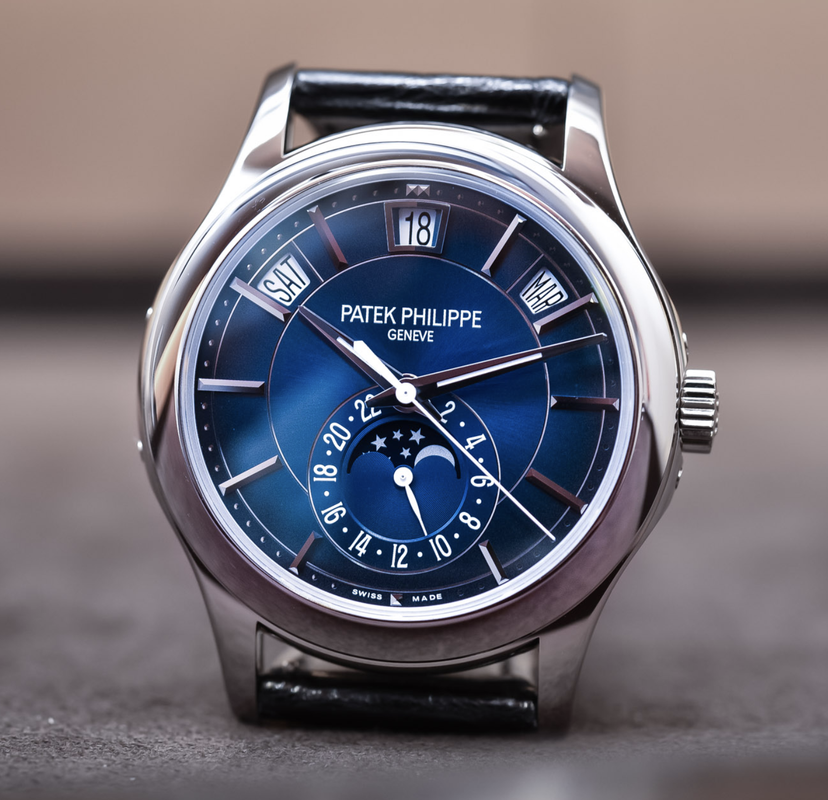
The 5205G-013 has a gradient sunburst blue-black dial, giving the watch a vibrant look and was therefore called the young man’s Patek by Monochrome Watches.
It has a concave bezel and skeletonized shaped lugs. The case in white gold is beautifully curved. The diameter is 40mm and the height is 11.36mm. It comes with a Shiny black alligator strap with an RRP of 43500 euro (EU price incl. taxes). Movement is an automatic caliber 324 S QA LU 24H/206 with 35-45h PR running at 4hz (28800vph).
The rep
Facts first:
This rep is a GRF version, which was released in July 2019.
Measures: I can confirm the rep to be 40mm in diameter and thickness is approx. 11mm.
The GRF version comes in a 5205G-001, 5205G-010 and the 5205G-013. I haven’t yet seen the rose gold versions in GRF.
Hands:
The hands have the right shape, length and color. The hour/minute hand though is two-facetted in the rep, while it is three-facetted on the gen. This is not noticeable though. It’s a small detail. Hour/minute hand are lumed true to gen.
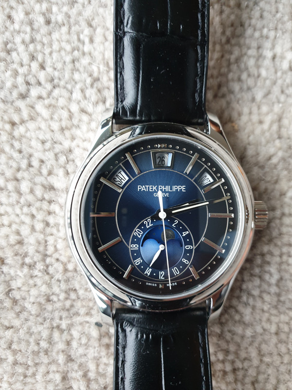
Case:
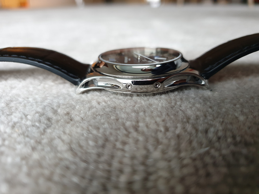
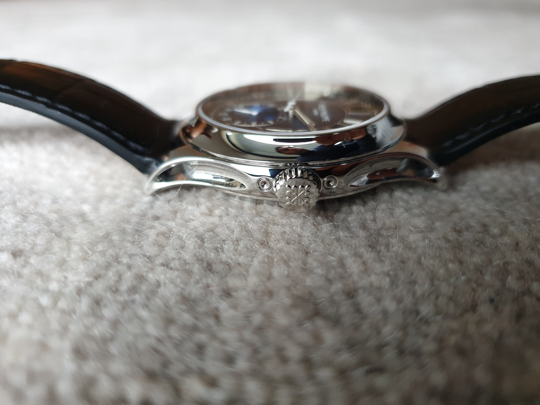
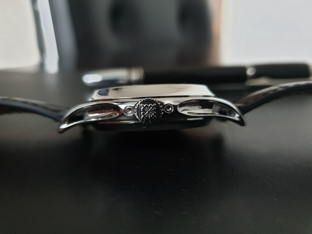
The case is remarkably beautiful, also in the mirror polished finishing. It has the same skeletonized lugs as the gen. On the sides they are concave and skeletonized, which is stuning. It has the thick bezel which is slightly convex like the gen and it makes the watch appear smaller, as it takes a few mm from the dial and because it is sloped.
It’s the same aesthetic design line as the 5227, 5207 and 5960.
Movement:
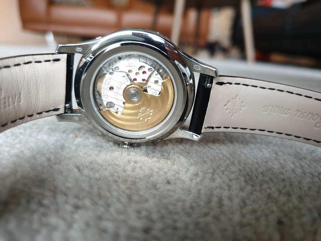
Movement is a decorated Miyota, which is modified.
The measurements from the TD shows a precision of +11,5s/day, same frequency as the gen: 4hz (28800vph), amplitude is 281degree, with a beat error of 0,2ms and a lift angle of 52degres. All which is fine.
The finishing (read decoration) on the movement is great IMO. The balance wheel is placed at 6 with the balance cock going out to 7, like the gen and the decoration plates are correctly shaped and placed. The engravings are fine. No big typhos other than it says: “Adjusted to Heat Gold Isochronism” instead of “Cold”. But for this you almost nead a loupe to see it. Difficult to see with the naked eye.
The rotor has the same shape, striping, color and PP cross as the gen, but the silvery area around the central screw is slightly bigger in the rep.
Functions:
Here it gets interesting. We have a Patek rep at hand where 7 of 8 functions are working more or less like the gen:
For me this watch is good enough functionally!
The recessed pusher at 10 can be pushed to set the day
The crown is unscrewed and the watch can then be manually wound also at position 1. The date can be changed with the crown in position 2. The hour/minutes are set at position 3. The seconds stop at position 3 for precise time-setting.
Strap:
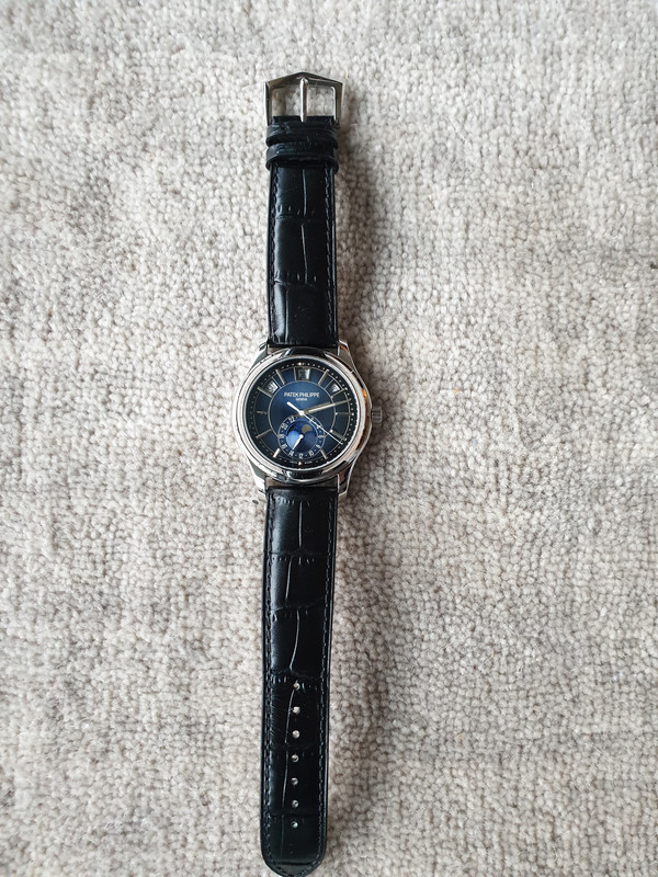
The rep strap is the usual crap. For the sake of the pictures I have manually softened it by bending it together, and given it leather balsam. It makes it sit much better on the wrist.
Measurements
Gen strap is 19/18 mm (lug/buckle width). Rep I measured to 20m at lugs and 18mm at buckle, and I mounted it on a 20/18 strap to confirm this. The rep has straight lugs and a quick release interchangeable system.
Actually, Puretime did me on this by sending a QC picture showing the strap is 19mm at the lug. And I have already ordered a CF strap for it, which is not going to fit. I sent CF a mail to ask if they could change it to 20mm, but it was ready to ship out. So the loss of 305 euro is on me.
Lesson learned. Never order a strap on basis of the TD’s measurements.
Pin buckle looks similar to the gen.
Dial:
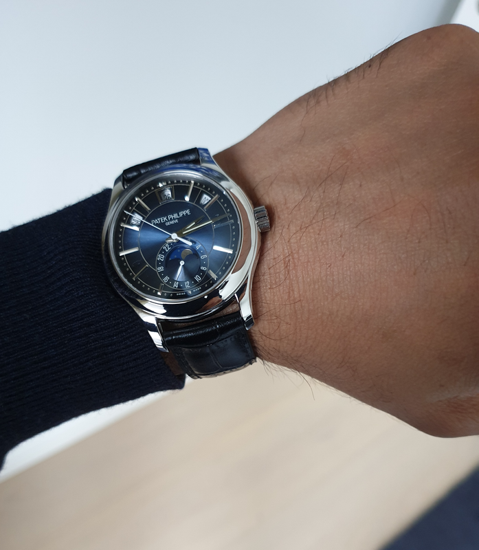
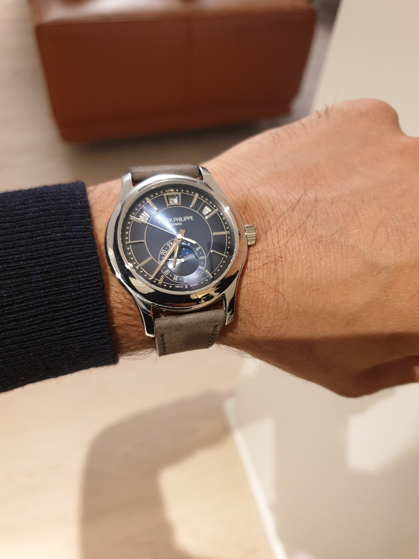
The dial color is beautiful and is the same vibrant blue-black gradient shade as the gen. This they have done really well. You can judge on the pictures.
The minute track has a slightly bigger distance to the bezel than the gen - a not-so-visible-on-wrist detail.
Date apertures:
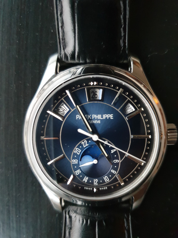
The font and size of the day and date are correct. The date is what will separate people about this rep:
The font is wrong and is smaller and the date wheel is sunken. They placed a little crystal in the front of it.
This is maybe the biggest flaw in the watch, but it’s not a big deal on the wrist. It’s visible when the watch is examined but not very noticeable on the wrist.
There are three wheels in the vicinity and they had to make it sunken to make all three wheels functional. An acceptable compromise in my opinion. And understandable.
The moon phase:
Color: The moon and stars are silver, while in the gen they are white.
Shape: At night from 8.30 pm to 4.30 am the crescent moon is visible. The gen has two full moons. The stars on the gen are slightly bigger and fewer.
But this I think is maybe moddable if the moon phase dial is painted, but I’m not sure. You don’t notice the moon on the wrist a lot and i don't think others will notice that it’s a day/night indicator. As it moves slowly and is small. But this is a highly avoidable mistake by GR Factory. But i think instead of using ressources on printing new moon phase subdials they used some prefabricated existing ones to keep costs down.
On the wrist:
The rep wears really nice on the wrist. It’s amazing. And I mean this. The lugs are short and downward curved and the watch is perfectly balanced between diameter and thickness. The skeletonized lugs are a great detail. It is truly stunning on the wrist and really comfortable. The dial is amazing. It wears more like a 39mm watch. Because of the proportions, bezel convexity and the lugs.
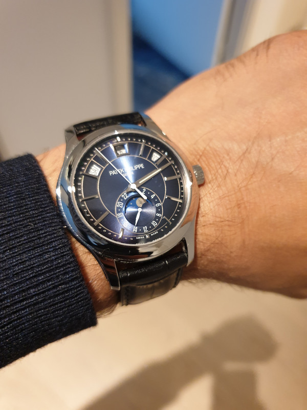
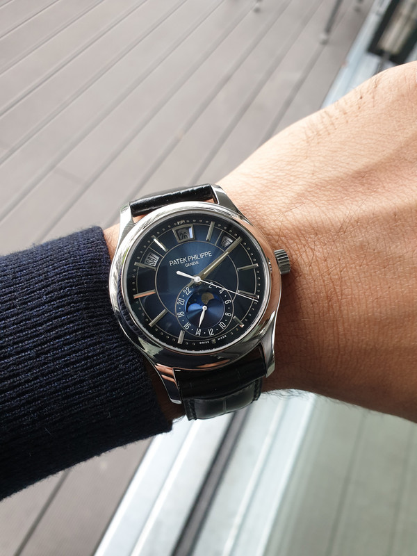
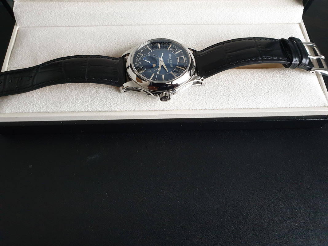
As you can see in these pictures the shade of blue is a bit dark. I tried putting it on A Collected Man grey nubuck strap. And it looks great. Also the dial color changes and looks more baby blue in appearance. Amazing:
Other versions of this rep:
GRF:
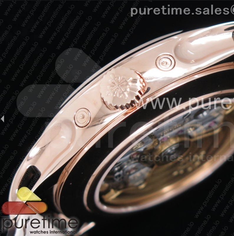
KMF:
Conclusion
What I especially like about this watch is the very traditional look of the shaped and rounded case and curved lugs. At the same time the gradient blue dial gives it a very modern and vibrant look. The dial changes color from a sunburst electric blue to dark blue/black depending on the lighting. The aesthetics of the watch are the same as the Calatrava 5227, 5207 and the 5960 / 5961. This has become one of Patek’s recognizable designs. They once again have succeeded in making a distinctive look for a line of their watch collection. And with this rep you can get a piece of all that.
Yes, there are compromises you must be willing to make. The moon phase is a day night indicator with a crescent moon, it’s silver instead of white. The datewheel is sunken and the font is smaller. My bet is, nobody else will notice. As people aren’t looking detailed at your watch for a longer time.
This watch is not for those who are looking for an almost flawlessly close-to-gen rep. This watch is for the gentleman who has other watches in the arsenal and therefore can accept the flaws it has. Make sure to get one with aligned date complications and you get to enjoy a complicated Patek with a functional calendar. It needs adjustment once a month, but who wears the same watch for a whole month anyway?
Its aesthetically pleasing and practical and I am simply loving it!
I apologize to the gentlemen who have written their thoughts already and shared their pictures in the thread here. But this is one of Patek’s special watches, and I think it deserves its own review thread.

The modern gentleman
Every one of us is surrounded by technology nowadays. We use computers at our jobs, our smartphone brings the work home, we are flooded by social media. The big tech corporates make us dependent on devices we didn’t know we needed. Could we even breath before there was a smart watch or a tablet?
Our smartwatches and smartphones can easily tell us the time and date. Even more precise than a mechanical watch ever will.
However, there are those among us, who cherish mechanical things. Who dislike the constant disturbance of devices and social media. Who like to control their presence in the now and being in control of using the devices to their benefit, and not let themselves be consumed by them.
The watch in question here is made for that modern gentleman, who needs a practical watch.

And this watch is a very practical annual calendar. It shows you the seconds, minute, hours, day, date and month. And it has a 24-hour GMT function and a moon phase display. And it does it in such a style, that no gismo made to date can keep up.

Patek Philippe and the annual calendar
Patek Philippe is known for complex watches and inventions. In 1996 Patek Philippe invented the annual calendar, which only requires adjustment in February every year. It accounts for the variations in length of months. The perpetual calendar can take leap years into account and only requires adjustment in year 2100, because the Gregorian calendar exceptionally will ignore the leap year on that year.
With the annual calendar, Patek gave watch enthusiasts the option of a practical watch, which is more affordable than a perpetual calendar.
The 5205 line was introduced in 2010; the ref 5205G-001 in white gold and the 5205G-010. In 2013 the 5205R-001 and 5205R-010 where added. And the latest addition was the 5205G-013 in 2018.

The gen
The 5205G-013 has a gradient sunburst blue-black dial, giving the watch a vibrant look and was therefore called the young man’s Patek by Monochrome Watches.
It has a concave bezel and skeletonized shaped lugs. The case in white gold is beautifully curved. The diameter is 40mm and the height is 11.36mm. It comes with a Shiny black alligator strap with an RRP of 43500 euro (EU price incl. taxes). Movement is an automatic caliber 324 S QA LU 24H/206 with 35-45h PR running at 4hz (28800vph).

The rep
Facts first:
This rep is a GRF version, which was released in July 2019.
Measures: I can confirm the rep to be 40mm in diameter and thickness is approx. 11mm.
The GRF version comes in a 5205G-001, 5205G-010 and the 5205G-013. I haven’t yet seen the rose gold versions in GRF.
Hands:
The hands have the right shape, length and color. The hour/minute hand though is two-facetted in the rep, while it is three-facetted on the gen. This is not noticeable though. It’s a small detail. Hour/minute hand are lumed true to gen.

Case:
The case is remarkably beautiful, also in the mirror polished finishing. It has the same skeletonized lugs as the gen. On the sides they are concave and skeletonized, which is stuning. It has the thick bezel which is slightly convex like the gen and it makes the watch appear smaller, as it takes a few mm from the dial and because it is sloped.
It’s the same aesthetic design line as the 5227, 5207 and 5960.


Movement:
Movement is a decorated Miyota, which is modified.
The measurements from the TD shows a precision of +11,5s/day, same frequency as the gen: 4hz (28800vph), amplitude is 281degree, with a beat error of 0,2ms and a lift angle of 52degres. All which is fine.
The finishing (read decoration) on the movement is great IMO. The balance wheel is placed at 6 with the balance cock going out to 7, like the gen and the decoration plates are correctly shaped and placed. The engravings are fine. No big typhos other than it says: “Adjusted to Heat Gold Isochronism” instead of “Cold”. But for this you almost nead a loupe to see it. Difficult to see with the naked eye.
The rotor has the same shape, striping, color and PP cross as the gen, but the silvery area around the central screw is slightly bigger in the rep.

Functions:
Here it gets interesting. We have a Patek rep at hand where 7 of 8 functions are working more or less like the gen:
- Hour, minutes, seconds, day, date and the 24-hour GMT hand works like in the gen. You understood correctly: Day and date change after midnight.
- The month can be changed also, but requires pushing the recessed pusher at 2. It doesn’t change automatically.
For me this watch is good enough functionally!
The recessed pusher at 10 can be pushed to set the day
The crown is unscrewed and the watch can then be manually wound also at position 1. The date can be changed with the crown in position 2. The hour/minutes are set at position 3. The seconds stop at position 3 for precise time-setting.
Strap:
The rep strap is the usual crap. For the sake of the pictures I have manually softened it by bending it together, and given it leather balsam. It makes it sit much better on the wrist.
Measurements
Gen strap is 19/18 mm (lug/buckle width). Rep I measured to 20m at lugs and 18mm at buckle, and I mounted it on a 20/18 strap to confirm this. The rep has straight lugs and a quick release interchangeable system.
Actually, Puretime did me on this by sending a QC picture showing the strap is 19mm at the lug. And I have already ordered a CF strap for it, which is not going to fit. I sent CF a mail to ask if they could change it to 20mm, but it was ready to ship out. So the loss of 305 euro is on me.
Lesson learned. Never order a strap on basis of the TD’s measurements.
Pin buckle looks similar to the gen.

Dial:
The dial color is beautiful and is the same vibrant blue-black gradient shade as the gen. This they have done really well. You can judge on the pictures.
The minute track has a slightly bigger distance to the bezel than the gen - a not-so-visible-on-wrist detail.

Date apertures:
The font and size of the day and date are correct. The date is what will separate people about this rep:
The font is wrong and is smaller and the date wheel is sunken. They placed a little crystal in the front of it.
This is maybe the biggest flaw in the watch, but it’s not a big deal on the wrist. It’s visible when the watch is examined but not very noticeable on the wrist.
There are three wheels in the vicinity and they had to make it sunken to make all three wheels functional. An acceptable compromise in my opinion. And understandable.

The moon phase:
Color: The moon and stars are silver, while in the gen they are white.
Shape: At night from 8.30 pm to 4.30 am the crescent moon is visible. The gen has two full moons. The stars on the gen are slightly bigger and fewer.
But this I think is maybe moddable if the moon phase dial is painted, but I’m not sure. You don’t notice the moon on the wrist a lot and i don't think others will notice that it’s a day/night indicator. As it moves slowly and is small. But this is a highly avoidable mistake by GR Factory. But i think instead of using ressources on printing new moon phase subdials they used some prefabricated existing ones to keep costs down.
On the wrist:
The rep wears really nice on the wrist. It’s amazing. And I mean this. The lugs are short and downward curved and the watch is perfectly balanced between diameter and thickness. The skeletonized lugs are a great detail. It is truly stunning on the wrist and really comfortable. The dial is amazing. It wears more like a 39mm watch. Because of the proportions, bezel convexity and the lugs.


As you can see in these pictures the shade of blue is a bit dark. I tried putting it on A Collected Man grey nubuck strap. And it looks great. Also the dial color changes and looks more baby blue in appearance. Amazing:

Other versions of this rep:
- The main other versions of this rep is one from 2016, which didn’t have a functional calendar. Only the date changed. Moonphase was off course a day/night indicator and it had a crescent moon at night like all other rep versions of this watch.
- KMFversion from January 2019 and the KMF from july 2018: Same as above mentioned regarding the visuals/function of the moon. Main difference being a functional calendar like the GRF, but there were some extra flaws:
- The blue dial of the KMF was done before Patek released the 5205G-013. Therefore it is not the same shade and it is not a gradient blue-black color. Maybe KMF made Patek release the -013 and they wanted to improve the colors?
- Case size and shape in the KMF is less close to gen. The recessed pushers are too far apart and the watch is 42mm and 13mm in diameter, which is much bigger than the GRF.
GRF:

KMF:

Conclusion
What I especially like about this watch is the very traditional look of the shaped and rounded case and curved lugs. At the same time the gradient blue dial gives it a very modern and vibrant look. The dial changes color from a sunburst electric blue to dark blue/black depending on the lighting. The aesthetics of the watch are the same as the Calatrava 5227, 5207 and the 5960 / 5961. This has become one of Patek’s recognizable designs. They once again have succeeded in making a distinctive look for a line of their watch collection. And with this rep you can get a piece of all that.
Yes, there are compromises you must be willing to make. The moon phase is a day night indicator with a crescent moon, it’s silver instead of white. The datewheel is sunken and the font is smaller. My bet is, nobody else will notice. As people aren’t looking detailed at your watch for a longer time.
This watch is not for those who are looking for an almost flawlessly close-to-gen rep. This watch is for the gentleman who has other watches in the arsenal and therefore can accept the flaws it has. Make sure to get one with aligned date complications and you get to enjoy a complicated Patek with a functional calendar. It needs adjustment once a month, but who wears the same watch for a whole month anyway?
Its aesthetically pleasing and practical and I am simply loving it!
Last edited:

