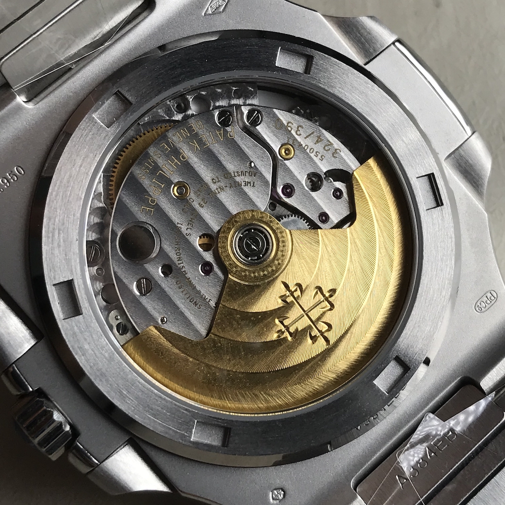
-
Tired of adverts on RWI? - Subscribe by clicking HERE and PMing Trailboss for instructions and they will magically go away!
You are using an out of date browser. It may not display this or other websites correctly.
You should upgrade or use an alternative browser.
You should upgrade or use an alternative browser.
Nautilus 40th Anniversary Rep
- Thread starter Mayor_McCheese
- Start date
Anadrol5
Active Member
- 14/10/18
- 254
- 192
- 43
Its quite hard to tell from the first pic because of angle but from the second pic (back of the watch) it looks like you have the correct V2 (non-fat first link ) bracelet.
I have never been interested in how the movement looks like because in the circle of people I mingle with no-one will ever ask to see my watch (and therefore no-one will ever see the back of my watch). For this reason I dont know whether this movement is engraved or printed.
What I pay particular attention to in this rep is whether there is a gap between the crown and the case ie- whether the tube that holds the crown is showing when the crown is fully screwed in. I have seen some QC pics in this thread that I personally would reject because of this issue. Your piece seems to be particularly good in this regard because I see absolutely no gap. It is even better than the one I accepted.
Seeing that all the other issues you should look for are in order I would accept this piece in a hurry before it goes to someone else
Thanks for your help! I’ve accepted the watch
It might be only lighting. Ask other photos from different angles.
Anadrol5
Active Member
- 14/10/18
- 254
- 192
- 43
Alright gentlemen (ladies) I received my watch yesterday and here is a little review.
The dial of this watch has very contrasting characters depending on the lighting conditions. Indoors the dial will appear very dark (almost black) and no detail can be seen. Even the '40th Anniversary' lettering cannot be made out.
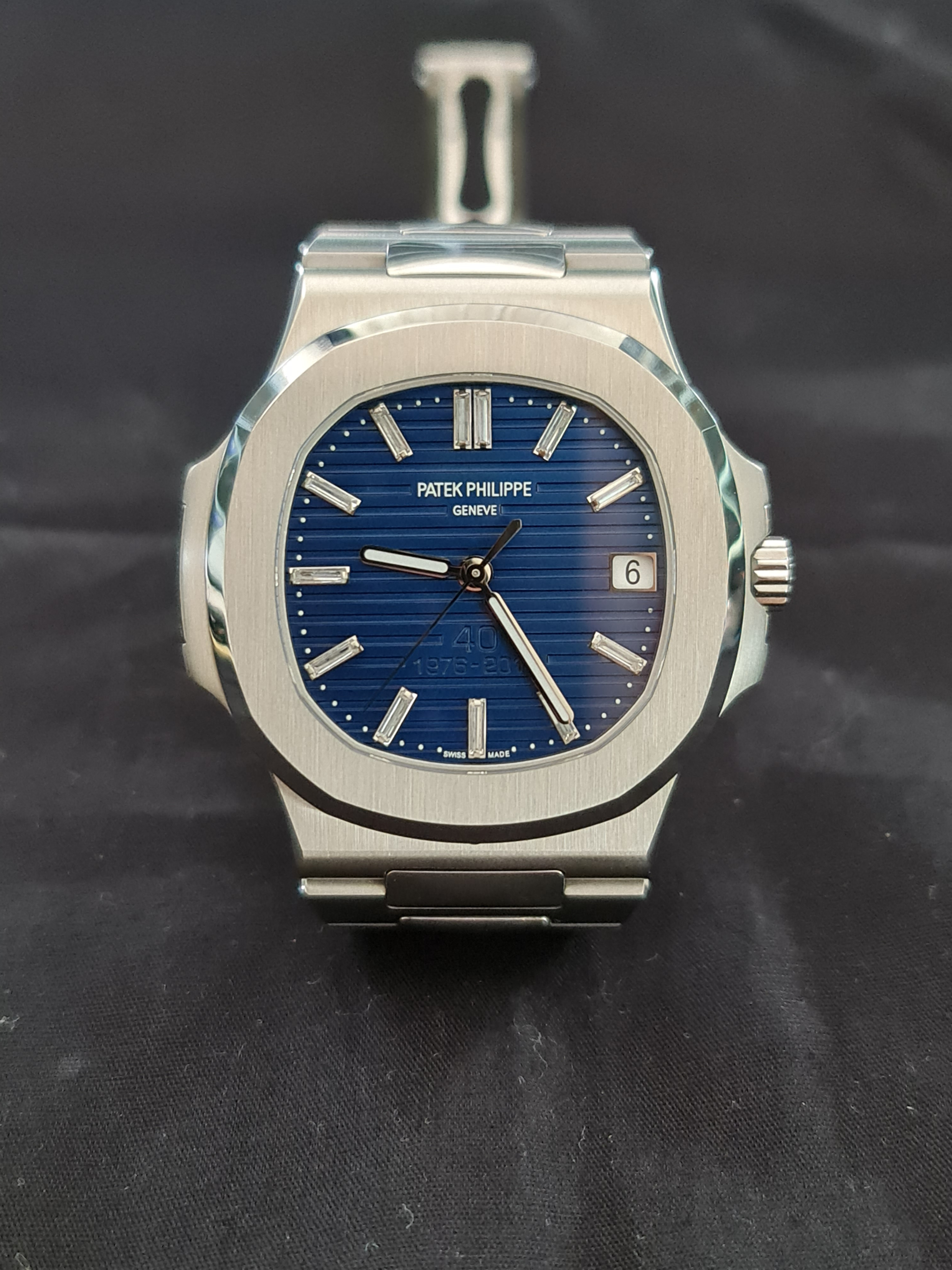
This pic was taken at 2X zoom and does not really convey what I am saying. Just take it from me that indoors, at wrist distance, nothing can be made out. Also, in this zoomed pic the 9 O'clock marker looks like its going to fall off but, trust me, in real life nothing like this can be seen.
The dial however very much comes alive under lights, be it natural or artificial.
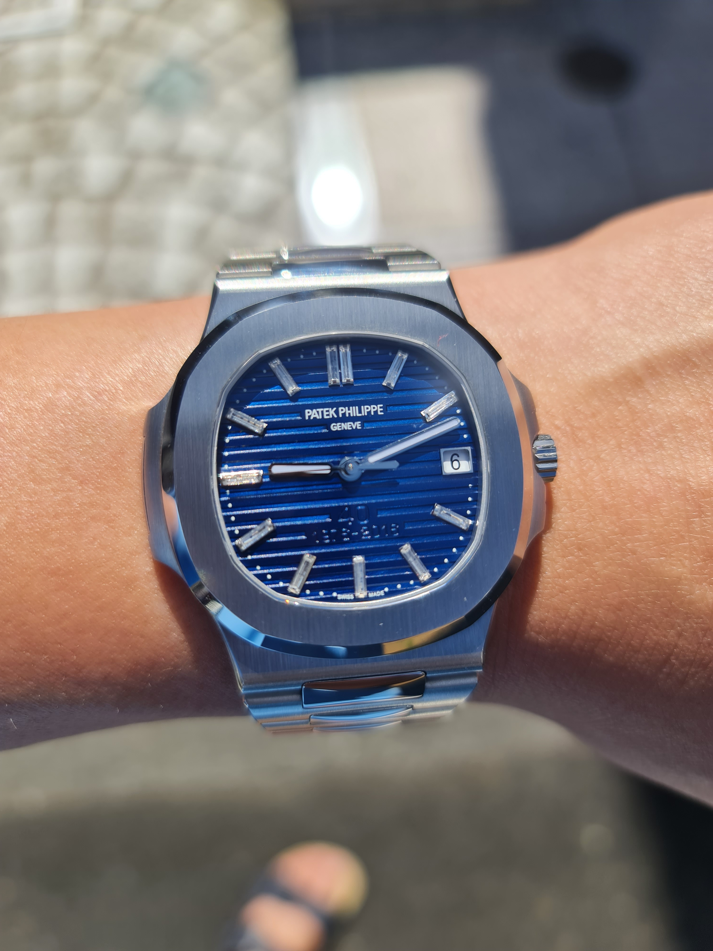
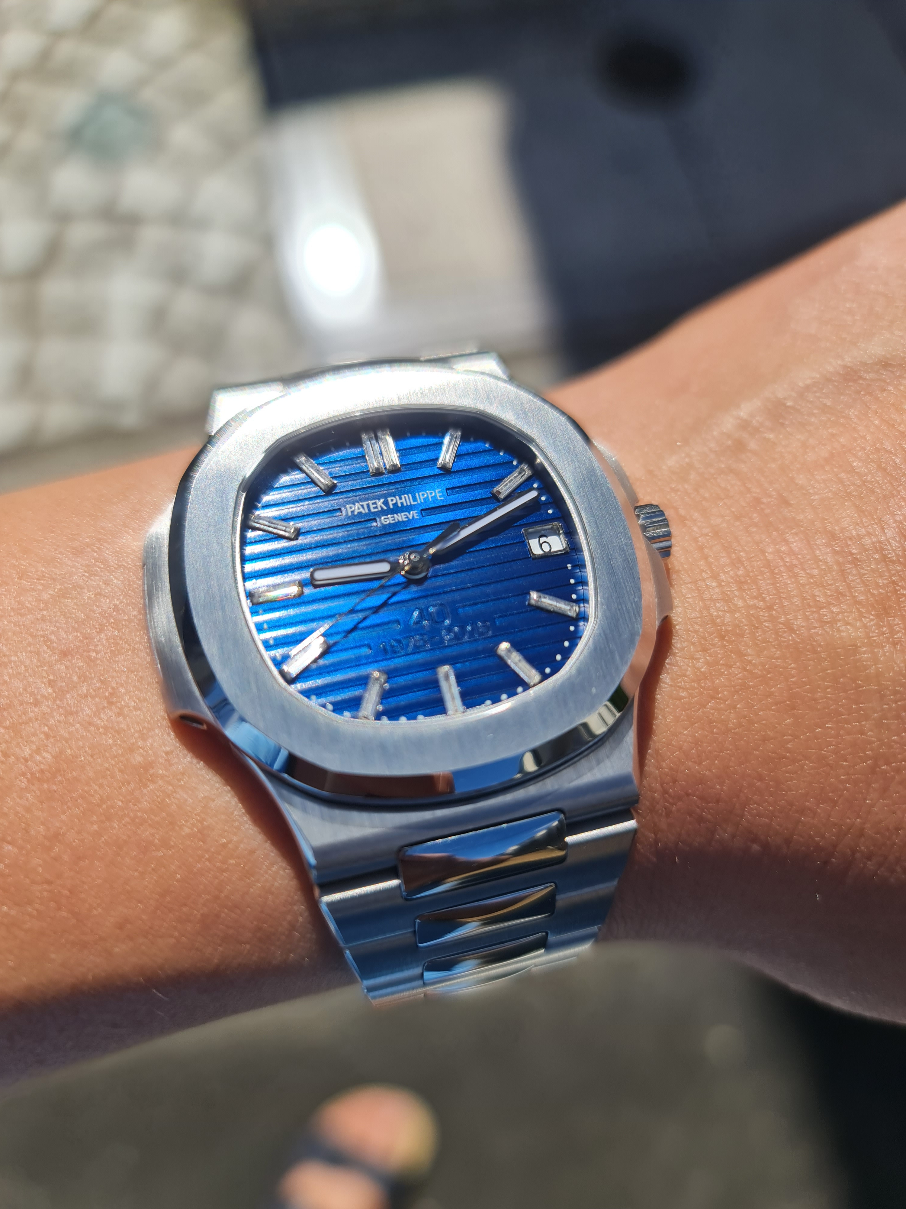
This is my first Nautilus from 3K and I have to say I am quite impressed by the overall build quality. The bracelet is very well made with no uneven gaps anywhere. Being a cloned movement it does not have the free-spinning rotor noise and the 'clunky' feel of a typical rep. Importantly, it also has the type of lume that remains white in daylight and only glows green in the dark.
In terms of movement decoration, as I have previously stated elsewhere, I generally do not care one bit what the movement looks like on reps because no-one will ever see the back of my watch. I personally even hardly ever see the movement on my gen watches. As such I have no idea whether the movement on this rep is printed or engraved and I have not bothered to check.
I do have to say however that the the encrusted diamond on the underside of the bezel at 6 O'clock position is a bit of a joke. It is way too small. I have see a gen of this watch somewhere in the past and I can tell you the diamond is supposed to be alot bigger. I suppose they have to make room for a V2.
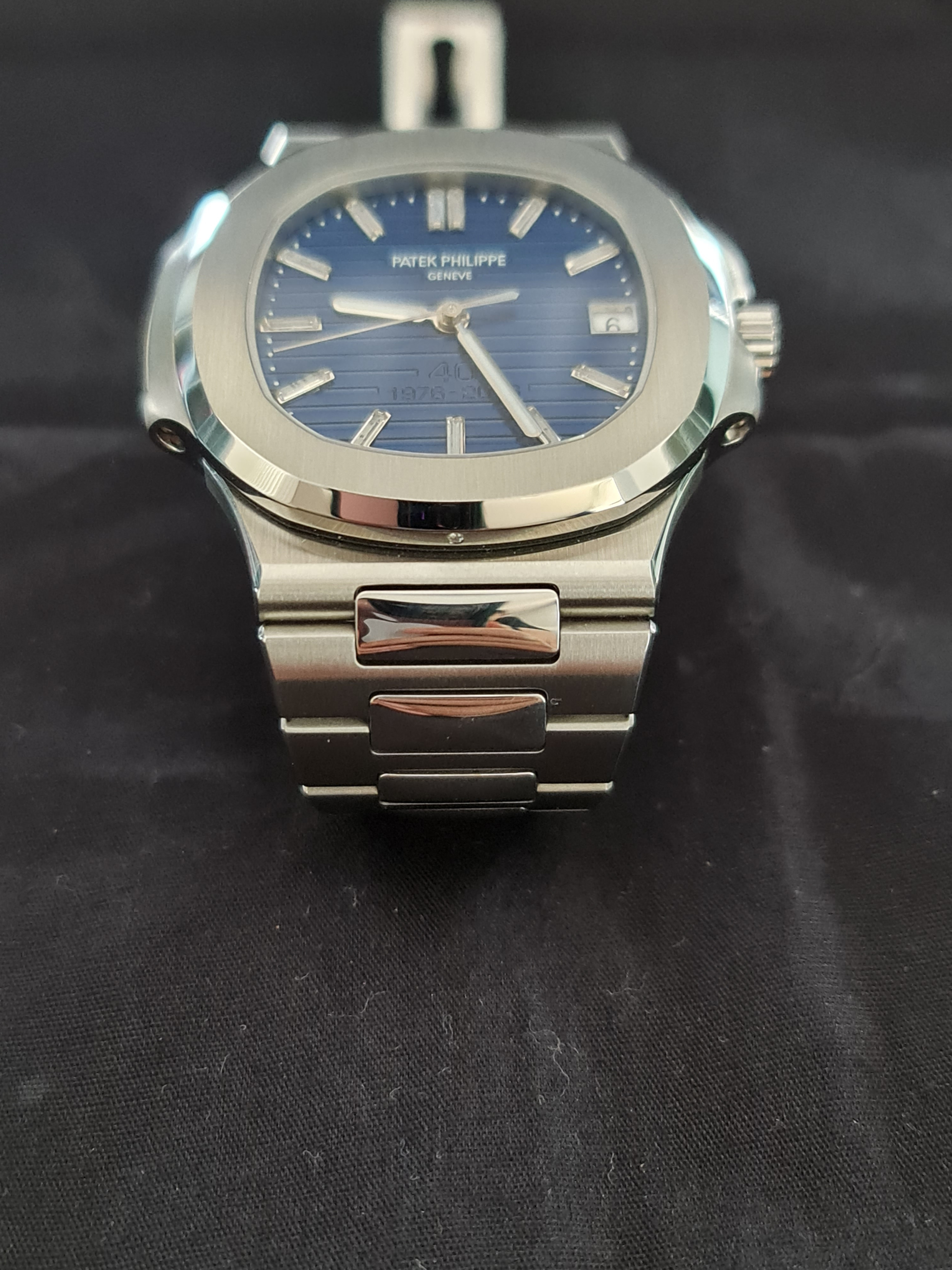
Another small reservation I have about this watch, and I am not sure if this is justified, is 3K may have got the shape of the bezel slightly wrong in that it may be a little wider than gen. When I opened the watch from the box, the first feeling I got was the bezel is too wide. Here is a comparison with a PF Nautilus I got some years ago. You can clearly see that 3K bezel is wider and hence has a more 'blocky' feel.
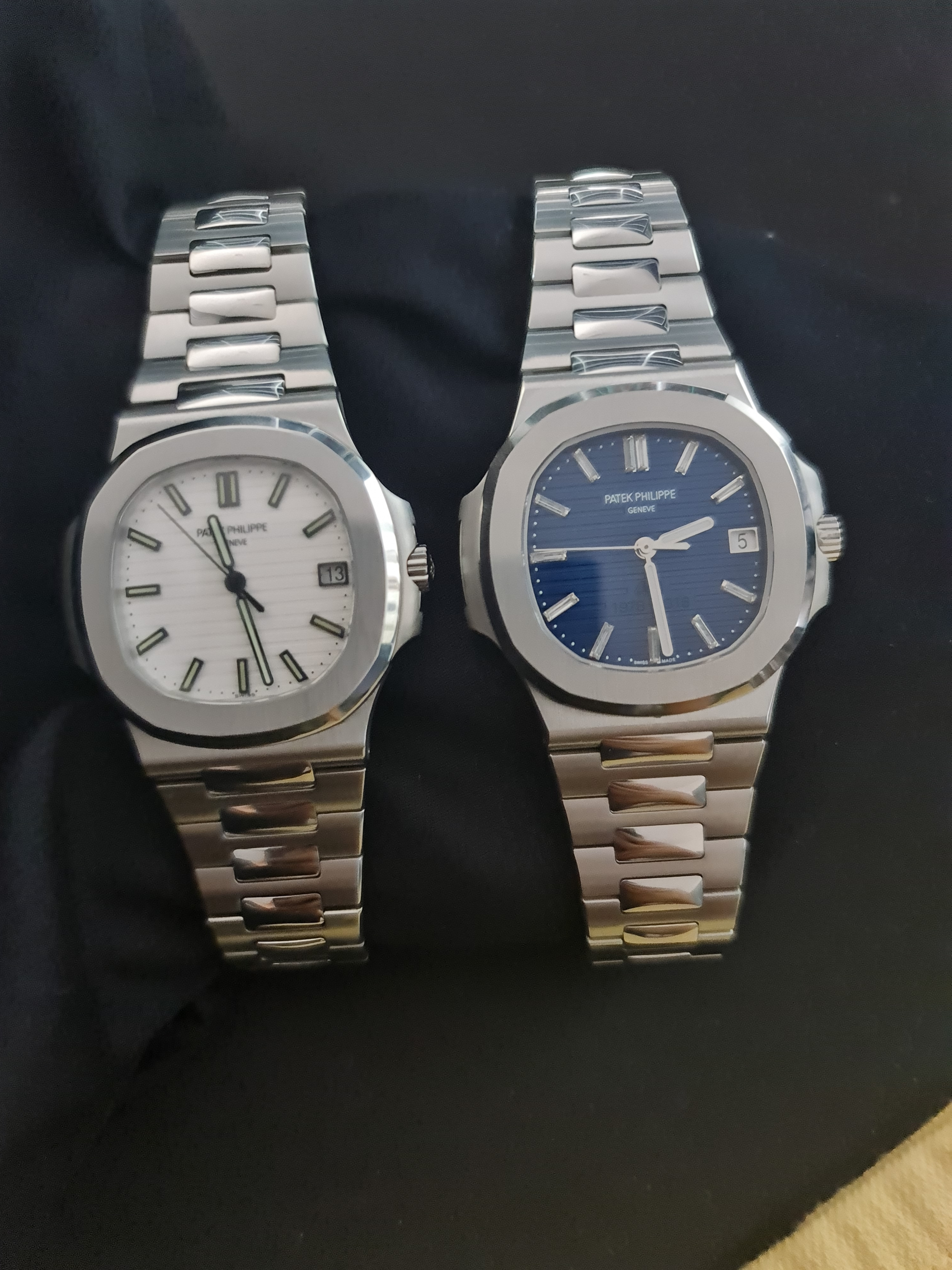
As I have said, this is entirely by feel and I honestly do not know which factory got the bezel shape wrong. What I can say is that having a thinner bezel gives the watch a much more elegant feel as opposed to the comparatively 'blocky' feel of the 3K. Maybe those more knowledgeable than me can shed some light on this issue.
I have in fact seen quite a number of gen Nautiluses in person and I don't ever recall getting that again 'blocky' feeling. Here is a gen Nautilus I tried on a couple of years ago.
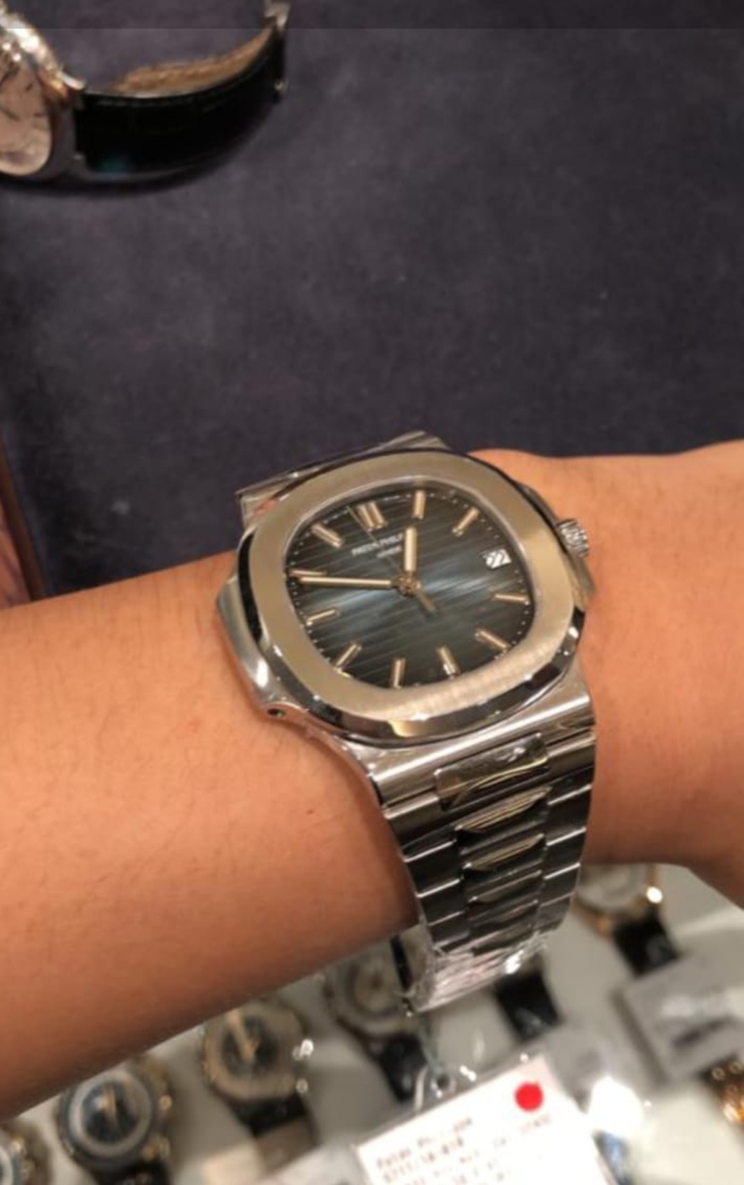
Overall, I am quite pleased with this watch and I feel I can quite confidently wear this out during the day.
The dial of this watch has very contrasting characters depending on the lighting conditions. Indoors the dial will appear very dark (almost black) and no detail can be seen. Even the '40th Anniversary' lettering cannot be made out.

This pic was taken at 2X zoom and does not really convey what I am saying. Just take it from me that indoors, at wrist distance, nothing can be made out. Also, in this zoomed pic the 9 O'clock marker looks like its going to fall off but, trust me, in real life nothing like this can be seen.
The dial however very much comes alive under lights, be it natural or artificial.


This is my first Nautilus from 3K and I have to say I am quite impressed by the overall build quality. The bracelet is very well made with no uneven gaps anywhere. Being a cloned movement it does not have the free-spinning rotor noise and the 'clunky' feel of a typical rep. Importantly, it also has the type of lume that remains white in daylight and only glows green in the dark.
In terms of movement decoration, as I have previously stated elsewhere, I generally do not care one bit what the movement looks like on reps because no-one will ever see the back of my watch. I personally even hardly ever see the movement on my gen watches. As such I have no idea whether the movement on this rep is printed or engraved and I have not bothered to check.
I do have to say however that the the encrusted diamond on the underside of the bezel at 6 O'clock position is a bit of a joke. It is way too small. I have see a gen of this watch somewhere in the past and I can tell you the diamond is supposed to be alot bigger. I suppose they have to make room for a V2.

Another small reservation I have about this watch, and I am not sure if this is justified, is 3K may have got the shape of the bezel slightly wrong in that it may be a little wider than gen. When I opened the watch from the box, the first feeling I got was the bezel is too wide. Here is a comparison with a PF Nautilus I got some years ago. You can clearly see that 3K bezel is wider and hence has a more 'blocky' feel.

As I have said, this is entirely by feel and I honestly do not know which factory got the bezel shape wrong. What I can say is that having a thinner bezel gives the watch a much more elegant feel as opposed to the comparatively 'blocky' feel of the 3K. Maybe those more knowledgeable than me can shed some light on this issue.
I have in fact seen quite a number of gen Nautiluses in person and I don't ever recall getting that again 'blocky' feeling. Here is a gen Nautilus I tried on a couple of years ago.

Overall, I am quite pleased with this watch and I feel I can quite confidently wear this out during the day.
Last edited:
...
As I have said, this is entirely by feel and I honestly do not know which factory got the bezel shape wrong. What I can say is that having a thinner bezel gives the watch a much more elegant feel as opposed to the comparatively 'blocky' feel of the 3K. Maybe those more knowledgeable than me can shed some light on this issue.
I have in fact seen quite a number of gen Nautiluses in person and I don't ever recall getting that again 'blocky' feeling. Here is a gen Nautilus I tried on a couple of years ago.
...
Overall, I am quite pleased with this watch and I feel I can quite confidently wear this out during the day.
I agree with you, I also have that "blocky" feeling regarding my PPFv4 5711. Based on the pictures 3KF v2 should be better. I own a PF case / PPF dial hybrid rep and this is the best for me bezel-wise.
Last edited:
https://postimg.cc/gallery/c8BGVNN
Please let me know your thoughts and if you spot any noticeable flaws with the watch.
My biggest concerns are the dial, date wheel alignment, markers, movement being engraved, the crown, and the infamous "fat first link."
Please let me know your thoughts and if you spot any noticeable flaws with the watch.
My biggest concerns are the dial, date wheel alignment, markers, movement being engraved, the crown, and the infamous "fat first link."
Anadrol5
Active Member
- 14/10/18
- 254
- 192
- 43
https://postimg.cc/gallery/c8BGVNN
Please let me know your thoughts and if you spot any noticeable flaws with the watch.
My biggest concerns are the dial, date wheel alignment, markers, movement being engraved, the crown, and the infamous "fat first link."
The scatter-gun approach to asking QC questions I see. I like it :thumbsup:. Anyway, you seem to have got an absolutely perfect piece. IMO reps cannot get any more perfect than this. This is definitely not the fat first link version.
Received mine in the mail a couple of days ago, really nice watch :thumbsup:.
Only thing that I think can be improved upon in a V2 as Anadrol5 says is the 'diamond' at 6 o'clock on the bezel. In these pics you can see of the gen vs mine, the gen is more oval shaped whereas on the 3KF it is circular. So i believe they got the height of it correct as it takes up the same amount of space in that dimension, just not the width. But I do not care about that detail at all and am very happy with the watch overall.

Only thing that I think can be improved upon in a V2 as Anadrol5 says is the 'diamond' at 6 o'clock on the bezel. In these pics you can see of the gen vs mine, the gen is more oval shaped whereas on the 3KF it is circular. So i believe they got the height of it correct as it takes up the same amount of space in that dimension, just not the width. But I do not care about that detail at all and am very happy with the watch overall.

Received mine in the mail a couple of days ago, really nice watch :thumbsup:.
Only thing that I think can be improved upon in a V2 as Anadrol5 says is the 'diamond' at 6 o'clock on the bezel. In these pics you can see of the gen vs mine, the gen is more oval shaped whereas on the 3KF it is circular. So i believe they got the height of it correct as it takes up the same amount of space in that dimension, just not the width. But I do not care about that detail at all and am very happy with the watch overall.

They look pretty identical to me, two round cut diamonds. The first picture was taken from a further distance while the second one is a bit closer making the diamond look bigger.
I might be wrong but if they end up updating it in the future I'll just go ahead and try to buy a new bezel separately for mine.
Last edited:
Long time lurker here, who uses the comparison pictures of caribbean_stud , to point out a possible flaw, which causes the somewhat "clunky" and wide feel of the 3kf and ppf bezel.
In short, the angle of the polished surface of the bezel is steeper on the rep, causing the brushed surface on top of the bezel to become larger.
If you extend a line, from the angled, polished surface of the bezel, the line seems to interfere with the crown guard/the "screwholder" on the replica, while on the gen, it doesn't even touch the crown guard/"screwholder".
In fact, the angled surface on the gen seems to be parallel to the tangent of a point on the crown guard/"screwholder", which is as far out as the other polished surface of the bezel extends vertically, which would be very plausible, design-wise.
I know, it's nitpicking, but the devil is in the detail and I believe that small features like this make or break a design masterpiece.
A skilled modder might be able to adjust the angle of the polished surface, to get rid of the "fat bezel", while making the overall feel of the watch more elegant. If so, the pf case mod would be obsolete IMO.
What do you guys think?
In short, the angle of the polished surface of the bezel is steeper on the rep, causing the brushed surface on top of the bezel to become larger.
If you extend a line, from the angled, polished surface of the bezel, the line seems to interfere with the crown guard/the "screwholder" on the replica, while on the gen, it doesn't even touch the crown guard/"screwholder".
In fact, the angled surface on the gen seems to be parallel to the tangent of a point on the crown guard/"screwholder", which is as far out as the other polished surface of the bezel extends vertically, which would be very plausible, design-wise.

I know, it's nitpicking, but the devil is in the detail and I believe that small features like this make or break a design masterpiece.
A skilled modder might be able to adjust the angle of the polished surface, to get rid of the "fat bezel", while making the overall feel of the watch more elegant. If so, the pf case mod would be obsolete IMO.
What do you guys think?
Long time lurker here, who uses the comparison pictures of caribbean_stud , to point out a possible flaw, which causes the somewhat "clunky" and wide feel of the 3kf and ppf bezel.
In short, the angle of the polished surface of the bezel is steeper on the rep, causing the brushed surface on top of the bezel to become larger.
If you extend a line, from the angled, polished surface of the bezel, the line seems to interfere with the crown guard/the "screwholder" on the replica, while on the gen, it doesn't even touch the crown guard/"screwholder".
In fact, the angled surface on the gen seems to be parallel to the tangent of a point on the crown guard/"screwholder", which is as far out as the other polished surface of the bezel extends vertically, which would be very plausible, design-wise.
I know, it's nitpicking, but the devil is in the detail and I believe that small features like this make or break a design masterpiece.
A skilled modder might be able to adjust the angle of the polished surface, to get rid of the "fat bezel", while making the overall feel of the watch more elegant. If so, the pf case mod would be obsolete IMO.
What do you guys think?
Cosmograph4ever (who's banned here) told me he did this mod on PPFv4 but it was a lengthy and tedious process:

LeonTiersan
Do not accept unsolicited offers
- 7/9/17
- 8
- 1
- 0
Just wondering, has anyone considered this to be a good alternative to as a rep wise, i feel like the Bezel / Dial looks better than 3kf and technically the Date wheel is still the clearest give away.
https://trustytime.io/index.php?main_page=product_info&cPath=39_199&products_id=19013
https://trustytime.io/index.php?main_page=product_info&cPath=39_199&products_id=19013
Anadrol5
Active Member
- 14/10/18
- 254
- 192
- 43
NO this is the correct V2 non-fat first link. Your watch looks immaculate.
NO this is the correct V2 non-fat first link. Your watch looks immaculate.
Yes, I think it looks stunning from all the other pictures I've received too.
Is the V2 supposed to be engraved as well?
Anadrol5
Active Member
- 14/10/18
- 254
- 192
- 43
Yes, I think it looks stunning from all the other pictures I've received too.
Is the V2 supposed to be engraved as well?
I don't think anybody knows. I have this watch and I personally don't really care whether the movement is engraved or not.


