- 21/4/19
- 1,814
- 2,208
- 113
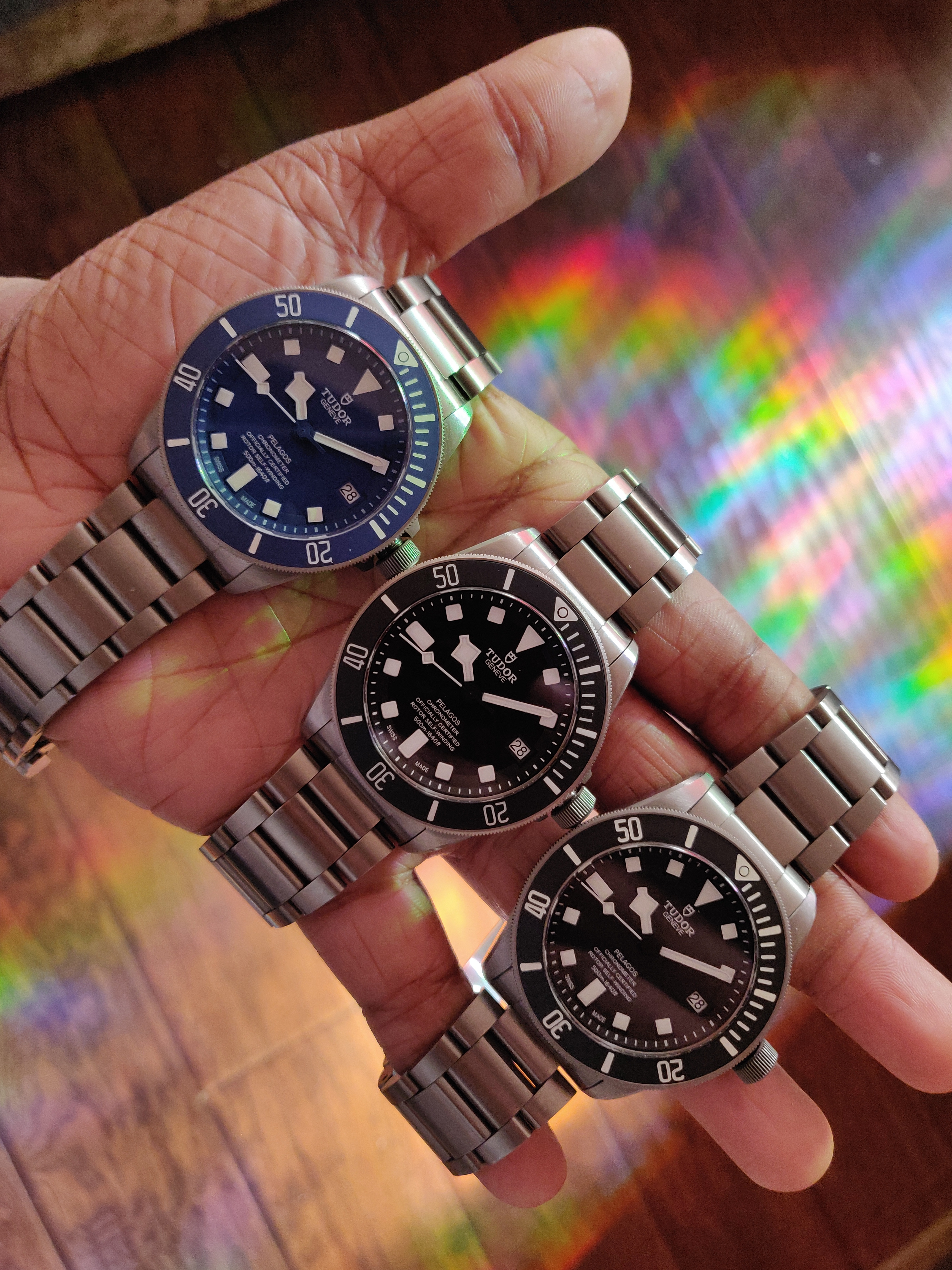
Alrighty, it's been a long while since I last wrote a review for the family here, and since then I've acquired a gen Tudor 25600. The Pelagos is my first serious Swiss watch that I got as a present for being accepted into a grad school in a PANDEMIC AND RECESSION. An impossible achievement crowned by an impossibly perfect all-round watch. I hope you enjoy the shots I've taken and are able to walk away from this thread with a lot more knowledge (Oh hey, RWI!)
Anyways, onto the review! :matty:
Introduction
To start with, I've gathered three wotches (to rule them all). One is a Tudor XF/V6F V4, another is a Tudor XF V5 and the last is a gen Pelagos. Take a guess at which is the gen.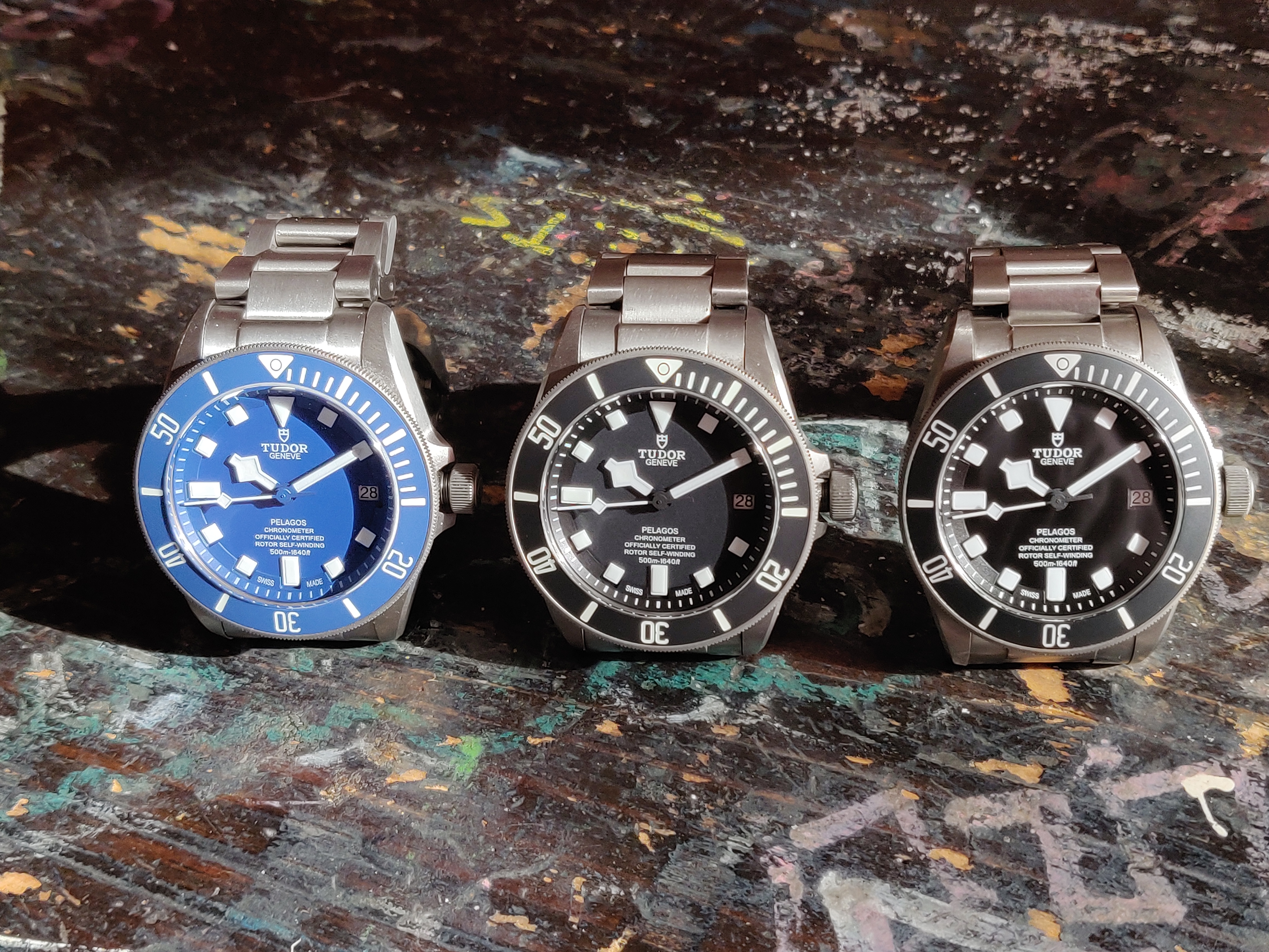

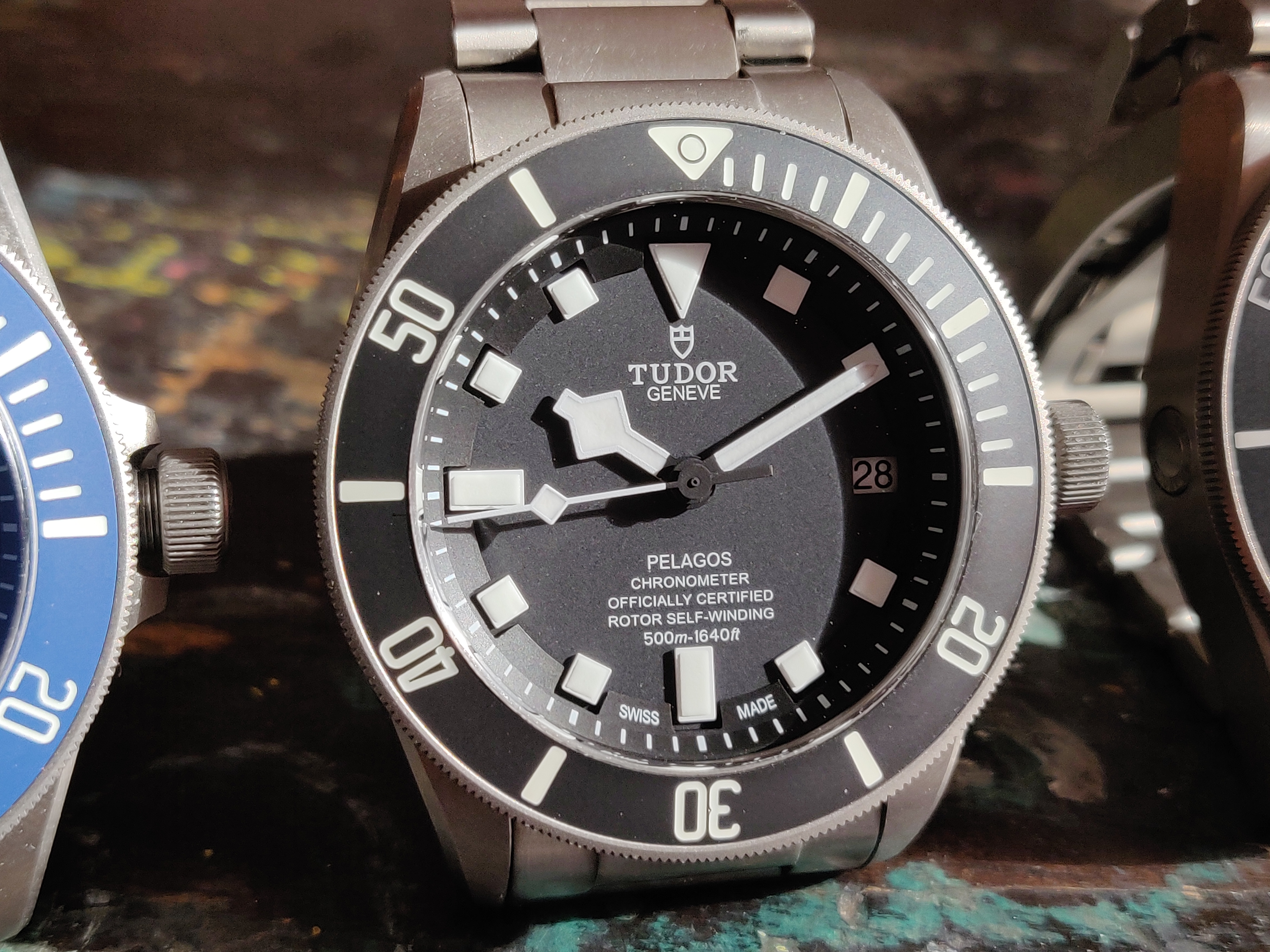
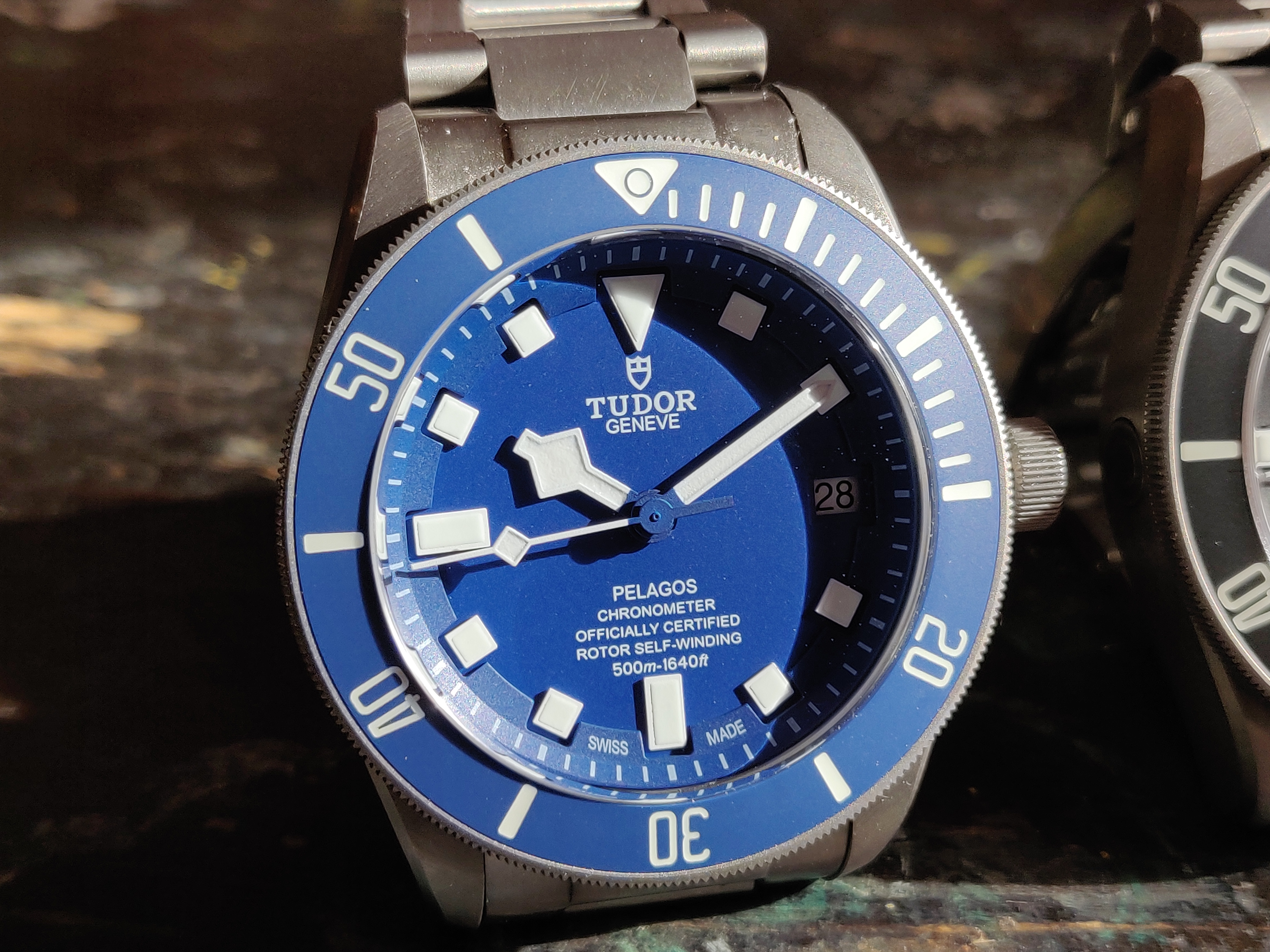
Got it? Good! Most folks would be confused too if they didn't know a plethora of intricacies to look out for. As with nearly every watch in the Rolex/Tudor family, the first thing you look out for is soft, rounded indices with generously supple edges.
Spotted it yet? Nice!
This is the 2021 gen 25600TN: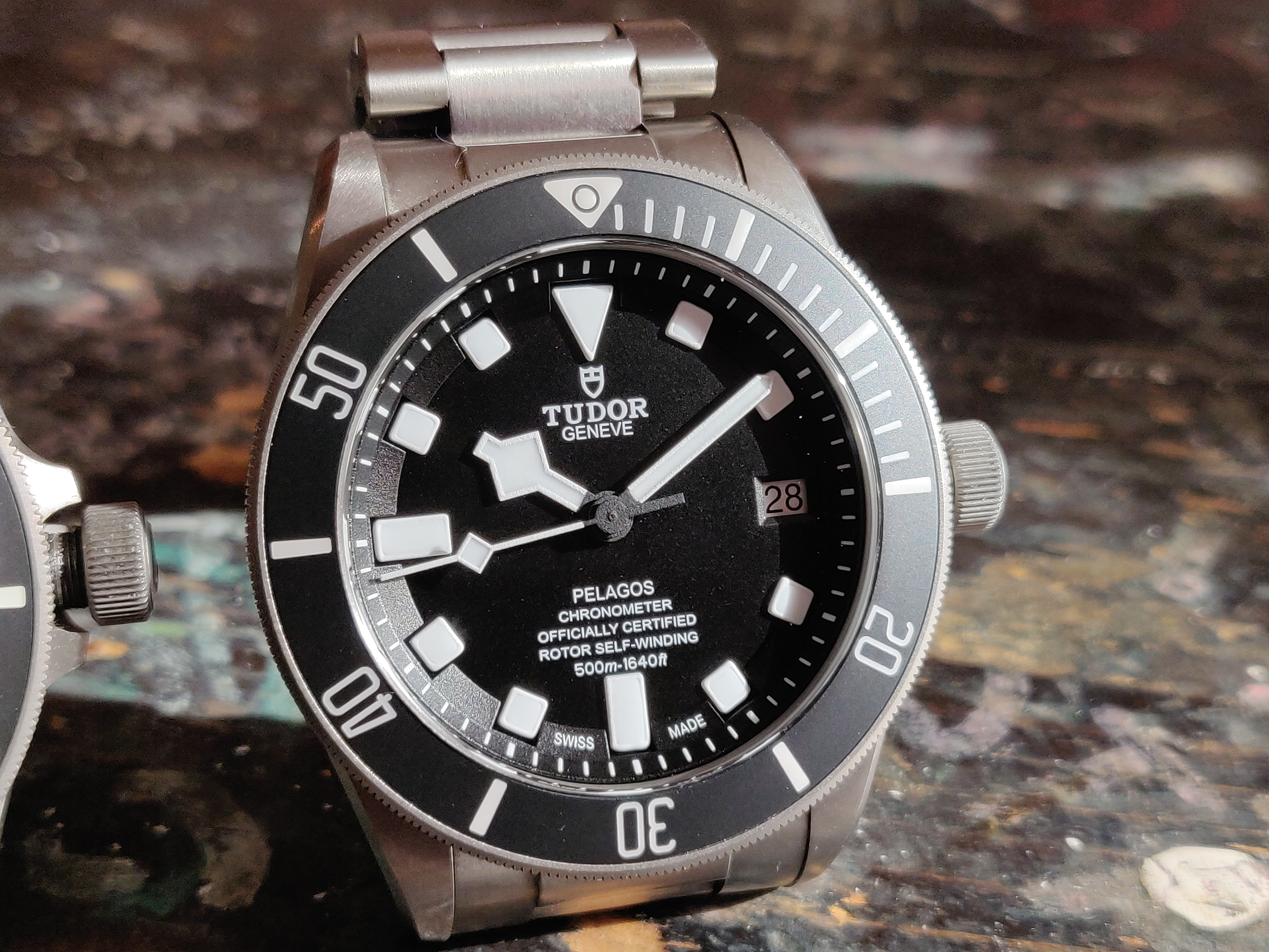
This is the XF/V6F V4:
This is the XF V5:

With that simple tell in mind, you can now easily discern between them using the indices as a cue.
Now that you know our beauty contestants, let's have a closer look.
A Closer Look
Let's compare how the dial texture, hands, chapter ring and other more intricate nuances differ between the gen and rep
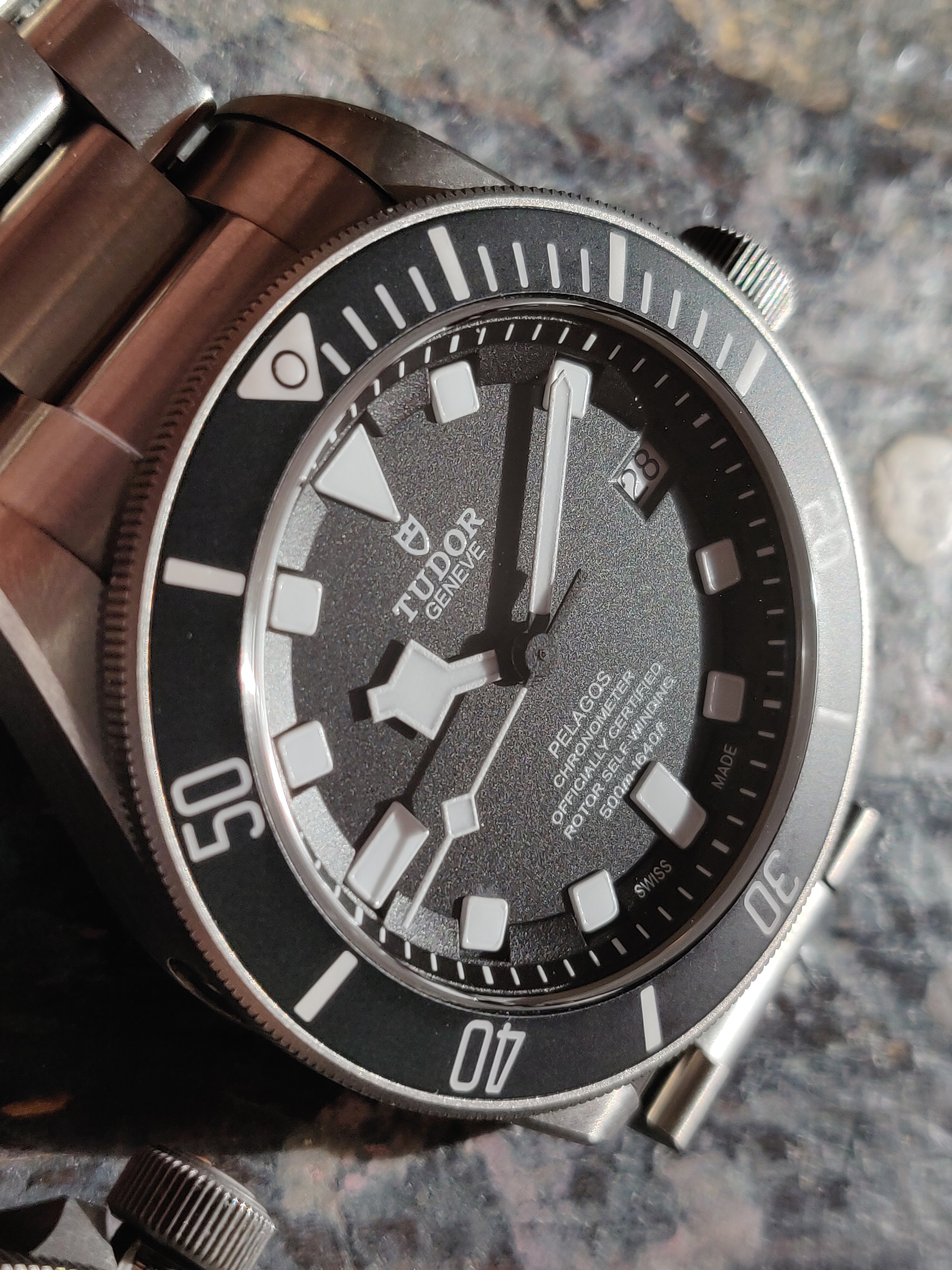
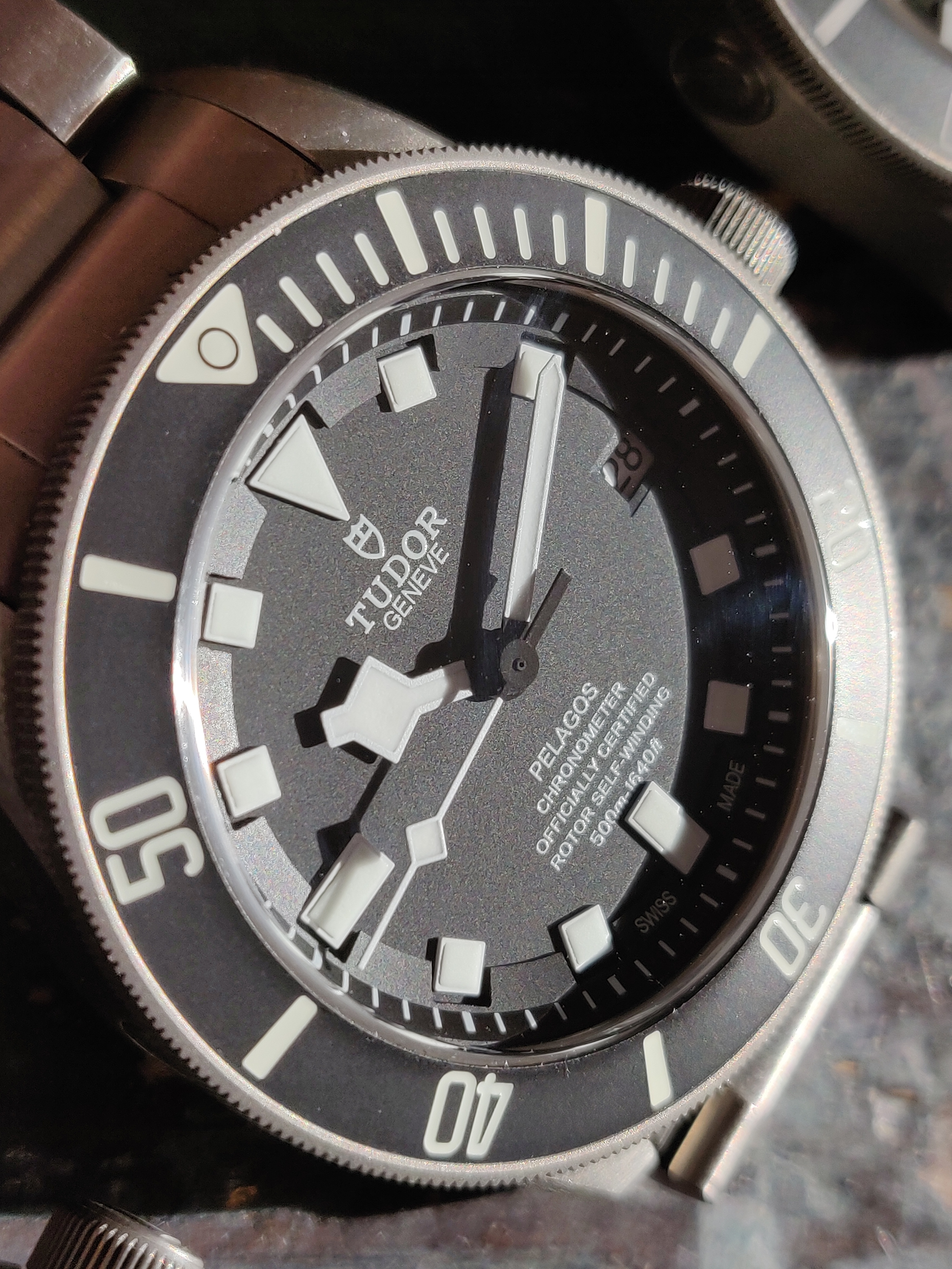
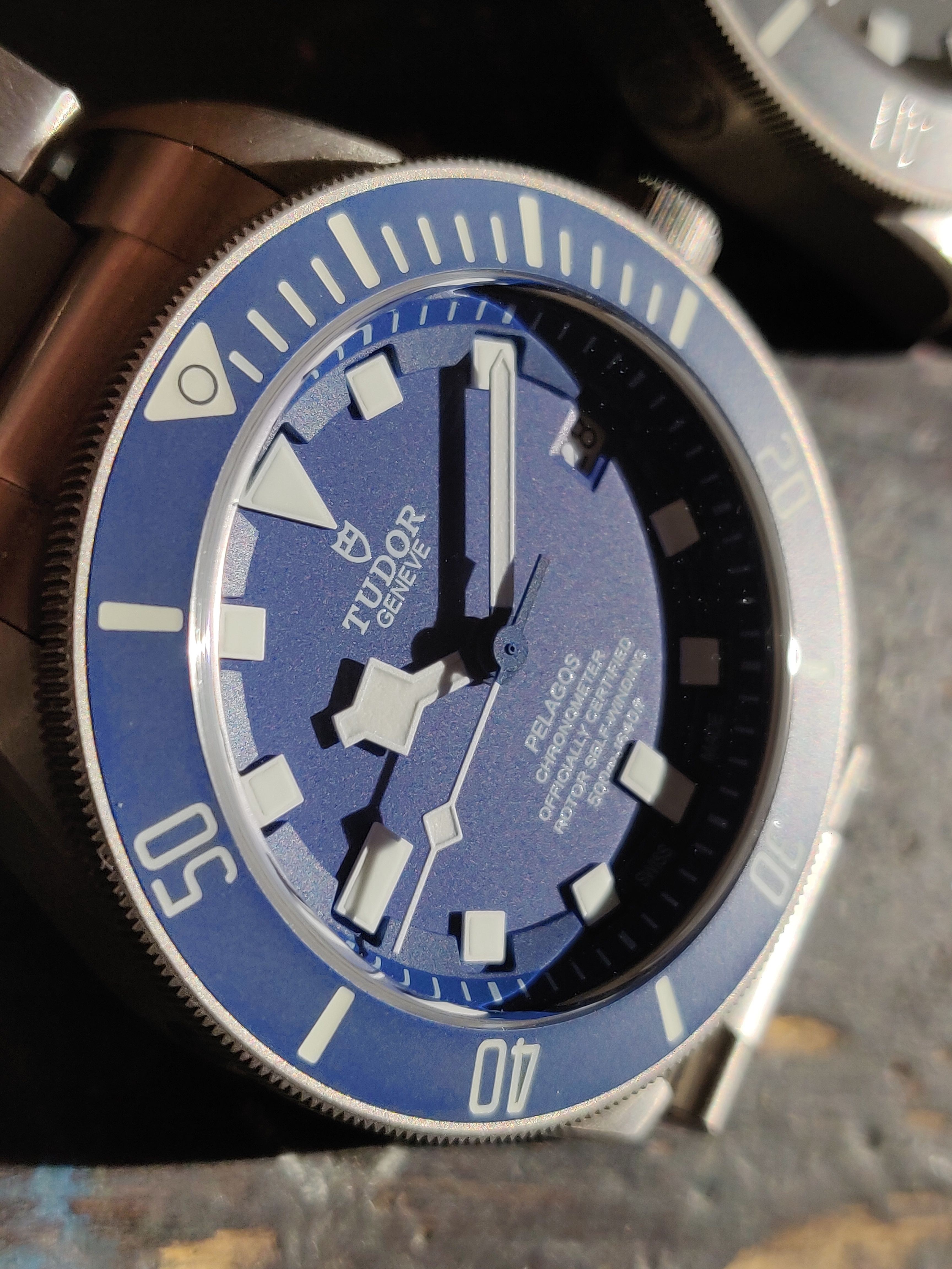
The dial texture on the gen is much more pronounced, and has more variance in terms of shading. The motif of texture follows all the way throughout the dial and hands. Like piles of ash (as opposed to snowflakes), it's a huge difference between gen and rep. Now, as with most watches, this could be a matter of production batch. I would love to see other gen owners compare their dials as well to get a consensus. The dial font on the reps are done really well, especially on the V4 by XF/V6F.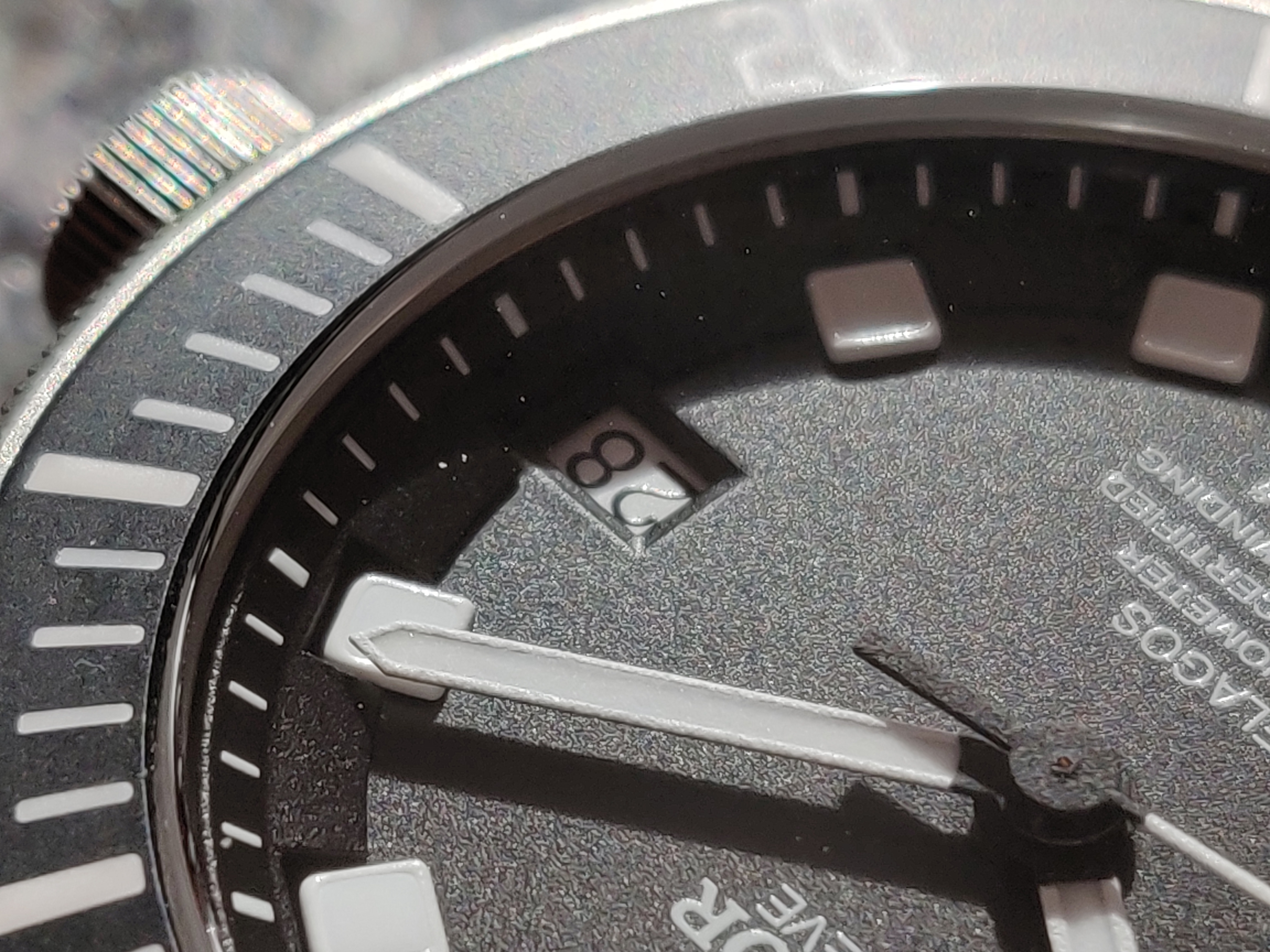
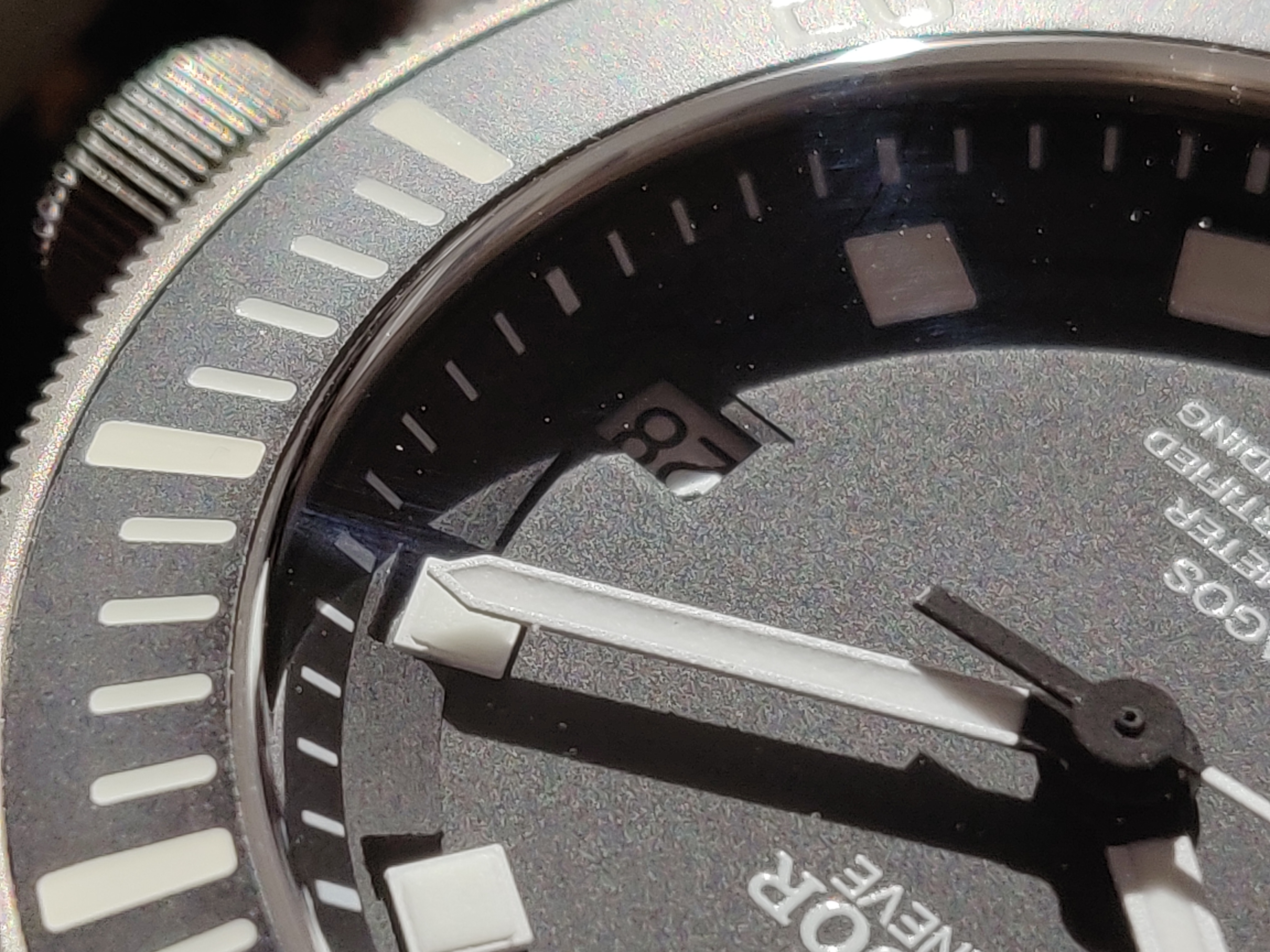
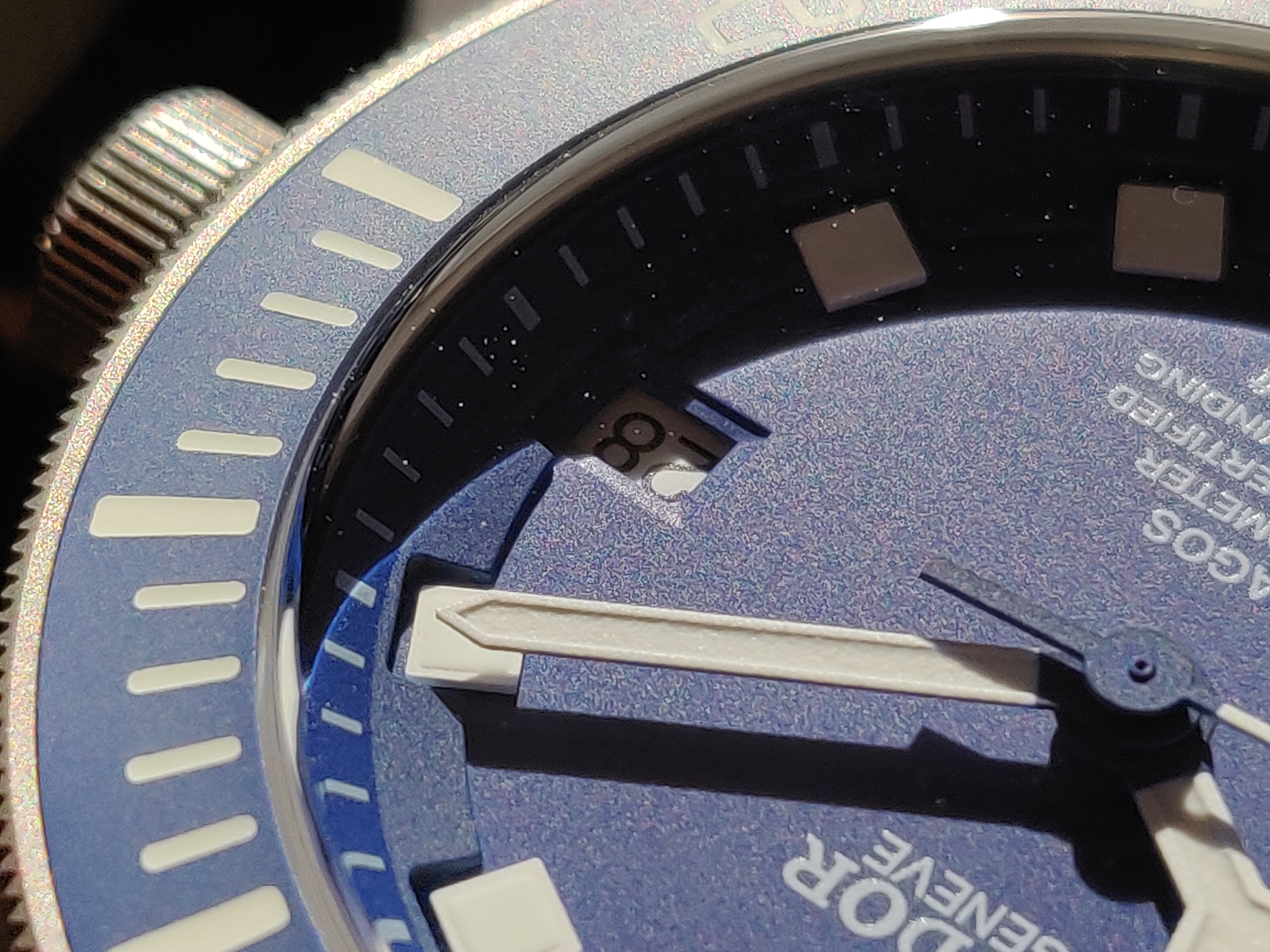
You can see that the indices on the chapter ring have a 3D shape to them, and are not flat unlike the reps shown. The ring also has the same texture motif as on the dial on its edges on top. The gen Pelagos also has a flush datewheel (which adjusts when turning the crown counterclockwise). Just to note midpoint, Many of these features are from a macro POV, so from a wrist to eye perspective it's nearly impossible to notice.
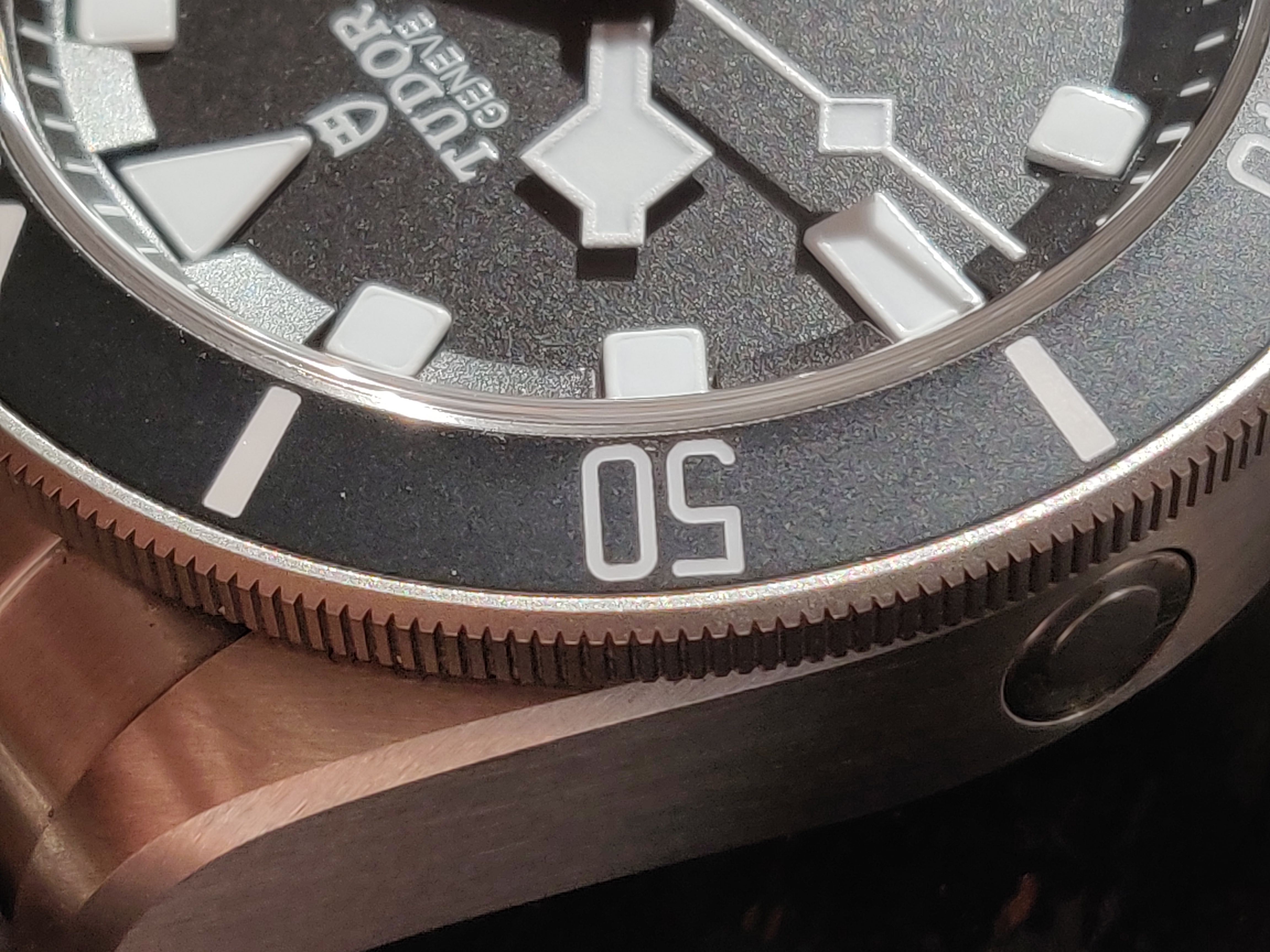
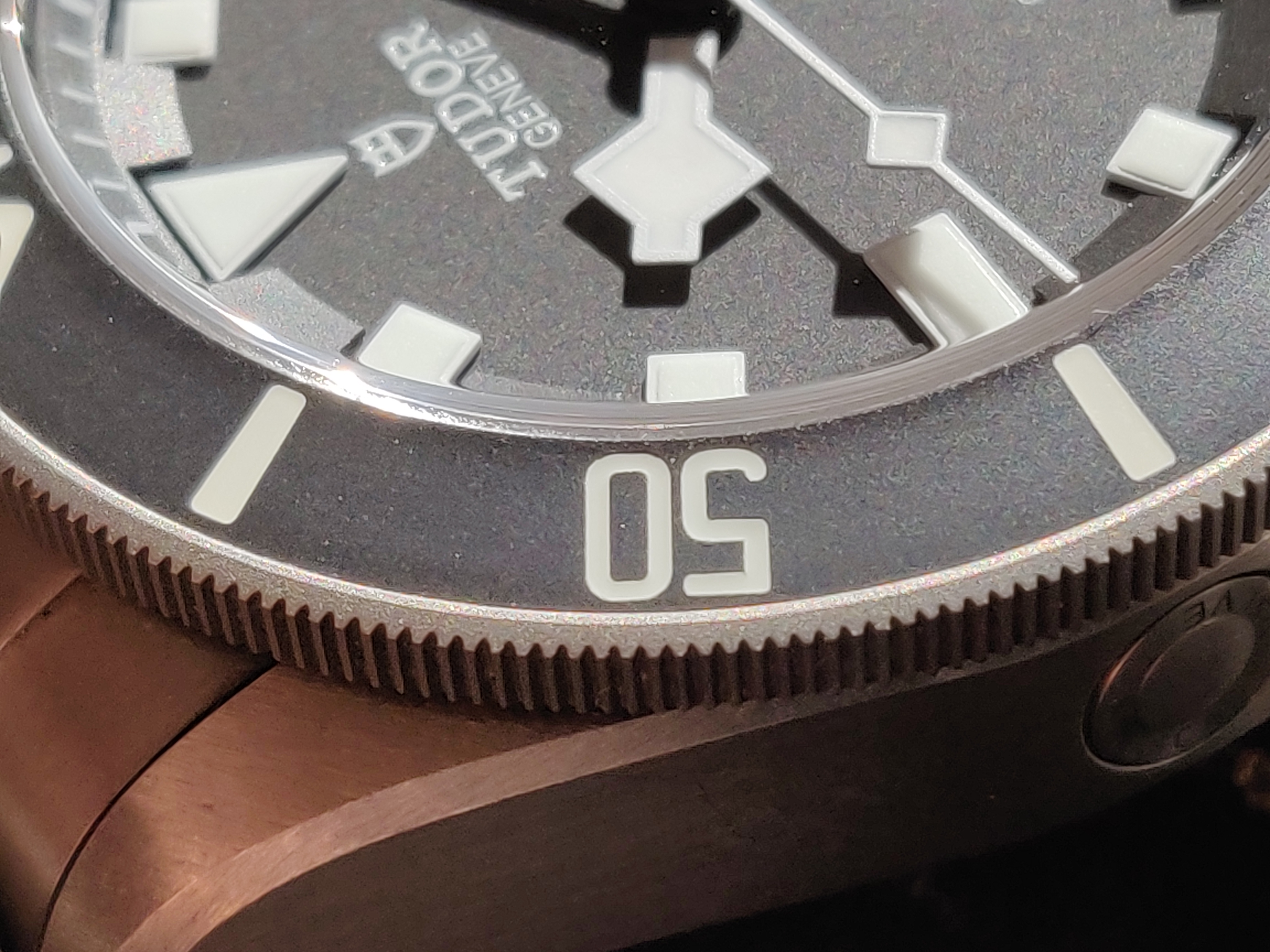
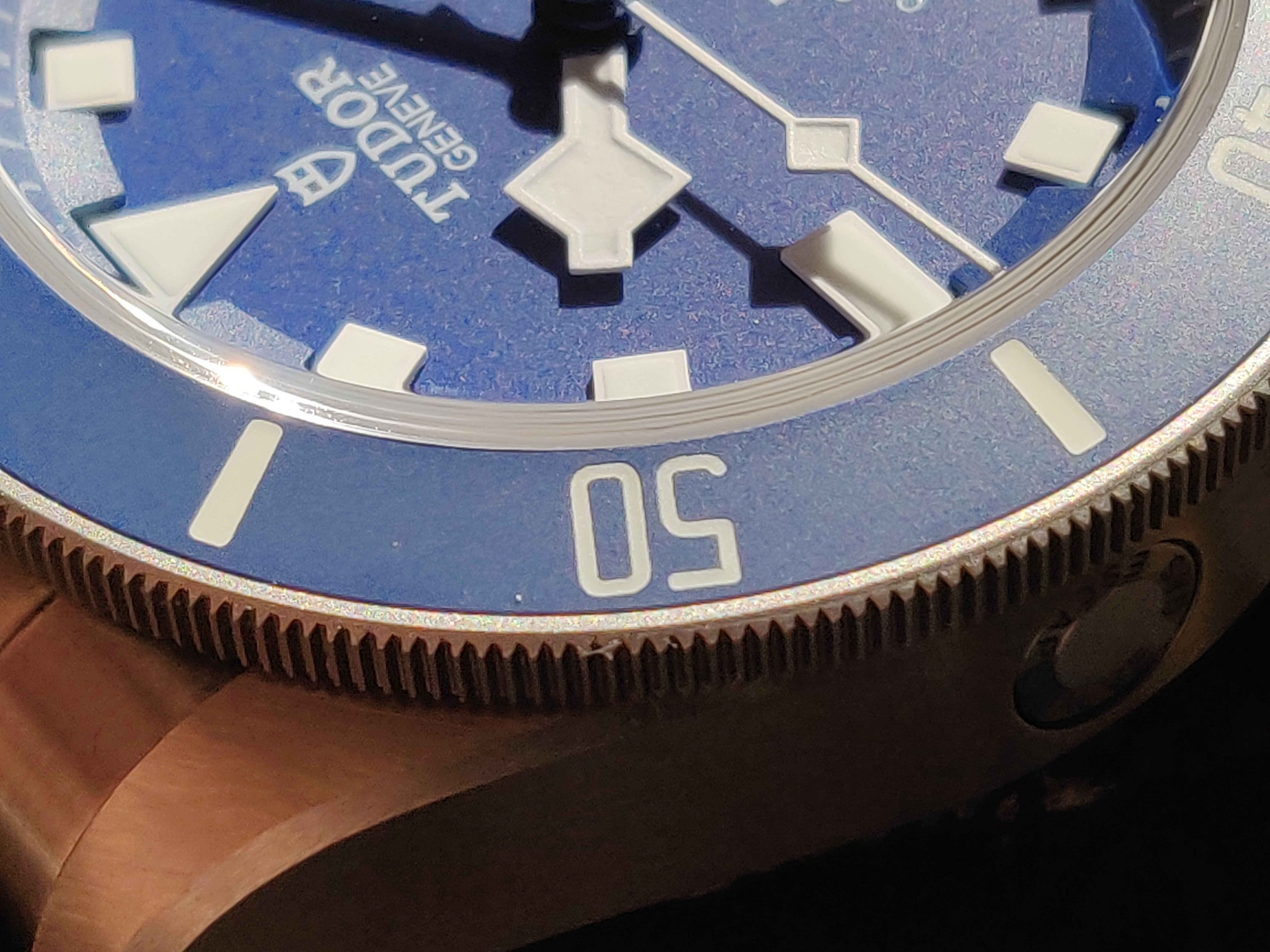
The 2021 gen pelagos in Noir has thinner bezel numerals than the V4 XF/V6F rep. However, the V5 has matching numeral thickness, which is very interesting. Something else to note, the XF V5 pelagos in Noir has thick numerals on the bezel. This leads to wonder if gen samples used for the cloning process played a role, as batch numbers can mean slight variations in gen details.
Fun fact about the gen bezel: It has solid clicks until noon, upon which there is a hard stop. You can simply tell when the bezel has turned all the way to noon by just feeling that hard stop. The bezel keeps turning of course, but you have to give just a slight extra nudge. It's a really unique quirk that is absent in all reps, and would be amazing if replicated.
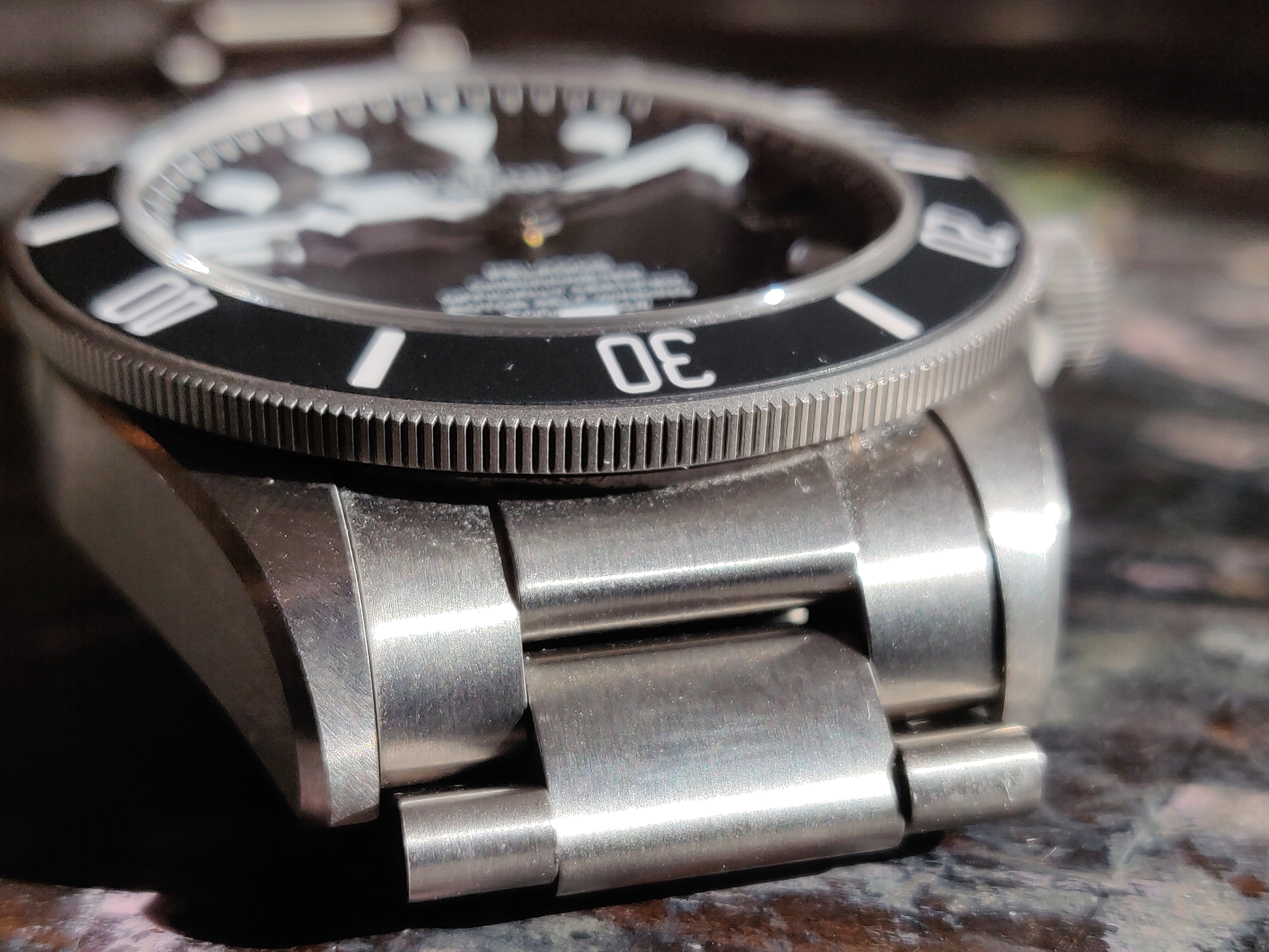
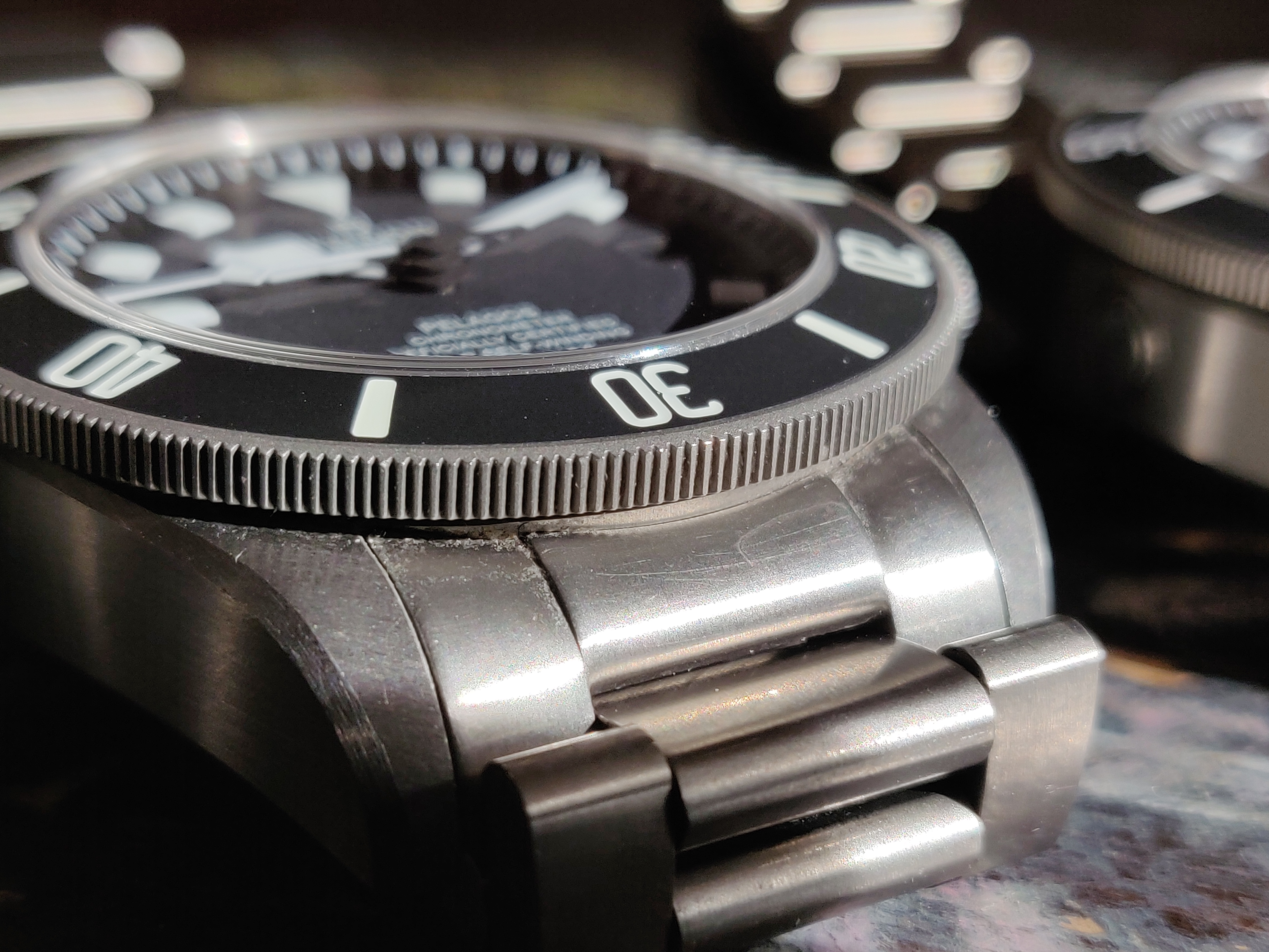
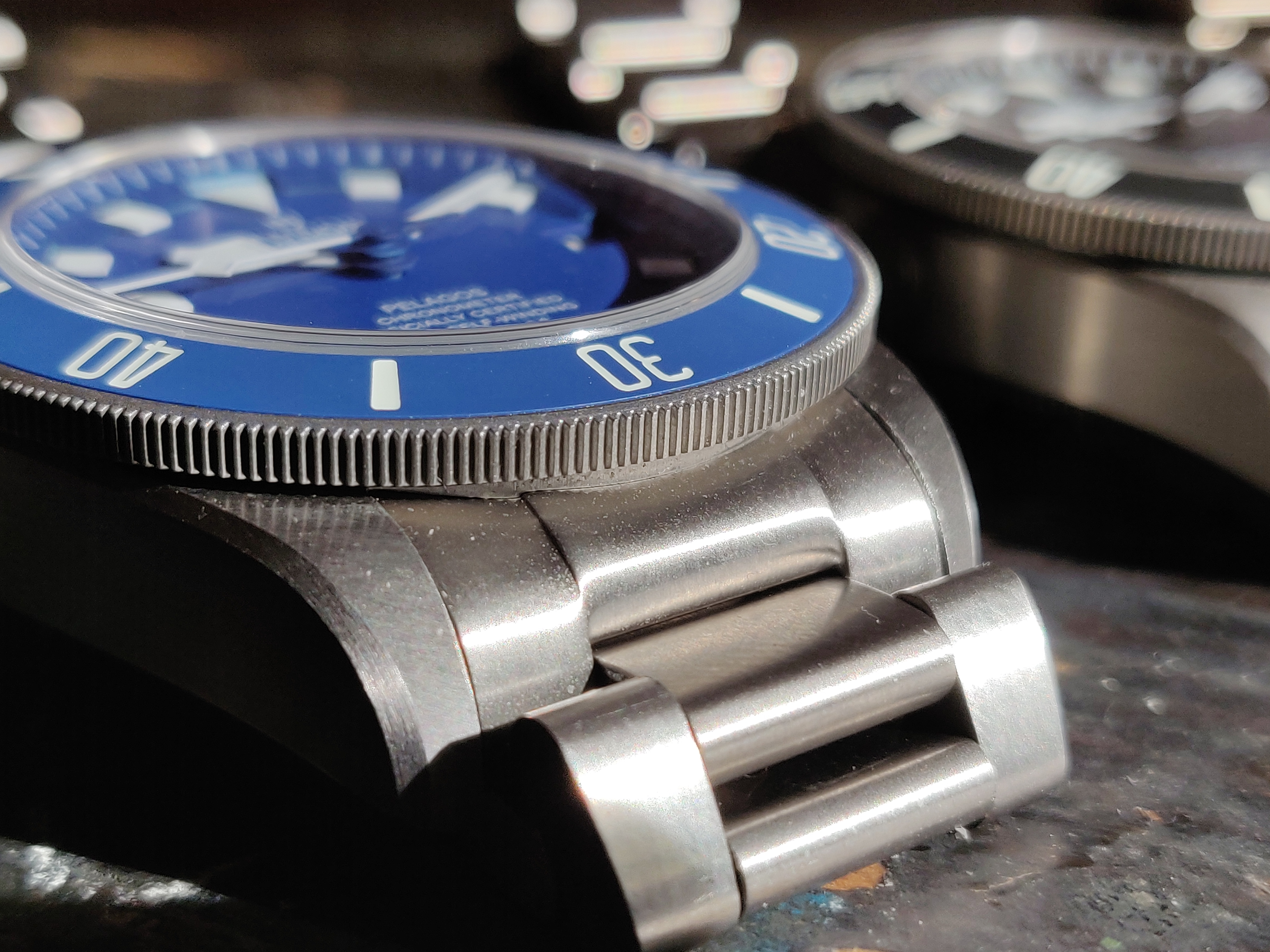
No surprise to see that the SEL fitting in the gen is nice and tight, as well as being properly recessed. Both reps have varying degrees of looseness and SEL fitment, mainly being either flush or slightly recessed but with major gaps. You can also notice the difference in bezel knurling.
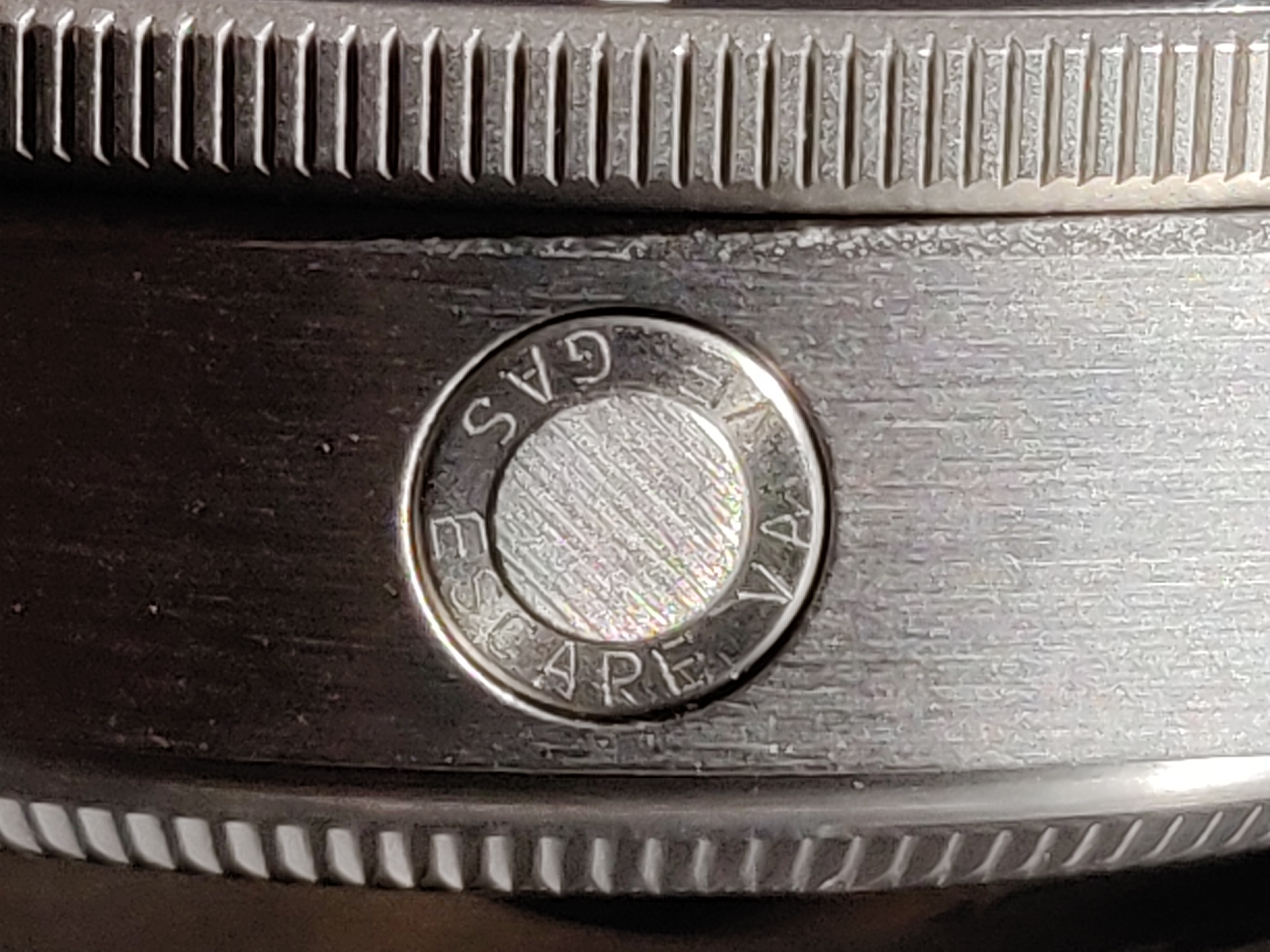
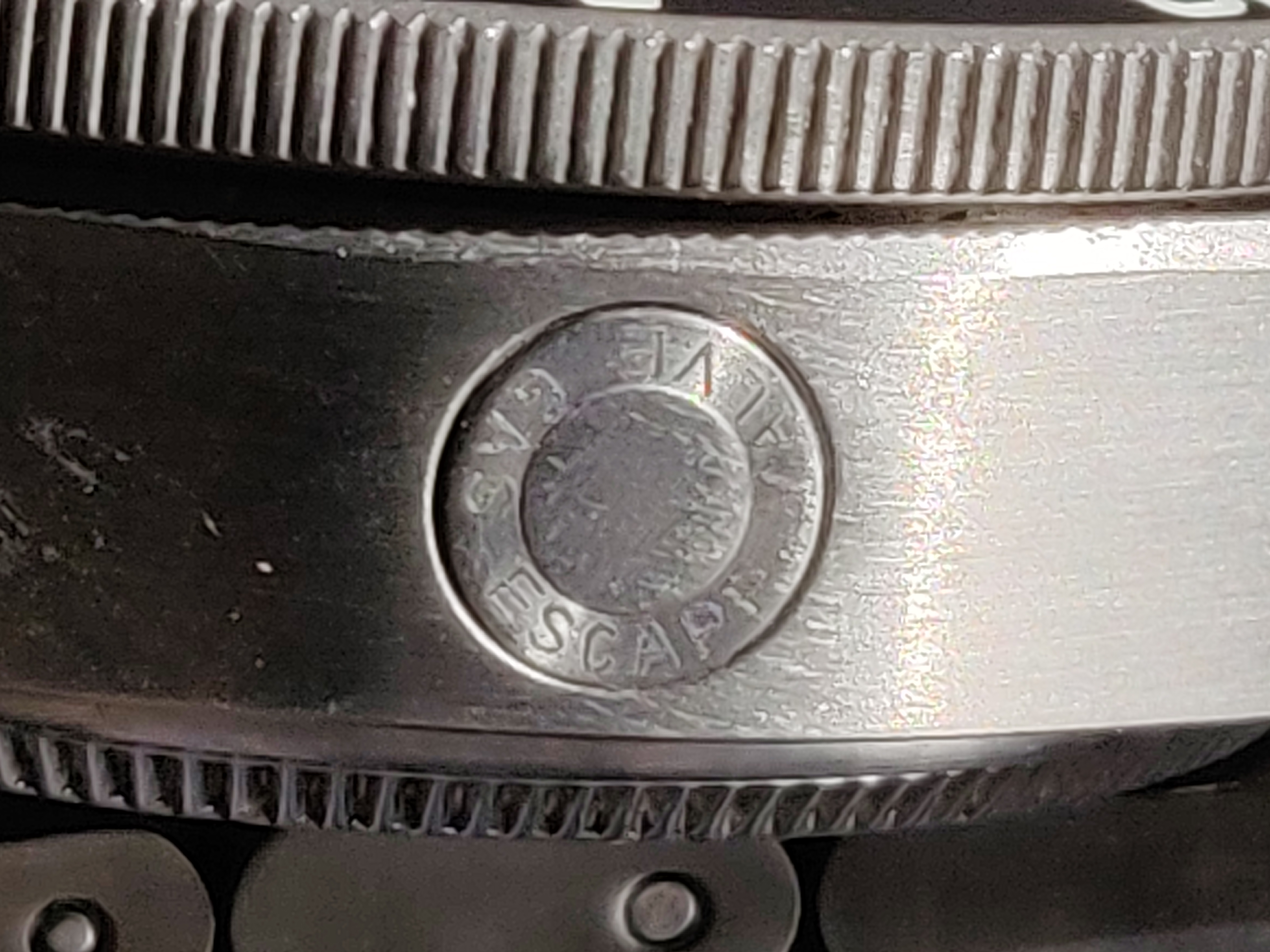
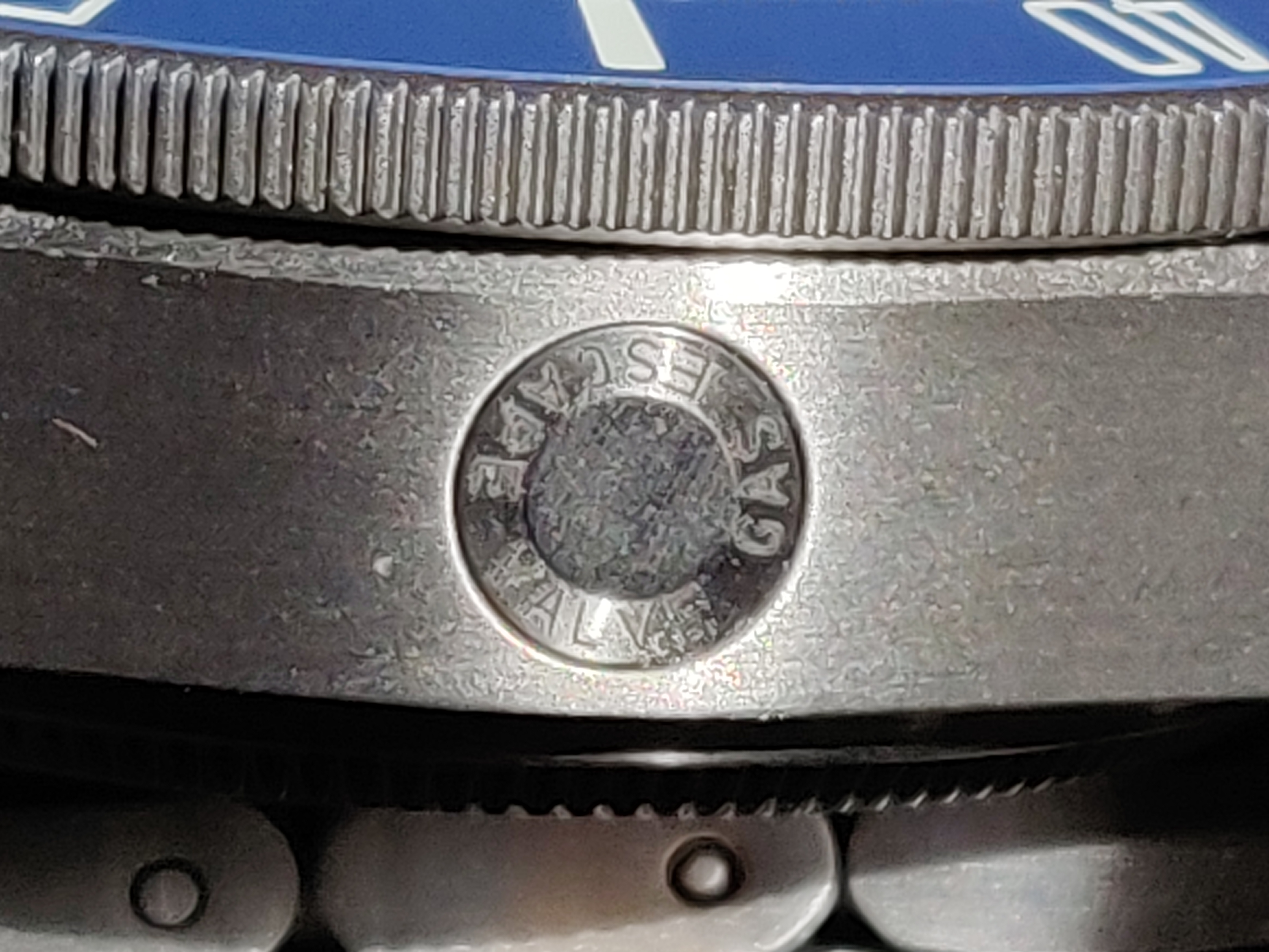
As we delve further into macro details, I'm sure at this point you can spot the rep and gen in these shots. The gas escape valve is nice and evenly round, with a single layer of brushing at the centre of the circle. The reps of course have some play to the detailing but are great considering. The V5 especially had made strides.
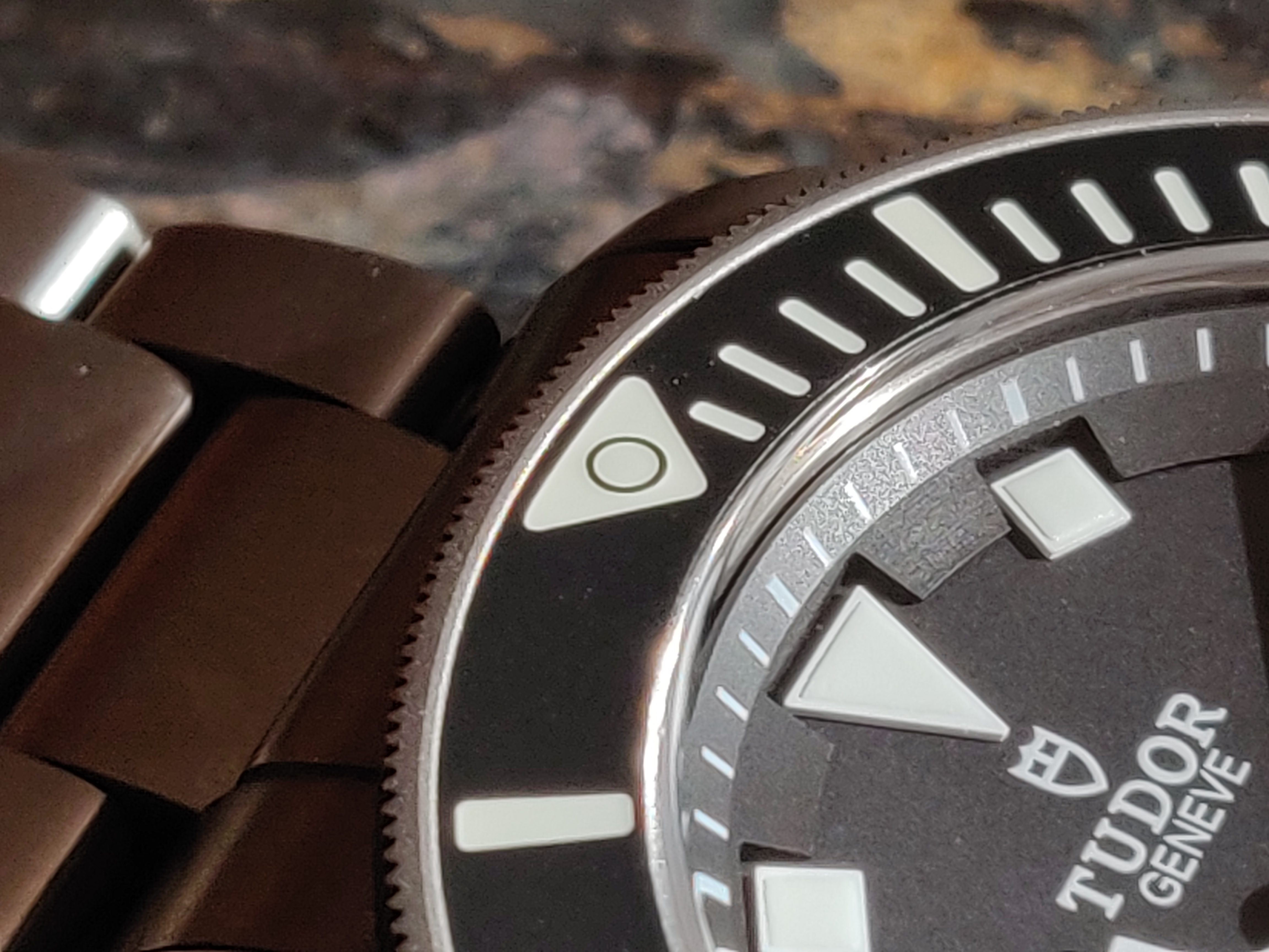
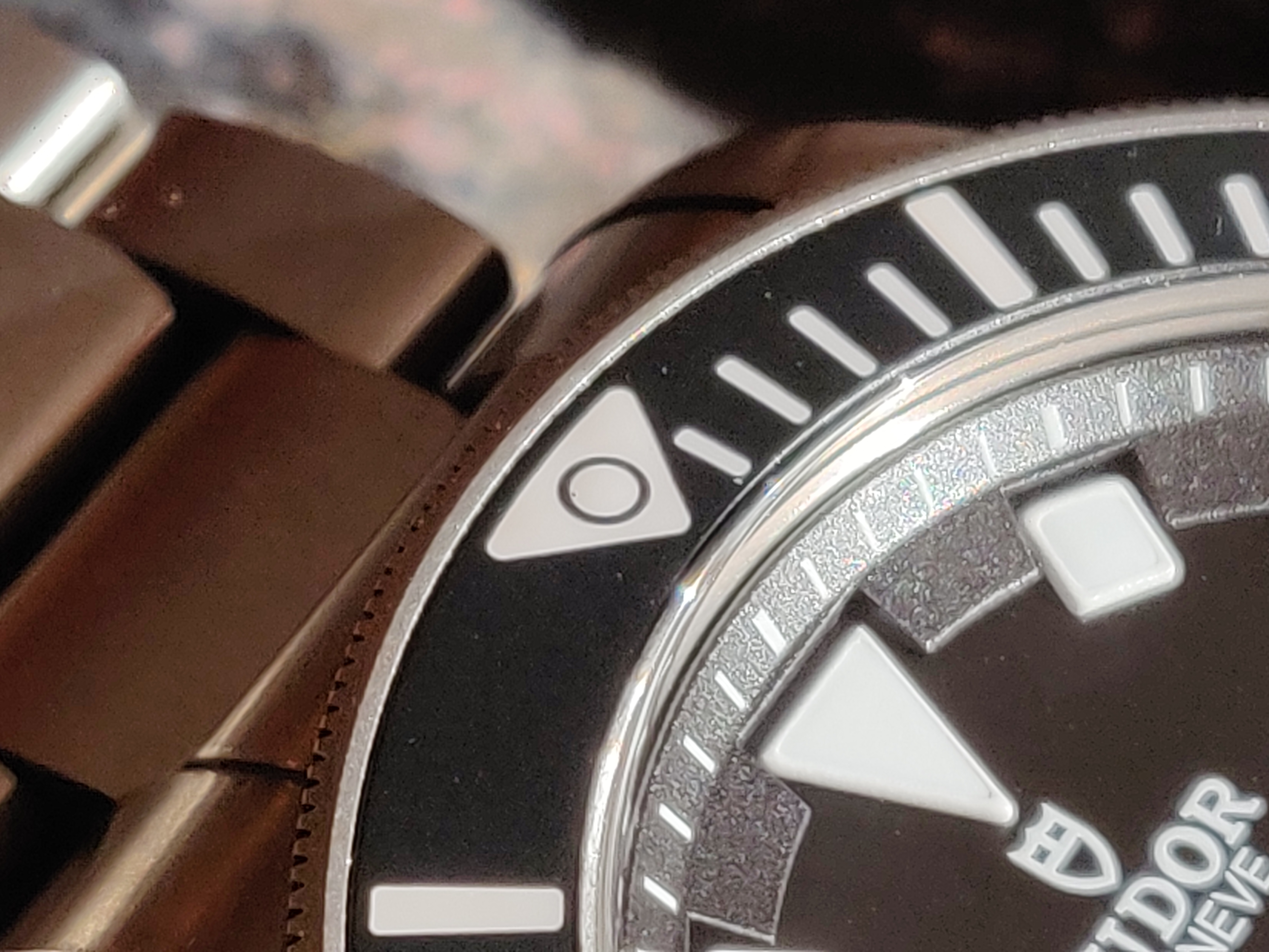
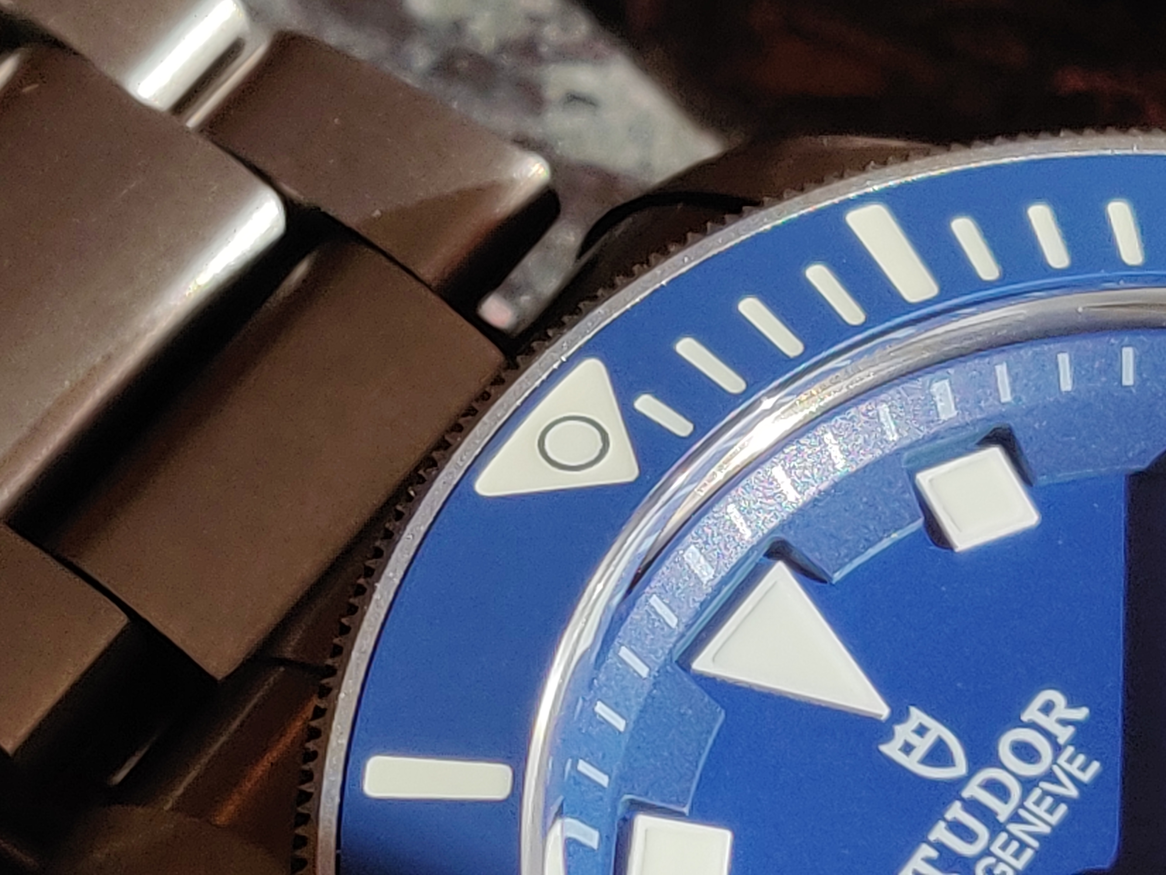
The triangle at 12 looked pretty great on all 3 watches, with there being ultra fine macro details worth of difference. Spot on, XF! :clap_1:
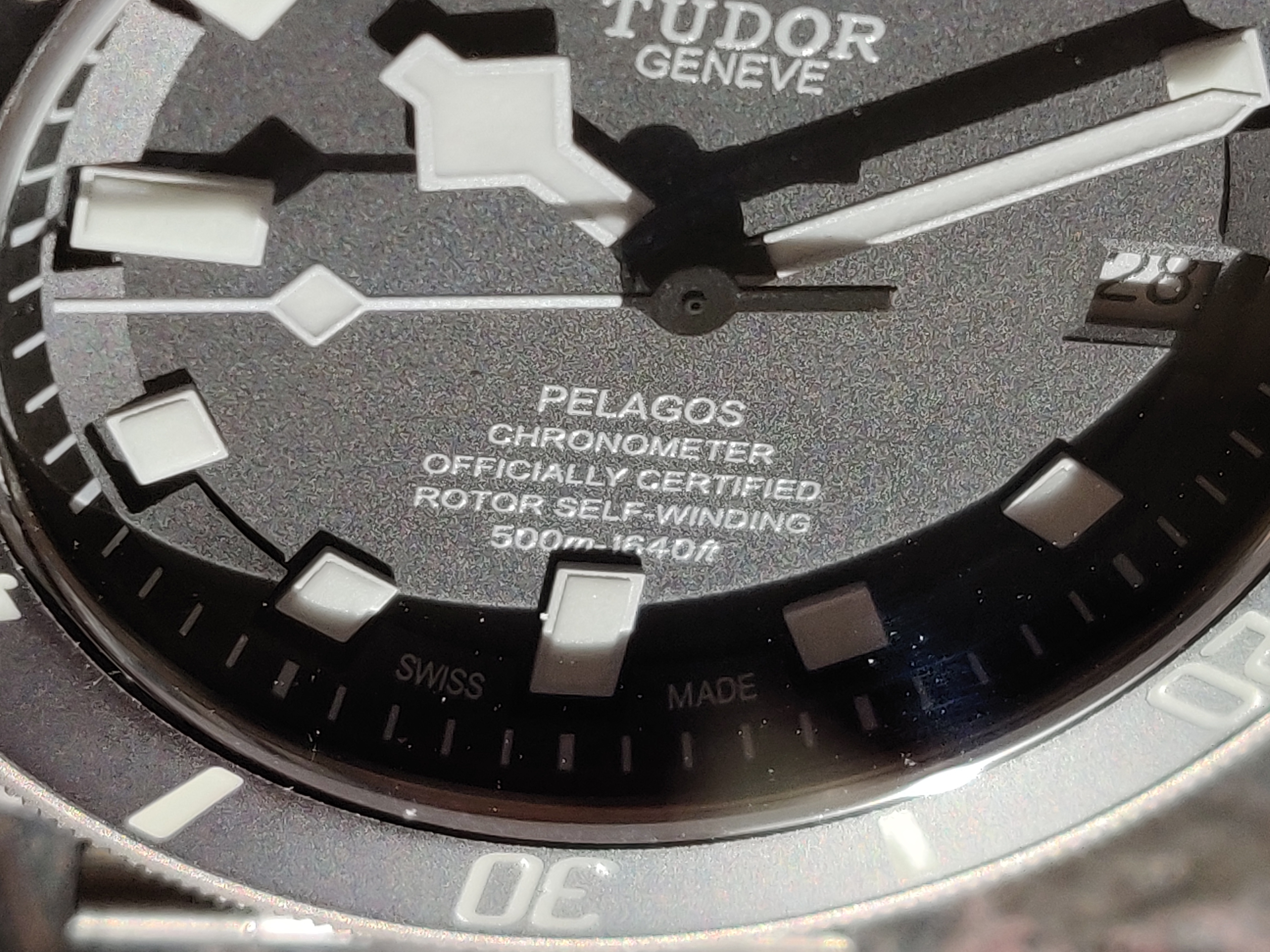
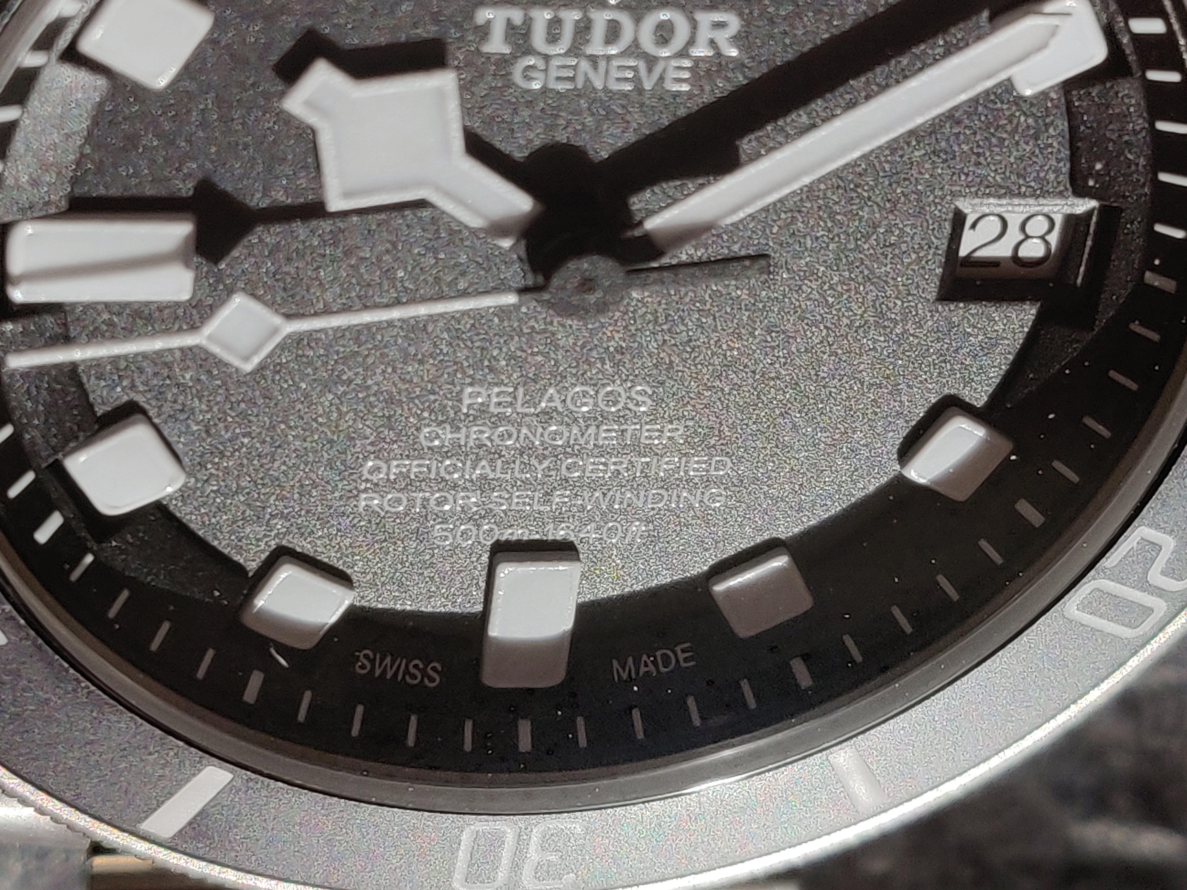
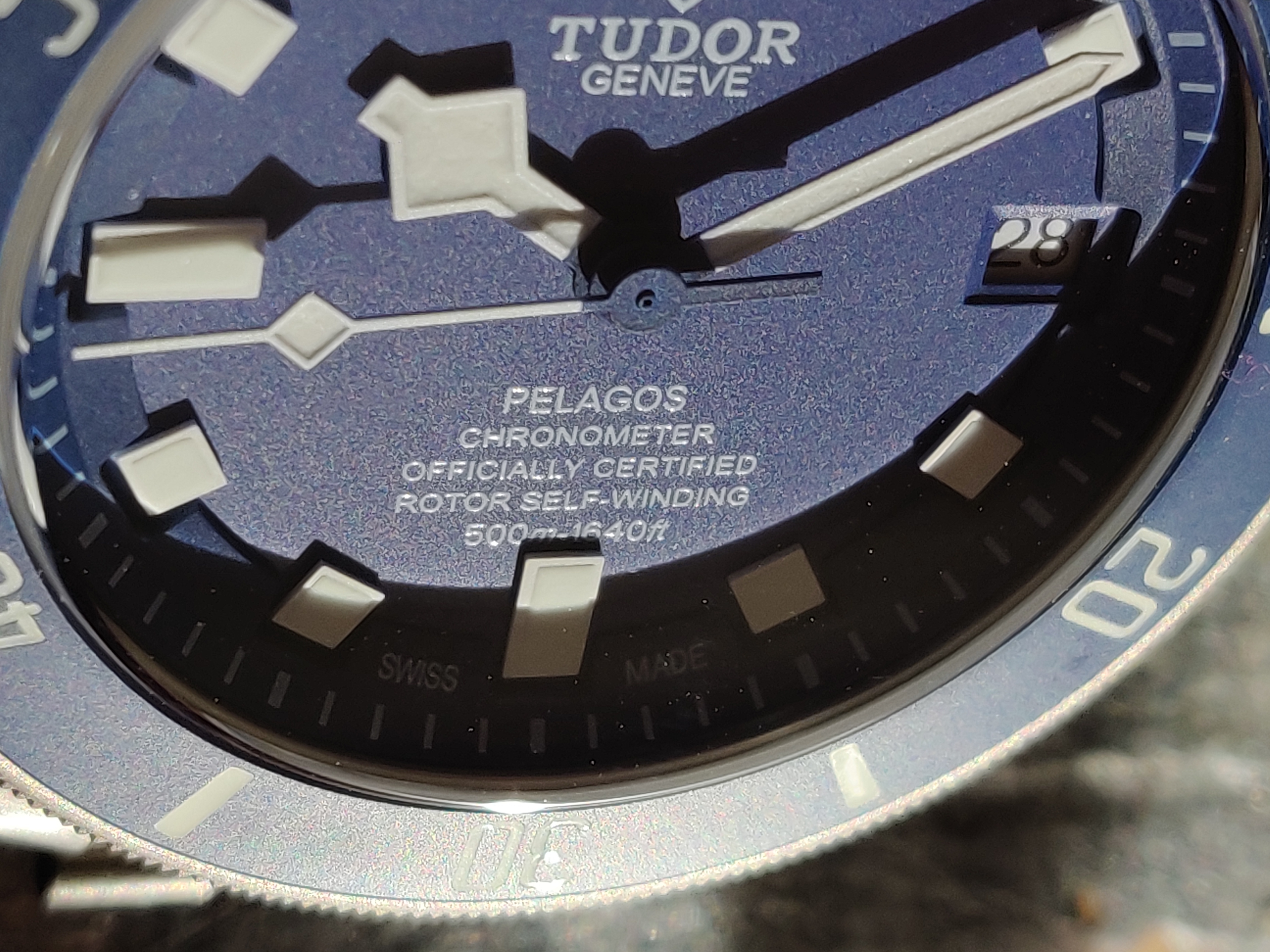
The dial font on the gen and V5 are super close, with the XF'V6F V4 being much thicker. Loads of bonus points to the V5 for this great detail.
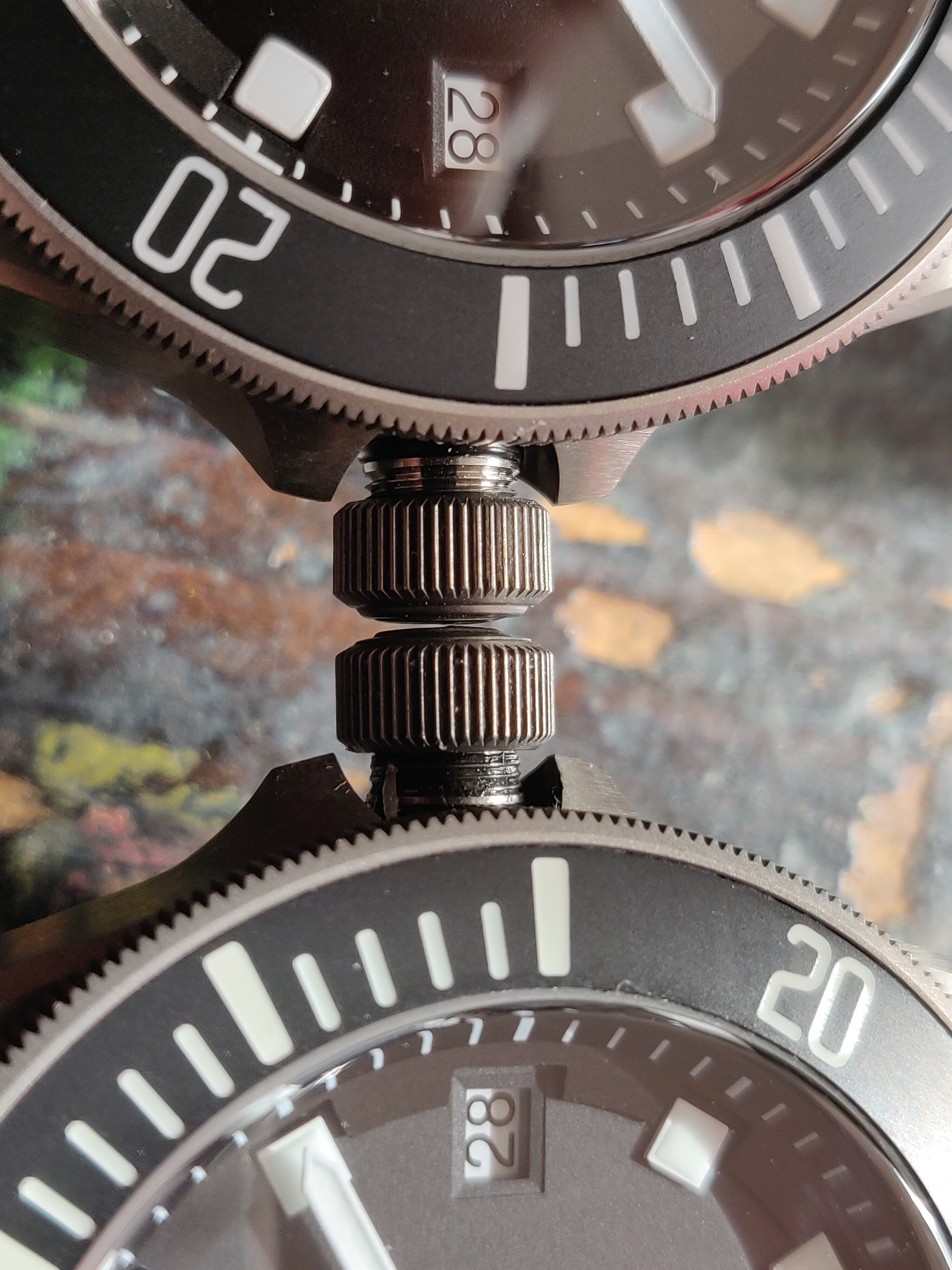
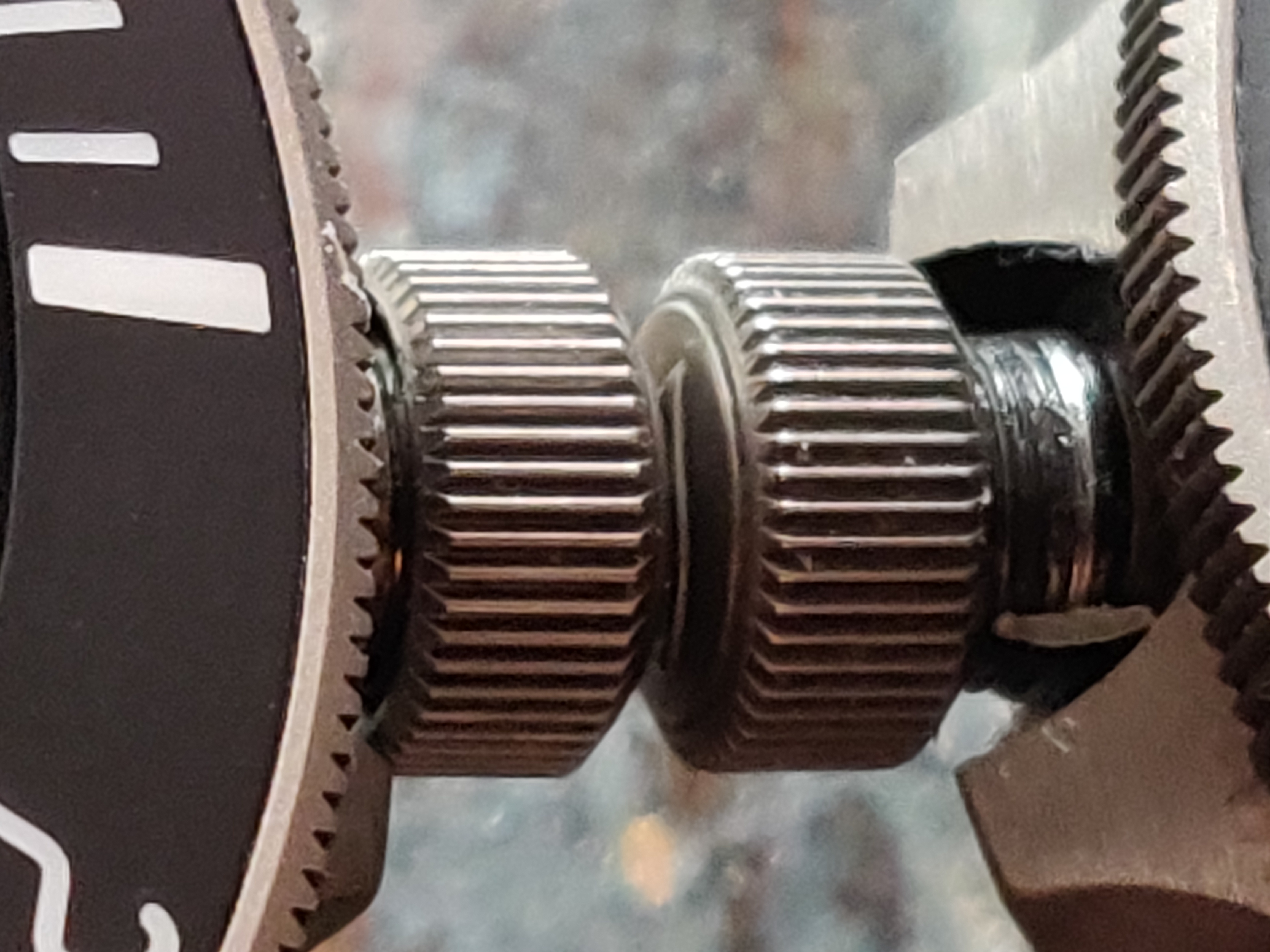
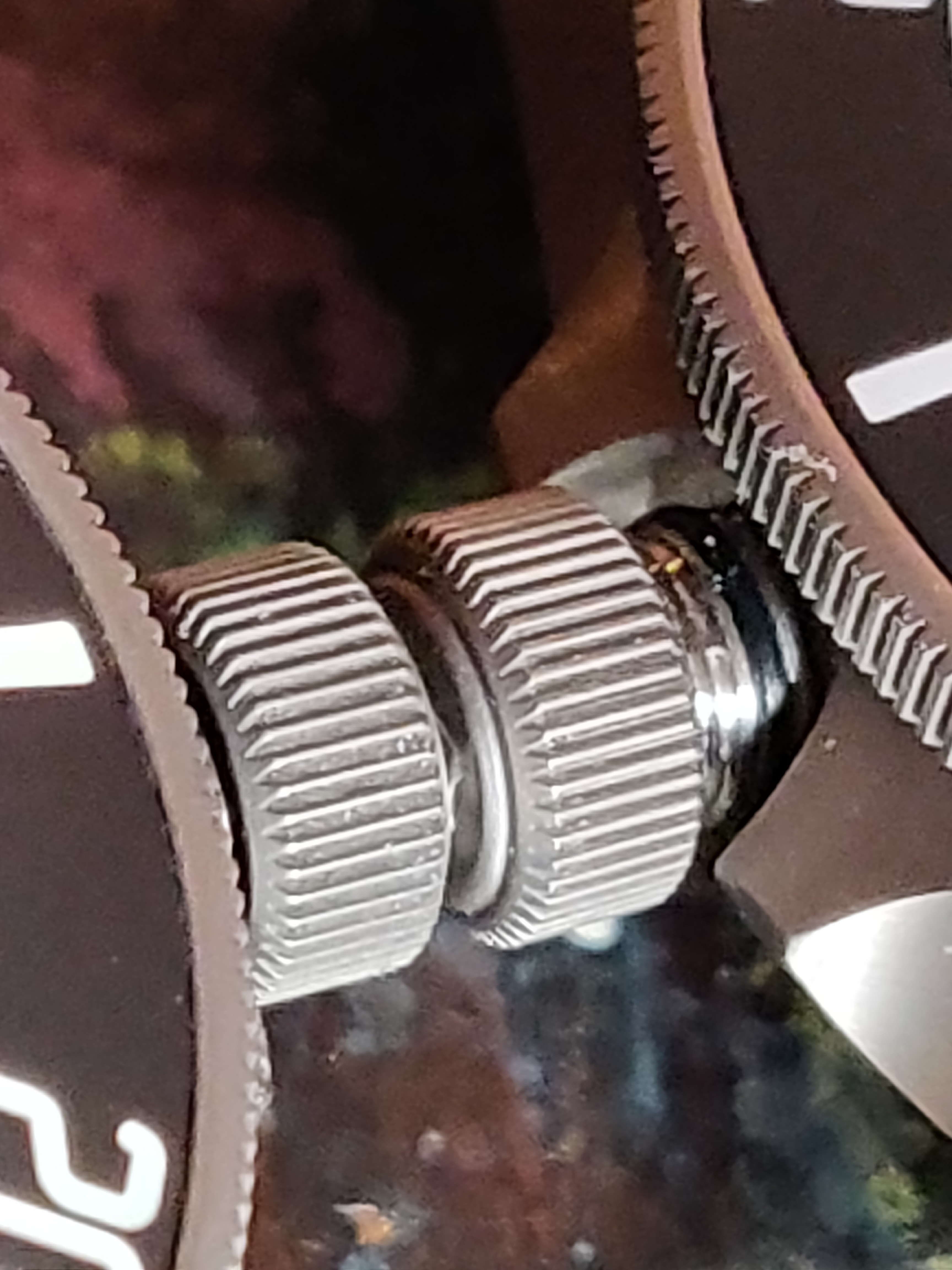
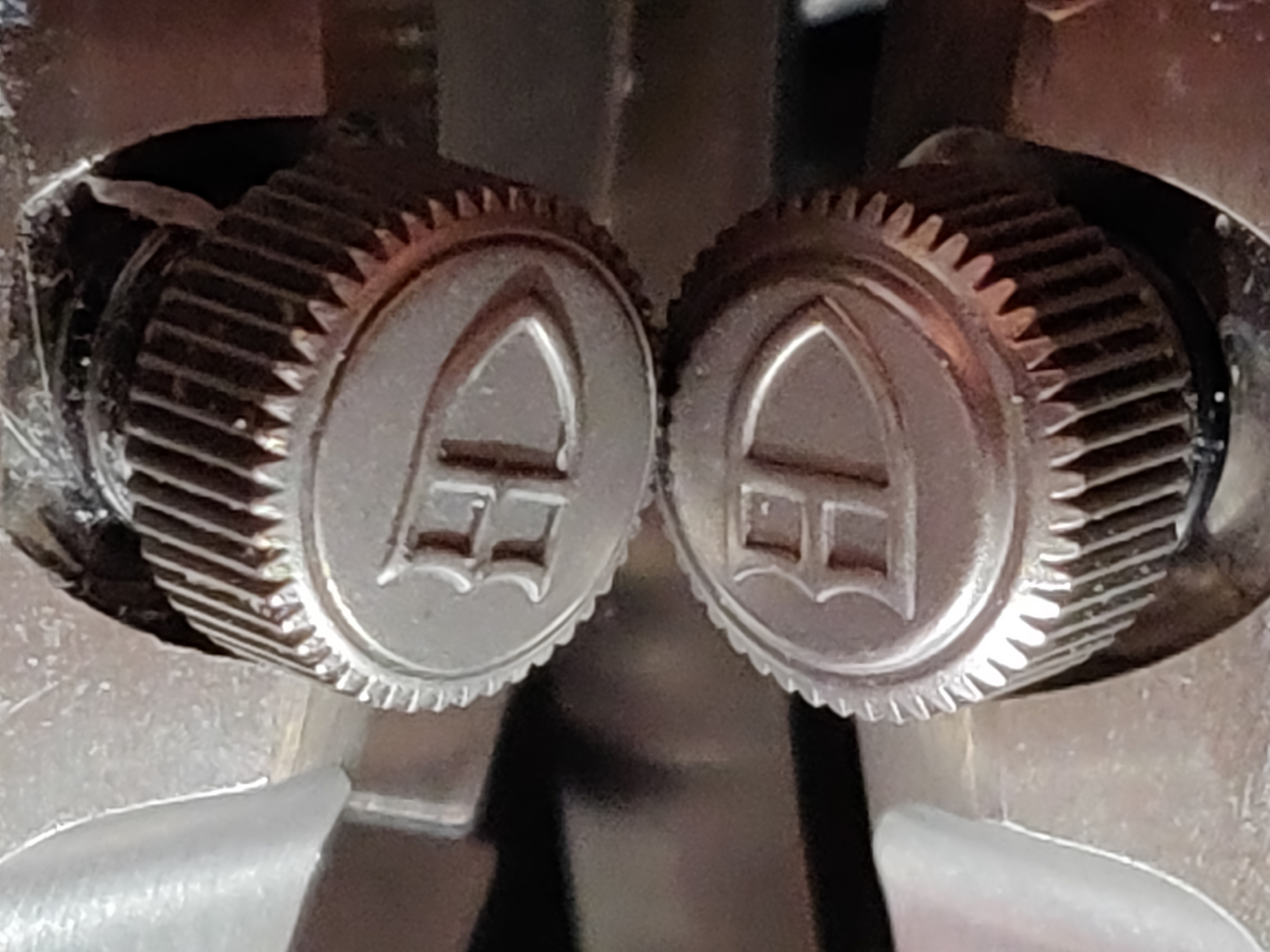
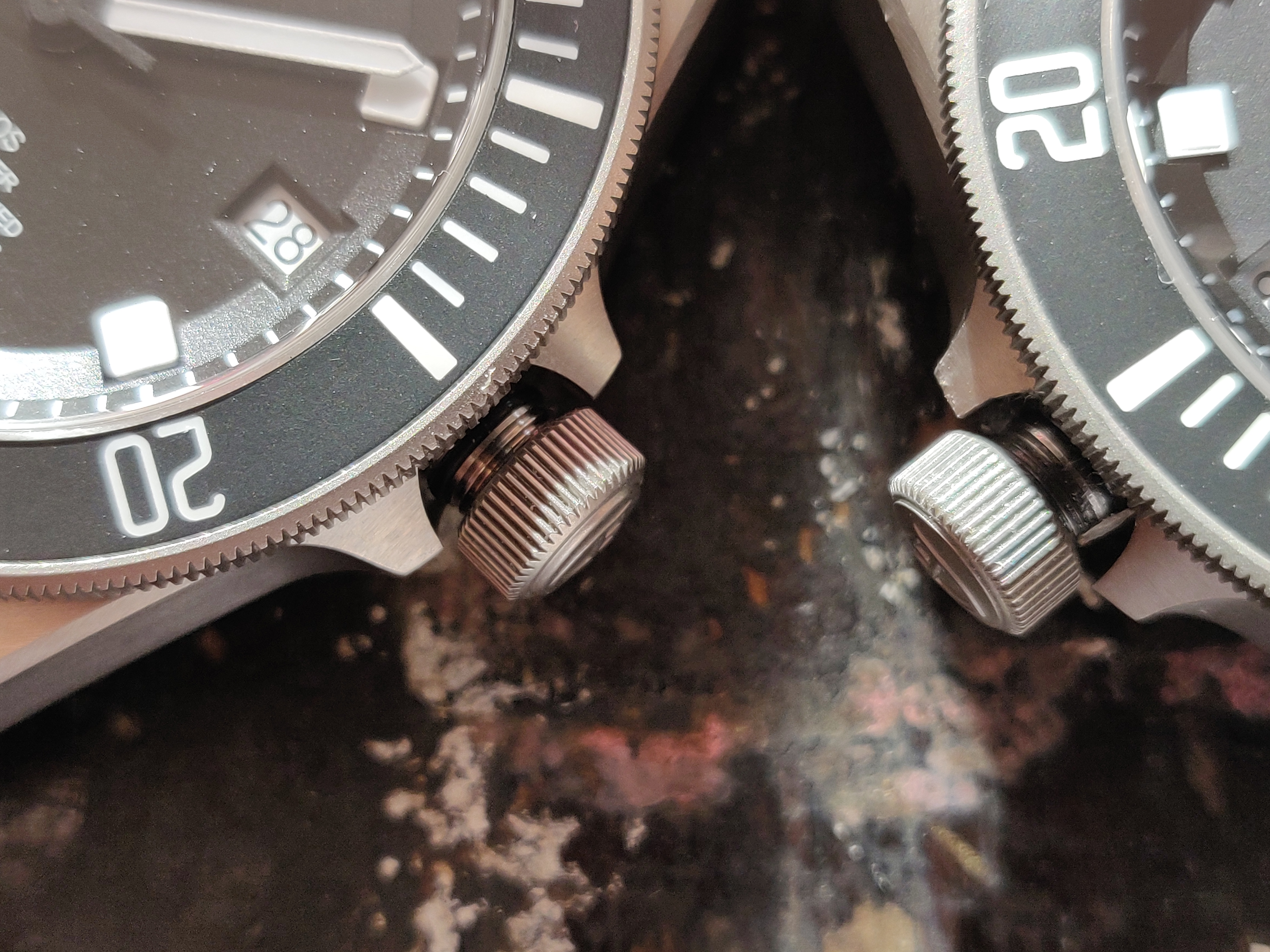
Comparing the knurling on the crown and crown logos of the XF/V6F V4 and gen here. The devil is in the details and you can see the differences are pretty stark under magnification. The knurling is significantly smoother and consistent on the gen, but serious props to the rep nonetheless. The crown logo is a bit botched on the rep V4 when compared with the gen.
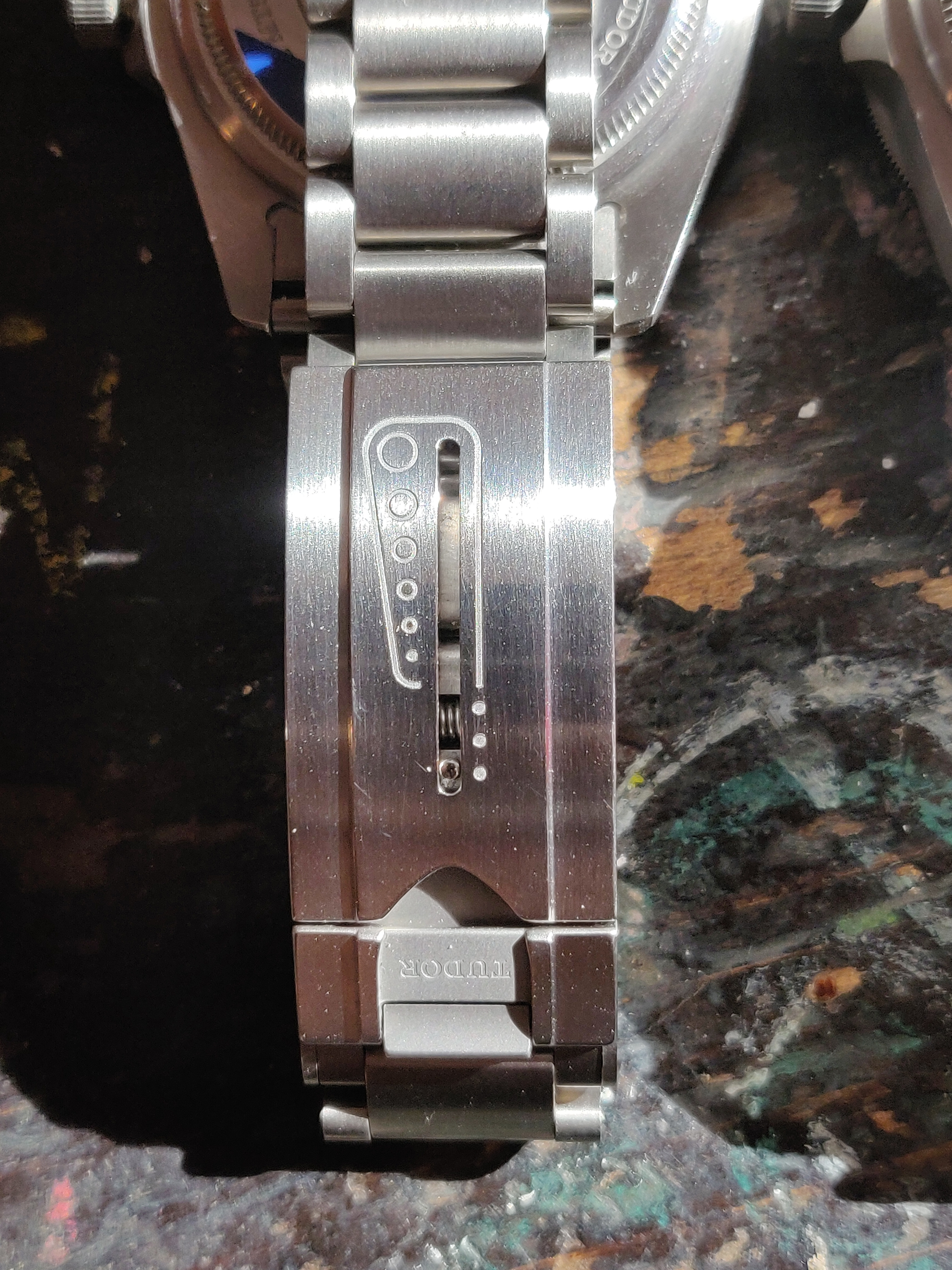
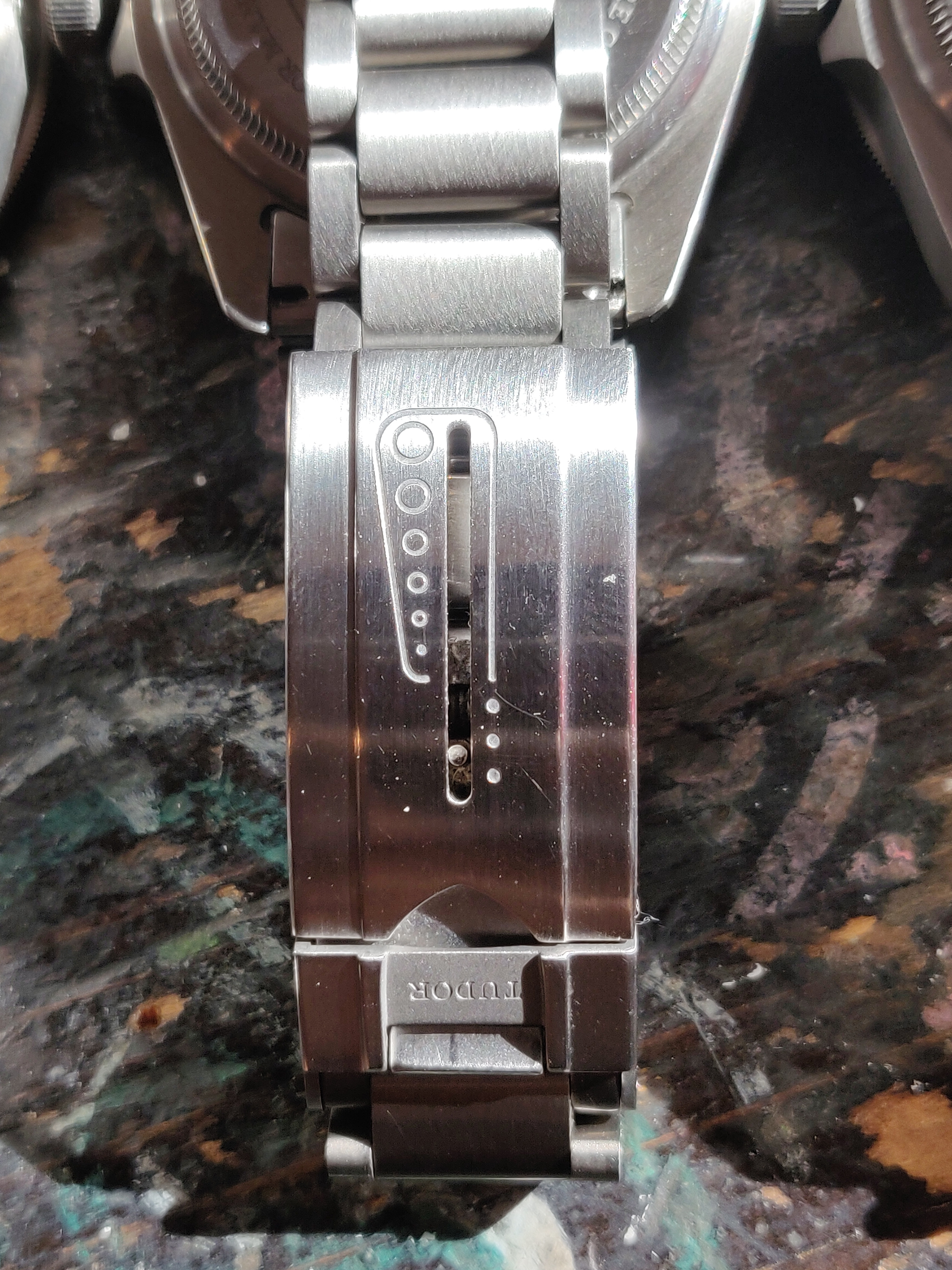
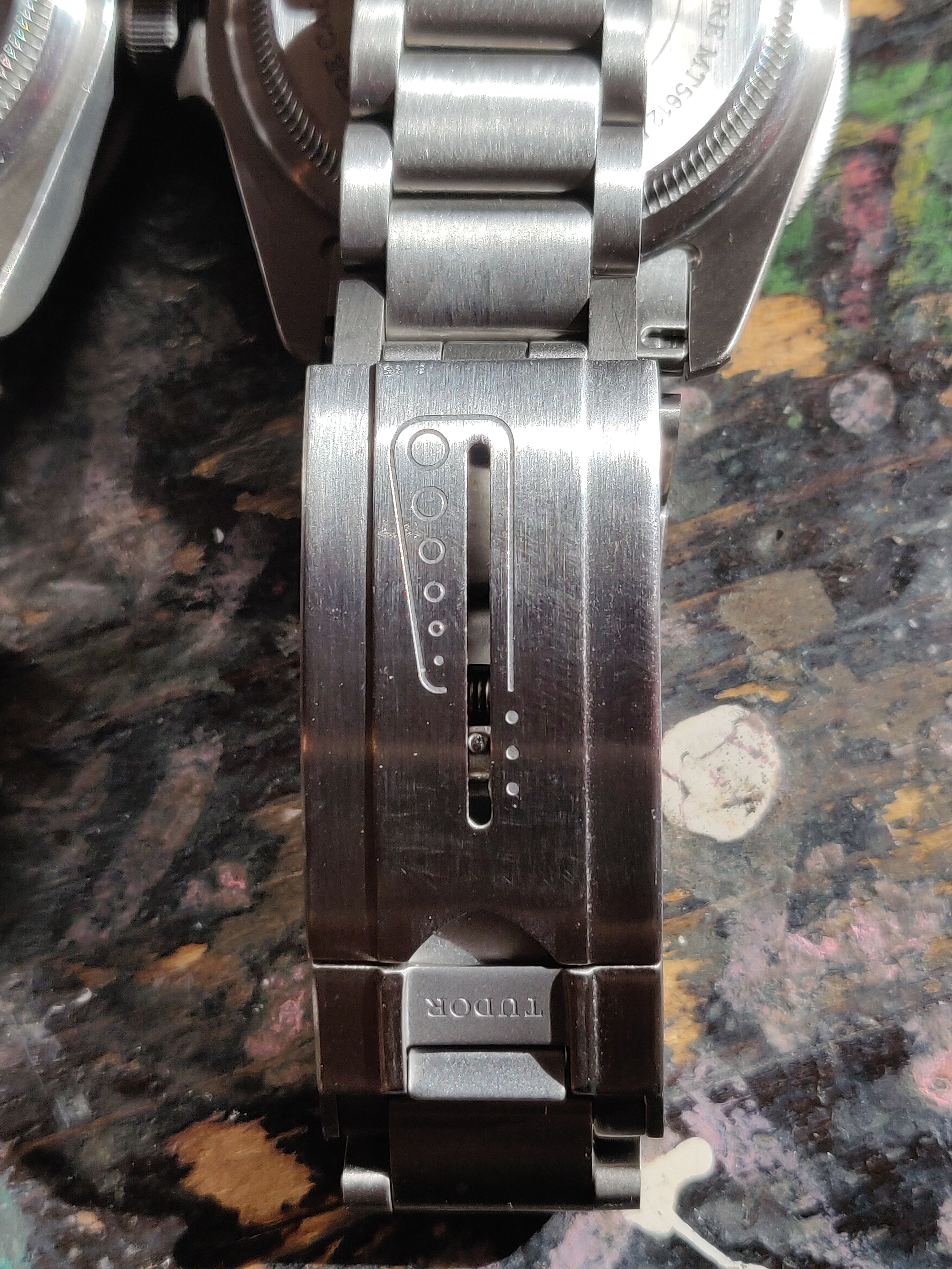
Rapid fire quiz. Can you spot the gen clasp? :detective2:
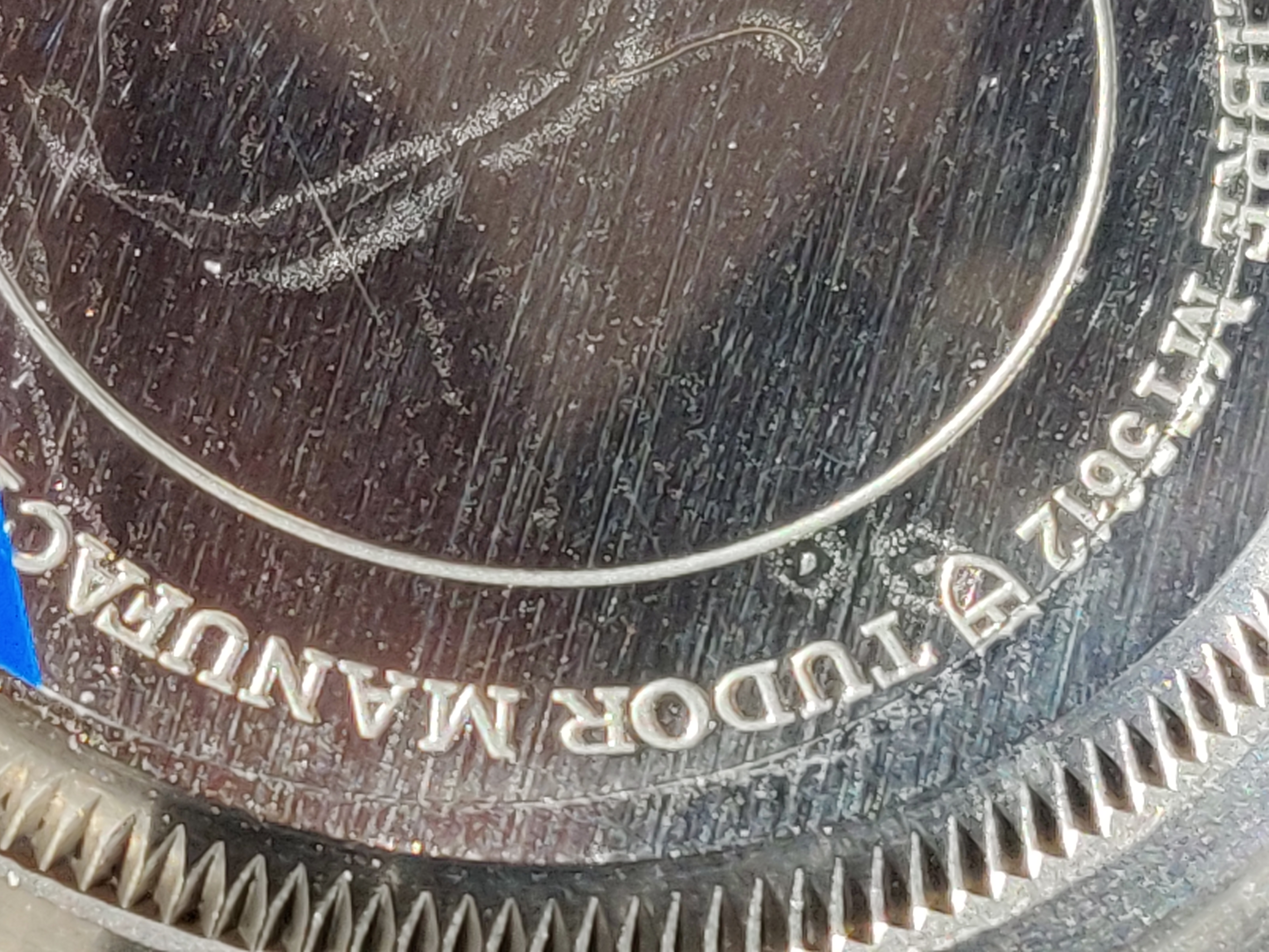
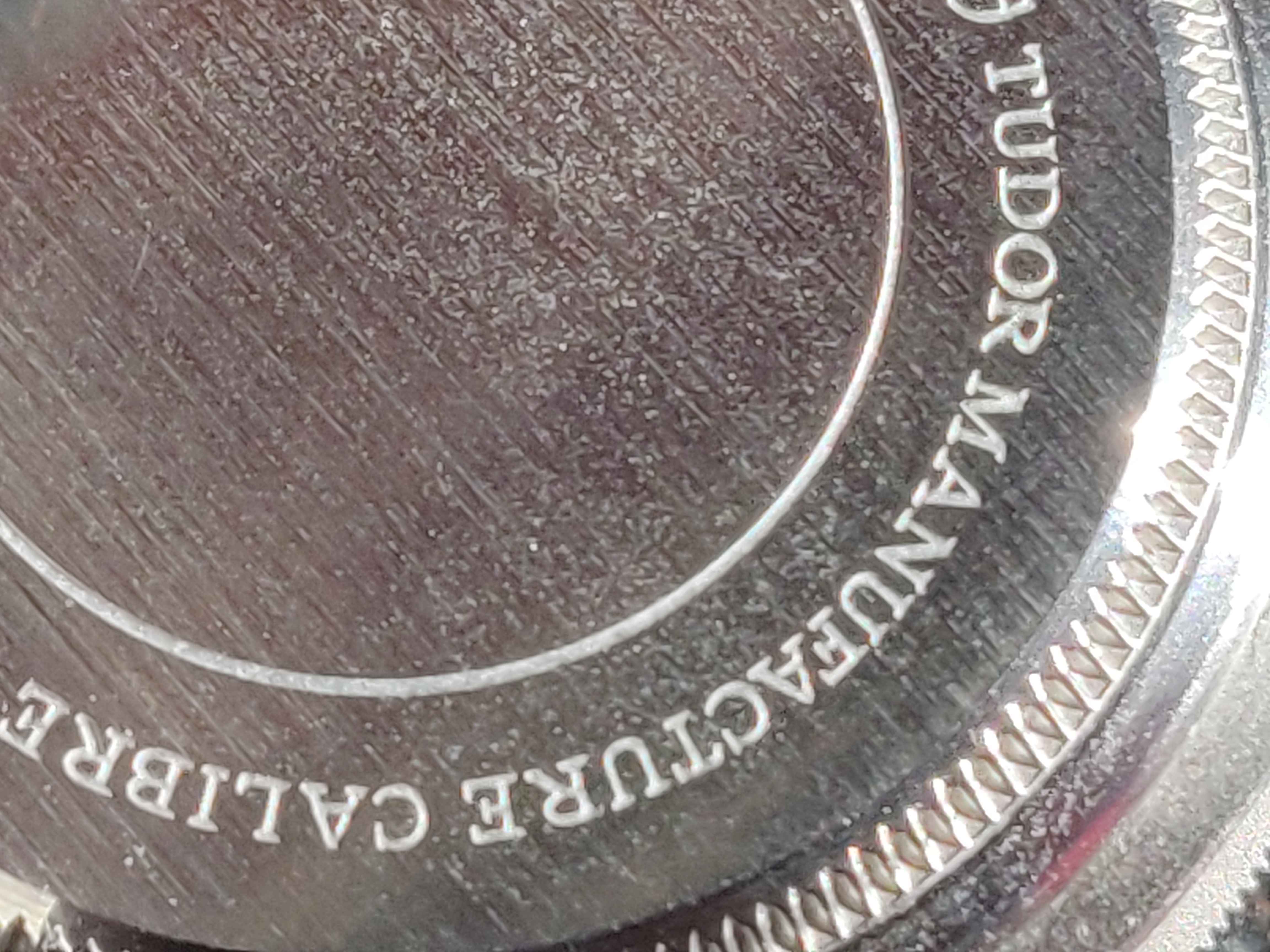
Engravings are MUCH thicker and deeper on the gen caseback, and knurling is shallower on the rep (V5 shown)
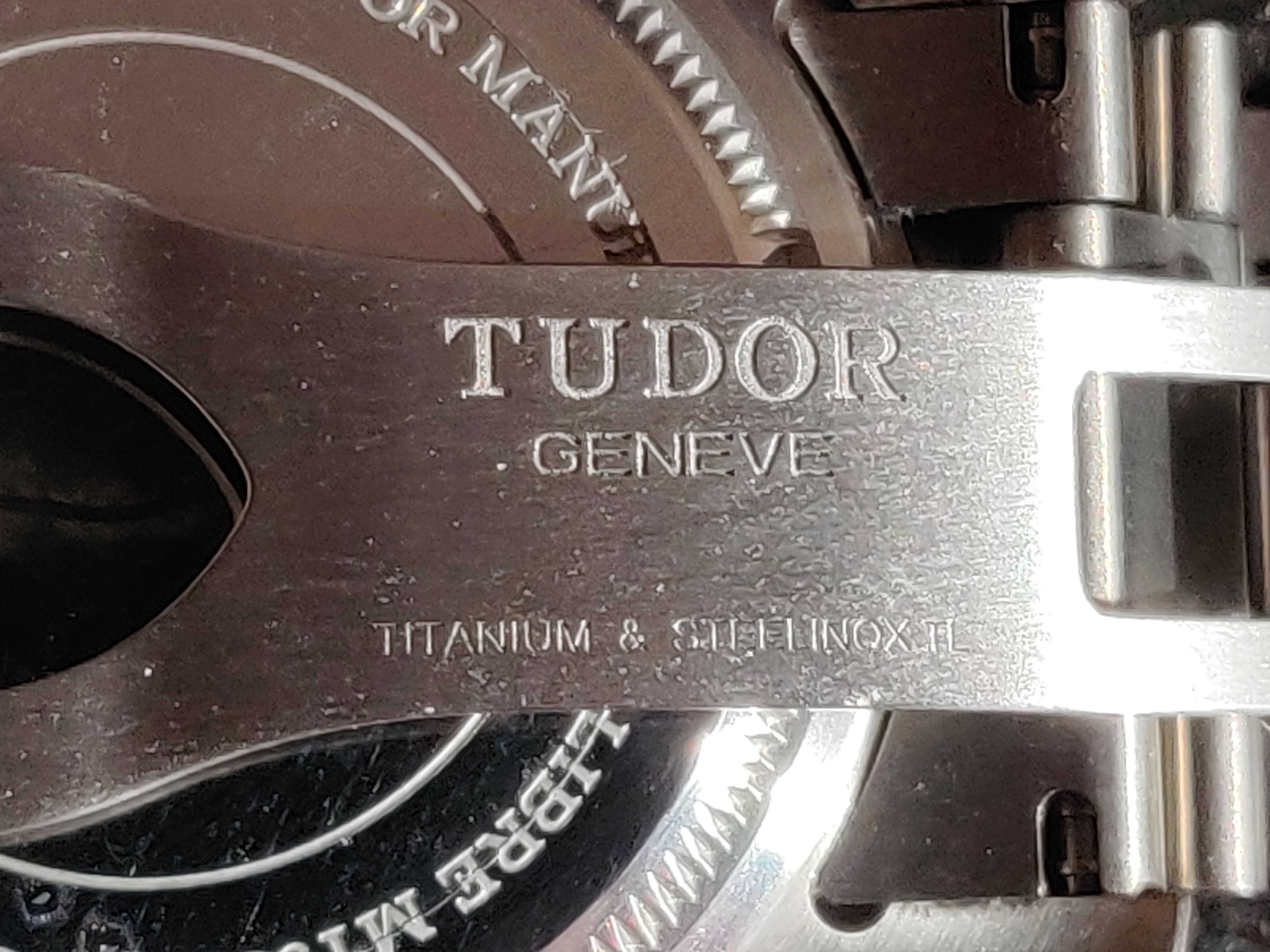
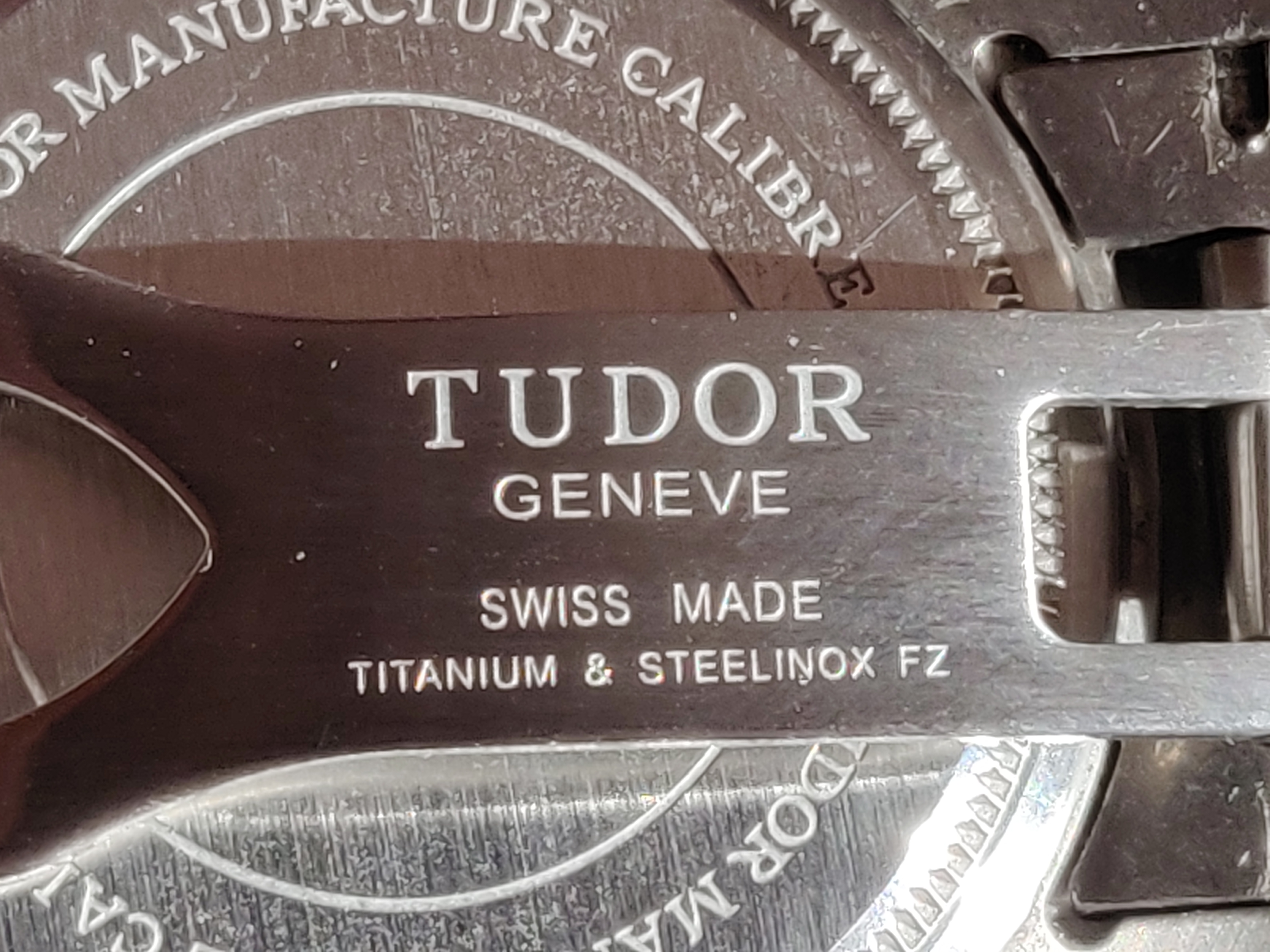
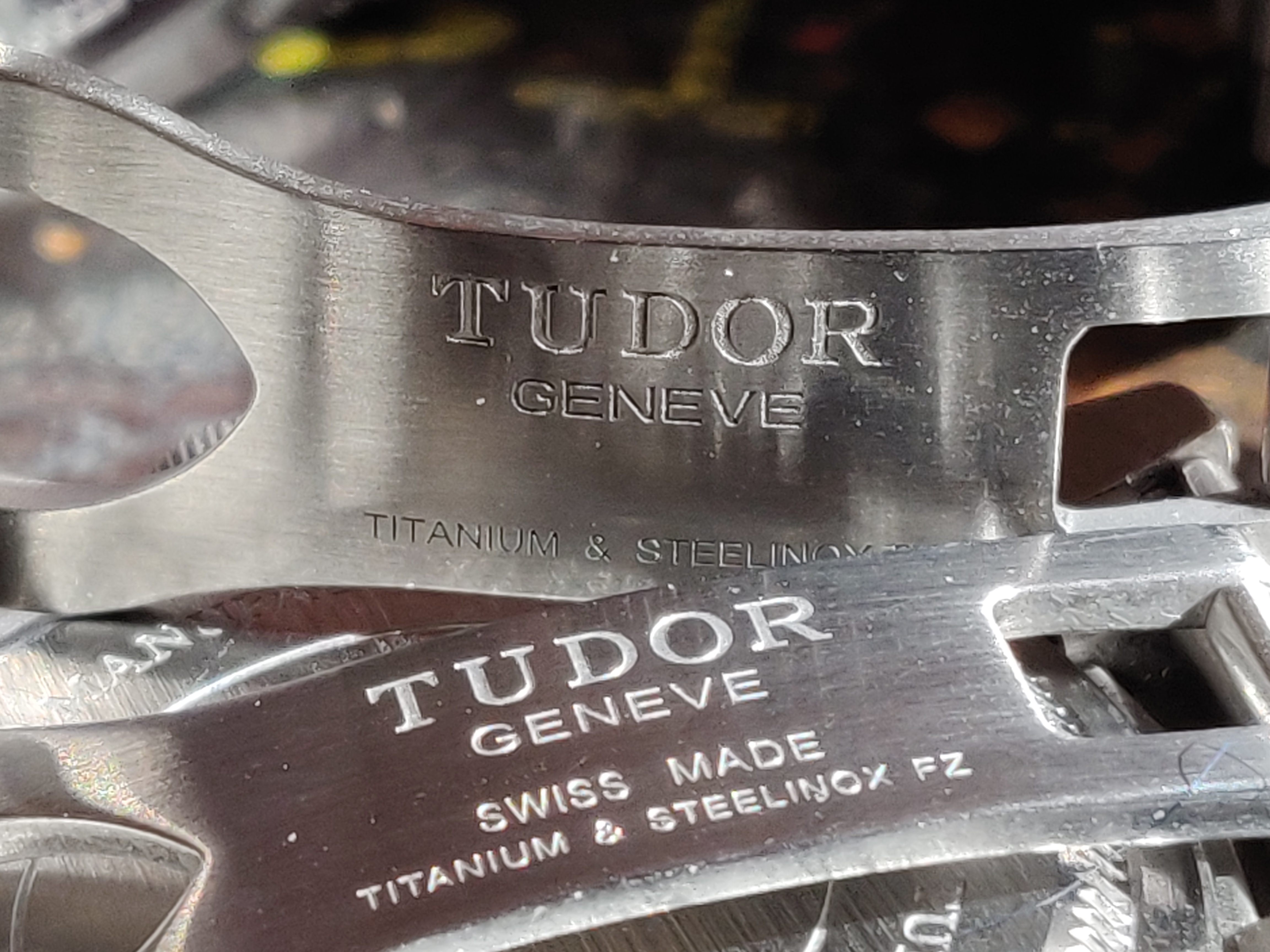
Comparing the gen and XF V5 here, the gen has thinner, but deeper engravings on the clasp. Also great to compare the fonts here. Overall, XF did quite well considering!
Even MORE macro details
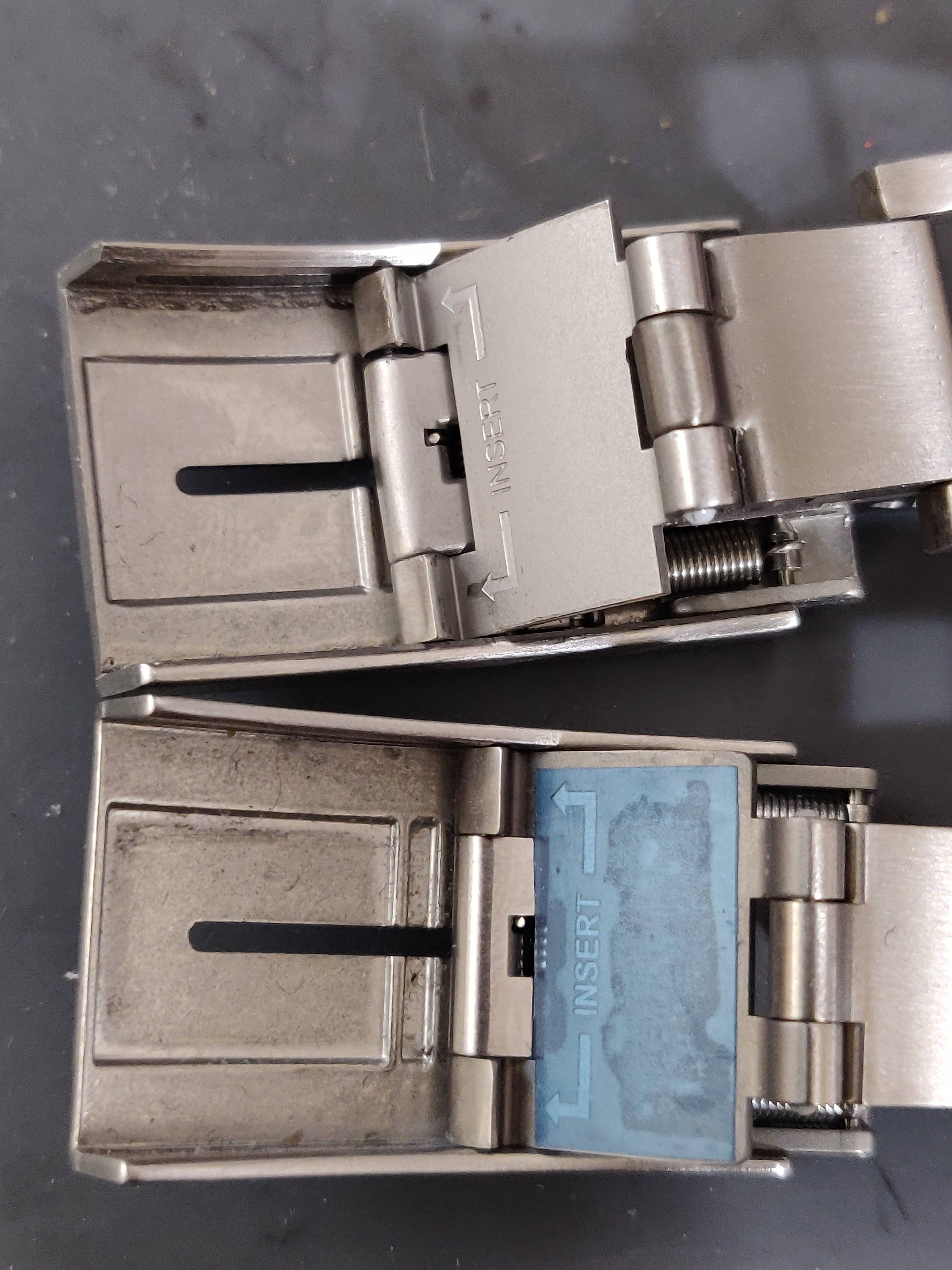
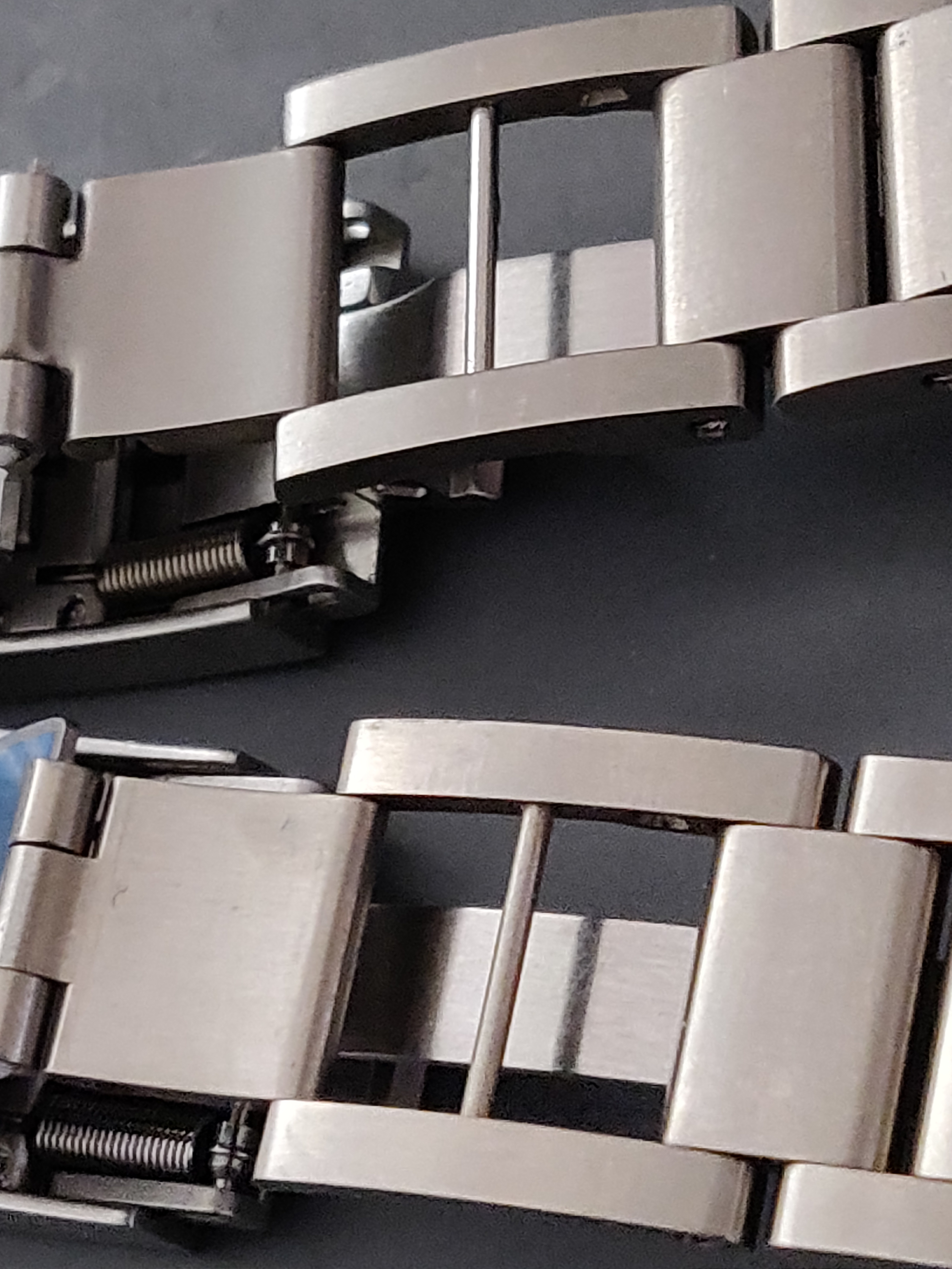
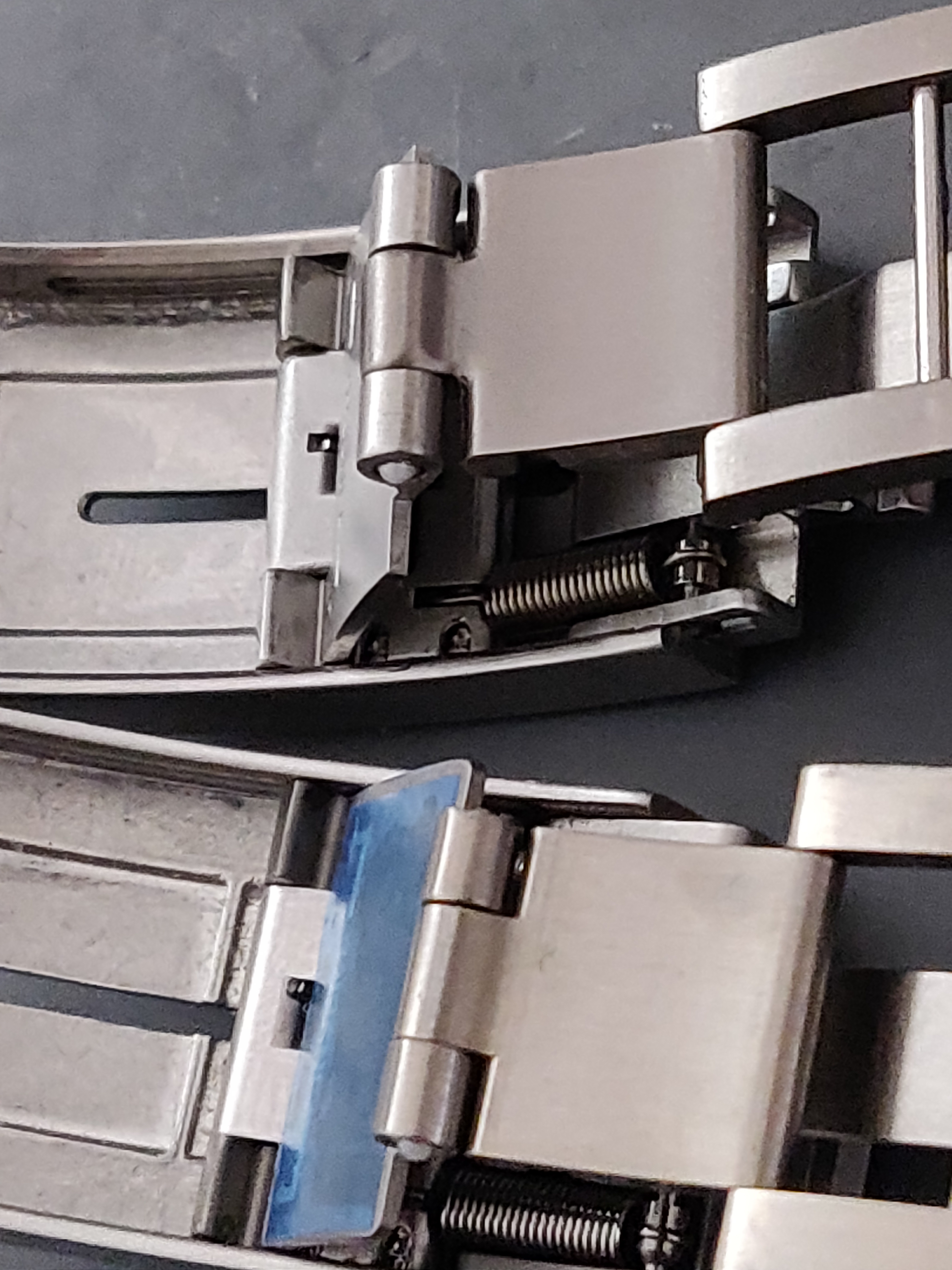
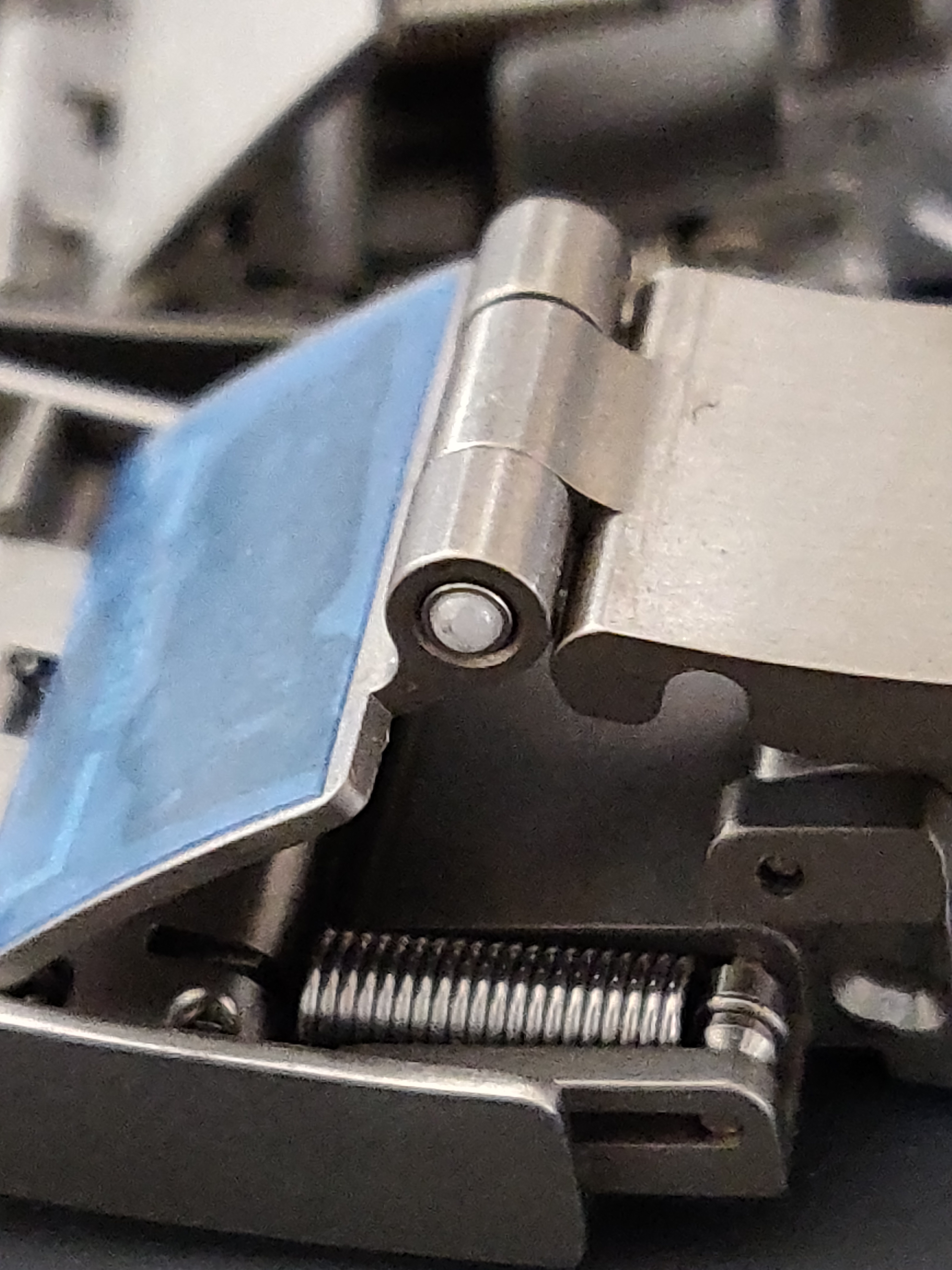
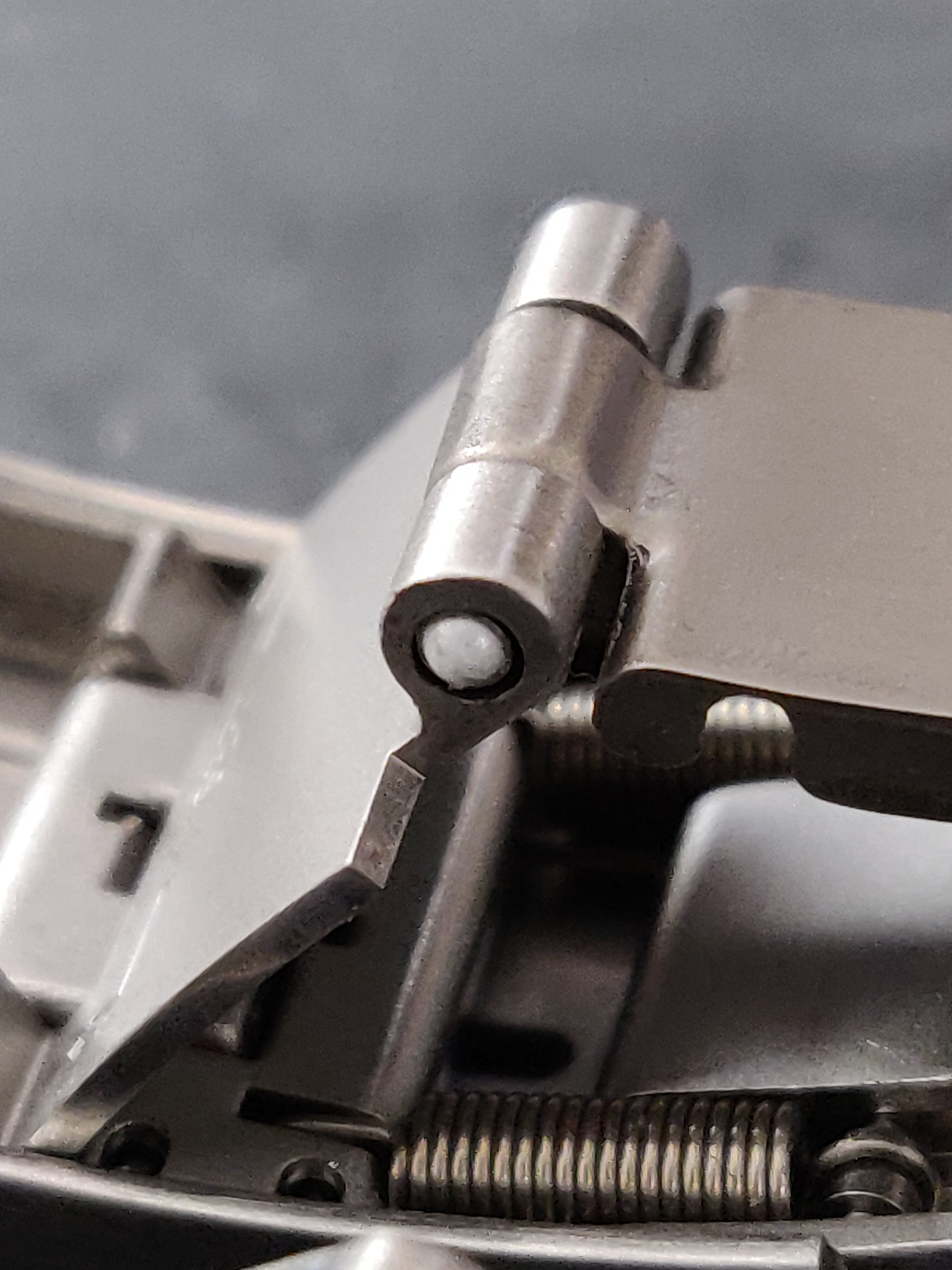
Some really interesting stuff here. Comparing the gen and XF V5, you can see that the diver's extension has razor sharp edges, while the gen has nice soft curves. The material used throughout the segment is also consistent on the gen, while on the rep it looks like they put in steel here and there. Notice the colouration and difference in glow between the materials.
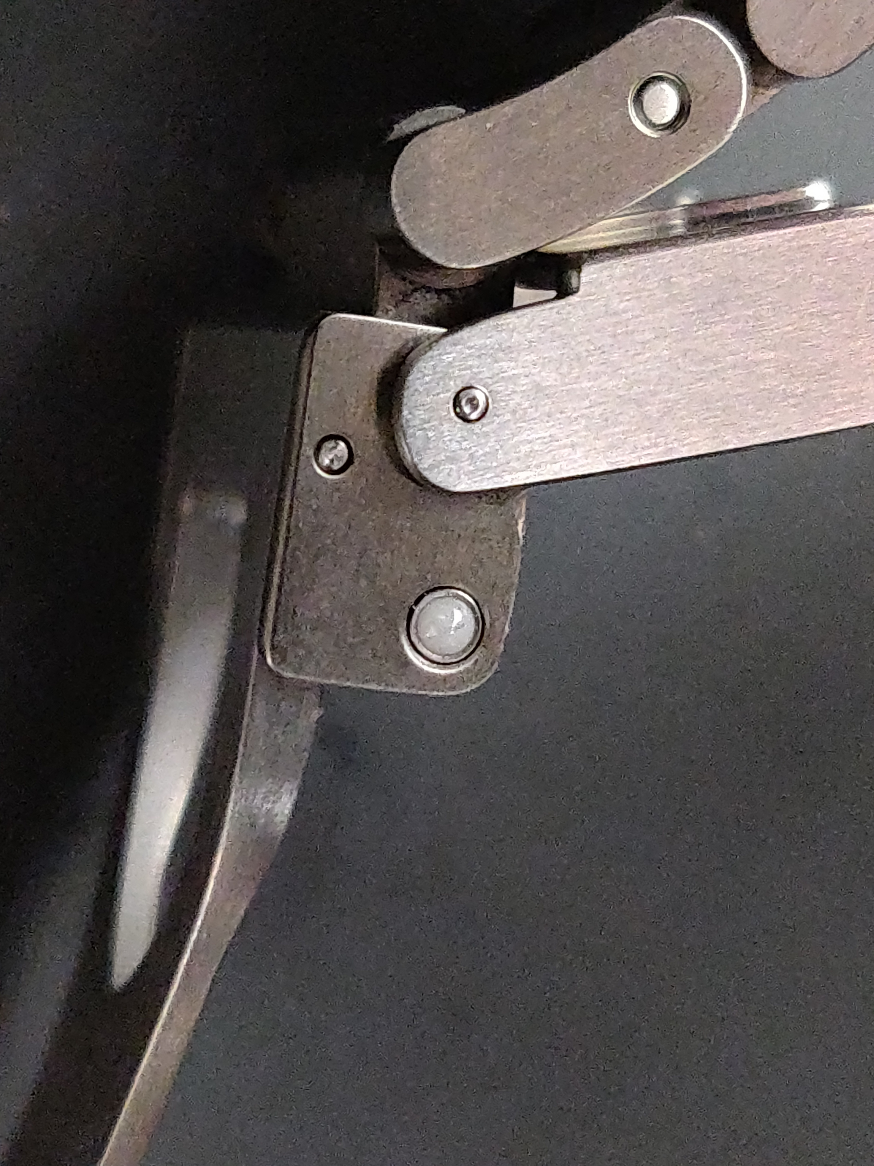
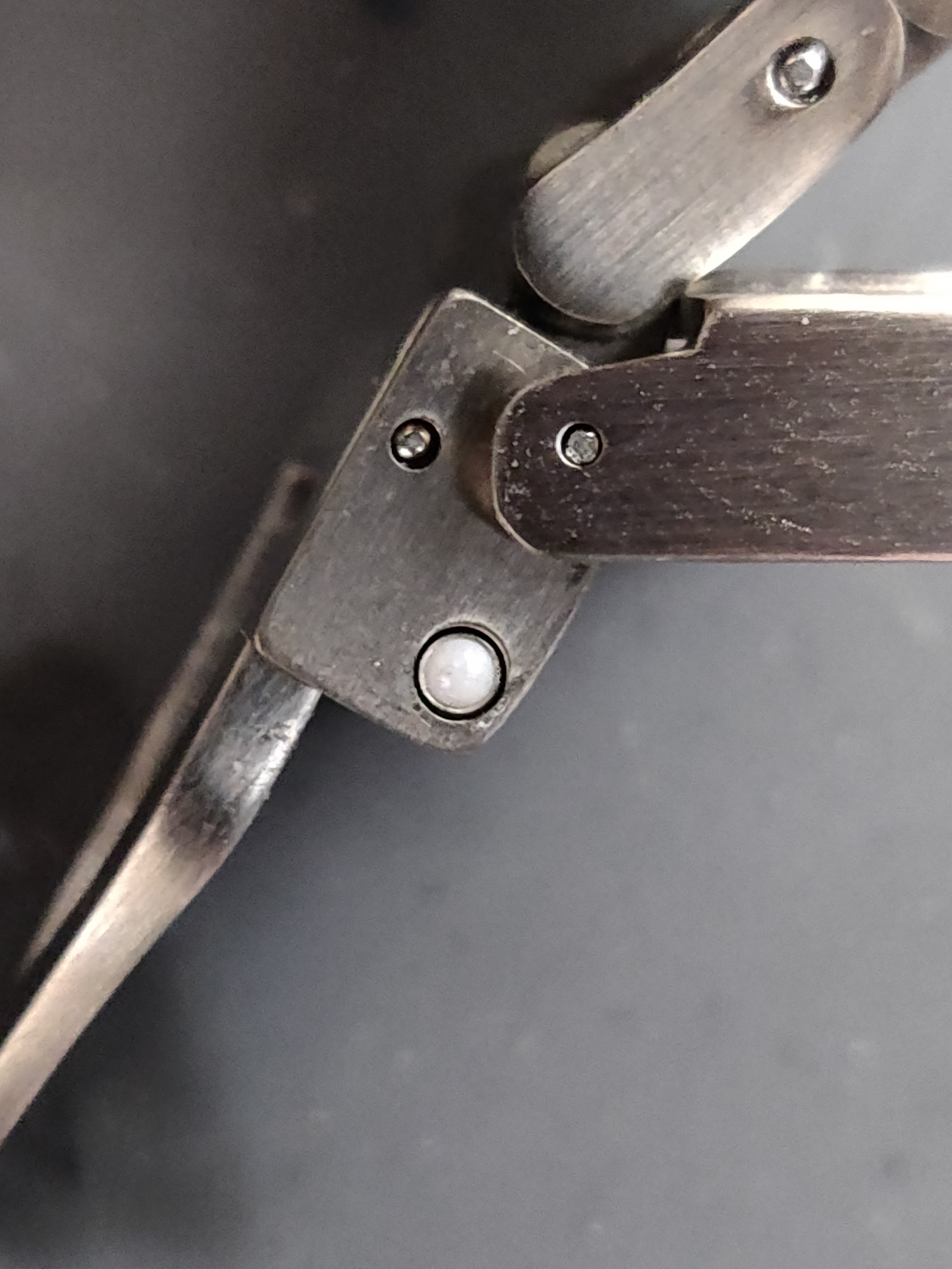
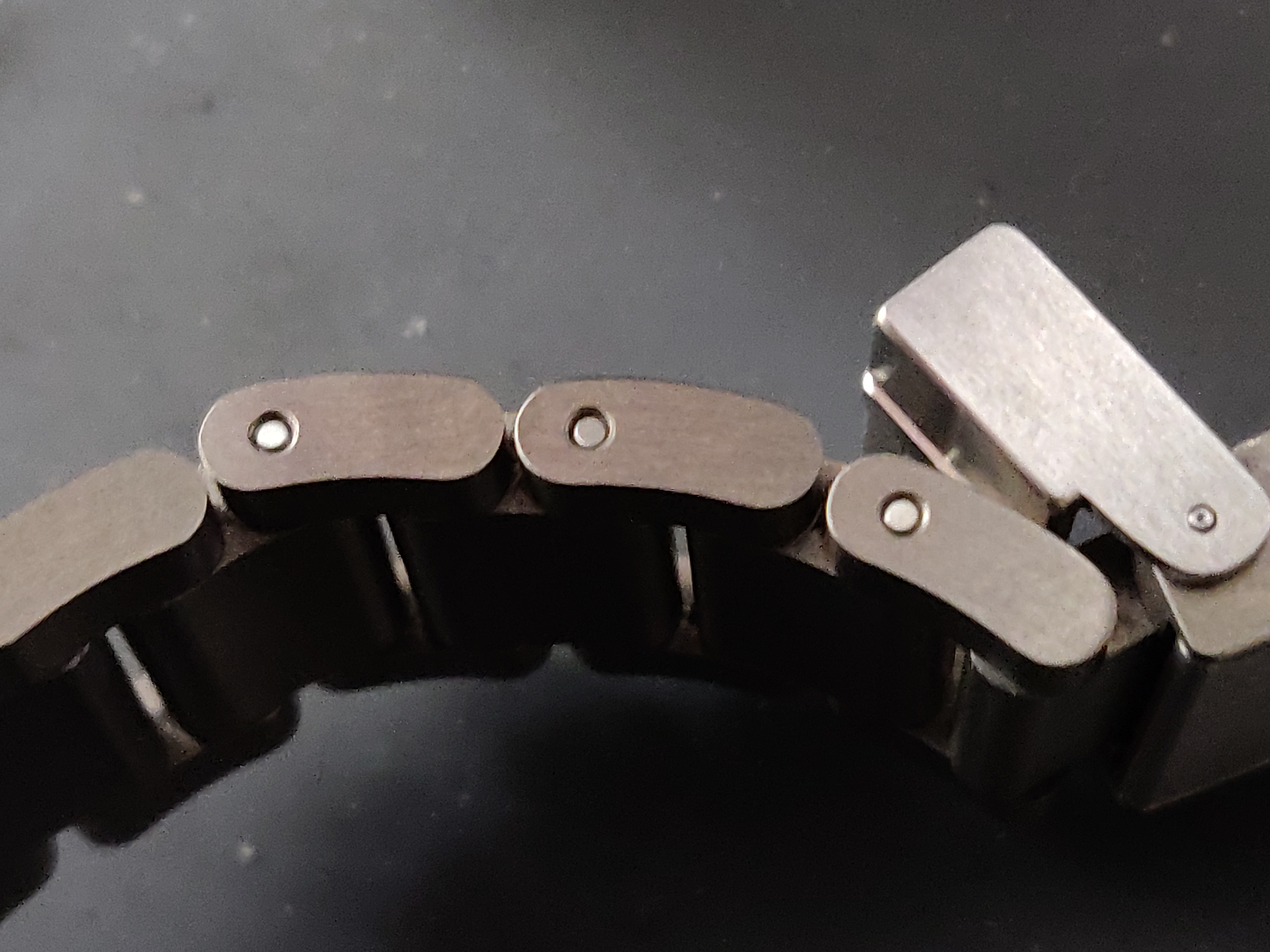
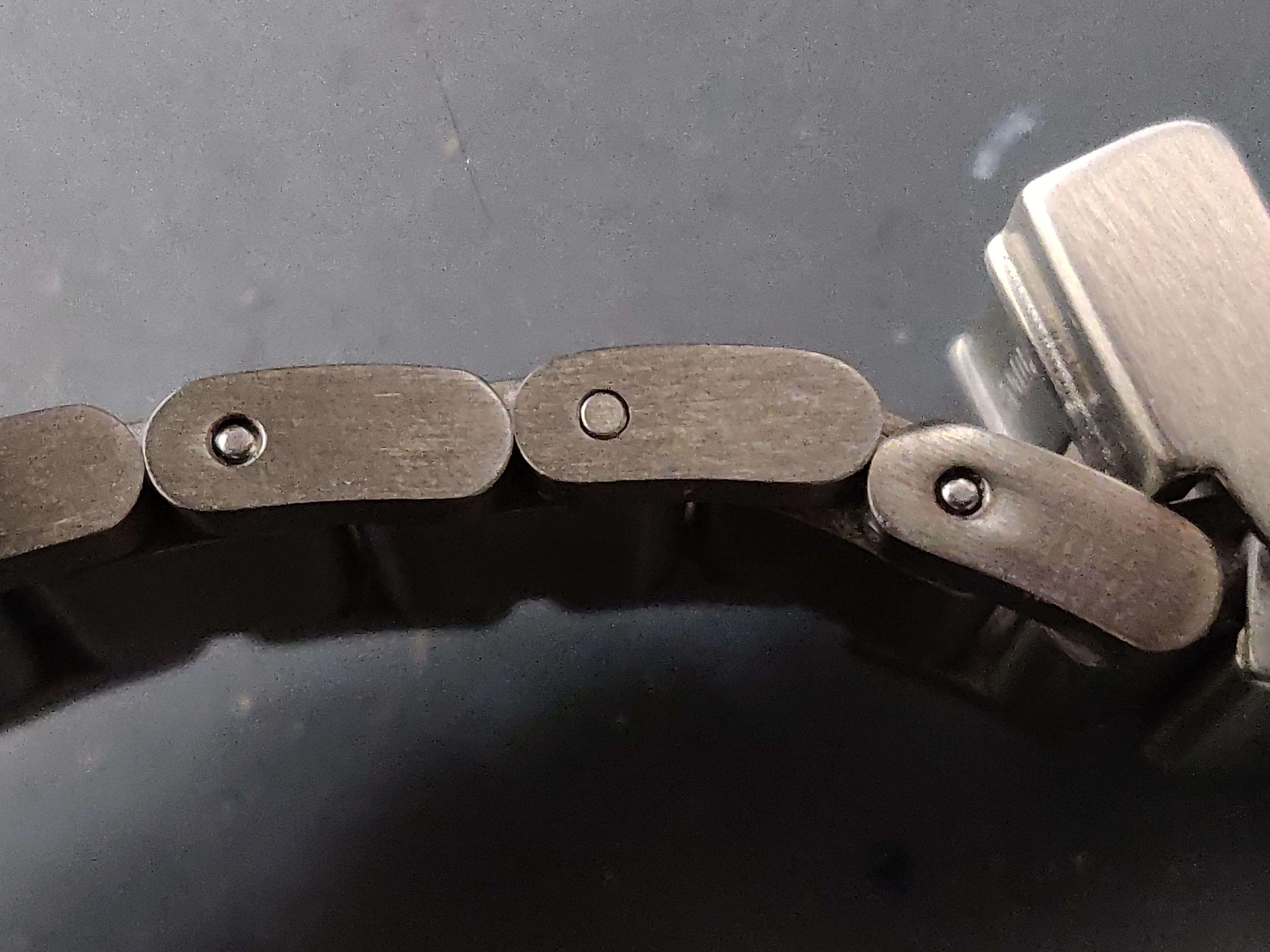
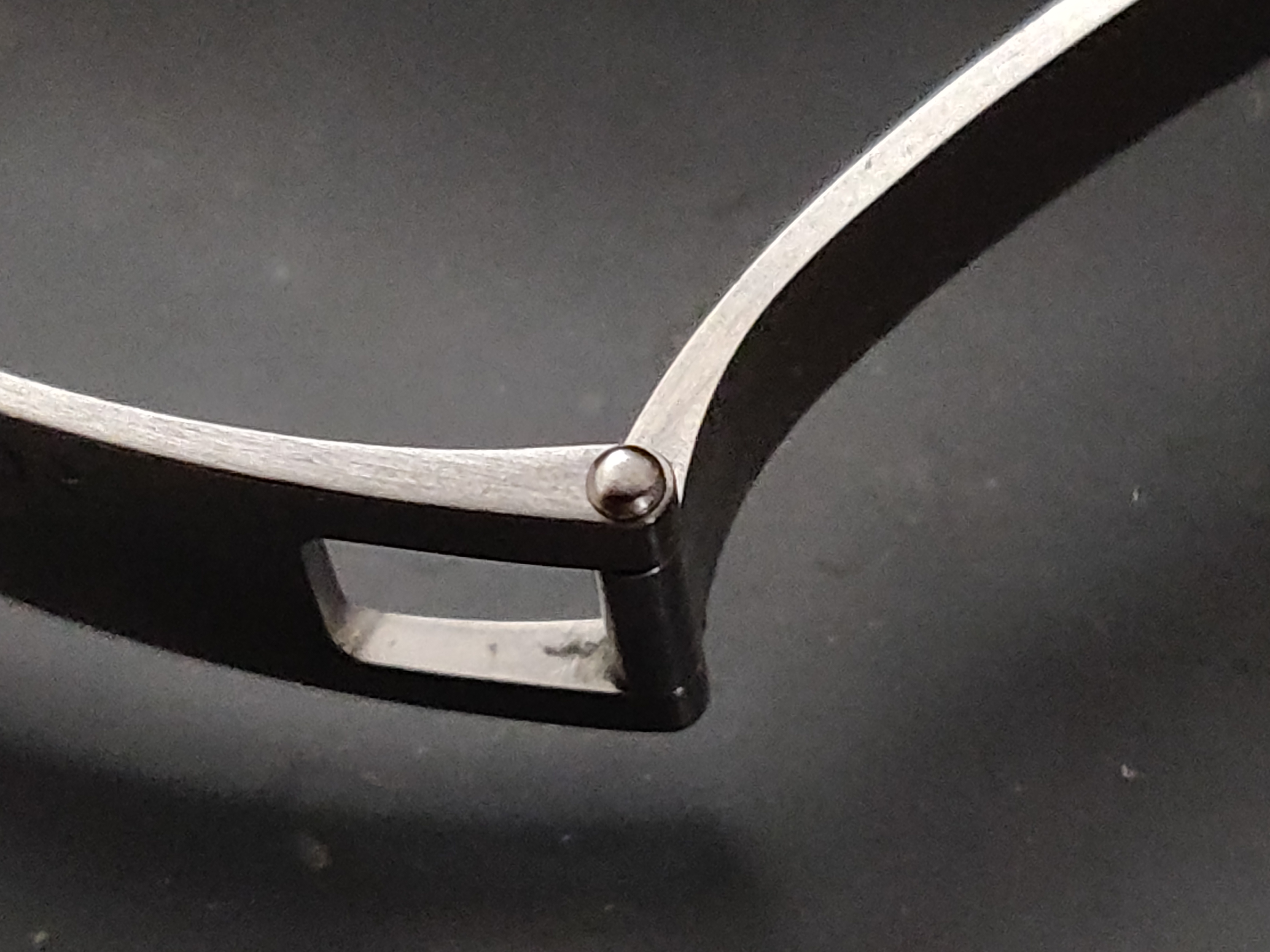
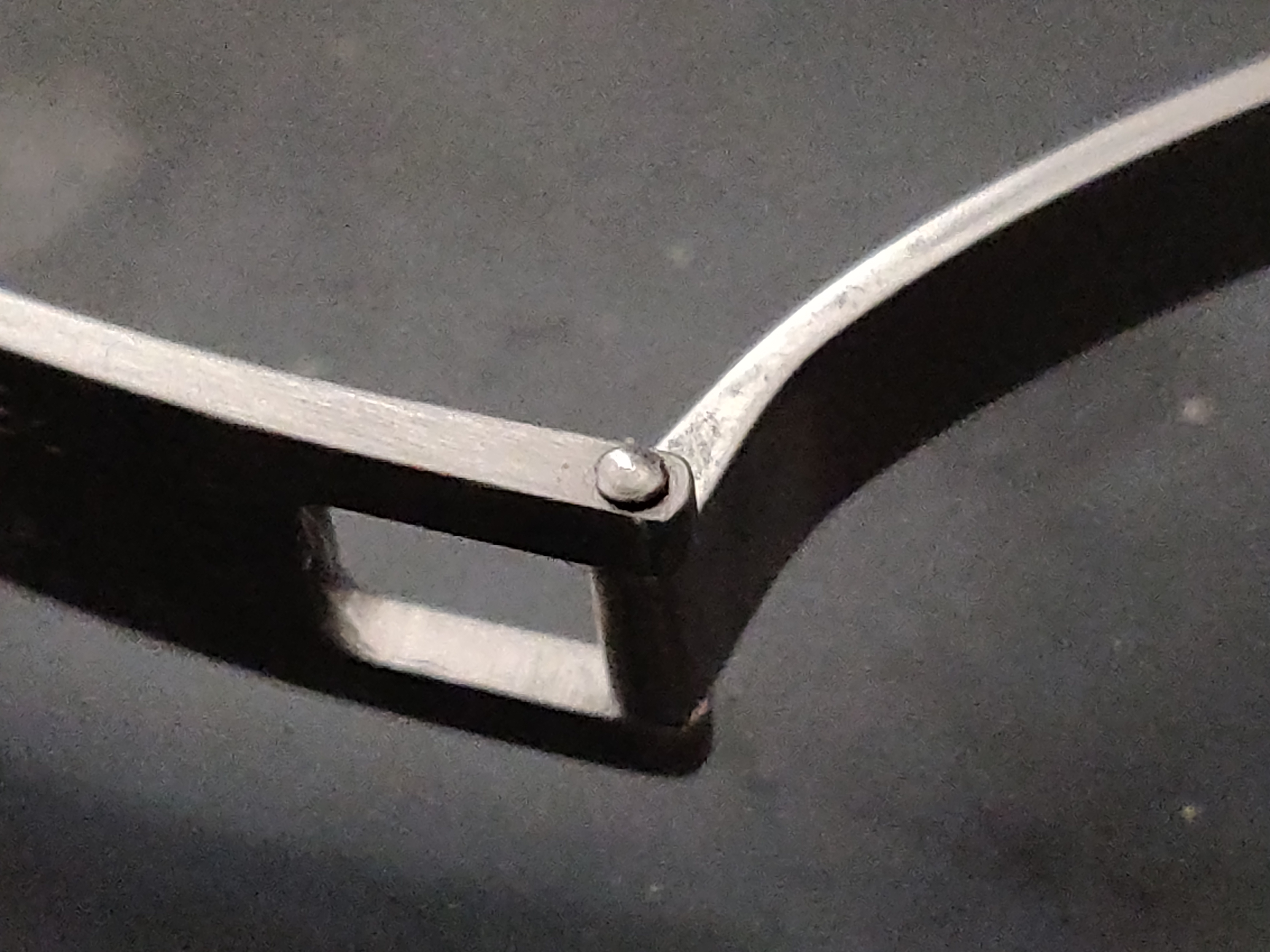
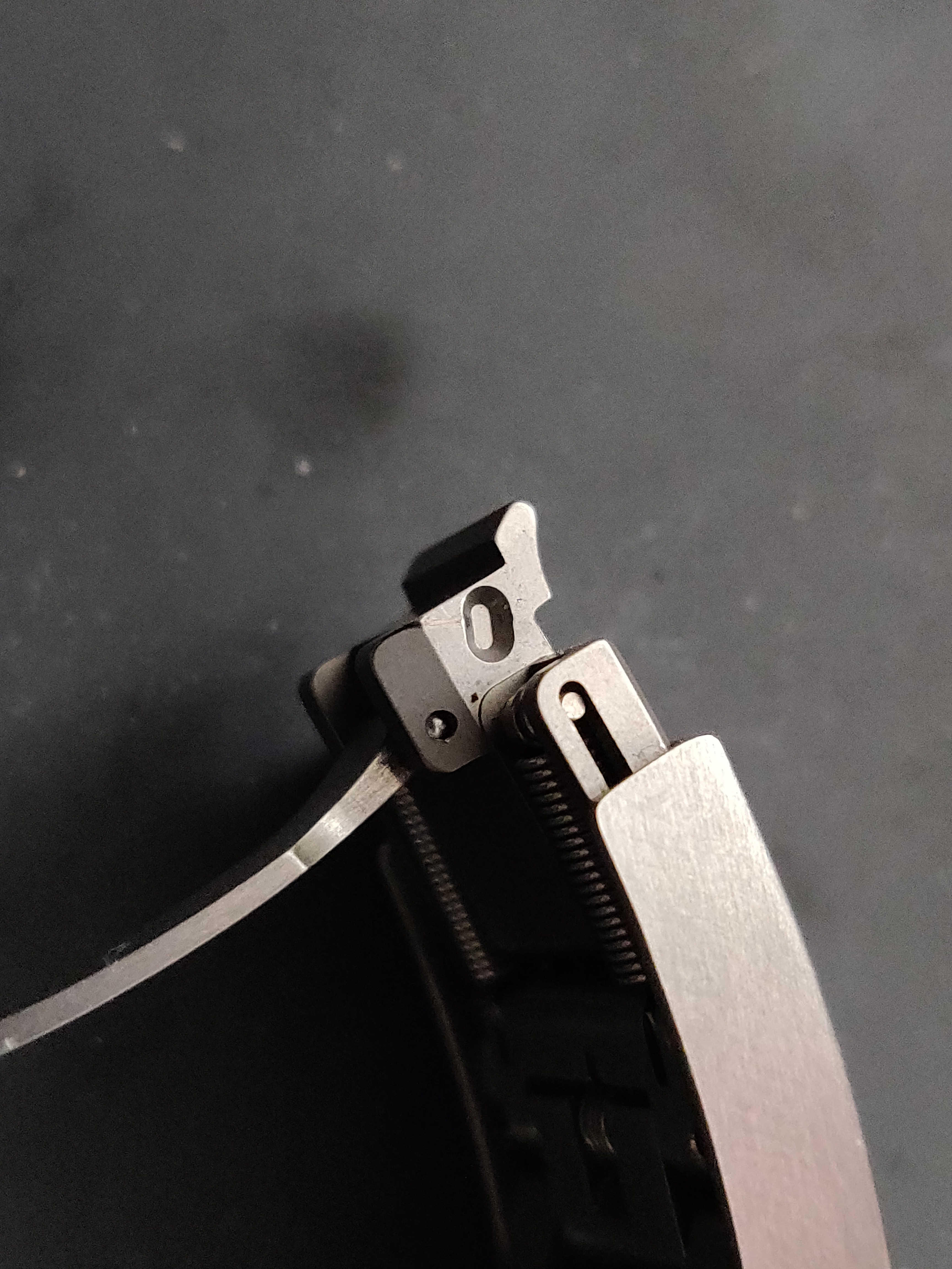
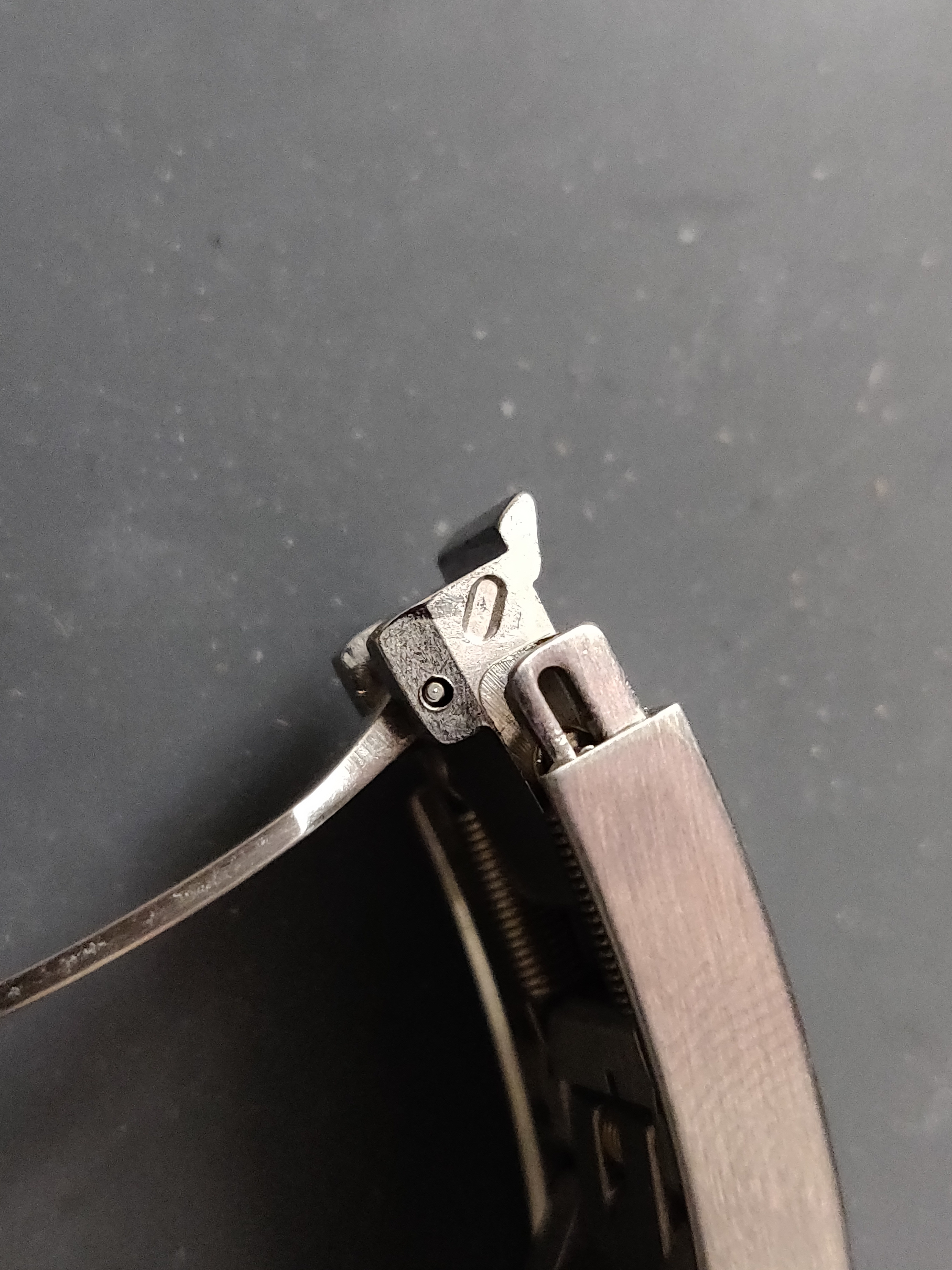
What's even more interesting the difference in locking mechanisms of each segment. The gen has well constructed fittings, as expected. But seeing the rep under magnification, it's quite clear why the clasps can be jangly or loose.
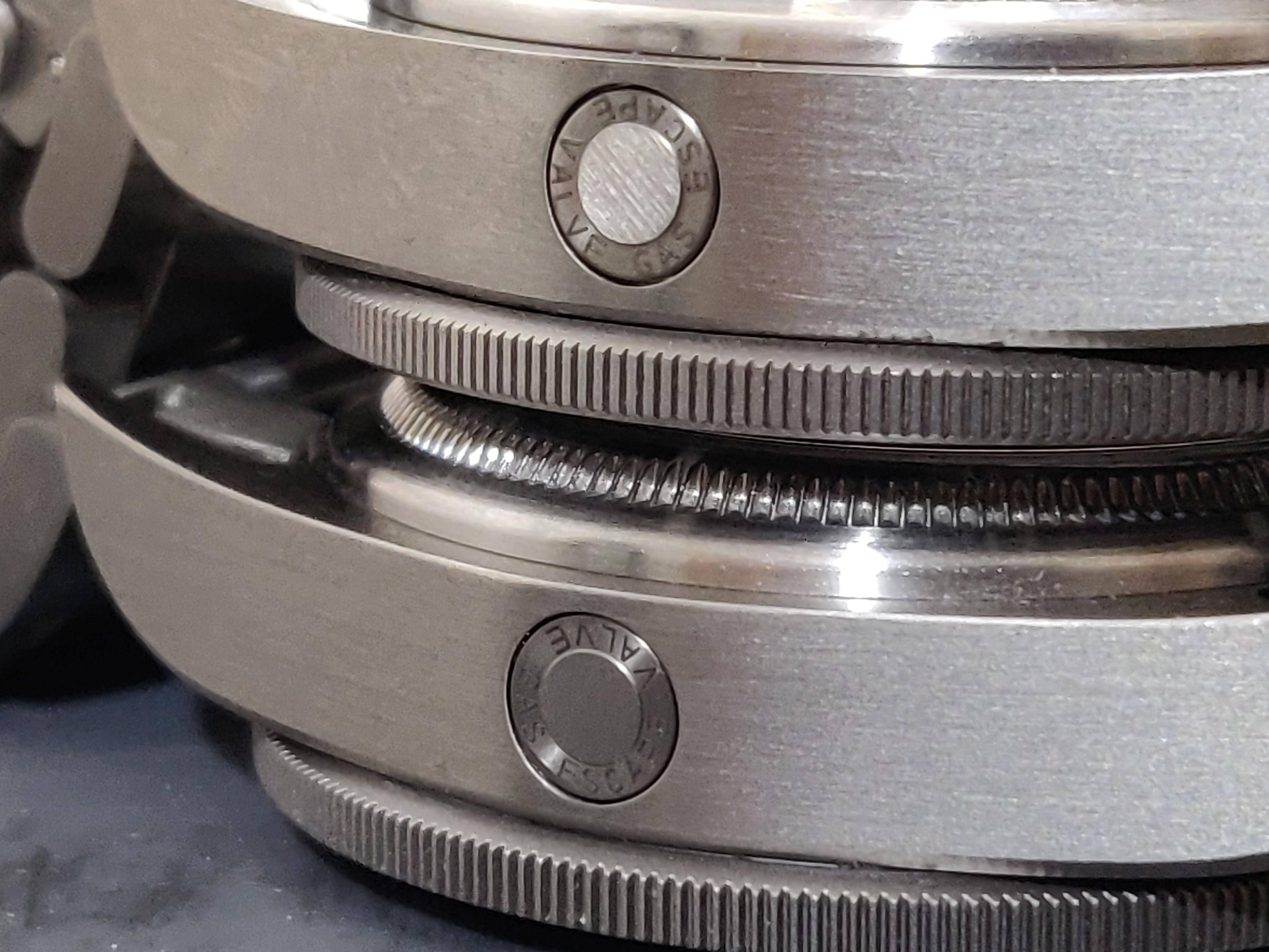
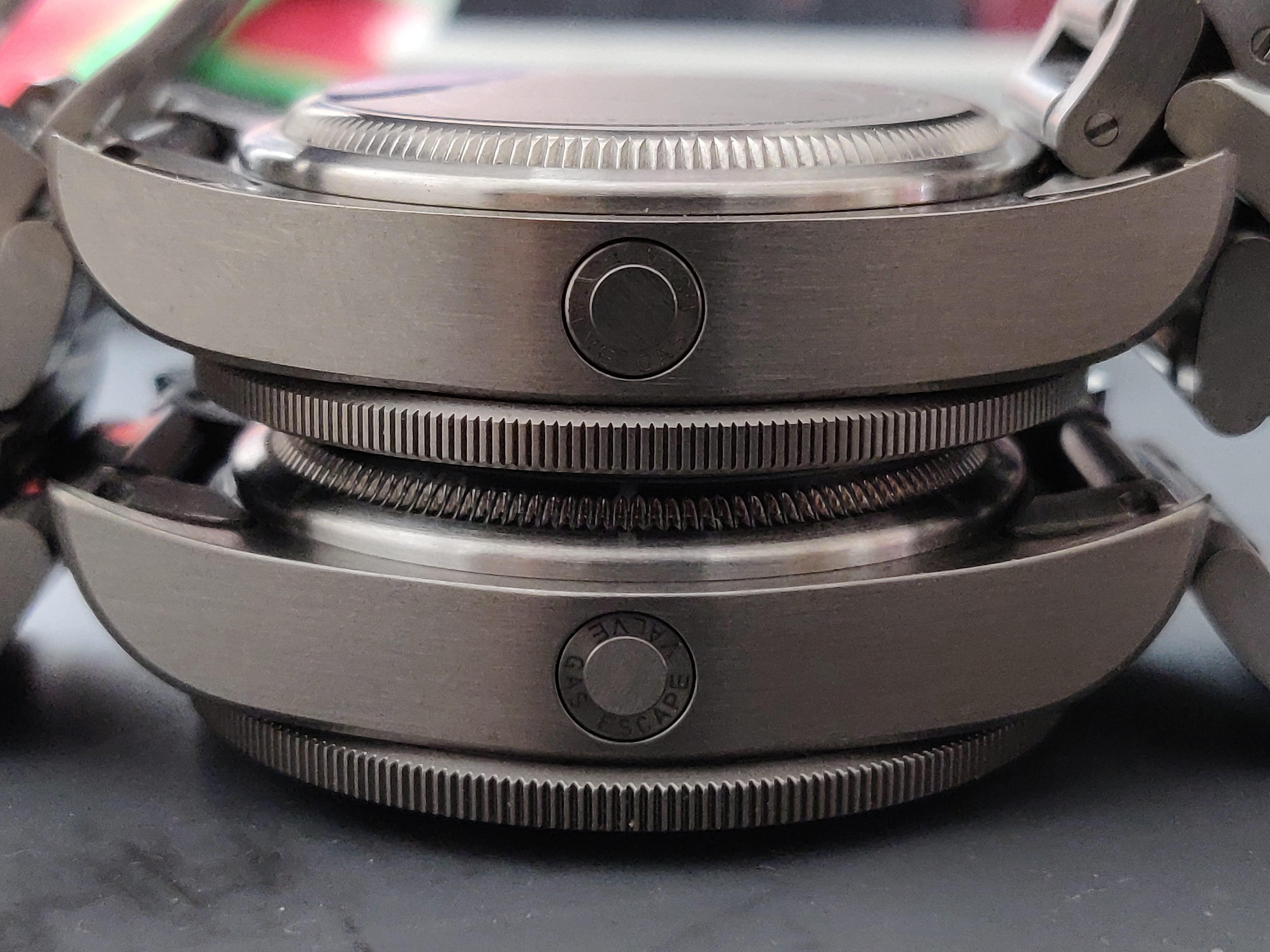
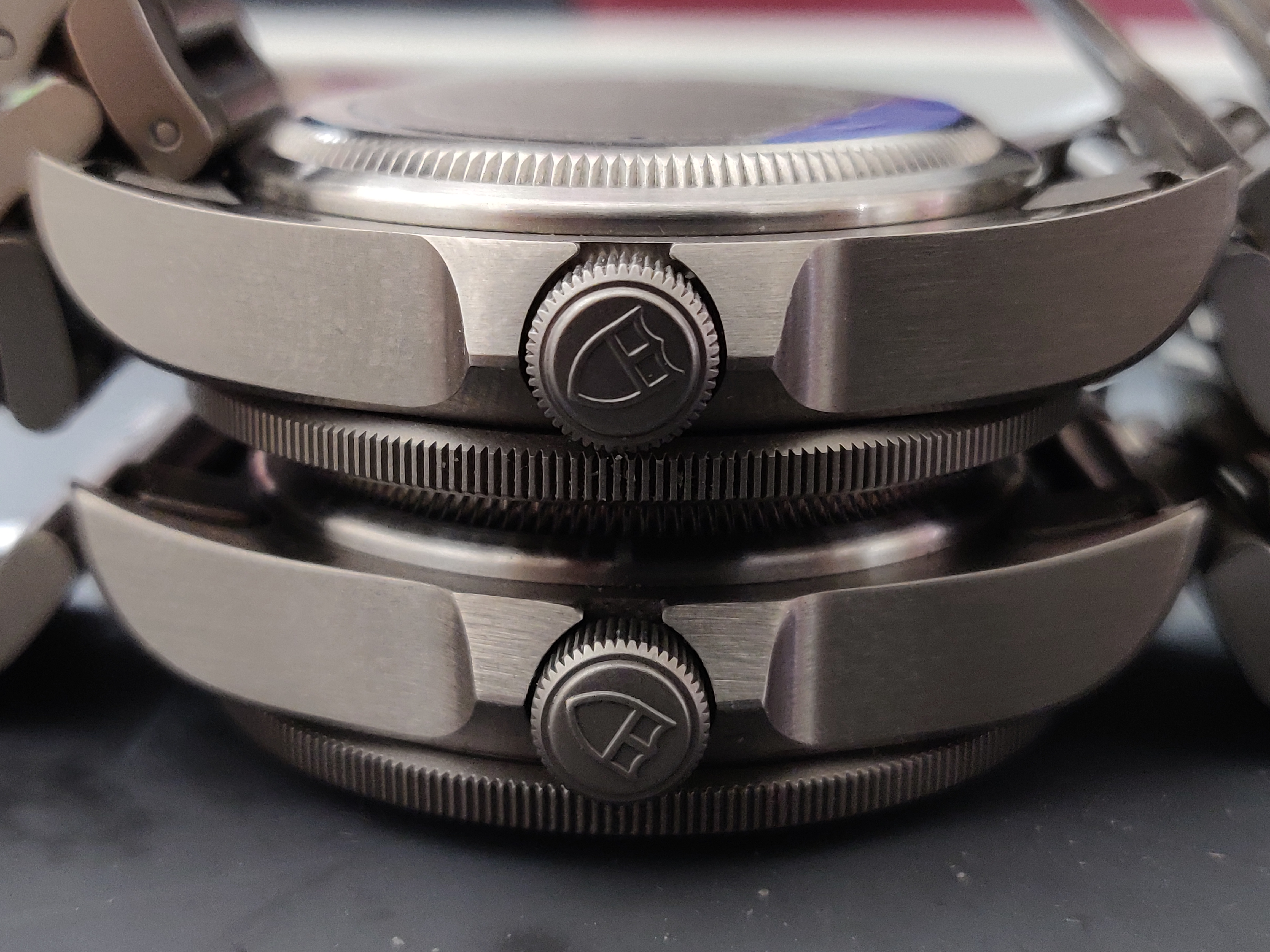
XF V5 and gen stacked. You can see the difference in finishing, crown lugs, as well as difference in case lug shaping
TUDOR LUMED UP
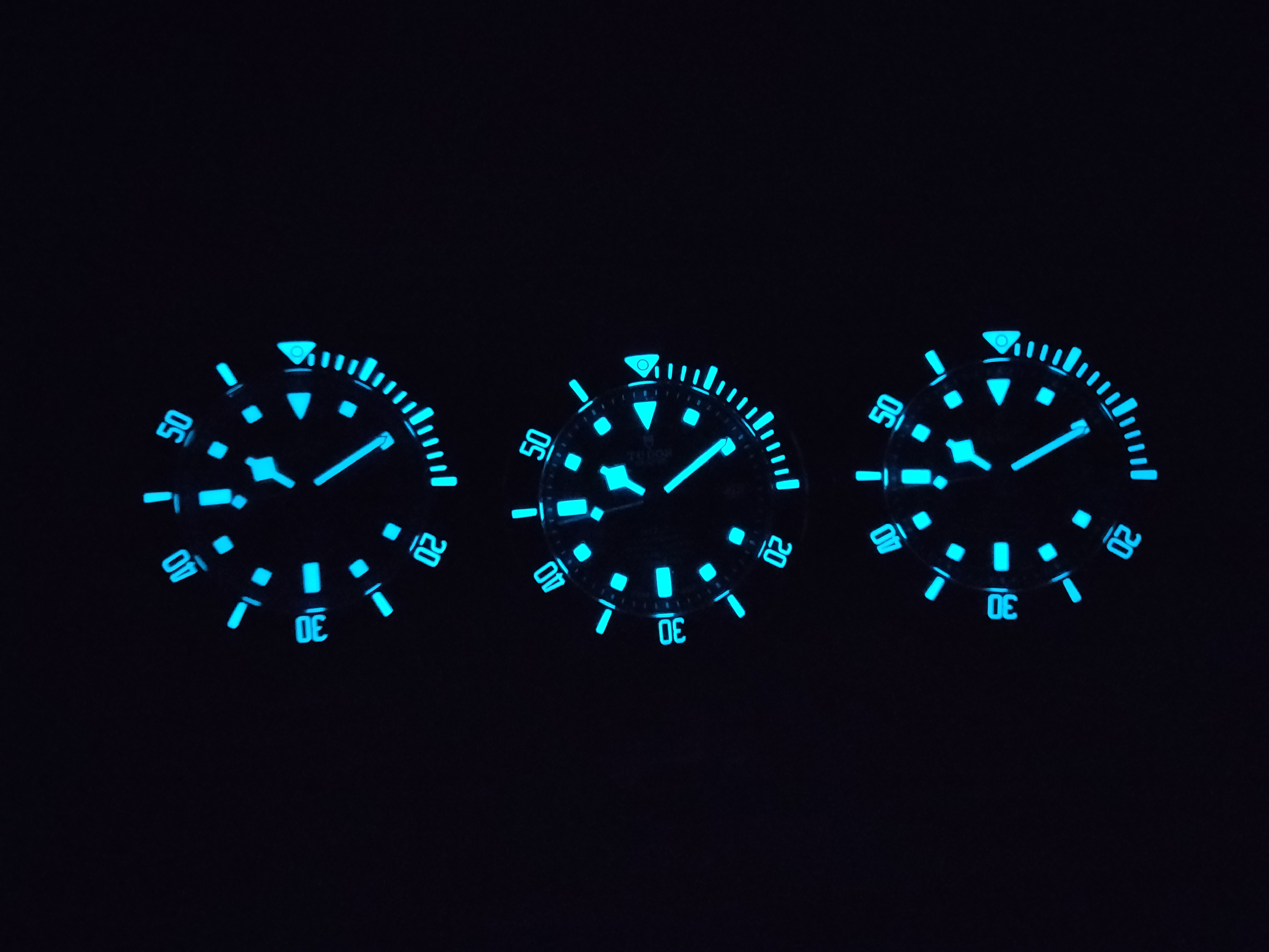
Can you spot which is the gen?
Final thoughts
If you made it this far, congratulations! Thank you for reading, and giving me a place to contribute! What a journey eh.
So....have you decided to chuck your rep? Yeah, don't do it. Because considering EVERYTHING, the rep is an insane bang for the buck. I'm absolutely satisfied with what the rep has to offer, and keep the gen as a commemorative symbol of a lifetime achievement. I wear the rep more often and sometimes it's hard to tell which is which unless I take a closer look. I would give the XF Pelagos rep family a 10/10 for value, similarity to gen and versatility :thumbup: Please share your thoughts here!
So what are you waiting for? Go out and get an XF Pelagos!!

Anyways, onto the review! :matty:
Introduction
To start with, I've gathered three wotches (to rule them all). One is a Tudor XF/V6F V4, another is a Tudor XF V5 and the last is a gen Pelagos. Take a guess at which is the gen.


Got it? Good! Most folks would be confused too if they didn't know a plethora of intricacies to look out for. As with nearly every watch in the Rolex/Tudor family, the first thing you look out for is soft, rounded indices with generously supple edges.
Spotted it yet? Nice!
This is the 2021 gen 25600TN:

This is the XF/V6F V4:

This is the XF V5:

With that simple tell in mind, you can now easily discern between them using the indices as a cue.
Now that you know our beauty contestants, let's have a closer look.
A Closer Look
Let's compare how the dial texture, hands, chapter ring and other more intricate nuances differ between the gen and rep


The dial texture on the gen is much more pronounced, and has more variance in terms of shading. The motif of texture follows all the way throughout the dial and hands. Like piles of ash (as opposed to snowflakes), it's a huge difference between gen and rep. Now, as with most watches, this could be a matter of production batch. I would love to see other gen owners compare their dials as well to get a consensus. The dial font on the reps are done really well, especially on the V4 by XF/V6F.


You can see that the indices on the chapter ring have a 3D shape to them, and are not flat unlike the reps shown. The ring also has the same texture motif as on the dial on its edges on top. The gen Pelagos also has a flush datewheel (which adjusts when turning the crown counterclockwise). Just to note midpoint, Many of these features are from a macro POV, so from a wrist to eye perspective it's nearly impossible to notice.


The 2021 gen pelagos in Noir has thinner bezel numerals than the V4 XF/V6F rep. However, the V5 has matching numeral thickness, which is very interesting. Something else to note, the XF V5 pelagos in Noir has thick numerals on the bezel. This leads to wonder if gen samples used for the cloning process played a role, as batch numbers can mean slight variations in gen details.
Fun fact about the gen bezel: It has solid clicks until noon, upon which there is a hard stop. You can simply tell when the bezel has turned all the way to noon by just feeling that hard stop. The bezel keeps turning of course, but you have to give just a slight extra nudge. It's a really unique quirk that is absent in all reps, and would be amazing if replicated.


No surprise to see that the SEL fitting in the gen is nice and tight, as well as being properly recessed. Both reps have varying degrees of looseness and SEL fitment, mainly being either flush or slightly recessed but with major gaps. You can also notice the difference in bezel knurling.


As we delve further into macro details, I'm sure at this point you can spot the rep and gen in these shots. The gas escape valve is nice and evenly round, with a single layer of brushing at the centre of the circle. The reps of course have some play to the detailing but are great considering. The V5 especially had made strides.


The triangle at 12 looked pretty great on all 3 watches, with there being ultra fine macro details worth of difference. Spot on, XF! :clap_1:


The dial font on the gen and V5 are super close, with the XF'V6F V4 being much thicker. Loads of bonus points to the V5 for this great detail.


Comparing the knurling on the crown and crown logos of the XF/V6F V4 and gen here. The devil is in the details and you can see the differences are pretty stark under magnification. The knurling is significantly smoother and consistent on the gen, but serious props to the rep nonetheless. The crown logo is a bit botched on the rep V4 when compared with the gen.


Rapid fire quiz. Can you spot the gen clasp? :detective2:


Engravings are MUCH thicker and deeper on the gen caseback, and knurling is shallower on the rep (V5 shown)


Comparing the gen and XF V5 here, the gen has thinner, but deeper engravings on the clasp. Also great to compare the fonts here. Overall, XF did quite well considering!
Even MORE macro details


Some really interesting stuff here. Comparing the gen and XF V5, you can see that the diver's extension has razor sharp edges, while the gen has nice soft curves. The material used throughout the segment is also consistent on the gen, while on the rep it looks like they put in steel here and there. Notice the colouration and difference in glow between the materials.


What's even more interesting the difference in locking mechanisms of each segment. The gen has well constructed fittings, as expected. But seeing the rep under magnification, it's quite clear why the clasps can be jangly or loose.


XF V5 and gen stacked. You can see the difference in finishing, crown lugs, as well as difference in case lug shaping
TUDOR LUMED UP

Can you spot which is the gen?
Final thoughts
If you made it this far, congratulations! Thank you for reading, and giving me a place to contribute! What a journey eh.
So....have you decided to chuck your rep? Yeah, don't do it. Because considering EVERYTHING, the rep is an insane bang for the buck. I'm absolutely satisfied with what the rep has to offer, and keep the gen as a commemorative symbol of a lifetime achievement. I wear the rep more often and sometimes it's hard to tell which is which unless I take a closer look. I would give the XF Pelagos rep family a 10/10 for value, similarity to gen and versatility :thumbup: Please share your thoughts here!
So what are you waiting for? Go out and get an XF Pelagos!!
