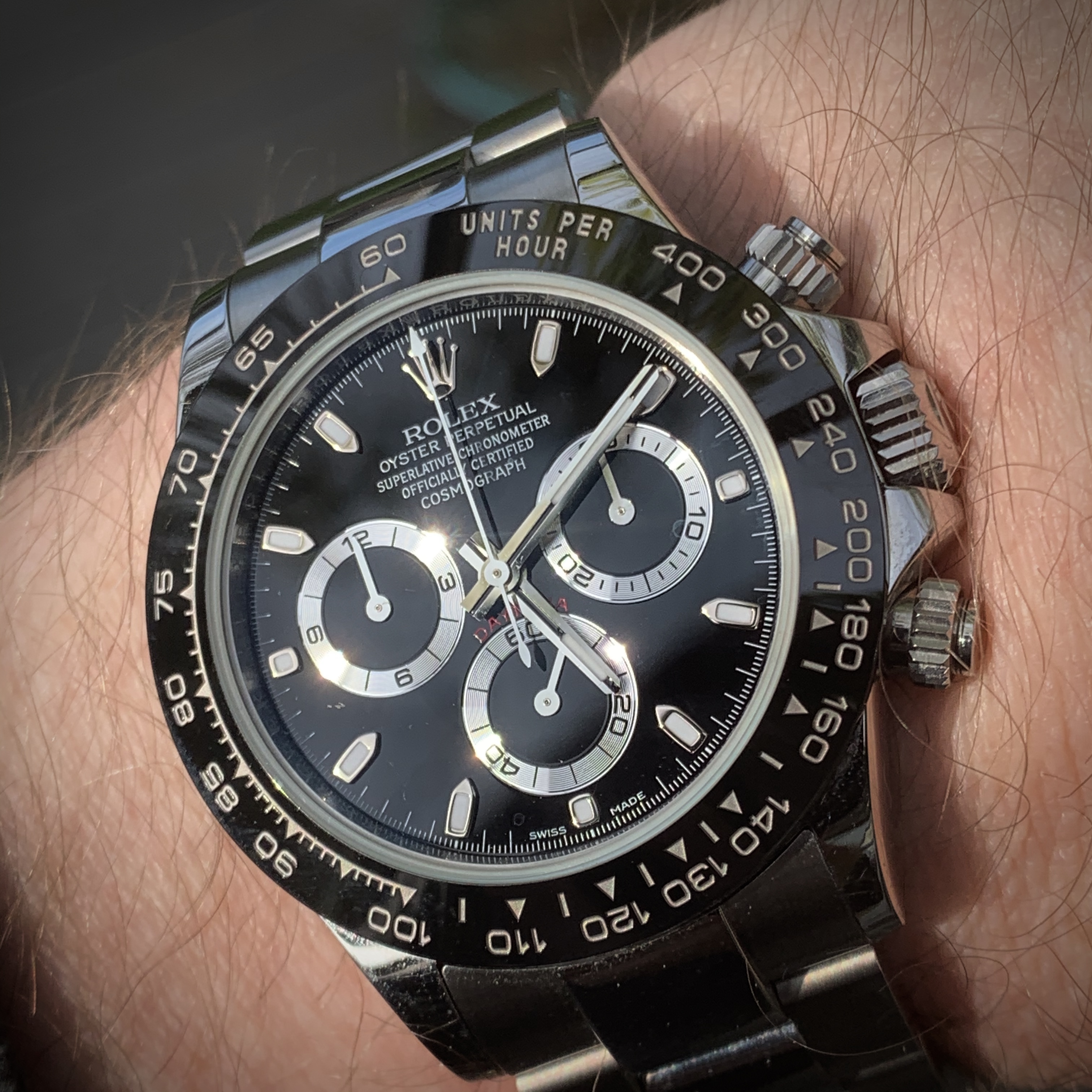
Personally, I think the infill of black looks too heavy, both on the original pic and the latest one they sent you (as far as it's possible to tell from the awful quality of the pic).
I'd rather it be fatter and better defined, with the correct font and spacing, than thin af, with the wrong font (like noob's) and with the wrong lucid paint, this is my gen, and as far as i can see the font is not bad, but the quality is really awful for real. I asked for a better pic under artificial light