I'm probably among one of the pickiest members here in terms of Panerai replicas
")
and I just want to add that DSN's products are generally good, but his 111H is not one of them.
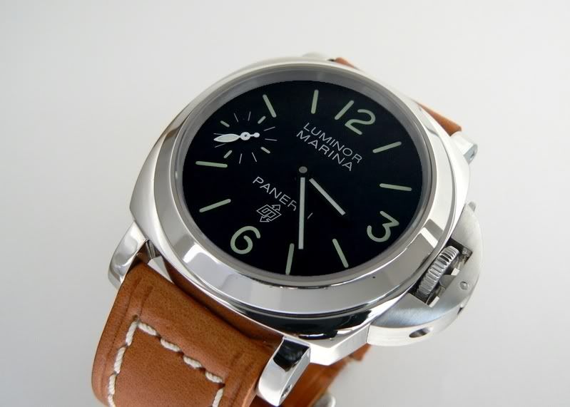
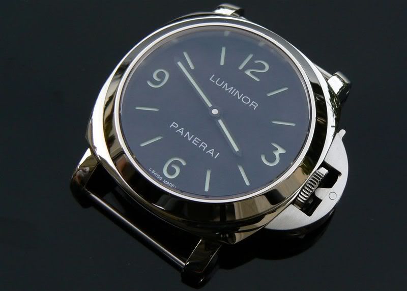
I am not even addressing the details here, it's the overall proportion (size & placement) of the number markers and fonts on the dial... it's very very off. For example, the number markers are too close to the edge of the dial, so the dial looks very stretched out.
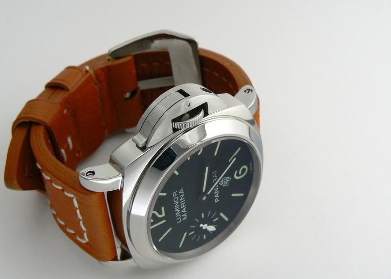
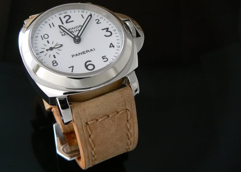
Over the holiday break, I had a chance to inspect 111H very closely in person (My friend in Seattle recently bought a used one off Risti), and this experience reminded me again how off our 111H replicas are (not just DSN's but others too). Even the weight was off considerably. I had PT's 111E with me to show him and my friend's 111H was about 30% heavier. Case sizes were consistent, but the CGs were very different. Gen 111H's CG is completely different in terms of shape and size, and it's not supposed to look like polished CGs that Panerai used to put out prior to its G series. These are not details. It's the overall feel and shape of the watch I am addressing. I almost wished I had a replica 111H with me to show all the differences in pictures.
This goes for Radiomir Pams as well. All replica Radiomir Pam cases are way too round. About a year and a few months ago, I brought my 183 (which I no longer own) to an AD to compare it to gen 183, and I was shocked how different feel the gen had. Gen looked much bigger because the case was much more square. Details were pretty dead on in terms of the font color and size, but they looked like different watches.
I agree DSN's 10D, 113, 127E (certain versions he had at one point) are much better and perhaps the best out of the box you can buy for those models. But his 111H needs a complete re-engineering/designing (from scratch) - new dial and CG & Davidsen, please help us and bring us the perfect 111 - you will sell thousands!
Just my two cents
J