- 16/4/22
- 481
- 546
- 93
")
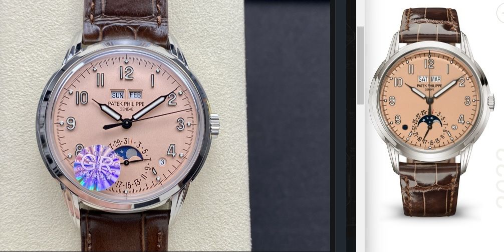
All true. But think of how many people would know what to look for ? This is a rare watch out in the wild.Day/month windows are smaller, font is wrong and are more sunken than gen.
The moon phase disc is the same wrong light color as the PPF 5726 and PPF 5712 V2. Same supplier?
The rehaut looks deeper, it is as if the whole dial looks like it’s been pushed down.
These things in total makes it look like a very different watch than the gen.
Yes agree. This model is all about the dial aesthetic. I think if they managed to get the correct salmon “hue” on the dial… the other detail shortcomings may be acceptable.All true. But think of how many people would know what to look for ? This is a rare watch out in the wild.
I personally would not buy one because I respect that model Patek way too much. Just like I wouldn't wear a Celestial rep. Not that they would ever make a decent one.Yes agree. This model is all about the dial aesthetic. I think if they managed to get the correct salmon “hue” on the dial… the other detail shortcomings may be acceptable.
I love when people so confidently point out a “flaw” that is in the gen tooThe 12 (2) is too low and seems to be a different size. Hands are too fat. Date and moon too sunken. It's a hard watch to rep.
This is not it imho.
Not A flaw. I see a bunch of them. But maybe take the plunge and we can meet at a PP AD for comparison.I love when people so confidently point out a “flaw” that is in the gen too