-
Tired of adverts on RWI? - Subscribe by clicking HERE and PMing Trailboss for instructions and they will magically go away!
You are using an out of date browser. It may not display this or other websites correctly.
You should upgrade or use an alternative browser.
You should upgrade or use an alternative browser.
Get the party started boys, AP DIVER V2 is OUT! (noobfactory)
- Thread starter Edgematic
- Start date
These are my first opinions after viewing the pics:
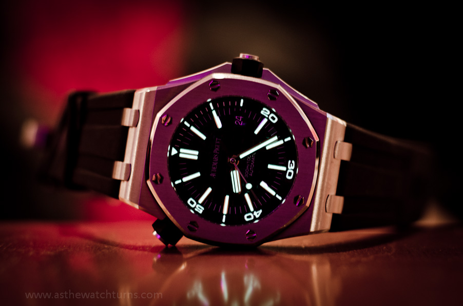
- 300m/1000ft AUTOMATIC text is the wrong font
- hour markers: need thinner surroundings, more lume
- hour markers at 12 should be next to each other, without a gap
- the bezel ring needs lume
- the date cyclopse window needs to be a bit bigger, now it is perfect for the scuba versions (scuba boutique, wempe & bartorelli) though
- the endlinks on the genuine article stick a bit out above the case
- AR on the cyclops & crystal would be nice...
SpootyPuff
I'm Pretty Popular
- 19/6/10
- 1,265
- 62
- 48


That is nice... Well done Yannou")
Txs
Just bought the noob version and I will mix the 2 versions....
To be continued
Hi Edge,
How about the HEV valve?
Thanks
How about the HEV valve?
Thanks
These are my first opinions after viewing the pics:
- 300m/1000ft AUTOMATIC text is the wrong font
- hour markers: need thinner surroundings, more lume
- hour markers at 12 should be next to each other, without a gap
- the bezel ring needs lume
- the date cyclopse window needs to be a bit bigger, now it is perfect for the scuba versions (scuba boutique, wempe & bartorelli) though
- the endlinks on the genuine article stick a bit out above the case
- AR on the cyclops & crystal would be nice...