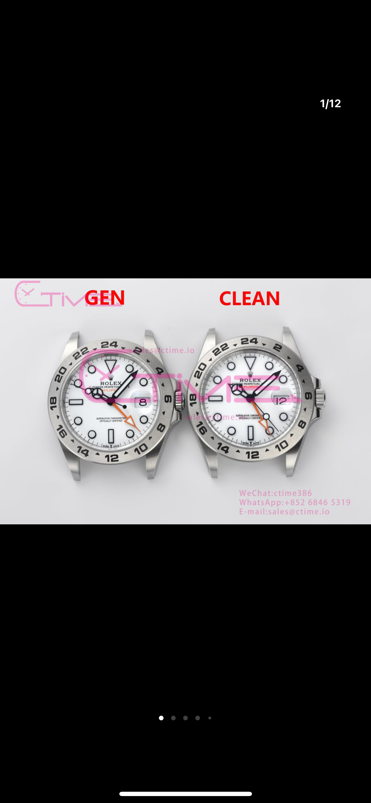
The faults I see
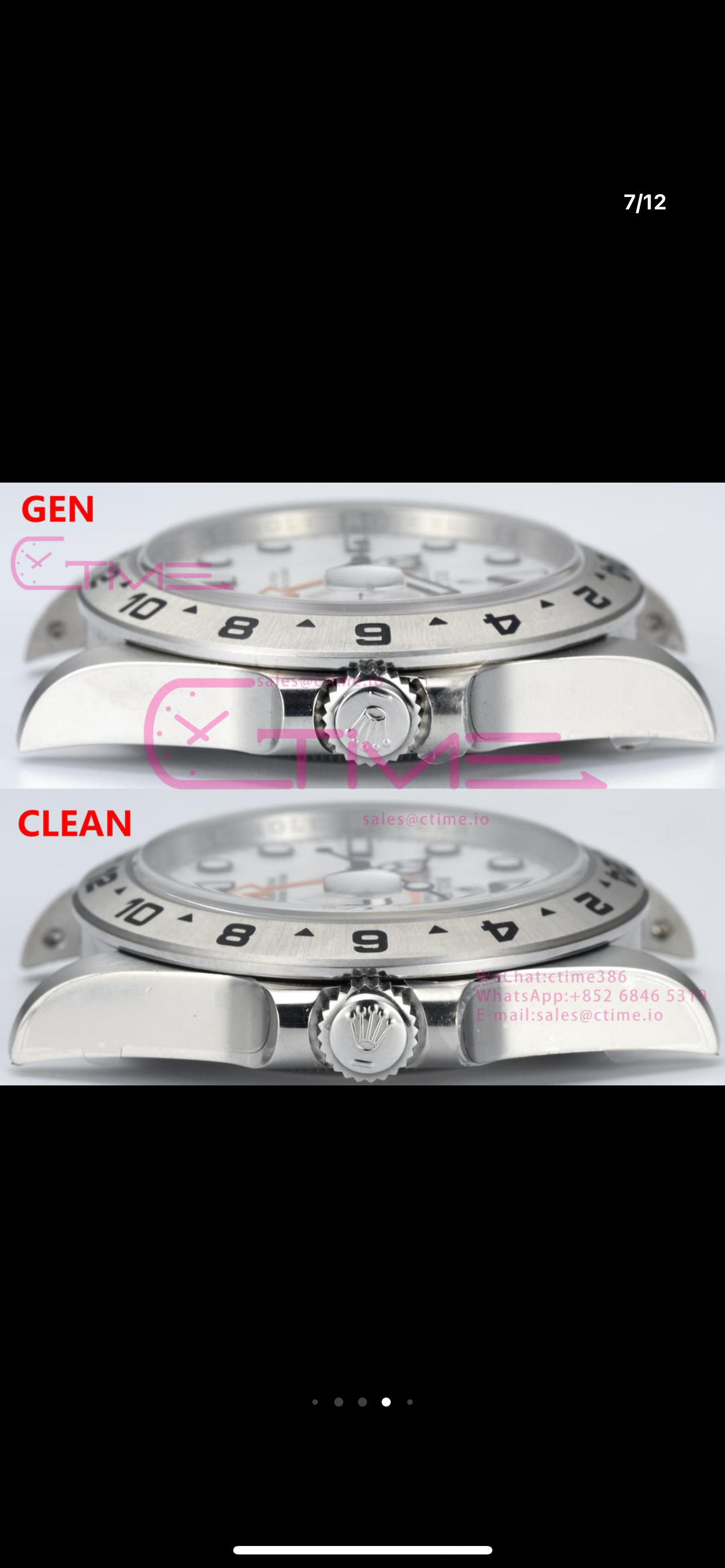
Crown is from a sub, far too thick
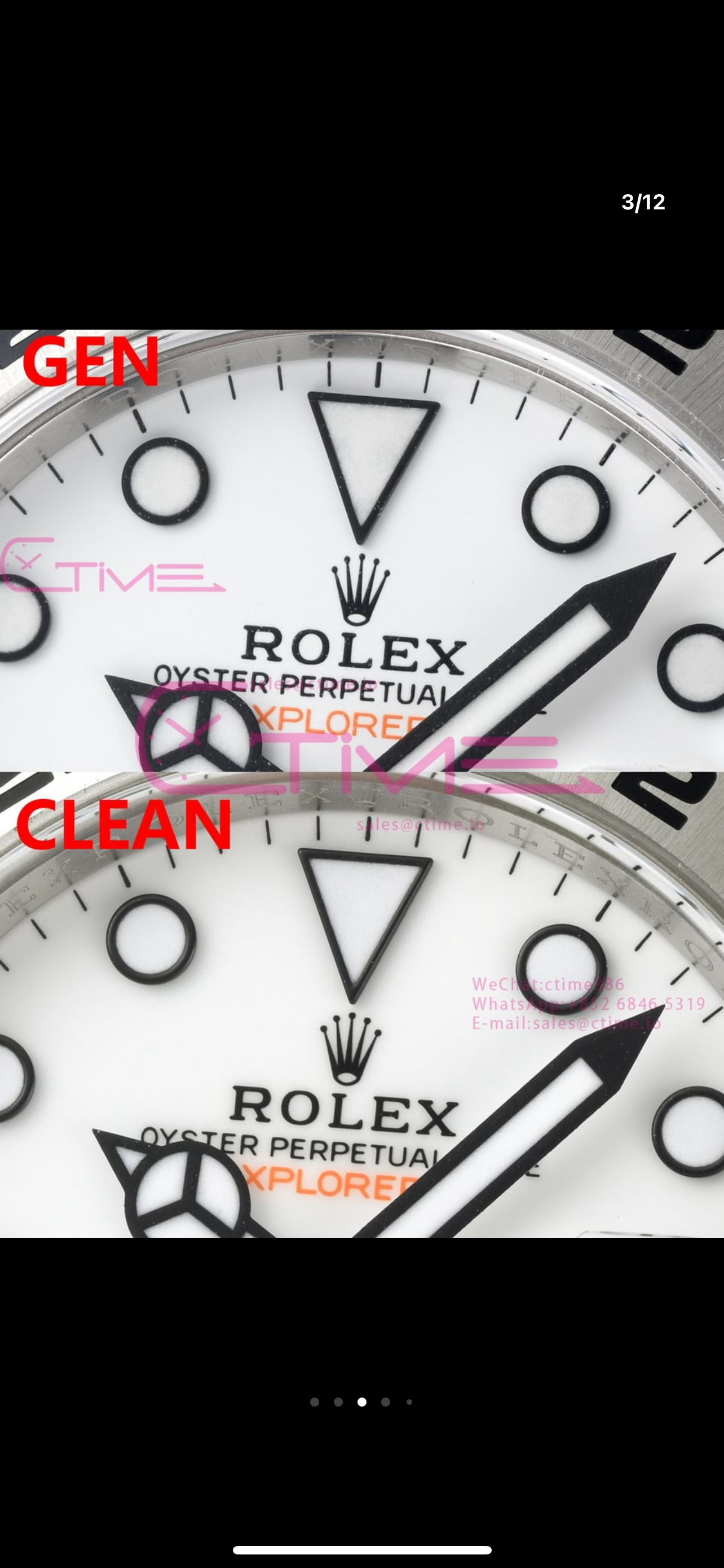
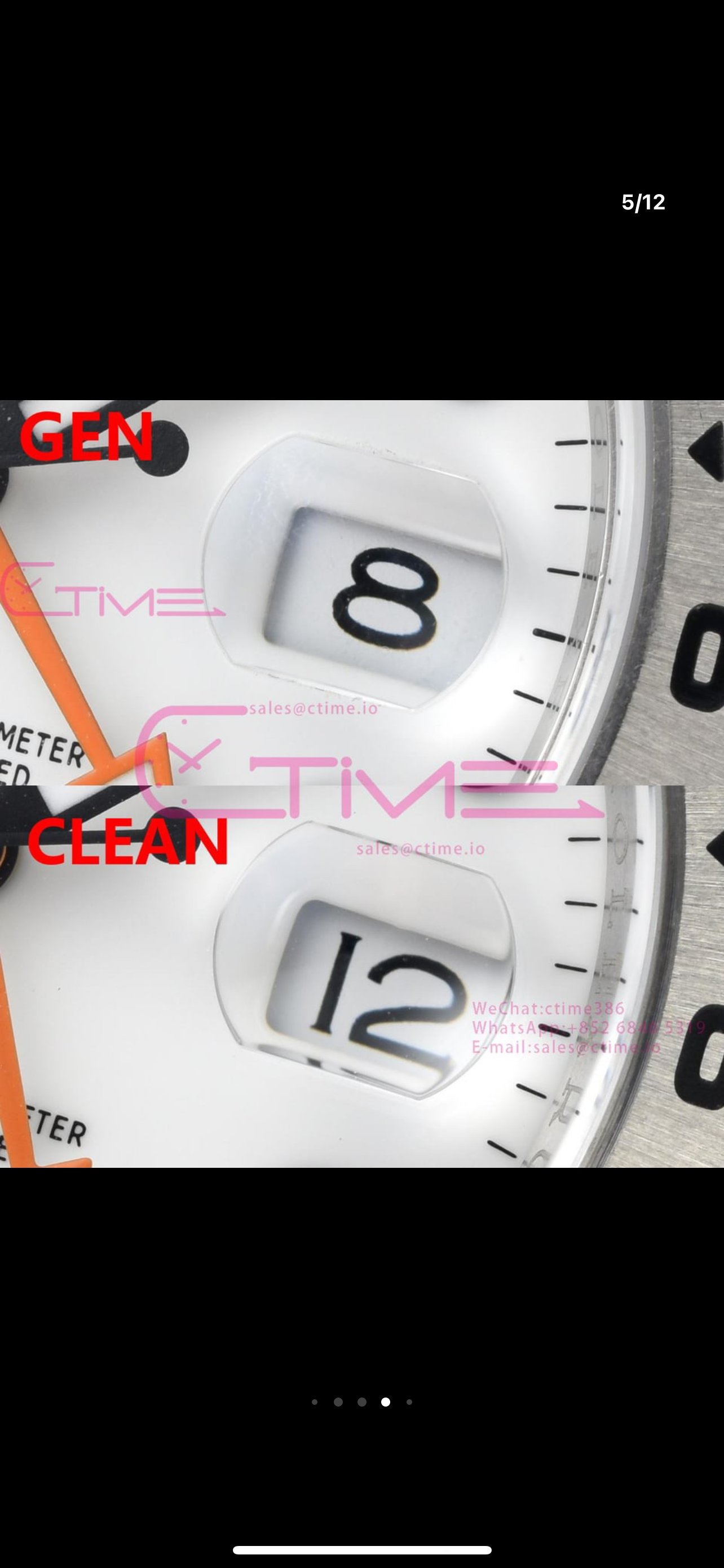
Hour marker rings have a curved top edge the gen is flat
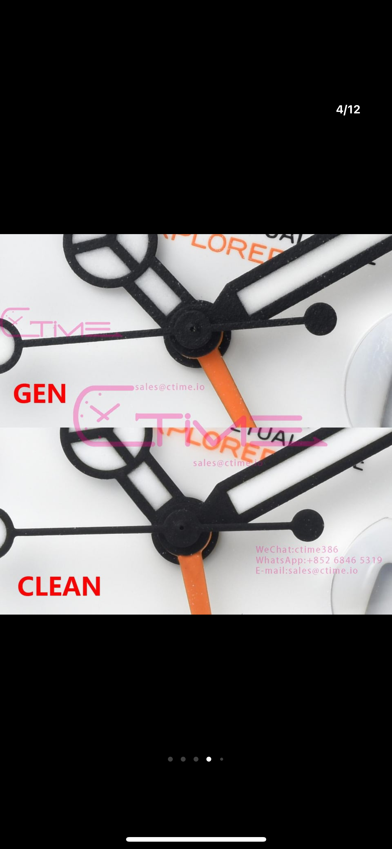
GMT hand is domed where the paint is higher along the centre and thinner towards the edges, the gen is the same level
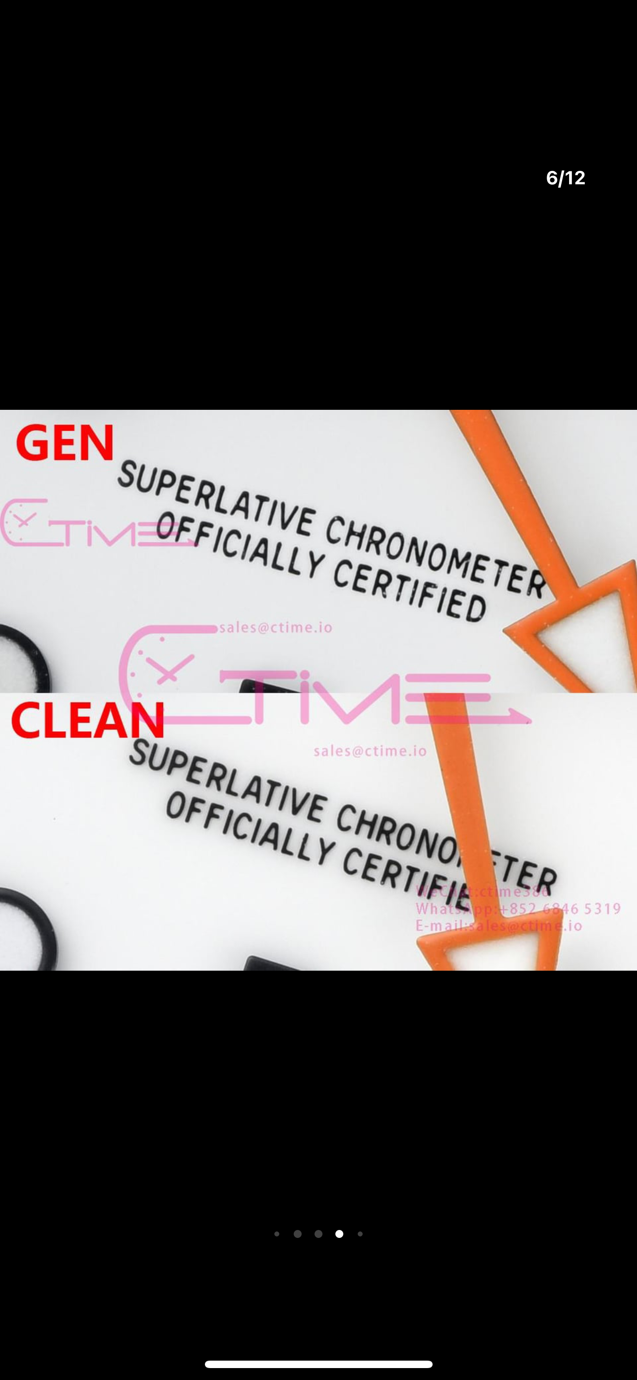
Crystal just can put my finger on it but really not that bad
Bezel numbers look too thick under close inspection (but at a distance not all that bad) I think its perhaps more the numbers have less clarity on the outer edges like bleeding or blurring, not actually as bad I had first througt.
Minute markers not quite as thick as the gen but not all that bad or noticeable by eye.
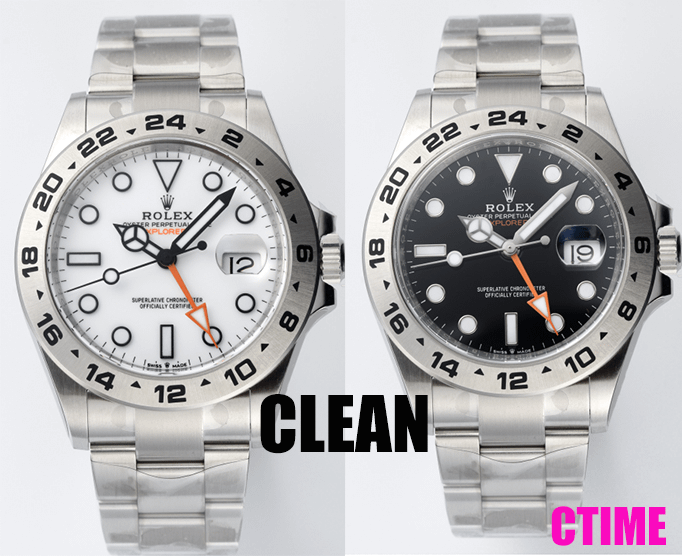
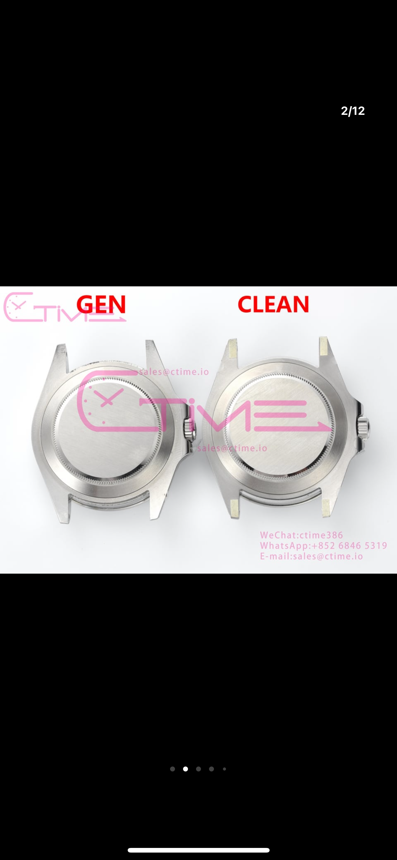
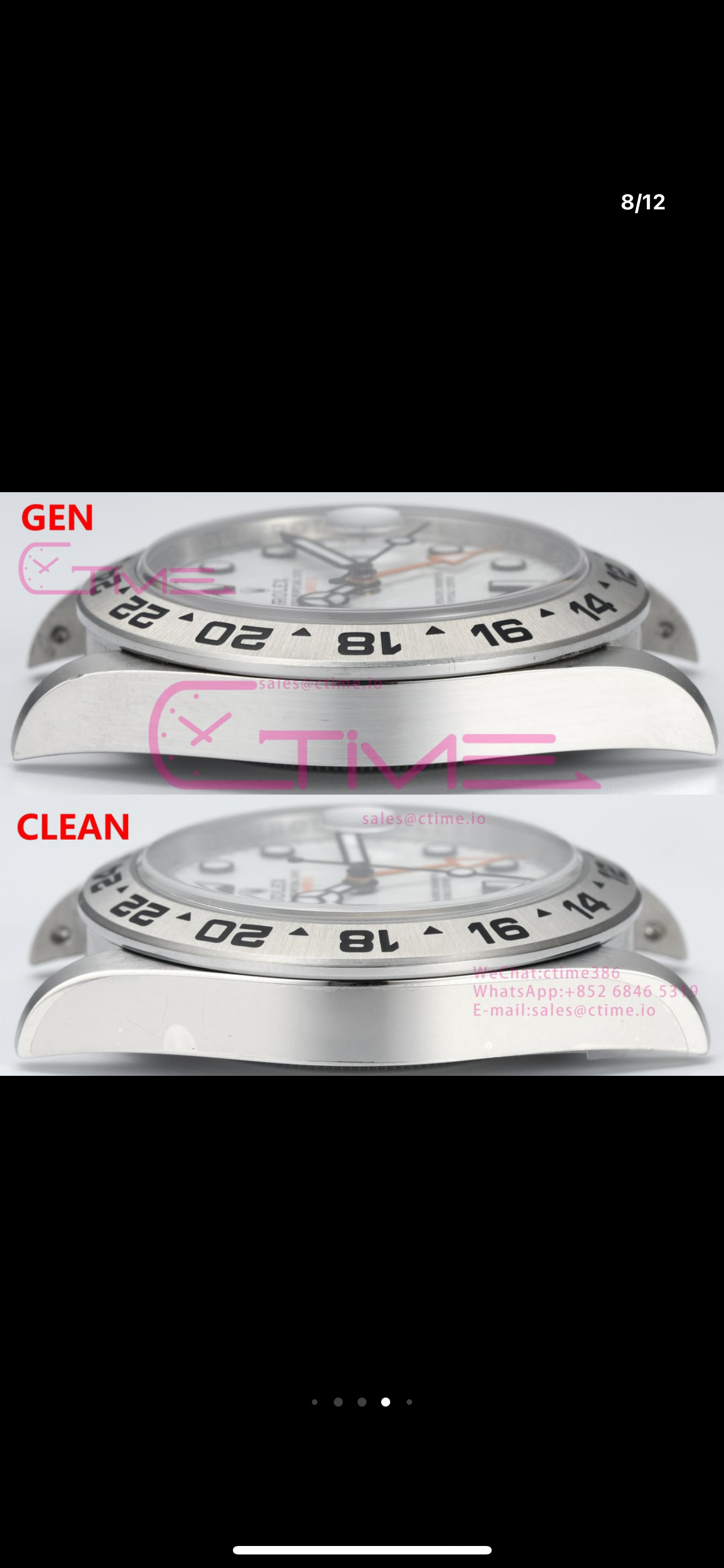
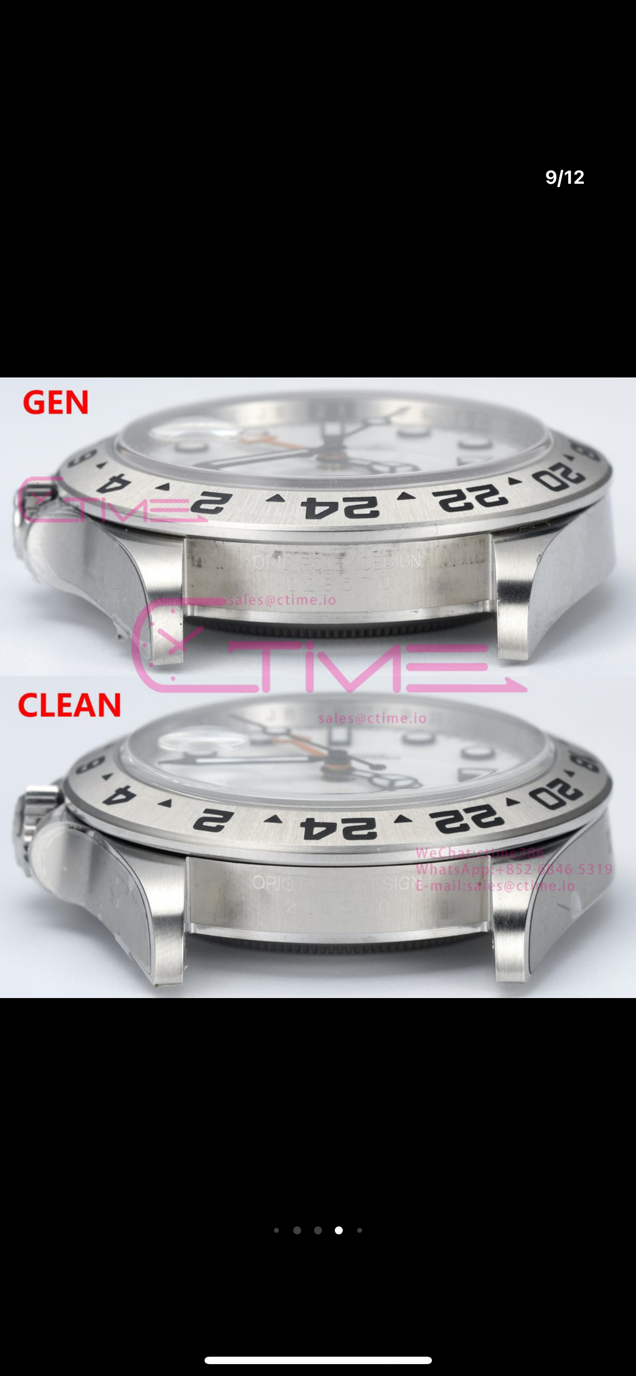
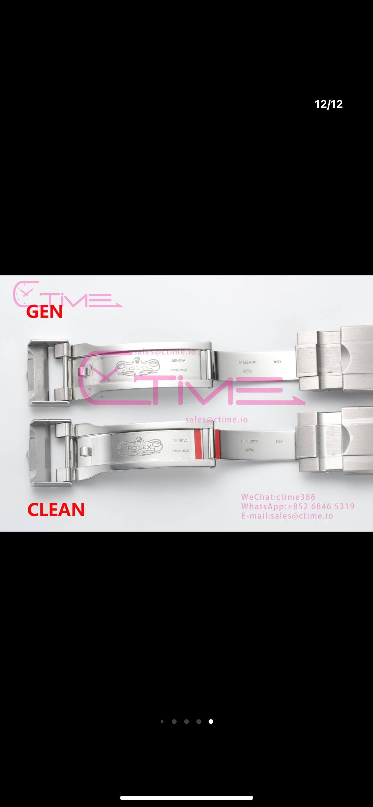
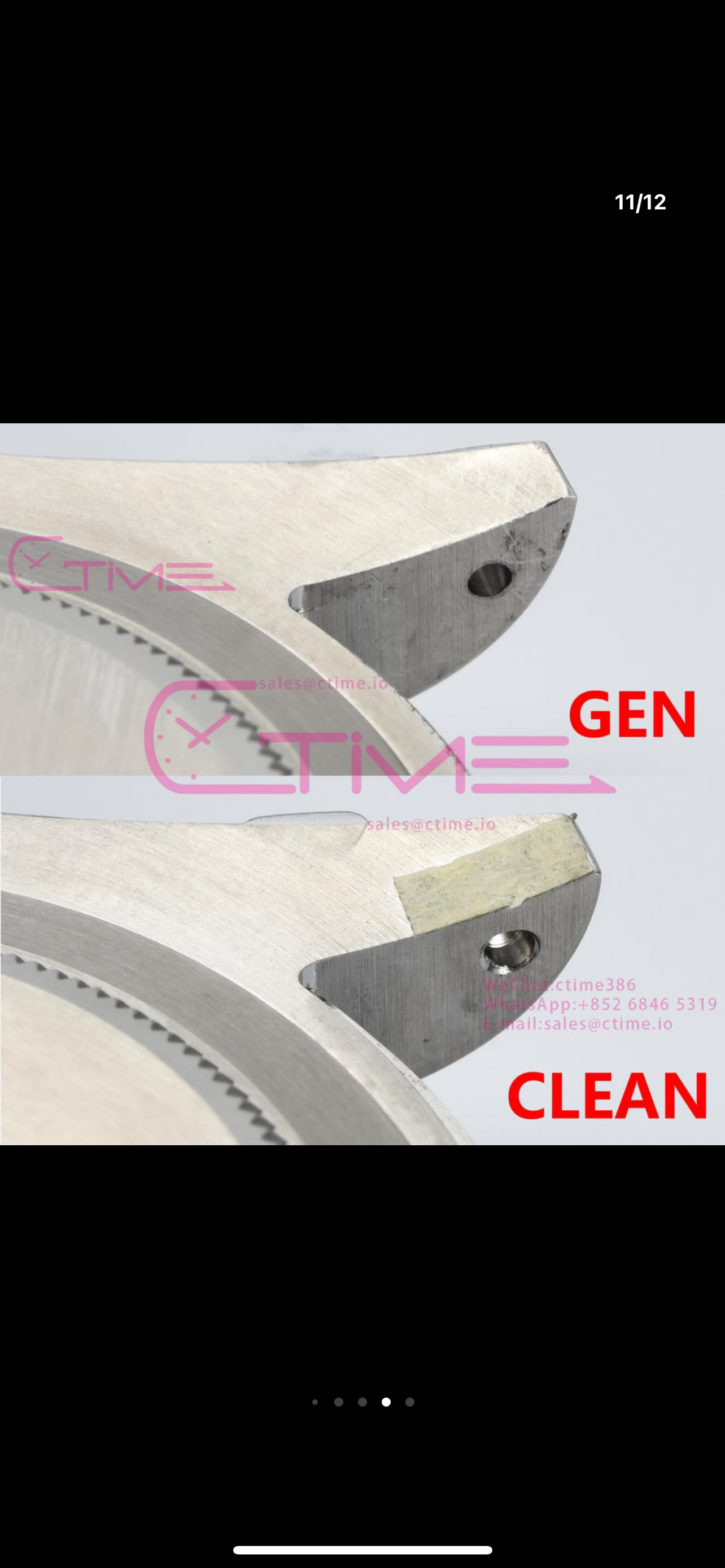
Case and bracelet look to be pretty good.
Rehaut could be polished a little more as the gen reflects the minute markers the rep less so but not all that bad.
Otherwise pretty good, the biggest tell at a glance to a gen are the top 3 ive listed these, often the GMT over the years has changed the rings on the markers from flat to ones with a slight bevel/curve on the top edge, so perhaps not all important as long as it is correct fo rthe age of the watch.
I do like these but are equally hard to come by in the gen world as the panda daytona. Pepsi is still like rocking horse sh*t but the prices on the grey have dropped a fair bti now and haggling down is now possible as people look to minimise loss. So sporting a Pepsi these days is not as unbelievable as it once was same as the BLNR, the Panda Daytona and this Explorer 2 are still hard to come buy, the Explorer being less sought after but equally as cool looking! If only RO had made the bezel like the GMT and made it from a satin ceramic in white and used the number infill with the same black superlume they used on the older YG white faced YatchMaster its would be even more awesome than the panda!