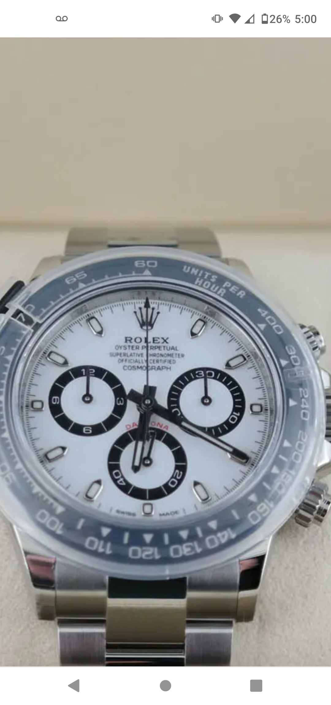
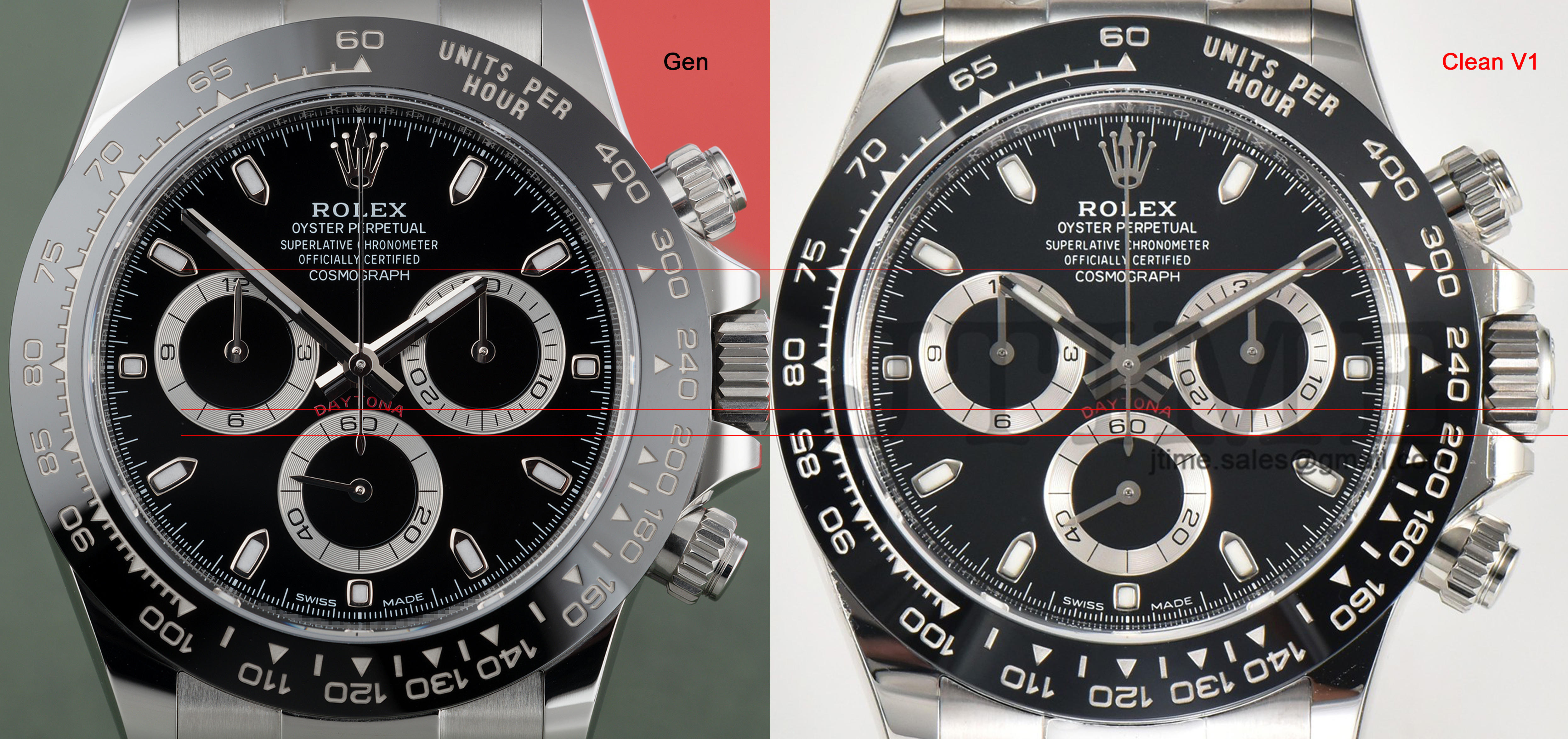
The dial crown is pretty bad. The insert font "units per hour" looks so weird next to gen!
Also the red "Daytona" on dial looks like a different shade.
Honestly it seems like they released this in a rush for the holidays. I mean even the movement from the pics look like it was engraved with a butter knife.
Definitely waiting this one out for a V2.
Also the red "Daytona" on dial looks like a different shade.
Honestly it seems like they released this in a rush for the holidays. I mean even the movement from the pics look like it was engraved with a butter knife.
Definitely waiting this one out for a V2.
Last edited:


