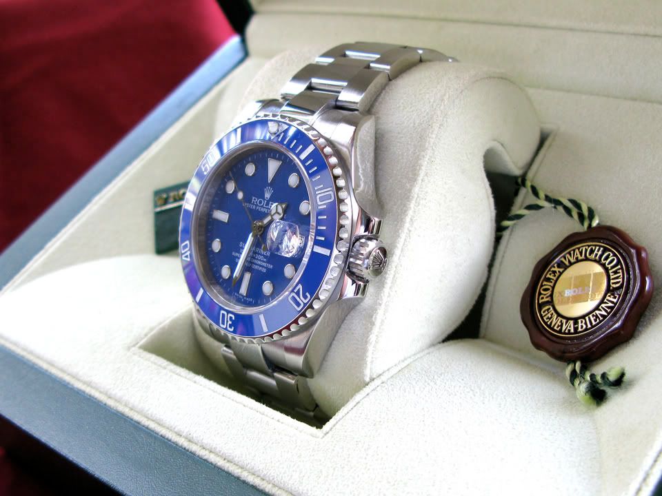
This is a piece I had inquired about to Hont, about a week ago & just got it this morning--apparently my gf decided to purchase it as surprise. ") She had read Spirit's phenomenal (and much more in-depth) review of this piece with me, and liked it.
She had read Spirit's phenomenal (and much more in-depth) review of this piece with me, and liked it.
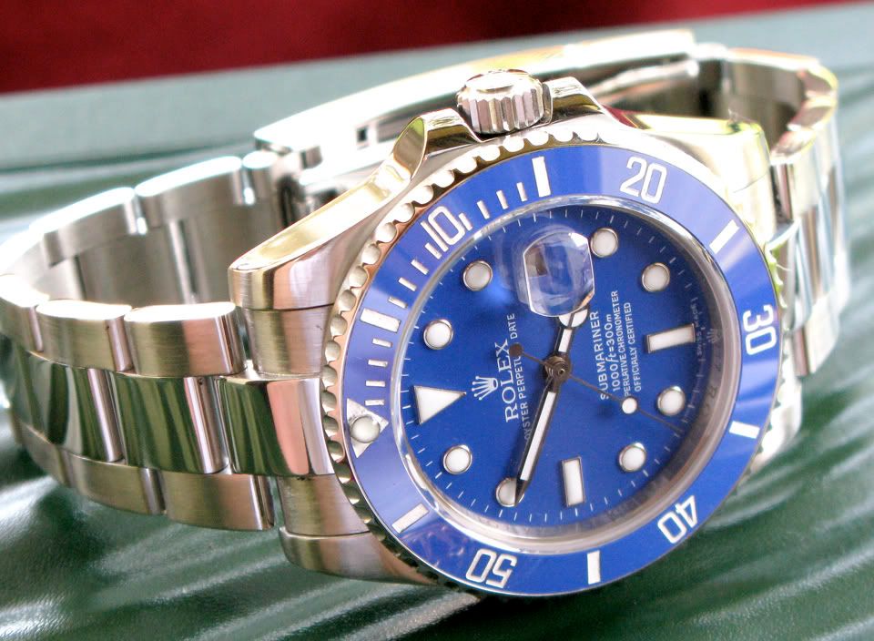
I shot this in natural light, in an attempt to get the pics as close to what is actually present on the watch, in the way of the blue's particular color (robins egg blue). And, yes, it is damn close to gen.
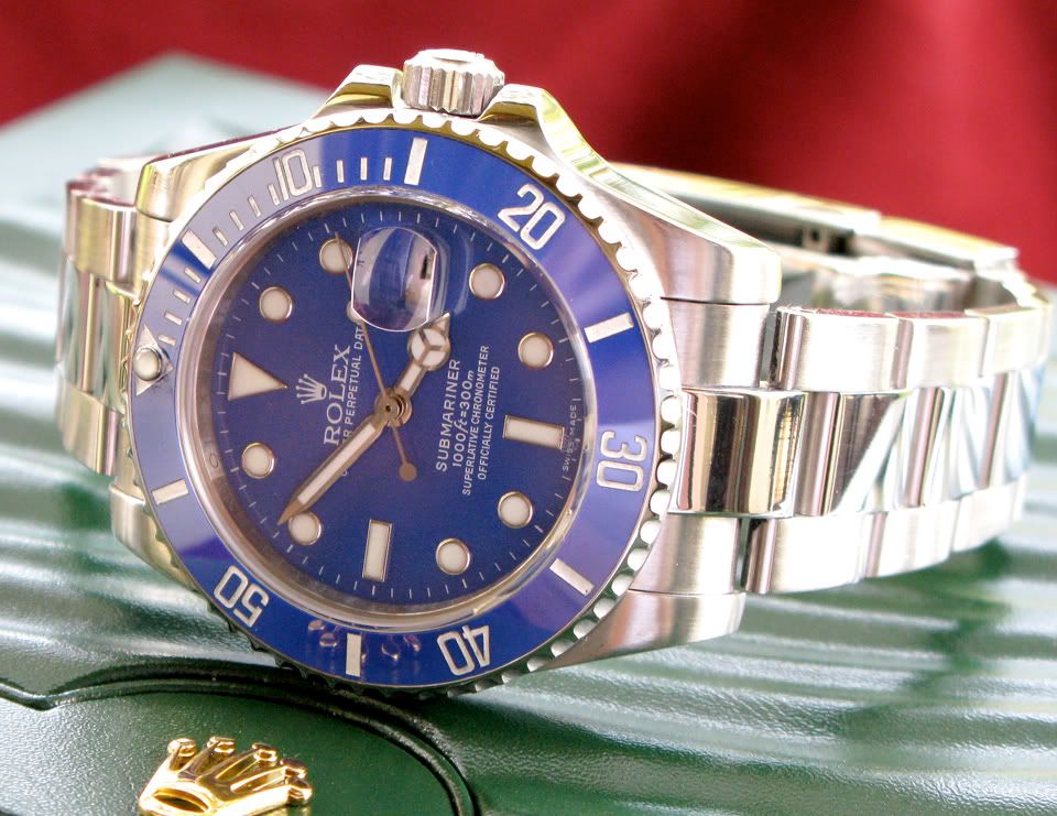
You'll notice the metal might have a bit more of a sheen to it, as I polished it up quite a bit (including some light buffing with rouge on the brushed parts as well), trying to make it stand out more than straight from the box--knowing that the gen is white-gold. I know white-gold in certain light appears to have more of a white luster (like sterling silver), rather than the cooler tones of steel, and while buffing won't change the reflective color, it will change the reflective properties. White-gold--in it's pure form--isn't "white" at all; it's actually a bit yellow. The surface areas of white-gold are generally coated with a layer of rhodium, or palladium (similar to how platinum is often treated), in order to make it appear less brassy and to give it a better sheen (all of your modern Daytona's bezels are coated with rhodium or palladium--the WGs, the platinums, and even the steel versions). So this buffing will hopefully help it to look less like simple, brushed steel.
(I also did a paint-mod on the bezel to get the numbers a bit brighter)
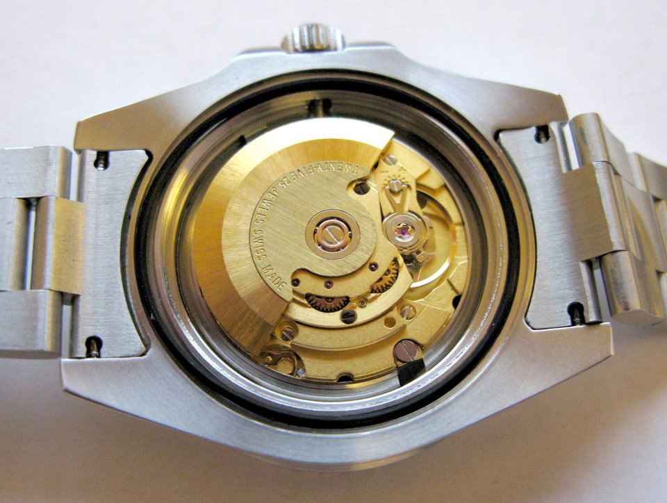
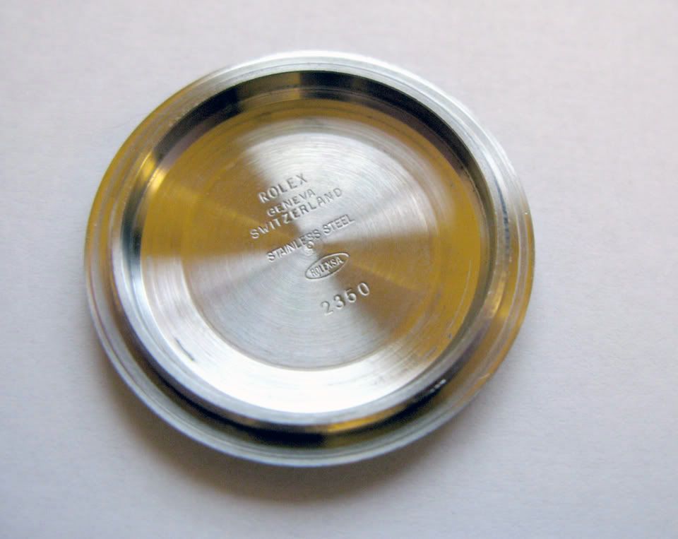
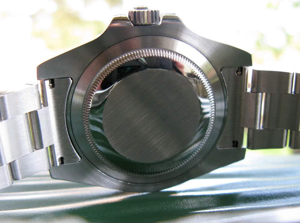
First, popped the back to check the movement. I don't know if anyone else has encountered this, but the case-back die that best fits this piece is the 28.3, which is odd because almost every sub I'm used to takes the 29.5. Oh well--everything looks good there:
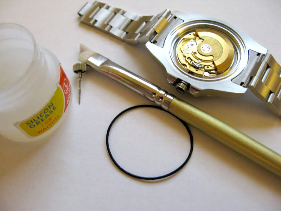
Next, time to grease the gaskets, to get it ready for water:
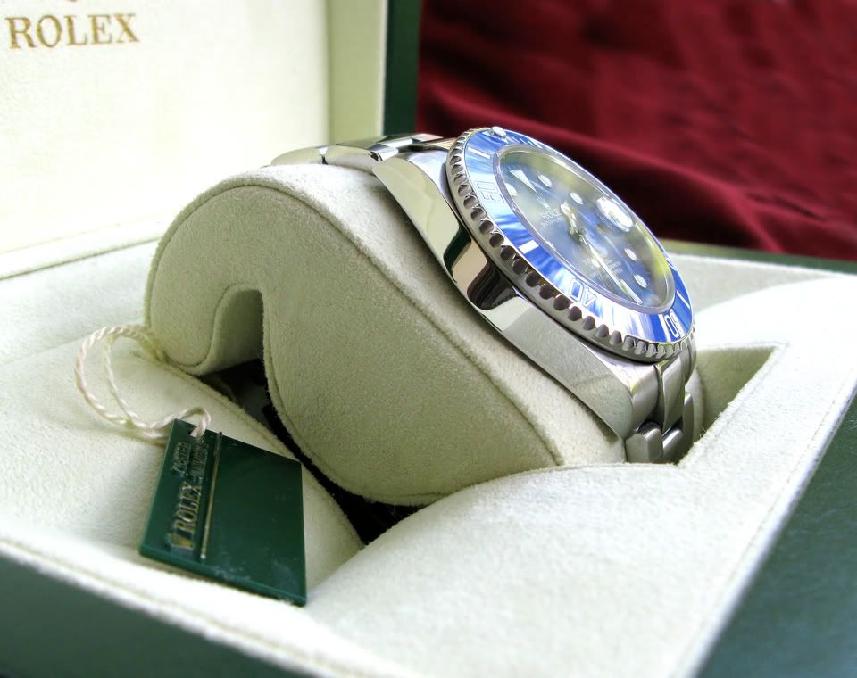
And now, outside:
The crown etching sits nice & straight, as it should, at 12 o'clock (I'm noticing a lot more reps are paying better attention to the way they seat the tubes now; they look much better like this):
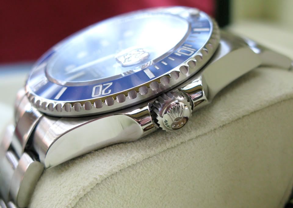
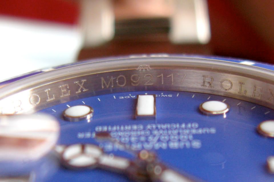
Nice, thick bezel too--sharply cut:
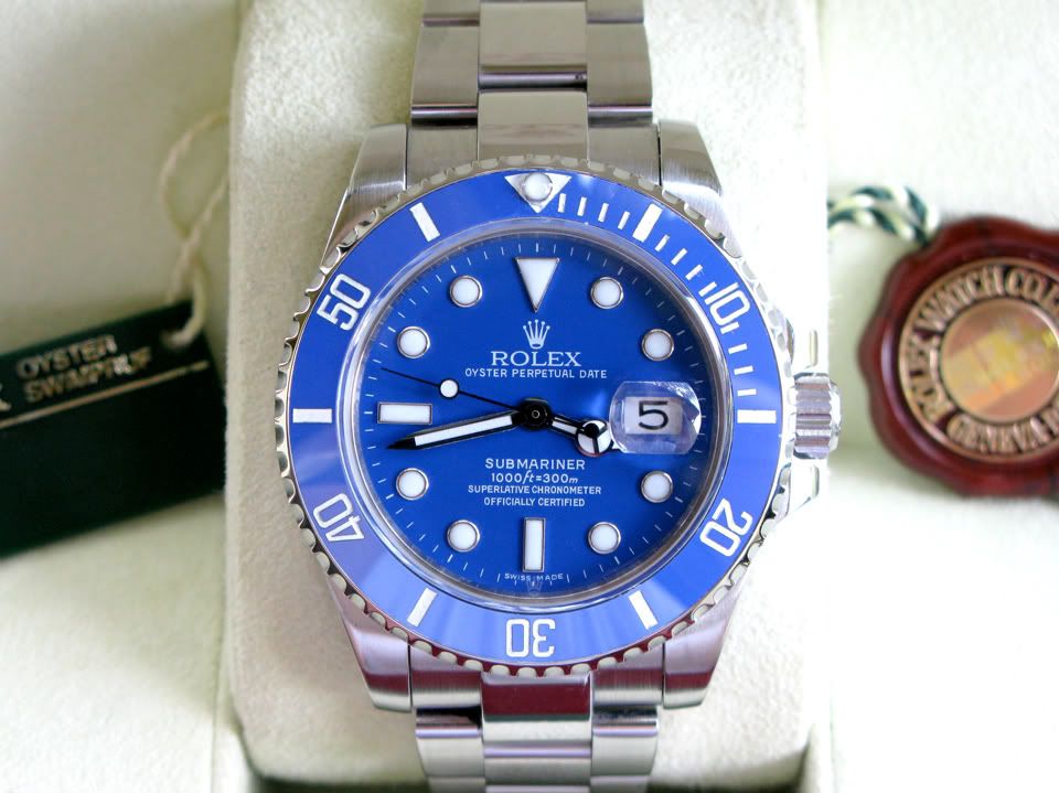
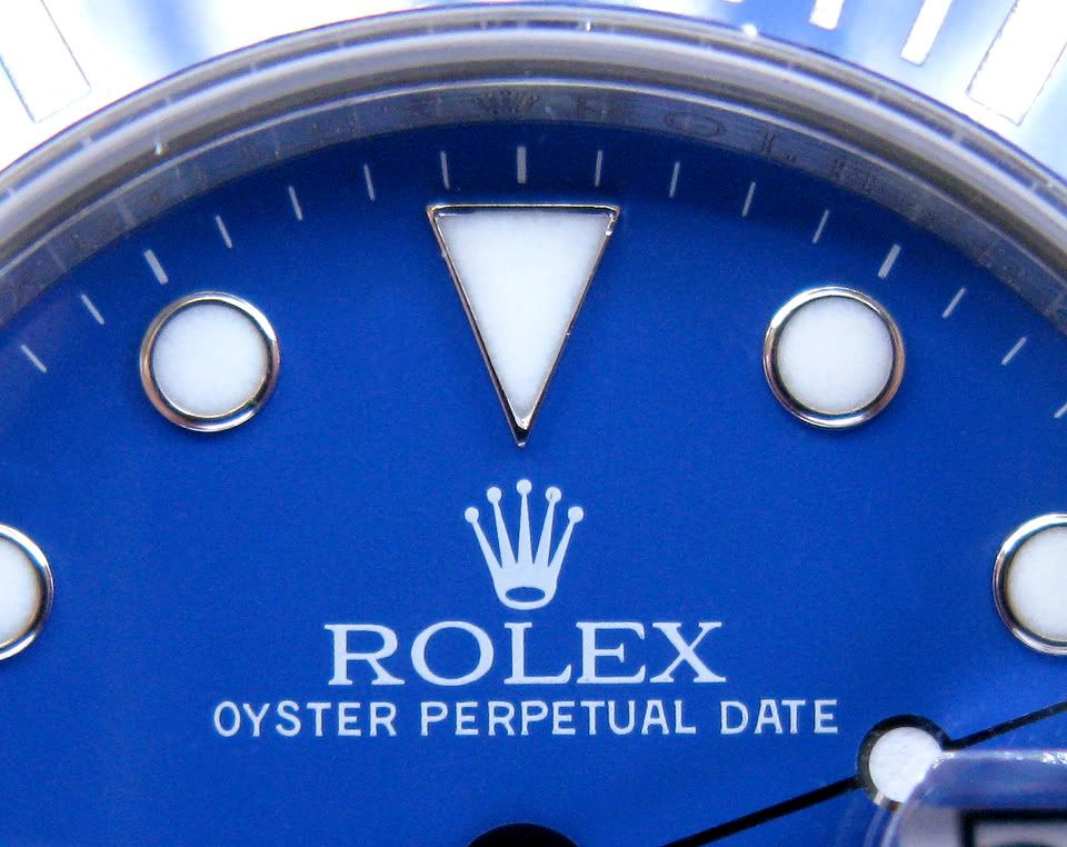
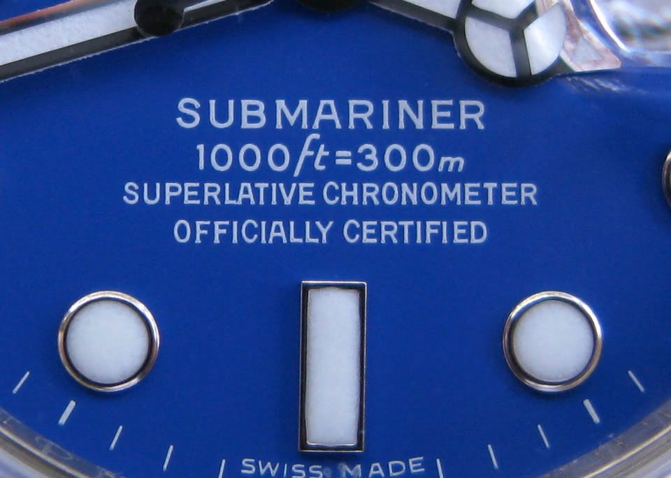
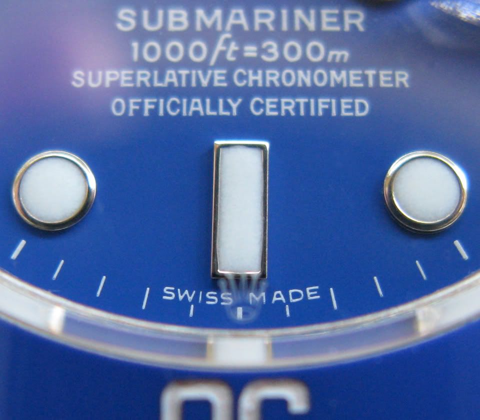
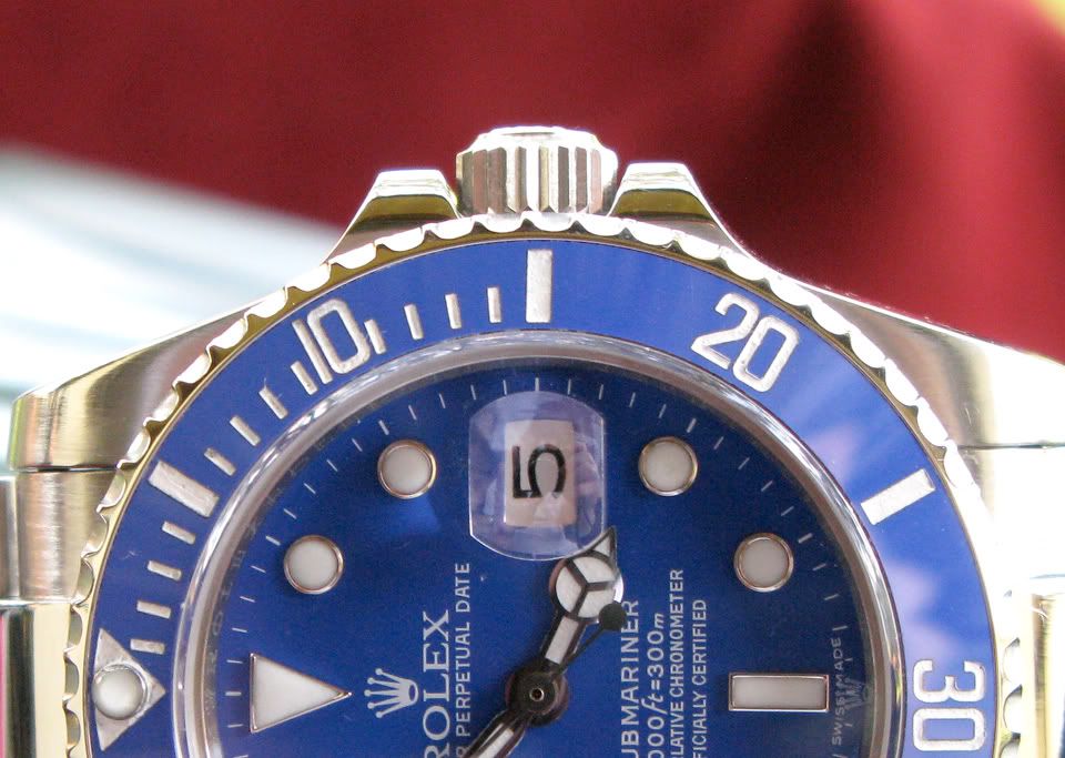
Dial details, a little skimping on the ink (notice the bottoms of some letters), but nonetheless, crisp, nice & sharp:
Crystal crown etching properly stippled, and not made of solid lines; aligned perfectly over 6, as it should be:
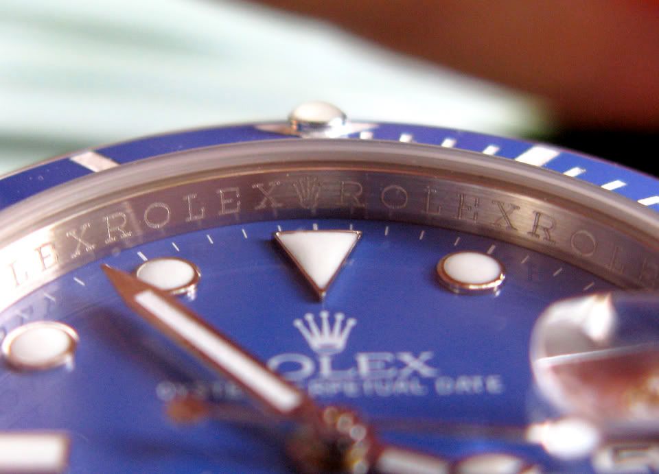
Rehaut appears to be the proper height, and the inscription on the rehaut is engraved--not printed--as it should be. It appears the engraving is slightly askew, but that will be easily fixable by simply shifting the movement a hair to one side, inside the case. Some gens are also misaligned as well--you'd think for $23,000, they might employ someone who knew how to double-check his work through a loupe:
Gen:
Rep:
Excellent CGs; accurately sized & shaped--quite nice:
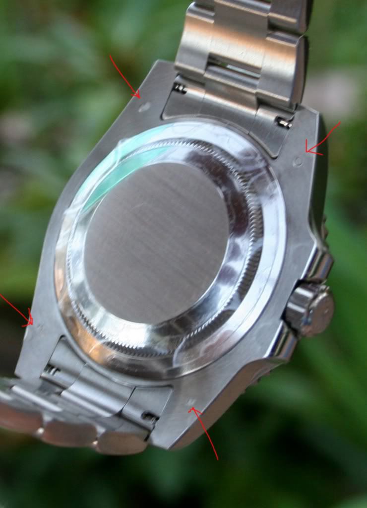
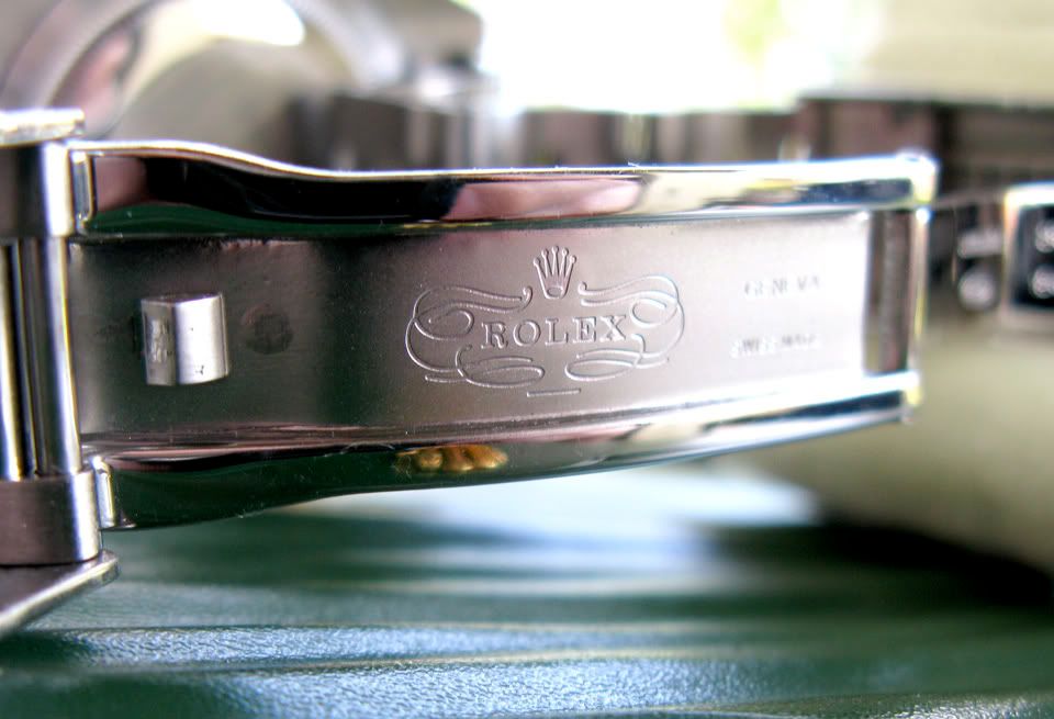
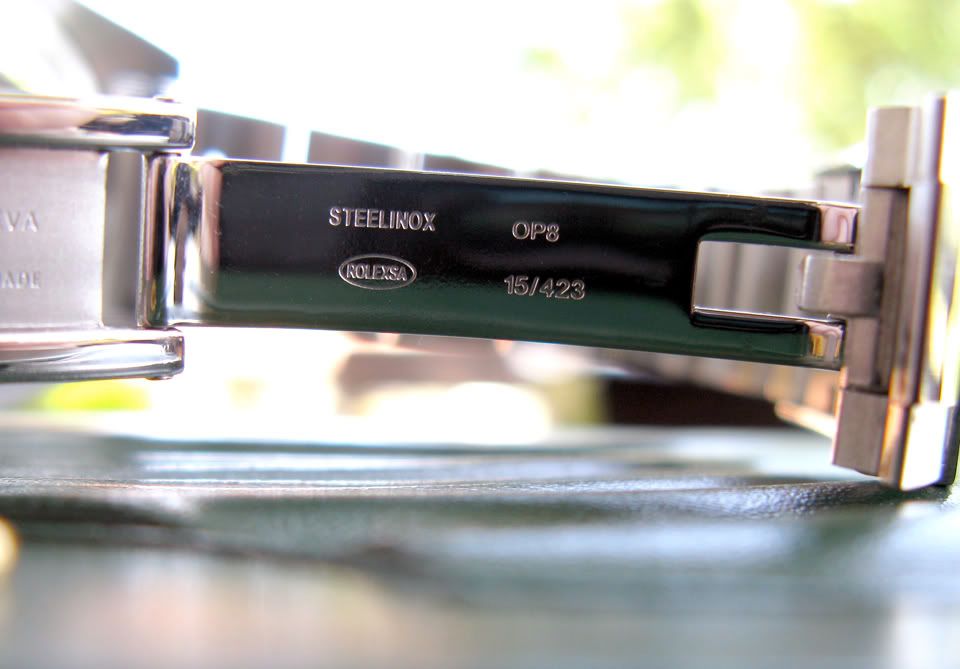
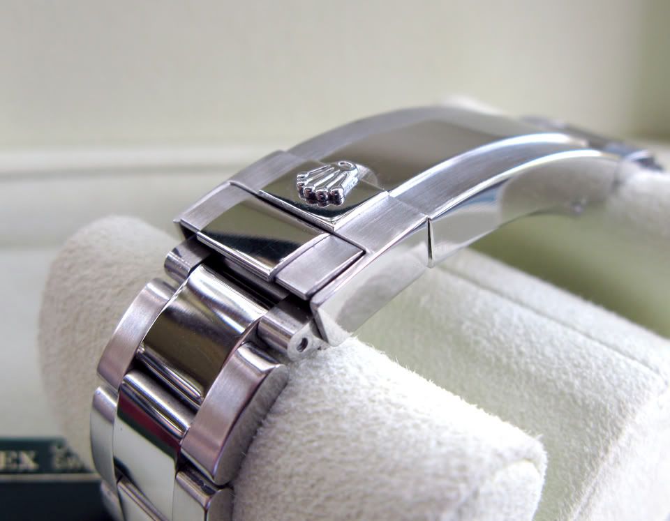
Band, clasp, case, and case-back (missing the four case-back engravings on the gen, but that was expected). Clasp markings aren't completely true to gen, but accurate enough--not to mentioned properly engraved, not printed, the way they're supposed to be:
Gen:
Rep:
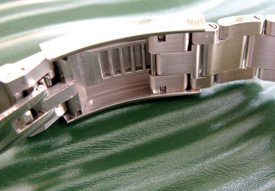
Proper diver's extension as well--nice to see they quit using the wrong one found on the older body-style of Subs:
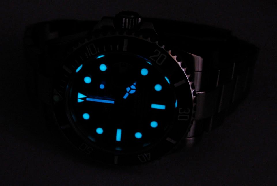
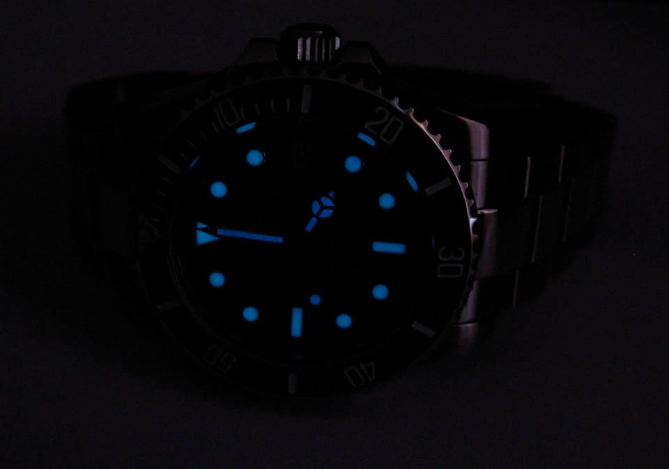
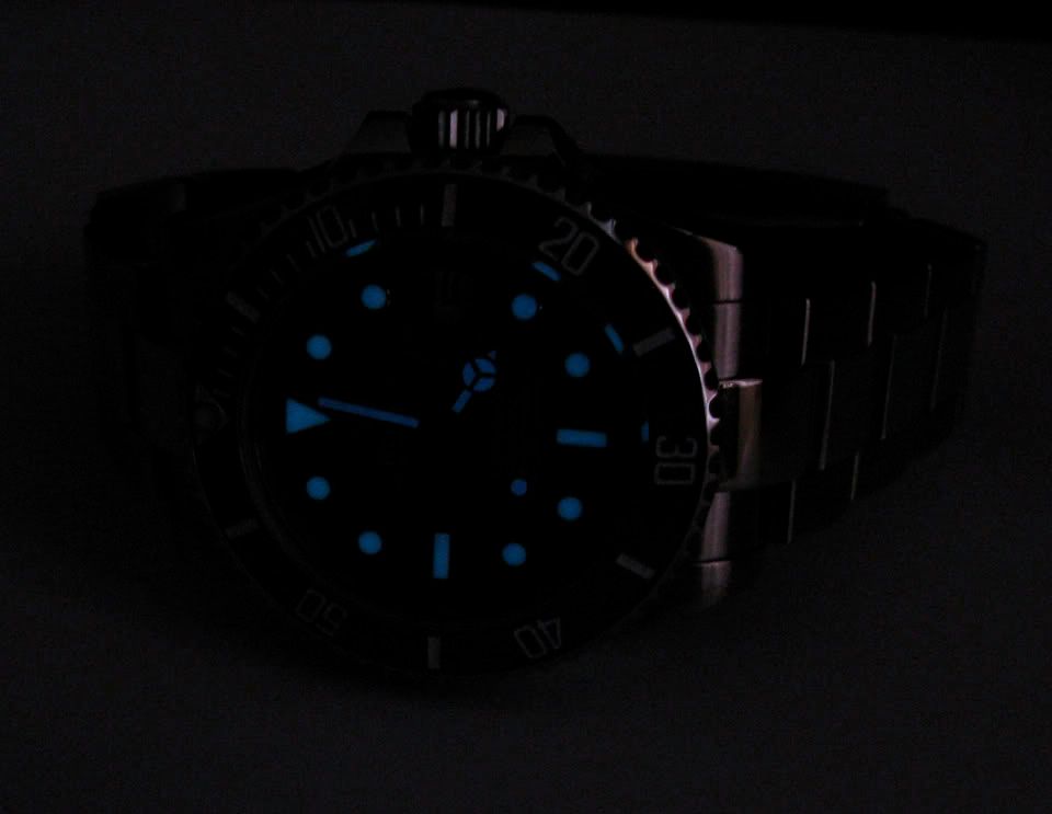
Factory lume was as expected too--markers lit up nicer than the hands, and definitely better than the pearl (which needs replacing). Lume faded quick, as expected--I played with a few settings to get teh most accurate-to-life pics I could take, and let me say, they're very close (aqua markers, green pearl, with the hands slightly more blue than the markers)--here are 3 shots, each approximately one minute apart, so you can see an accurate depiction of the glow's intensity and how the peak fades to a color change a little more towards the blue side:
Does anyone know--for certain--what color the lume is on the gen? I suspect the same color as the DSSD, in order to accentuate the blue dial & insert, as I think green on the gen (or this) piece simply doesn't match, and would look tacky. Anyone?
Well, that's pretty much it for this one. Watch is keeping perfect time after syncing it with the atomic clock's website--hasn't gained or lost a single second since 9 AM (published this review 6 hours later, at 4 PM, EST).
Hope you enjoy; it's truly a very nice piece, and well put together.
Thanks, Hont!
She had read Spirit's phenomenal (and much more in-depth) review of this piece with me, and liked it.I shot this in natural light, in an attempt to get the pics as close to what is actually present on the watch, in the way of the blue's particular color (robins egg blue). And, yes, it is damn close to gen.
You'll notice the metal might have a bit more of a sheen to it, as I polished it up quite a bit (including some light buffing with rouge on the brushed parts as well), trying to make it stand out more than straight from the box--knowing that the gen is white-gold. I know white-gold in certain light appears to have more of a white luster (like sterling silver), rather than the cooler tones of steel, and while buffing won't change the reflective color, it will change the reflective properties. White-gold--in it's pure form--isn't "white" at all; it's actually a bit yellow. The surface areas of white-gold are generally coated with a layer of rhodium, or palladium (similar to how platinum is often treated), in order to make it appear less brassy and to give it a better sheen (all of your modern Daytona's bezels are coated with rhodium or palladium--the WGs, the platinums, and even the steel versions). So this buffing will hopefully help it to look less like simple, brushed steel.
(I also did a paint-mod on the bezel to get the numbers a bit brighter)
First, popped the back to check the movement. I don't know if anyone else has encountered this, but the case-back die that best fits this piece is the 28.3, which is odd because almost every sub I'm used to takes the 29.5. Oh well--everything looks good there:
Next, time to grease the gaskets, to get it ready for water:
And now, outside:
The crown etching sits nice & straight, as it should, at 12 o'clock (I'm noticing a lot more reps are paying better attention to the way they seat the tubes now; they look much better like this):
Nice, thick bezel too--sharply cut:
Dial details, a little skimping on the ink (notice the bottoms of some letters), but nonetheless, crisp, nice & sharp:
Crystal crown etching properly stippled, and not made of solid lines; aligned perfectly over 6, as it should be:
Rehaut appears to be the proper height, and the inscription on the rehaut is engraved--not printed--as it should be. It appears the engraving is slightly askew, but that will be easily fixable by simply shifting the movement a hair to one side, inside the case. Some gens are also misaligned as well--you'd think for $23,000, they might employ someone who knew how to double-check his work through a loupe:
Gen:
Rep:
Excellent CGs; accurately sized & shaped--quite nice:
Band, clasp, case, and case-back (missing the four case-back engravings on the gen, but that was expected). Clasp markings aren't completely true to gen, but accurate enough--not to mentioned properly engraved, not printed, the way they're supposed to be:
Gen:
Rep:
Proper diver's extension as well--nice to see they quit using the wrong one found on the older body-style of Subs:
Factory lume was as expected too--markers lit up nicer than the hands, and definitely better than the pearl (which needs replacing). Lume faded quick, as expected--I played with a few settings to get teh most accurate-to-life pics I could take, and let me say, they're very close (aqua markers, green pearl, with the hands slightly more blue than the markers)--here are 3 shots, each approximately one minute apart, so you can see an accurate depiction of the glow's intensity and how the peak fades to a color change a little more towards the blue side:
Does anyone know--for certain--what color the lume is on the gen? I suspect the same color as the DSSD, in order to accentuate the blue dial & insert, as I think green on the gen (or this) piece simply doesn't match, and would look tacky. Anyone?
Well, that's pretty much it for this one. Watch is keeping perfect time after syncing it with the atomic clock's website--hasn't gained or lost a single second since 9 AM (published this review 6 hours later, at 4 PM, EST).
Hope you enjoy; it's truly a very nice piece, and well put together.
Thanks, Hont!