- 12/3/18
- 36,451
- 74,900
- 113
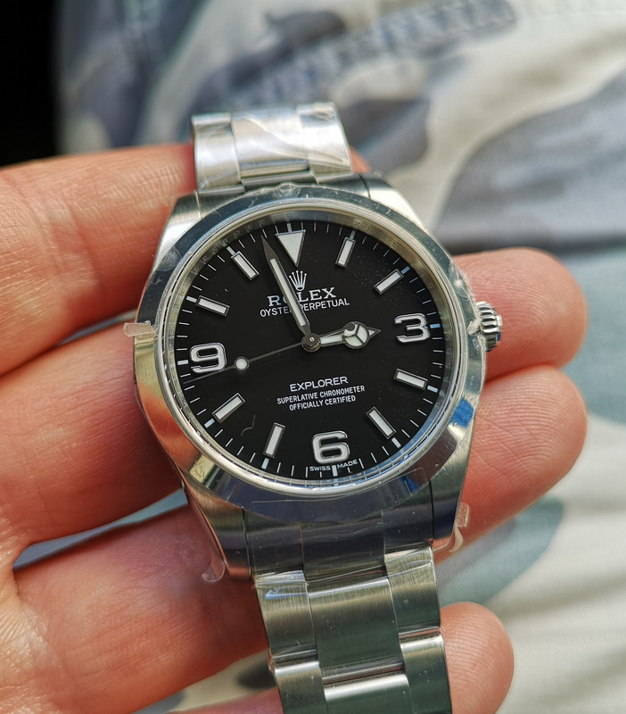
Well if users are that nitpicky about the "3", then the above posted photo also has spacing between "E" and "xplorer".issue, not very prominent as in the older JF but still not spot on.
Yeah I saw that. Scroll back a page to my pic of the gen, it has that also. The new ARF ( E XPLORER ) spacing is spot on with gen. ARF is a little less bold font though. In this pic you can readily see the thinner ARF font on the numerals I mentioned earlier. Also the hour markers are thinner. Still a great rep!

Last edited:


