-
Tired of adverts on RWI? - Subscribe by clicking HERE and PMing Trailboss for instructions and they will magically go away!
You are using an out of date browser. It may not display this or other websites correctly.
You should upgrade or use an alternative browser.
You should upgrade or use an alternative browser.
Pepsi Meteorite project
- Thread starter Oascom
- Start date
- 28/2/17
- 2,311
- 1,815
- 113
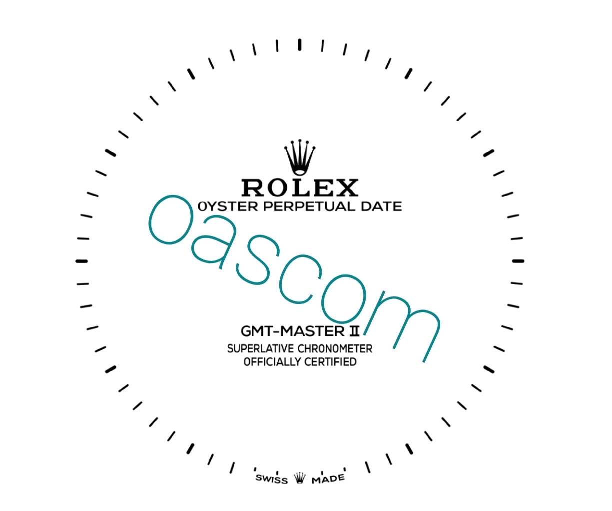
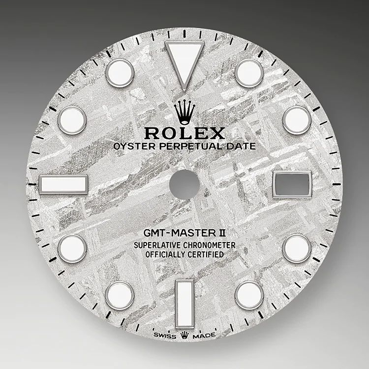
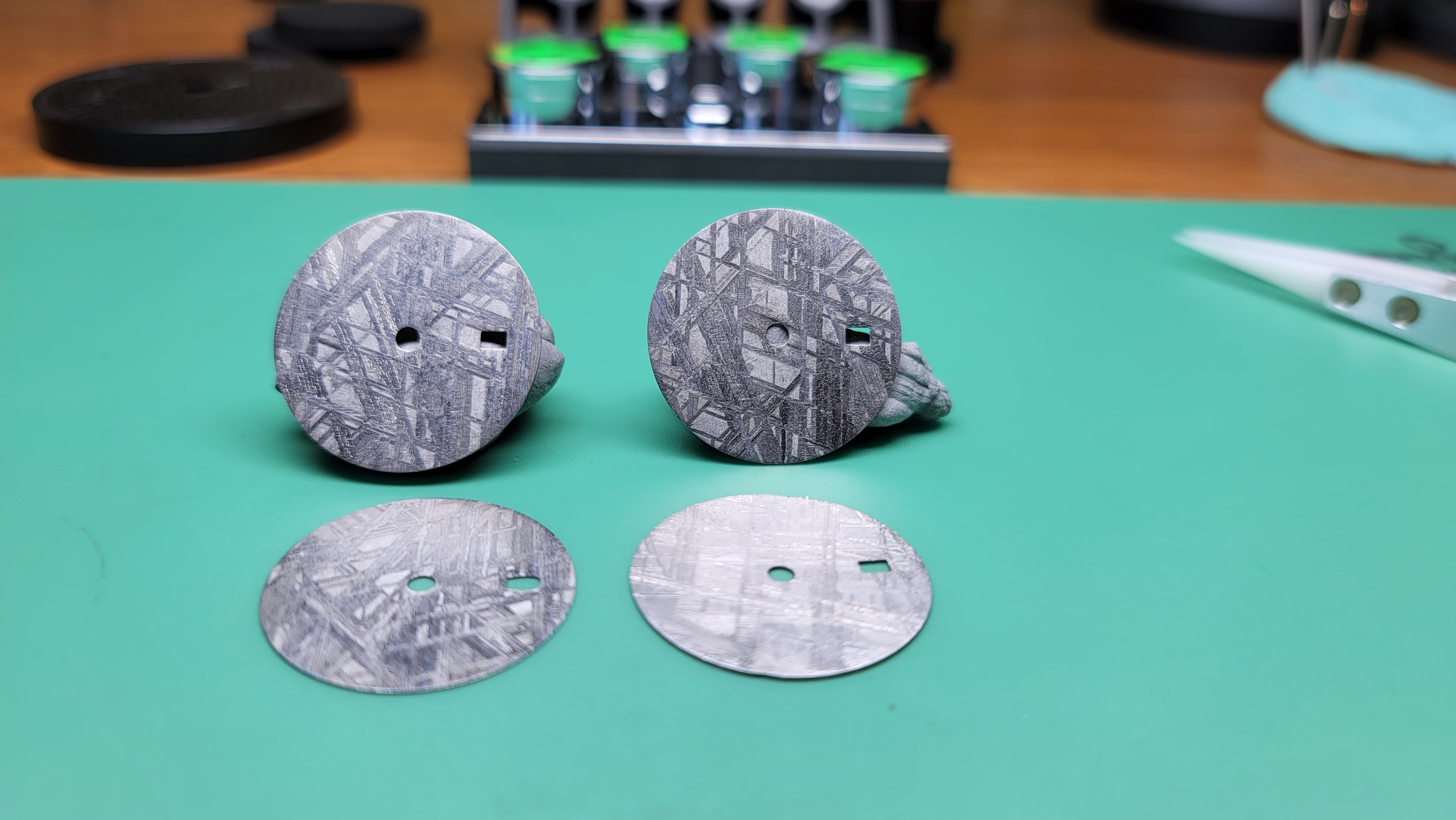
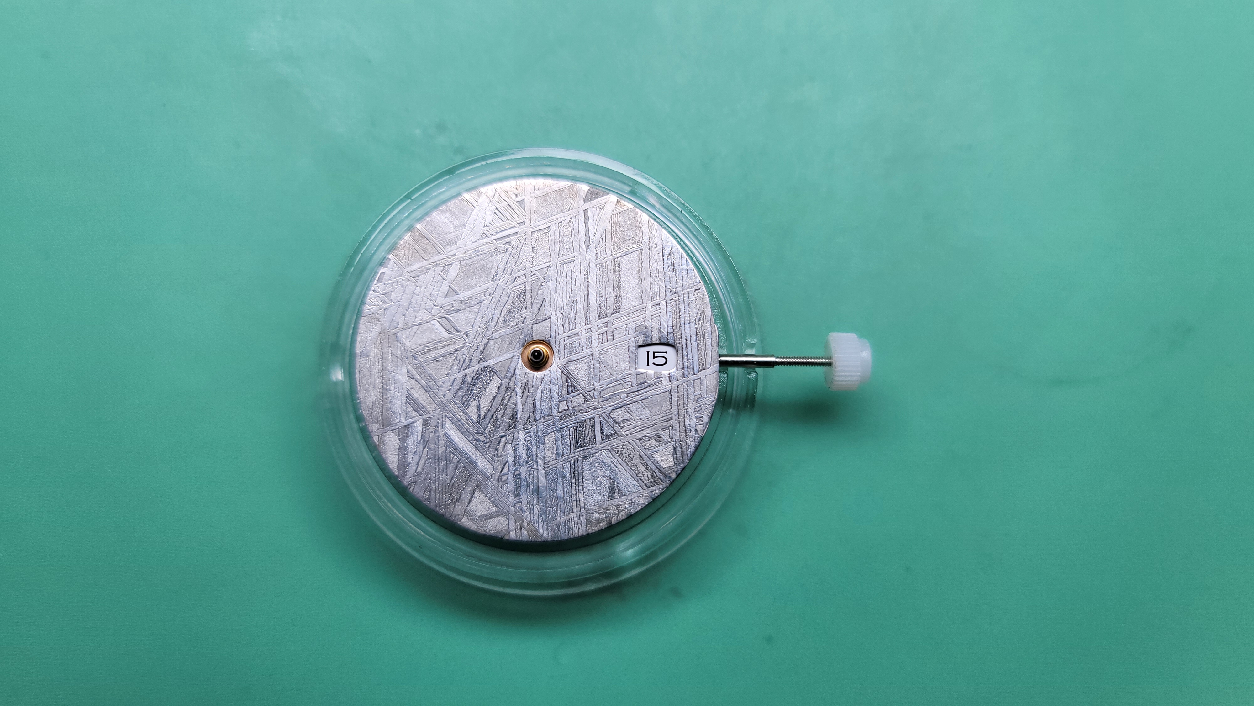
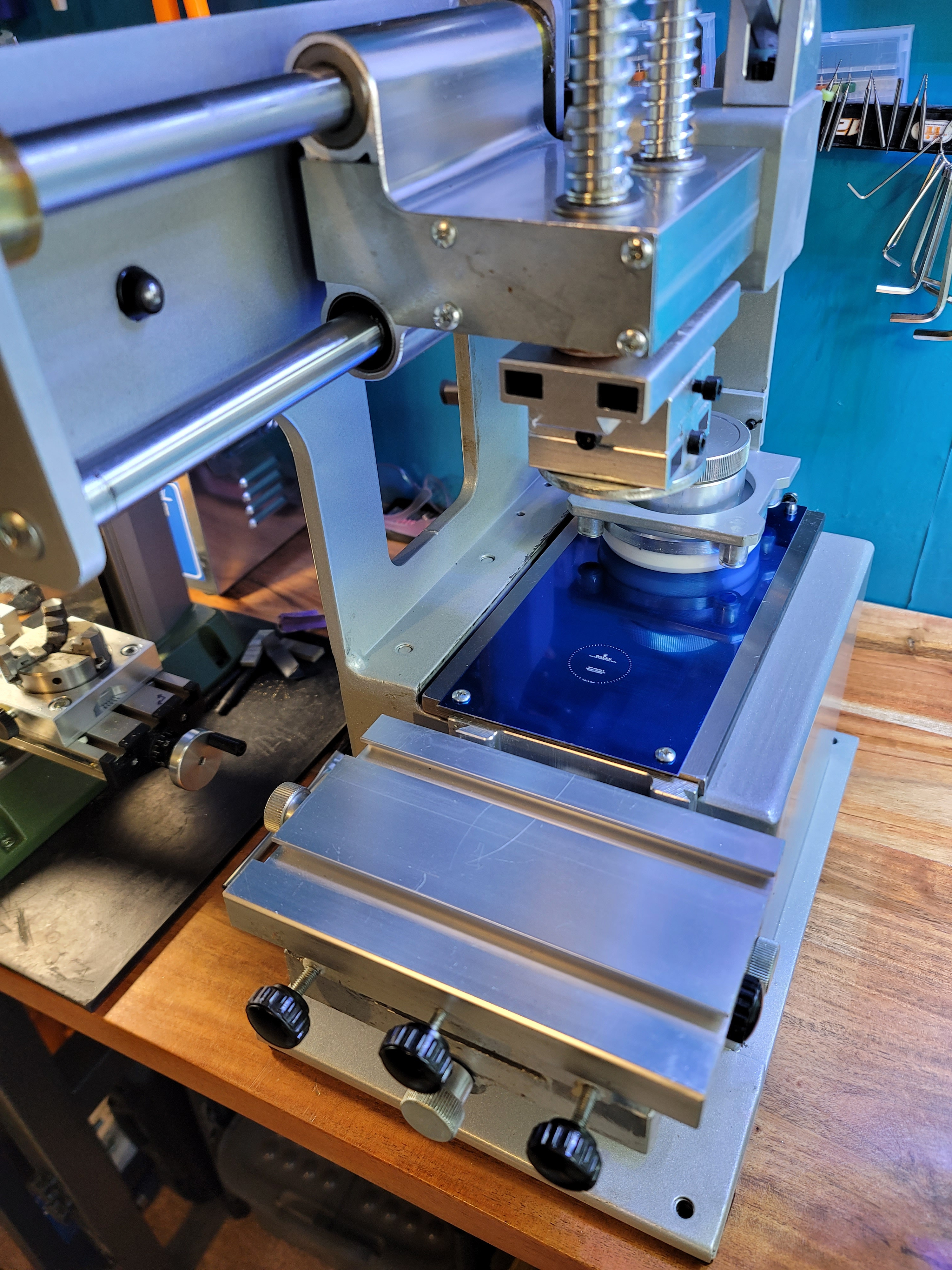
Stepping up production, props! Are you going to use a standard dial as a base, reuse the markers and attach the thin layer of meteorite to that? Didnt ask last time but do you have marker holes drilled in the meteorite or do you file off the pegs on the back of the markers and wing it? Im about as much use as the designer of noob v1-12, but the vector looks pretty good to me. I guess the key is working out how much the rubber will expand by when you print it, and how much to scale down the text by to accommodate that.
MikeMeezy77
That’s not 904L…
- 28/2/17
- 2,311
- 1,815
- 113
Do you just freehand where the markers end up then with epoxy? Id be tempted to buy a 3d printer and make a template to drop them through haha
Stepping up production, props! Are you going to use a standard dial as a base, reuse the markers and attach the thin layer of meteorite to that? Didnt ask last time but do you have marker holes drilled in the meteorite or do you file off the pegs on the back of the markers and wing it? Im about as much use as the designer of noob v1-12, but the vector looks pretty good to me. I guess the key is working out how much the rubber will expand by when you print it, and how much to scale down the text by to accommodate that.
Yes i file down markers from dials and epoxy it freehand. Just too much trouble to drill holes especially that different factories use different size studs and i never know what I'll have available. It super secure so no reason to mess with drilling.
Also freehand alow me to do micro adjustments.
- 12/3/18
- 32,783
- 59,021
- 113
KJ2020 you have a good eye for this, what do you think?
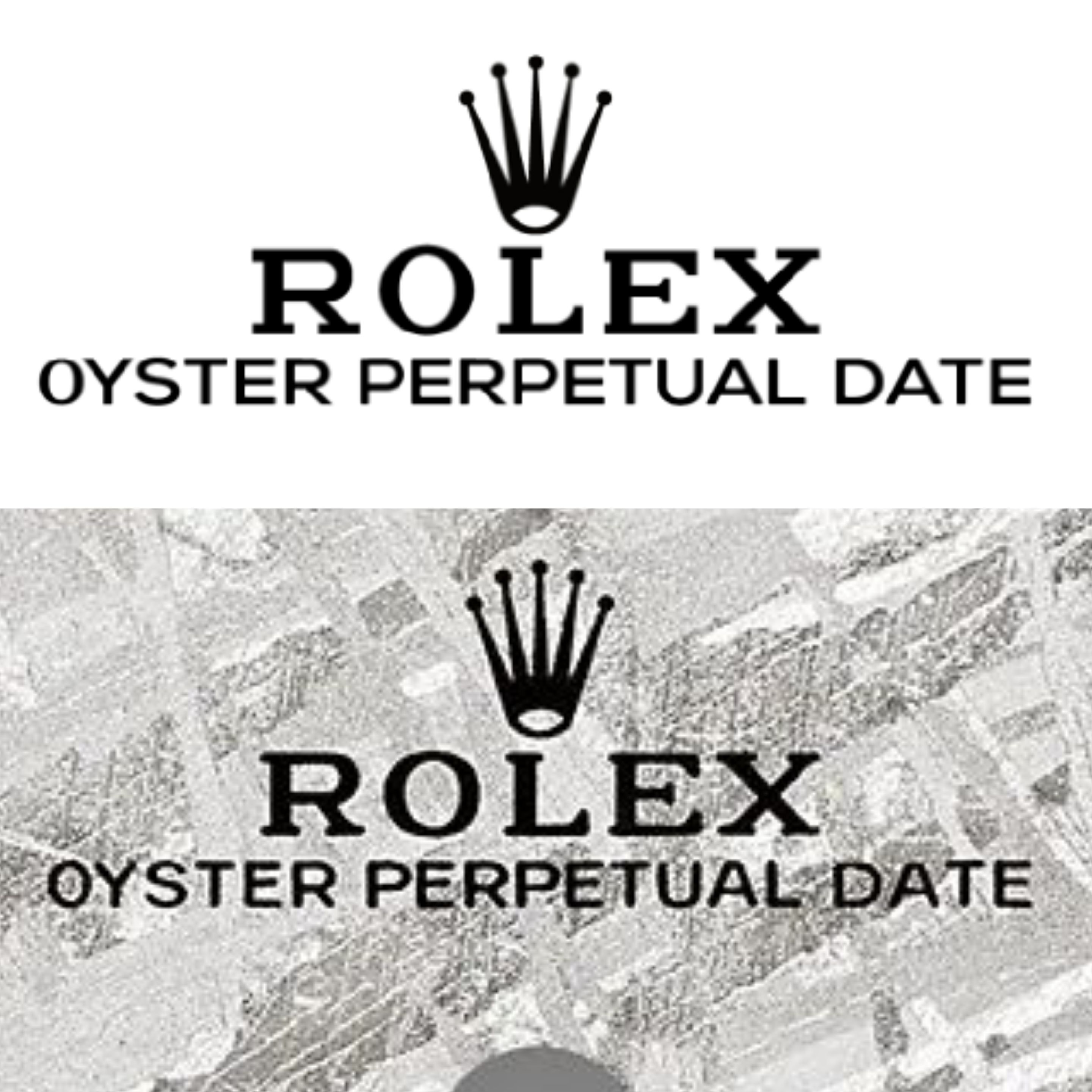
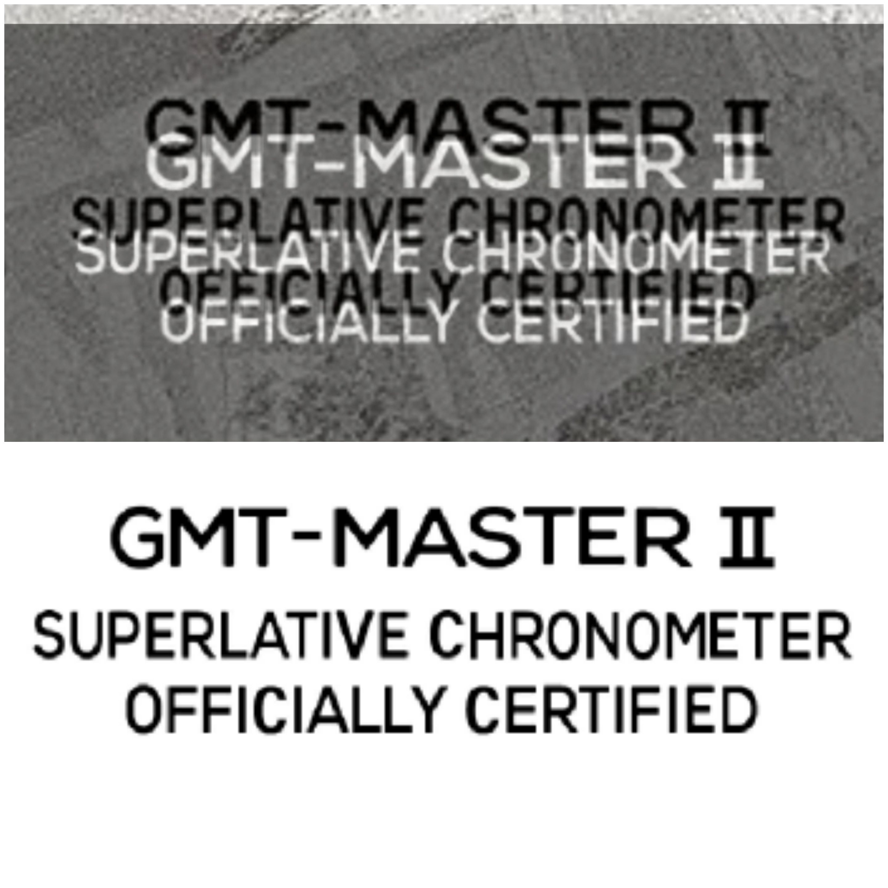
Awesome work bro. You could use your vector files as they are, especially since they are being printed on irregular uneven surfaces. Your work is really close to the gen.
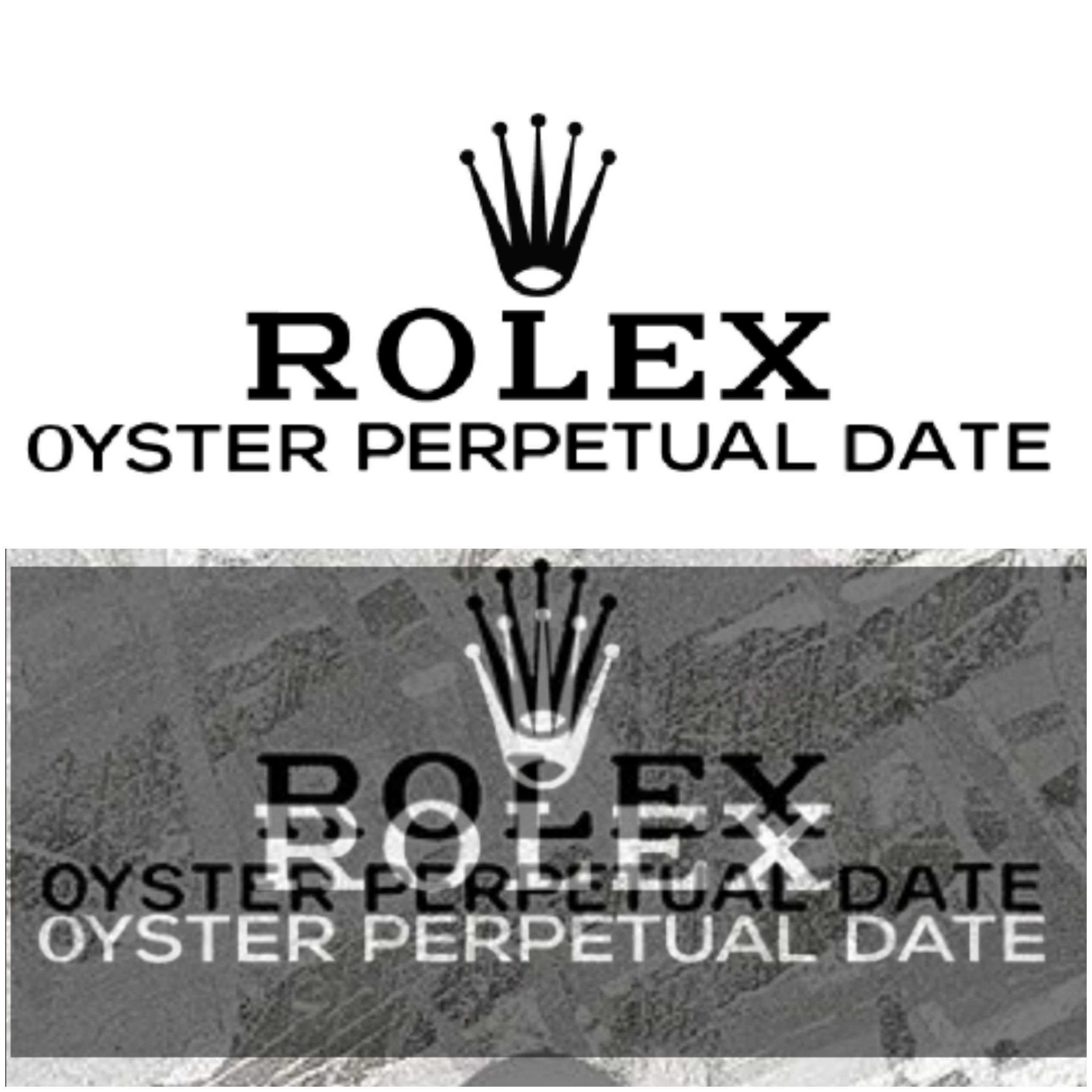
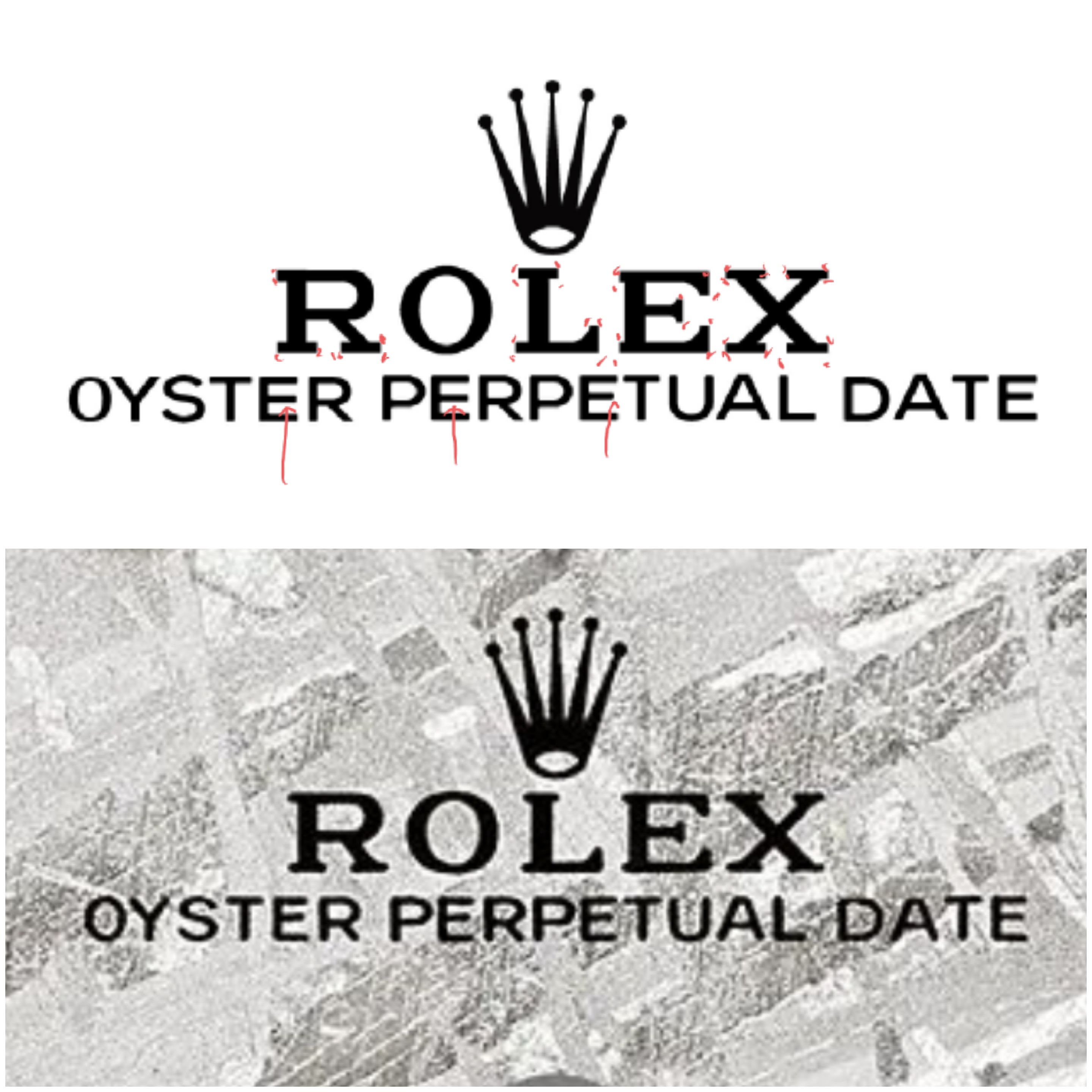
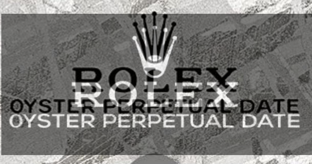
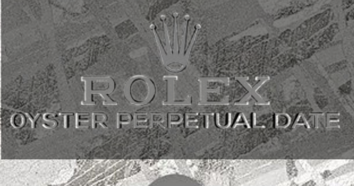
If you do want to tweak it it a little, here's what I see. I inverted your images so your text is white, and at 50% transparent you can see the gen next to and underneath it.
First two pics:
Some minor spacing issues near the end of PERPETUAL and in DATE
Also your fonts are perfect and symmetrical, the gen fonts are not. On the gen, the following are notable differences
T - shorter top bar
E - middle bar is top justified
P - top curved opening is top justified
A - top has a longer bar
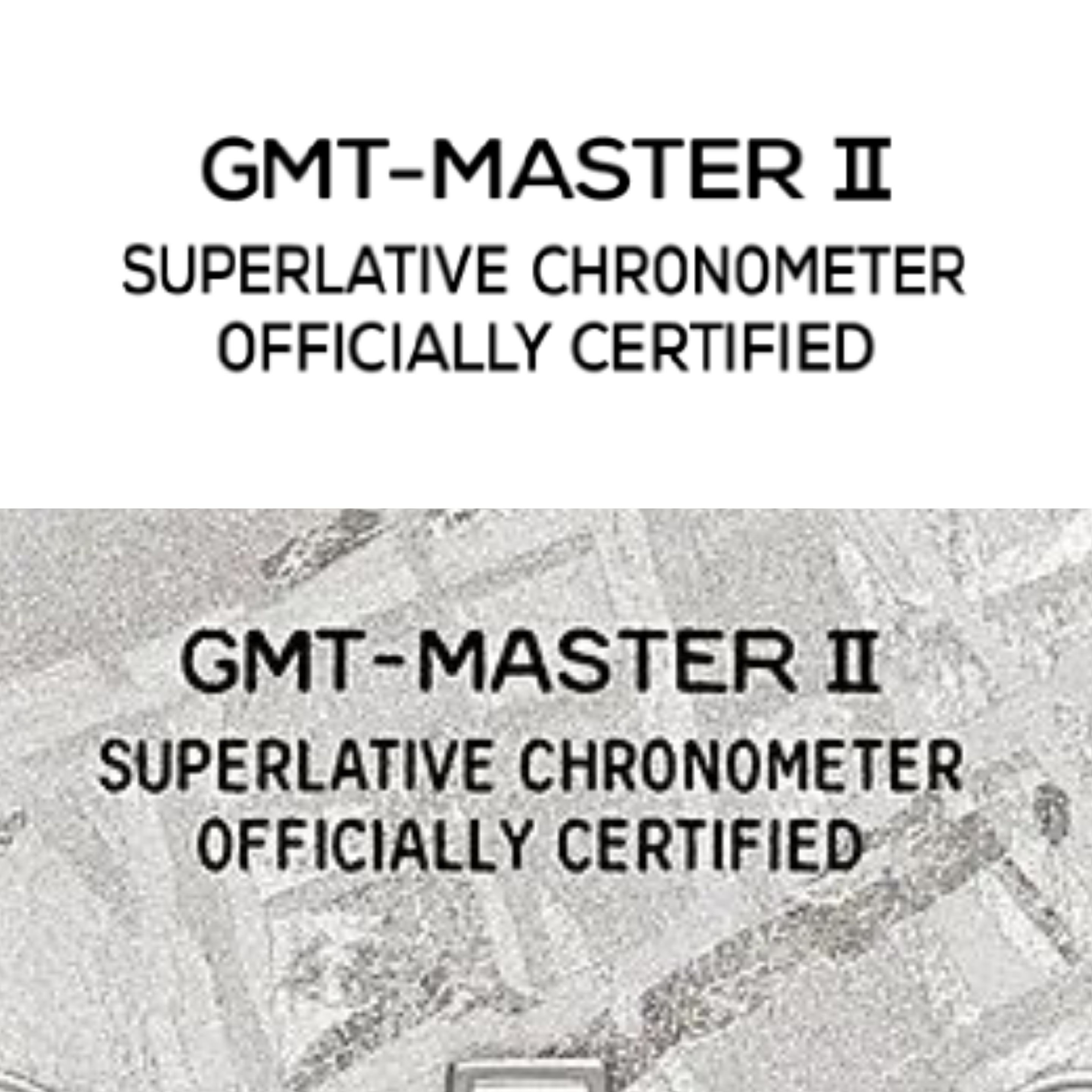
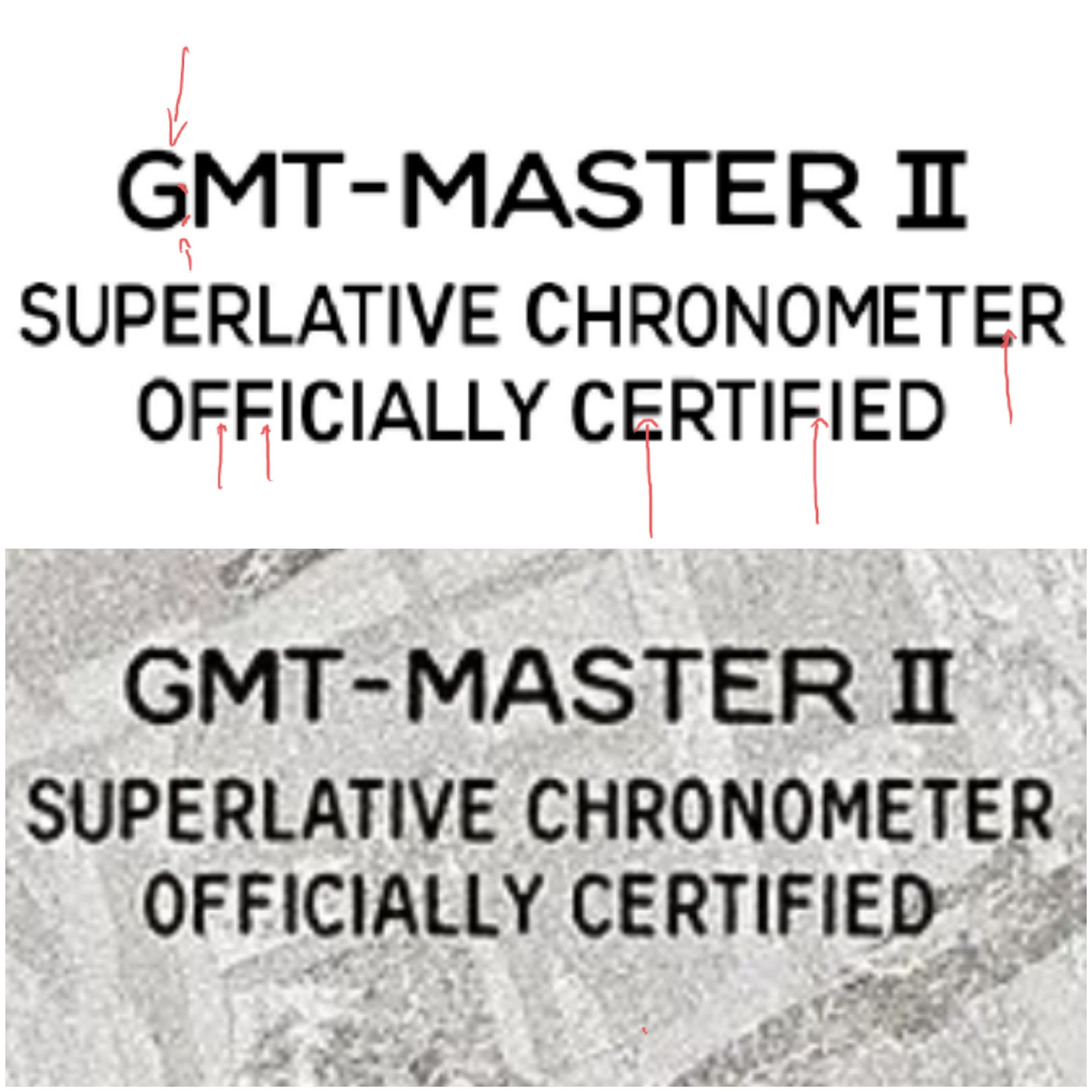
Next two pics:
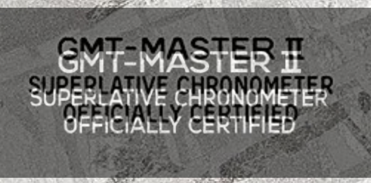
Again minor spacing issues toward the end of the lines, last line of text minor vertical spacing issue.
Same slight font differences, also the C's are more noticeably different since Rolex has a very distinct letter C in these text lines.
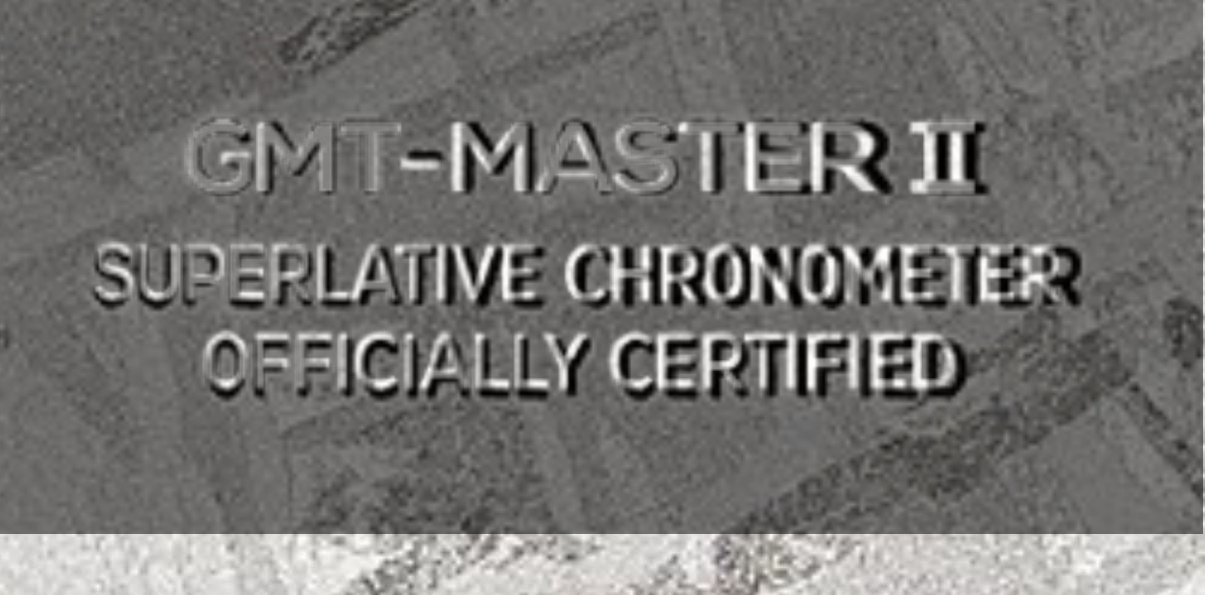
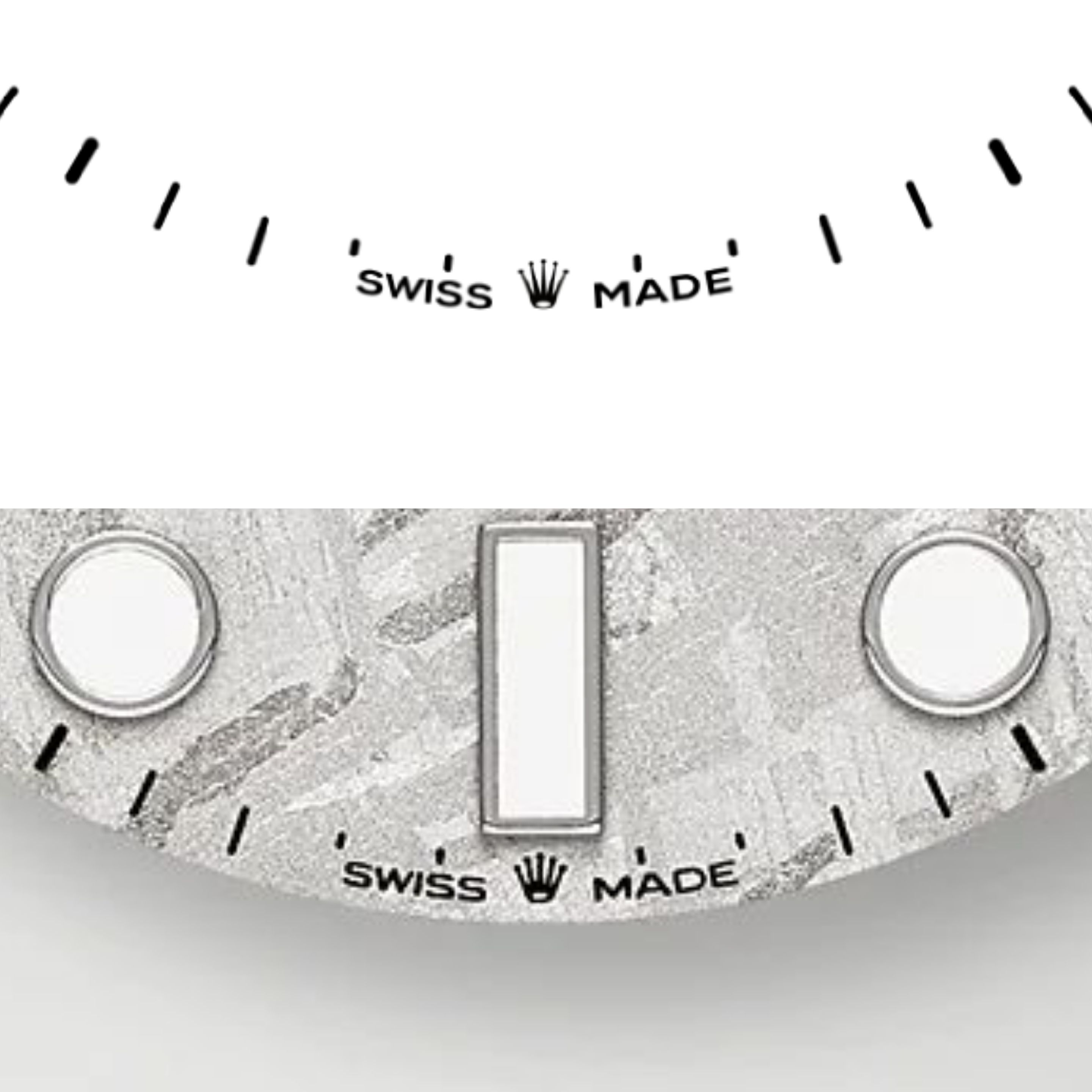
Next two pics:
Looks fine really, the A and D in MADE are a little different - fat D on the gen
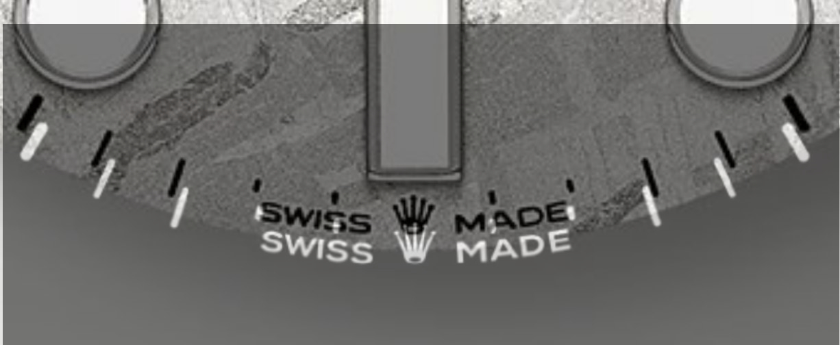
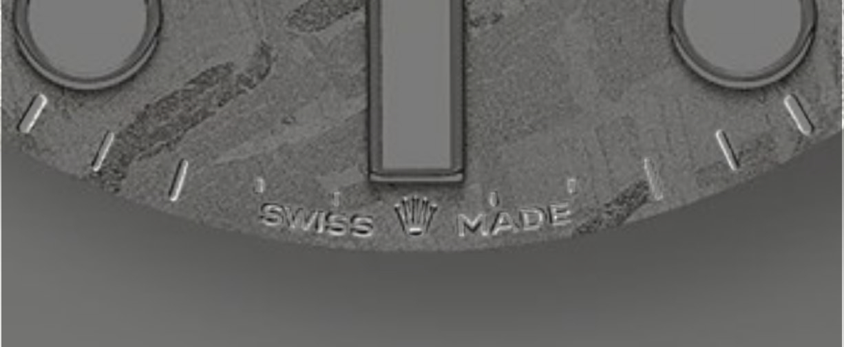
Again like I said you could roll with it, I'm being picky but that's what we do here right? If you only did two things I would fix the spacing and the letter C's in the bottom lines of text. Those would have to be done individually by stretching the vector points rather than using a set font letter. But It would be worth it IMO, those letters have been like that on Rolex dials forever and a normal C just doesn't look right there.
Awesome work bro. You could use your vector files as they are, especially since they are being printed on irregular uneven surfaces. Your work is really close to the gen.
If you do want to tweak it it a little, here's what I see. I inverted your images so your text is white, and at 50% transparent you can see the gen next to and underneath it.
First two pics:
Some minor spacing issues near the end of PERPETUAL and in DATE
Also your fonts are perfect and symmetrical, the gen fonts are not. On the gen, the following are notable differences
T - shorter top bar
E - middle bar is top justified
P - top curved opening is top justified
A - top has a longer bar


Next two pics:
Again minor spacing issues toward the end of the lines, last line of text minor vertical spacing issue.
Same slight font differences, also the C's are more noticeably different since Rolex has a very distinct letter C in these text lines.


Next two pics:
Looks fine really, the A and D in MADE are a little different - fat D on the gen


Again like I said you could roll with it, I'm being picky but that's what we do here right? If you only did two things I would fix the spacing and the letter C's in the bottom lines of text. Those would have to be done individually by stretching the vector points rather than using a set font letter. But It would be worth it IMO, those letters have been like that on Rolex dials forever and a normal C just doesn't look right there.
I was waiting for that !
Thanks buddy !
I'm actually happy it's not as bad, took a day to make i knew it's not 1:1.
I'll try to tweak it slightly
- 12/3/18
- 32,783
- 59,021
- 113
Looks like you're wanting to strive for perfection bro which is great but remember the surface it's going on. A lot of those little details will get lost. Overall appearance is what matters most.
One thing that we haven't talked about is that all of the smaller text gen fonts are slightly narrower than yours which contributes to that overall appearance. Each one of yours would have to be scaled down horizontally a little. IDK if you want to go to those extremes. Your letter C's look great now as does the spacing.
I'll be happy to do some more mock ups whenever you want to see some. You want some now, or wait a bit?
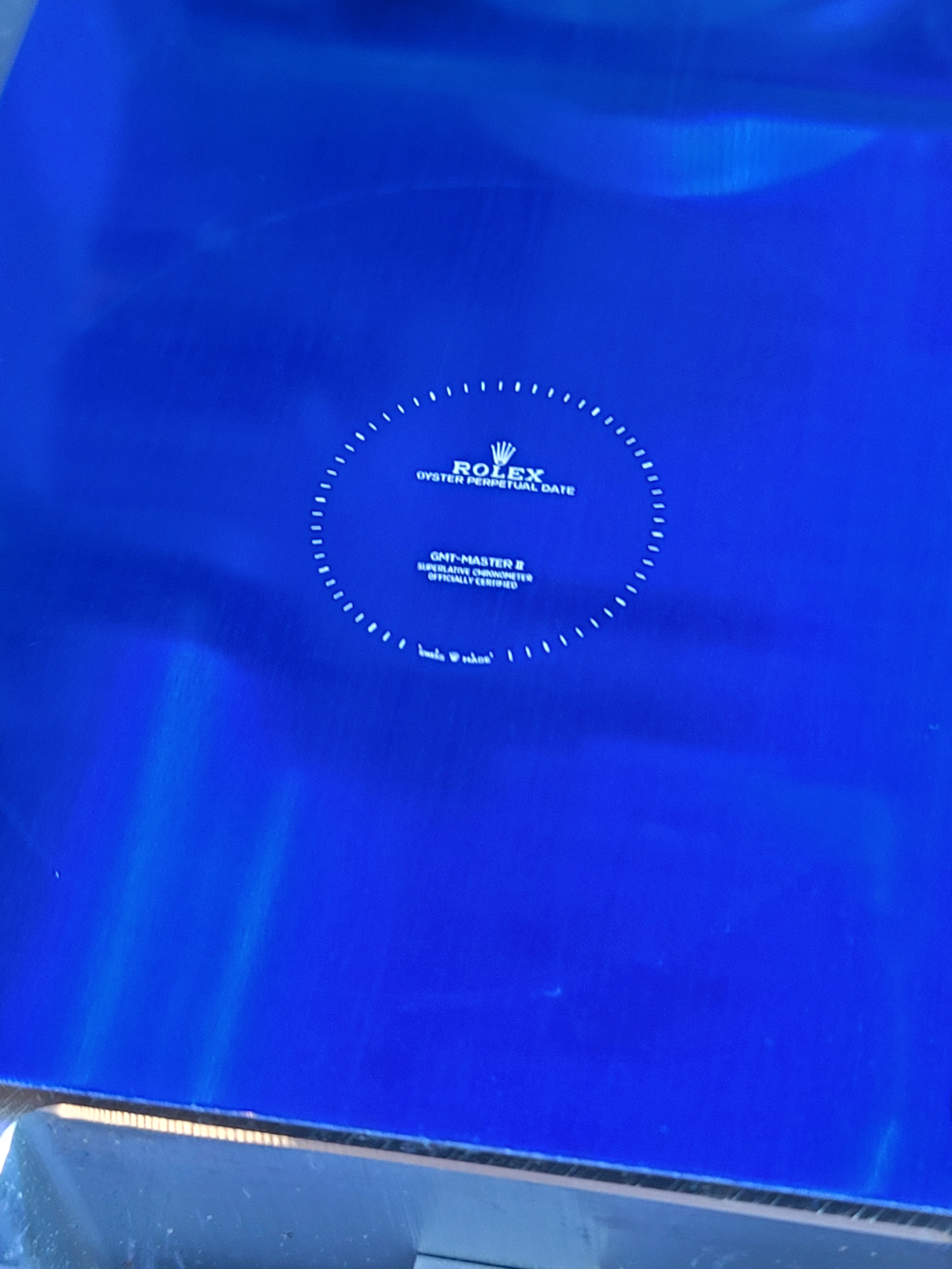
Check this out
i know it never going to be 1:1 but hey if we can make.it better why not
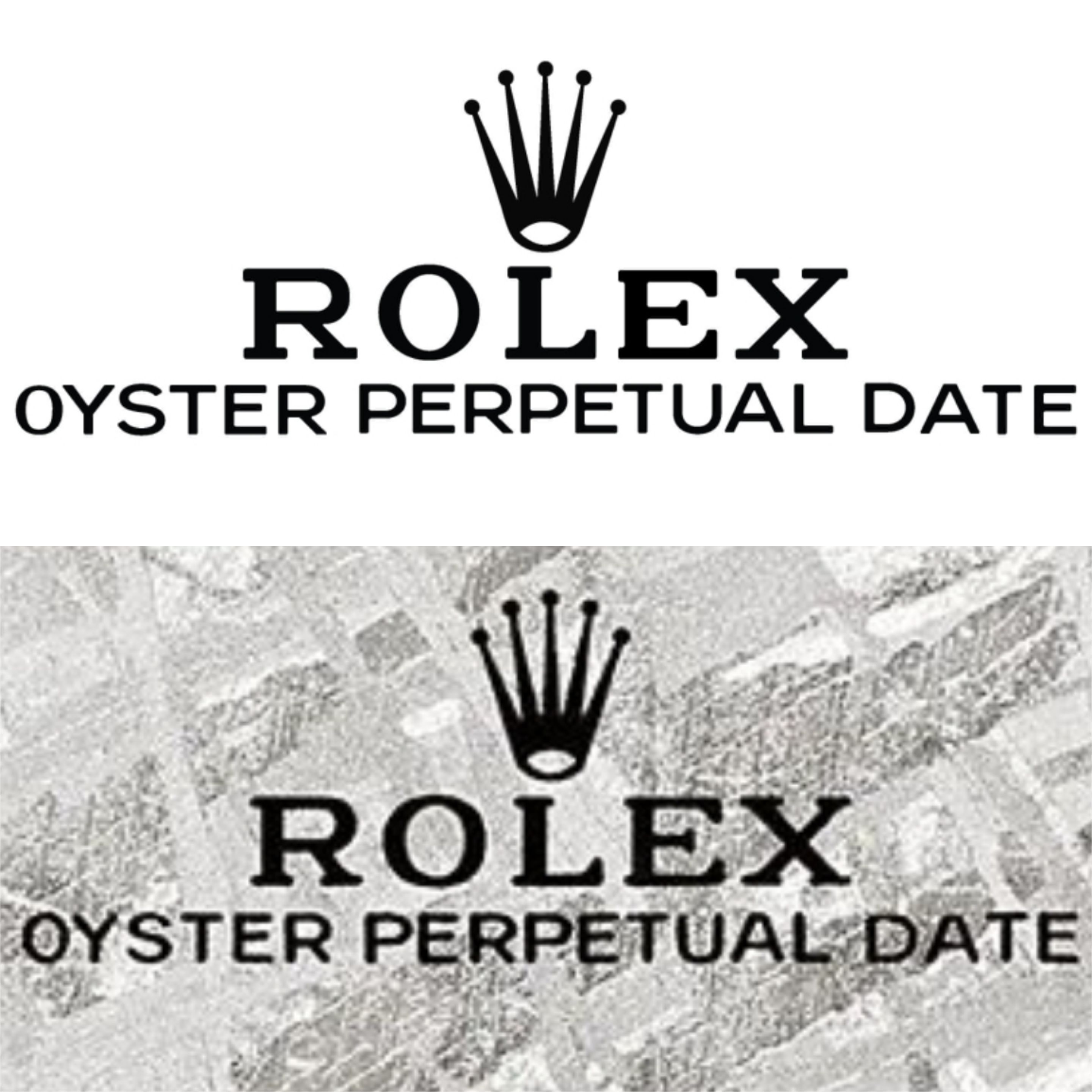
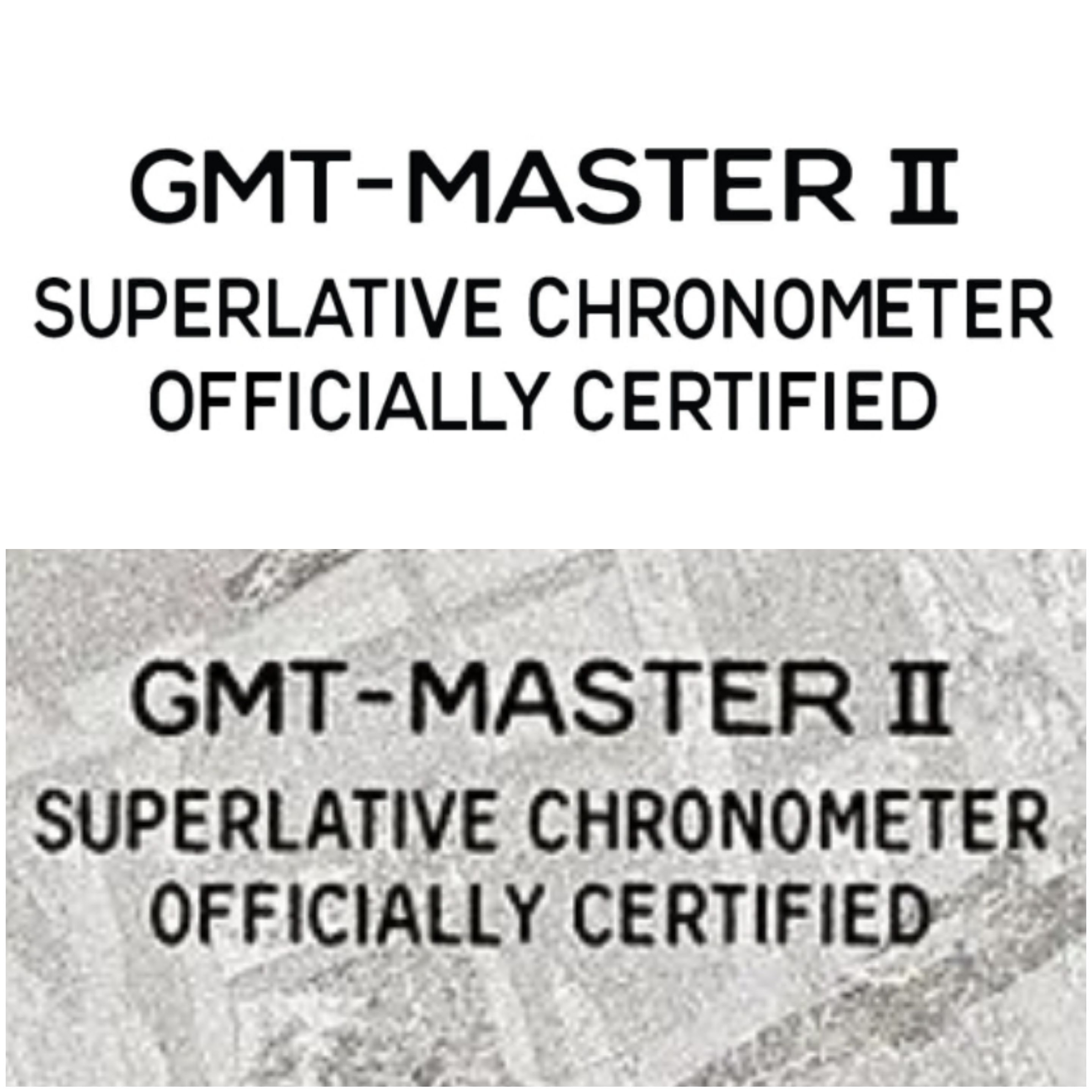
I think i will leave it as is, i think this is best i can do without going extreme like you said plus meteorite surface will dissort it a little.
Let me know what those looks like and can i make a cliche out of those files hehe
Last edited:

