-
Tired of adverts on RWI? - Subscribe by clicking HERE and PMing Trailboss for instructions and they will magically go away!
You are using an out of date browser. It may not display this or other websites correctly.
You should upgrade or use an alternative browser.
You should upgrade or use an alternative browser.
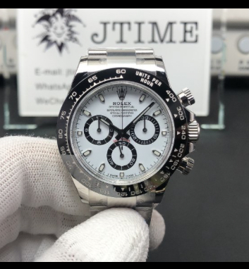
Clean Factory Daytona 116500 Actual Watch Detailed Pictures Sharing
- Thread starter jtimewatch
- Start date

mrlemonjello
Known Member
- 22/4/20
- 110
- 26
- 28
That looks really nice. Thanks for sharing the QC.
CF really has guts to push out the clone 4130 Daytonas. Hope they are not committing suicide.
M Scott
Renowned Member
- 22/9/18
- 817
- 1,047
- 93
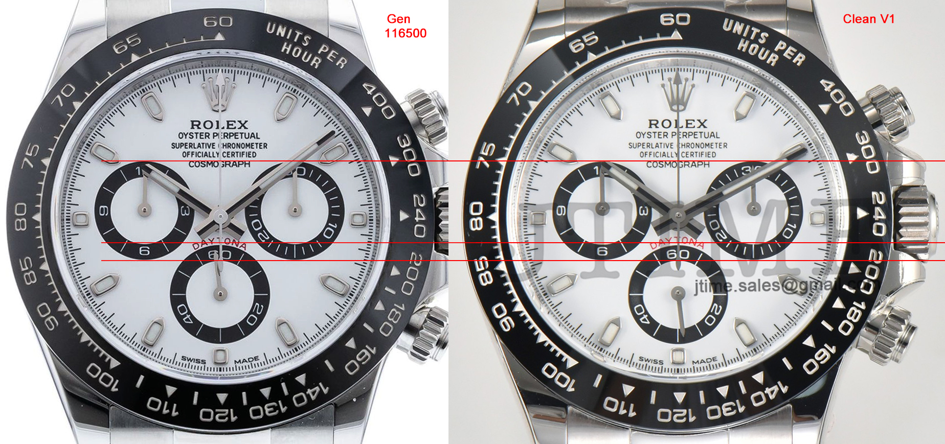
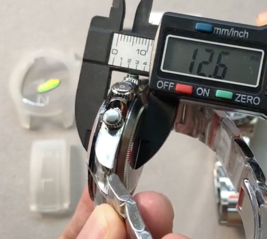
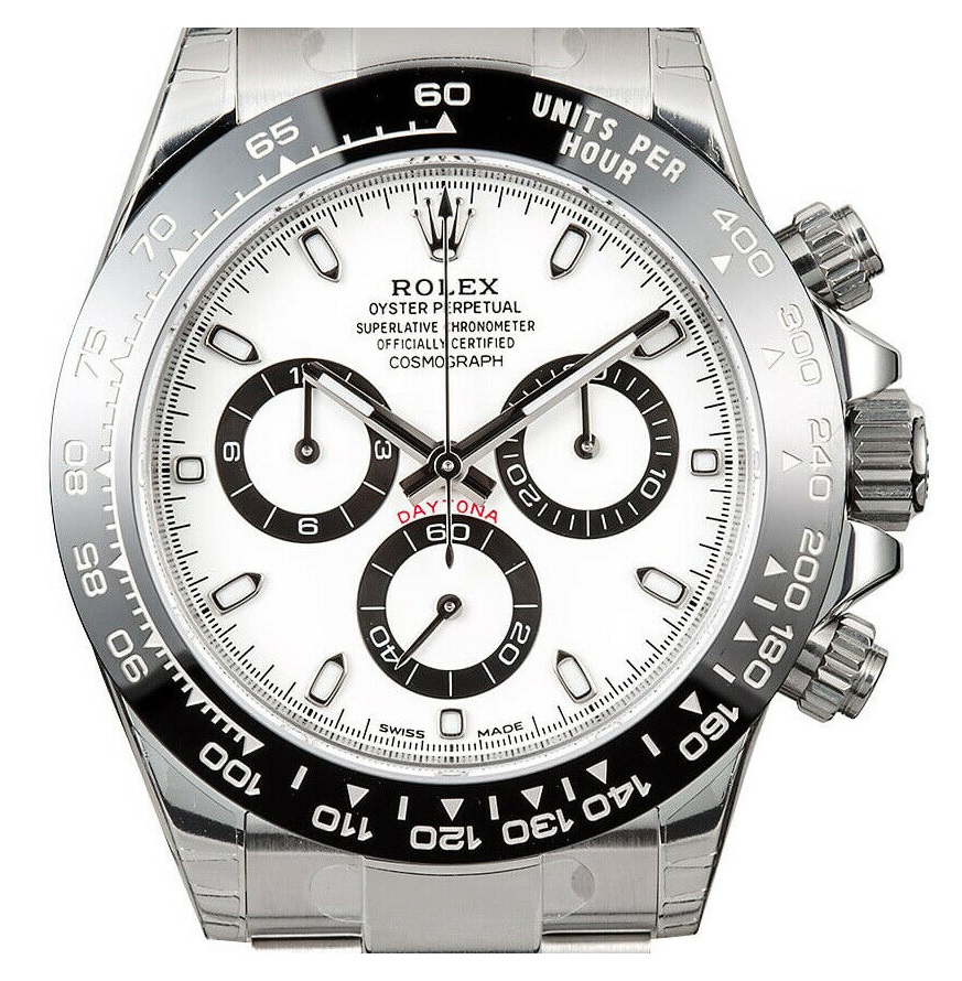
Alright Gentlemen, here is a high resolution comparison for you to chew on, and then argue about.
- 12/3/18
- 32,783
- 59,017
- 113
Alright Gentlemen, here is a high resolution comparison for you to chew on, and then argue about.
More than 1000 words.
Thanks for the perfect picture bro.
Last edited:
- 1/8/18
- 484
- 184
- 43
Alright Gentlemen, here is a high resolution comparison for you to chew on, and then argue about.
Finally we have the master in the room!
Alright Gentlemen, here is a high resolution comparison for you to chew on, and then argue about.
So one photo does say alot. The subdials look great. The text looks great, color of white dial looks fine (some have said that Rolex changed from a warmer white to stark white this year)
Things that are off
Lume indices shape looks off
Lume color looks off (could be lighting)
Bezel insert front looks a bit thicker, which I happen to prefer on the CF!
Last edited:
7five7
Active Member
- 31/12/19
- 234
- 127
- 43
Alright Gentlemen, here is a high resolution comparison for you to chew on, and then argue about.
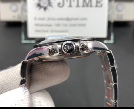
Looks great. The only things I see that differ from gen are the following.
-Dial markers have thicker edges around the lume on Gen
-Dial Font is darker and bolder on Gen
-Insert Font is thinner on Gen
-Daytona Font is darker on Gen
-Case back looks odd on CF
overall the case looks great and will probably be the best OTB rep Daytona if the QC’s hold up
Look way too off from gen.. lolAlright Gentlemen, here is a high resolution comparison for you to chew on, and then argue about.
McPwn
Active Member
- 21/9/20
- 291
- 116
- 43
Looks great. The only things I see that differ from gen are the following.
-Dial markers have thicker edges around the lume on Gen
-Dial Font is darker and bolder on Gen
-Insert Font is thinner on Gen
-Daytona Font is darker on Gen
-Case back looks odd on CF
overall the case looks great and will probably be the best OTB rep Daytona if the QC’s hold up
Not sure if its the post-processing, that might be why the DAYTONA font looks darker on gen. On other pics, gen seems to be bright red also.
McPwn
Active Member
- 21/9/20
- 291
- 116
- 43
ssouthall6
Put Some Respect On My Name
- 10/10/13
- 3,539
- 1,562
- 113
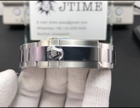
It looks good. Far better than the noob. The case still isn't right but it's an improvement. Mismatching lume never bothered me till I got a Sinn U1.
Sent from my KB2003 using Tapatalk
Sent from my KB2003 using Tapatalk
- 14/8/14
- 5,033
- 2,774
- 113
So one photo does say alot. The subdials look great. The text looks great, color of white dial looks fine (some have said that Rolex changed from a warmer white to stark white this year)
Things that are off
Lume indices shape looks off
Lume color looks off (could be lighting)
Bezel insert front looks a bit thicker, which I happen to prefer on the CF!
I swear they one upped Rolex with their tweaks haha
Plantagenet
Active Member
The plastic protector behind seems to indicate it's a noob??