• Tired of adverts on RWI? - Subscribe by clicking HERE and PMing Trailboss for instructions and they will magically go away!

KW/V6F PAM 508 Ceramic review [PICS HEAVY]

kilowattore

Sales Moderator / Section Moderator
Staff member
Moderator Sales
Section Moderator
Certified
11/5/13
13,589
5,713
113
Italy
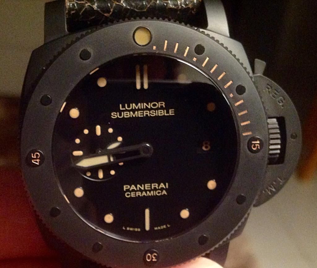
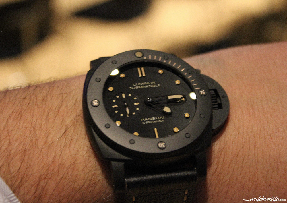
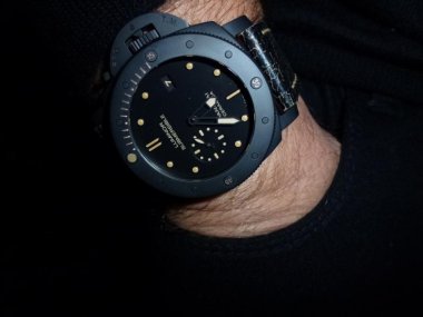
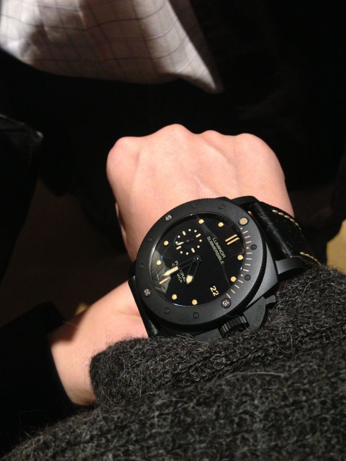
LUMINOR SUBMERSIBLE 1950 3 DAYS AUTOMATIC CERAMICA
PAM00508

Pictorial review


I must admit I thought that given the complexity of the production process for this material, a proper ceramic rep would have never materialized.
Well, I'm happy to say I was wrong, and by far.
The first 438/441 ceramic releases were already very good, apart from some issues with pointy CP and short hour hand (already fixed in most recent batches). It was pretty obvious that the ceramic submersible would have followed up, and here it is, in all its beauty. :)

THE GEN


During SIHH 2013 Panerai presented three special limited edition submersibles: PAM507 in bronze, PAM 364 in titanium and PAM 508 in ceramic.
In my opinion PAM 508 was the most interesting piece of that year, since 364 is not really my cup of tea and the bronze 507 is only a 382 with power reserve indicator on the face and it cannot really be defined as a novelty.
It is obvious that the ceramic case represents something exotic and appealing. The sandblasted matte finish of the ceramic material gives a very unique look to this watch. Case, dial, markers rings are all black, while all the lumed parts and the bezel markers are in a beautiful shade of orangeish beige usually called "vintage lume".
There's very little "vintage" in this piece though, thanks to the particular material, the case has a very modern look, it reminds me of the monolith from "2001: A space odissey" :)

Here's an extract I found regarding the production of the ceramic case:

"Upon closer inspection of the 47mm black ceramic case we see that it has a fine sandblasted finish, resulting in the uniform matte appearance of the case. The material, which is synthesized from zirconium oxide powder (Zr02); to achieve the color, a pigment highly resistant to heat is added during the production process.
A ratio of ~80% zirconia powder and 20% binding powder are warmed and mixed slightly, then forced under extremely high pressure into the mold that takes the form of the component being produced. While still soft, components are further shaped and refined by turning, milling and drilling. Then, over a period of about three days, the components are heated to 1500C and then allowed to cool down; at this stage components consist of 100% zirconia ceramic (binder has been removed via a chemical process) and has a hardness of 1200HV, about about 5x that of stainless steel. The hard ceramic is then workable, via diamond grinding, to its final shape and sandblasted to a matte finish. In addition to its hardness, the ceramic has additional desirable qualities such as light weight, excellent resistance to scratches and corrosion."

For this watch I had Orloff make a custom strap for me resembling the cracked leather look of the gen strap, as usual his work looks beautiful and offers top comfort on the wrist, I can do nothing but recommend him :)

Let's see how this rep is:


THE REP


Model: PAM 508
Maker: KW/V6 factory
Movement: a7750
Dealer: Supermirrors


Since the initial release of this watch there have been various revisions of the pearl on the bezel, which as usual seems to be the most difficult part to replicate adequately, who knows why.
Many pics with different pearl shape and color, and even different case and CG were spread around the forum during the release days, and some members apparently got some "pre-production" samples. I waited a few days before placing my order, and this seems to have the definitive version of the pearl.

This is what I received:


Saying I was amazed having the watch in my hands is euphemistic. Possibly not even the bronzo had this effect on me, and my first thought was "OMG that's perfect!". Well it obviously isn't, but the quality of this rep is incredible.

Let's see it in detail:

CASE

GEN


REP


The more I look at this watch, the more I am impressed by the great work the maker did with replicating this ceramic case. I don't know if they used the same process used for the gen, but the result is breath taking. The watch has a presence that's emphasized by its perfect finish and touching the case somehow feels like touching a stone.
The ceramic material allows for very sharp lines but in some specific areas the lines are softer, just like the watch was sculpted, check for example the slight curve on the inner side of the lugs where they meet the case, or the inner shape of CG in order to see what I'm saying.

As said before the finish looks perfect, closing up on the case you can see how the sandblasted finish gives a sort of porosity to the ceramic material. The result is a clean and matte surface that changes color pretty easily depending on how it is hit by the light.

GEN


REP


The shape is almost perfect, even though I am under the impression that lugs should be a tad longer to be like gen. A very minor difference in any case.


BEZEL

GEN


REP


The bezel is superbly built, it is perfectly firm and solid, the 60 clicks as per gen specs are crisp and satisfactory.
The chamfered edges around the bezel are sharp and clean, though on the bottom side the chamfering angle looks to have a little less inclination, as also observed by Mysterio in his 569 review. The notches look to be a little deeper than gen.


Bezel dots and 15, 30, 45 markers are perfectly applied: they are raised on the outer side and almost flush with the bezel in the inner side. To me it looks like they're made from the same ceramic material used for the case, but they are not sandblasted on the surface, the different finish and their angle on the bezel determines the way they reflect the light and makes them look darker at certain angles. The gen looks the same, this effect is only a bit less pronounced on the rep.
The numeral markers on the bezel are shaped perfectly, with a nice softened edge. Engraved numbers are ever so slightly smaller and thinner than gen and not so perfectly centered, especially 15 and 45.
The bezel dots are, again, well shaped and have softened corners, just not as much as numeral markers an not as much as gen. They are also a bit taller than gen.


Some small painting imperfections, only visible in macro pics.


PEARL

GEN


REP

(notice the grain of the ceramic material due to the sandblasting process)

Despite the various versions showed during the first days since release, the pearl is the only detail that is still not perfectly dead on with the gen. Nonetheless the result is pretty good in my eyes and I think it now is more than acceptable.
Index bars are shaped correctly, very sharply engraved. The first index is a bit more detached from the pearl compared to what we usually see in other subs bezels. The rep is just like gen in this regard.


Color is a bit darker than gen, but tbh all painted/lumed parts look a bit darker than gen so it is hard to evaluate without having both gen and rep side by side.
Pearl rim is thinner than gen and results in a bigger looking pearl.
As Polonus correctly explained, the pearl cup is first filled with the lume material which is then covered with a transparent compound that gives the pearl a domed/rounded look. This is an acceptable compromise, but the gen pearl has a more uniform gloss and a less pronounced domed profile.

It is very hard to take a pic of it that shows how it really looks in real life because the transparent layer is visible in pics only at certain angles, and as you see in my pics it often looks to be concave instead of convex. IRL the transparent glossy layer is more noticeable and gives the pearl a more gen like shape.
All in all I'm very satisfied by it, despite the imperfections.


CRYSTAL

Nothing special about the crystal, it's clear, has single sided AR as per gen and the coating is colorless and good quality imho.


DIAL

GEN
Panerai-PAM-508-Dial-Closeup.jpg


REP


Dial is black with a semi-matte finish and shinier seconds subdial, the hour markers are surrounded by black rims. Lume is well applied, but a bit more grainy and opaque than gen.
Inscriptions on dial are well placed, look slightly glossy and the font used seems right.


I can't really say if the colors used are exactly as gen, but I can say the color scheme looks right to me and makes the rep plausible:
- Hour markers match the bezel markers color, they are creamy rose gold color.
- Datewheel and seconds subdial markers match the hour markers.
- Lume on hands is a lighter beige/cream color matching the inscriptions on dial.
- Pearl does not match hour markers nor hands, it is a darker shade of the latter color.

All in all a very convincing result imho.

Lume shot:


Lume is average.

HANDS


Hands are matte black, skeleton shaped as in many Panerai submersibles. Length is correct and lume is well applied. Some small imperfection on the paint near the CP, totally invisible IRL.
CP is slightly recessed, but it's perfectly flat and polished, very gen-like.


CROWNGUARD

GEN
Panerai-PAM-508-Ceramic-Crown.jpg


REP


CG is as perfect as it can get imho :)
The shape is great, the chamfered upper and bottom corners are impeccable, REG.T.M. engravings are well placed, maybe REG. is slightly too close to the edge, but it's a matter of microns.
The lever tip is almost spot on, it should only be a little softer in the upper part. Lever has no ball bearing like gen.
CG pin is placed correctly and again it's dead on in shape.


Crown looks very good as well, no difference that I can tell.


CASEBACK

GEN


REP


The closed case back is made of titanium, once again perfectly repped. Engravings are crisp and well defined, fonts look good.


Advertising pics from Panerai show the word "DIVER'S" among the inscriptions, that's funny because the actual production samples show the word spelled "DIVERS" instead. The maker replicated the correct "DIVERS" spelling :)


Movement shot:


Movement is an older revision of the P.9000 decorated A7750 with incorrect INVERTED layout compared to the gen movement.


CONCLUSIONS


Well, I tried to be as impartial as possible in this review, not an easy task because this level of replication, considering the use of a ceramic case looked to be such a challenge that I can't help being totally amazed at how good the maker did.


This time I had to use a loupe along with macro pics in order to find some of the imperfections I stated in the review, and I think this fact alone should make clear how good the rep is.
The overall finish level is impressive, and even going through the smallest details the differences found are the slightest.
We had a deluge of new reps from KW from the end of 2014 and the beginning of 2015, most of them have been very impressive like the 389, the 438/441 (these two even more with the latest improved hour hand and flush CP) and the 569. PAM 508 definitely deserves to be among these, one of the most beautiful looking and better built PAM reps currently available.


And now a few more pics :)


Any comment is welcome, please let me know if I missed something so I can update the review.
Hope you liked reading it as much as I do preparing it :)

:cheers:
 

rhaykal

Renowned Member
18/8/13
741
1
18
Great review. And I agree, I'm totally blown away by the quality of this rep. I was planning on wearing my 569 today. Took it outta the winder, put it on my wrist, looked at the 508 just sitting there and ended up wearing this one again today. I'm loving your Orloff strap and am considering contacting him for a similar one.
 

J_North

You're Saying I Can Sell?
14/1/15
91
3
8
Oh wow, thank you for these lovely pics. I've learned a lot thanks to your detailed reviews, keep up the good work!
A quick question tough, how do the hour markers and hands look on the wrist with natural light?
Are they more of a salmon color just like in the pics or are they more green/yellowish?
 

Hawker789

I'm Pretty Popular
Supporter
Certified
4/5/13
1,144
25
48
Phenomenal review; thanks! And there I was thinking the 438 was perfect....!


Sent from my iPhone using Tapatalk
 

eyky

Active Member
20/1/14
364
3
18
Fantasic review, A! Makes me want to get one.
Also very nice Orloff strap you got there!
 

ALE7575

Section Mod
Section Moderator
Certified
18/1/11
19,826
339
83
Thanks again kilo for this detailed review
You have got the most important of a review: Giving to the reader a good idea about the watch he can buy.
IMO with your fantastic pictorial and review buyer can get a perfect idea about the features, finish, qualities, accuracy of KW-V6Fac PAM 508.

Following this Reference review and bearing in mind the closed caseback, the little flaws about pearl and little differences on knurling shape of the bezel, we could evaluate this rep as Super rep of low level, or even medium level. Leaving a margin for improvements in pearl and knurling.
What do you guys think??

We are proud and glad to have you in our PCTeam
You really are a big asset to our forum

Keep the good job, please

Thanks again
ALE


COMMENTS and
NOTES about the review:

MOVEMENT:
Kilo text:
Movement is an older revision of P.9000 decoration with non-inverted balance clock.

But the movement really is the old version with INVERTED layout
As already said by mysterio:
http://forum.replica-watch.info/vb/showthread.php?t=206983&p=2110872&viewfull=1#post-2110872
there is a slight confusion of denominations about movements with inverted and non-inverted layout
I would like to clarify this matter:

Gen P.9000 has the balance cock coming from the right to the left side when the balance wheel is placed at the top.
First decorated rep movements have the balance cock just as A7750 has it: coming from the left to the right side.
This matter causes that first decorated rep movements have the whole layout placed in an inverted position: shape of bridges, placement and orientation of inscriptions, jewels placement, escapement wheel position, etc...
For that reason we are calling these first decorated rep movements with INVERTED layout

From some months ago, makers are using a decorative balance cock coming from the right to the left side, in the same orientation as gen has, leaving hidden the real balance wheel under the decoration and the false escapement wheel. This causes that we can get the correct appearance of the balance cock, and the correct orientation and placement of inscriptions and a more accurate shape of the decoration bridges
We are calling them decorated rep movements with NON-INVERTED layout. Following mysterio suggestion we should call them corrected layout, but I think is more appropriate calling them movements with CORRECT (non-inverted) layout

That said the movement of above reviewed rep, KW/V6Fac PAM 508, has the first INVERTED layout movement from KW.

I would suggest kilowattore to change his text according above mentioned, in order not to get people confused.


BEZEL DOTS:
Kilo Text:
Bezel dots and 15, 30, 45 markers are perfectly applied: they are raised on the outer side and almost flush with the bezel in the inner side. To me it looks like they're made from the same ceramic material used for the case, but they are not sandblasted on the surface, the different finish and their angle on the bezel determines the way they reflect the light and makes them look darker at certain angles. The gen looks the same, this effect is only a bit less pronounced on the rep.

What do actually you mean?
Do you mean the gen also has non-sandblasted dots and the difference between dots and bezel surface on gen is more pronounced than on rep?
Please elaborate.


CG LEVER
Kilo Text:
Lever has no ball bearing like gen.
That could create confusion. IMO You should say: Lever has no ball bearing, the same as gen.


PEARL:
Kilo Text:
IRL the transparent glossy layer is more noticeable and gives the pearl a more gen like shape.
Could you explain above sentence? Sorry, I cannot understand your statement
 

Teris

Active Member
31/12/14
439
29
28
Kilo, I love your reviews! Thanks so much for taking the time to do these. You're killing my wallet, though, because I wind up buying every watch you review. :)
 

chris3007

Mythical Poster
24/8/13
9,407
109
0
Another great review. Thanks for that kilo.


Sent from my iPhone 6
 

kilowattore

Sales Moderator / Section Moderator
Staff member
Moderator Sales
Section Moderator
Certified
11/5/13
13,589
5,713
113
Italy
Thank you all guys! :)

Great review. And I agree, I'm totally blown away by the quality of this rep. I was planning on wearing my 569 today. Took it outta the winder, put it on my wrist, looked at the 508 just sitting there and ended up wearing this one again today. I'm loving your Orloff strap and am considering contacting him for a similar one.

I did a bit of research on that strap, and the only worth to mention apart from Orloff is HKtan. He has an hide that's looking even closer to the gen strap, but his prices more or less double the price asked by Orloff. Moreover I must say that since Mario lives in my country it's much easier dealing with him.
If you don't already own one of his straps, definitely buy one. You will thank me ;)


COMMENTS and
NOTES about the review:

MOVEMENT:
Kilo text:
Movement is an older revision of P.9000 decoration with non-inverted balance clock.

But the movement really is the old version with INVERTED layout
As already said by mysterio:
http://forum.replica-watch.info/vb/showthread.php?t=206983&p=2110872&viewfull=1#post-2110872
there is a slight confusion of denominations about movements with inverted and non-inverted layout
I would like to clarify this matter:

Gen P.9000 has the balance cock coming from the right to the left side when the balance wheel is placed at the top.
First decorated rep movements have the balance cock just as A7750 has it: coming from the left to the right side.
This matter causes that first decorated rep movements have the whole layout placed in an inverted position: shape of bridges, placement and orientation of inscriptions, jewels placement, escapement wheel position, etc...
For that reason we are calling these first decorated rep movements with INVERTED layout

From some months ago, makers are using a decorative balance cock coming from the right to the left side, in the same orientation as gen has, leaving hidden the real balance wheel under the decoration and the false escapement wheel. This causes that we can get the correct appearance of the balance cock, and the correct orientation and placement of inscriptions and a more accurate shape of the decoration bridges
We are calling them decorated rep movements with NON-INVERTED layout. Following mysterio suggestion we should call them corrected layout, but I think is more appropriate calling them movements with CORRECT (non-inverted) layout

That said the movement of above reviewed rep, KW/V6Fac PAM 508, has the first INVERTED layout movement from KW.

I would suggest kilowattore to change his text according above mentioned, in order not to get people confused.


You're perfectly right, I will update the description as follows: "Movement is an older revision of the P.9000 decorated a7750 with incorrect INVERTED layout compared to the gen movement."

BEZEL DOTS:
Kilo Text:
Bezel dots and 15, 30, 45 markers are perfectly applied: they are raised on the outer side and almost flush with the bezel in the inner side. To me it looks like they're made from the same ceramic material used for the case, but they are not sandblasted on the surface, the different finish and their angle on the bezel determines the way they reflect the light and makes them look darker at certain angles. The gen looks the same, this effect is only a bit less pronounced on the rep.

What do actually you mean?
Do you mean the gen also has non-sandblasted dots and the difference between dots and bezel surface on gen is more pronounced than on rep?
Please elaborate.


Yes, I mean both gen and rep have non-sandblasted dots on the bezel.
BUT on the rep the dots are mounted with more angle (i.e. they are taller towards the outer side of the bezel compared to gen)
This different inclination is what makes the dots look darker than the bezel in both rep and gen.
On the rep the difference is more pronounced due to the greater inclination.

It's not easy to explain in words, I hope I was more clear this time :)

CG LEVER
Kilo Text:
Lever has no ball bearing like gen.
That could create confusion. IMO You should say: Lever has no ball bearing, the same as gen.

Of course you're right, missed a comma there ;)

PEARL:
Kilo Text:
IRL the transparent glossy layer is more noticeable and gives the pearl a more gen like shape.
Could you explain above sentence? Sorry, I cannot understand your statement

In most of my pics the pearl looks flat because the light is diffused all over by the light box.
In real life the glossy transparent upper layer reflects the direct light sources from the ambient and the domed shape becomes visible, so the pearl looks more gen like.
 

Bizi

Renowned Member
4/10/09
739
64
0
Congratulations Kilo, you really did a great job!

Could you tell us more about those minute markers on the bezel?

For me, they look unacceptably uneven painted and with a different color, more like metallic beige instead of vintage cream as per the hour / minute dots on the dial.

This is mine:

D9BE984B-B8AF-4BE5-A6ED-09B202A03E4A_zpsgr5umszt.jpg
 

ALE7575

Section Mod
Section Moderator
Certified
18/1/11
19,826
339
83
Many thanks kilo for the corrections and your explanations
I got it now
ALE
 

joshthedoc

You're Saying I Can Sell?
5/12/12
47
0
0
Great review!! What was the model number for the strap. Couldn't seem to find it on orloff's blog. Cost?
 

ztealth

Active Member
11/8/13
298
41
28
Congratulations Kilo, you really did a great job!

Could you tell us more about those minute markers on the bezel?

For me, they look unacceptably uneven painted and with a different color, more like metallic beige instead of vintage cream as per the hour / minute dots on the dial.

This is mine:

The rep has too many different shades of color going on.
The markers in the dial, the inscriptions and the bezel fonts all have different colors, while in the gen, it only has one single-matching color.
 

kilowattore

Sales Moderator / Section Moderator
Staff member
Moderator Sales
Section Moderator
Certified
11/5/13
13,589
5,713
113
Italy
Congratulations Kilo, you really did a great job!

Could you tell us more about those minute markers on the bezel?

For me, they look unacceptably uneven painted and with a different color, more like metallic beige instead of vintage cream as per the hour / minute dots on the dial.

This is mine:

D9BE984B-B8AF-4BE5-A6ED-09B202A03E4A_zpsgr5umszt.jpg

Yes somehow it looks.metallic, but that's only from a very close distance. No shine or metallic reflection that is noticeable on the wrist.
Not that there's a way to evaluate it exactly only from a pic anyway. The color looks right to me, but that's juat my opinion :)
The rep has too many different shades of color going on.
The markers in the dial, the inscriptions and the bezel fonts all have different colors, while in the gen, it only has one single-matching color.

panerai_pam508_ceramica_6_0.jpg


panerai_pam508_ceramica_14.jpg


panerai_image.3727603.jpg


PAM-508-Luminor-Submesible-Ceramic-Automatic1.jpg


As you can see above, the gen does not have a single matching color in real life.
The color scheme is similar in the rep, but colors look generally more saturated and pearl looks a bit darker.
A very minor difference I would say after all :)
What I find more noticeable is the gloss of the lume dots in gen, the rep ones are opaque.