Welcome everyone, to another showdown !
This time I am taking a look at the Audemars Piguet ref. 15202 “Jumbo” .. stacking the three best options available against each other and digging into the details between JF , DC , and the newly released XF ..
I have to say that the Jumbo is one of my all time favorite AP models. The original reference 5402 was an absolutely groundbreaking release for Audemars Piguet in 1972. The design from Gérald Genta changed the face of the watch industry forever, and it is still to-date the most iconic design in AP’s catalogue.
What I personally love about this watch is its wearable 39mm size. The 15450 at 37mm is also an excellent option for those with smaller wrists, but the case proportions are a bit bulkier due to its thickness. The 41mm 15400 / 15500 is suitable for a lot of people with larger wrists but still tends to wear quite large given the extensive wingspan from lug to lug.. At 39mm, the Jumbo is perfection.
There has been a lot of debate between who makes the best 15202, and I have no intention of answering that conclusively today. With each factory, I feel there are some well executed details, as well as some oversights that were missed. I’ve thrown the DC quartz into the mix because it still holds its own as a contender against JF and XF given how cheap it is, and how well executed some of the details are…
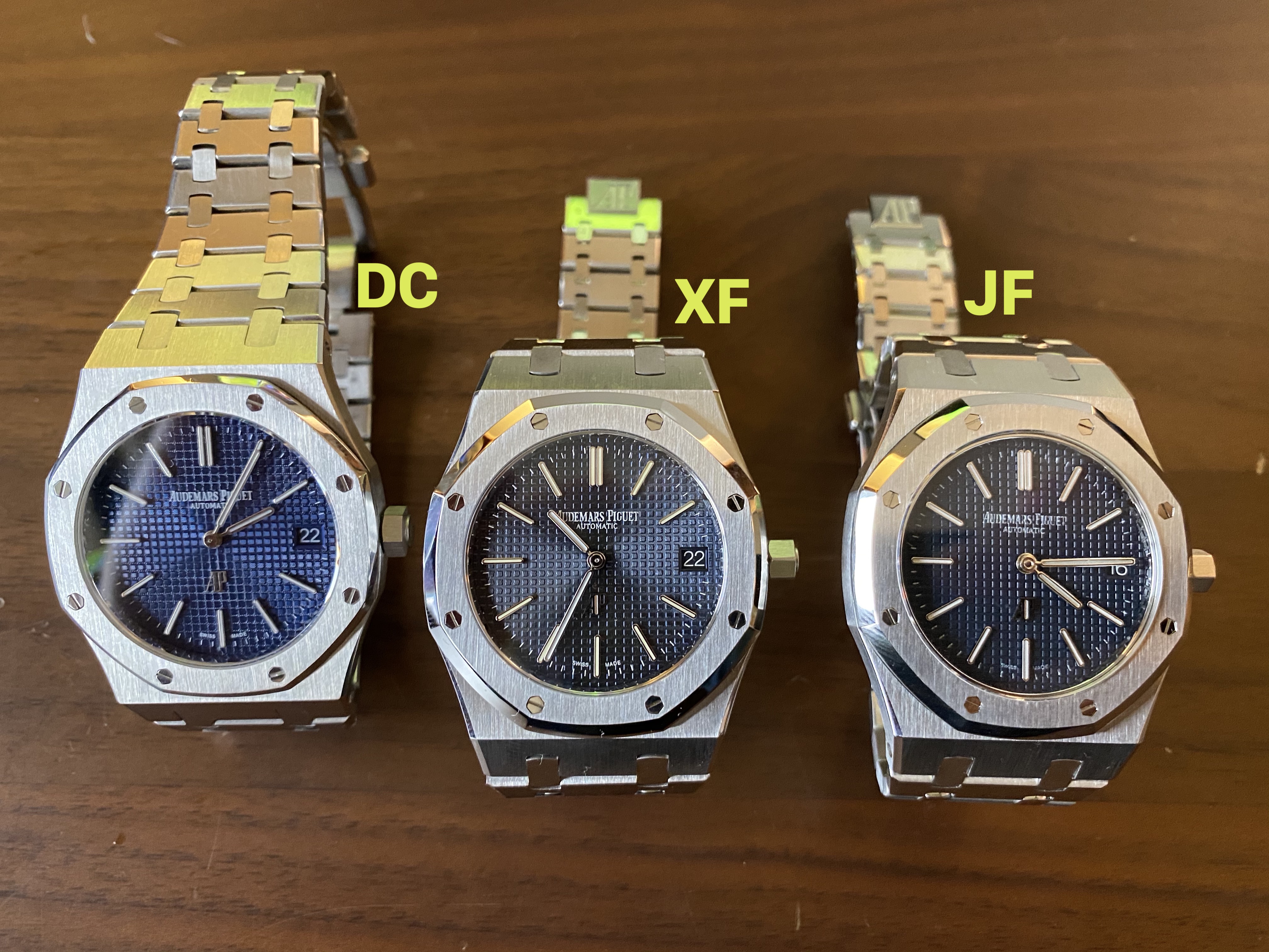
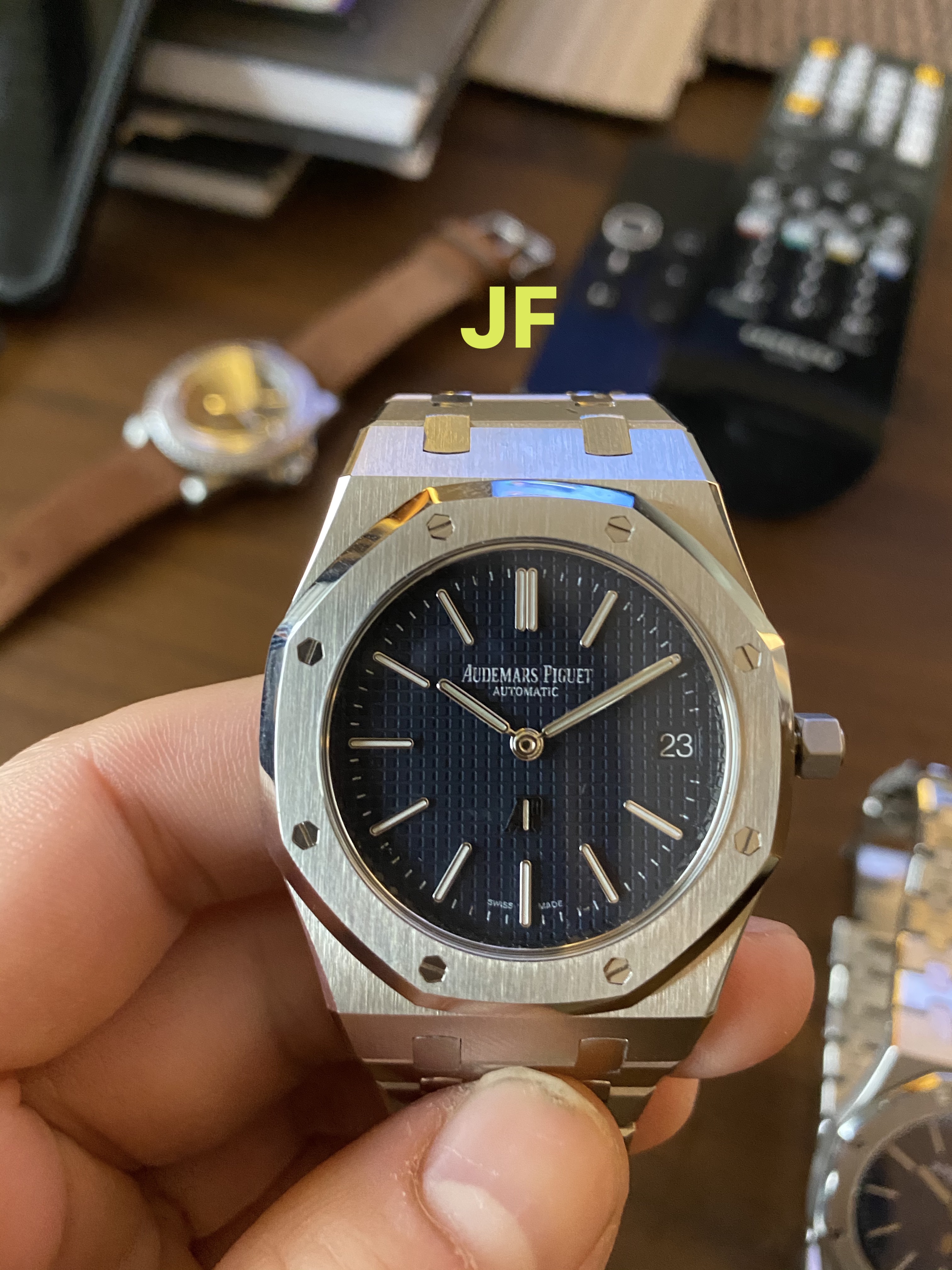
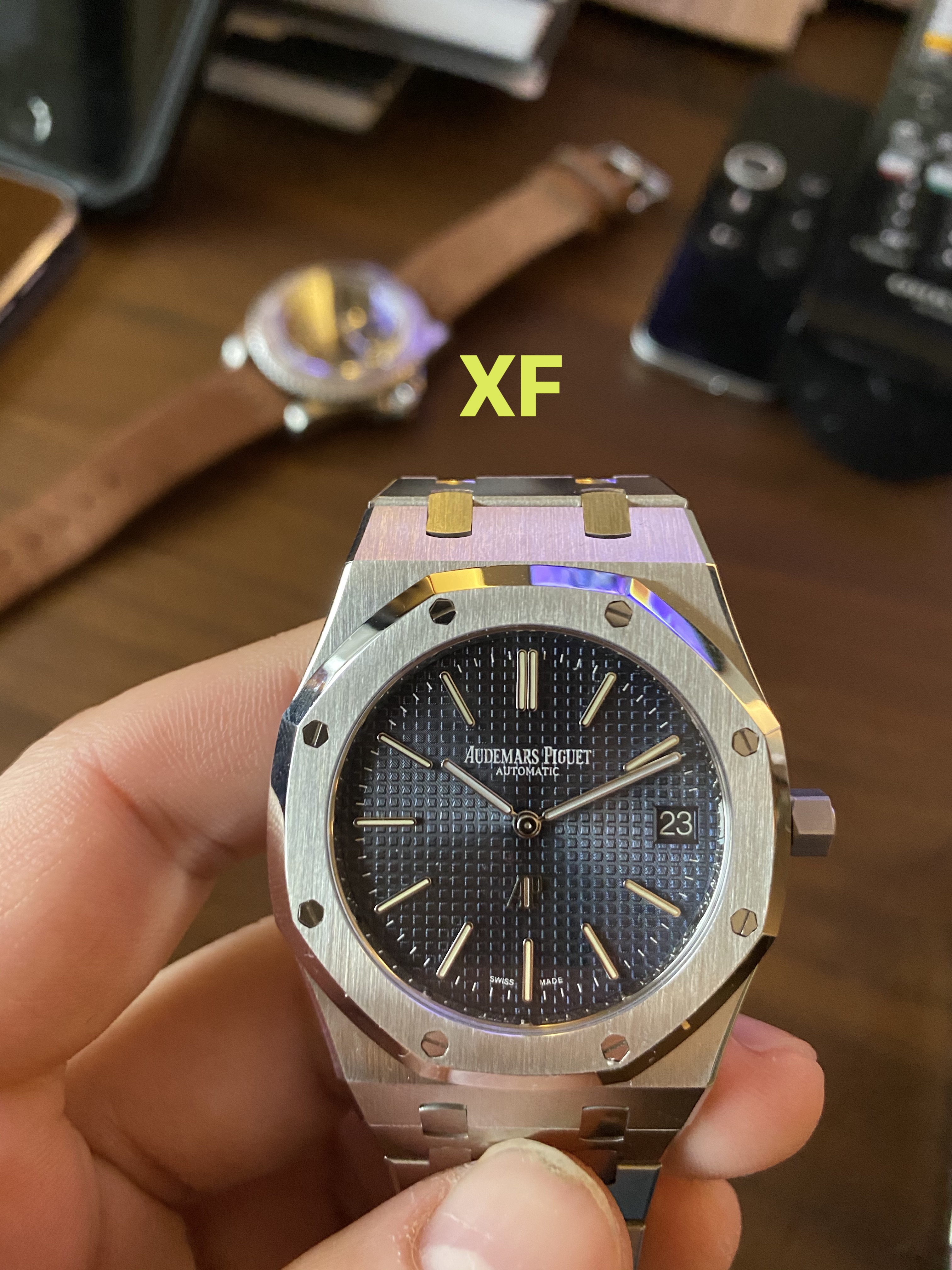
Without further rambling, here are some side-by-side pictures from all three models, labeled for clarity:
.
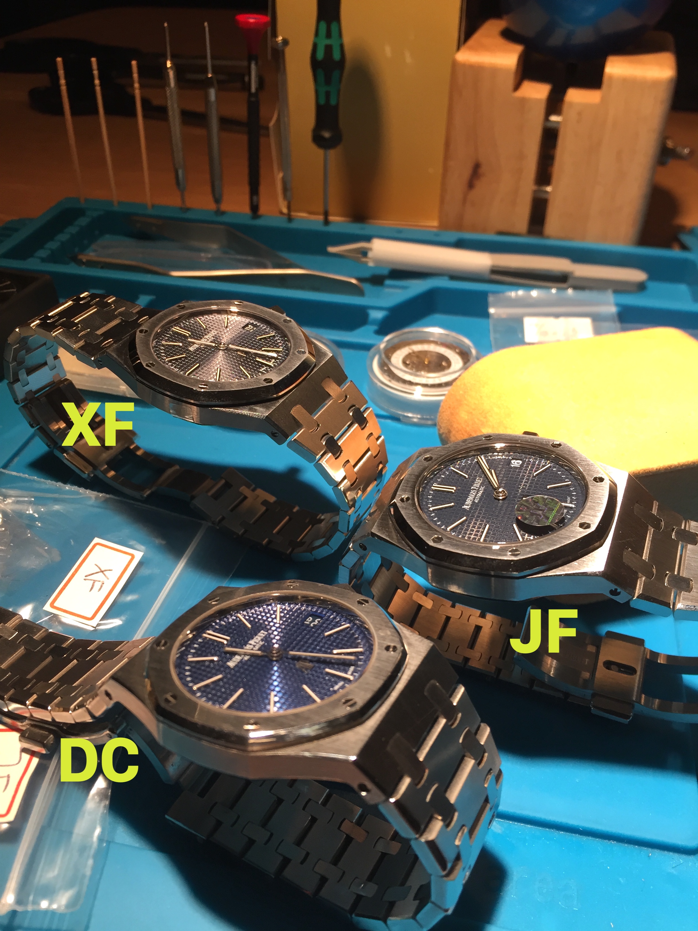
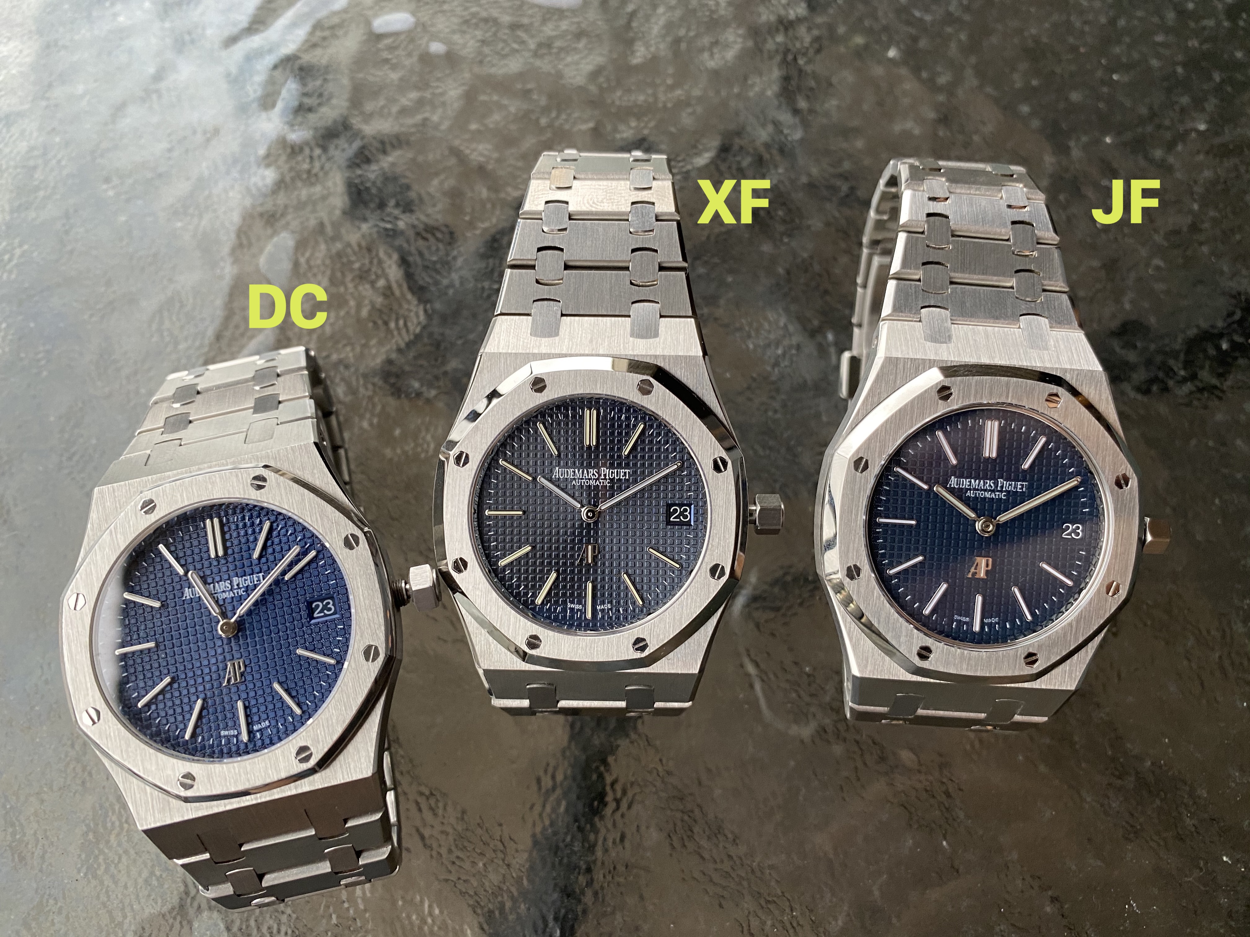
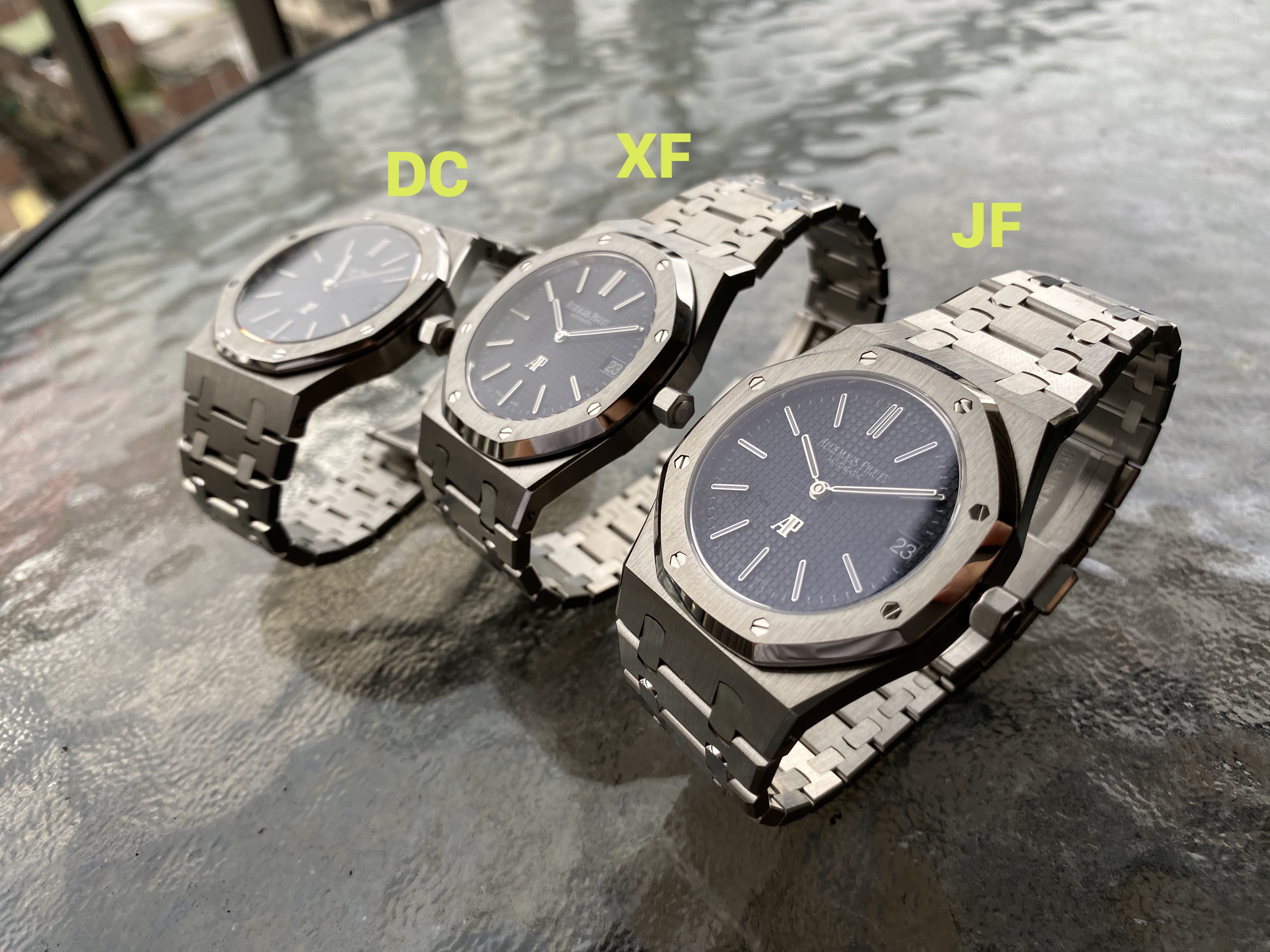 .
.
THE DIAL:
The first detail that stands out to me as the most obvious is of course the dial. We have roughly 4 things to consider when looking at the dial from each of these factories.
1. Color
2. Print
3. Tapisserie
4. Sunburst
.
.
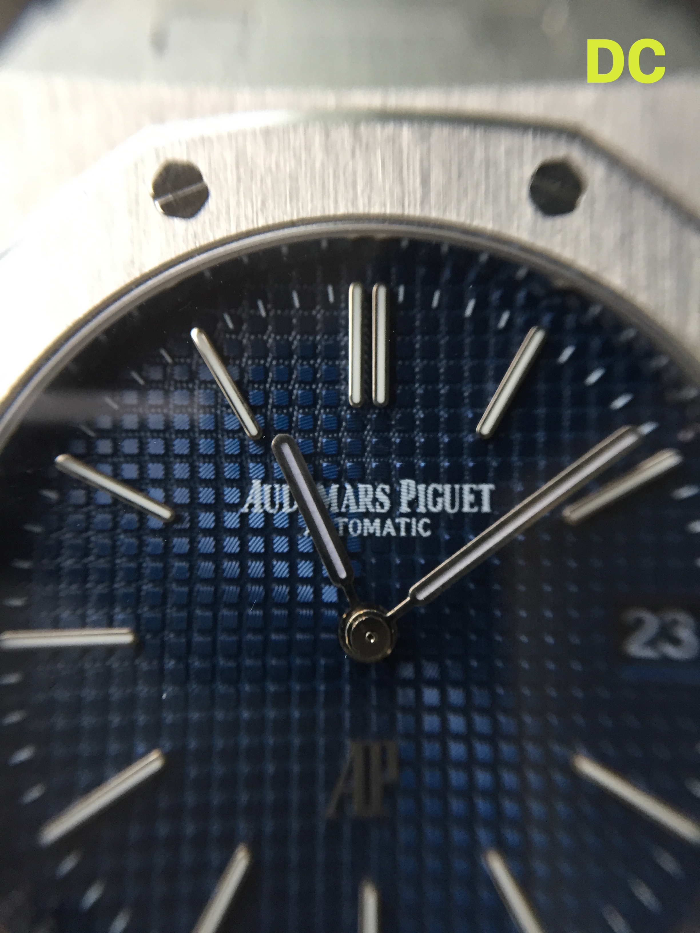
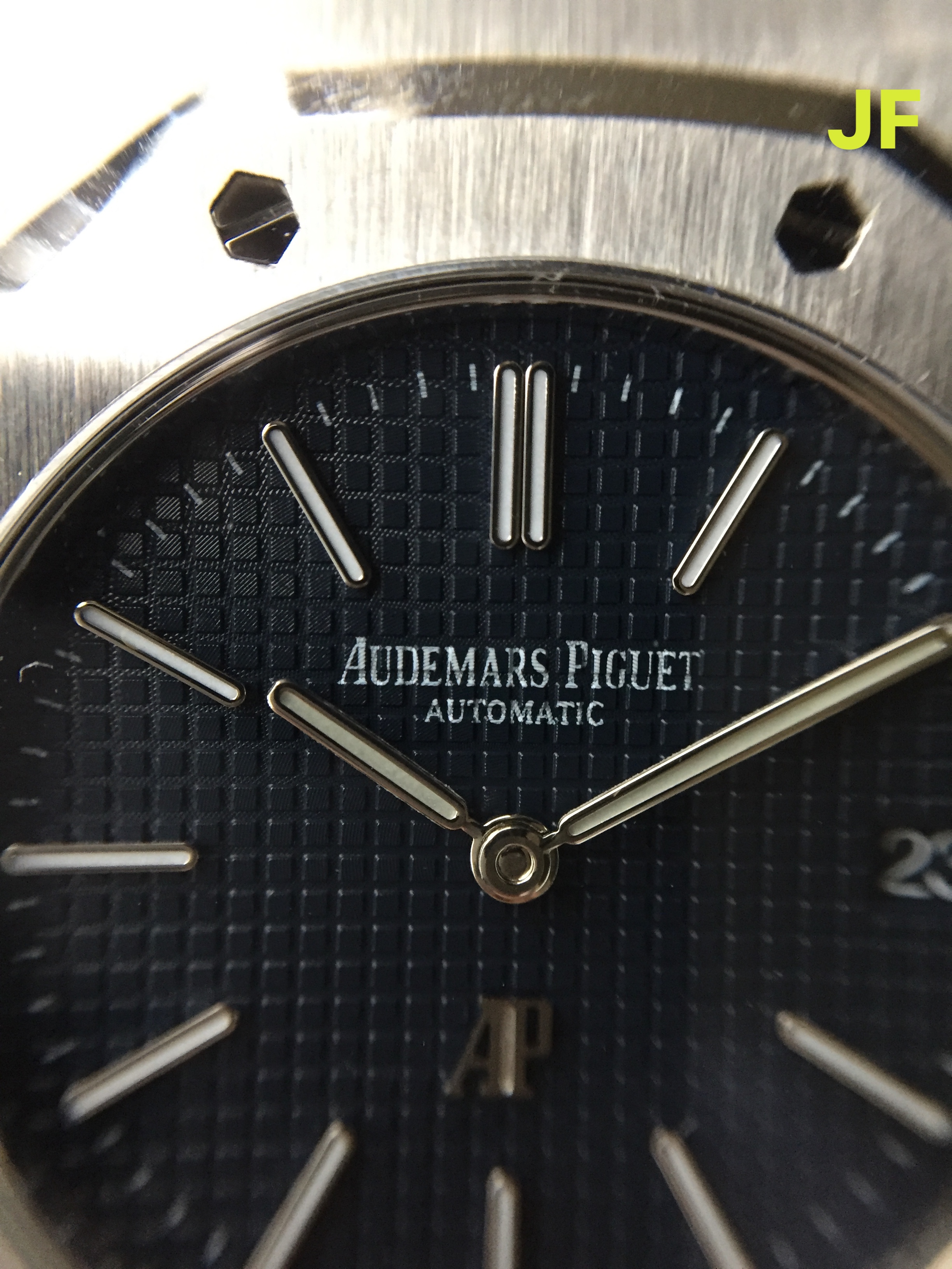
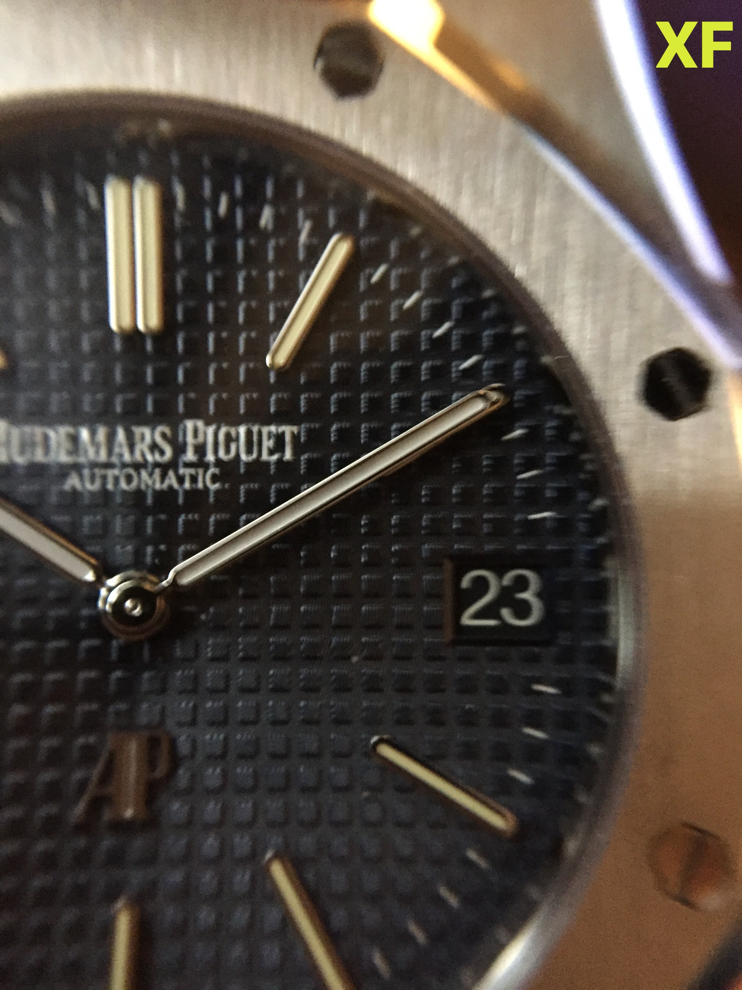
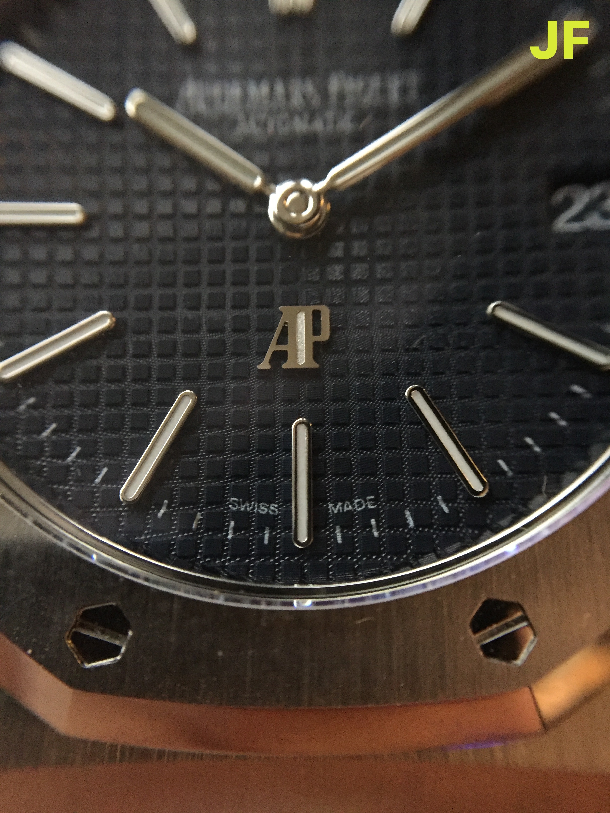
First looking at the JF (Based on the Mark 1 dial): The tapisserie looks very sharp and nicely finished. The blue color is deep and rich, it certainly has the deepest blue color out of all three dials. In low light it may even appear black. The sunburst on this dial is present but not excessively bright or obvious, at least this was my observation with soft light. Under a halogen bulb the sunburst reveals itself much more obviously. I think The main area where this dial falls short is in the print, which has improved over the earlier version but still does not look as clear or crisp as XF or even DC. You can still see very easily where the print has been affected by the uneven surface of the tapisserie texture.
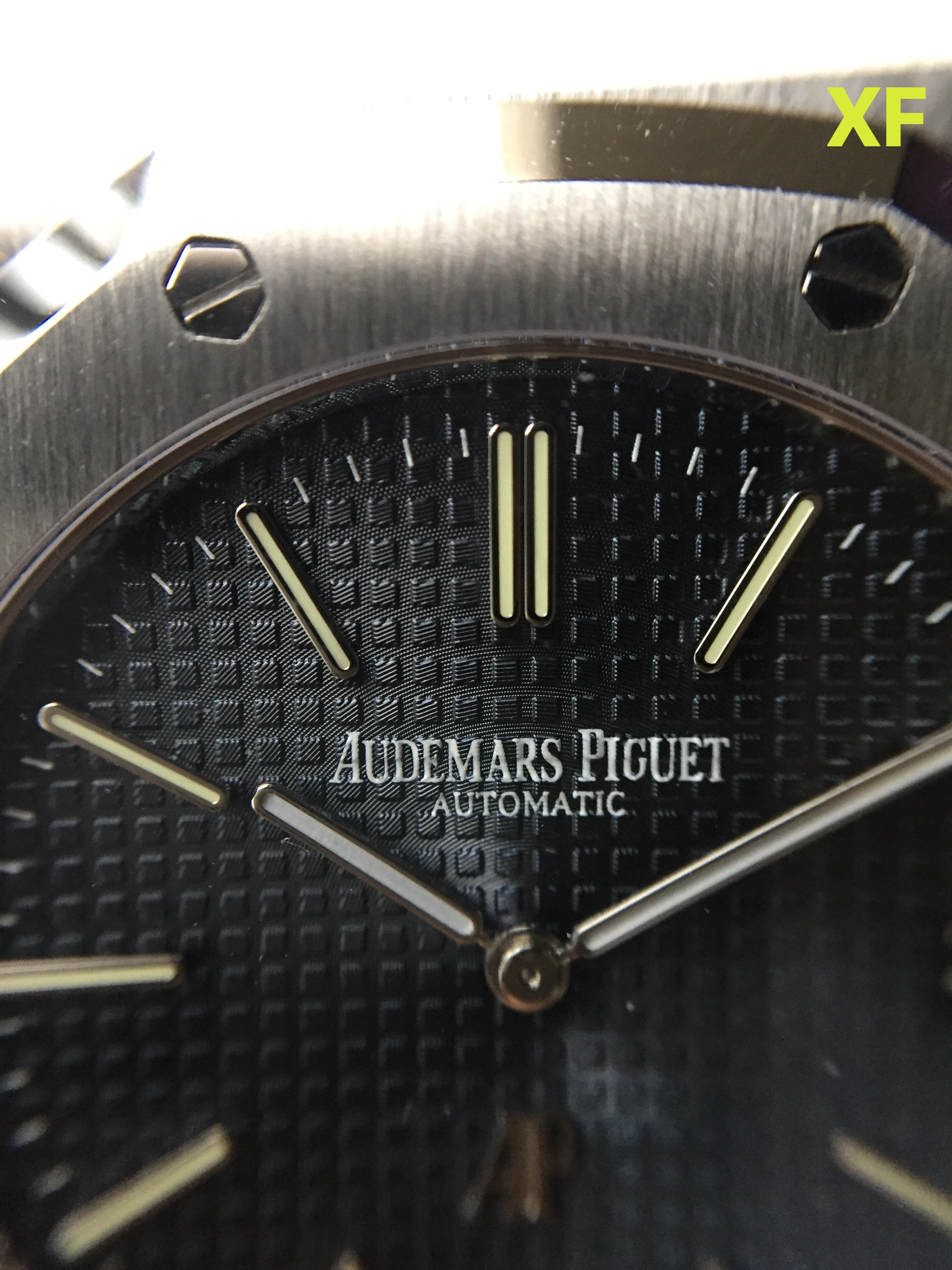
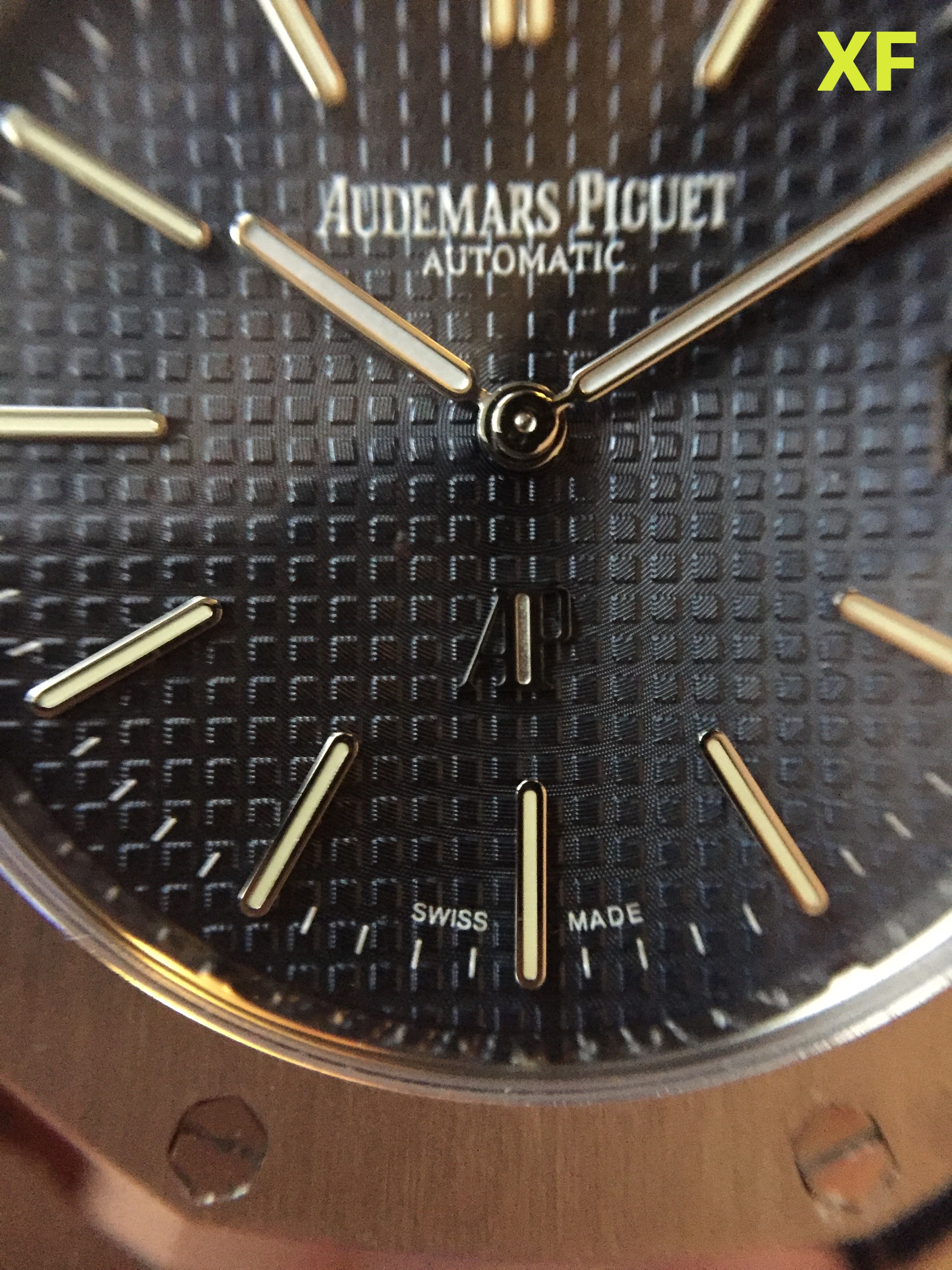
Next, looking at the details of XF (Based on the Mark 3 dial): This is also a gorgeous dial... it has a beautiful grayish-blue hue that is slightly different from JF, as another member pointed out these are based on different versions of the genuine 15202 , Mark 1 vs Mark 3. The color shifts depending on the angle of lighting, in low light it appears deep blue / black. The dial also features a slightly smaller tapisserie pattern that in my opinion appears closer to the gen tapisserie. Where the XF dial surprised me most is in how bright the sunburst appears. For some reason this dial appears to have the most prominent sunburst of the three, where I had expected based on the early reviews that it would be a much more muted blue. Lastly, and where I feel XF has really nailed it, the dial printing is fantastic. It is very crisp and clean, and appears unaffected at all by the shape of the tapisserie pattern.
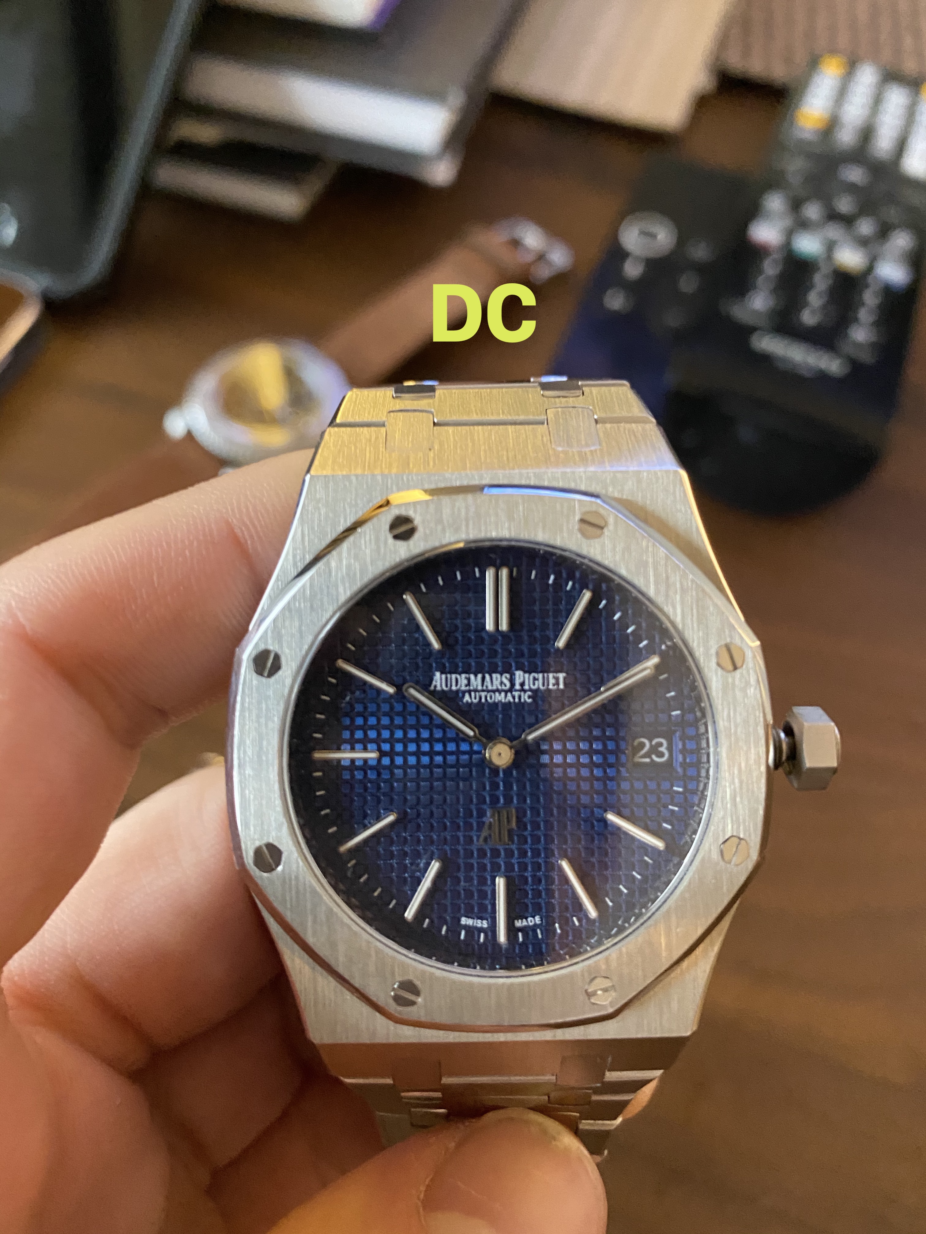
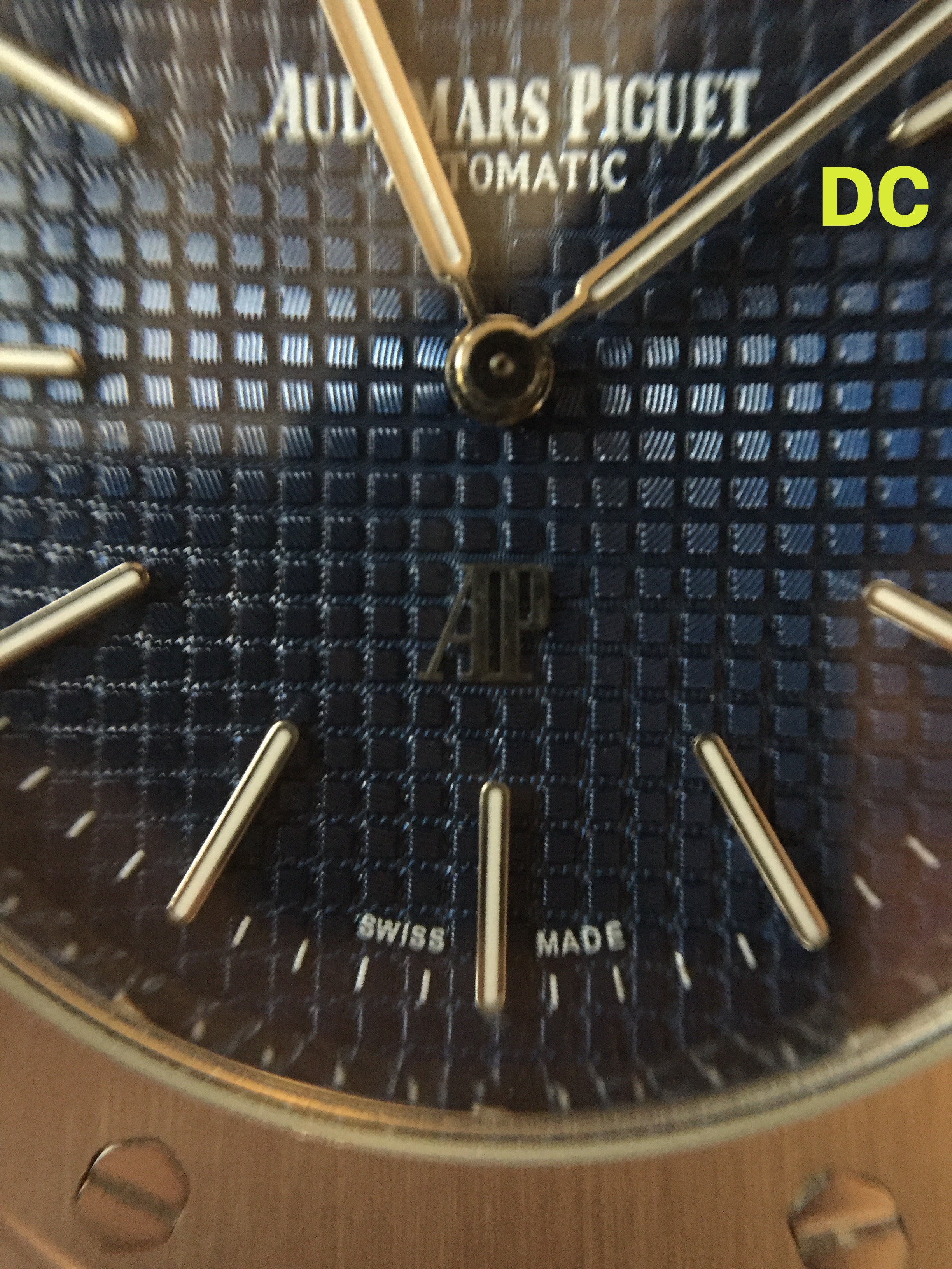
Lastly looking at the DC dial: This is by far the richest and brightest blue hue of the three dials. I don't feel that the color is very accurate to gen. However I’ve seen some variation in the 15202 color, and it becomes difficult to compare when referencing online photos that have been heavily post-edited. I will say that the color is very bright. The tapisserie is not as sharp as the JF dial, the small ’squares’ have slightly rounded corners. That said, overall the way the dial reflects light is very nice. For the price on this piece the dial could have been much worse. The last detail that is very well executed is the print pattern. Much better even than JF. The lettering is white, clear, and almost completely unaffected by the tapisserie pattern.
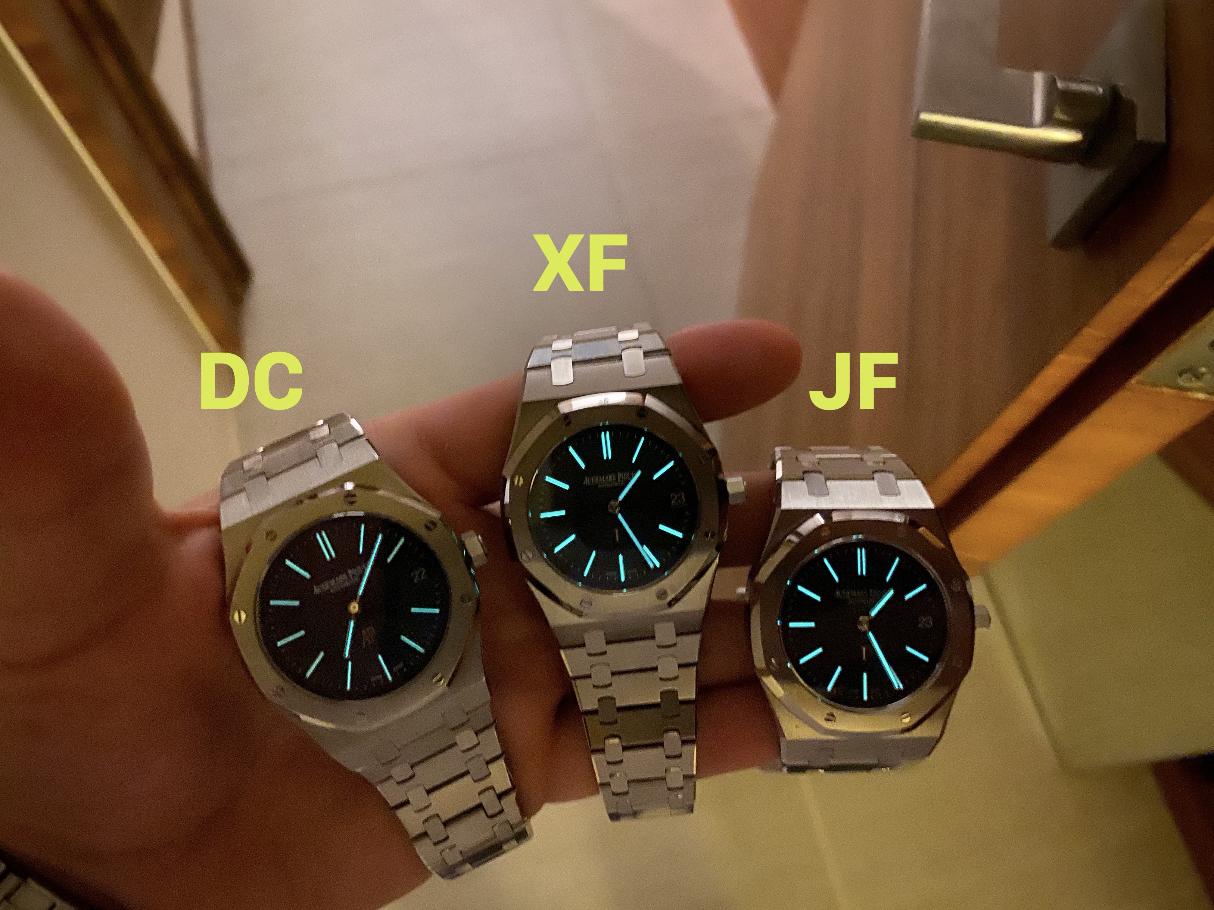
Looking very briefly at the lume from each factory, there were some very subtle differences between them:
DC - The lume application has nice color consistency between the dial and hands, with the hands being maybe slightly darker. The glow on these is easily the worst from all three factories.
XF - There is some inconsistency between the dial and hands. The lume on the hands appears much more white, whereas the dial lume has a very slight greenish hue. The glow on this dial is easily the brightest, unfortunately the hands do not match the same brightness and it becomes obvious there is a difference in the lume quality (or application) between the dial and hands…
JF - Again the lume consistency appears uniform between the dial and hands. The hue on this is white for both. The glow from JF is actually very good, it is not as bright as XF but there is a nice consistency between the dial and hands, and frankly it isn’t slacking in this department. Compared to DC it has a fantastic, and bright lume..
Lume pics:
.
.
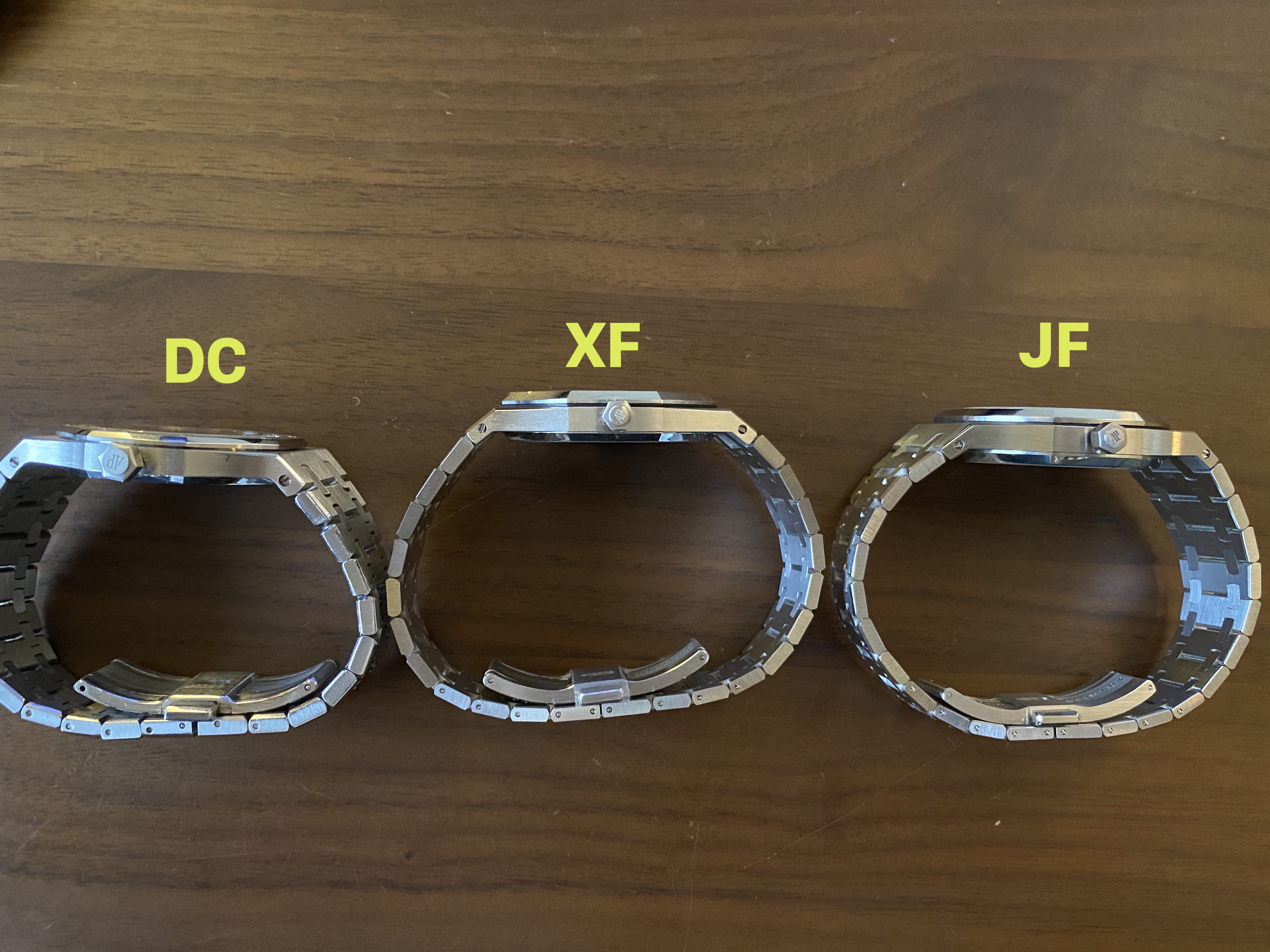
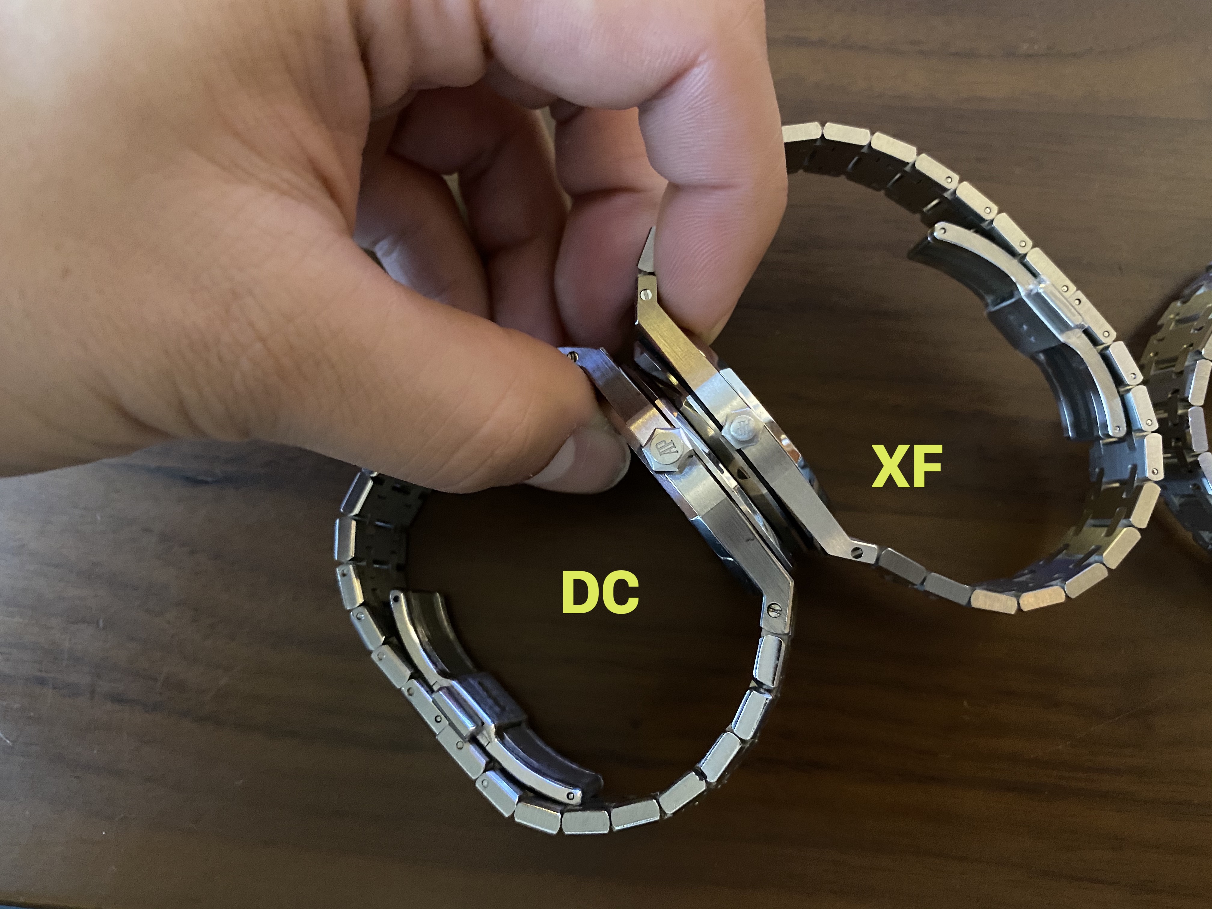
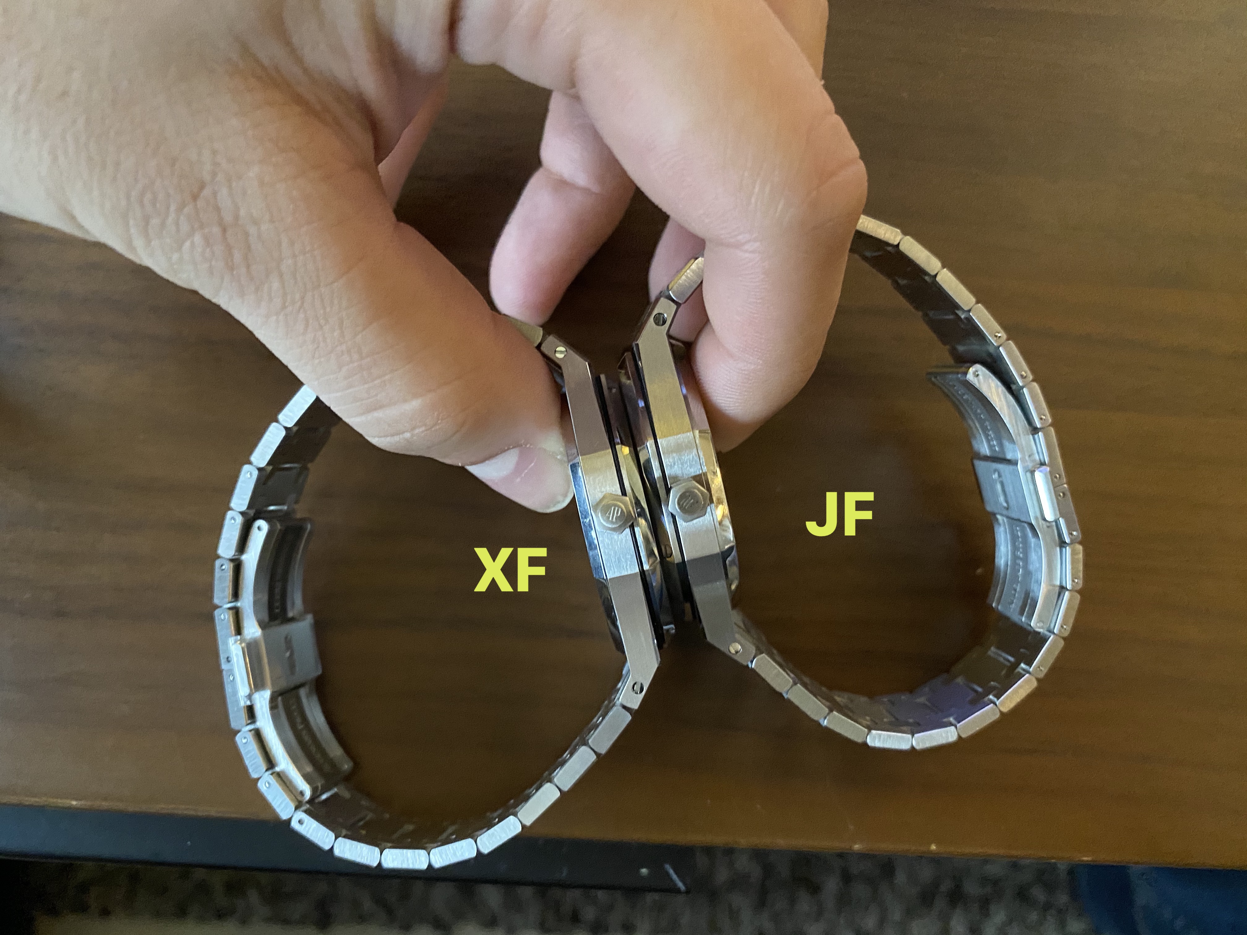
CASE / BRACELET:
Here we have some major differences in the case details between the three factories. I will preface by saying that my DC Quartz version has been fully rebrushed by Jon , and therefore is not a fully accurate representation on the finishing that comes direct from the factory. However I will focus less on these small details and instead just highlight the major differences in the bezel, case dimension, bracelet thickness, and clasp..
.

.
For easy reference, I am again listing the case and bracelet dimensions:
Case thickness:
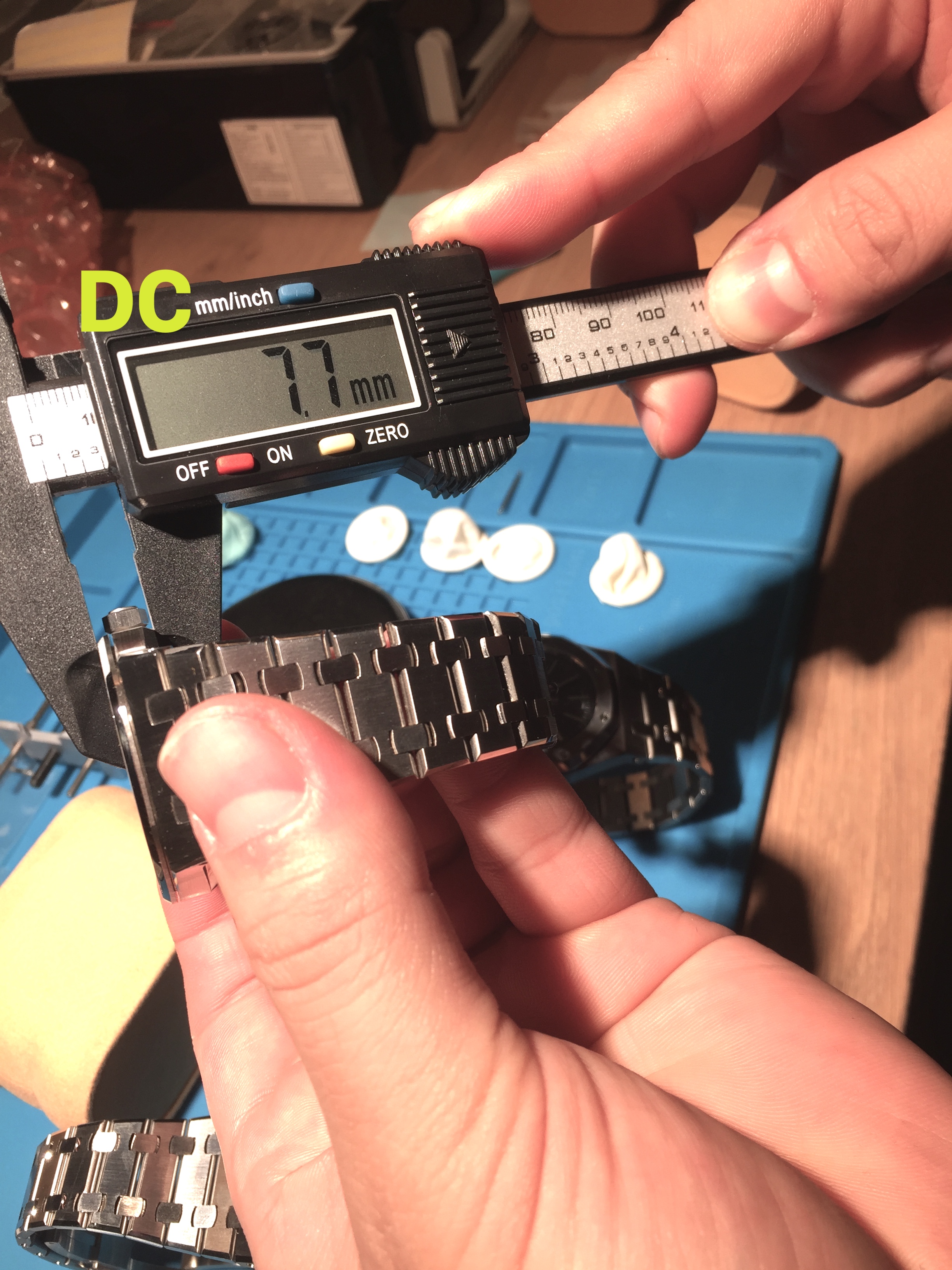
DC = 7.7mm
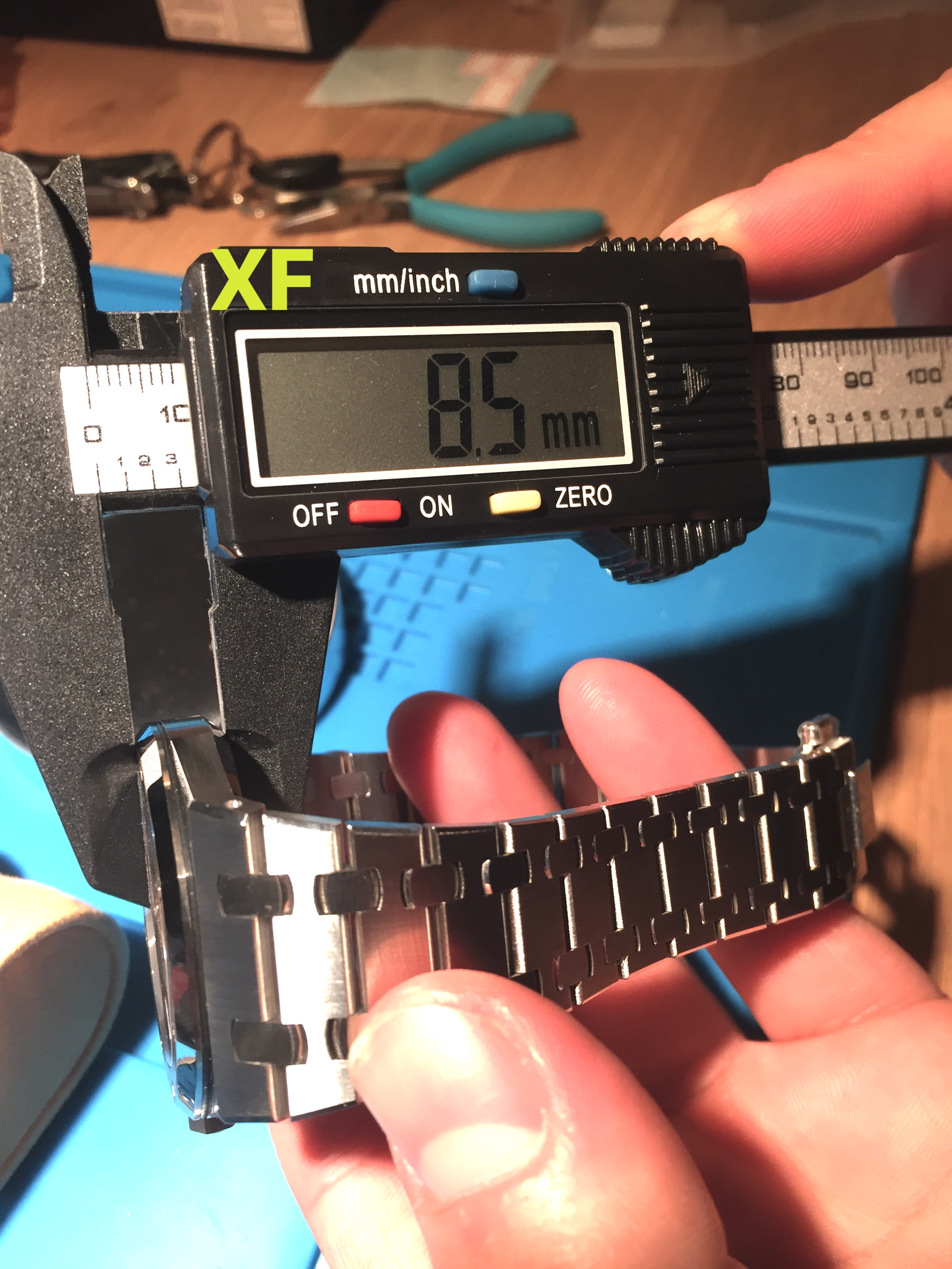
XF = 8.5mm
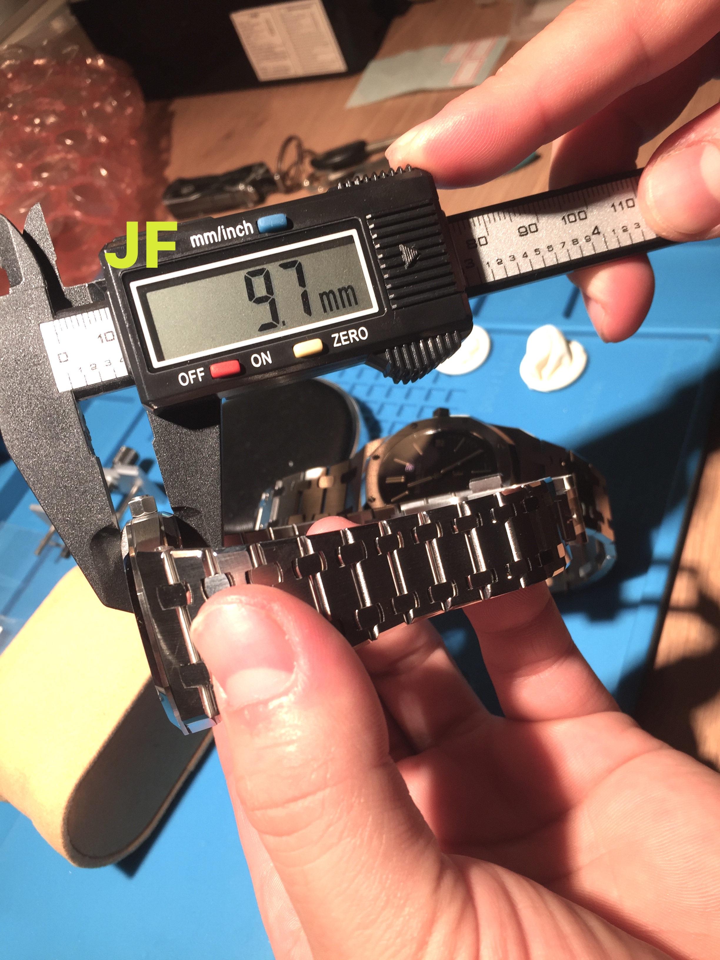
JF = 9.7mm
Bracelet thickness:
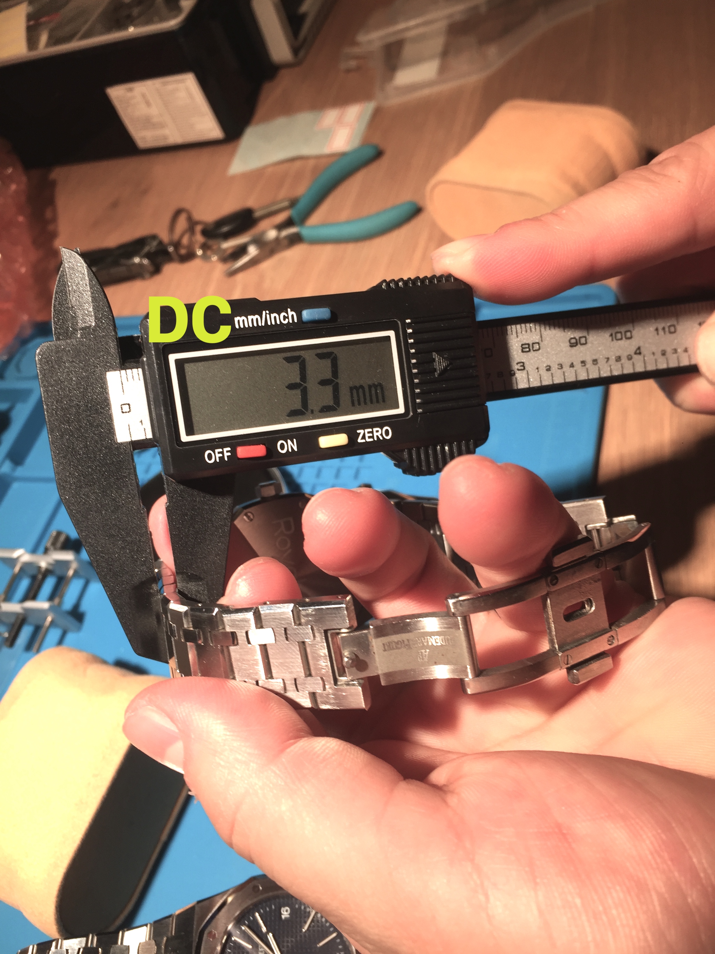
DC = 3.3mm
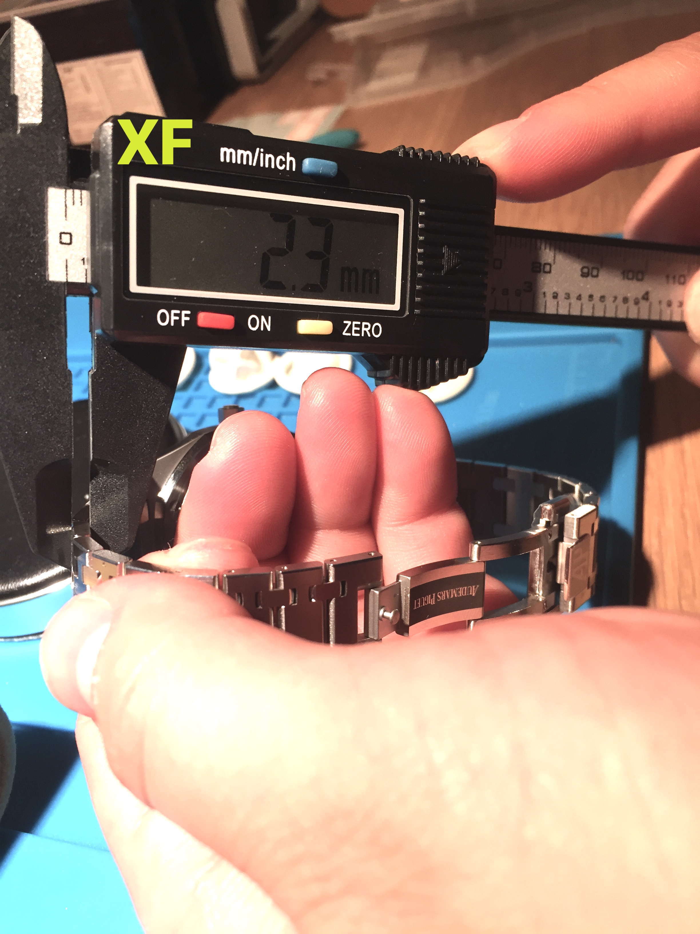
XF = 2.3mm
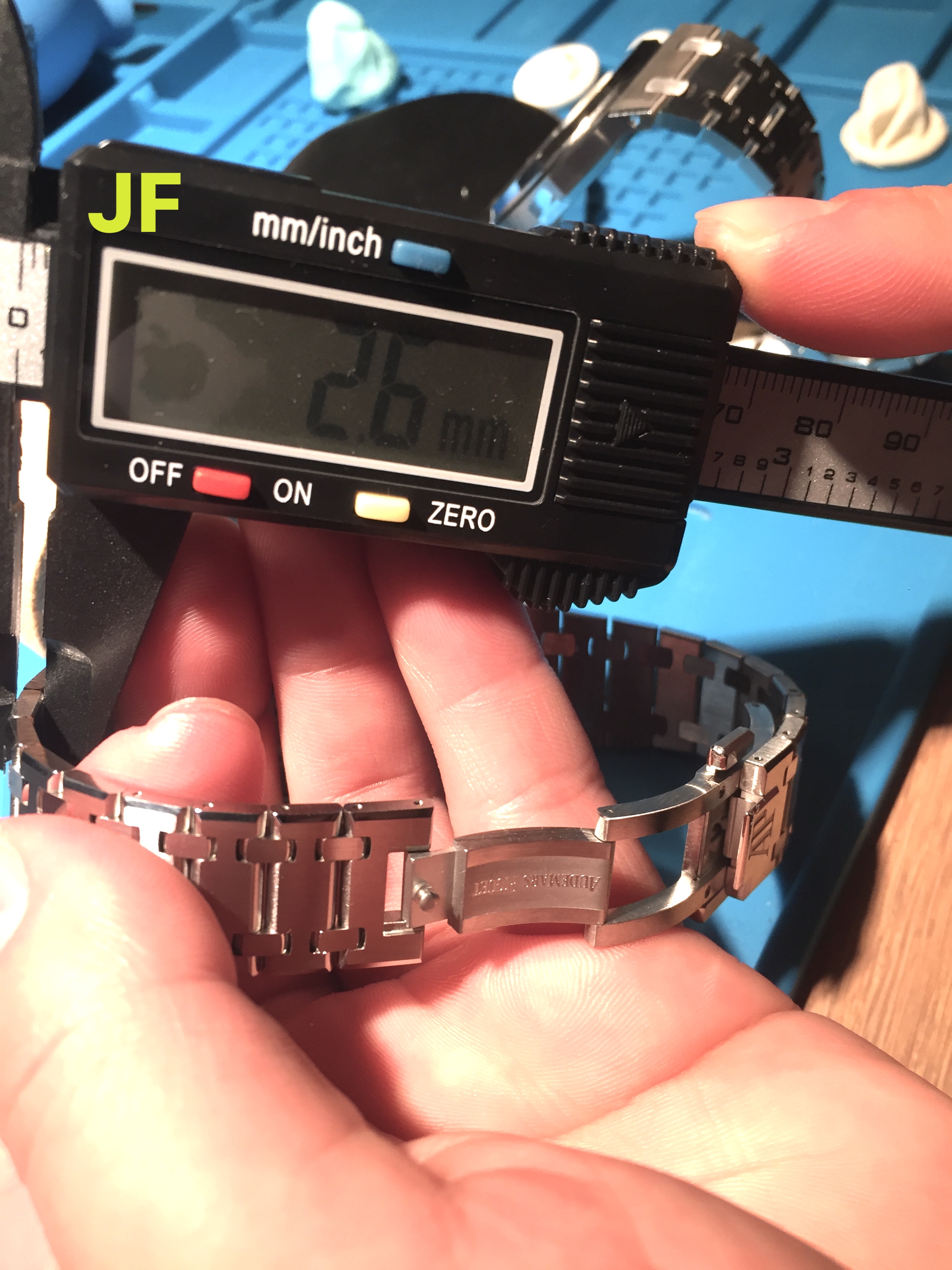
JF = 2.6mm
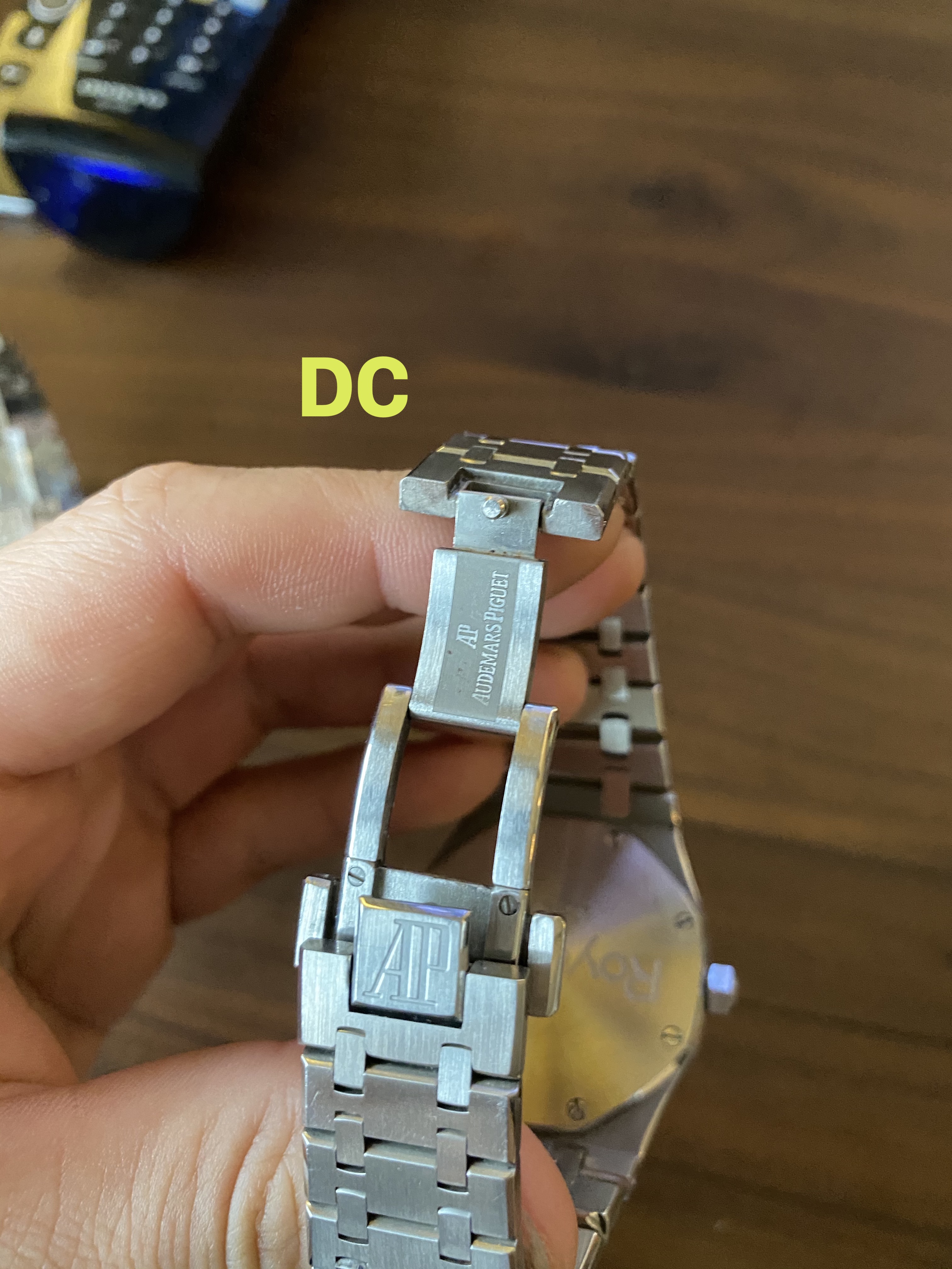
The thinnest option available as you all already know is from DC. This is because the movement running this model is a quartz movement with a battery, and not an automatic movement. While you get fantastic accuracy from a quartz movement, and the convenience of almost never needing to re-set the time - the sacrifice in having such a thin case is that there is no exhibition case back. Instead DC has opted for an engraved case back that somewhat resembles a 5402 without any letter designation for the serial. Frankly it is nothing offensive, and it looks quite decent. Unless the watch is taken off your wrist, this detail goes unnoticed. I’d also like to point out that at 7.7mm thick , this case is slightly thinner than the genuine 15202 specs listed on the AP website (8.1mm)
Surprisingly in contrast to how thin the DC case is, the bracelet links are the thickest of the three, at 3.3mm.. It does not carry the same refinement of the bracelet from JF or XF.
The next thinnest case option is the XF at 8.5mm. It is incredibly close to the gen thickness of 8.1mm, and featuring a fully automatic movement (that functions the same as gen). The sacrifice that XF made in this case (no pun intended) is that the movement does not include a decorated plate. It is an exposed Miyota 9015 that appears as such. It personally doesn’t bother me much, and I would take the undecorated movement and a slim case over the chunky 9.7mm case that JF offers (with deco plate, btw)..
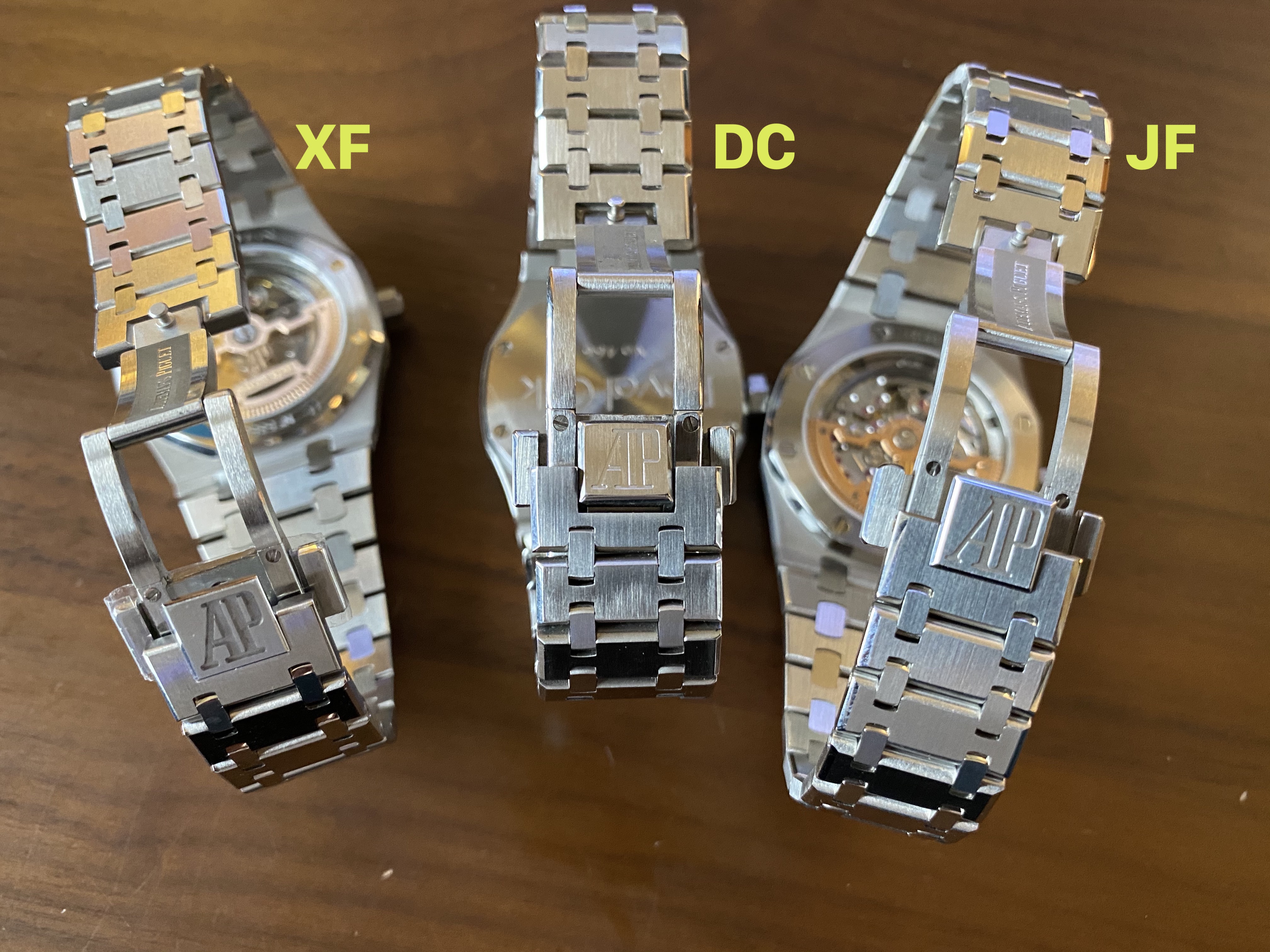
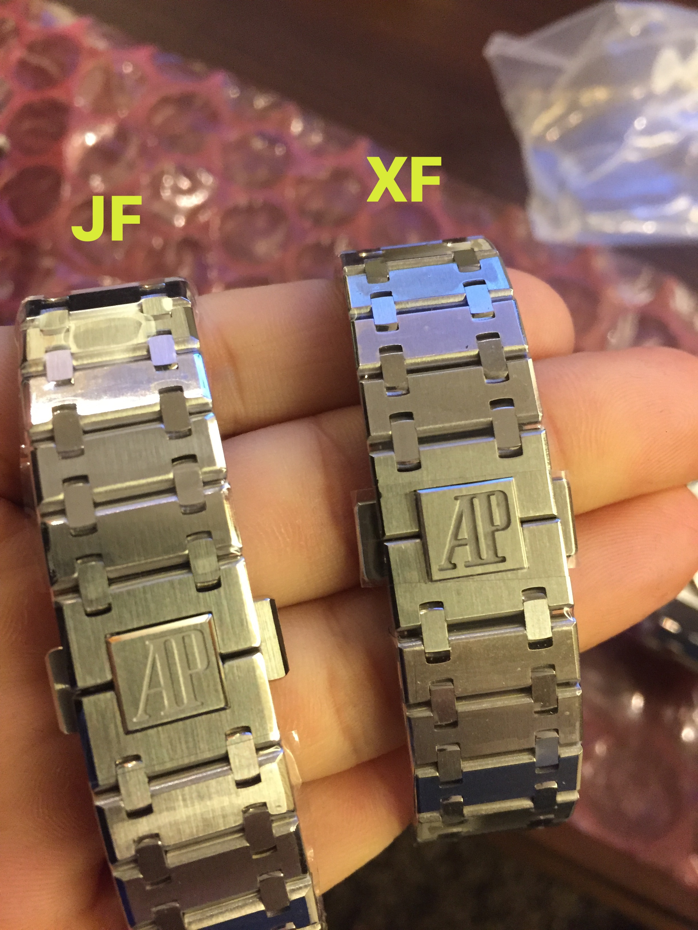
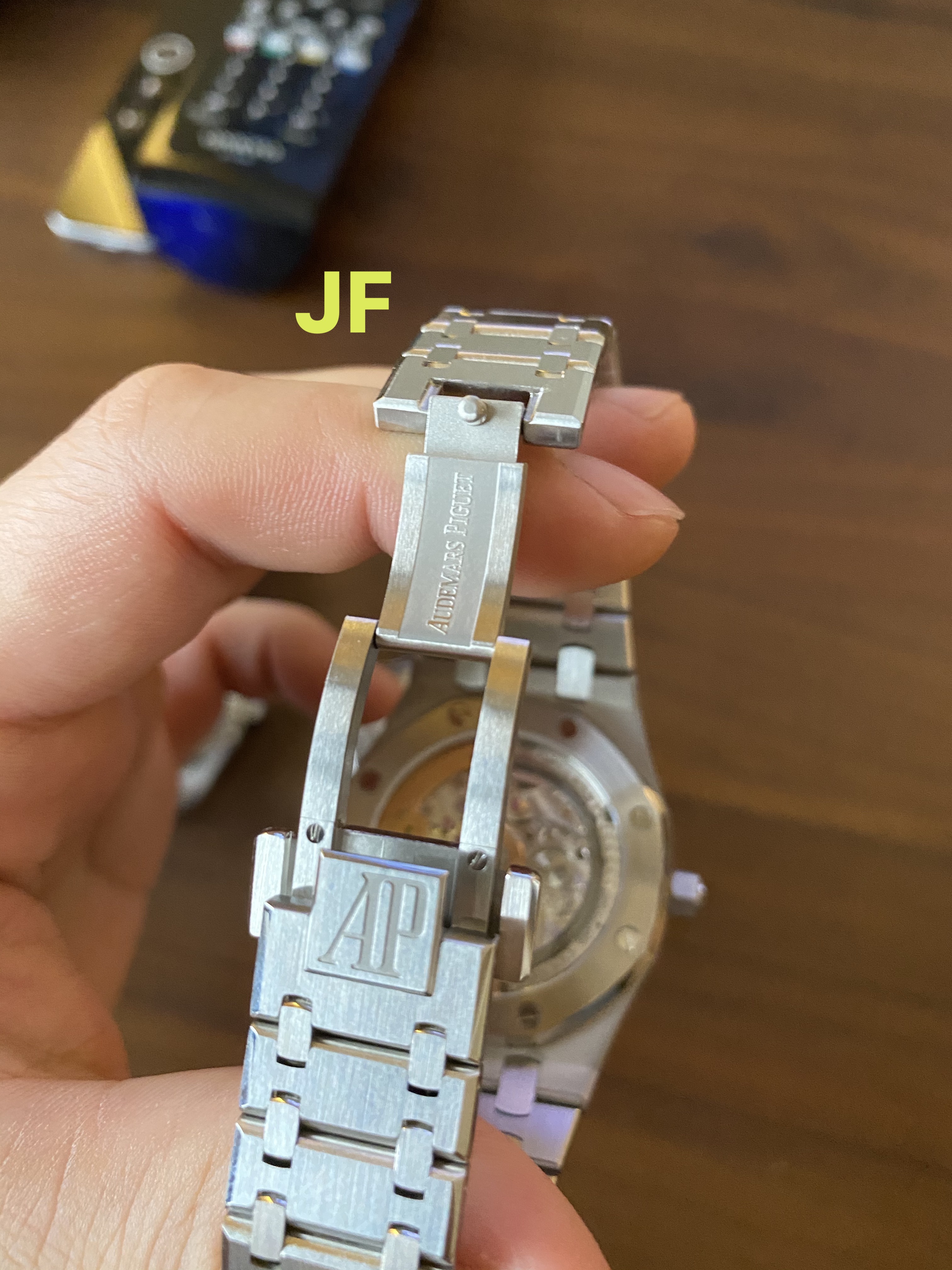
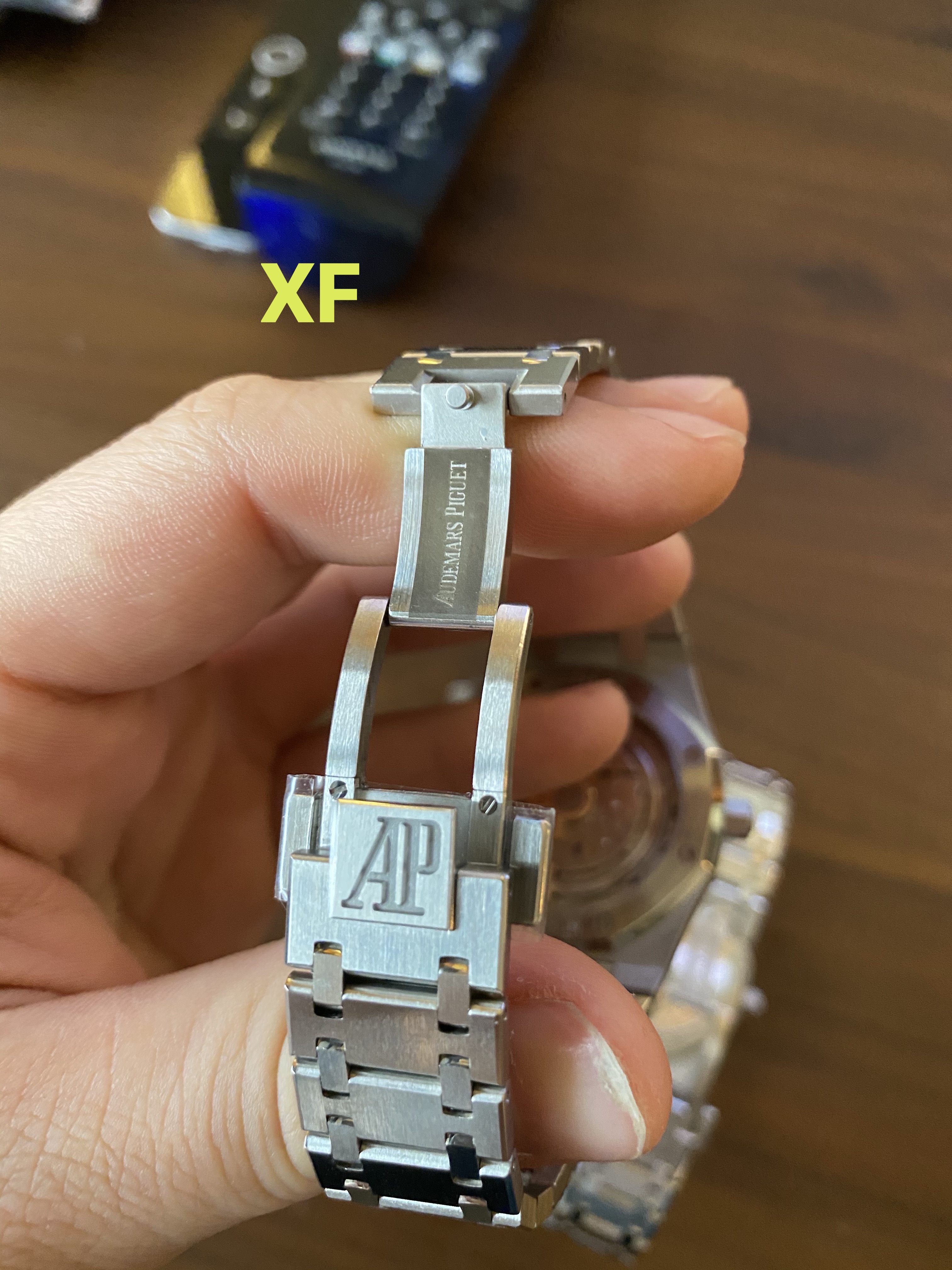
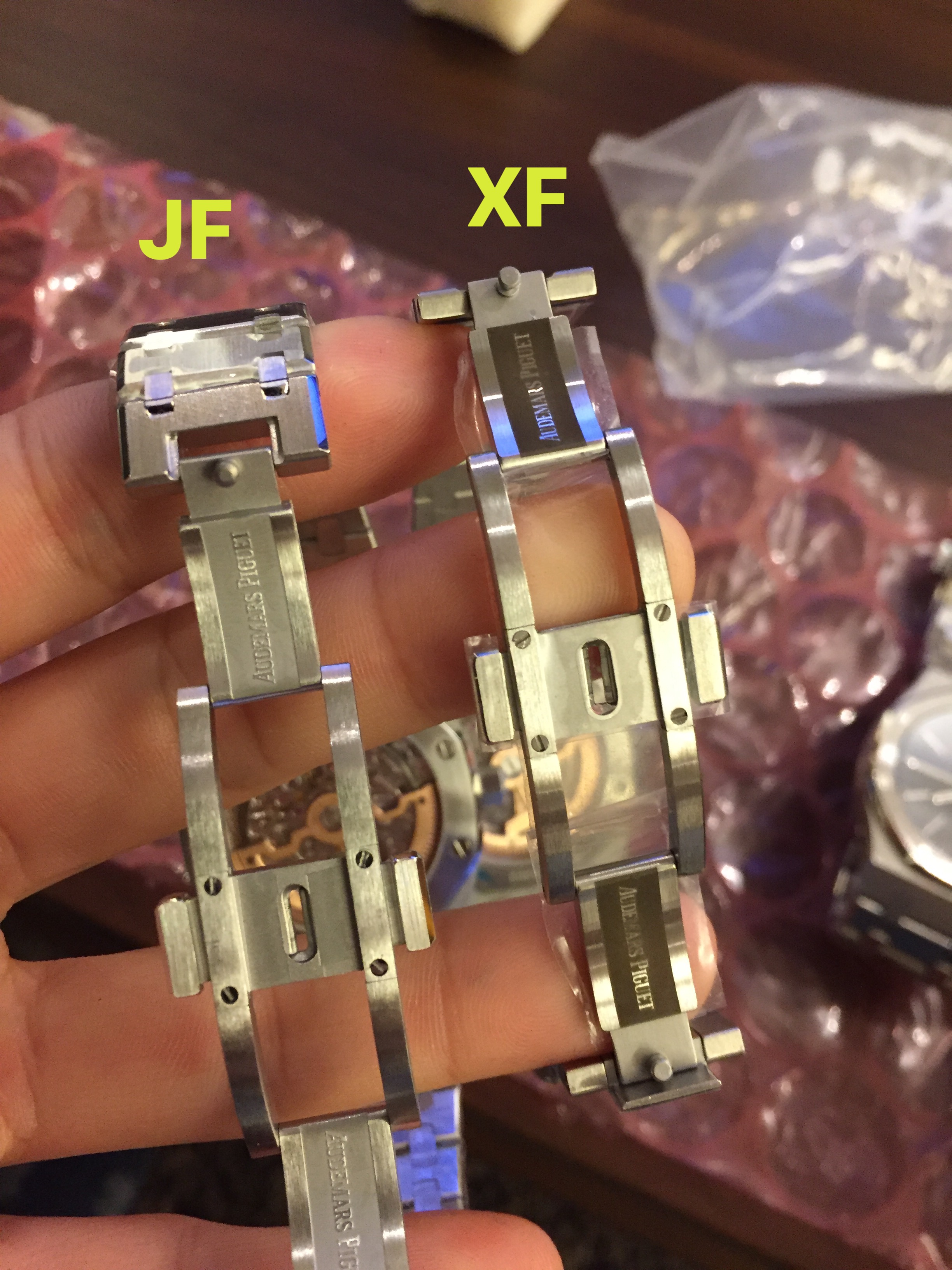
I’m going to set aside DC and only compare the clasp / bracelet from JF and XF. Both factories did a great job in the bracelet finishing, where XF has achieved a slightly thinner bracelet thickness of 2.3mm. Additionally on the clasp, the XF AP logo is a much deeper engraving than on JF. There is also a ’sand blasted' inner logo that reads “Audemars Piguet” on both; again here there is a fairly obvious difference where the XF is much darker.
I tried to compare these two details with photos of the genuine 15202 online. It appears to me that the XF clasp is a bit closer to gen finishing. The deep logo and the dark sand-blasted inner logo can both be seen on genuine bracelets.
Here are the clasp photos again for easy reference, and pics of the genuine 15202:
.

.
THE CROWN:
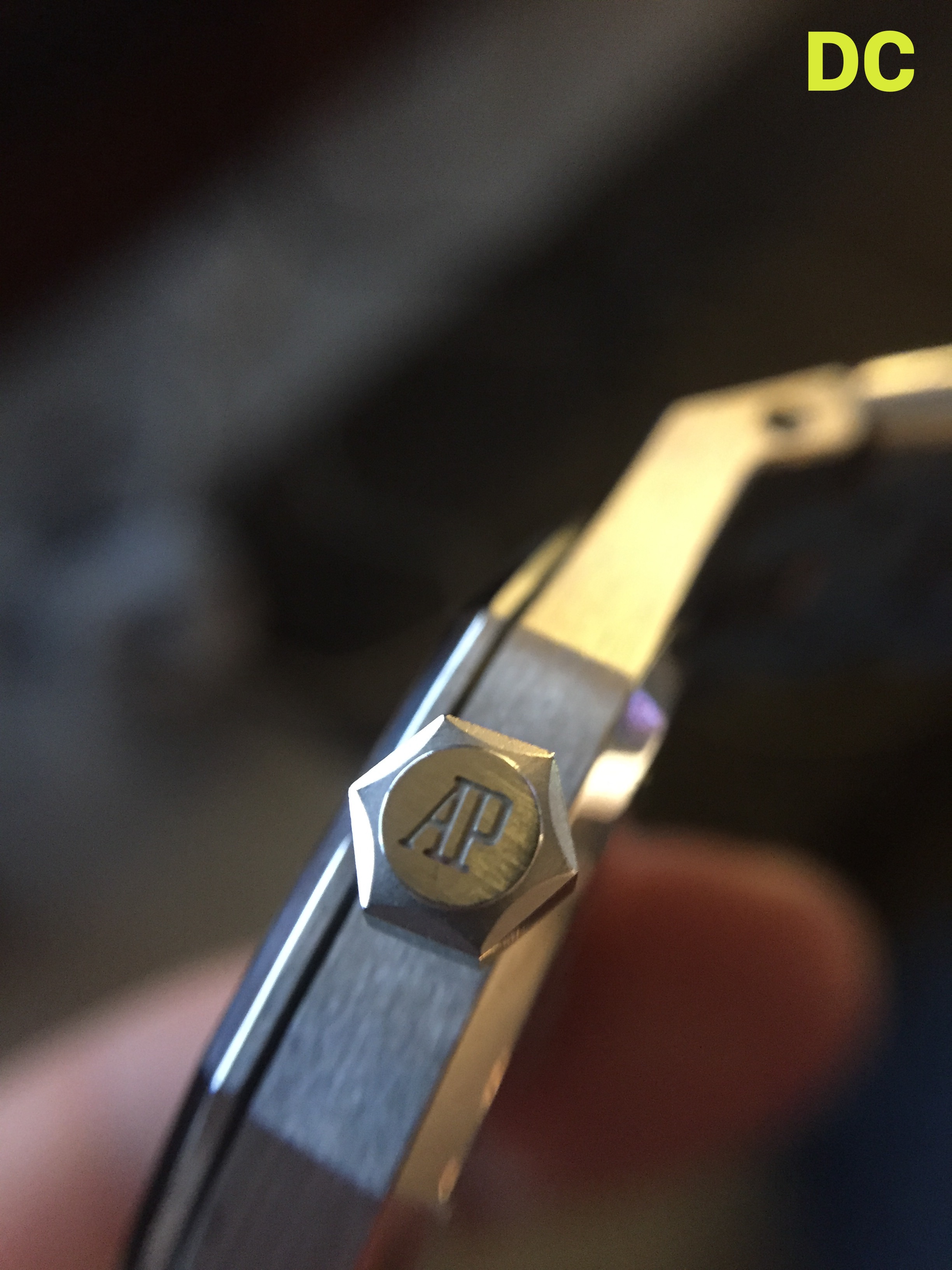
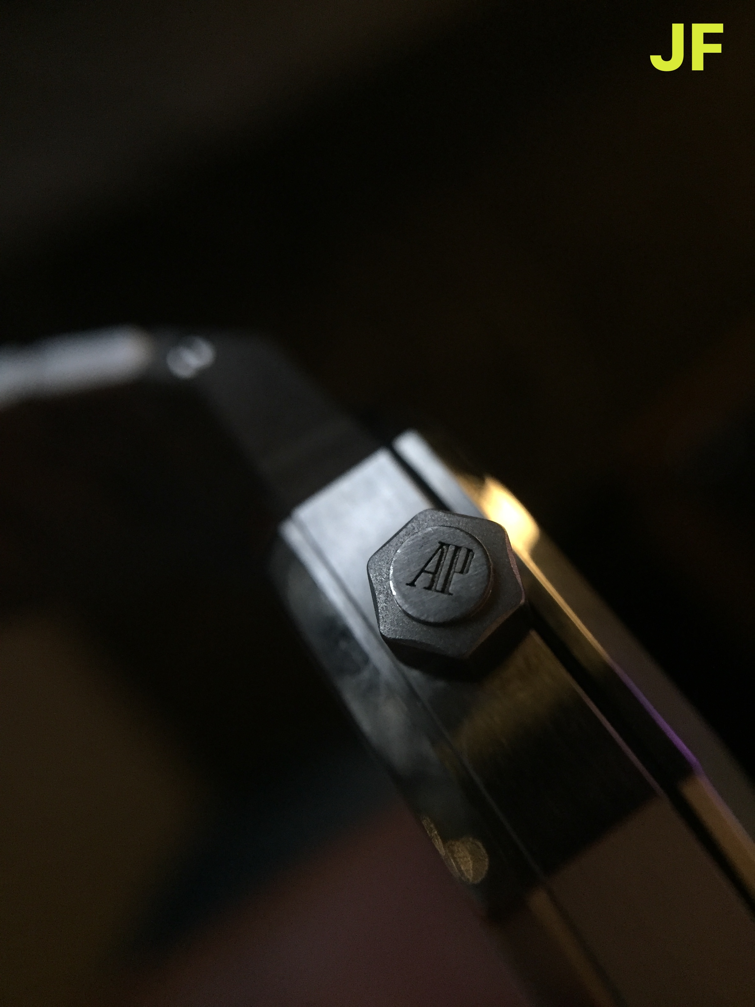
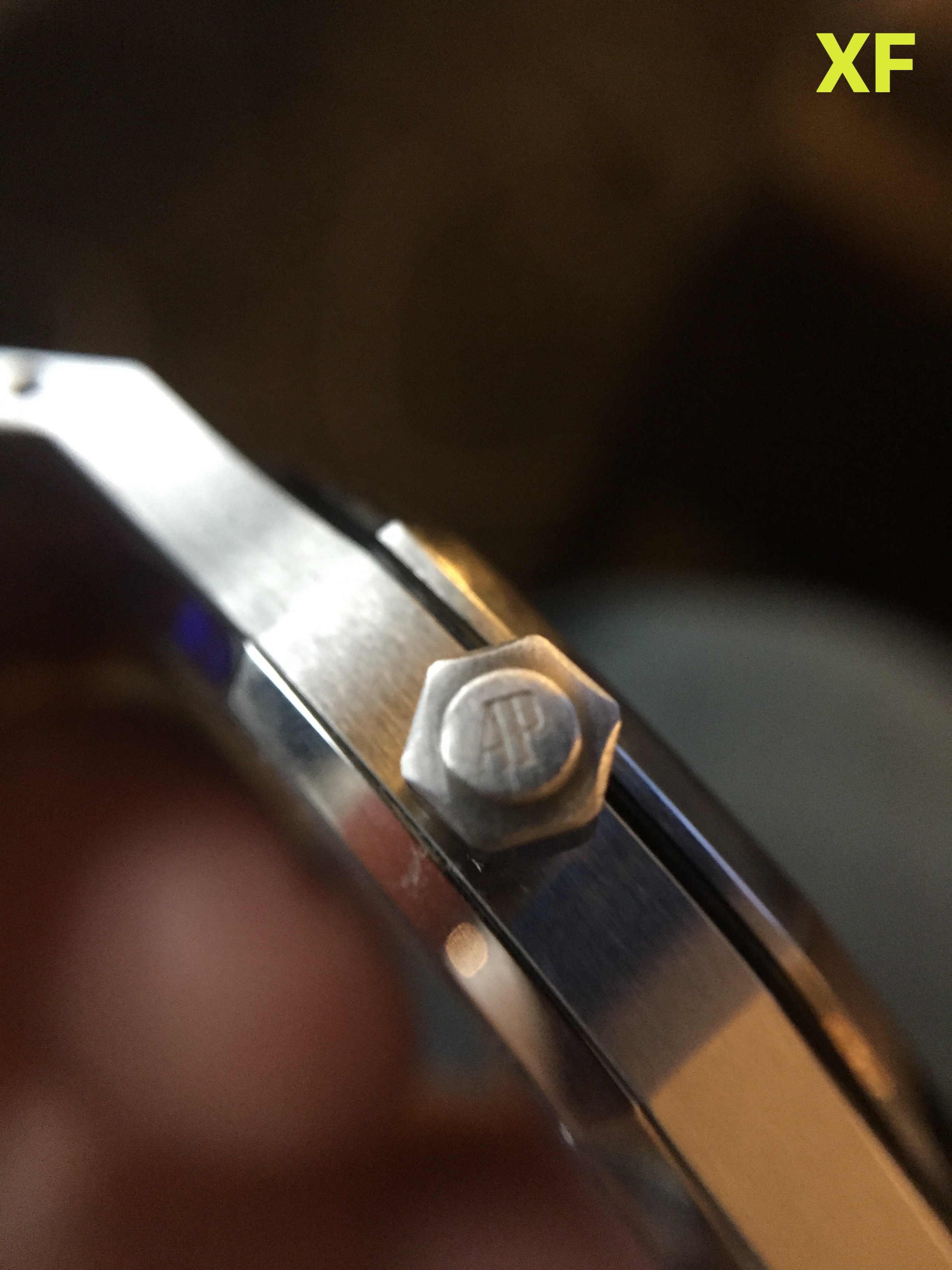
Next to quickly compare the crown from each factory. I have noticed that the DC quartz has not even attempted to replicate the correct shape of the 15202 crown. It is much shorter and much wider in diameter.. The engraving however is nicely executed and clearly visible.
The crown from both XF & JF have similar proportions and appear like-gen. The biggest difference between them (from my observation) has been the AP engraving. The JF engraving is deep and clearly visible, the XF engraving is shallow.
I have also checked some references of genuine 15202 crowns online, and JF is much more accurate to gen in this detail.
.
.
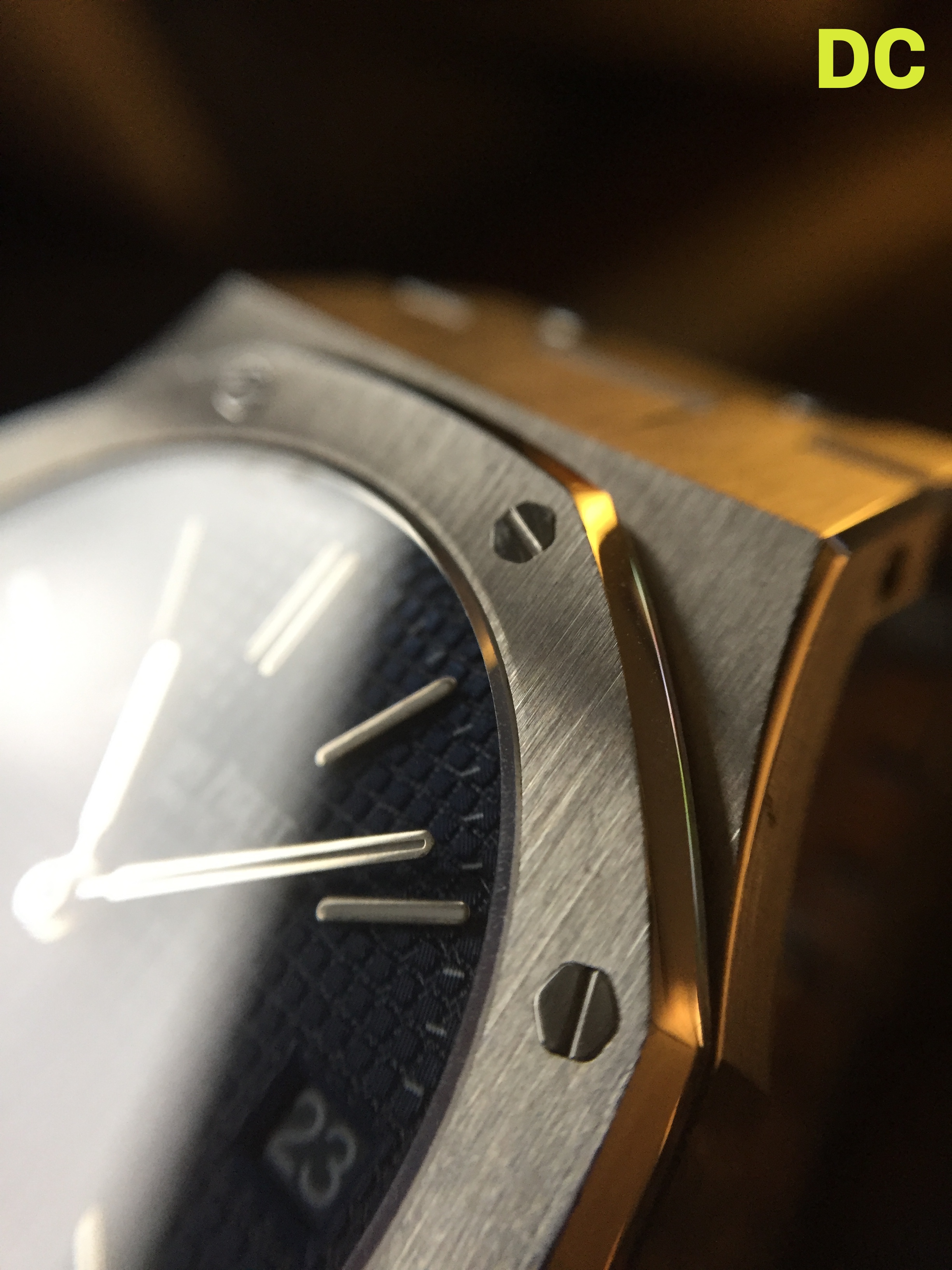
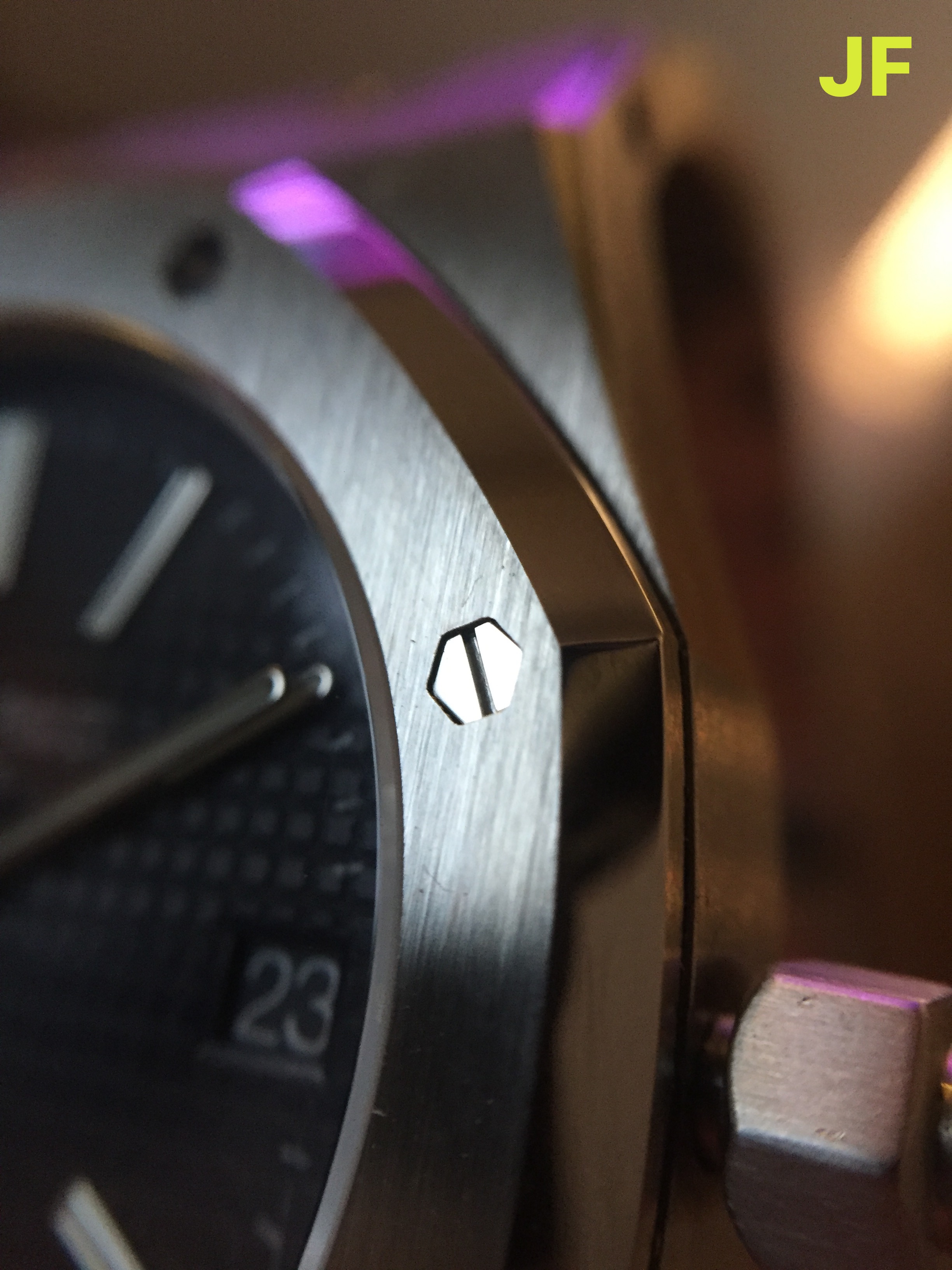
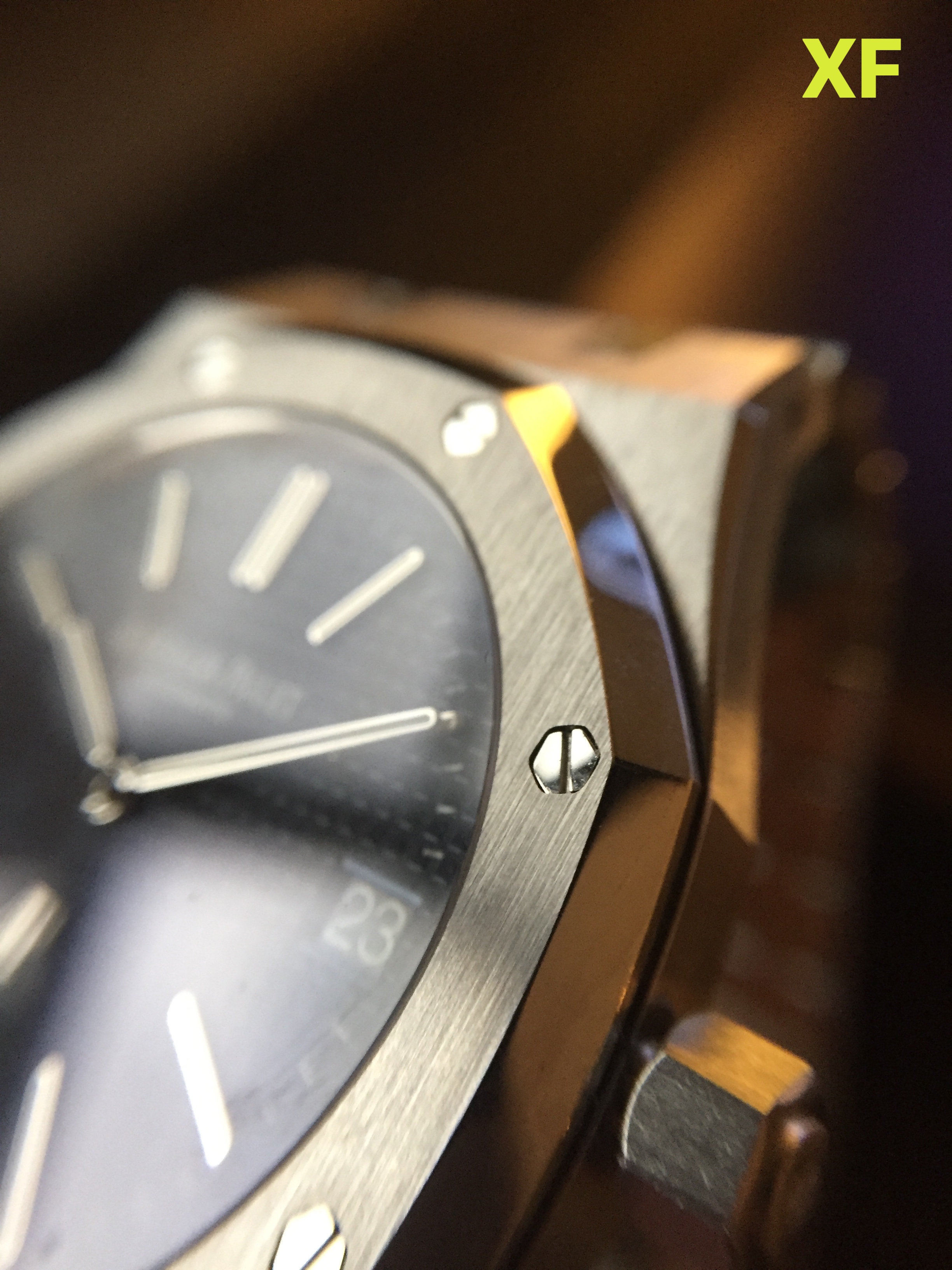
THE BEZEL
Lastly comparing the bezel between the three factories. The XF and JF bezel have similar proportions which are much more accurate to gen. The DC bezel shape appears totally incorrect. The beveled edge of the bezel should be much more visible… Though it seems that DC has attempted to flatten the bezel proportions to achieve a thinner overall case.
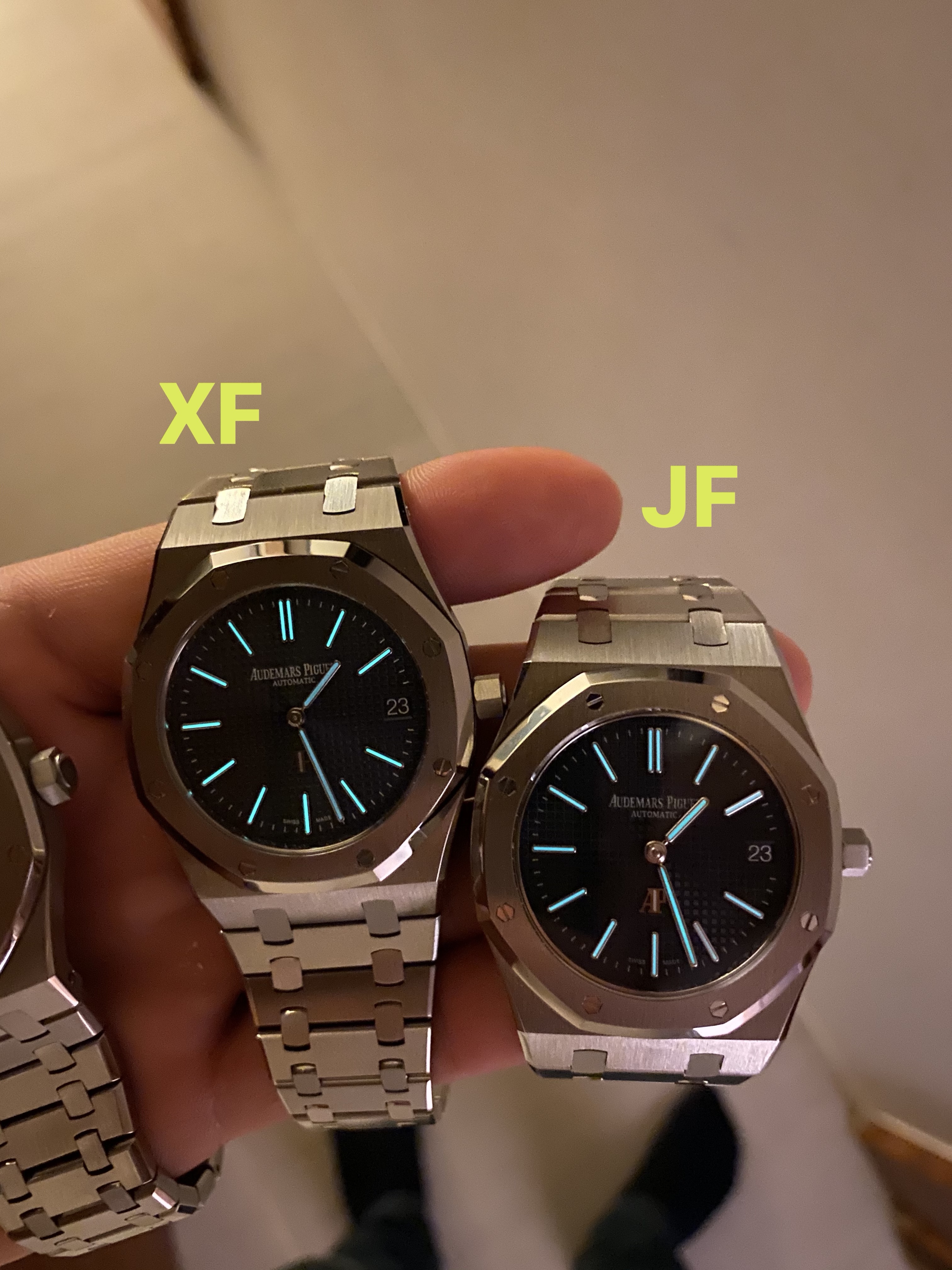
Between XF and JF, its hard to say which is closer to gen. Between these two it actually appears at a glance as if the JF dial is slightly larger (proportionately to the case) than XF. The bezel screws on XF sits much closer to the edge of the bezel, whereas JF has a much better ‘gap’ in-between the bezel screws.
Both JF and XF factories have very subtly 'sunken screws', which is a nice attention to detail. The DC quartz has omitted this detail...
The final detail I’ve noted on the bezel is that none of the factories have properly rounded the screw heads on the bezel. The JF screws appear to be very slightly rounded, which is a nice attention to detail, although its not quite as rounded as on gen. Both DC and XF have almost completely omitted this detail, which is very subtle to be fair, but thats the point of digging into these details.
THE HANDS:
It is difficult for me to share micro details on the hands since I have not dismantled the JF or XF. I can only comment on the pinion…
The DC hand stack actually contains hour, minute, and seconds.. However, instead of a seconds hand, DC has very cleverly added a flat round disc that simply sits on top of the stack. This disc ticks away as if it were a functioning seconds hand, but it is invisible to the eye as the subtle shift of this disc is impossible to notice.
The XF pinion compared to JF is much smaller and refined. I’m not clear how they have managed to construct this since my understanding is both models use a Miyota 9015 movement. The XF pinion appears much closer to gen, where the JF is much larger by comparison...
FINAL THOUGHTS
To just wrap this up, I wanted to share some final thoughts on each 15202 from the three factories…
XF 15202:
The Good
Easily one of the most ‘well-rounded’ options available at the moment. You get a nicely modified 9015 movement that functions accurately like the Calibre 2121. The case measures 8.5mm which is a negligible 0.4mm thicker than gen, and currently the thinnest automatic 15202 available.
The dial is no slouch either, with a beautifully crisp dial print. And, in my opinion a slightly more accurate “small” tapisserie pattern as well.
It also has a very nice and accurate clasp / bracelet, with the thinnest links.
The DW also has an excellent, and accurate front. The font appears a bit more refined than JF in my opinion.
Lastly it has the nicest, most accurate looking hand-stack pinion from the three options available.
The Bad
The XF dial color / sunburst is questionably bright. I would love if someone could chime in with some additional photos of how the genuine dial appears, but at least to me it was a bit surprising at how prominent the sunburst was. The color also does not appear as blue as gen, where the references I have seen have a very deep / rich color. The XF dial appears a grey-blue.
The lume application on the dial and hands looks fine, although with a slight difference in hue. I would say that the obviously inconsistent glow between the dial and hands looks quite bad.
The Ugly
Honestly nothing… Overall all the details are well executed and this is a really stunning watch. If I had to pick one watch out of the box, without mods, and despite its flaws, it would be the XF 15202. It is the most well-rounded of the three.
JF 15202:
The Good
JF factory has been known for a long time as the #1 factory for AP Royal Oaks. It really shows in the quality of the dial: The color, the detailed tapisserie texture, and all the subtleties they executed correctly.
The hands have nicely applied lume, with a bright and consistent glow. The lume really appears to be solid quality.
I also have felt that JF nailed the bezel, and took the time and effort to slightly round out the bezel screws, which is a nice attention to detail that elevates the appearance of the watch.
The DW has an excellent font as well. This was updated from the earlier version where the font was terribly inaccurate, it was nice to see that JF improved on this.
Lastly, if this matters to you - the decorated movement is quite nice to look at, and it shows they took the time to try and mimic the Cal. 2121… though to me this is of little (no) importance, when you consider the case size.
The movement also just functions like a standard Miyota, with quick-set option for cycling the dates. This, I suppose could be considered a plus-point since its a massive pain in the ass to cycle through dates on the Cal. 2121.. even if its less accurate.
The Bad
The dial print is still lacking in quality.. It's just a shame that with such a great looking dial they could screw up this detail. It is not offensive but it certainly could be much better.
The pinion is another area where JF could have improved. The dimensions on this look totally wrong and once seen can’t be unseen.
The Ugly
I hate to say it but … the case thickness at 9.7mm is by far the most egregious flaw committed by JF.
Please don't whip out the pitchforks for me saying it, as I still think that a lot of the details on this watch are fantastic and beautifully executed. However the “Jumbo” is known for its incredibly slim case design, and frankly this watch misses that point entirely.
Its a solid 1.6mm thicker than gen.. Which may be negligible to some, and at the end of the day the tolerance for flaws is up to the buyer, but I feel that this difference in thickness is hard to ignore.
DC 15202:
The Good
Easily the case thickness is the highlight of this offering from DC. The 7.7mm thickness is super slim and even surpasses gen. Whether you see this as good or bad is up to you, I consider this a win.
Although I did not mention pricing for either JF or XF, I am going to highlight that at $140 you really cannot go wrong with the DC version. Its price alone is a huge reason why this version is so wildly popular.. It costs only a fraction of the price from JF / XF, but frankly holds up well side-by-side. It is by no means as good as either factory, and you certainly get what you pay for, but to the end buyer the question is if that cost difference is worth the details…
Lastly I’m going to go ahead and say that the dial print and DW are both fantastic on DC, considering it took JF a V2 release to get the DW font right, DC has been on point with this detail. The print finishing may not be as clean, but it still looks very nice from a wrists distance.
The Bad
Without nitpicking on the details. I would say that overall the case proportions on DC are not great. The bezel proportions are wrong, and the case appears a bit too wide compared to JF / XF. Lastly the crown has a completely incorrect shape.
I forgot to add to the above section on Dials - the DC dial is missing the white lume fill on the AP logo above 6:00. Its a minor detail they missed out and I wanted to highlight that here.
Lastly, the brushing finishing stock from factory (I have heard) can be hit or miss. I’ve seen complaints that the bracelet is uncomfortable, and pinches hairs etc.
The Ugly
Honestly… I’ve got nothing. For the price & quality of this watch there is nothing horribly wrong with it. It's a fantastic budget option that does the job. It looks great, is super slim, and functions reliably.
Leaving the review with some macro pictures of the detailing between all three watches…
Thanks for reading this far, and enjoy!
Happy holidays RWI !
.
This time I am taking a look at the Audemars Piguet ref. 15202 “Jumbo” .. stacking the three best options available against each other and digging into the details between JF , DC , and the newly released XF ..
I have to say that the Jumbo is one of my all time favorite AP models. The original reference 5402 was an absolutely groundbreaking release for Audemars Piguet in 1972. The design from Gérald Genta changed the face of the watch industry forever, and it is still to-date the most iconic design in AP’s catalogue.
What I personally love about this watch is its wearable 39mm size. The 15450 at 37mm is also an excellent option for those with smaller wrists, but the case proportions are a bit bulkier due to its thickness. The 41mm 15400 / 15500 is suitable for a lot of people with larger wrists but still tends to wear quite large given the extensive wingspan from lug to lug.. At 39mm, the Jumbo is perfection.
There has been a lot of debate between who makes the best 15202, and I have no intention of answering that conclusively today. With each factory, I feel there are some well executed details, as well as some oversights that were missed. I’ve thrown the DC quartz into the mix because it still holds its own as a contender against JF and XF given how cheap it is, and how well executed some of the details are…
Without further rambling, here are some side-by-side pictures from all three models, labeled for clarity:
.
THE DIAL:
The first detail that stands out to me as the most obvious is of course the dial. We have roughly 4 things to consider when looking at the dial from each of these factories.
1. Color
2. Print
3. Tapisserie
4. Sunburst
.
.
First looking at the JF (Based on the Mark 1 dial): The tapisserie looks very sharp and nicely finished. The blue color is deep and rich, it certainly has the deepest blue color out of all three dials. In low light it may even appear black. The sunburst on this dial is present but not excessively bright or obvious, at least this was my observation with soft light. Under a halogen bulb the sunburst reveals itself much more obviously. I think The main area where this dial falls short is in the print, which has improved over the earlier version but still does not look as clear or crisp as XF or even DC. You can still see very easily where the print has been affected by the uneven surface of the tapisserie texture.
Next, looking at the details of XF (Based on the Mark 3 dial): This is also a gorgeous dial... it has a beautiful grayish-blue hue that is slightly different from JF, as another member pointed out these are based on different versions of the genuine 15202 , Mark 1 vs Mark 3. The color shifts depending on the angle of lighting, in low light it appears deep blue / black. The dial also features a slightly smaller tapisserie pattern that in my opinion appears closer to the gen tapisserie. Where the XF dial surprised me most is in how bright the sunburst appears. For some reason this dial appears to have the most prominent sunburst of the three, where I had expected based on the early reviews that it would be a much more muted blue. Lastly, and where I feel XF has really nailed it, the dial printing is fantastic. It is very crisp and clean, and appears unaffected at all by the shape of the tapisserie pattern.
Lastly looking at the DC dial: This is by far the richest and brightest blue hue of the three dials. I don't feel that the color is very accurate to gen. However I’ve seen some variation in the 15202 color, and it becomes difficult to compare when referencing online photos that have been heavily post-edited. I will say that the color is very bright. The tapisserie is not as sharp as the JF dial, the small ’squares’ have slightly rounded corners. That said, overall the way the dial reflects light is very nice. For the price on this piece the dial could have been much worse. The last detail that is very well executed is the print pattern. Much better even than JF. The lettering is white, clear, and almost completely unaffected by the tapisserie pattern.
Looking very briefly at the lume from each factory, there were some very subtle differences between them:
DC - The lume application has nice color consistency between the dial and hands, with the hands being maybe slightly darker. The glow on these is easily the worst from all three factories.
XF - There is some inconsistency between the dial and hands. The lume on the hands appears much more white, whereas the dial lume has a very slight greenish hue. The glow on this dial is easily the brightest, unfortunately the hands do not match the same brightness and it becomes obvious there is a difference in the lume quality (or application) between the dial and hands…
JF - Again the lume consistency appears uniform between the dial and hands. The hue on this is white for both. The glow from JF is actually very good, it is not as bright as XF but there is a nice consistency between the dial and hands, and frankly it isn’t slacking in this department. Compared to DC it has a fantastic, and bright lume..
Lume pics:
.
.
CASE / BRACELET:
Here we have some major differences in the case details between the three factories. I will preface by saying that my DC Quartz version has been fully rebrushed by Jon , and therefore is not a fully accurate representation on the finishing that comes direct from the factory. However I will focus less on these small details and instead just highlight the major differences in the bezel, case dimension, bracelet thickness, and clasp..
.
.
For easy reference, I am again listing the case and bracelet dimensions:
Case thickness:
DC = 7.7mm
XF = 8.5mm
JF = 9.7mm
Bracelet thickness:
DC = 3.3mm
XF = 2.3mm
JF = 2.6mm
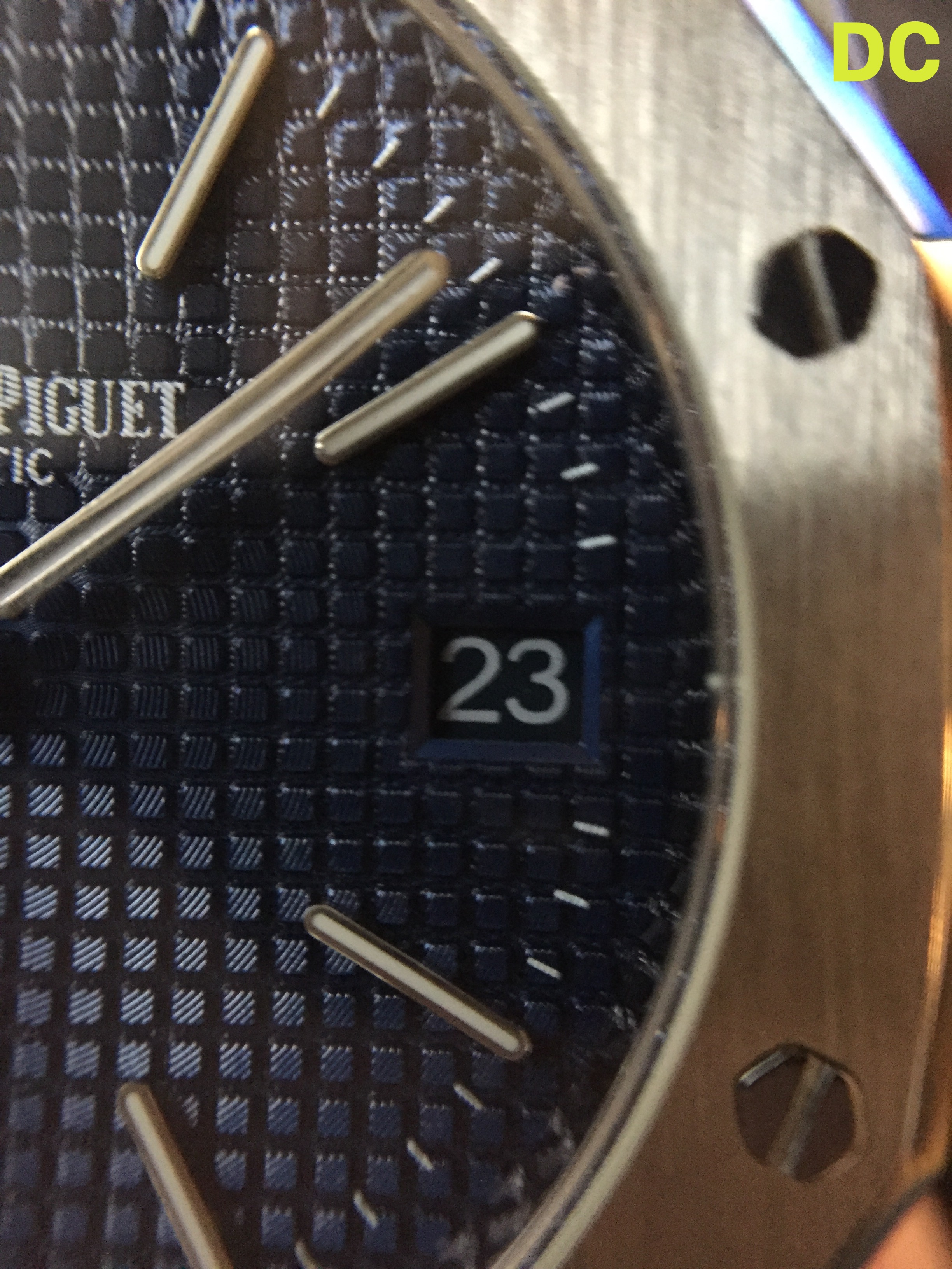
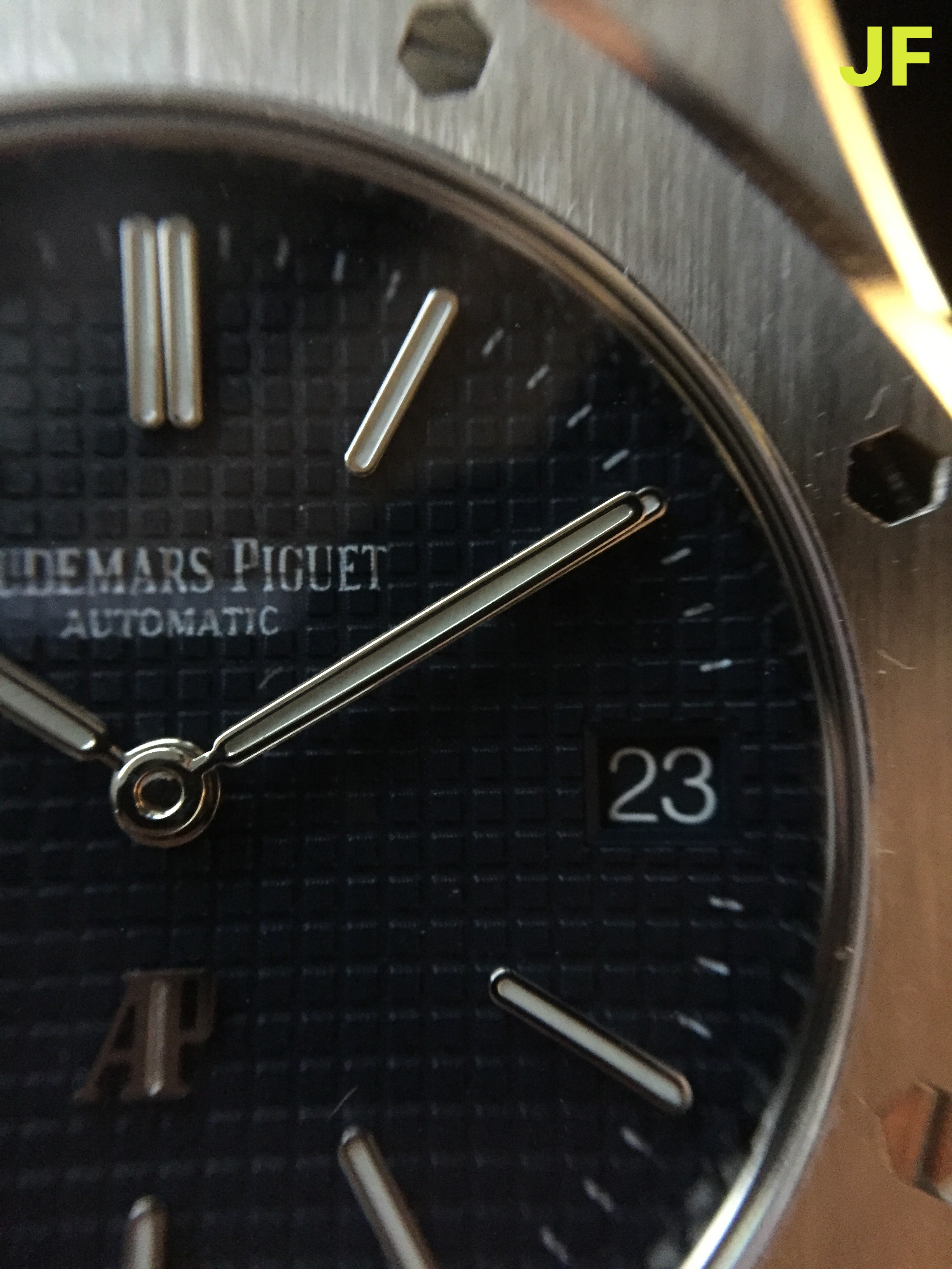
The thinnest option available as you all already know is from DC. This is because the movement running this model is a quartz movement with a battery, and not an automatic movement. While you get fantastic accuracy from a quartz movement, and the convenience of almost never needing to re-set the time - the sacrifice in having such a thin case is that there is no exhibition case back. Instead DC has opted for an engraved case back that somewhat resembles a 5402 without any letter designation for the serial. Frankly it is nothing offensive, and it looks quite decent. Unless the watch is taken off your wrist, this detail goes unnoticed. I’d also like to point out that at 7.7mm thick , this case is slightly thinner than the genuine 15202 specs listed on the AP website (8.1mm)
Surprisingly in contrast to how thin the DC case is, the bracelet links are the thickest of the three, at 3.3mm.. It does not carry the same refinement of the bracelet from JF or XF.
The next thinnest case option is the XF at 8.5mm. It is incredibly close to the gen thickness of 8.1mm, and featuring a fully automatic movement (that functions the same as gen). The sacrifice that XF made in this case (no pun intended) is that the movement does not include a decorated plate. It is an exposed Miyota 9015 that appears as such. It personally doesn’t bother me much, and I would take the undecorated movement and a slim case over the chunky 9.7mm case that JF offers (with deco plate, btw)..
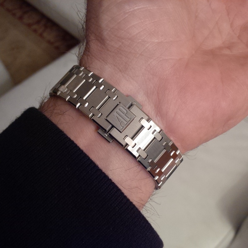
I’m going to set aside DC and only compare the clasp / bracelet from JF and XF. Both factories did a great job in the bracelet finishing, where XF has achieved a slightly thinner bracelet thickness of 2.3mm. Additionally on the clasp, the XF AP logo is a much deeper engraving than on JF. There is also a ’sand blasted' inner logo that reads “Audemars Piguet” on both; again here there is a fairly obvious difference where the XF is much darker.
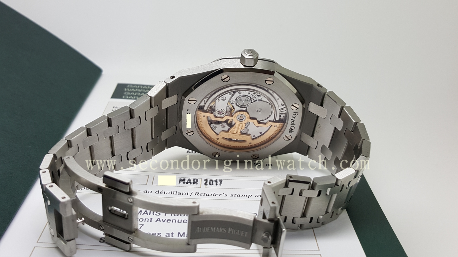
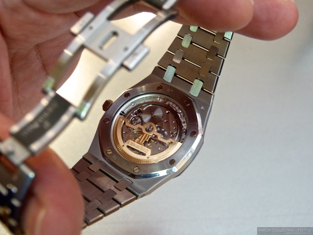
I tried to compare these two details with photos of the genuine 15202 online. It appears to me that the XF clasp is a bit closer to gen finishing. The deep logo and the dark sand-blasted inner logo can both be seen on genuine bracelets.
Here are the clasp photos again for easy reference, and pics of the genuine 15202:
.
.
THE CROWN:
Next to quickly compare the crown from each factory. I have noticed that the DC quartz has not even attempted to replicate the correct shape of the 15202 crown. It is much shorter and much wider in diameter.. The engraving however is nicely executed and clearly visible.
The crown from both XF & JF have similar proportions and appear like-gen. The biggest difference between them (from my observation) has been the AP engraving. The JF engraving is deep and clearly visible, the XF engraving is shallow.
I have also checked some references of genuine 15202 crowns online, and JF is much more accurate to gen in this detail.
.
.
THE BEZEL
Lastly comparing the bezel between the three factories. The XF and JF bezel have similar proportions which are much more accurate to gen. The DC bezel shape appears totally incorrect. The beveled edge of the bezel should be much more visible… Though it seems that DC has attempted to flatten the bezel proportions to achieve a thinner overall case.
Between XF and JF, its hard to say which is closer to gen. Between these two it actually appears at a glance as if the JF dial is slightly larger (proportionately to the case) than XF. The bezel screws on XF sits much closer to the edge of the bezel, whereas JF has a much better ‘gap’ in-between the bezel screws.
Both JF and XF factories have very subtly 'sunken screws', which is a nice attention to detail. The DC quartz has omitted this detail...
The final detail I’ve noted on the bezel is that none of the factories have properly rounded the screw heads on the bezel. The JF screws appear to be very slightly rounded, which is a nice attention to detail, although its not quite as rounded as on gen. Both DC and XF have almost completely omitted this detail, which is very subtle to be fair, but thats the point of digging into these details.
THE HANDS:
It is difficult for me to share micro details on the hands since I have not dismantled the JF or XF. I can only comment on the pinion…
The DC hand stack actually contains hour, minute, and seconds.. However, instead of a seconds hand, DC has very cleverly added a flat round disc that simply sits on top of the stack. This disc ticks away as if it were a functioning seconds hand, but it is invisible to the eye as the subtle shift of this disc is impossible to notice.
The XF pinion compared to JF is much smaller and refined. I’m not clear how they have managed to construct this since my understanding is both models use a Miyota 9015 movement. The XF pinion appears much closer to gen, where the JF is much larger by comparison...
FINAL THOUGHTS
To just wrap this up, I wanted to share some final thoughts on each 15202 from the three factories…
XF 15202:
The Good
Easily one of the most ‘well-rounded’ options available at the moment. You get a nicely modified 9015 movement that functions accurately like the Calibre 2121. The case measures 8.5mm which is a negligible 0.4mm thicker than gen, and currently the thinnest automatic 15202 available.
The dial is no slouch either, with a beautifully crisp dial print. And, in my opinion a slightly more accurate “small” tapisserie pattern as well.
It also has a very nice and accurate clasp / bracelet, with the thinnest links.
The DW also has an excellent, and accurate front. The font appears a bit more refined than JF in my opinion.
Lastly it has the nicest, most accurate looking hand-stack pinion from the three options available.
The Bad
The XF dial color / sunburst is questionably bright. I would love if someone could chime in with some additional photos of how the genuine dial appears, but at least to me it was a bit surprising at how prominent the sunburst was. The color also does not appear as blue as gen, where the references I have seen have a very deep / rich color. The XF dial appears a grey-blue.
The lume application on the dial and hands looks fine, although with a slight difference in hue. I would say that the obviously inconsistent glow between the dial and hands looks quite bad.
The Ugly
Honestly nothing… Overall all the details are well executed and this is a really stunning watch. If I had to pick one watch out of the box, without mods, and despite its flaws, it would be the XF 15202. It is the most well-rounded of the three.
JF 15202:
The Good
JF factory has been known for a long time as the #1 factory for AP Royal Oaks. It really shows in the quality of the dial: The color, the detailed tapisserie texture, and all the subtleties they executed correctly.
The hands have nicely applied lume, with a bright and consistent glow. The lume really appears to be solid quality.
I also have felt that JF nailed the bezel, and took the time and effort to slightly round out the bezel screws, which is a nice attention to detail that elevates the appearance of the watch.
The DW has an excellent font as well. This was updated from the earlier version where the font was terribly inaccurate, it was nice to see that JF improved on this.
Lastly, if this matters to you - the decorated movement is quite nice to look at, and it shows they took the time to try and mimic the Cal. 2121… though to me this is of little (no) importance, when you consider the case size.
The movement also just functions like a standard Miyota, with quick-set option for cycling the dates. This, I suppose could be considered a plus-point since its a massive pain in the ass to cycle through dates on the Cal. 2121.. even if its less accurate.
The Bad
The dial print is still lacking in quality.. It's just a shame that with such a great looking dial they could screw up this detail. It is not offensive but it certainly could be much better.
The pinion is another area where JF could have improved. The dimensions on this look totally wrong and once seen can’t be unseen.
The Ugly
I hate to say it but … the case thickness at 9.7mm is by far the most egregious flaw committed by JF.
Please don't whip out the pitchforks for me saying it, as I still think that a lot of the details on this watch are fantastic and beautifully executed. However the “Jumbo” is known for its incredibly slim case design, and frankly this watch misses that point entirely.
Its a solid 1.6mm thicker than gen.. Which may be negligible to some, and at the end of the day the tolerance for flaws is up to the buyer, but I feel that this difference in thickness is hard to ignore.
DC 15202:
The Good
Easily the case thickness is the highlight of this offering from DC. The 7.7mm thickness is super slim and even surpasses gen. Whether you see this as good or bad is up to you, I consider this a win.
Although I did not mention pricing for either JF or XF, I am going to highlight that at $140 you really cannot go wrong with the DC version. Its price alone is a huge reason why this version is so wildly popular.. It costs only a fraction of the price from JF / XF, but frankly holds up well side-by-side. It is by no means as good as either factory, and you certainly get what you pay for, but to the end buyer the question is if that cost difference is worth the details…
Lastly I’m going to go ahead and say that the dial print and DW are both fantastic on DC, considering it took JF a V2 release to get the DW font right, DC has been on point with this detail. The print finishing may not be as clean, but it still looks very nice from a wrists distance.
The Bad
Without nitpicking on the details. I would say that overall the case proportions on DC are not great. The bezel proportions are wrong, and the case appears a bit too wide compared to JF / XF. Lastly the crown has a completely incorrect shape.
I forgot to add to the above section on Dials - the DC dial is missing the white lume fill on the AP logo above 6:00. Its a minor detail they missed out and I wanted to highlight that here.
Lastly, the brushing finishing stock from factory (I have heard) can be hit or miss. I’ve seen complaints that the bracelet is uncomfortable, and pinches hairs etc.
The Ugly
Honestly… I’ve got nothing. For the price & quality of this watch there is nothing horribly wrong with it. It's a fantastic budget option that does the job. It looks great, is super slim, and functions reliably.
Leaving the review with some macro pictures of the detailing between all three watches…
Thanks for reading this far, and enjoy!
Happy holidays RWI !
.
Last edited: