Hi Guys,
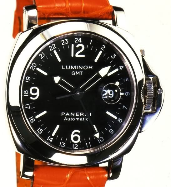
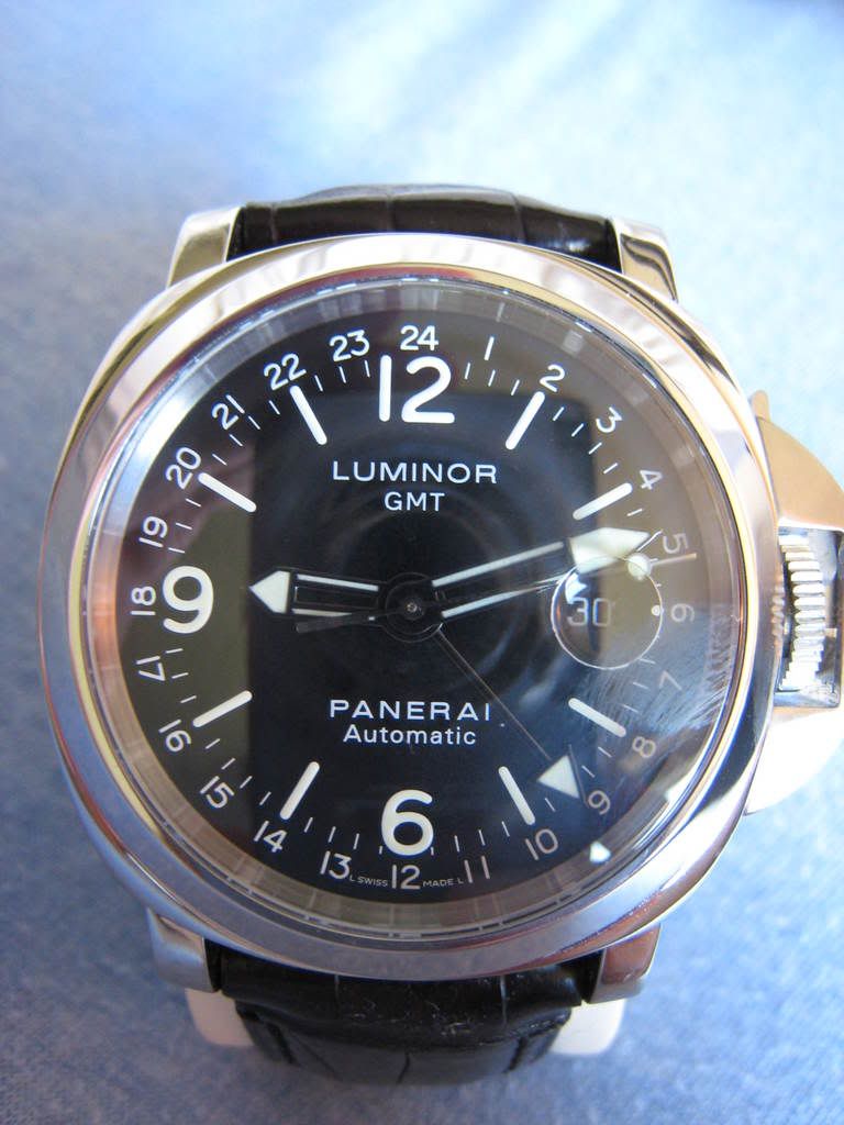
I am about to send out a PAM 63 to be completely modded, but I need to resolve one issue before I do. I have two dials one is from Davidsen and the other one came with the watch. The Davidesen dial has great lume, but is very green (even when it has not been exposed to light). So I was going to have it relummed with a different mixture in order to get it closer to gen. However, when I began looking at the dials they seem to have different fonts (manly in size of the logo and GMT hours). I have been comparing both of them to the gen and I keep getting more confused. Could you guys chime in and tell me what you think. I have attached pics of the gen and both dials. Which dial is closest to the gen.
Thank you in advance for you help,
Dave
Gen

Dial 1

Dial 2

I am about to send out a PAM 63 to be completely modded, but I need to resolve one issue before I do. I have two dials one is from Davidsen and the other one came with the watch. The Davidesen dial has great lume, but is very green (even when it has not been exposed to light). So I was going to have it relummed with a different mixture in order to get it closer to gen. However, when I began looking at the dials they seem to have different fonts (manly in size of the logo and GMT hours). I have been comparing both of them to the gen and I keep getting more confused. Could you guys chime in and tell me what you think. I have attached pics of the gen and both dials. Which dial is closest to the gen.
Thank you in advance for you help,
Dave
Gen

Dial 1

Dial 2

