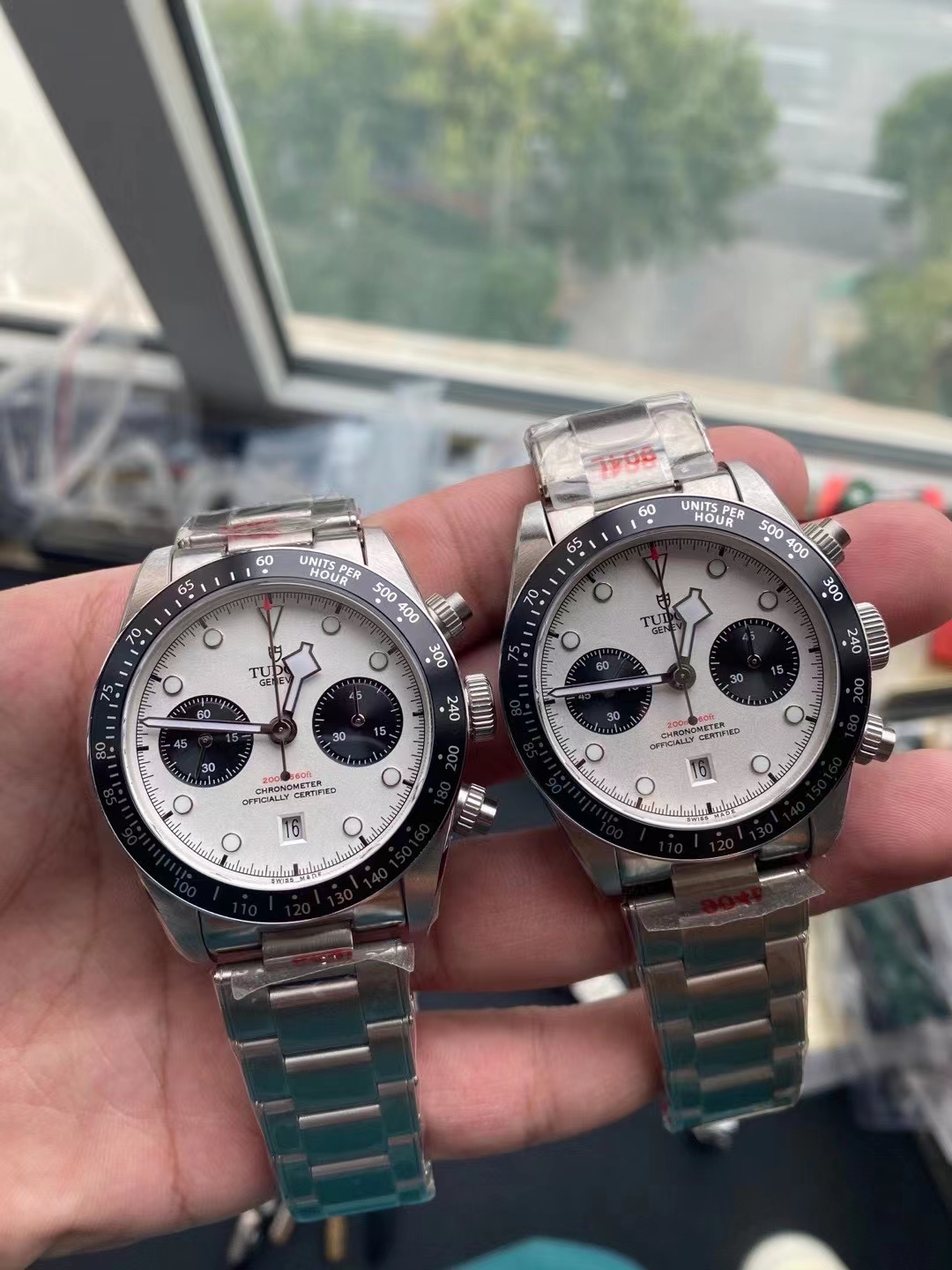
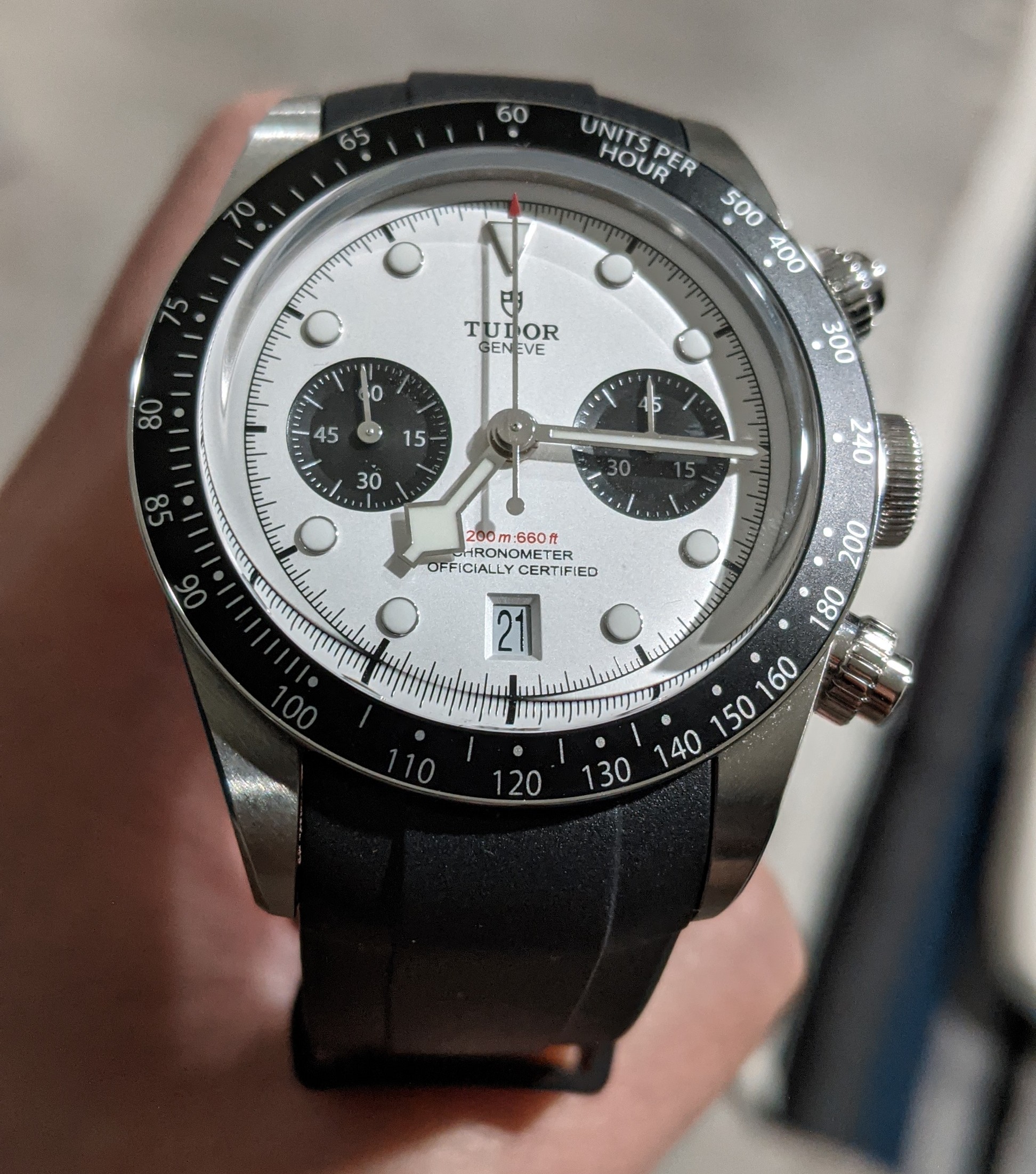
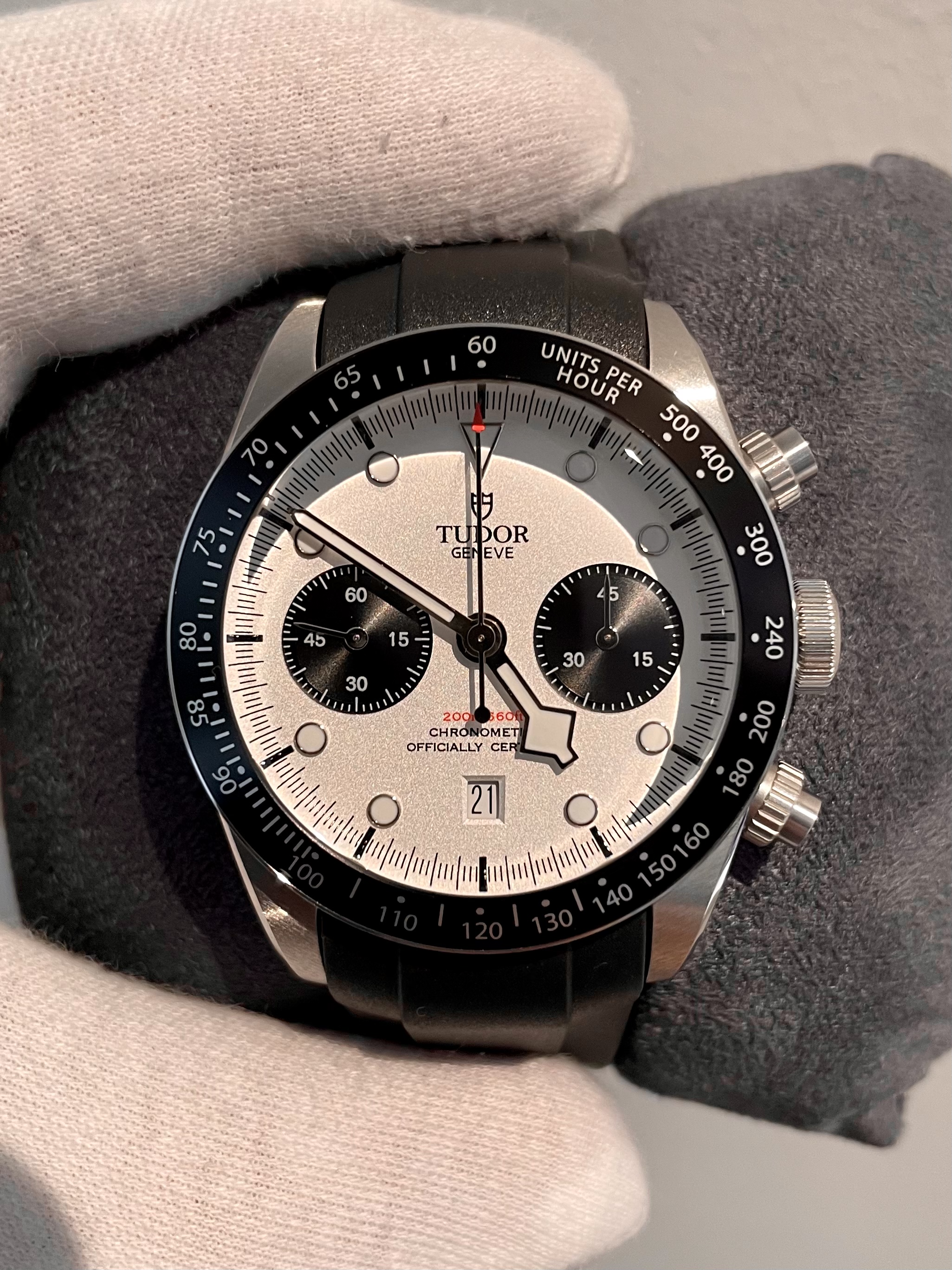
Here is my take!
My Gen for reference -
https://clickpix.org/images/jUFWZp.jpg
1. All fonts used on this rep are off. They didn't even try
to match them it seems like. "TUDOR" on the dial is too
big (shield logo also is too big) and too close to each
other compared to Gen. "200m: 660" on rep "200m :660"
on gen and the font is wrong (again). "UNITS PER HOUR"
on the bezel - "HOUR" font is wrong and there is too
much spacing between 0 and U. Too many to list...
2. Sunken and wrong font on the DW. Date window is
also too short compared to gen
3. Either the bezel insert is slightly too wide or the text
on the bezel is placed to close to the center. There is too
much spacing between the outer edges of the bezel and
the numbers/letters. Edit: also missing the two extra
dots around 180.
4. Rep looks to have just flat black subdials. Gen has
subdials that are recessed into the dial (they give it more
depth and unique light reflection).
5. Dial color is hard to tell but Gen has a very silverish/
metallic tone to it in person. From the pic above, the rep
dial color looks more white/light ivory tone. Also Gen
dial has a very subtle texture/sheen to it. Rep dial above
looks pretty flat.
6. SEL gap is also on gens but rep above looks much
more pronounced. Lugs are too long.
7. Rose logo on the crown on Gen is not engraved like the
rep. It feels 3D when you put your finger over it.
8.Pushers on rep look a bit less rounded. Also I can't tell
for sure but it looks like they're using brushed stainless
steel - Gen is polished. Also the length seems a bit too
long


