Introducing the Carrera Calibre 1887 41mm
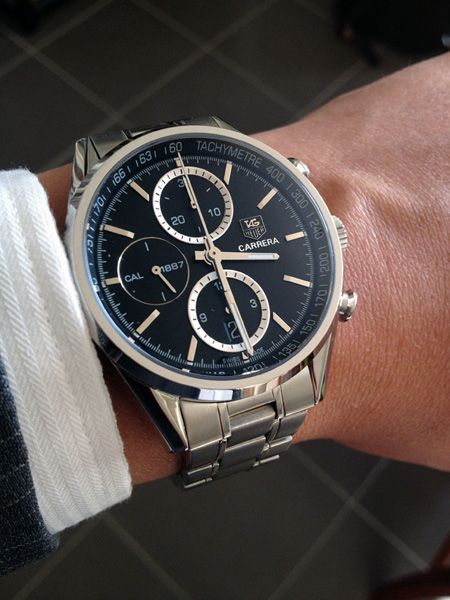
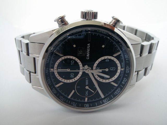
I was browsing through the TAG section of a dealer's website when this watch caught my eye. Not having done any research previously on the gen, this replica still looked really attractive and I placed my order for it after only a little deliberation. I can't say I'm disappointed; it looks really great in the flesh as you can see from the picture above. It has great presence on the wrist and is definitely a worthy addition to the collection.
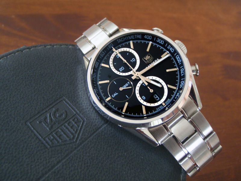
Presenting the TAG Heuer Carrera Calibre 1887 Chronograph 41mm – this is a replica of the V3 Carrera Calibre 1887 Chronograph 41mm. I'll give you the bottom line up front: this is not the most accurate replica ever. In fact, there are many inaccuracies when comparing this rep to the gen and some are quite glaring. Nevertheless, it's still a fine looking watch in its own right and with great build quality.
Background: the various versions of the watch to date

The gen Carrera Calibre 1887 41mm's initial design (V1) is shown the far left of the picture above. This was not a production version and had the tachy scale on the bezel. Feedback from retailers pointed out the similarity of this to the normal Calibre 16 Carrera. So, in order to distinguish the two models, TAG removed the tachymetre scale and made the outer bezel thinner. This resulted in V2 of the watch as shown in the middle. Many have stated a preference for this version with the cleaner overall look to the watch face. V2 is a production version with limited availability in only certain countries.
V3 (pictured on the far right) is the current production version. Here the tachy scale has been brought back because its designers wanted to re-acknowledge Carrera's racing heritage, but has been placed on the inner bezel instead. Another change is the slightly sunken flying-seconds sub-dial at 9 o'clock.
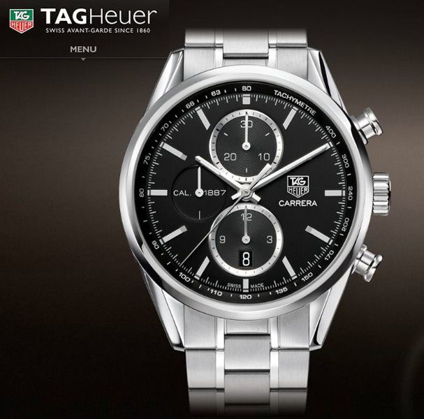
However, note again that there is yet another difference between the actual production model and the evolution photo series above. The TAG Heuer logo and Carrera lettering in the actual production watch has been moved down slightly here, rather than having the "CAL 1887", "CARRERA" and 3 o'clock marker lining up horizontally across the dial.
Overall impressions: the dial face
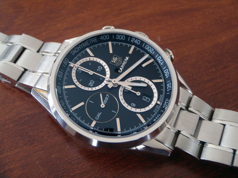
Firstly, the dial face itself is very attractive. The polished hands, applied hour markers and sub-dials stand out clearly from the black dial and are really eye-catching. The sapphire crystal with AR coating does a wonderful job of allowing the elements below stand out. The thin design of the outer bezel also makes the watch face look larger and feel more "open", belying its 41mm size.
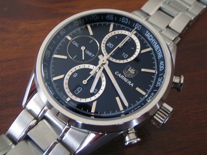
An obvious (and most noticeable) discrepancy between the rep here and the gen is the size of the printing on the tachymetre scale. The printing of the actual lettering and numbers are humungous on the rep when compared to the gen! But whilst this print size is highly inaccurate, I did find it to be easily readable on my wrist when I timed a 1 km run on the highway in my vehicle going at 110 kph. It worked great, I thought; I'd imagine it would be much harder to read with the much smaller font on the gen.
Other inaccuracies when compared to the gen would be the sub-dials (the 12 and 6 o'clock sub-dials on the rep look almost metallic white whereas the gen's are polished steel, and the sunken sub-dial at 9 o'clock on the gen does not have the polished outline of the rep) and the logo and lettering alignment (the production gen’s being a little bit lower than on the rep).
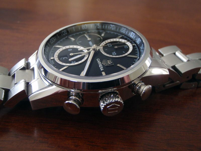
The watch has a domed sapphire crystal and the AR coating does a remarkable job of reducing glare and setting off the elements underneath.
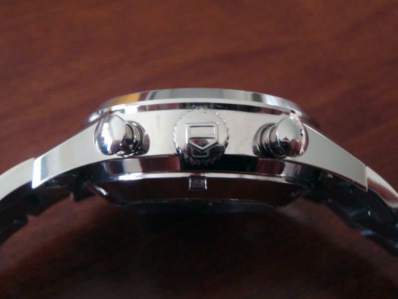
As far as I can tell, the chrono pushers and crown are accurate to gen, as are the overall case dimensions.
Showing off: the clear caseback
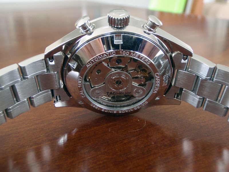
The watch has a clear caseback, like the gen, which allows the movement to be seen in action.
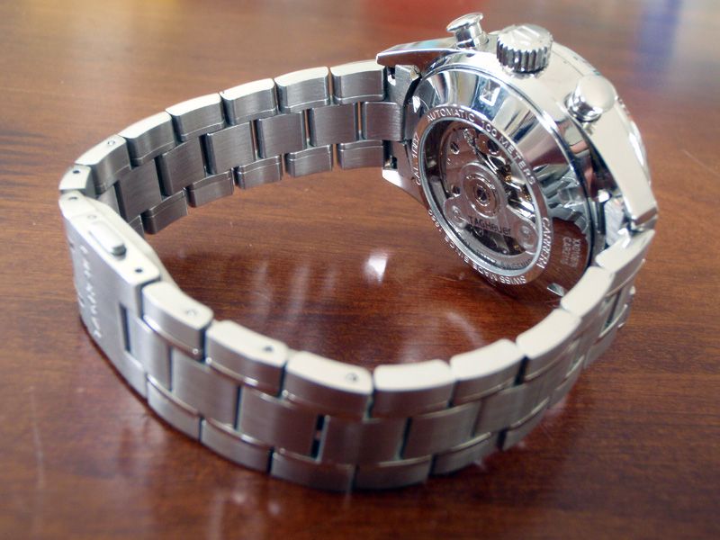
I know a lot of people like clear casebacks but really, this can only be appreciated when the watch is not being worn. I've had quite a few people ooh-ing and ahhh-ing when they see the movement through the back; I doubt that any of them knew they were looking at a clone 7750 movement rather than TAG's Calibre 1887. More about the movement later.
Applied TAG Heuer logo
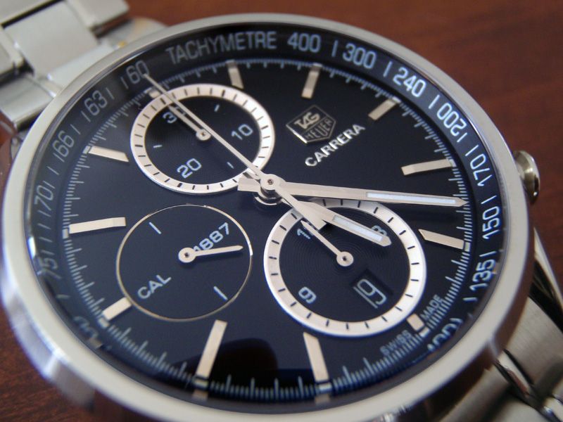
Looking closely at the dial, we can see the applied logo and raised font printing of the CARRERA lettering on the rep.
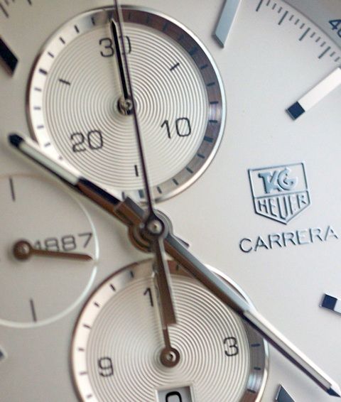 I believe the gen uses a printed logo rather than an applied one (albeit with raised printing to give it a 3D effect).
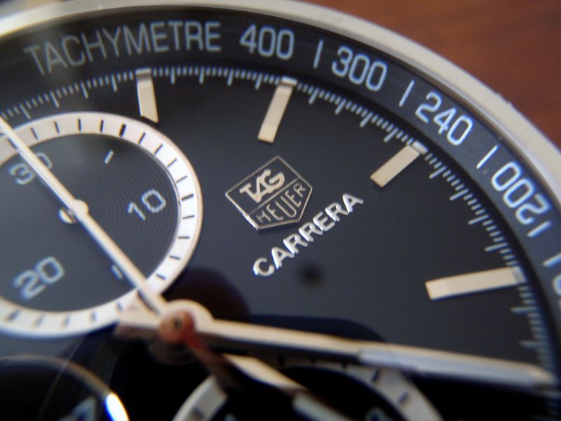
Nevertheless, the applied rep logo still looks great. The same as in my Link Chrono (review here), the applied logo is one of the new ones with correct arrows at the end of the G. With the black background of the logo against the black dial, and with its size from a normal viewing distance when the watch is on the wrist, it’s really hard to see any difference between the applied look and the printed look.
One thing that's always bothered me about the white coloured applied rep TAG logos on white faced dials is the silvered background of those applied logos. They should be white/cream to match the background and the silvering just makes them look completely out of place. Because of this I’m happier sticking to the black ones instead.
Bracelet and clasp
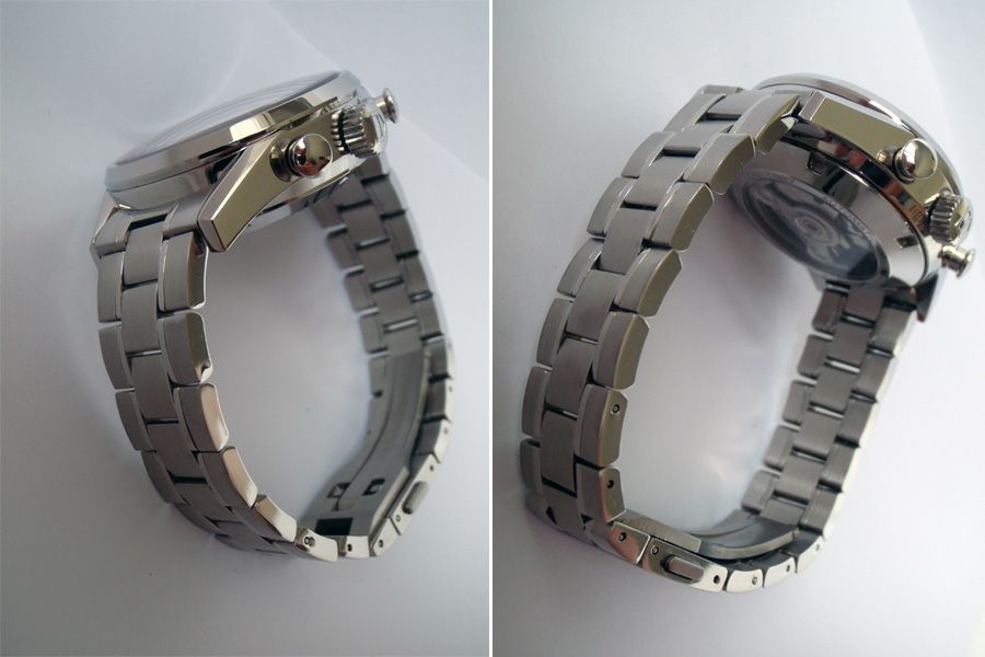
The stainless steel bracelet feels top notch and looks just like the gen with the 5-link style. Some links were a bit stiff as you would expect of the brand new rep, but nothing a good soak in WD40 didn't take care of.
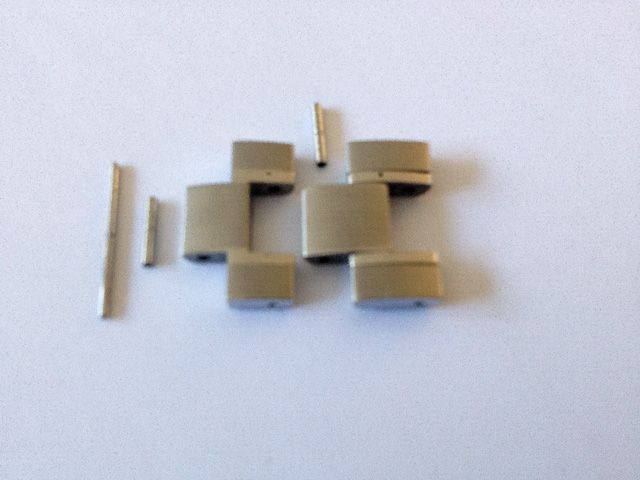
I must admit I did not enjoy resizing the bracelet. The traditional friction pin and sleeve setup is used here and as we know from working on Omega PO bracelets, these can be a right royal pain! I managed to bend the pusher pin on my cheapie resizing tool, and also managed to snap 2 of the bracelet's friction pins in the process.
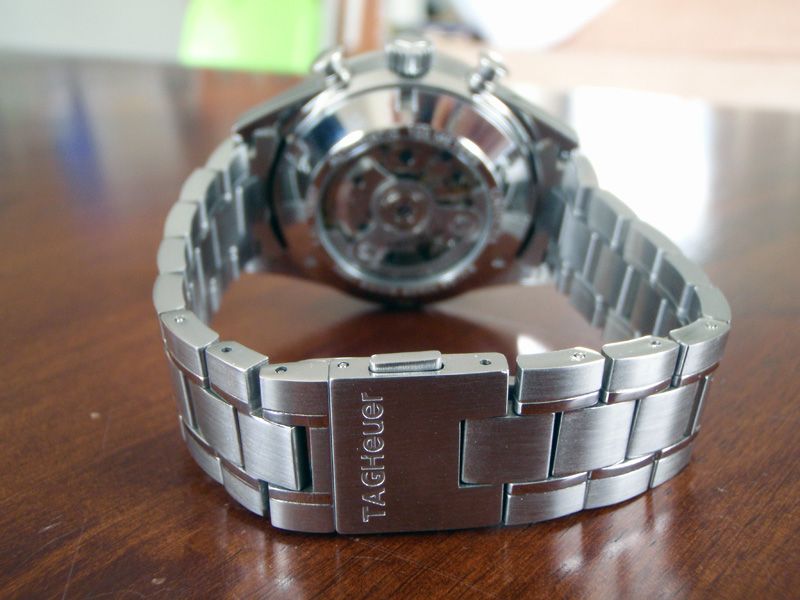
Here's a shot of the clasp. The engraving on the outside is nice, clear and crisp.
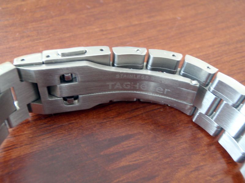
The same can't be said of the inside though. The engraving here looks rather shallow and nowhere near as distinct and clear as what I have on my Link rep.
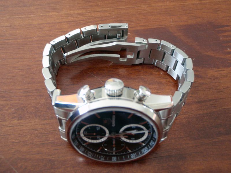
The fold-over deployment clasp is well constructed and works great.
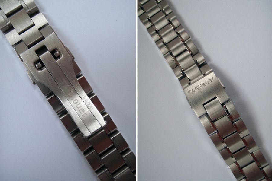
The clasp closes tightly on this rep with no gaps and no play or loose movement when locked in place. It feels secure and can only be released when the buttons on both sides are depressed firmly.
Movement
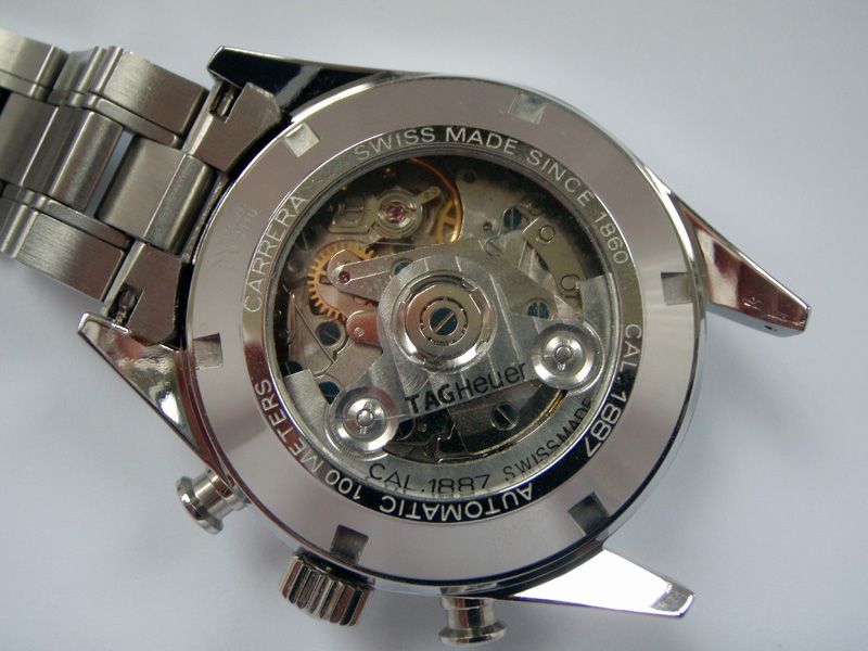
Okay, so we're on to the movement. TAG Heuer's Calibre 1887 is an in-house movement whereas the one in this rep is a clone Asian 7750. It's got a decorated rotor and the usual blue screws.
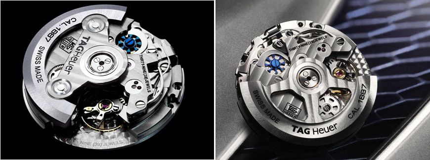
The images above show the gen Calibre 1887 movements. The one on the left depicts an earlier version with the old style rotor which this rep attempts to mimic. Current production gens, however, have the new style rotor as shown on the right.
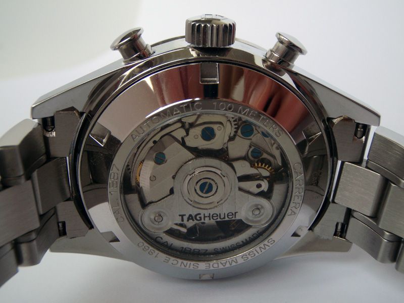
Above is another photo of the display caseback on the rep showing the clone 7750 movement with the old style rotor. To be honest, I seriously doubt very many people would be able to pick up on the different movement when looking at the caseback (this too only if you decide to show it off). How many people would actually know what a Calibre 1887 movement looks like? Everyone who's seen this watch has remarked on how amazing the movement looks with the swinging rotor and the beating of the balance mechanism, the polished gears and parts and even the blue screws! No-one really knows (or cares?) about the Asian clone 7750 movement; they're too busy being blown away by the wow factor of seeing a complex mechanical movement in action.
Wrist presence
While the watch is smaller than the 43mm models such as the Link Chrono and Carrera Calibre 16 Day-Date, it still has great wrist presence.
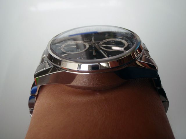
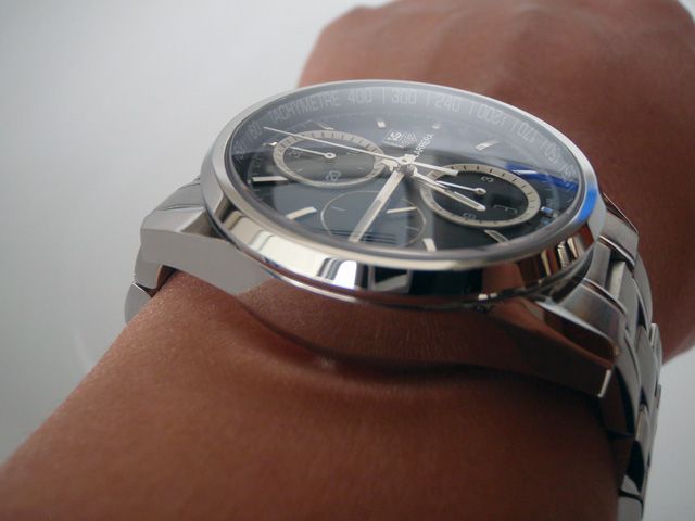
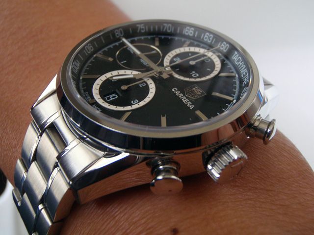
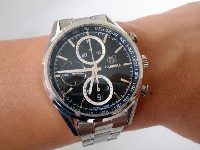 Measuring 41mm in case diameter and 16mm in case height, the watch sits high on my 6.5 inch wrist but (I believe) does not overwhelm it. The beautiful case and polished accents are set off by the predominantly brushed bracelet and the whole look works equally well peeking out of the sleeve of a business suit or with a much more causal weekend polo shirt.
Additional photos
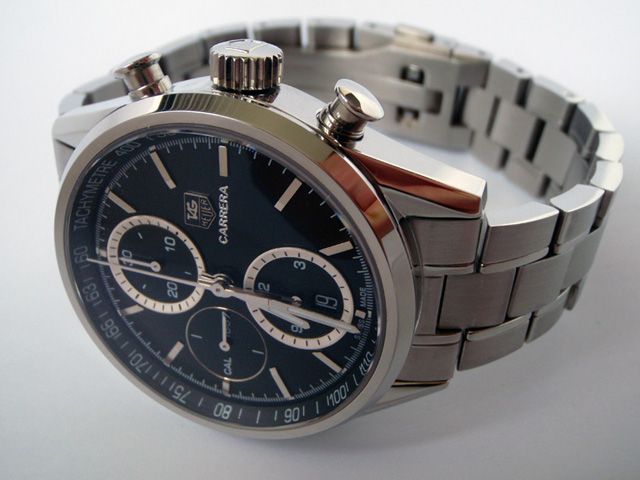
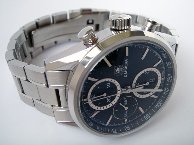
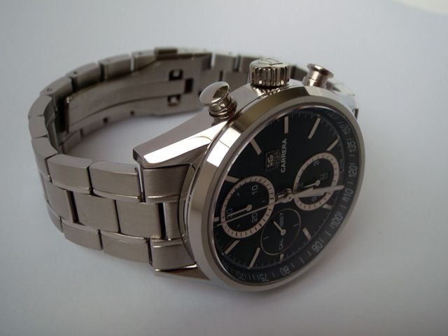
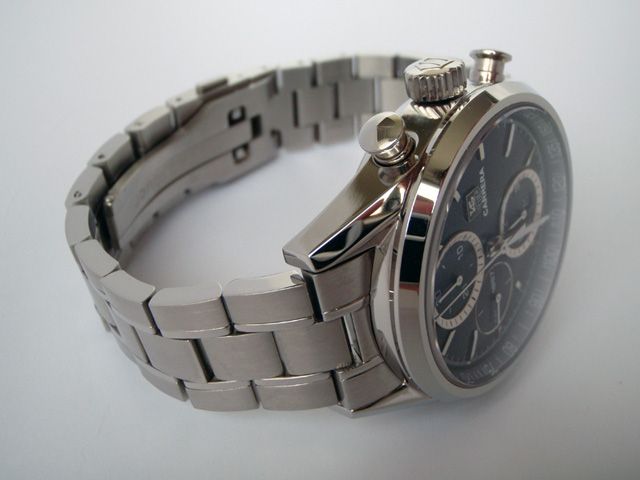
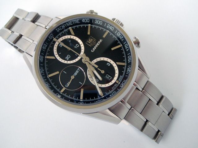
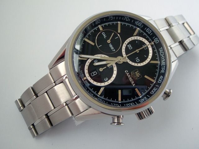
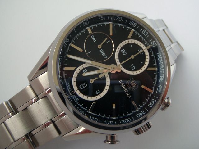
Below are some additional photos of the watch for those who might be interested.
In conclusion
I hope you enjoyed reading this review. There are many inaccuracies on this rep when one compares it to the gen, but that does not change the fact that it is still a quality watch that looks fantastic, has great wrist presence and works well. If the inaccuracies do indeed bother you, then it might be worthwhile holding off until the new 2013 Calibre 1887 TAGs get repped. I honestly believe, however, that all but the most knowledgeable/anal TAGaholics and aficionados will be able to tell the difference "in the wild".
Scav.

I was browsing through the TAG section of a dealer's website when this watch caught my eye. Not having done any research previously on the gen, this replica still looked really attractive and I placed my order for it after only a little deliberation. I can't say I'm disappointed; it looks really great in the flesh as you can see from the picture above. It has great presence on the wrist and is definitely a worthy addition to the collection.

Presenting the TAG Heuer Carrera Calibre 1887 Chronograph 41mm – this is a replica of the V3 Carrera Calibre 1887 Chronograph 41mm. I'll give you the bottom line up front: this is not the most accurate replica ever. In fact, there are many inaccuracies when comparing this rep to the gen and some are quite glaring. Nevertheless, it's still a fine looking watch in its own right and with great build quality.
Background: the various versions of the watch to date

The gen Carrera Calibre 1887 41mm's initial design (V1) is shown the far left of the picture above. This was not a production version and had the tachy scale on the bezel. Feedback from retailers pointed out the similarity of this to the normal Calibre 16 Carrera. So, in order to distinguish the two models, TAG removed the tachymetre scale and made the outer bezel thinner. This resulted in V2 of the watch as shown in the middle. Many have stated a preference for this version with the cleaner overall look to the watch face. V2 is a production version with limited availability in only certain countries.
V3 (pictured on the far right) is the current production version. Here the tachy scale has been brought back because its designers wanted to re-acknowledge Carrera's racing heritage, but has been placed on the inner bezel instead. Another change is the slightly sunken flying-seconds sub-dial at 9 o'clock.

However, note again that there is yet another difference between the actual production model and the evolution photo series above. The TAG Heuer logo and Carrera lettering in the actual production watch has been moved down slightly here, rather than having the "CAL 1887", "CARRERA" and 3 o'clock marker lining up horizontally across the dial.
Overall impressions: the dial face

Firstly, the dial face itself is very attractive. The polished hands, applied hour markers and sub-dials stand out clearly from the black dial and are really eye-catching. The sapphire crystal with AR coating does a wonderful job of allowing the elements below stand out. The thin design of the outer bezel also makes the watch face look larger and feel more "open", belying its 41mm size.

An obvious (and most noticeable) discrepancy between the rep here and the gen is the size of the printing on the tachymetre scale. The printing of the actual lettering and numbers are humungous on the rep when compared to the gen! But whilst this print size is highly inaccurate, I did find it to be easily readable on my wrist when I timed a 1 km run on the highway in my vehicle going at 110 kph. It worked great, I thought; I'd imagine it would be much harder to read with the much smaller font on the gen.
Other inaccuracies when compared to the gen would be the sub-dials (the 12 and 6 o'clock sub-dials on the rep look almost metallic white whereas the gen's are polished steel, and the sunken sub-dial at 9 o'clock on the gen does not have the polished outline of the rep) and the logo and lettering alignment (the production gen’s being a little bit lower than on the rep).

The watch has a domed sapphire crystal and the AR coating does a remarkable job of reducing glare and setting off the elements underneath.

As far as I can tell, the chrono pushers and crown are accurate to gen, as are the overall case dimensions.
Showing off: the clear caseback

The watch has a clear caseback, like the gen, which allows the movement to be seen in action.

I know a lot of people like clear casebacks but really, this can only be appreciated when the watch is not being worn. I've had quite a few people ooh-ing and ahhh-ing when they see the movement through the back; I doubt that any of them knew they were looking at a clone 7750 movement rather than TAG's Calibre 1887. More about the movement later.
Applied TAG Heuer logo

Looking closely at the dial, we can see the applied logo and raised font printing of the CARRERA lettering on the rep.


Nevertheless, the applied rep logo still looks great. The same as in my Link Chrono (review here), the applied logo is one of the new ones with correct arrows at the end of the G. With the black background of the logo against the black dial, and with its size from a normal viewing distance when the watch is on the wrist, it’s really hard to see any difference between the applied look and the printed look.
One thing that's always bothered me about the white coloured applied rep TAG logos on white faced dials is the silvered background of those applied logos. They should be white/cream to match the background and the silvering just makes them look completely out of place. Because of this I’m happier sticking to the black ones instead.
Bracelet and clasp

The stainless steel bracelet feels top notch and looks just like the gen with the 5-link style. Some links were a bit stiff as you would expect of the brand new rep, but nothing a good soak in WD40 didn't take care of.

I must admit I did not enjoy resizing the bracelet. The traditional friction pin and sleeve setup is used here and as we know from working on Omega PO bracelets, these can be a right royal pain! I managed to bend the pusher pin on my cheapie resizing tool, and also managed to snap 2 of the bracelet's friction pins in the process.

Here's a shot of the clasp. The engraving on the outside is nice, clear and crisp.

The same can't be said of the inside though. The engraving here looks rather shallow and nowhere near as distinct and clear as what I have on my Link rep.

The fold-over deployment clasp is well constructed and works great.

The clasp closes tightly on this rep with no gaps and no play or loose movement when locked in place. It feels secure and can only be released when the buttons on both sides are depressed firmly.
Movement

Okay, so we're on to the movement. TAG Heuer's Calibre 1887 is an in-house movement whereas the one in this rep is a clone Asian 7750. It's got a decorated rotor and the usual blue screws.

The images above show the gen Calibre 1887 movements. The one on the left depicts an earlier version with the old style rotor which this rep attempts to mimic. Current production gens, however, have the new style rotor as shown on the right.

Above is another photo of the display caseback on the rep showing the clone 7750 movement with the old style rotor. To be honest, I seriously doubt very many people would be able to pick up on the different movement when looking at the caseback (this too only if you decide to show it off). How many people would actually know what a Calibre 1887 movement looks like? Everyone who's seen this watch has remarked on how amazing the movement looks with the swinging rotor and the beating of the balance mechanism, the polished gears and parts and even the blue screws! No-one really knows (or cares?) about the Asian clone 7750 movement; they're too busy being blown away by the wow factor of seeing a complex mechanical movement in action.
Wrist presence
While the watch is smaller than the 43mm models such as the Link Chrono and Carrera Calibre 16 Day-Date, it still has great wrist presence.


Additional photos
Below are some additional photos of the watch for those who might be interested.


In conclusion
I hope you enjoyed reading this review. There are many inaccuracies on this rep when one compares it to the gen, but that does not change the fact that it is still a quality watch that looks fantastic, has great wrist presence and works well. If the inaccuracies do indeed bother you, then it might be worthwhile holding off until the new 2013 Calibre 1887 TAGs get repped. I honestly believe, however, that all but the most knowledgeable/anal TAGaholics and aficionados will be able to tell the difference "in the wild".
Scav.
