kilowattore
Sales Moderator / Section Moderator
Staff member
Moderator Sales
Section Moderator
Certified
Pre-V dials pt.2 - The new DSN dials
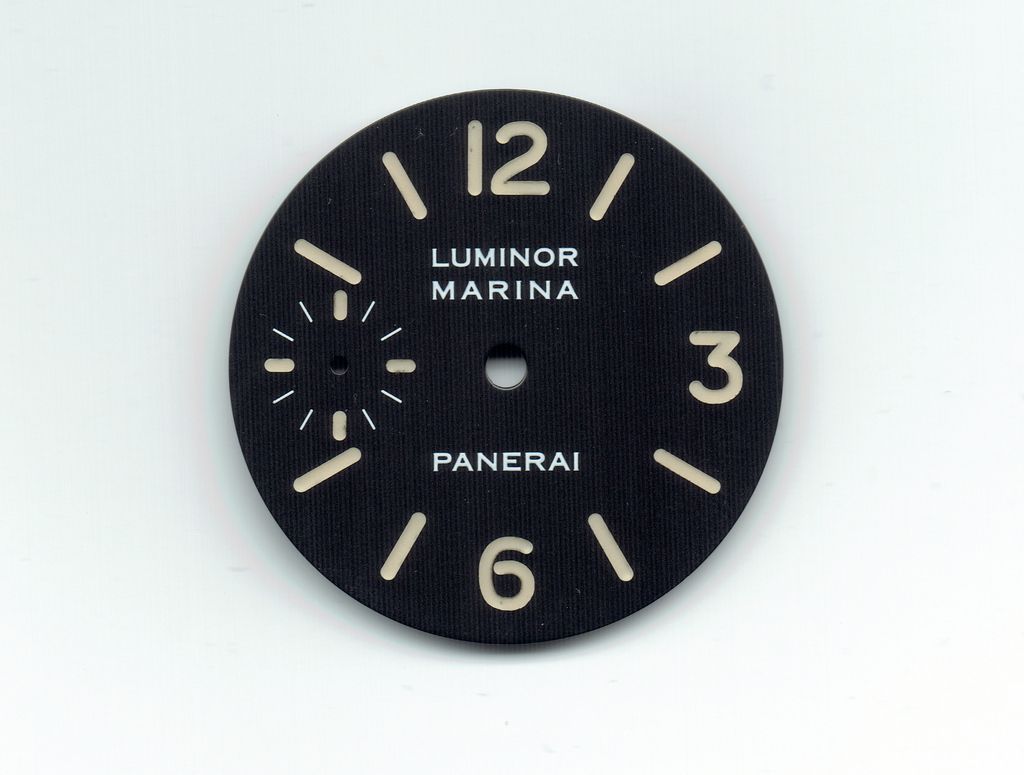
Following my pre-v dials comparison thread earlier this year (HERE), I would like to share with you some of the updated dials I received from Davidsen a few days ago.I will start saying that overall they look like a great improvement on the earlier batches, although they're still not perfect they are way more nicely finished. Here are some shots taken under direct light, in order show more clearly the details on these dials.NEW DSN 5218-201/A DIAL


 For comparison purposes, here are a couple of pics of the earlier batch:OLD DSN 5218-201/A DIAL

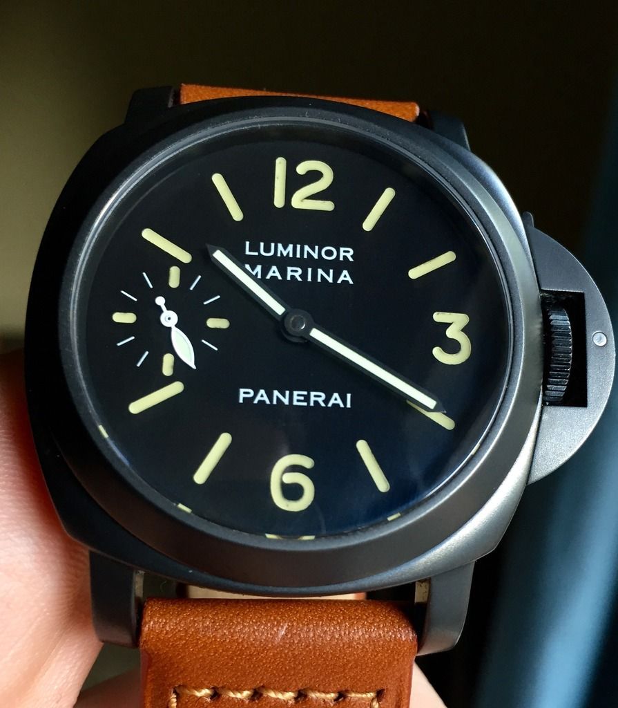
 As you can see, the painted indices are now a way paler creamy tone (great for a "matching" build imho), hard to capture in pics but definitely nice IRL. As you know, old tritium dials developed patina differently over time, with the result that a lot of variations can be observed in the color of indices. I think the reference dial for this new DSN batch might be this one:GEN
 Vannic calls this the "fat index" dial. As you can see numbers and indexes are indeed fatter than most 201/A dials we see (including the great rolli/FGD release), also lume color is a pale creamy yellow.DSN dial does a good job replicating this one:Numbers shape is very good and improved compared to earlier batches, especially in 12 and 3, LP inscription and logo are thin and crisp, raised and glossy. The whole dial has a nice matte black finish, way better than before.NEW DSN 5218-202/A DIAL


 Again a great starting point for a matching dial 202/A build. Slightly thinner indexes and numbers compared to above 201/A dial, but all the other features remain the same: Great looking thin and glossy inscriptions, great matteblack finish. 12 shape is good but is apparently missing the improvements of above 201/A dial.Here's Vannic's 202/A matching dial:


 This 203/A dial looks to be an intermediate batch, or maybe a sort of experiment, since it looks to have a completely different structure compared to the new 201/A and 202/A dials. Also, I think this suits a non-matching build instead of matching due to the darker shade of indexes and numbers.It's main point of strength are the LP MARINA inscriptions, they are just top notch, super glossy and noticeably raised.Pity for the "sausage" style of paint application and for that "rim" around the paint that reminds me of the old 036 and 082 DSN dials, not very accurate. If it would have been closer to the painted area...And Vannic's 203/A (man, this guy is the luckiest man on earth! :lol


