I was just going off the pics that Ale posted.
Maybe I was explaining wrong but I can see a difference.
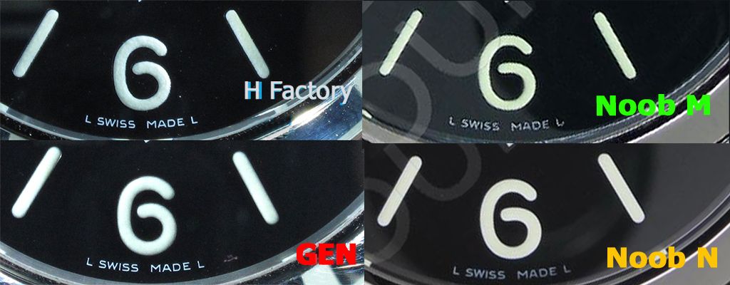
I downloaded a google app to try and illustrate. The lines aren't exact/perfectly N-S, so there is definitely some error. Maybe someone with/has experience with autoCAD can do up a better more exact comparison. (also: numbers are arbitrary)
Not really clear which is better but I still think gen has a smaller spacing.
Hi emmune
Many thanks this is an interesting study
I hope you have take the measurements directly from the pics, but I have tried to have the same scale but I have not made a perfect work in order to start a study of dimmensions like yours.
Anyway your study is valid and we can take conclusions.
- The 6 marker font is smaller in H maker and higher in Noob
- It seems is clear that the font size is more acurate in Noob
- It seems that SWISS MADE is closer in gen and is more accurate the H maker position.
Anyhow not only the dimensions are important in a dial. We need also considering: font Shape, font thickness, Lume application, lume colour, overall positions, texture of the surface, contour of the markers, dial colour...
Bearing in mind all these considerations, and this is what Rwolf and me are saying, the Nood seems superior to the H maker. And this is the first case in a sausage dial.
MANY THANKS for your effort and info.
ALE
")