- 18/1/11
- 19,846
- 423
- 83
Dial Review of PAM 449 Replica - Release July 2014
This is a review of the PAM 449 rep S.L.C. DIAL written as a continuation of the nice Pictorial and good review by RWI’s member firesuite as follows:
http://forum.replica-watch.info/vb/showthread.php?t=191076
I have used rep firesuite’s pics to make the comparisons.
DIAL LAYOUT
As we can see in below comparison Figure 1, there are no significant differences between layouts of both dials.
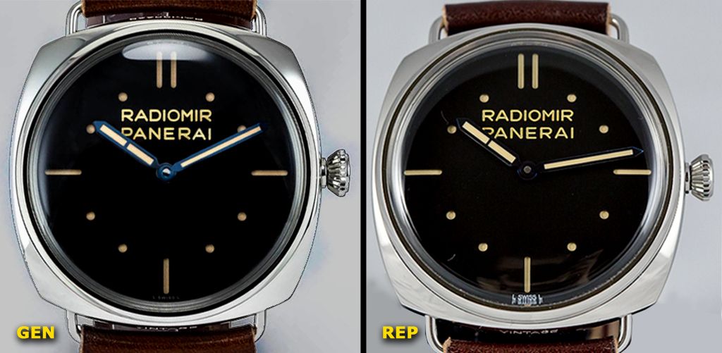
Figure 1 - PAM 449 – DIAL LAYOUT – GEN- REP COMPARISON
I have checked layout accuracy, drawing lines in the pics by Photoshop, to assure similarity, but in order not to be boring, I think it is no necessary to show them because the accuracy is evident.
Rep inscriptions and markers (either sticks or dots) are well placed and overall layout is accurate.
SANDWICH CUTOUTS: STICK AND DOTS
All rep markers, either sticks or dots, are well defined and very sharp. Contours of the cutouts are very clean and nicely made, just like gen ones. It is possible that rep cutouts are a bit thicker, maybe due to different lighting conditions but anyway few noticeable See Figure 2.
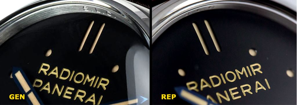
Figure 2 - PAM 449 – SANDWICH CUTOUTS – GEN- REP COMPARISON
The thickness of the upper layer of the rep sandwich is the same as gen and you cannot see differences on quality. Rep dial is an awesome build in this regard. See below Figure 3.
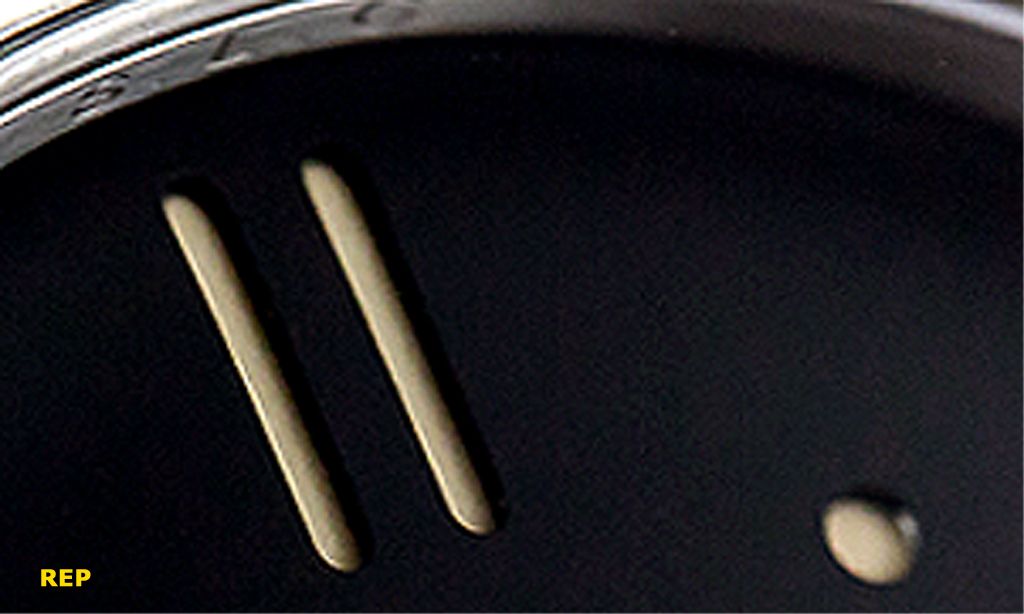
Figure 3 - PAM 449 – THE AWESOME REP CUTOUTS
RADIOMIR PANERAI ENGRAVINGS ON DIAL
In the same way as PAM 372, this engraved inscription is an interesting feature of this watch.
Gen RADIOMIR PANERAI engraved inscription is really nice, with awesome finish, completely uniform, sharp, crisp and very deep with a strong 3D effect. Yellowish paint is also applied completely uniform. As we can see in below Figures 4a-4b & 4c of these awesome Gen engravings.
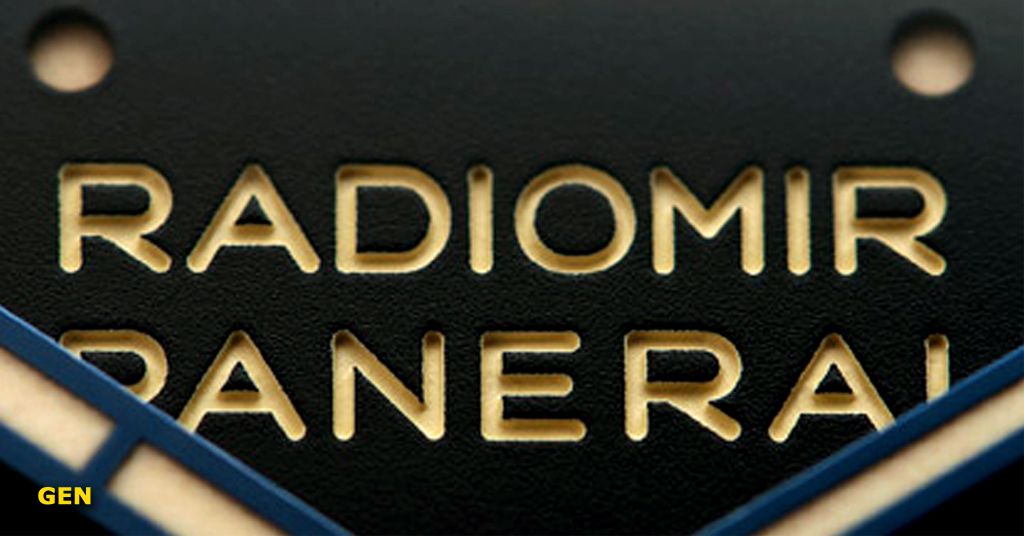
Figure 4a - PAM 449 – THE AWESOME GEN RADIOMIR-PANERAI ENGRAVINGS
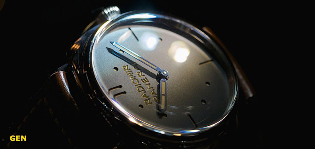
Figure 4b - PAM 449 – THE AWESOME GEN RADIOMIR-PANERAI ENGRAVINGS
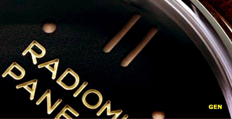
Figure 4c - PAM 449 – THE AWESOME GEN RADIOMIR-PANERAI ENGRAVINGS
As you can see in above Figures Gen engravings don’t need additional comments, pics talk by themselves
Rep RADIOMIR PANERAI engraved inscription is not at all bad, indeed it seems better than the best of PAM 372, but is not as sharp, crisp, deep and uniform as Gen engravings. You cannot doubt that gen inscriptions are engraved under any light condition an effect of 3D is strong and always present. Rep inscription engravings could disappear under some light conditions.
Gen engravings are “U” shaped and perfect, whereas rep engravings seem more “V” shaped and unequal, making that the inner part of the engravings is very uniform and really marked in gen, whereas in rep have some differences and is not so marked. Besides, rep paint application is not uniform like in gen, and some lacks of paint can appear in the inner part of the engravings. See “M” and other characters in below Figure 5, where can be seen some black points with missing paint.
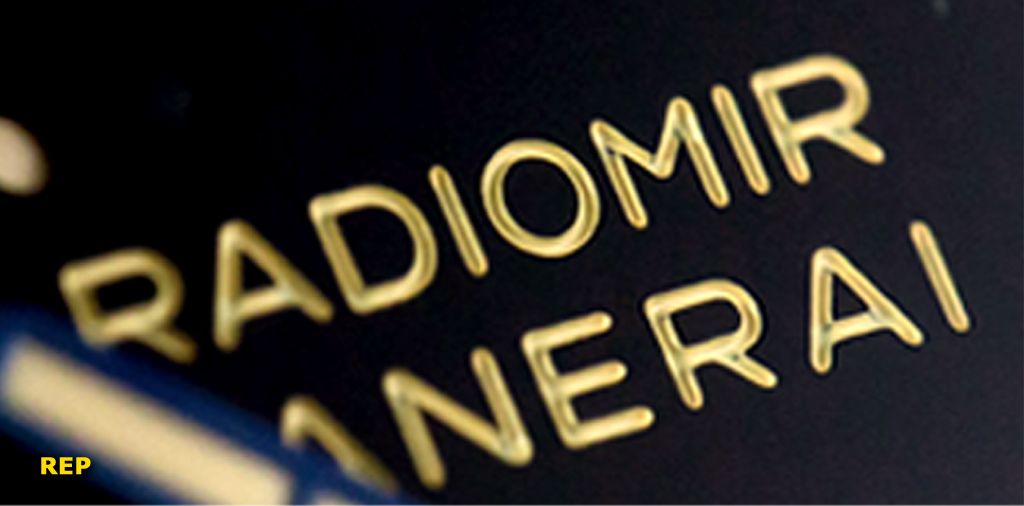
Figure 5 - PAM 449 – REP RADIOMIR-PANERAI ENGRAVINGS
Regarding fonts accuracy there are more differences. Rep fonts are a little bit wider but they are also smaller, as we can see in below Figures 6 & 7 with the green reference lines.
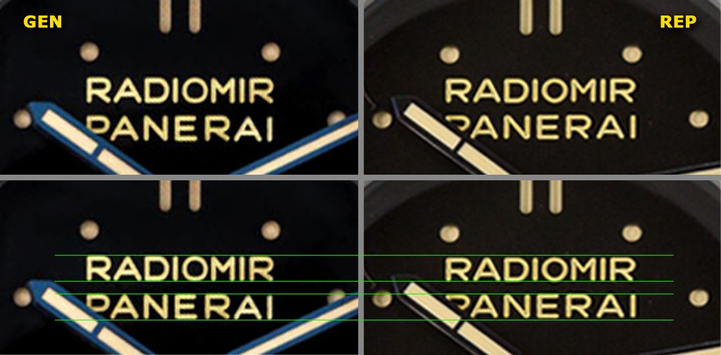
Figure 6 - PAM 449 – FONTS ACCURACY OF ENGRAVINGS – GEN-REP COMPARISON
Fonts shape presents also some differences.
Very noticeable in “R” (shorter tail but longer inner upper part), see orange reference line in below Figure 7.
The same occurs with the inner part of “P” which is clearly longer in rep.
It is also noticeable in “A”, because horizontal bar of this character is placed very low in rep, leaving a much bigger inner triangle in the rep, which is indicated by a yellow arrow. With a blue arrow we are indicating the different “A” tip: sharp in gen and blunt in rep. See Figure 7.
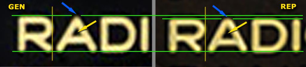
Figure 7 - PAM 449 – DETAILS OF FONTS ACCURACY OF ENGRAVINGS – GEN-REP COMPARISON
There are also differences in “E” “M” and even “O” but much less noticeable
Those font differences are few noticeable in practice, but they actually exist and can be used to tell the reps or for identification purposes.
COLOUR OF LUME, INSCRIPTIONS AND DIAL SURFACE
LUME and RADIOMIR PANERAI ENGRAVINGS COLOUR
Markers lume is ECRU like gen, whereas RADIOMIR PANERAI engraving is clearly yellowish like gen. Maybe the contrast is more obvious in rep where both colours are more evident. But this subject is difficult to say without a side by side comparison. Anyway overall very accurate colours very similar to the gen.
DIAL SURFACE COLOUR
Surface dial is black like gen, but the gen has a texture, see Figure 4a, which is less marked in rep. This is few noticeable without enlarged pics or under nuked eye.
L SWISS L INSCRIPTION @6
This is maybe the most noticeable flaw of this rep dial. It can be realized even without direct pic comparison
In Figure 1 of dials comparison, L SWISS L rep inscription is a bit distorted by the edge of the Plexy crystal. But the main problem is that rep inscription is white whereas gen inscription is not so light and remains much less evident in the overall view of the PAM 449 dial on Figure 1. Therefore, gen is always clearly less light, way more discreet and less obvious.
HANDS AND CANNON PINION
Hands shape is good enough, with less sharp edges (as usually) and a bit thicker lume (as usually). It is very difficult to talk about the blue colour, because depending on light conditions varies from light Blue to black. But following comments from owners of reps PAM 448 the colour is accurate.
CP has a flaw, because rep CP is smaller than gen. But in some light conditions, and following projectologist comments, the differences are not so noticeable and this flaw doesn't seem as serious as we thought. Indeed I have seen some rep CP pics that seemed like gen.
REHAUT
S.L.C. engraving in rehaut is nice, well placed and accurate, a bit less deep and crisp in rep, as we can see in several of above Figures.
CONCLUSIONS
Overall PAM 449 rep dial from July 2014 seems better than expected and we should be glad to see the quality of these last reps of PAM 448 and 449. Layout, colours are very accurate and mainly sandwich cutouts quality is awesome and very gen-like
I had given to PAM 449 an evaluation slightly smaller than PAM 448, but considering this last dial review and firesuite pics and review above mentioned, I should to consider this difference of evaluation. We will see bearing in mind the comments about this review and firesuite’s one.
Thanks for reading
ALE
This is a review of the PAM 449 rep S.L.C. DIAL written as a continuation of the nice Pictorial and good review by RWI’s member firesuite as follows:
http://forum.replica-watch.info/vb/showthread.php?t=191076
I have used rep firesuite’s pics to make the comparisons.
DIAL LAYOUT
As we can see in below comparison Figure 1, there are no significant differences between layouts of both dials.
Figure 1 - PAM 449 – DIAL LAYOUT – GEN- REP COMPARISON
I have checked layout accuracy, drawing lines in the pics by Photoshop, to assure similarity, but in order not to be boring, I think it is no necessary to show them because the accuracy is evident.
Rep inscriptions and markers (either sticks or dots) are well placed and overall layout is accurate.
SANDWICH CUTOUTS: STICK AND DOTS
All rep markers, either sticks or dots, are well defined and very sharp. Contours of the cutouts are very clean and nicely made, just like gen ones. It is possible that rep cutouts are a bit thicker, maybe due to different lighting conditions but anyway few noticeable See Figure 2.
Figure 2 - PAM 449 – SANDWICH CUTOUTS – GEN- REP COMPARISON
The thickness of the upper layer of the rep sandwich is the same as gen and you cannot see differences on quality. Rep dial is an awesome build in this regard. See below Figure 3.
Figure 3 - PAM 449 – THE AWESOME REP CUTOUTS
RADIOMIR PANERAI ENGRAVINGS ON DIAL
In the same way as PAM 372, this engraved inscription is an interesting feature of this watch.
Gen RADIOMIR PANERAI engraved inscription is really nice, with awesome finish, completely uniform, sharp, crisp and very deep with a strong 3D effect. Yellowish paint is also applied completely uniform. As we can see in below Figures 4a-4b & 4c of these awesome Gen engravings.
Figure 4a - PAM 449 – THE AWESOME GEN RADIOMIR-PANERAI ENGRAVINGS
Figure 4b - PAM 449 – THE AWESOME GEN RADIOMIR-PANERAI ENGRAVINGS
Figure 4c - PAM 449 – THE AWESOME GEN RADIOMIR-PANERAI ENGRAVINGS
As you can see in above Figures Gen engravings don’t need additional comments, pics talk by themselves
Rep RADIOMIR PANERAI engraved inscription is not at all bad, indeed it seems better than the best of PAM 372, but is not as sharp, crisp, deep and uniform as Gen engravings. You cannot doubt that gen inscriptions are engraved under any light condition an effect of 3D is strong and always present. Rep inscription engravings could disappear under some light conditions.
Gen engravings are “U” shaped and perfect, whereas rep engravings seem more “V” shaped and unequal, making that the inner part of the engravings is very uniform and really marked in gen, whereas in rep have some differences and is not so marked. Besides, rep paint application is not uniform like in gen, and some lacks of paint can appear in the inner part of the engravings. See “M” and other characters in below Figure 5, where can be seen some black points with missing paint.
Figure 5 - PAM 449 – REP RADIOMIR-PANERAI ENGRAVINGS
Regarding fonts accuracy there are more differences. Rep fonts are a little bit wider but they are also smaller, as we can see in below Figures 6 & 7 with the green reference lines.
Figure 6 - PAM 449 – FONTS ACCURACY OF ENGRAVINGS – GEN-REP COMPARISON
Fonts shape presents also some differences.
Very noticeable in “R” (shorter tail but longer inner upper part), see orange reference line in below Figure 7.
The same occurs with the inner part of “P” which is clearly longer in rep.
It is also noticeable in “A”, because horizontal bar of this character is placed very low in rep, leaving a much bigger inner triangle in the rep, which is indicated by a yellow arrow. With a blue arrow we are indicating the different “A” tip: sharp in gen and blunt in rep. See Figure 7.
Figure 7 - PAM 449 – DETAILS OF FONTS ACCURACY OF ENGRAVINGS – GEN-REP COMPARISON
There are also differences in “E” “M” and even “O” but much less noticeable
Those font differences are few noticeable in practice, but they actually exist and can be used to tell the reps or for identification purposes.
COLOUR OF LUME, INSCRIPTIONS AND DIAL SURFACE
LUME and RADIOMIR PANERAI ENGRAVINGS COLOUR
Markers lume is ECRU like gen, whereas RADIOMIR PANERAI engraving is clearly yellowish like gen. Maybe the contrast is more obvious in rep where both colours are more evident. But this subject is difficult to say without a side by side comparison. Anyway overall very accurate colours very similar to the gen.
DIAL SURFACE COLOUR
Surface dial is black like gen, but the gen has a texture, see Figure 4a, which is less marked in rep. This is few noticeable without enlarged pics or under nuked eye.
L SWISS L INSCRIPTION @6
This is maybe the most noticeable flaw of this rep dial. It can be realized even without direct pic comparison
In Figure 1 of dials comparison, L SWISS L rep inscription is a bit distorted by the edge of the Plexy crystal. But the main problem is that rep inscription is white whereas gen inscription is not so light and remains much less evident in the overall view of the PAM 449 dial on Figure 1. Therefore, gen is always clearly less light, way more discreet and less obvious.
HANDS AND CANNON PINION
Hands shape is good enough, with less sharp edges (as usually) and a bit thicker lume (as usually). It is very difficult to talk about the blue colour, because depending on light conditions varies from light Blue to black. But following comments from owners of reps PAM 448 the colour is accurate.
CP has a flaw, because rep CP is smaller than gen. But in some light conditions, and following projectologist comments, the differences are not so noticeable and this flaw doesn't seem as serious as we thought. Indeed I have seen some rep CP pics that seemed like gen.
REHAUT
S.L.C. engraving in rehaut is nice, well placed and accurate, a bit less deep and crisp in rep, as we can see in several of above Figures.
CONCLUSIONS
Overall PAM 449 rep dial from July 2014 seems better than expected and we should be glad to see the quality of these last reps of PAM 448 and 449. Layout, colours are very accurate and mainly sandwich cutouts quality is awesome and very gen-like
I had given to PAM 449 an evaluation slightly smaller than PAM 448, but considering this last dial review and firesuite pics and review above mentioned, I should to consider this difference of evaluation. We will see bearing in mind the comments about this review and firesuite’s one.
Thanks for reading
ALE
