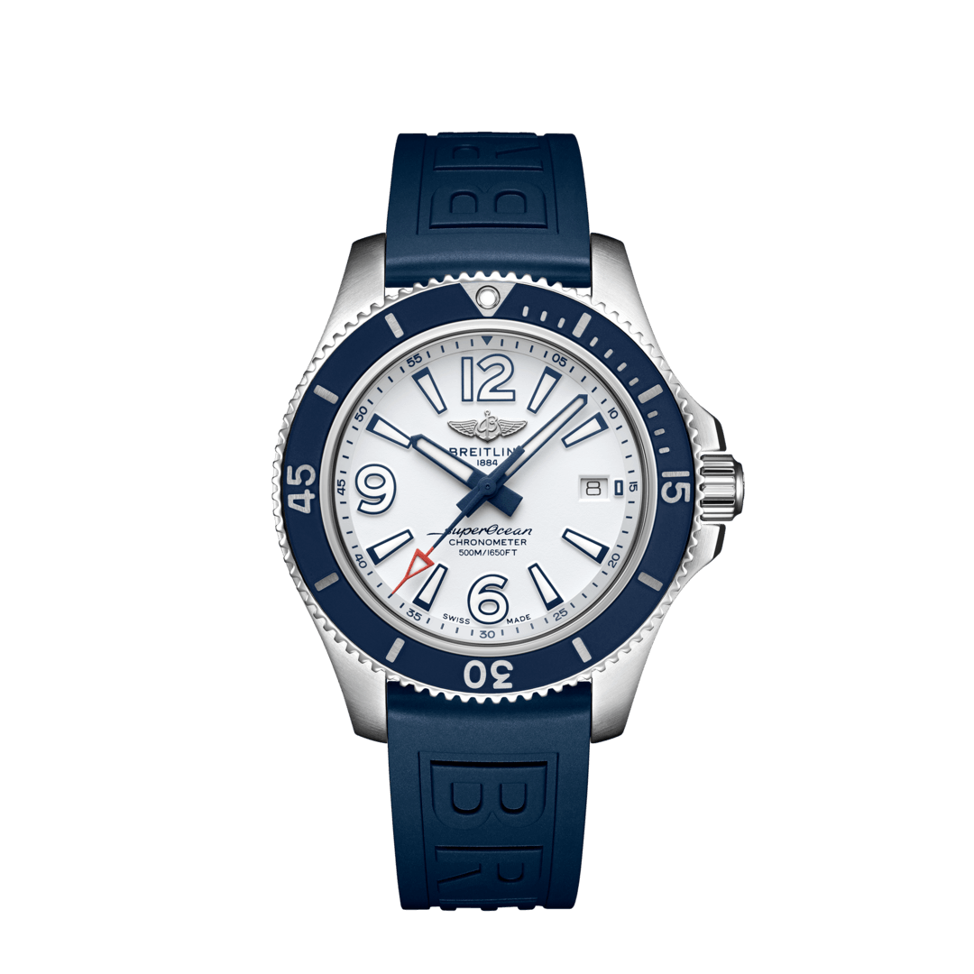
The stick markers are fighting with the numerals - one or the other need to be dominant (preferably the numerals). And the width of the sticks are visually the same width of the hands. The eye doesn’t know where to go first. If they would get the balance of the design right, I would really like it. I love the color scheme! But as it stands, I’m keeping my black and blue SuperOcean II 44s. Even though its a busier design, it is better balanced, and still to me its the easiest dial/bezel to read at a glance. No coincidence I’m wearing one now (out of 30+ watches).


