• Tired of adverts on RWI? - Subscribe by clicking HERE and PMing Trailboss for instructions and they will magically go away!

My Sixth Rep

walden

Active Member
13/5/12
223
0
0
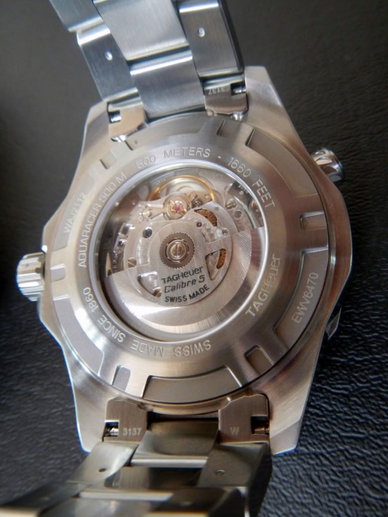
Here is another decent rep added to my growing collection. I find it a bit big on my thin wrist. But I'm getting used to it. It's nicely put together and, like most hollow link bracelets, it feels a bit on the "cheap" side. But so do Rolexes, Breitlings, etc. in this regard.

TD review can be found HERE.

IMG_3254.jpg


IMG_3261.jpg


IMG_3265.jpg


IMG_3266.jpg
 
D

d4m.test

Guest
VERY nice rep, mate! I have the gen (w/ blue dial/bezel and quartz movement). Heavy watch, but very stylish and masculine. Wear it well.

dave
 

AstroAvia

Renowned Member
29/8/08
762
32
28
BRAZIL
As a sixth rep, does it see dead reps?

jokes apart, could you please upload a closeup picture of the logo on the dial? It seems to be the correct G shape, with the complete arrow.

Congrats on a very nice replica!
 

walden

Active Member
13/5/12
223
0
0
As a sixth rep, does it see dead reps?

jokes apart, could you please upload a closeup picture of the logo on the dial? It seems to be the correct G shape, with the complete arrow.

Congrats on a very nice replica!

Yes, it does! LOL :)

I can't find a photo clear enough to show that correctly. But it is the correct "G" with the arrowheads at both endpoints of the letter.

I was wrong! I did find an image clear enough to show it!

IMG_3268crop.jpg
 

AstroAvia

Renowned Member
29/8/08
762
32
28
BRAZIL
Yes, that is the correct logo indeed! Very nice! I wish we could find the source of the logos and buy them to replace the bad ones in the watches we already own...
 

AstroAvia

Renowned Member
29/8/08
762
32
28
BRAZIL
You know, the shape of the logo is nearly perfect, but alas the finish is not. The painting should be a matte grey rather than the silverish hue we see on all the replica logos, correct shape or not. Do you consider modifying this?
 

walden

Active Member
13/5/12
223
0
0
You know, the shape of the logo is nearly perfect, but alas the finish is not. The painting should be a matte grey rather than the silverish hue we see on all the replica logos, correct shape or not. Do you consider modifying this?

I am happy with the watch the way it is. It serves its' purpose for me and it looks quite good to my eye. The only thing I might fix one day is the misaligned bezel marker. But it's not a big priority at the moment.

I took a look at the new version of the gen Aquaracer at an AD a few days ago. I love the new smaller size, but the new look did not grab me as much as the photos of it might have led me to think. :unsure:
 

sauuce

Getting To Know The Place
1/1/12
44
0
6
here's a pic of the gen in blue for reference.
DSCN0906_zpsc032db78.jpg


DSCN0910_zps0dbb5c11.jpg

i honestly think that this rep is as good as it gets.
NEVER gonna get called out unless somebody has a black gen RIGHT next to it.
 

walden

Active Member
13/5/12
223
0
0
here's a pic of the gen in blue for reference.
DSCN0906_zpsc032db78.jpg


DSCN0910_zps0dbb5c11.jpg

i honestly think that this rep is as good as it gets.
NEVER gonna get called out unless somebody has a black gen RIGHT next to it.

That's a really nice one! :D