-
Tired of adverts on RWI? - Subscribe by clicking HERE and PMing Trailboss for instructions and they will magically go away!
You are using an out of date browser. It may not display this or other websites correctly.
You should upgrade or use an alternative browser.
You should upgrade or use an alternative browser.
Latest PAM 177 - A dial question.....
- Thread starter Debellum
- Start date
- 9/12/18
- 2,637
- 11,144
- 113
You're splitting hairs in concerning yourself with that minor detail... As @mrsullivan stated the much more prominent issue with HWF dials are the chunky markers.
Yes , too much probs in my head…You're splitting hairs in concerning yourself with that minor detail... As @mrsullivan stated the much more prominent issue with HWF dials are the chunky markers.
Regard
Junio
Yes, that's right, it's too close.
You can assume that if the cutouts were the correct width, the lettering would appear farther from the bottom of the "6", also did not make a serious comparison, but I do not rule out that the geometry of the font makes it more vertically elongated, because there is a cumulative feeling that the inscription takes up more space.
In the end, the eye does not cling to such differences when the overall proportion of the dial is violated.
I think the cutout situation may seem relative in the photo, unlike the placement of the fonts, but it has a significant effect on the overall perception of the watch, while the correct placement of the L SWISS MADE L would be the icing on the cake.
Treat the PAM177 HWF as an opportunity to own a titanium bettarini from the dealer, brand new, without limits. This possibility was absent for a number of years, and uenna, however, more should not be expected from this.
@KOT1917Yes, that's right, it's too close.
You can assume that if the cutouts were the correct width, the lettering would appear farther from the bottom of the "6", also did not make a serious comparison, but I do not rule out that the geometry of the font makes it more vertically elongated, because there is a cumulative feeling that the inscription takes up more space.
In the end, the eye does not cling to such differences when the overall proportion of the dial is violated.
I think the cutout situation may seem relative in the photo, unlike the placement of the fonts, but it has a significant effect on the overall perception of the watch, while the correct placement of the L SWISS MADE L would be the icing on the cake.
Treat the PAM177 HWF as an opportunity to own a titanium bettarini from the dealer, brand new, without limits. This possibility was absent for a number of years, and uenna, however, more should not be expected from this.
Now I'm looking for a 111 dial by Noob from resellers and TD's.
If I can't find the Nood Dial which Factory can I put on my 177.....?
A better dial than what I have now.
I think it is difficult to find the Noob dial.
In your opinion which one should I fit on mine ?
Logically a factory still exists......
Then, if it doesn't go well I would give it to my best friend @Nikz19 for the jobs.
Tx
Last edited:
Fusible
Renowned Member
- 5/5/22
- 594
- 973
- 93
If the dial and hands bother you, but you love the case set then by all means locate a suitable donor dial and hands (noob or otherwise). I’m currently doing the same thing putting a v3 noob dial and hands into an HWF titanium case set. Without the presence of the CG lever QC issue, the HWF case set was done quite well and very true to gen. I would expect as much as their 111 got quite close and HWF has steadily made some improvements.
Yes, that's right, it's too close.
You can assume that if the cutouts were the correct width, the lettering would appear farther from the bottom of the "6", also did not make a serious comparison, but I do not rule out that the geometry of the font makes it more vertically elongated, because there is a cumulative feeling that the inscription takes up more space.
In the end, the eye does not cling to such differences when the overall proportion of the dial is violated.
I think the cutout situation may seem relative in the photo, unlike the placement of the fonts, but it has a significant effect on the overall perception of the watch, while the correct placement of the L SWISS MADE L would be the icing on the cake.
Treat the PAM177 HWF as an opportunity to own a titanium bettarini from the dealer, brand new, without limits. This possibility was absent for a number of years, and uenna, however, more should not be expected from this.
@KOT1917,
Theoretically, if you had an HWF and had it modded with a high quality custom dial — by a Ukrainian artisan, for example — would it approach NWBIG status? If I understand correctly, they nailed the case and the movement is pretty close.
Personally, I don't. I have a specific attitude towards individual modification. I would do it on the best factory version to invest extra money, risks, expectations in a watch that will really be close to ideal, and not just a compromise that will be slightly different. But this is my personal opinion, I'm sure that people act differently here. Besides, I haven't seen custom dials for 177, for example, to understand whether it is better than the factory NOOB (Time of 177 release) or not. I didn't have the latest HWF at hand, but what I managed to catch was a rough finish movt., the case is not so bad, but still does not come close to the noob of old times. I think this is the most accessible base for modifications, but far from the best.@KOT1917,
Theoretically, if you had an HWF and had it modded with a high quality custom dial — by a Ukrainian artisan, for example — would it approach NWBIG status? If I understand correctly, they nailed the case and the movement is pretty close.
Personally, I don't. I have a specific attitude towards individual modification. I would do it on the best factory version to invest extra money, risks, expectations in a watch that will really be close to ideal, and not just a compromise that will be slightly different. But this is my personal opinion, I'm sure that people act differently here. Besides, I haven't seen custom dials for 177, for example, to understand whether it is better than the factory NOOB (Time of 177 release) or not. I didn't have the latest HWF at hand, but what I managed to catch was a rough finish movt., the case is not so bad, but still does not come close to the noob of old times. I think this is the most accessible base for modifications, but far from the best.
Thank you. Maybe I just stick with my Noob V4.
Hi People
I got the PAM 177 by HWF today.
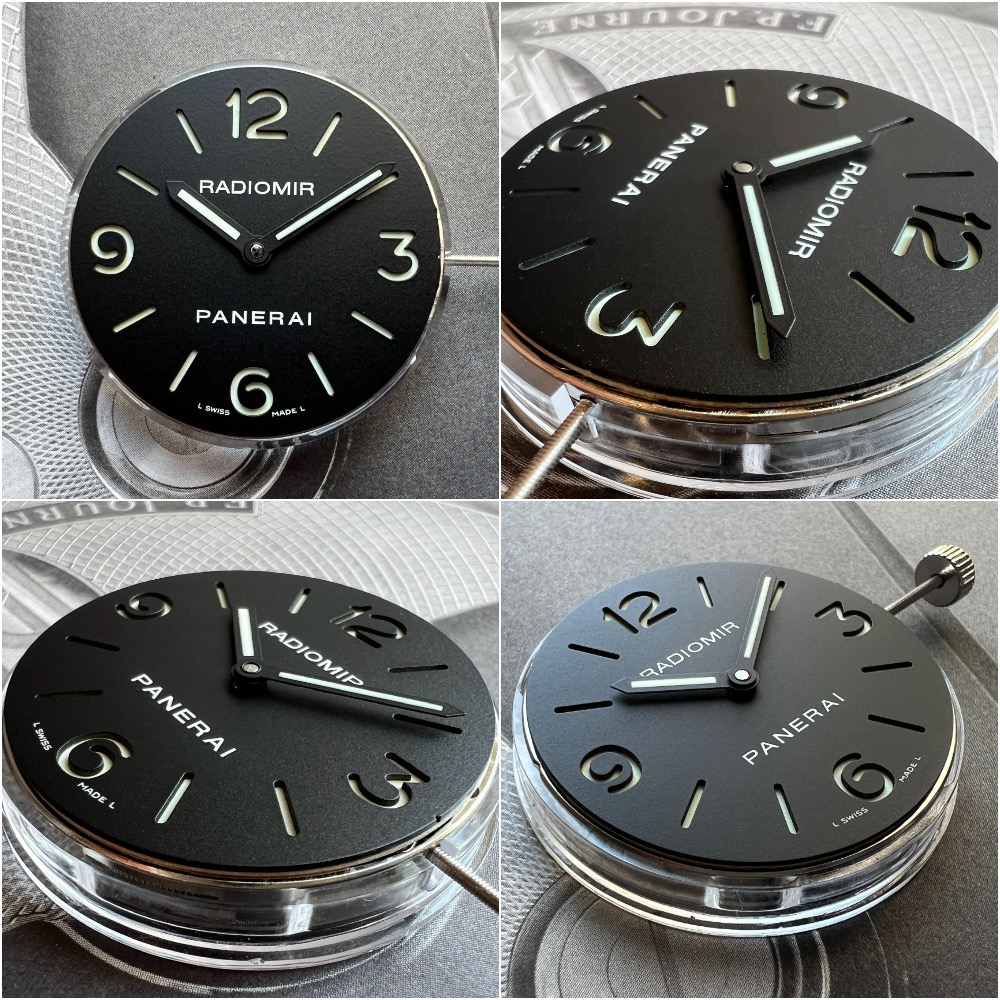
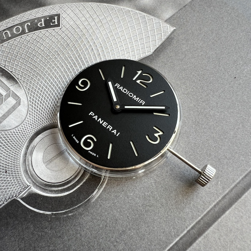
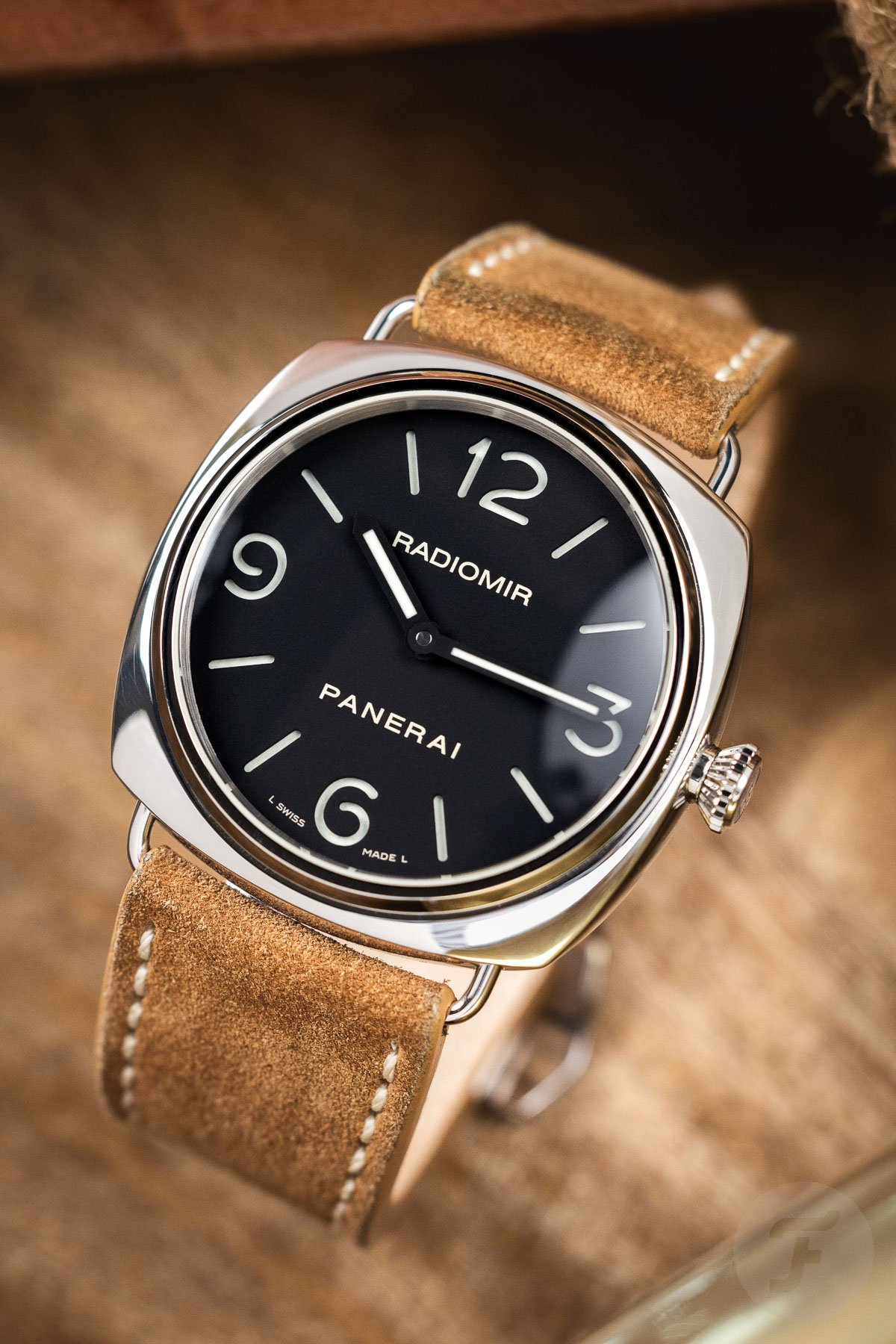
I wanted to ask the experts if "L Swiss Made L" is correct.
In my humble opinion it looks closer to the number 6 on the dial. What do you think about it ?

Thanx
Junio M.
I can comment on this because I own both an HWF rep from 2022 and a gen from 2013. I was given the gen by my dad and I don't like to travel with it so I ordered a rep from Trusty-Time.
Anyhow. HWF has done a remarkable job for the most part. Still where it falls apart, when you have both in hand, is that the HWF has noticeably wider cutouts for the numerals and markers. I wouldn't say that the distance to the "SWISS MADE" text is any different that I can see. I gotta hand it to them because even the movement layout is dead-on. The colors of the jewels, and the overall polish and finish of the visible gears, are slightly off but nothing too unreasonable. The case itself seems absolutely identical; I can't make out a single difference. The crown guard is right on point: the HWF even has that tiny ball bearing that slides along the crown when you pull up the lever. The gen has better antiglare and the crown is smoother, but only slightly. The winding feel is quite different; can't put my finger on it. I can't say that the hands are any different, although I don't have a loupe to see fine detail.
Long story short, if HWF was able to get their cutouts in the sandwich dial a bit more accurate, and devote a little more effort to polishing the movement, it would be mighty mighty hard to discern the difference.
Thank you, this is a great post! I hope my response is acceptable, as it is intended, as a public service announcement and not a sales post. Because I think it is directly relevant to the topic here. Moderator: please move or remove this if it is inappropriate.
I recently had a full custom PAM 210 built from Belkin12 that included a super nice sandwich dial (but I don't have a GEN to do a full side-by-side comparison). While I have only done a full watch with him, I believe other forum member have ordered parts that they have used for project / franken watches. From what I gather from your post, this HWF might be a good base for someone wanting to do such a 177 project.
Here are the pics of the dial he made for my PAM 210:


And, I'll anticipate the next question about the placement of the "Swiss Made". Here is a pic of the GEN (not mine) -- the "Swiss Made" is on the sides of the 6 on a 210, not below.

Last edited:


