kilowattore
Sales Moderator / Section Moderator
Staff member
Moderator Sales
Section Moderator
Certified
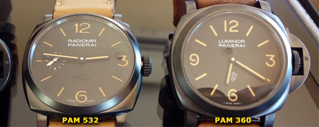
Radiomir 1940 3 Days Paneristi Forever PAM 532 KW

Model: PAM 532
Maker: KW maker
Movement: a6497 21,600 vph
Dealer: Hont

I must admit, I was not aware that Panerai had released a new special edition for Paneristi until I saw that Kuvarsit was releasing the rep.
Since I have a growing collateral addiction for vintage PAM models, I was delighted to see a 1940 DLC'ed case with black dial and vintage lumed indices. The combo is simply perfect to me because it makes this watch modern and vintage at the same time.
On to another short review then")
THE GEN


(errr... what is this guy doing with a plastic knife???)

The 532 was released in 2013 as a limited special edition of 500 pieces dedicated to the Paneristi community.
The watch features a DLC'ed case, very similar in color to the 360, black dial and black hand both vintage lumed. On the bottom of the dial there's an embossed reproduction of the S.L.C. (Sottomarino a Lenta Corsa) invented by Teseo Tesei and nicknamed "Maiale" (pig) by him.
The 1940 case is inspired to the transitional model between the Radiomir (3646) and the Luminor (6152/1) cases, as a matter of fact this case is pretty much the same as the reference 6154 from the 40's. The crown is a screw-in type recalling the shape of the Rolex crowns used at that time.
Imho Panerai did a good job modernizing an old styled watch while adding so many details that refer to the history of the brand.
The contrast with the dark grey DLC'ed case and the strong orange of the numbers and indices makes for a stunning look of this piece, indeed one with a clear personality.
The movement is the inhouse manual wind Cal. P.3000, hidden by a closed SS caseback, that features a huge PANERISTI FOREVER engraving. A strong statement of appreciation for its online community from Panerai.
THE REP

The rep does look great as it is, even with its inaccuracies. Since these are flaws that can be addressed (I don't know how easily though), possibly a v2 will fix them.
CASE


First thing you notice wearing this watch is how thin it looks. The 1940 case with its 47 mm size is a big watch, but the lack of a CG and the flat crystal make it very comfortable on the wrist, the thin profile gives an elegant touch to the design.
Case shape is very close to gen from what I can see, no evident flaws at least.
THe DLC is clearly darker than gen, but it feels solid and good quality, even though not at the same level of my 504 which has a finer "grain" of the steel under the coating.

Instead of the usual system based on screw bars, Panerai opted for standard pins on this watch, a choice that I think linked to what was used in vintage models. Obviously the rep uses the same system.
CROWN

The screw-in crown is well replicated in shape, vaguely recalling the vintage Rolex crowns used in 6154 models. It does not screw in completely, like gen, though maybe it goes a bit closer to the case, a very discussed choice from Panerai explained stating that screwing the crown completely in could damage the coating of the case.
Near the crown there's a nick in the case, meant to host the fully screwn in crown. As ALE promptly noticed and reviewed HERE, the shape of the nick is a bit less defined than in gen.


Crown shape is close, but not exactly as gen, OP logo is well defined. You can refer to ALE's thread for in depth analisys
DIAL

The black sandwich dial features vintage lumed numerals and indices and seconds subdial at 9. The cuts are sharp, as in almost every PAM rep I saw, and numbers are shaped correctly.
The color of the vintage lume though is noticeably lighter than the strong orange of the gen.
Hour and minutes hands are black while seconds hand is white. A nice touch that matches the RADIOMIR PANERAI inscription in the upper side. Printing is pretty well defined.
The CP is clearly wider than gen. It is flush, flat and polished though

The embossed SLC is well executed, it's defined and very close to the gen shape as far as I can tell.

LUME

CRYSTAL

The almost flat crystal is clear and does not sit too high on the bezel.
AR is possibly the worst I saw so far in a PAM, it' s almost impossible to avoid reflections on the dial in the pics
A slightly purplish tone can be seen in certain light conditions, so at least you can be sure it is there

CASEBACK

Caseback is closed, thus eliminating any possible problem regarding the replication of the movement. This rep features the mighty a6497, on of the most inexpensive and reliable movements found in reps.
The engravings are very nice, PANERISTI FOREVER is pretty much like gen and other inscriptions are well defined and correct as well. As PolonusTM noticed HERE, the engravings in the centre of the dial are slightly tilted in respect to the outer engravings.
Not very noticeable indeed, and if he didn't notice it I would not even be aware of this issue, anyway another lack of care from the maker.
CONCLUSIONS

This rep looks exceptionally to detail it nice to me, but it leaves a sour taste in my mouth because with a very little more attention it could have easily been a super rep and a must have in any PAM collection. I think its' even more disappointing that this lack comes from KW, a maker that has an history of impressive attention to detail.
As it is, it's still a great looking rep and a watch I advise to anyone. The build is solid, the feel is nice, the look is good!
Few more pics


As usual I'm glad to hear your opinions and please do correct me if I said something wrong, I'm always happy to update the review
:cheers:
Model: PAM 532
Maker: KW maker
Movement: a6497 21,600 vph
Dealer: Hont
I must admit, I was not aware that Panerai had released a new special edition for Paneristi until I saw that Kuvarsit was releasing the rep.
Since I have a growing collateral addiction for vintage PAM models, I was delighted to see a 1940 DLC'ed case with black dial and vintage lumed indices. The combo is simply perfect to me because it makes this watch modern and vintage at the same time.
On to another short review then
THE GEN
(errr... what is this guy doing with a plastic knife???)
The 532 was released in 2013 as a limited special edition of 500 pieces dedicated to the Paneristi community.
The watch features a DLC'ed case, very similar in color to the 360, black dial and black hand both vintage lumed. On the bottom of the dial there's an embossed reproduction of the S.L.C. (Sottomarino a Lenta Corsa) invented by Teseo Tesei and nicknamed "Maiale" (pig) by him.
The 1940 case is inspired to the transitional model between the Radiomir (3646) and the Luminor (6152/1) cases, as a matter of fact this case is pretty much the same as the reference 6154 from the 40's. The crown is a screw-in type recalling the shape of the Rolex crowns used at that time.
Imho Panerai did a good job modernizing an old styled watch while adding so many details that refer to the history of the brand.
The contrast with the dark grey DLC'ed case and the strong orange of the numbers and indices makes for a stunning look of this piece, indeed one with a clear personality.
The movement is the inhouse manual wind Cal. P.3000, hidden by a closed SS caseback, that features a huge PANERISTI FOREVER engraving. A strong statement of appreciation for its online community from Panerai.
THE REP
The rep does look great as it is, even with its inaccuracies. Since these are flaws that can be addressed (I don't know how easily though), possibly a v2 will fix them.
CASE
First thing you notice wearing this watch is how thin it looks. The 1940 case with its 47 mm size is a big watch, but the lack of a CG and the flat crystal make it very comfortable on the wrist, the thin profile gives an elegant touch to the design.
Case shape is very close to gen from what I can see, no evident flaws at least.
THe DLC is clearly darker than gen, but it feels solid and good quality, even though not at the same level of my 504 which has a finer "grain" of the steel under the coating.
Instead of the usual system based on screw bars, Panerai opted for standard pins on this watch, a choice that I think linked to what was used in vintage models. Obviously the rep uses the same system.
CROWN
The screw-in crown is well replicated in shape, vaguely recalling the vintage Rolex crowns used in 6154 models. It does not screw in completely, like gen, though maybe it goes a bit closer to the case, a very discussed choice from Panerai explained stating that screwing the crown completely in could damage the coating of the case.
Near the crown there's a nick in the case, meant to host the fully screwn in crown. As ALE promptly noticed and reviewed HERE, the shape of the nick is a bit less defined than in gen.
Crown shape is close, but not exactly as gen, OP logo is well defined. You can refer to ALE's thread for in depth analisys
DIAL
The black sandwich dial features vintage lumed numerals and indices and seconds subdial at 9. The cuts are sharp, as in almost every PAM rep I saw, and numbers are shaped correctly.
The color of the vintage lume though is noticeably lighter than the strong orange of the gen.
Hour and minutes hands are black while seconds hand is white. A nice touch that matches the RADIOMIR PANERAI inscription in the upper side. Printing is pretty well defined.
The CP is clearly wider than gen. It is flush, flat and polished though
The embossed SLC is well executed, it's defined and very close to the gen shape as far as I can tell.
LUME
CRYSTAL
The almost flat crystal is clear and does not sit too high on the bezel.
AR is possibly the worst I saw so far in a PAM, it' s almost impossible to avoid reflections on the dial in the pics
A slightly purplish tone can be seen in certain light conditions, so at least you can be sure it is there
CASEBACK
Caseback is closed, thus eliminating any possible problem regarding the replication of the movement. This rep features the mighty a6497, on of the most inexpensive and reliable movements found in reps.
The engravings are very nice, PANERISTI FOREVER is pretty much like gen and other inscriptions are well defined and correct as well. As PolonusTM noticed HERE, the engravings in the centre of the dial are slightly tilted in respect to the outer engravings.
Not very noticeable indeed, and if he didn't notice it I would not even be aware of this issue, anyway another lack of care from the maker.
CONCLUSIONS
This rep looks exceptionally to detail it nice to me, but it leaves a sour taste in my mouth because with a very little more attention it could have easily been a super rep and a must have in any PAM collection. I think its' even more disappointing that this lack comes from KW, a maker that has an history of impressive attention to detail.
As it is, it's still a great looking rep and a watch I advise to anyone. The build is solid, the feel is nice, the look is good!
Few more pics
As usual I'm glad to hear your opinions and please do correct me if I said something wrong, I'm always happy to update the review
:cheers: