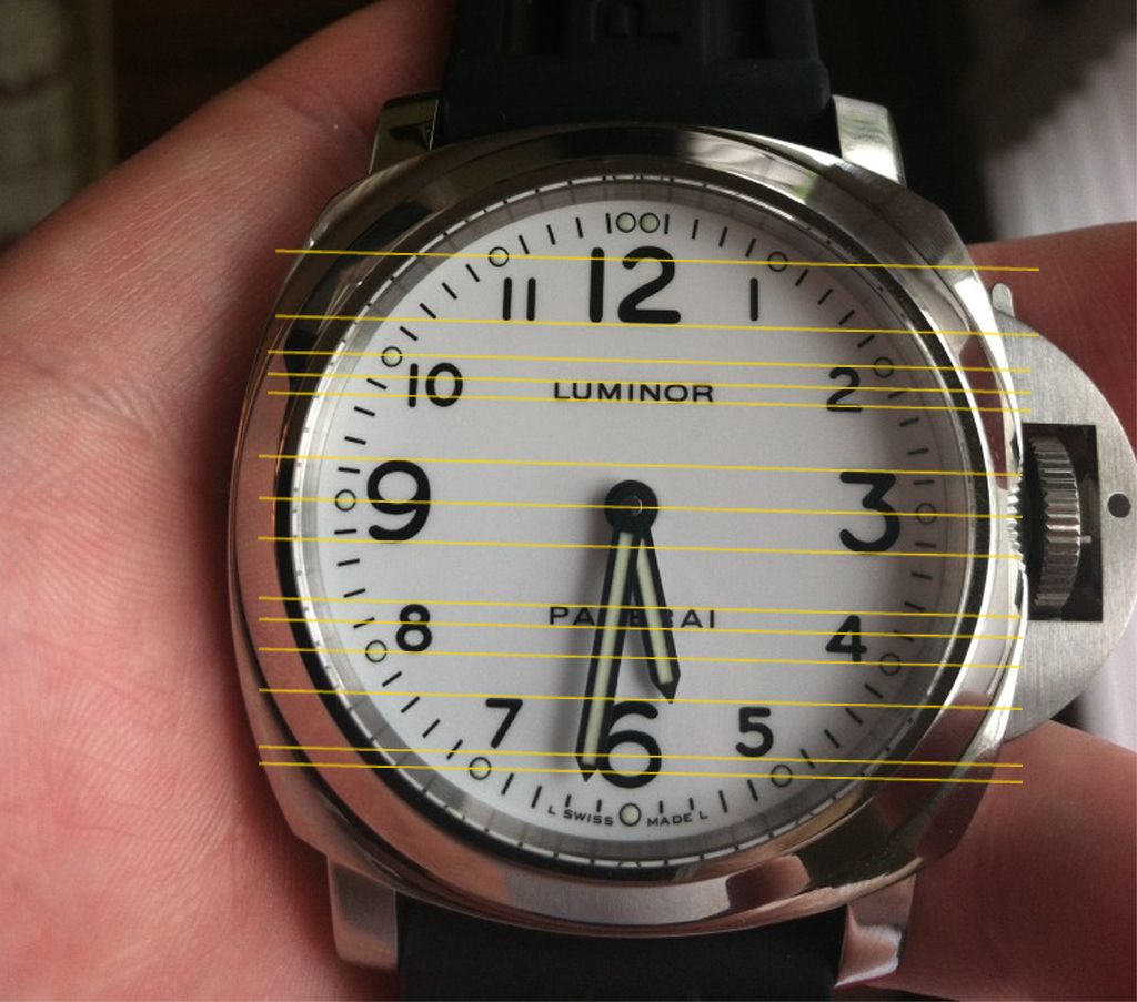
Is it just me or does the dial font seem tilted? I know the dials in right because the feet are in secure. It just seems the luminor is tilted up and to the right.
i have the same view with you coldi. seems that if the luminor wording is alone then the visual effects(or is it?) kicks in. however if its 'luminor panerai' instead as in pam 360/390 for example it doesnt look that bad :S