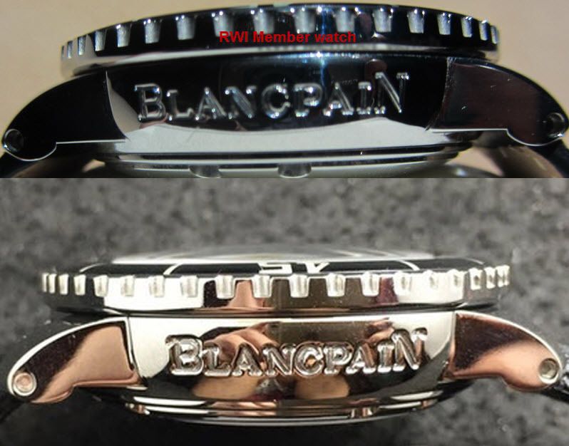
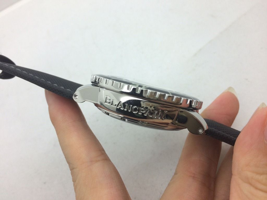
Hello fellow members, I have a question for you FF experts...Should the Noob FF "BlancpaiN" engraving look like this?
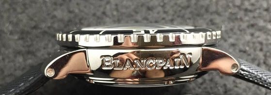
The letters seem to be too close and jumbled. Anyone who has one, could you please comment. I would like to know if this is what it's supposed to look like as other pictures show the spacing to be wider and correct to the gen.
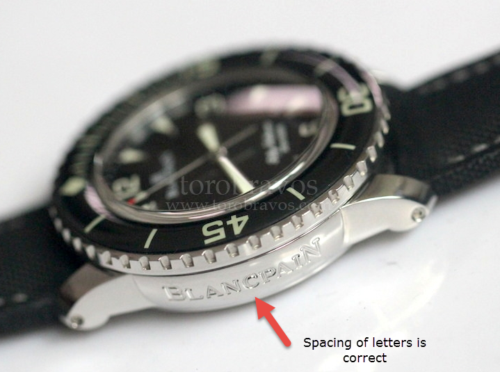
Here's a pic from Toro's website which looks much neater and crisp:
Any thoughts would be greatly welcomed. Thanks.
Best,
Pip

The letters seem to be too close and jumbled. Anyone who has one, could you please comment. I would like to know if this is what it's supposed to look like as other pictures show the spacing to be wider and correct to the gen.
Here's a pic from Toro's website which looks much neater and crisp:

Any thoughts would be greatly welcomed. Thanks.
Best,
Pip

