- 27/6/16
- 797
- 2,564
- 93
Our previous WhatsApp account is temporarily unavailable.
We have switched to a new contact:
WhatsApp: + 86 135 0241 3035
Please add us using this number.
Hello everyone, this is Steve and I'm back!
As the title says, let's get started!


By repeated comparison with the object, clean dial colour is closest to GEN! VR, GM seems darker and in poor light VR looks like purple. The CS is too bright blue.


The surface of the VR is too grainy, and the other three factories are not bad!


The chamfering of GM's glass edge is very good, almost the same as the original! Although Clean has been done, it is too obvious! The effect of VR and CS processing is almost invisible.

In addition, it can be clearly seen that the CS bezel and the side of the case are too tight, and there is almost no gap. Maybe it is an assembly problem and this has yet to be confirmed!
From the perspective of the second picture, the structure and grinding treatment under the bezel of GM and CS are somewhat different from GEN. Clean is very close to GEN, followed by VR. However, there is a problem with Clean in the section below the teeth—— there are very clear horizontal lines!


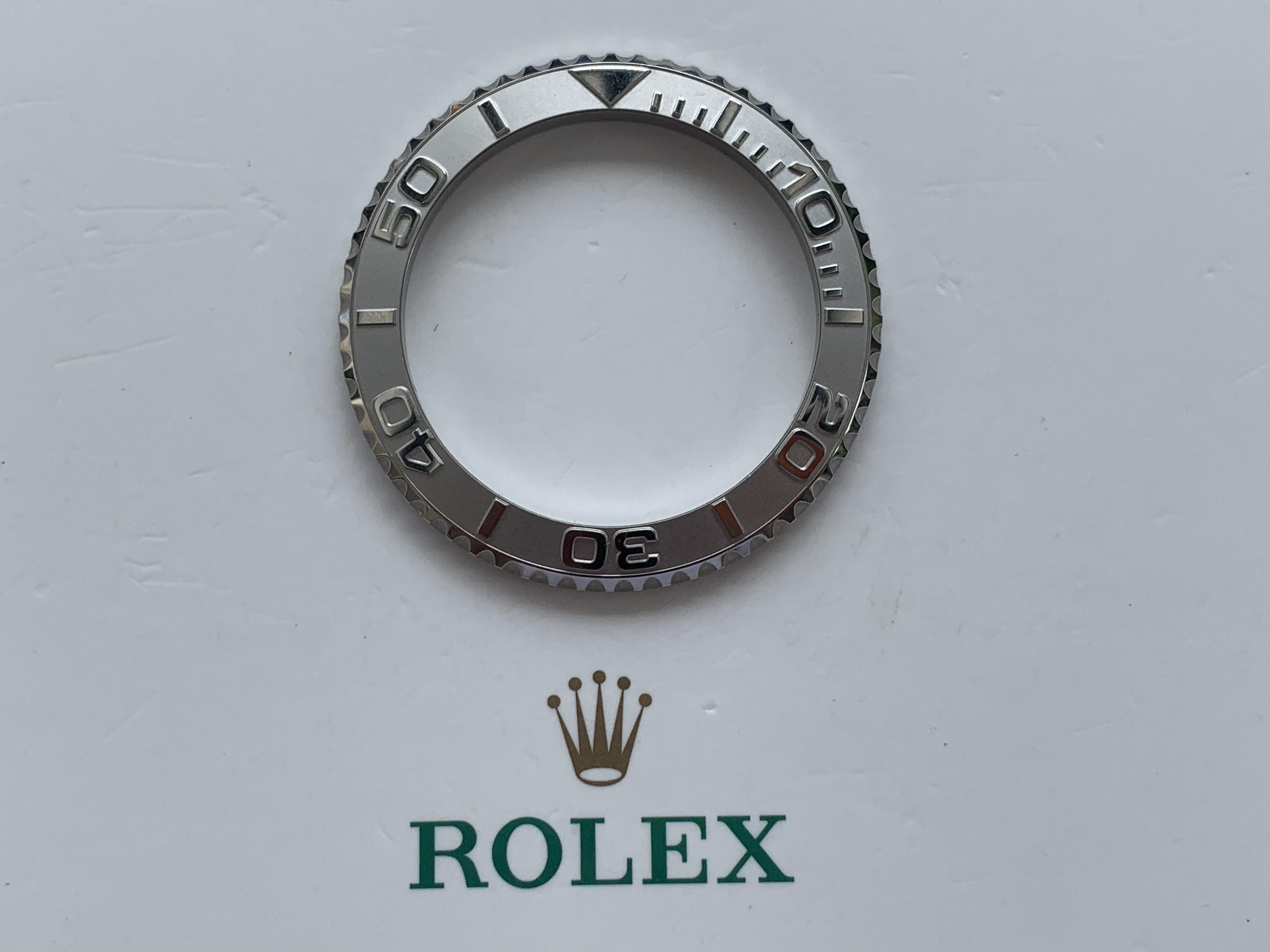
Clean, GM, and CS all have the edge chamfering of numbers and scale bars, but Clean handles the details and the inner corner of the digital logo better, while VR almost does not do secondary processing.


The triangle and small bar scale of CS are obviously too small!
For the chamfering of the triangle, VR did not do it, and the other three factories have different control of shape and distance! Combining these two data, I think GM is better! You can also discuss in the comments section.
We have switched to a new contact:
WhatsApp: + 86 135 0241 3035
Please add us using this number.
Hello everyone, this is Steve and I'm back!
As the title says, let's get started!


Front view


Indoor and outdoor mobile phone pictures
By repeated comparison with the object, clean dial colour is closest to GEN! VR, GM seems darker and in poor light VR looks like purple. The CS is too bright blue.


Bezel Side View
The surface of the VR is too grainy, and the other three factories are not bad!


Crystal Side View
The chamfering of GM's glass edge is very good, almost the same as the original! Although Clean has been done, it is too obvious! The effect of VR and CS processing is almost invisible.

Teeth Side View
There is no problem with the shape of the teeth, but the VR has a horizontal brushed pattern! It's doing it wrong here.
In addition, it can be clearly seen that the CS bezel and the side of the case are too tight, and there is almost no gap. Maybe it is an assembly problem and this has yet to be confirmed!
From the perspective of the second picture, the structure and grinding treatment under the bezel of GM and CS are somewhat different from GEN. Clean is very close to GEN, followed by VR. However, there is a problem with Clean in the section below the teeth—— there are very clear horizontal lines!


bezel font View
Clean, GM, and CS all have the edge chamfering of numbers and scale bars, but Clean handles the details and the inner corner of the digital logo better, while VR almost does not do secondary processing.


Triangular View
The triangle and small bar scale of CS are obviously too small!
For the chamfering of the triangle, VR did not do it, and the other three factories have different control of shape and distance! Combining these two data, I think GM is better! You can also discuss in the comments section.
Last edited:


