- 3/5/07
- 1,759
- 128
- 63
After reading about the looking at photos of the SMP chrono, I finally ordered one from ruby a month or so ago. Everything we're read and heard about this watch is true. It's an outstanding replica.
I've also wanted the non-chrono version but have been waiting for the dealers to fix the problems with the "red" model. When I found one with the red "Seamaster" in its correct location, under the Omega name and logo, I snapped it up. Following is a side-by-side review of the two models and the genuine.

It turns there are some major differences in the quality and built of the two watches. As you know, the Chrono is powered by the new Asian 7750. My "Red" SMP is powered by a 21j "Asian," I'm not sure which model. I can hear the rotor whirring and spinning away when I gently shake the watch.
The first thing I noticed was the feel of the bracelet. The Chrono bracelet has smoother links, particularly around the edges. Hopefully you can see this in the following picture:

The non-chrono version on the right has links that are squared off, not rounded like the Chrono on the left. This gives the bracelet a rougher feel, not smooth like the Chrono's bracelet. Plus, the bracelet feels a little lighter, not as robust. Also, the bezel on the "Red" watch is a darker blue than that on the Chrono. I thought it was black when I opened the package.
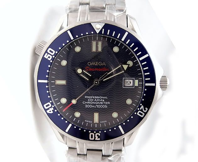
Here's a shot of their dials:

It's really apparent in this shot, but the printing on the "Red" dial is a bit rougher than that of the Chrono. It reminds of comparing 600 dpi laser printing with 1,200 dpi. There's a difference but you might need a magnifying glass to see it. The date font is different, and, as you will see in a minute, it is different than the gen but same as is used in my PO.
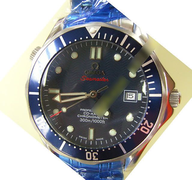
Okay, side-by-side with the genuine:


The rep's second hand is not as long as the gen's. (Hard to tell because it's blurred in my pic.)
The hour markers are smaller on the rep and have the usual poor rep lume.
Pearl is bigger on the rep (and lumes like crazy!).
The "Omega" letters are not joined like on the gen.
The "I" at 9:00 and 6:00 and "II" at 12:00 are thicker and shorter than the gen.
The bezel font is thicker on the rep.
The printing below the post is a bit wider than the gen.
Though it's hard to tell here, I think the helium valve is in the correct position. At least it looks to be positioned the same as on the Chrono.
Date font is wrong, as I said earlier.
The rep lacks the little hour marker block between the date box and the edge of the dial.
In summary, not a real accurate rep. It's many flaws doom it to be given to one of my sons, probably the 21-year-old.
Still, I'll enjoy wearing it for a while and it only set me back $89.
Here are my 3 Omegas:

See how the "Red" date font looks to be the same as on the PO?
Parting shots:


I've also wanted the non-chrono version but have been waiting for the dealers to fix the problems with the "red" model. When I found one with the red "Seamaster" in its correct location, under the Omega name and logo, I snapped it up. Following is a side-by-side review of the two models and the genuine.
It turns there are some major differences in the quality and built of the two watches. As you know, the Chrono is powered by the new Asian 7750. My "Red" SMP is powered by a 21j "Asian," I'm not sure which model. I can hear the rotor whirring and spinning away when I gently shake the watch.
The first thing I noticed was the feel of the bracelet. The Chrono bracelet has smoother links, particularly around the edges. Hopefully you can see this in the following picture:
The non-chrono version on the right has links that are squared off, not rounded like the Chrono on the left. This gives the bracelet a rougher feel, not smooth like the Chrono's bracelet. Plus, the bracelet feels a little lighter, not as robust. Also, the bezel on the "Red" watch is a darker blue than that on the Chrono. I thought it was black when I opened the package.
Here's a shot of their dials:
It's really apparent in this shot, but the printing on the "Red" dial is a bit rougher than that of the Chrono. It reminds of comparing 600 dpi laser printing with 1,200 dpi. There's a difference but you might need a magnifying glass to see it. The date font is different, and, as you will see in a minute, it is different than the gen but same as is used in my PO.
Okay, side-by-side with the genuine:
The rep's second hand is not as long as the gen's. (Hard to tell because it's blurred in my pic.)
The hour markers are smaller on the rep and have the usual poor rep lume.
Pearl is bigger on the rep (and lumes like crazy!).
The "Omega" letters are not joined like on the gen.
The "I" at 9:00 and 6:00 and "II" at 12:00 are thicker and shorter than the gen.
The bezel font is thicker on the rep.
The printing below the post is a bit wider than the gen.
Though it's hard to tell here, I think the helium valve is in the correct position. At least it looks to be positioned the same as on the Chrono.
Date font is wrong, as I said earlier.
The rep lacks the little hour marker block between the date box and the edge of the dial.
In summary, not a real accurate rep. It's many flaws doom it to be given to one of my sons, probably the 21-year-old.
Still, I'll enjoy wearing it for a while and it only set me back $89.
Here are my 3 Omegas:
See how the "Red" date font looks to be the same as on the PO?
Parting shots: