- 14/9/06
- 259
- 0
- 0
if only...
but dammit, the gen is too rare and too expensive (over $20K).
and i have yet to see a decent rep of this sought after watch, either.
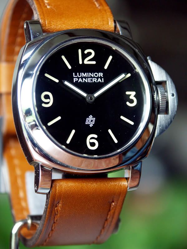
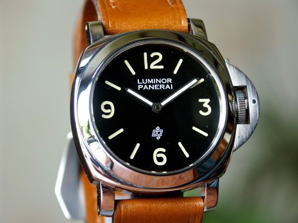
first, here are pix of the gen:


compared to the davidsen latest (pictured below) version, there are a number of issues i wish could be cleaned up:
1. the font on the latest davidsen is very wrong. the gen has a very simple, sans serif font. compare the top of the "l", bottom of "p" or bottom of "r" (really, the "ends" of each straight line) carefully with the gen and you'll see what i mean. there is some sort of ornateness going on with the davidsen font.
2. the gen does NOT have a sandwich dial. the preV watches are quite interesting because they appear as though a sandwich has been filled in with material and paint. in some ways, more of a sausage dial that seems "etched" or slightly recessed on the edges is what it looks like.
3. one thing that makes the preV watches so unique looking--again, refer to the gen pictures--is how the 6 and 9 are almost entirely the same thickness everywhere, even up to the point where they almost fully close (where the inner loop comes closing a circle). and note how fat the numbers are on the gen, how the 6 and 9 are almost closed, and then compare to the davidsen. also, the davidsen's "3" just doesn't look right, even inherently speaking and not comparing it to anything. the top portion on the left hand side of the davidsen "3" (that is, the top backward "c", if you know what i mean) looks like it got so fat, it lost its clarity.
4. the crown guard on gen has a much smaller cut for the crown, forming a smaller cavity around the crown.
5. the numbers and indices on the gen 201a's i've seen are somewhat yellowed in a more pale yellow, and less of a bright banana yellow
6. finally, the case on the davidsen luminors is NOT 1:1 with gen 44mm cases. at least not the one i have. each lug is thinner in width, and the overall thickness of the case (that is from the top of your wrist/case back to the top of crystal) is about 2-3mm shorter than gen!!!! really, the watch wears smaller. in fact, my gen 44mm luminors make my davidsen rep look and wear like a 40mm.
i increasingly admire davidsen's work, as i think we all do. but in the quest to improve the products we buy--and you have to admire and appreciate, as i do, davidsen's openness to critique and improvement--i thought i'd get a discussion going on this topic.. especially since the 201a is such a special watch to any pan fan. i for one would really like to see a better version rep offered by davidsen or someone in the future.
thoughts?


but dammit, the gen is too rare and too expensive (over $20K).
and i have yet to see a decent rep of this sought after watch, either.
first, here are pix of the gen:


compared to the davidsen latest (pictured below) version, there are a number of issues i wish could be cleaned up:
1. the font on the latest davidsen is very wrong. the gen has a very simple, sans serif font. compare the top of the "l", bottom of "p" or bottom of "r" (really, the "ends" of each straight line) carefully with the gen and you'll see what i mean. there is some sort of ornateness going on with the davidsen font.
2. the gen does NOT have a sandwich dial. the preV watches are quite interesting because they appear as though a sandwich has been filled in with material and paint. in some ways, more of a sausage dial that seems "etched" or slightly recessed on the edges is what it looks like.
3. one thing that makes the preV watches so unique looking--again, refer to the gen pictures--is how the 6 and 9 are almost entirely the same thickness everywhere, even up to the point where they almost fully close (where the inner loop comes closing a circle). and note how fat the numbers are on the gen, how the 6 and 9 are almost closed, and then compare to the davidsen. also, the davidsen's "3" just doesn't look right, even inherently speaking and not comparing it to anything. the top portion on the left hand side of the davidsen "3" (that is, the top backward "c", if you know what i mean) looks like it got so fat, it lost its clarity.
4. the crown guard on gen has a much smaller cut for the crown, forming a smaller cavity around the crown.
5. the numbers and indices on the gen 201a's i've seen are somewhat yellowed in a more pale yellow, and less of a bright banana yellow
6. finally, the case on the davidsen luminors is NOT 1:1 with gen 44mm cases. at least not the one i have. each lug is thinner in width, and the overall thickness of the case (that is from the top of your wrist/case back to the top of crystal) is about 2-3mm shorter than gen!!!! really, the watch wears smaller. in fact, my gen 44mm luminors make my davidsen rep look and wear like a 40mm.
i increasingly admire davidsen's work, as i think we all do. but in the quest to improve the products we buy--and you have to admire and appreciate, as i do, davidsen's openness to critique and improvement--i thought i'd get a discussion going on this topic.. especially since the 201a is such a special watch to any pan fan. i for one would really like to see a better version rep offered by davidsen or someone in the future.
thoughts?


