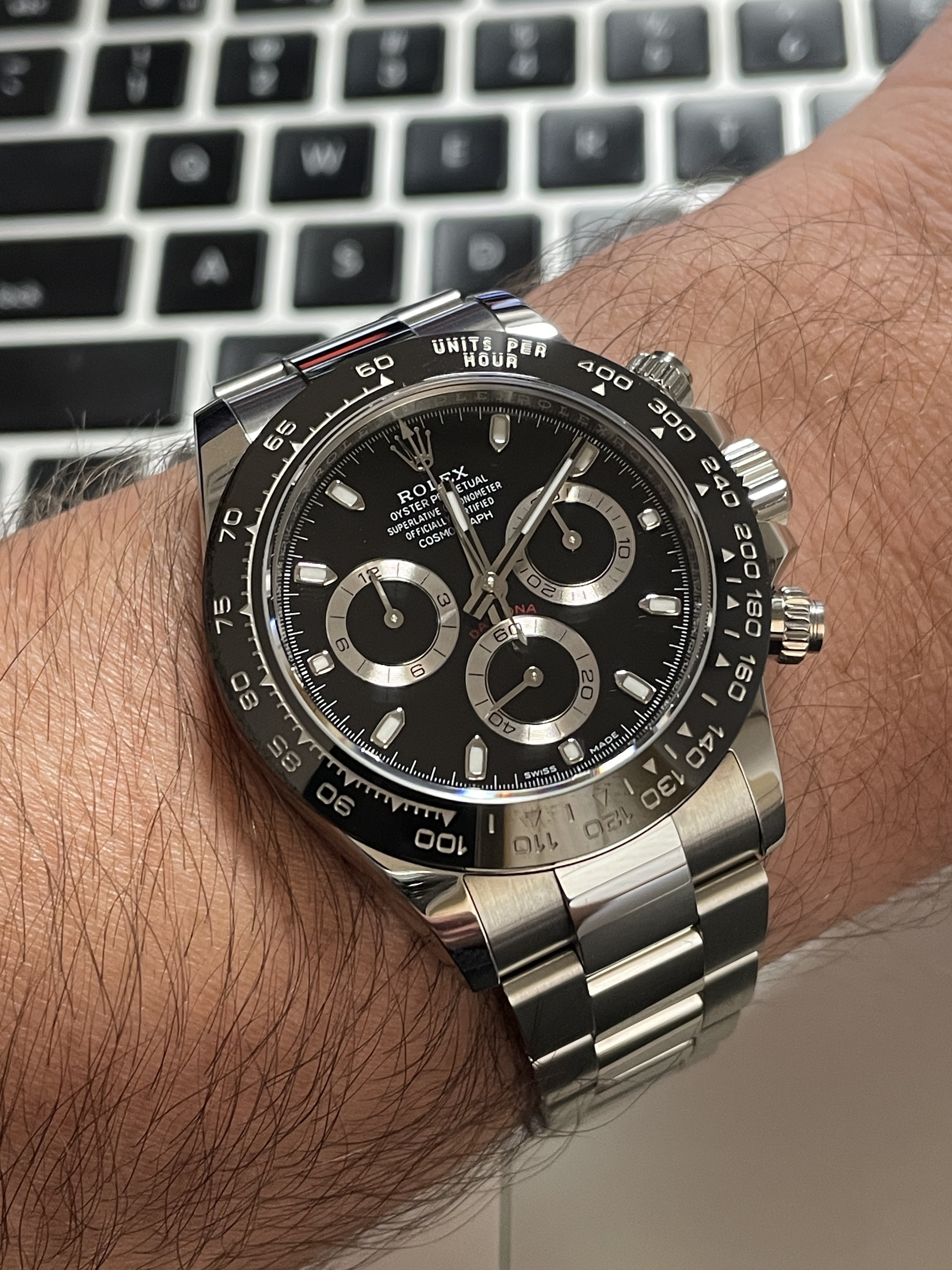
Recently I received a 116500 BTF dial courtesy of @Hasselbaink
We discussed a lot about the quality especially vs. the main competitor Clean and came to the conclusion that we should run a line-up that might be of interest others as a chapter in this never-ending debate within Daytona owners .
.
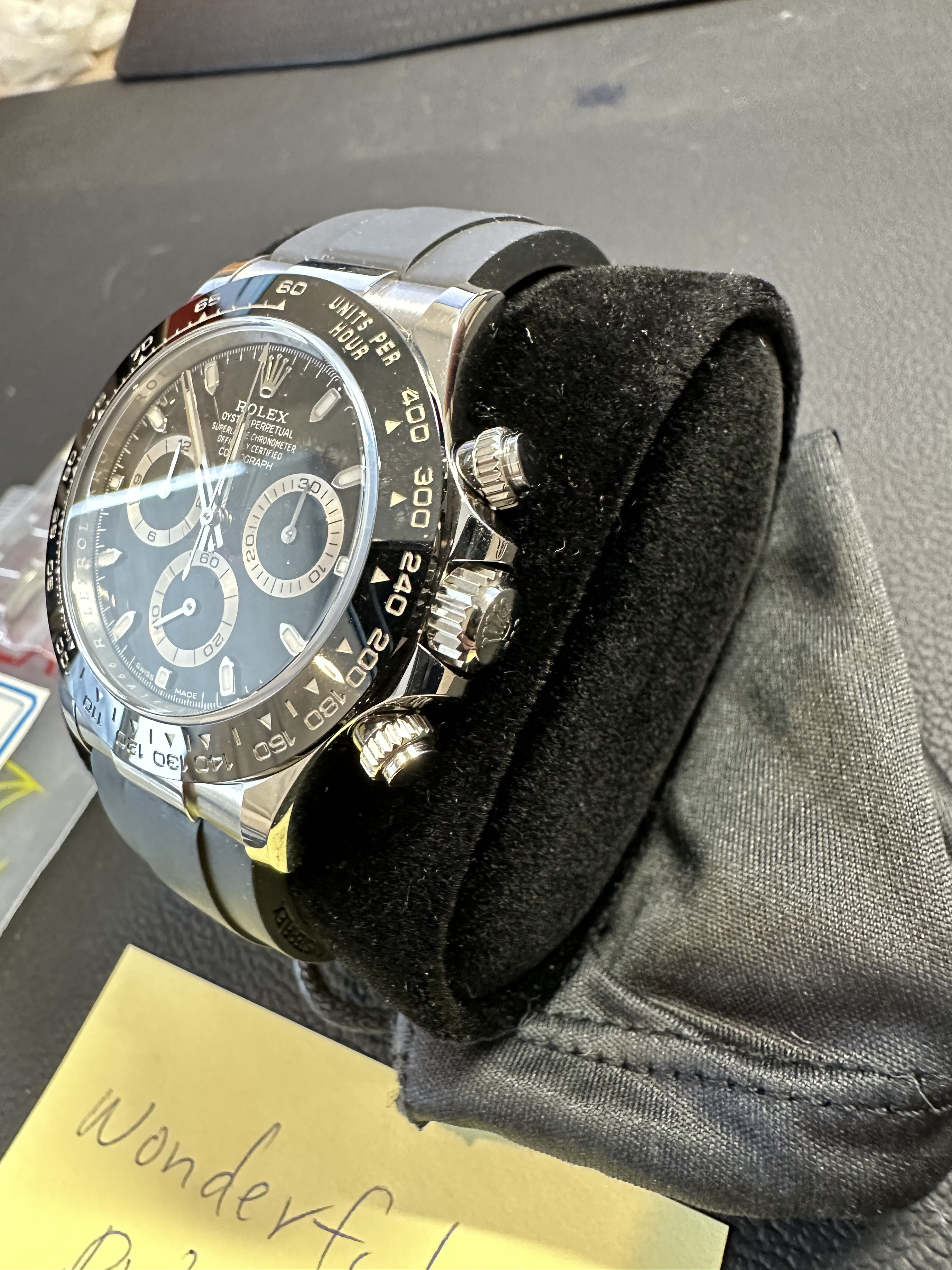
My initial idea was to build a BTF 116500 dial into the Clean 116520 watch base.
In both cases, the donor was a V3 version.
An eternal debate, perhaps, which is better, BTF or Clean? FYC everything pointed out here is purely based on my individual findings and experience.
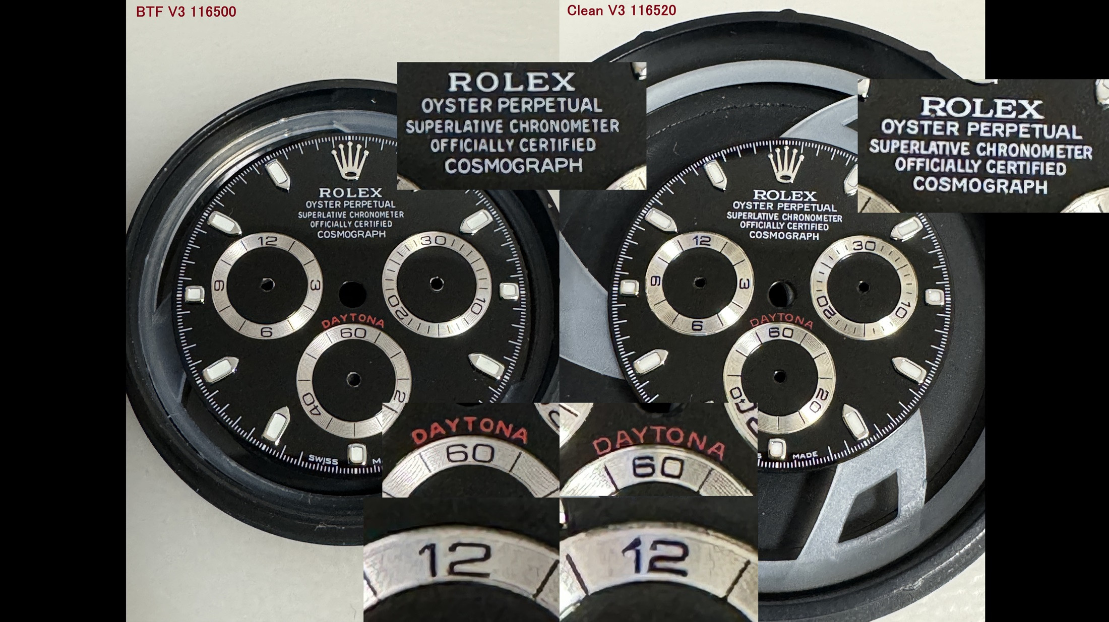
1.) Print
As a small introduction: I looked at many versions throughout the web finding more than 30+ (!) type of batches, releases, versions:
Without going into crazy details we can just state that gen batches through the years varies from subdial size, subdial print fonts, upper print fonts and positions, etc. so ultimately what are we talking about
ie. see here how the subdial font looked alike in 2003 (series F),
or even subdial print imperfection(!) like here (this version most likely would not pass at any rep QC among us :rofl)
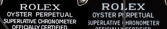
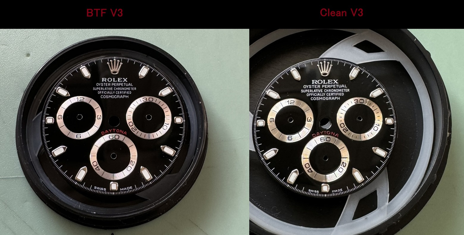
Considering all these and returning to the main subject I think the Rolex - Oyster inscriptions on the BTF dial do look sharper and thinner.
Even in the case of subdial prints, the inscriptions of the BTF are sharper.
However, the situation may be slightly different in the case of the Daytona print. When it comes to positioning, Clean looks better, It is closer to the lower subdial. In the case of BTF the inscription is not very nice and visible, ie. the letter "o" is horrible.
2.) Painting / Varnishing
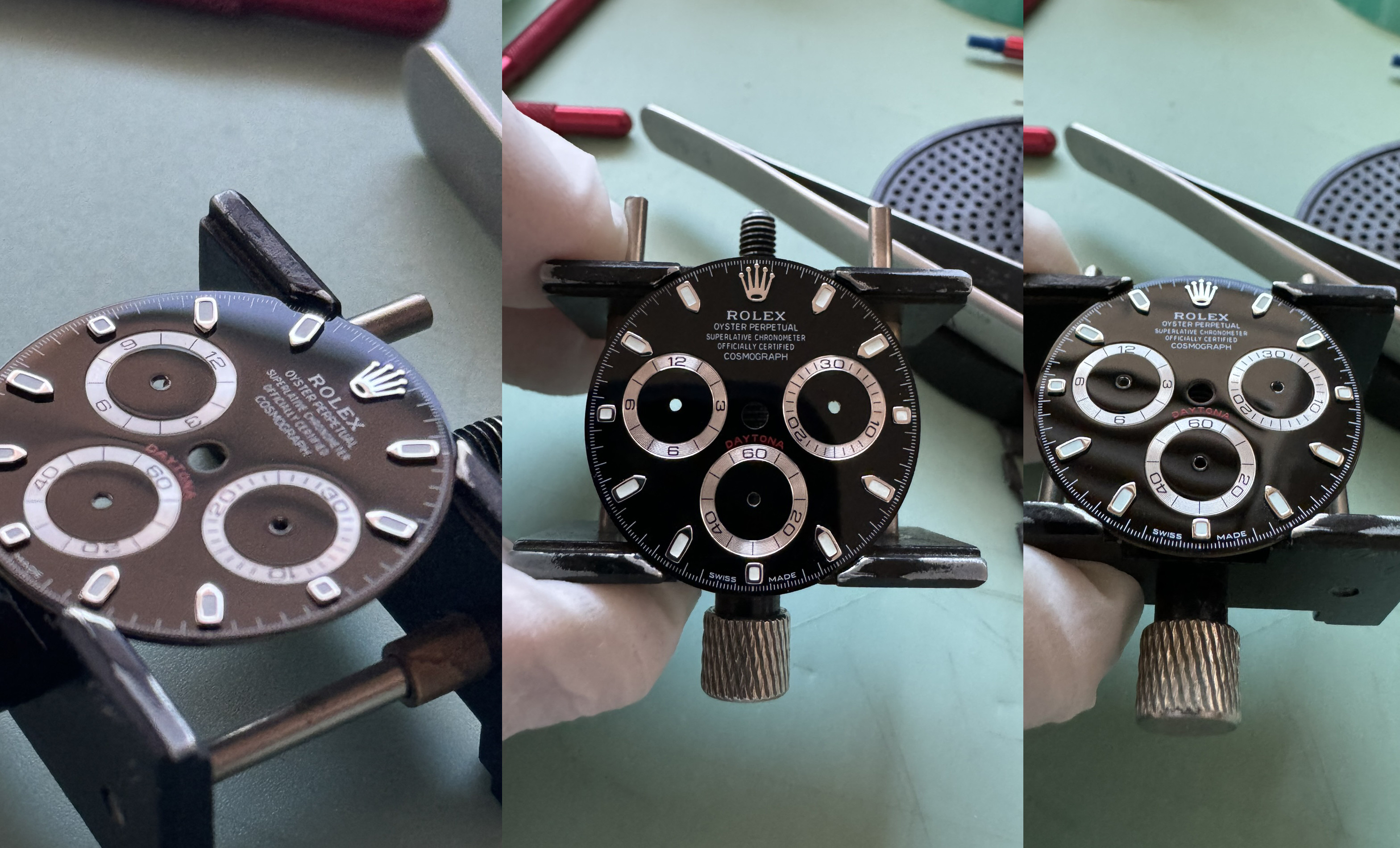
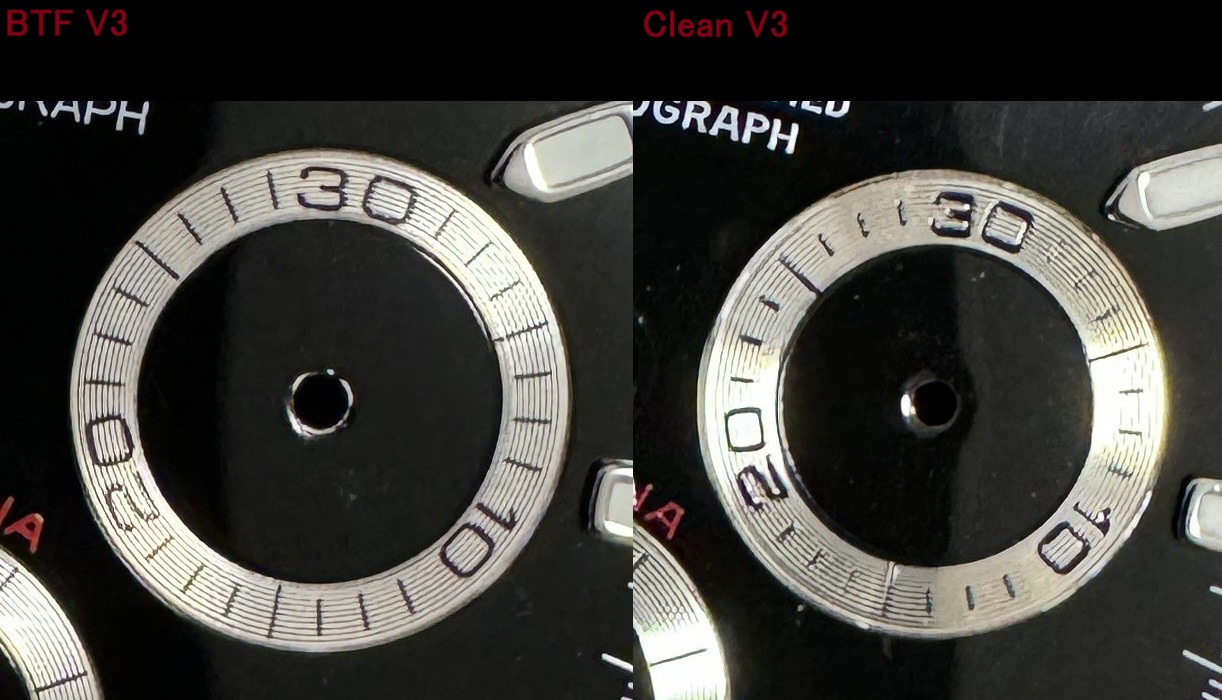
In case of Clean, I noticed that the black paint is either more spread out or better applied via several layers on the surface, it is much nicer overall.
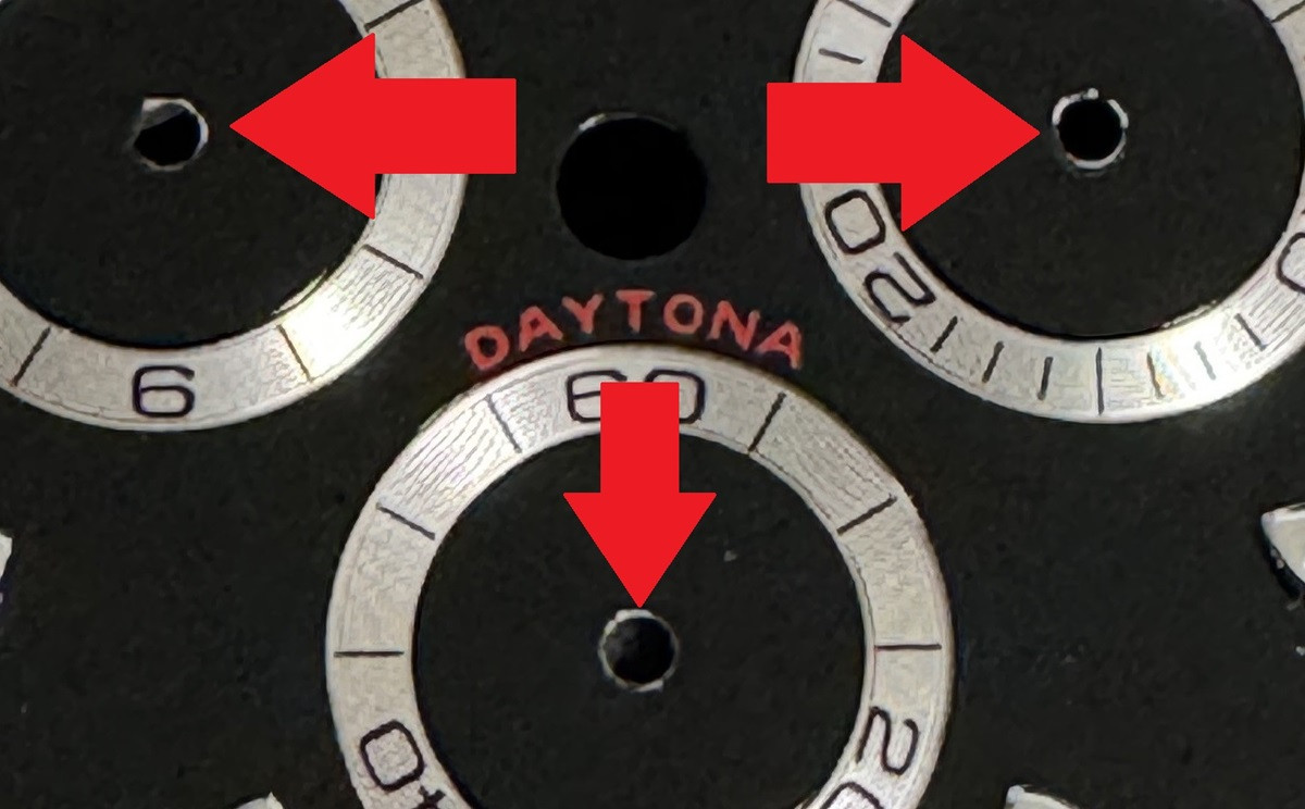
With the subdial and the cut-out circles in the middle, you can see that the processing of the Clean is also better, while on the BTF you can notice a lower level of finish with less attention to details and less covering, ie. the gold-colored main plate under the paint.
The essential varnish is thicker in the case of Clean, which btw can be beneficial from a service point of view. BTF is clearly the runner-up here.
3.) Subdials
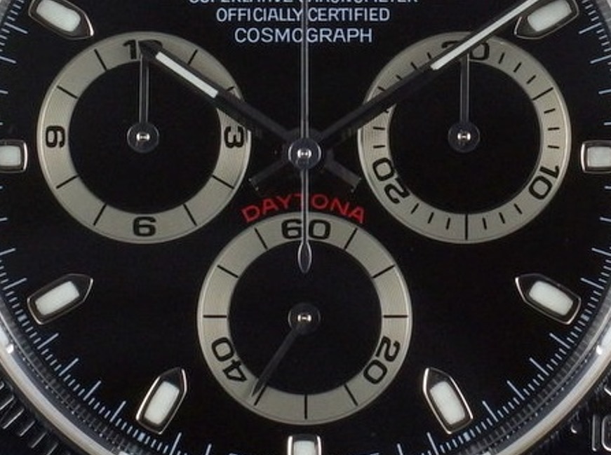
The subdial of Clean is very bright/shiny (even disturbing to me). I already mentioned it in the 1. point, the prints are much nicer, there is no question that BTF is overall better looking due to the matte genlike finish.
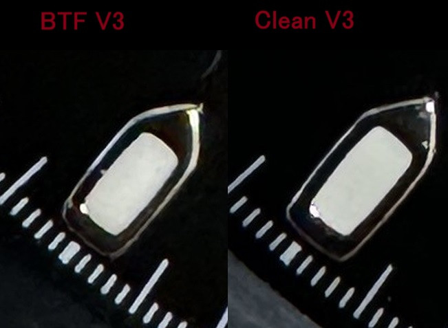
4.) Indexes and crown
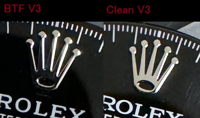
The crown logo winner closer to gen is clearly BTF. The edges are more nicely rounded than Clean where you can notice that it is excessively "sharp".
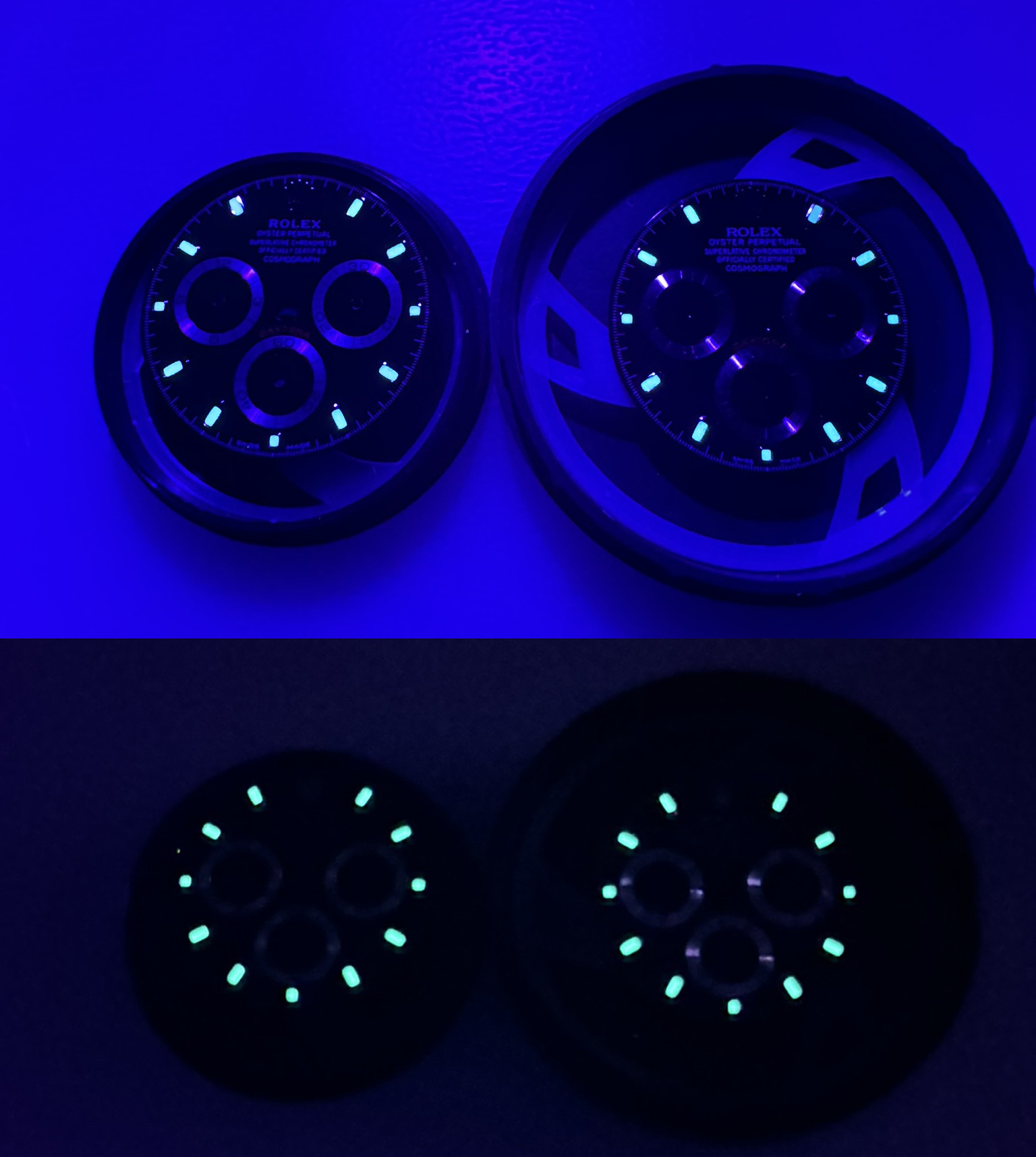
Markers: Clean looks better and more precise in terms of size, finish as well as lume accuracy. Lume has been checked under UV light and a 10sec indoor light recharge time. There is no difference at all, I suspect both factories use the same lume appliance.
5.) Conclusion
Both dials are top notch, and its really a personal preference and kinda OCD +nitpicking which might be anyone’s favorite, you simply can’t go wrong with the dials of nowadays vs the gen.
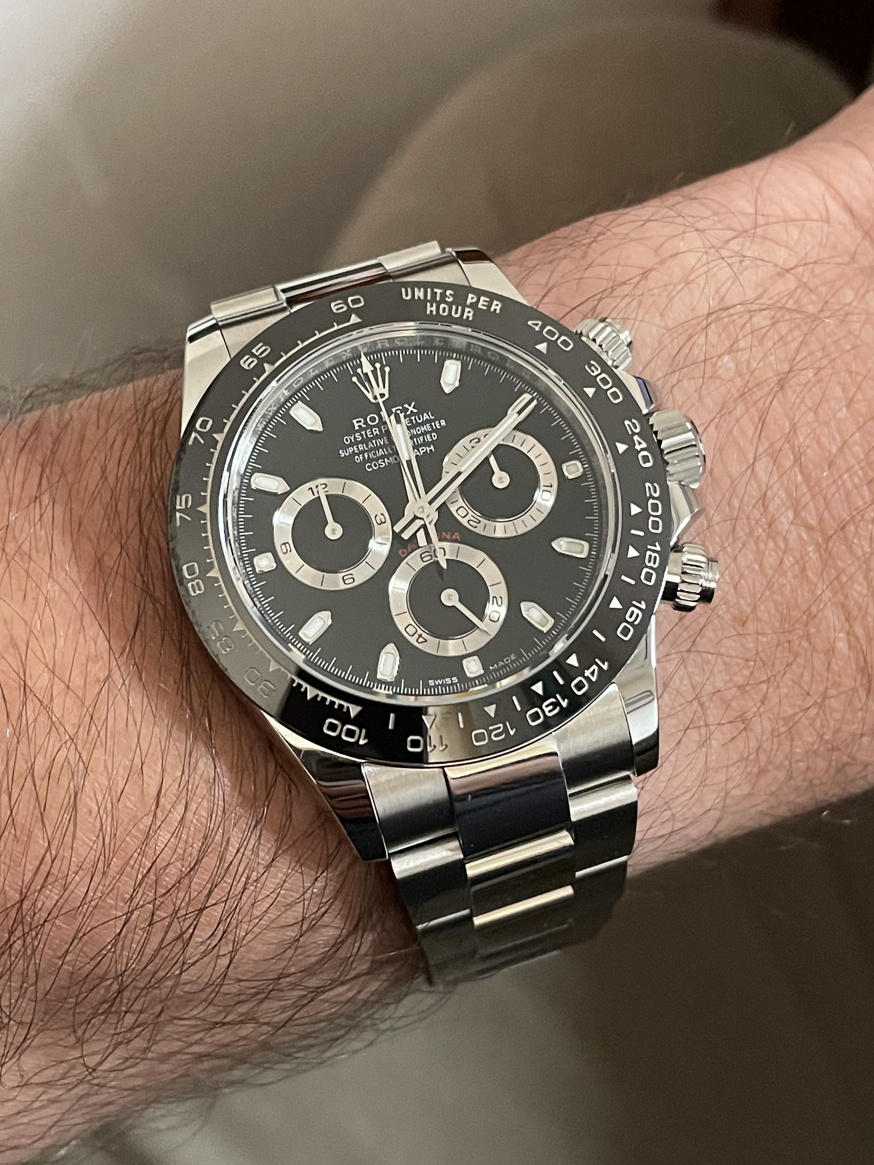
Overall the reason why I installed the BTF in my own Clean V3 base watch is mainly because of the coronet, subdial finish plus top layer grooving and last but not least the Rolex print.
The less shiny subdial rings with a Deep xtal (NWBIG-the best upgrade you can do to your dial/build) adds a lot to the overall image.
Good luck with your builds
Thx for reading!
We discussed a lot about the quality especially vs. the main competitor Clean and came to the conclusion that we should run a line-up that might be of interest others as a chapter in this never-ending debate within Daytona owners
.My initial idea was to build a BTF 116500 dial into the Clean 116520 watch base.
In both cases, the donor was a V3 version.
An eternal debate, perhaps, which is better, BTF or Clean? FYC everything pointed out here is purely based on my individual findings and experience.
1.) Print
As a small introduction: I looked at many versions throughout the web finding more than 30+ (!) type of batches, releases, versions:
Without going into crazy details we can just state that gen batches through the years varies from subdial size, subdial print fonts, upper print fonts and positions, etc. so ultimately what are we talking about
ie. see here how the subdial font looked alike in 2003 (series F),
or even subdial print imperfection(!) like here (this version most likely would not pass at any rep QC among us :rofl)
Considering all these and returning to the main subject I think the Rolex - Oyster inscriptions on the BTF dial do look sharper and thinner.
Even in the case of subdial prints, the inscriptions of the BTF are sharper.
However, the situation may be slightly different in the case of the Daytona print. When it comes to positioning, Clean looks better, It is closer to the lower subdial. In the case of BTF the inscription is not very nice and visible, ie. the letter "o" is horrible.
2.) Painting / Varnishing
In case of Clean, I noticed that the black paint is either more spread out or better applied via several layers on the surface, it is much nicer overall.
With the subdial and the cut-out circles in the middle, you can see that the processing of the Clean is also better, while on the BTF you can notice a lower level of finish with less attention to details and less covering, ie. the gold-colored main plate under the paint.
The essential varnish is thicker in the case of Clean, which btw can be beneficial from a service point of view. BTF is clearly the runner-up here.
3.) Subdials
The subdial of Clean is very bright/shiny (even disturbing to me). I already mentioned it in the 1. point, the prints are much nicer, there is no question that BTF is overall better looking due to the matte genlike finish.
4.) Indexes and crown
The crown logo winner closer to gen is clearly BTF. The edges are more nicely rounded than Clean where you can notice that it is excessively "sharp".
Markers: Clean looks better and more precise in terms of size, finish as well as lume accuracy. Lume has been checked under UV light and a 10sec indoor light recharge time. There is no difference at all, I suspect both factories use the same lume appliance.
5.) Conclusion
Both dials are top notch, and its really a personal preference and kinda OCD +nitpicking which might be anyone’s favorite, you simply can’t go wrong with the dials of nowadays vs the gen.
Overall the reason why I installed the BTF in my own Clean V3 base watch is mainly because of the coronet, subdial finish plus top layer grooving and last but not least the Rolex print.
The less shiny subdial rings with a Deep xtal (NWBIG-the best upgrade you can do to your dial/build) adds a lot to the overall image.
Good luck with your builds
Thx for reading!