• Tired of adverts on RWI? - Subscribe by clicking HERE and PMing Trailboss for instructions and they will magically go away!

111 h new dial ! what do you think?

davidsenjpn

Active Member
27/3/06
453
2
0
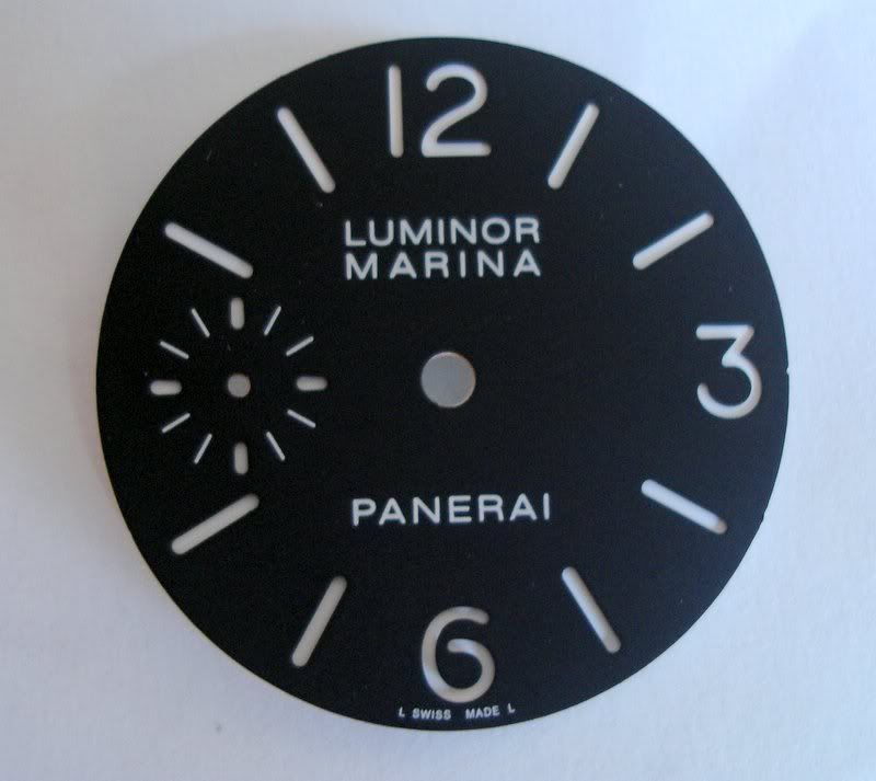
My dial supplier has been making my 111h dial not 100% correctly in the past months.

This is the final outcome i just recevied from him today.This is only the top sandwich plate without any
lume at all.But the important part is the logo fonts ,size and position.What do you think??
DSC02926.jpg


If you accpet this.then i will lum it with c3 and put it in a 111h complete watch for you to see the final
outcome tomorrow.

All comments are welcome.

Thank you
 

VDBroucke

Known Member
6/8/06
145
0
0
111h

great job and i think the original is not better
i wont the end of produckt
wot think you is ready?
 

007

Renowned Member
19/10/06
500
0
0
David son,
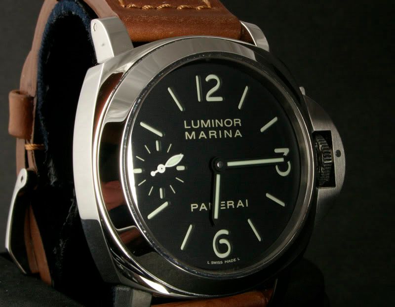
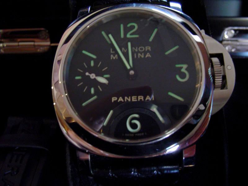
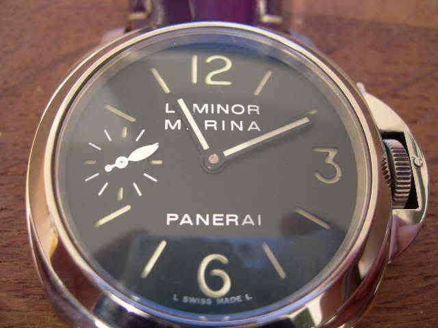
I have uploaded three pictures for you to examine. The first two are of two different genuine Pam 111H watches. The third one is my fairly upgraded 111H that is waiting for me on the post office for pickup, that I am gonna do first thing tomorrow morning. It is coming back from mods. Now, I am showing it to you, not because it has your AR coated crystal and your superlumed hands fitted, but because the lettering on the dial is very close, almost identical to the genuine dial. And the dial comes from Pure Time.
Why can't you just get the dial from the same source as he does? And I mean it well! I appreciate everything you do for our hobby, but this 111H dial project of yours seems to be enchanted.

DSC00310.jpg

DSC00309.jpg

DSCN0845.jpg


Of course on my dial the L SWISS MADE L is off. It doesn't bother me as much as the wrong main lettering though. Who knows. I have to see it in person tomorrow, when I pick it up. I am still hoping it's the crystal distortion from the angle, that does make it appear a bit bigger.
 

maxse

Banned member, the goat does not approve
Banned
4/11/06
550
0
0
Im no expert but it seems the LUMINOR MARINA is either to small or too close together. Some of the 'R' should be a little past the 1 o'clock marker. Also it seems that you need slightly more space between the LUMINOR and MARINA.
 

Natron

I'm Pretty Popular
Advisor
11/10/06
1,419
7
38
it looks to me as if the Luminor font is too compact. I am no expert by any means but I figured I would give some feedback.

Natron
 

evildee

Active Member
13/9/06
432
0
0
The type needs to be a tad bit thinner.

Stretch all line of type (Do not add space in between the letters!).

If possible, thicker plate please!

davidsendialij1.jpg
 

seraphe

Renowned Member
9/10/06
656
1
0
Plus the lume markers for the second subdial need to be slightly longer.
 
D

d4m.test

Guest
the indices are too close to the edge of the dial. your 055 and 082 have the same problem. you should use the second sub dial as the reference. the rest of the indices should line up with or on the same circumference as the 45 minute indice of the sub dial.
 

Cucumber_Jones

I'm Pretty Popular
15/3/06
1,511
0
0
I am no font expert so all I will say is THANKS FOR ALL THIS WORK DAVIDSEN. Your help is apriceated!
 

WatchDude13

Renowned Member
3/11/06
795
0
0
Not perfect, but pretty damn close!

I thank you for all your hard work. If this is final, I will likely order. If it is not, I look forward to a PERFECT rep (you gonna do a dagger? :D ).

Best,
WD
 

drfcfighter

I'm Pretty Popular
19/11/06
1,307
2
38
Yeah... close enough for the average Joe, not close enough for the OCD horologists... I happened to be an average Joe.

Then again, all the members with a keen eye constantly make product improvements progress.

:D
 

Caseydog

Active Member
22/3/06
214
9
18
evildee said:
The type needs to be a tad bit thinner.

Stretch all line of type (Do not add space in between the letters!).

If possible, thicker plate please!

davidsendialij1.jpg

Perfect comparison.
 

babola

I'm Pretty Popular
19/9/06
1,660
79
48
The latest sandwich 111 dial text is actually closer in size and style to 111G painted/sausage dial. The dial text on those is smaller.

Evildee's pic shows the good comparison, although slightly skewed by an angle of shooting - it's spot on.

Also, not sure about other forumers, but I believe now's the good time as any to get the color and shade of 111H dial txt right, the gen dial comes with off-white/cream color dial txt.
Although it could be seen by some here as nitpicking, that particular sandwich dial detail shouldn't be too hard to recreate, IMO. Panerai rep makers have already 'fixed' it on the latest Radiomir sandwich dials, although left it as crisp white on other 44mm historic line sandwich dials.

Nice to see the number 6 is finally the correct shape for H-series ! :)

cheers,
babola
 

hk45ca

Legendary Member
Advisor
17/3/06
11,843
6
38
evildee said:
The type needs to be a tad bit thinner.

Stretch all line of type (Do not add space in between the letters!).

If possible, thicker plate please!

davidsendialij1.jpg

i am no font expert either. i certainly thank davidsen for all of his hard work in this matter as i to am waiting for this to be resolved.

this comparison is so good even i can see the differences. that is amazing work evildee. computers are so cool, i just wish i knew how to work one. lol :lol:
 

scin

Getting To Know The Place
20/3/06
67
0
0
IMHO,

the font is...

1) slightly too bold
2) slightly too condensed ( width of the individual alphabets ) hence, if you look at the O and the U, this is very obvious
3) the leading ( space between the top line and the bottom line ) is to small
4) the kerning (space between alphabets left and right) is too small.

However, that said, hats of to you Davidsen for all the effort you have put in to this. You are almost there...! And when you are, I am sure there will be heaps of orders coming in...! Cheers
 

bigbadbrad

I'm Pretty Popular
18/3/06
1,647
1
0
Cucumber_Jones said:
I am no font expert so all I will say is THANKS FOR ALL THIS WORK DAVIDSEN. Your help is apriceated!

Seconded! Simply wild - we are beyond anal :oops:
 

drfcfighter

I'm Pretty Popular
19/11/06
1,307
2
38
bigbadbrad said:
Cucumber_Jones said:
I am no font expert so all I will say is THANKS FOR ALL THIS WORK DAVIDSEN. Your help is apriceated!

Seconded! Simply wild - we are beyond anal :oops:

Yeppers... as I said earlier, "OCD Horologists!"

However, due to constant scruitny and keen perceptiveness, the demand for quality inevitably increases the product quality... especially due to the passion shared by people like Davidsen :D

So... Kudos to all!
 

davidsenjpn

Active Member
27/3/06
453
2
0
Well,

Thank you for your your feedbacks.

The dial looks slighgly differnt after lum iwht c3 and put it as a compled watch.

Hope you like it better.

DSCF2818-2.jpg

DSCF2867-1.jpg
 

Niko

Renowned Member
25/7/06
910
3
18
David, is this project now complete and ready for production?
 

Sack

Do not accept unsolicited offers
15/12/06
8
0
0
Davidsen, it is looking pretty good, but the font should not be pure white.