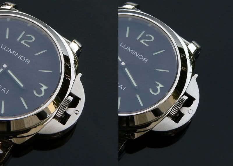
I have always loved my 024A from EL, I like the sub line from panerai, and I liked the fact that the bezel did not have the hash marks between 12 and 3. The circular markers on the bezel and the circular hour markers on the dial combined with the brushed circular bezel gave this watch the feeling of being a "study in circles", which I really liked.
The one thing I was always vaguely a bit unhappy with was the fact that the case and crown were highly polished and only the bezel was brushed, giving too much of a bling effect to a watch that by design should have been strictly ruggedly masculine. Here is what it looked like before I decided to mod it:
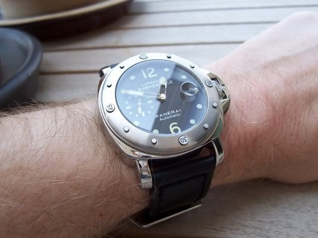
Definitely a good looking watch. But I thought it could be even better with an all-brushed case. Less accurate to the gen? Sure. But since I think panerai missed the boay on this one (and since there is no Ti brushed 025 reps available), I figured "why not?"
So, some time with some fine grit sandpaper, a brillo pad, and a scratch-pen, here are the results:
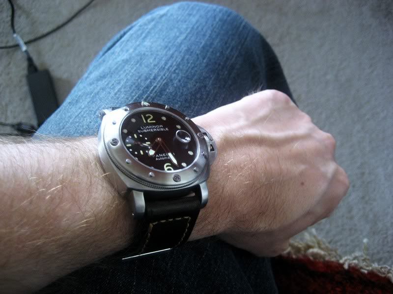
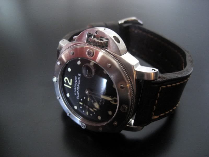
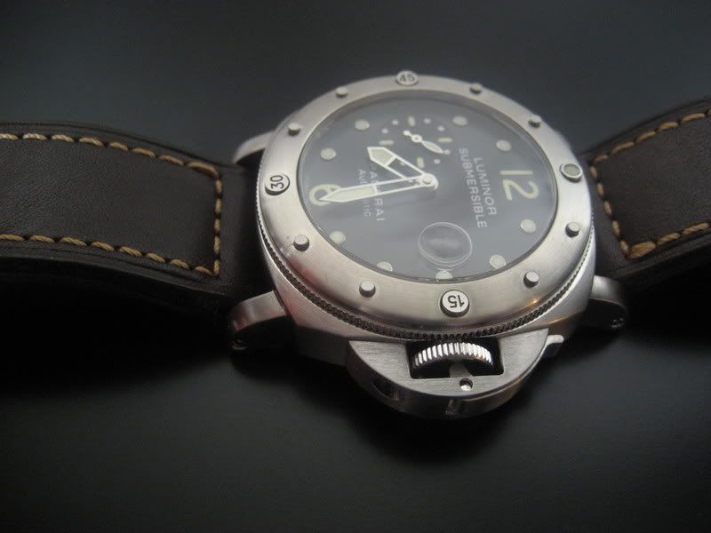
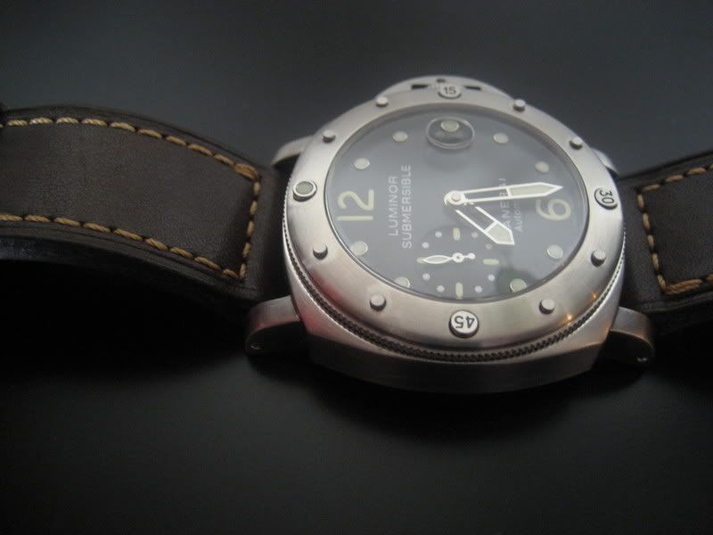
Hope you like it, I know I'm ecstatic!
[Update 9/29/2007]
OK, the next step I took was inspired by BBB (that's bigbadbrad to the rest of you). He experimented with "vintaging" some of his panny dials by putting them in the oven and the rubbing them with instant coffee grounds. I really liked the look he was able to come up with, so I tried it myself.
I disassembled the watch, removed the hands, removed the dial, and put them into a non-stick baking pan and popped them into the oven at 500 degree Farenheit. 20 minutes later I pulled them all out, re-assembled everything and Voila! Here is the result:


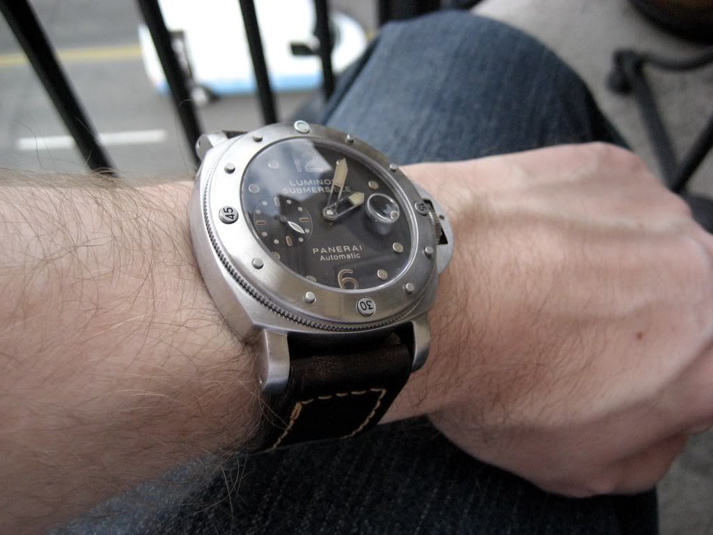
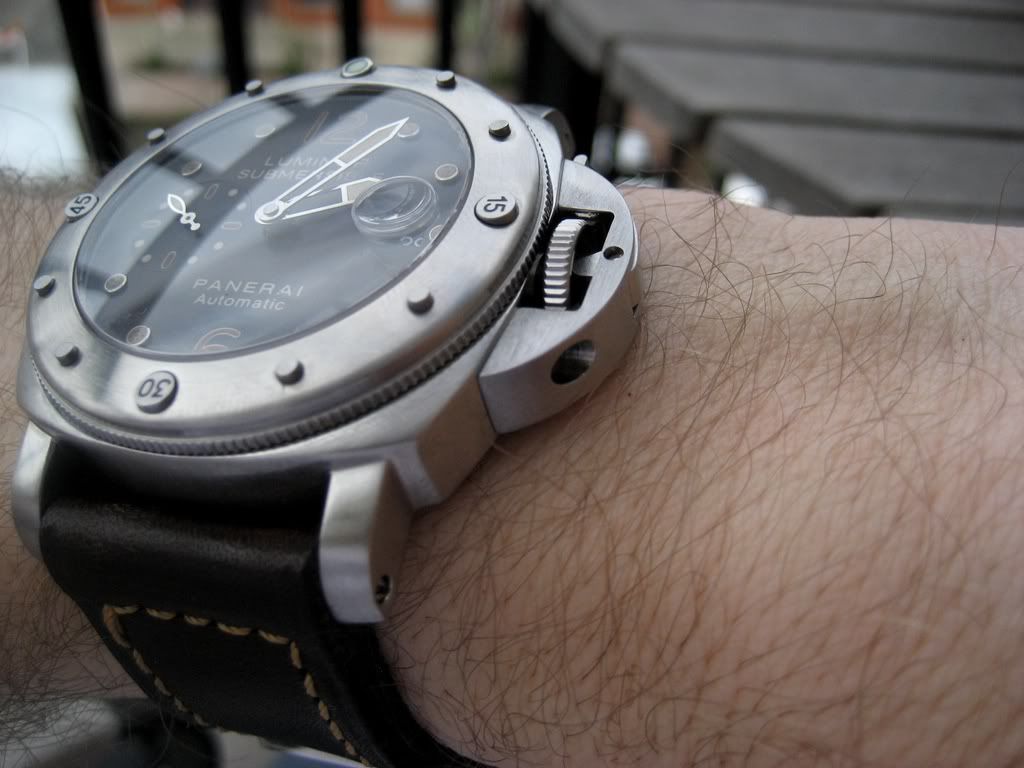
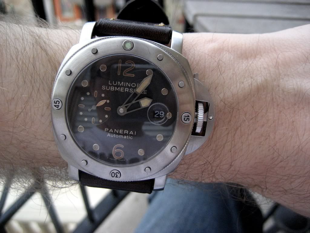
Now I'm even happier with the watch and I have to give a big shout out to Brad for inspiring this final step.
The one thing I was always vaguely a bit unhappy with was the fact that the case and crown were highly polished and only the bezel was brushed, giving too much of a bling effect to a watch that by design should have been strictly ruggedly masculine. Here is what it looked like before I decided to mod it:

Definitely a good looking watch. But I thought it could be even better with an all-brushed case. Less accurate to the gen? Sure. But since I think panerai missed the boay on this one (and since there is no Ti brushed 025 reps available), I figured "why not?"
So, some time with some fine grit sandpaper, a brillo pad, and a scratch-pen, here are the results:


Hope you like it, I know I'm ecstatic!
[Update 9/29/2007]
OK, the next step I took was inspired by BBB (that's bigbadbrad to the rest of you). He experimented with "vintaging" some of his panny dials by putting them in the oven and the rubbing them with instant coffee grounds. I really liked the look he was able to come up with, so I tried it myself.
I disassembled the watch, removed the hands, removed the dial, and put them into a non-stick baking pan and popped them into the oven at 500 degree Farenheit. 20 minutes later I pulled them all out, re-assembled everything and Voila! Here is the result:


Now I'm even happier with the watch and I have to give a big shout out to Brad for inspiring this final step.

