• Tired of adverts on RWI? - Subscribe by clicking HERE and PMing Trailboss for instructions and they will magically go away!

New Breitling B01 Genuine, Why I DONT like it!

daytona4me

SOVED-24 - Sudden Onset Varying Excuses Disorder
Staff member
Administrator
Certified
4/3/06
14,895
15,772
113
I visited my local Breitling dealer to see what they had new.
They had a number of dial designs available in the new B01 model.

Although there were several dials that I liked, I could not get over the hideously large pearl! It is horrible! It's is a nasty green color and is very very large.

I also did not like bezel. Most people say they like the new design of the bezel, let me tell you that in the pictures, it looks nice, in person , you realize how much empty space there really is on that bezel. There is a lot of unused space on the bezel and it is awkwardly bare.

Overall, I'm not happy with the new B01 and I will not be looking forward to it's replica release.

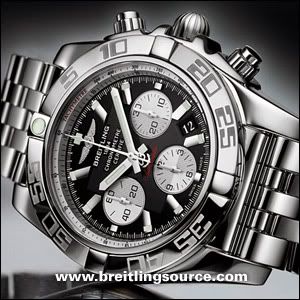
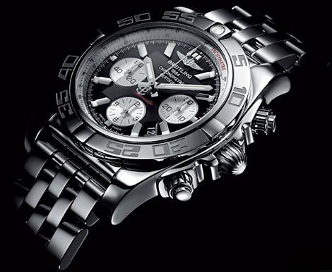
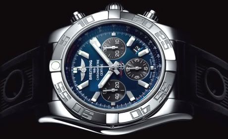
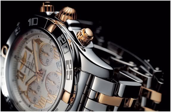
Look at these pretty pictures below, the GENUINE WATCH DOES NOT DO THE PICTURES JUSTICE. It's really odd I know, but try it for yourself, when you see it in person the bezel leaves a lot to be desired, and the pearl, awful!

chronomat_b01_01.jpg


breitling-chronomat-b01.jpg


breitling-chronomat-b01-3.jpg


breitling-chronomat-b01-2.jpg
 

acharria

Respected Member
26/10/09
5,146
11
0
Tks a lot, i was thinking on get me one, but afther this review, i will find another rep for me.
I´m really gratefull whit this post.
 

Hambone

Banned member, the goat does not approve
Banned
24/11/06
2,639
1
0
I agree. Upon seeing this at the Torneau AD, I told the salesman he had to get it out of my sight before I punched his lights out. He complied, but I punched his lights out anyway, just so he knew where I was coming from.
 

Anopsis

I'm Pretty Popular
5/8/09
2,899
1
38
I don't care much for the pearl, but I like the bezel FROM WHAT I SEE IN THE PIC. However, I trust you when you say that in person it doesn't work. Bummer.
 

tommy_boy

Athletic Supporter
23/4/09
9,562
174
63
The Evergreen State
I agree. Upon seeing this at the Torneau AD, I told the salesman he had to get it out of my sight before I punched his lights out. He complied, but I punched his lights out anyway, just so he knew where I was coming from.


Yeah, that's what I'm talkin' about! :cool2:
 

JellyJoe

Respected Member
28/9/09
4,103
37
48
The new bezel and pearl are making the watch look like a damn swatch. It sucks, new design only managed to make it look cheaper.
 

rooster133

Mythical Poster
Advisor
25/7/08
6,358
29
0
Funny, 'cause I kind of had the opposite experience... When I saw the pictures I though it sucked big time. But when I saw a few different versions at the AD I thought it was better than expected. I still think the design is somewhat a bit of a mess (e.g., that date font, the subdial markers font, and the bezel font should not appear on the same watch!!). But the good news was that the big square in the middle of the dial didn't look half as bad as it did in the pics... Anyway, this is definitely a weird watch... Pity, because the movement is somewhat an exciting development. Anyway, I'm curious to see how the rep turns out. Not too long now.
 

guru

Advisor
Advisor
Certified
30/9/06
11,780
1,602
113
It is good that everybody has a different taste, I like the bezel a lot. But I will check with the AD coming next week.
 

trailboss99

Head Honcho - Cat Herder
Staff member
Administrator
Certified
30/3/08
43,901
20,149
113
I agree. Upon seeing this at the Torneau AD, I told the salesman he had to get it out of my sight before I punched his lights out. He complied, but I punched his lights out anyway, just so he knew where I was coming from.

Yeah, it just doesn't look like a Briet does it? Not sure this one is going to grow me either.

Col.
 

hk45ca

Legendary Member
Advisor
17/3/06
11,843
7
38
i don't care for the digital looking fonts on the bezel. it's a perfect candidate for a diamond bezel.
 

daytona4me

SOVED-24 - Sudden Onset Varying Excuses Disorder
Staff member
Administrator
Certified
4/3/06
14,895
15,772
113
I really like the different dials they have available for these. The "big square" in the middle of the dial really did not look bad. I even like the bezel font, not too bad (dont prefer it though)
but it just left a big void on the rest of the bezel.

I also tried on a new Bentley that has a much wider lug, rubber strap combo, really..... nasty.

I did talk the guy into selling me a nice Omega Constellation wall clock for $250, I might buy it when I attend a private showing for VIPs next weekend (arent I special)
 

hk45ca

Legendary Member
Advisor
17/3/06
11,843
7
38
if you buy a new one you can sell me your evo. lol
 

mpg54

Known Member
29/8/09
153
0
0
I can't stand the rounded crown on Breitlings, otherwise I like them.
 

guru

Advisor
Advisor
Certified
30/9/06
11,780
1,602
113
there are lots of discussions about this watch in the Breitling forums. some people like it, some do not like it. I am glad to see a new bezel which is not in the Breitling line. Why not doing something new? All other Breitling watches have the rider at 3,6,9 and 12...this one for sure will not hurt your long arm shirts.

I wil try the gen on this week, maybe I will change my mind?:nah:
 

hk45ca

Legendary Member
Advisor
17/3/06
11,843
7
38
I can't stand the rounded crown on Breitlings, otherwise I like them.

the rounded crown and rider tabs are only on the chronomat line of breitlings. The crown is designed from the prop hub cover. none of the other breitling models have it. the bezel design was from the front view of a radial engine and emulated the push rod tubes on the forward side of the engine. the new design moved totally away from the original intint of the watches appearance. now it is just something they took from an invicta and put on it.

http://forum.replica-watch.info/vb/showthread.php/what-inspired-chronomat-designi-4685
 

I am Sam

Renowned Member
9/10/09
714
0
0
I was in LaSwiss the other day and had a chance to look at the posters for this series. IMHO the weird font they used is making it look ugly in pics as well as in person. Take the font out and replace it with GMT IIc font and this watch will be a beauty.
 

R2D4

Admin
Advisor
15/4/07
14,908
56
48
I think this is one of those watches that fall into the "Will Grow on You" category. I saw the pics, then went to look at one in the flesh. To me, it's ok. I wouldn't sell my collection to go buy one but it one were given to me I would probably wear it. I agree with Daytona on the pearl, it's a glowing snot wad.