- 18/3/13
- 2,912
- 22
- 0
Hi RWI Brothers and Sisters
So here we have an little Addon to the "OLDER Session"
This was the Previous Session
http://forum.replica-watch.info/vb/...p-Dial-under-Microscope-and-more-(Big-Review)
http://forum.replica-watch.info/vb/showthread.php/246464-Yacht-Master-Rep-Dials-vs-GEN-Dials-(Addon)
In the Addon #2 i will show you the difference between the different YM TC Dials (KH and v1) and GEN Dials (2004,2010)
Let us this Time check the Details of Print etc.
and make an Comparison btw the Platinum Colors
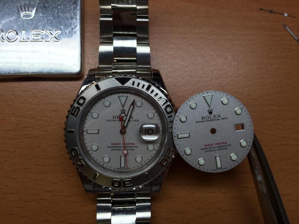
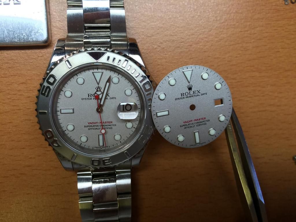
So let us start with
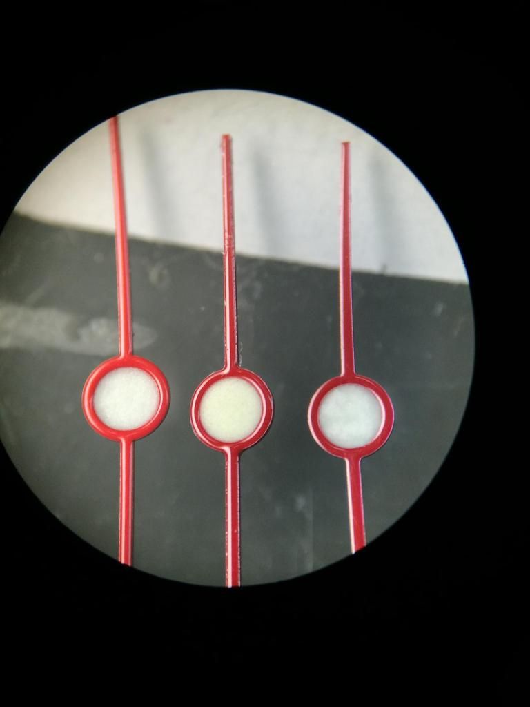
The three Stooges
Which one is the GEN ?!???
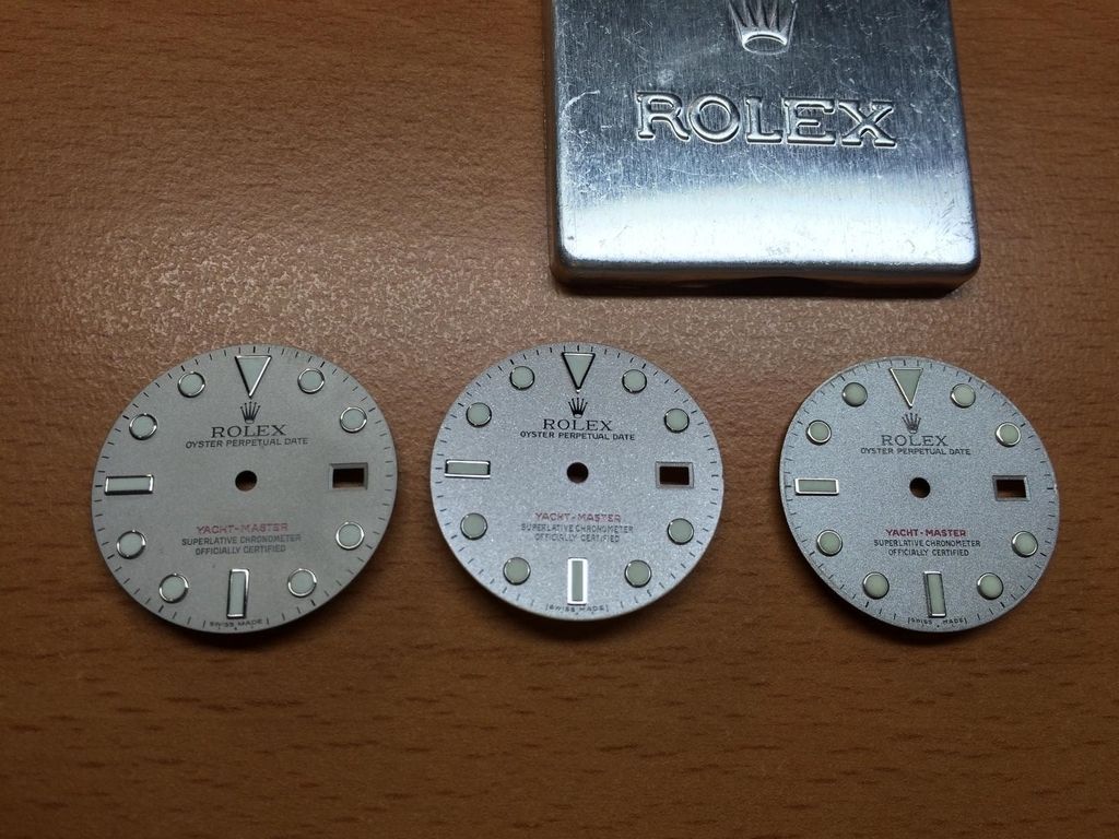
From Left to Right: GEN 2010 , TC KH Dial , TC YM Dial (v1 Dial)
So we see the GEN Dial has a very fine Platinum structure.
it looks like an fine quartz sand structure.
and there is no gloss to see on the surface
at the TC Dials we see a much coarser Platinum structure.
and a shiny surface
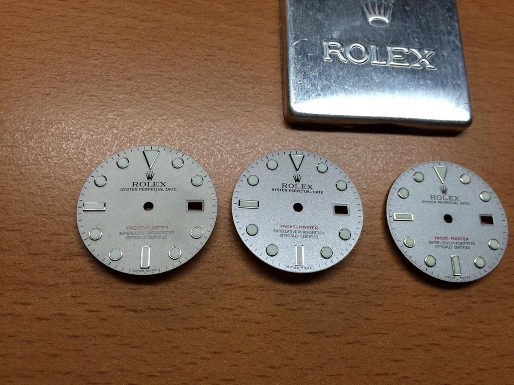
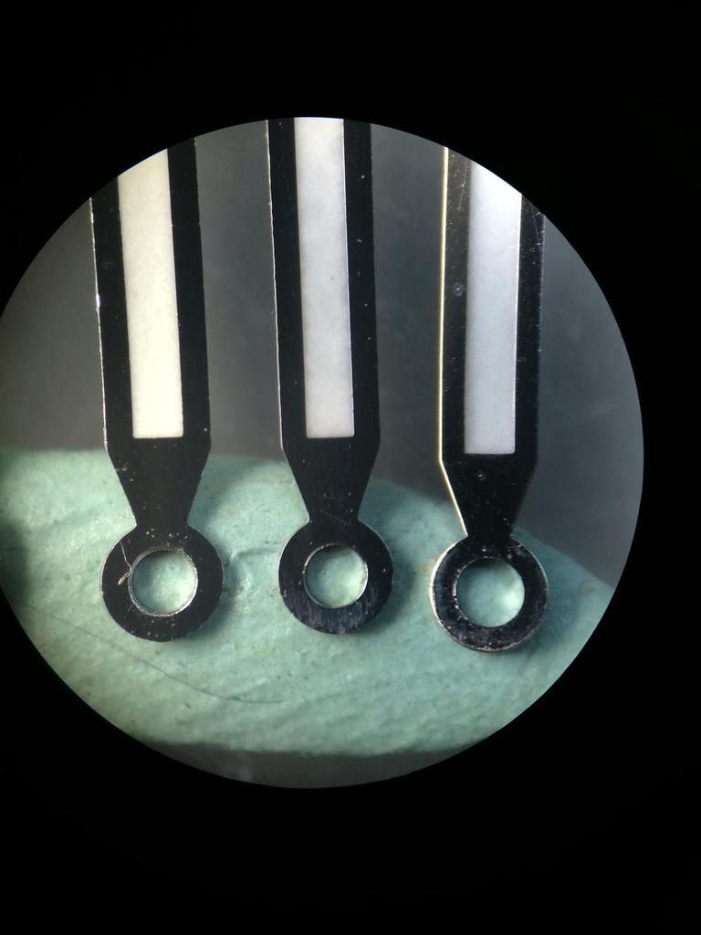
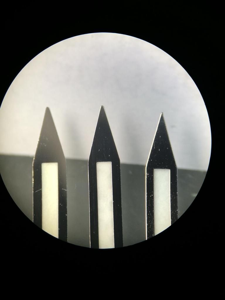
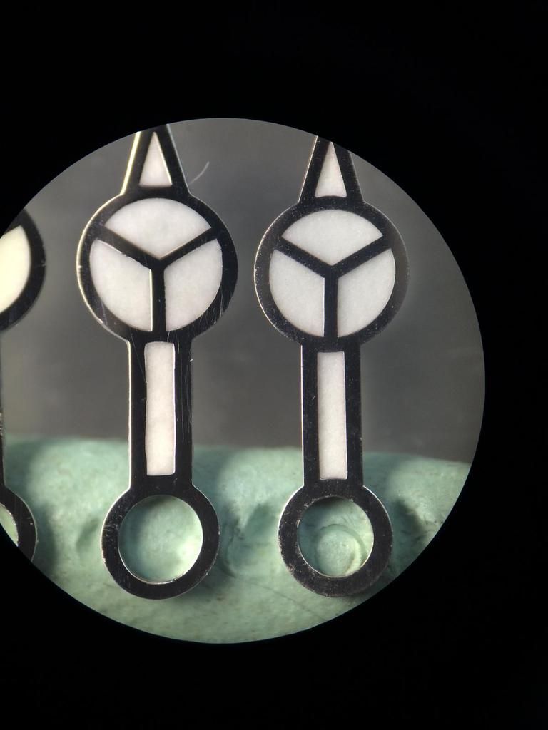
a closer shot
a closer shot
in the pic it looks as if the GEN Dial has a darker color
but if you see the Dials at different Angles in the Sunlight it is Conversely
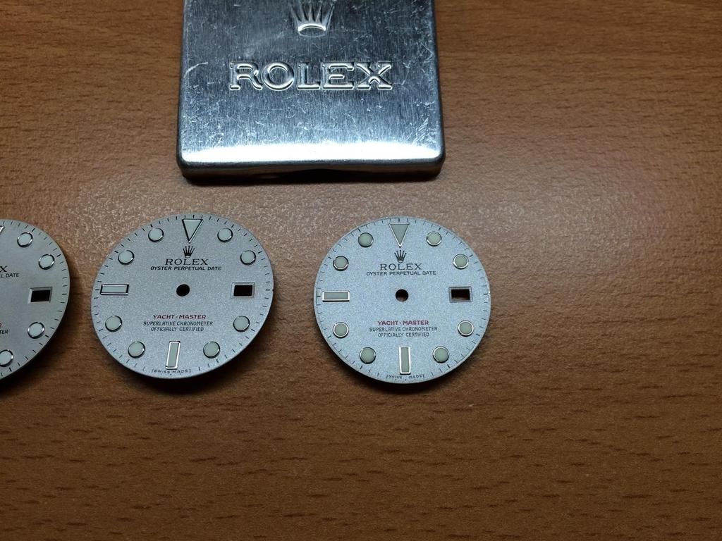
Let us see under different Lights.
Left: GEN , Right: TC KH , Bottom: TC v1
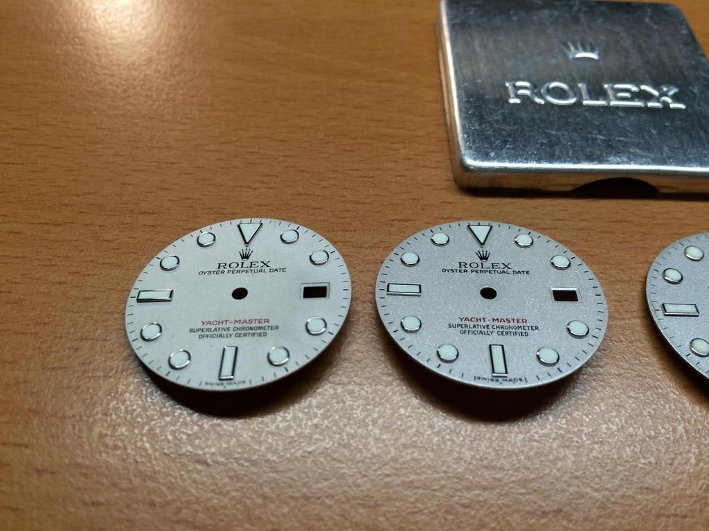
Comapred to the OLD GEN Dial from 2004
Top Left: GEN2010 , Top Right: GEN2004 , Bottom Left: TC v1 , Bottom Right: TC KH
Ok let us see the differents btw GEN2004(Watch) and GEN2010(Dial Only)
We see the structure of the Old Dial is more rough. The newer Dial has an even finer structure.
in the sunlight, the new Dial appears really strong. That´s why many GEN Users change there Dials in there YM
and pay a lot of more $$$ for an older Dial
We see the Color is nearly the same on the Old and New GEN Dial... Both are Platinum Blasted...
That Technique that Rolex use is an Art of Work! And that´s why nothing can Beat the GEN...
The Rep Dials are maybe close for the fast look on it, but if you go into the Detail you´ll see the real Magic of the YM...
To the differents of the Dials self we come back later.
Ok so now we Compare the GEN2004 with the TC KH Dial
Why i Compare to that? Because TC or the Dial maker have try to Emulate the Older GEN Series Dial.
The Main aspect on the Dials lay on the Platinum Color.
We see clearly that the TC KH Dial have a coarser structure.
There is an clearly different under different Lights, but the Complete look of the TC KH Dial is AMAZING.
I wish TC could affect the manufacturers a bit then we would have a Super Rep!
Lets see some different Angles on some you will be impressed
Especially on that
Ok so let us see the OLD TC v1 Compared to the OLD GEN Dial
IMG_4987
We can see also Clearly the coarser structure.
But if we Compare now the Old TC to the New one i must say the Complete look of the new KH Dial is really great.
But to the Details we came a bit later
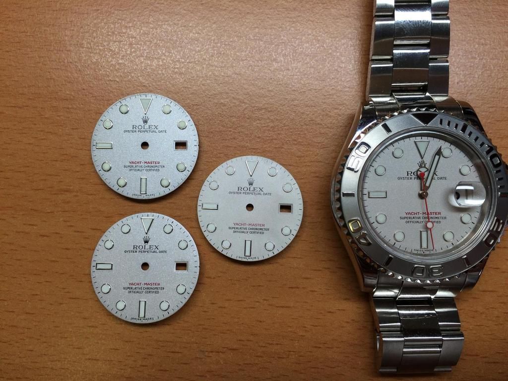
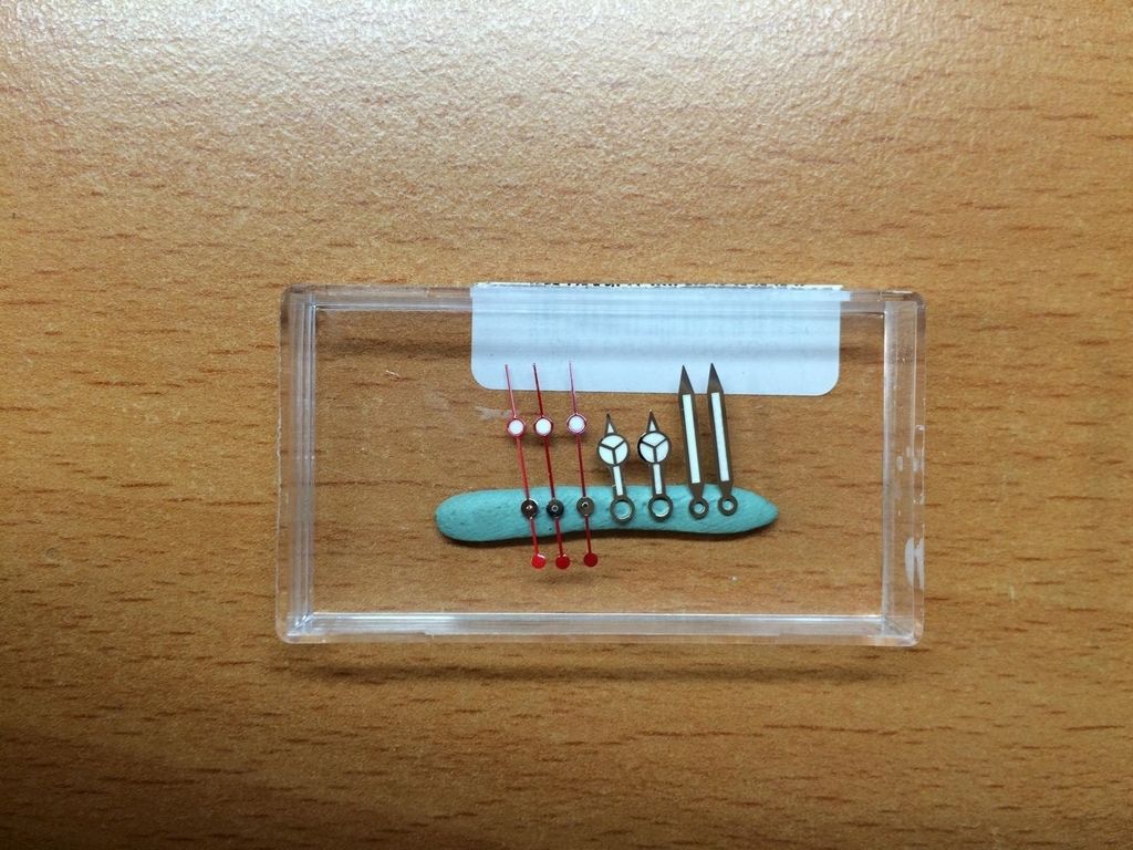
And an last Group shot and now let us go into the Details.
I have made all Shots from the same Distance from the Microscope Lense and always use the same Light Angles...
Let us begin with the GEN Dial 2010
Ok GEN2010 i think i don´t need much to say?
The Platinum structure is ultra fine! And we see there absolutley no Brownish Color or any other Darker Color as Silver
And that makes the different Color in the SunLight. As i said before these fine structure Reflect in the Sun sooooo much that you get Blind if you look at it.
The Lume Color (DayLight) is nice white, Typical Rolex Lume (SuperLuminova)
The Triangle looks very nice in all Details.
The Index Lines, Crown (all Prints) are really nice and Perfect.
The Rims of the GEN are sooooo nice!
I wish any Rep Factory would revise this!
If you Compare all Rep Dots that are out, you´ll see that the Dots are not rounded inside.
Check the next upcoming Pics on the Rep Dials. If they would do an improvement on the Rims the most Dials would look directley minimum 30% better.
Nothing more to say?! Absolut Perfect Print... But the Rep Prints are get better and better... And with the Naked Eye you won´t notice much differents.
See the Yacht-Master Print... Did you guys notice?
The Print on the newer Dials have change... The Typo is now Sarif... Look at every letter.
The SWISS MADE Print is now a little finer and there is more Space btw the S and M
And an Rim again... The Rim´s on the newer Dials have changed also... The Rims are much thicker!
The Indice Lines are normally Lines not like an I (Sarif)
Ok so let us check the new TC KH Dial...
One thing that i haven´t measure! but i have notice as i have changed the Dial on the Movement Holder.
I haven´t change the size on the Holder, i had the Gen Dial in before and it wasn´t tighten in the Holder.
I could take the Dial so out!
As i would lay the Rep Dial in the Holder i saw the Rep Dial has an larger diameter. See Pic
only for info
What we see directly is the different structure.
The structure under the Microscope looks like sand paper really really rough.
The Platinum Color of the KH is also more Brownish in the most Angles...
Same as on the older TC v1 Dial.
The Triangle is really nice! also the Plate of the Triangle, Dots and Rims is much much better as on the older Dials.
The Lume Especial the Daylight Lume has also updated! It´s not that pure White that the GEN have,
but it´s really close and much better as on the older Dials.
For this Rough structure the Print is very nice! the Crown isn´t 1:1 but i think this wouldn´t be noticable.
The Yacht-Master Print is really good now! The Color isn´t the same but the Print self is the best i saw on an YM Rep Dial.
The Dots are really nice! but you can see what i meant before. The inner circle of the Dot is sharp!
If the Factorys would do an Polish before they Plate the Dots, Rims, Sqaures etc it would be absolut Perfect.
The Square is also really nice. The SWISS MADE is now better and fit to the older Series Dial.
Another Dot again, also here all Perfect. Only the Indice Lines are wrong!
That need an improvement... For Emulate the old Dial it need the I (sarif) look.
Ok let´s see the Old TC Dial again...
Hooooooly C...p what we saw all the Years as really Perfect and good?!??
I think it don´t need much words or?
The Triangle looks ahmmm yeah... think self!
Ok the structure is also Rough and the Platinum Color has much more Brownish Parts in as the KH Dial have.
The Lume Color of the Older TC Dials are Defenitley too Yellowish at the DayLight.
Hell yeah... We love all the Years an Fantasy Crown?!??
I think there is not much too say... The Crown and Print isn´t that nice as on the KH...
The Dots on the old was a little better in my eyes... But the Plate of the Dots etc wasn´t Perfect.
But if you look closer you´ll see the Inner Circle is more rounded.
Plate these dot new and i think it´s better as the new Dots
The Print of the Yacht-Master is too light in the Color and the Typo is too FAT...
But these we also know all the Years before.
The Squares of the Old Dial wasn´t the best... But what should we do??? We had no other things!! we must use what we got... hehe
The S and M Print has too much Distance... And Yes i know that there are was different Prints on the GEN too.
But no GEN Dial looks like that.
An Dot again... Here we see again that the older Dots are more rounded... After an Plate and Relume these Dots looks GEN like
Ok let´s see the Older GEN2004 Dial
It´s the same as on the 2010 Dial... Structure is really really fine, and absolutley no Brownish Parts.
That makes the different as already said if you Plate with real Platinum or if you Paint with Color.
Trinagle, Print, Lume all Perfect.
The Crown is different. Print self Perfect.
The Dots of the older Dials are much smaller... If you look closer on the GEN Dots you will see the rounding in the
inner Circle.
The Yacht-Master Print self is nice as all Prints on the GEN Dials.
But the Typo self has changed with the Years as i already said. The older Dials have an Typical ARIAL Typo.
No Sarif Typo as the newer Dials.
The Squares are Perfect...
The SWISS MADE Print on these Dial is really close.
There is not much Space. But there was also Older Dials out with a little bit more Space.
Dot again... We see again the older Dots are smaller as the newer ones.
And we see the Full Hour Indiec have I (Sarif) Typo
These must be updated on the TC KH Dial
So that´s it so far from the Dial!!! I hope you had Fun till here?!??
we come to the final sprint...
The Hands...
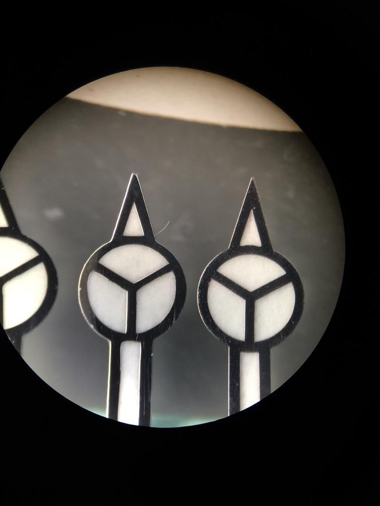
Minute Hands (Left TC v1, Right TC v2)
Only different we see at the bottom is the Lume Color
The newer TC Hands have updated Lume DayLight Color and match Perfect to the KH Dials.
At the Tip we see an improfement
The new Tip if much more Accurate. And the Plate on the newer Hands is also much better!
Same as on the Dial Dots, Rims, Squares etc.
The same updates we have on the Hour Hands (Left TC v1, Right TC v2)
The Second Hands have changed too but it´s not sooooo noticable. (Left TC v1, Right TC v2)
Under Microscope you see the Details... Lume is updated too...
And the Red is now a little Darker as on the old Hand. The old Hand Color was in my eyes a little bit better.
But both are far away from the GEN.
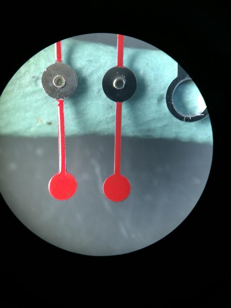
Here we see the Second Hands from Left to Right
GEN, TCv1, TCv2
we see clearly both Colors are too dark.
Under Microscope
GEN, TCv1, TCv2
Minute Hands again Compared with the GEN
(Left TC v1, Middle TC v2 , Right GEN)
We don´t see any real different. I can tell you the only different from this is the side view.
The GEN has an much better Finish (Plate)
So the Tip of the GEN is a little bit more sharp but TCv2 is close
Also the cut out for the Lume is at the GEN a little little bit wider.
The Min Hand... (Left TC v1, Middle TC v2 , Right GEN)
The TCv2 Min hand is really good, the only flaw that all Rep Hands have on the Min hand is
the rounding in the Top Tip... Look closer to the Mercedes Star, at the out side circle.
It goes Perfect round also on the inner Tip.
A closer Pic
Ok Brothers and Sisters...
That´s it now...
I hope you had all Fun... And Rep Points are Welcome hehe
So let us make some Conclusion:
The TC YM KH Dial is one of the closest to the GEN YM Dials.
The overall Quality of the Dial is really really Great!
If TC maybe make in the near Future an new KH YM v2 Dial and it has a few little little improvements, i will call it Super Rep.
So for now this is the best Rep Dial (Watch) that you can get for $$$
If we see the Improvements btw the TCv1 and TC KH Dial there are Worlds...
So at the beginning i must say i was a little Skeptical
but now I'm really very impressed...
The KH Factory is one of the best Rep Factorys for Dials and Hands...
The Quality is AMAZING !!!
I hope TC will stay with them a long Time...
I can only say bravo TC very nice Work!
I hope that people appreciate it...
Here are some summaries:
Thanks for looking !!!
So here we have an little Addon to the "OLDER Session"
This was the Previous Session
http://forum.replica-watch.info/vb/...p-Dial-under-Microscope-and-more-(Big-Review)
http://forum.replica-watch.info/vb/showthread.php/246464-Yacht-Master-Rep-Dials-vs-GEN-Dials-(Addon)
In the Addon #2 i will show you the difference between the different YM TC Dials (KH and v1) and GEN Dials (2004,2010)
Let us this Time check the Details of Print etc.
and make an Comparison btw the Platinum Colors
So let us start with
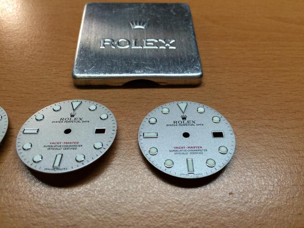
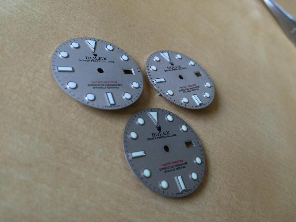
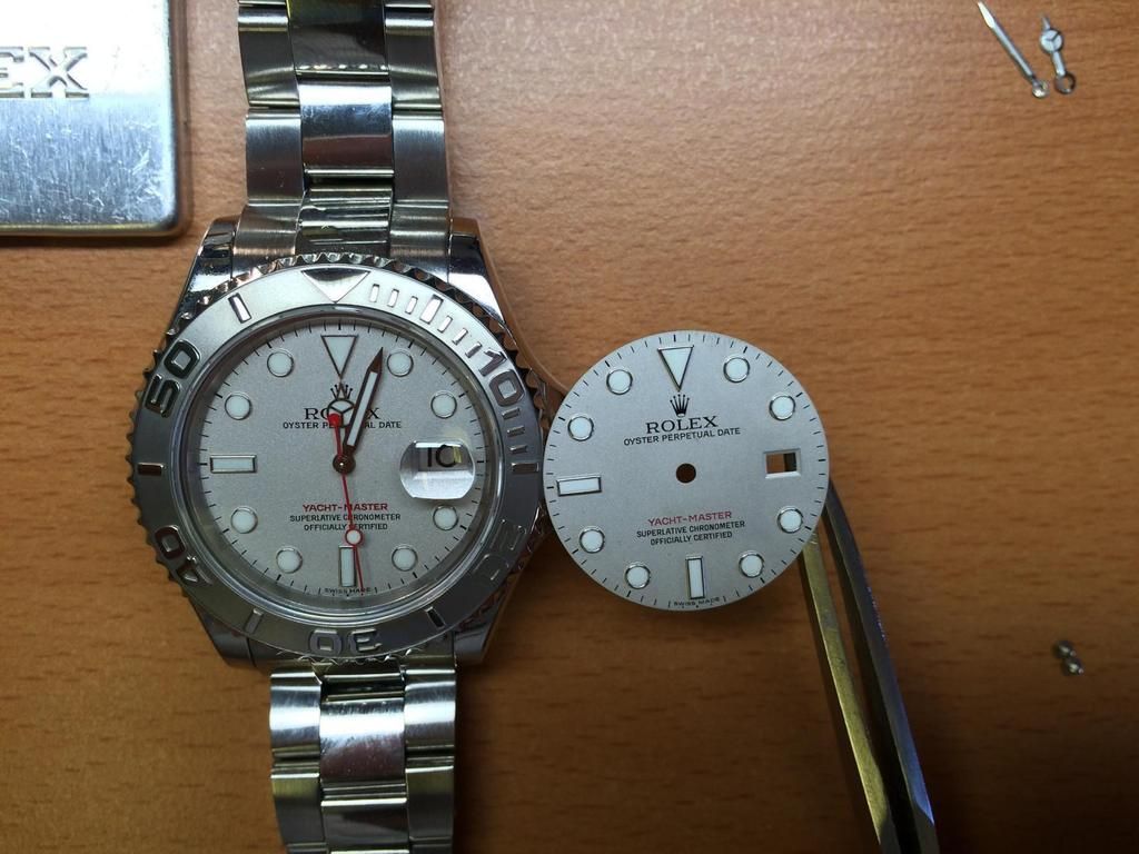
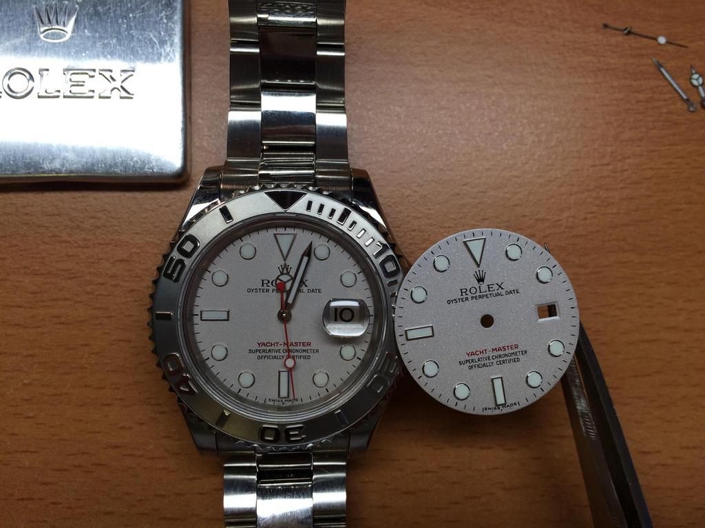
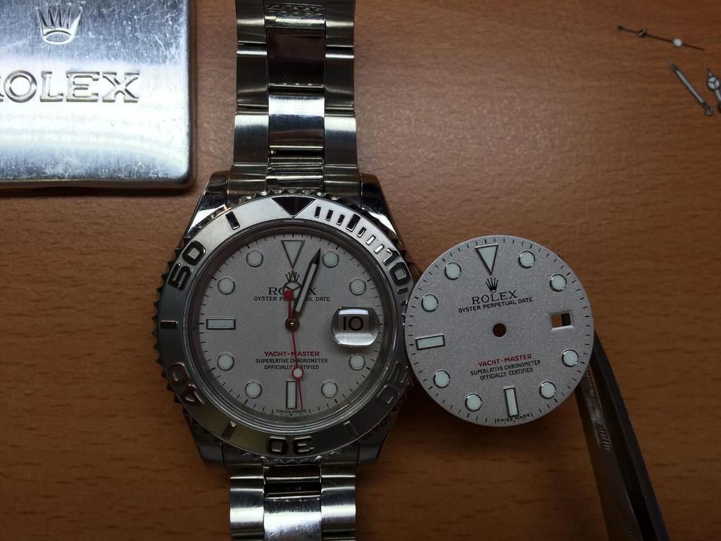
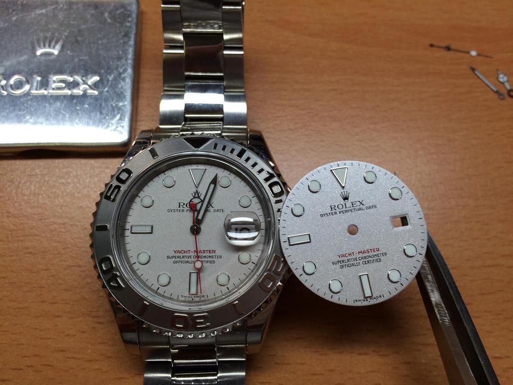
The three Stooges
Which one is the GEN ?!???

From Left to Right: GEN 2010 , TC KH Dial , TC YM Dial (v1 Dial)

So we see the GEN Dial has a very fine Platinum structure.
it looks like an fine quartz sand structure.
and there is no gloss to see on the surface

at the TC Dials we see a much coarser Platinum structure.
and a shiny surface

a closer shot

a closer shot

in the pic it looks as if the GEN Dial has a darker color
but if you see the Dials at different Angles in the Sunlight it is Conversely
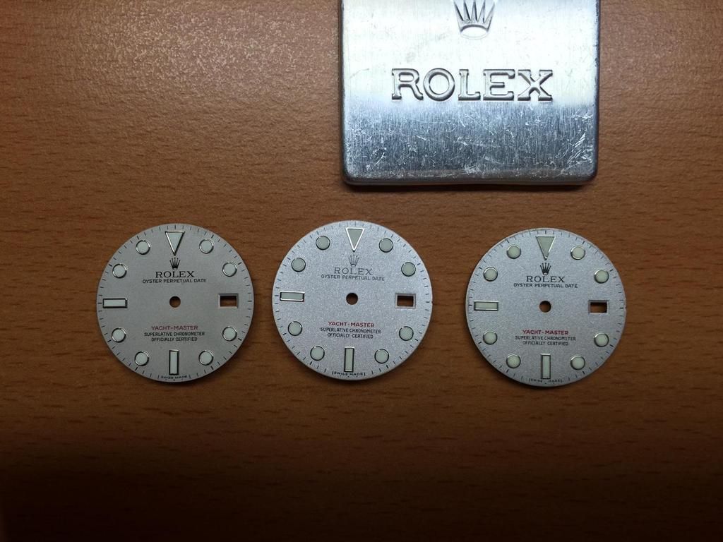
Let us see under different Lights.

Left: GEN , Right: TC KH , Bottom: TC v1


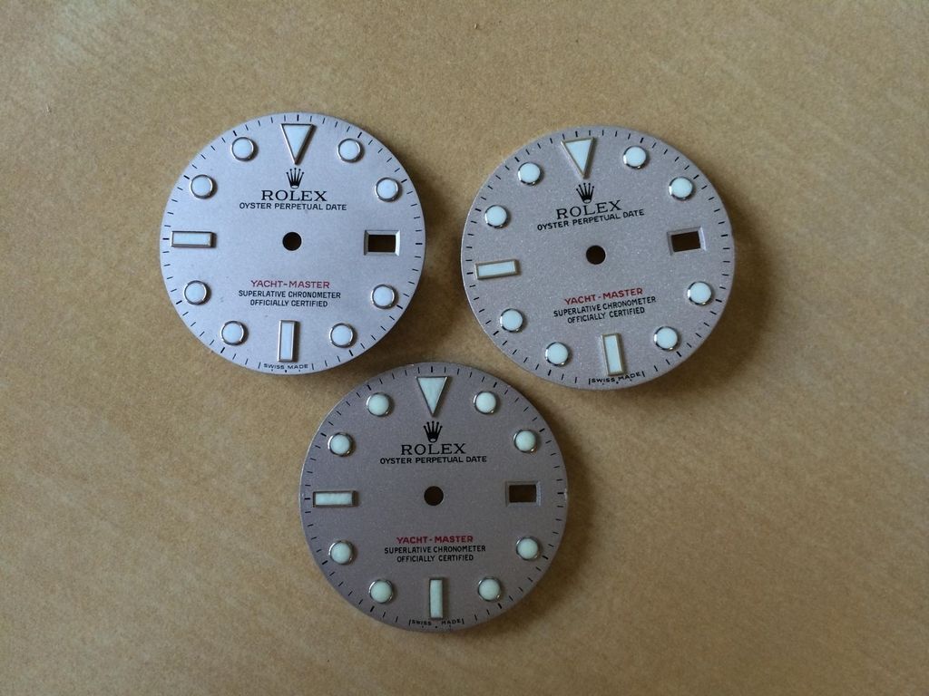
Comapred to the OLD GEN Dial from 2004
Top Left: GEN2010 , Top Right: GEN2004 , Bottom Left: TC v1 , Bottom Right: TC KH

Ok let us see the differents btw GEN2004(Watch) and GEN2010(Dial Only)
We see the structure of the Old Dial is more rough. The newer Dial has an even finer structure.
in the sunlight, the new Dial appears really strong. That´s why many GEN Users change there Dials in there YM
and pay a lot of more $$$ for an older Dial

We see the Color is nearly the same on the Old and New GEN Dial... Both are Platinum Blasted...
That Technique that Rolex use is an Art of Work! And that´s why nothing can Beat the GEN...
The Rep Dials are maybe close for the fast look on it, but if you go into the Detail you´ll see the real Magic of the YM...

To the differents of the Dials self we come back later.

Ok so now we Compare the GEN2004 with the TC KH Dial
Why i Compare to that? Because TC or the Dial maker have try to Emulate the Older GEN Series Dial.
The Main aspect on the Dials lay on the Platinum Color.
We see clearly that the TC KH Dial have a coarser structure.
There is an clearly different under different Lights, but the Complete look of the TC KH Dial is AMAZING.
I wish TC could affect the manufacturers a bit then we would have a Super Rep!

Lets see some different Angles on some you will be impressed


Especially on that


Ok so let us see the OLD TC v1 Compared to the OLD GEN Dial

IMG_4987
We can see also Clearly the coarser structure.
But if we Compare now the Old TC to the New one i must say the Complete look of the new KH Dial is really great.
But to the Details we came a bit later


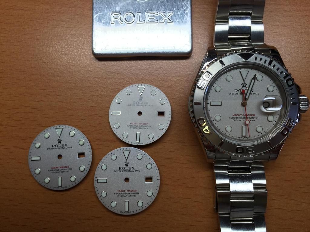
And an last Group shot and now let us go into the Details.

I have made all Shots from the same Distance from the Microscope Lense and always use the same Light Angles...
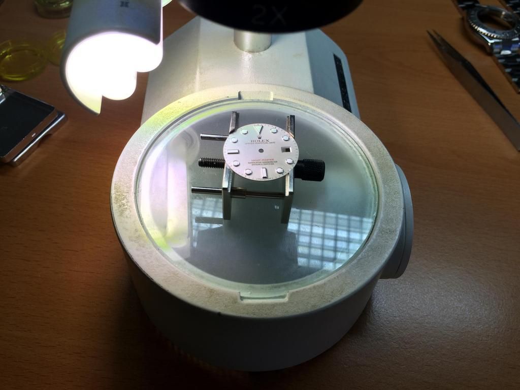
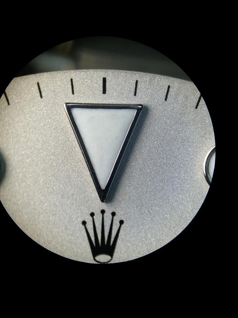
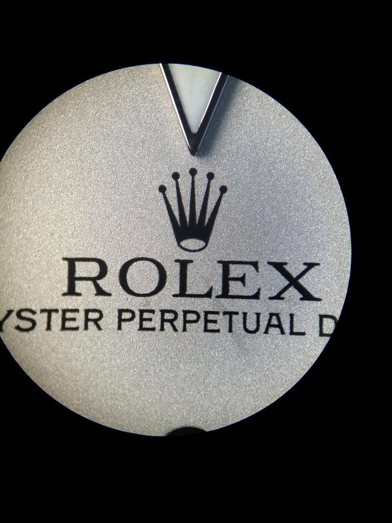
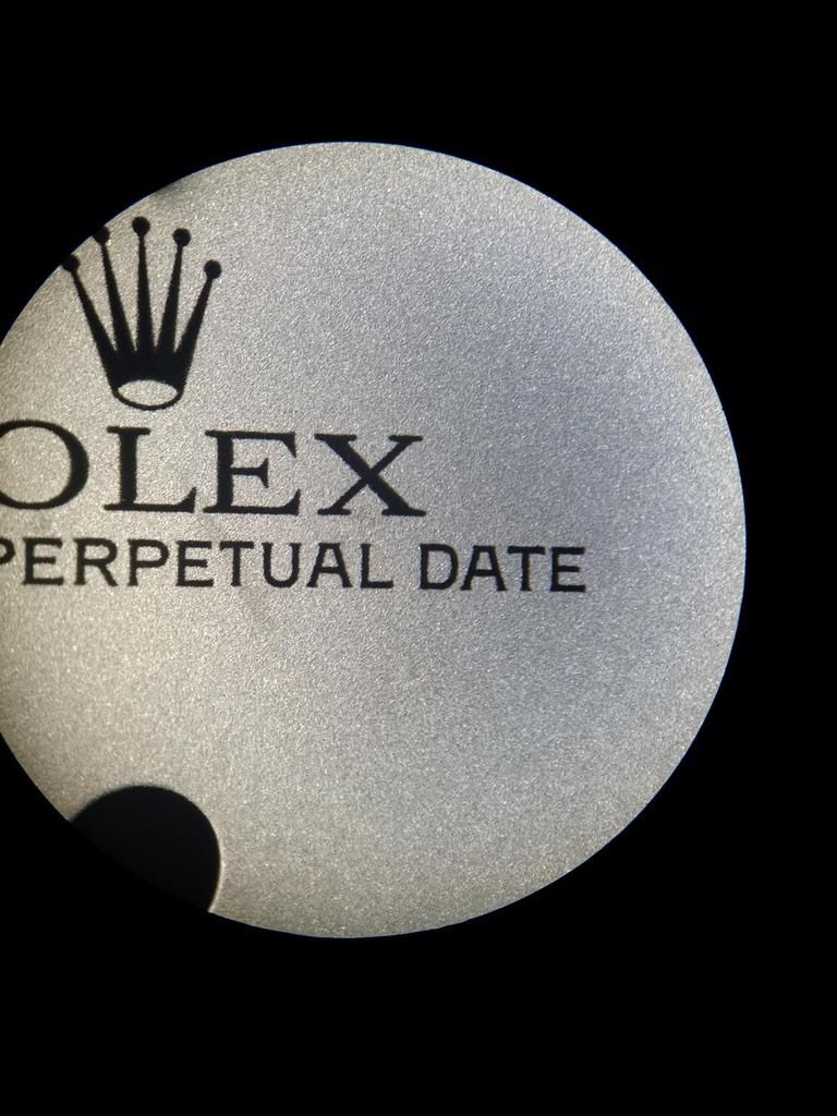
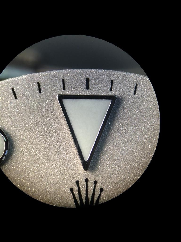
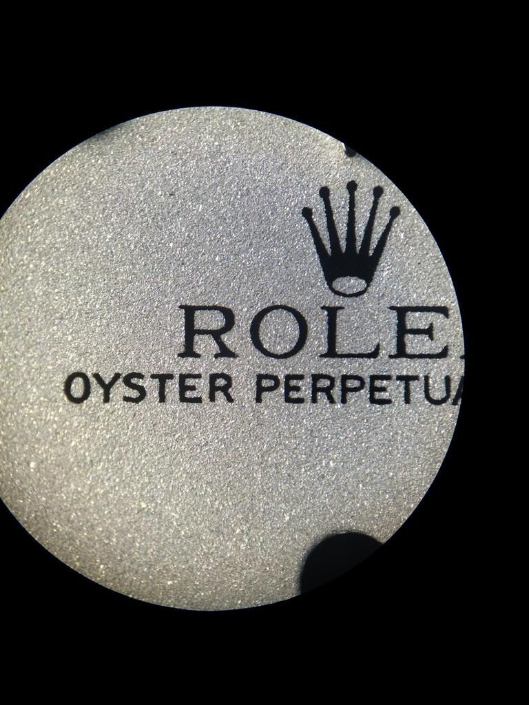
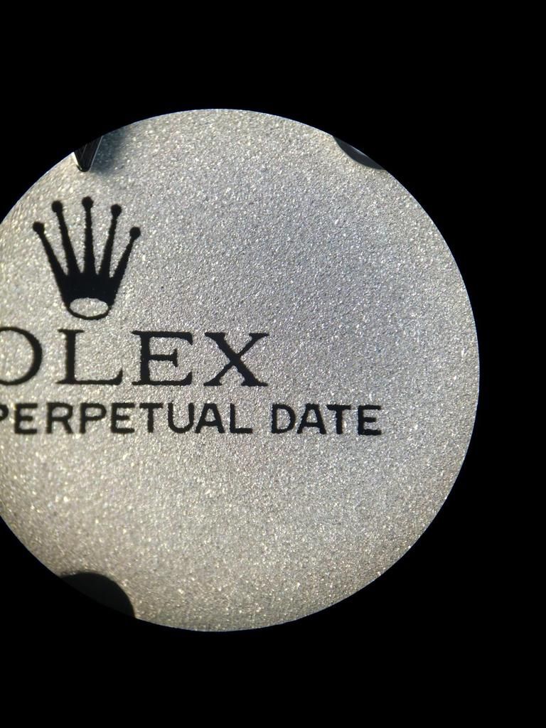
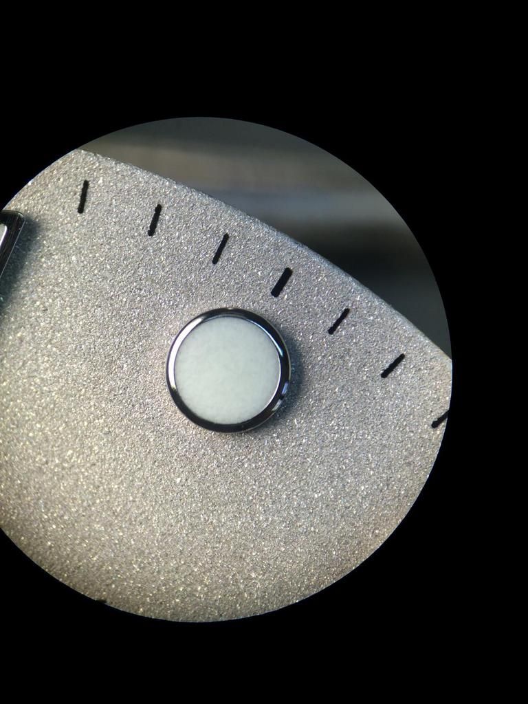
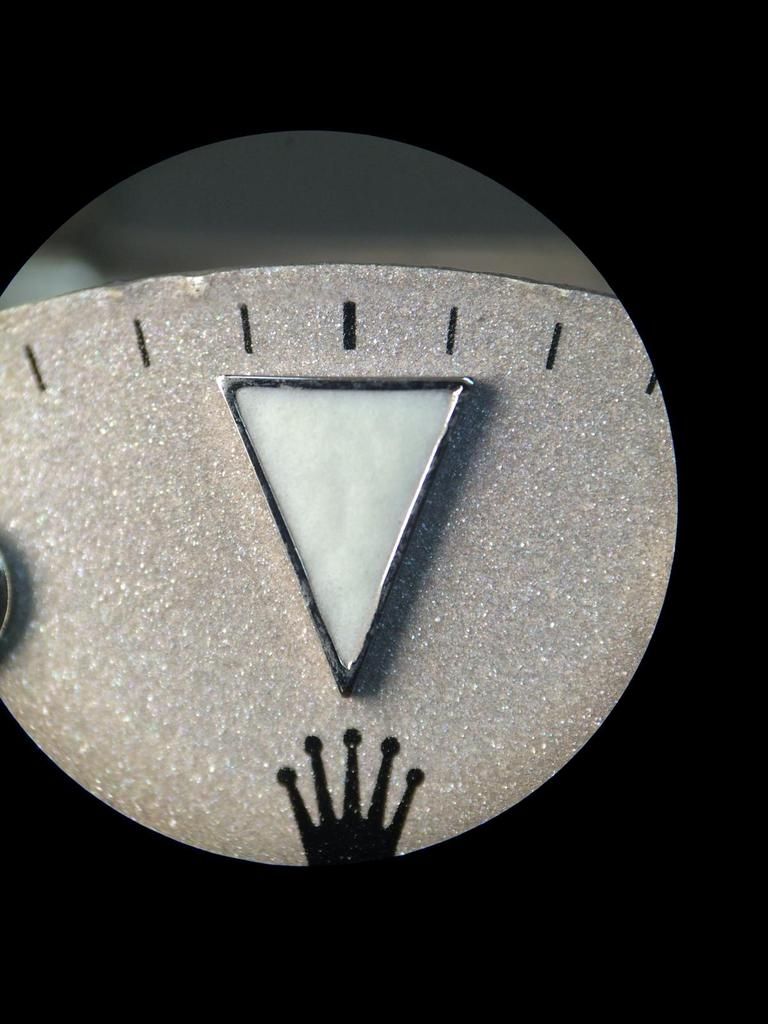
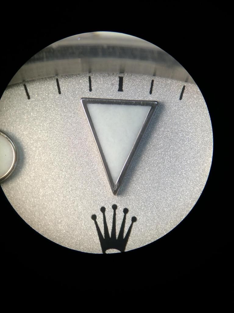
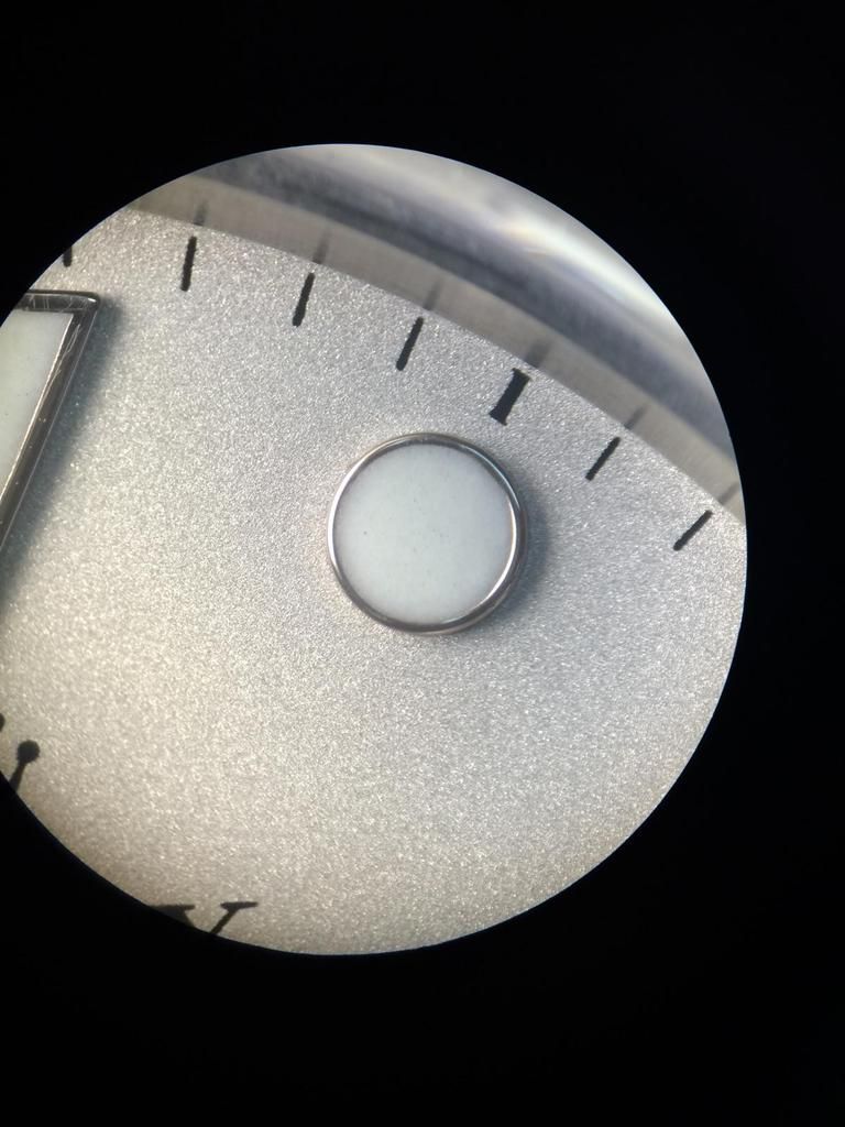
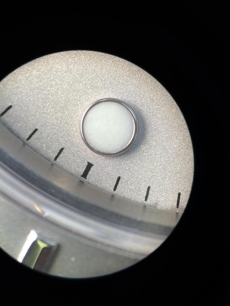
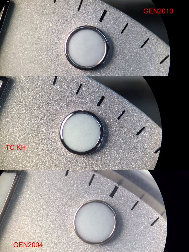
Let us begin with the GEN Dial 2010

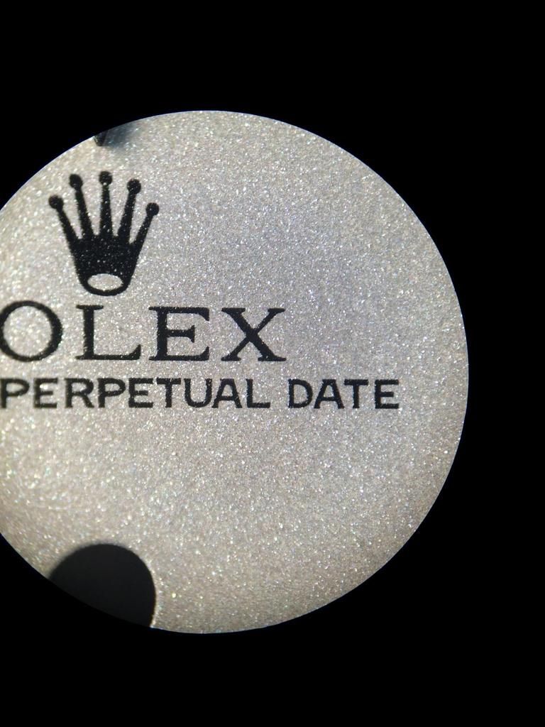
Ok GEN2010 i think i don´t need much to say?
The Platinum structure is ultra fine! And we see there absolutley no Brownish Color or any other Darker Color as Silver
And that makes the different Color in the SunLight. As i said before these fine structure Reflect in the Sun sooooo much that you get Blind if you look at it.
The Lume Color (DayLight) is nice white, Typical Rolex Lume (SuperLuminova)
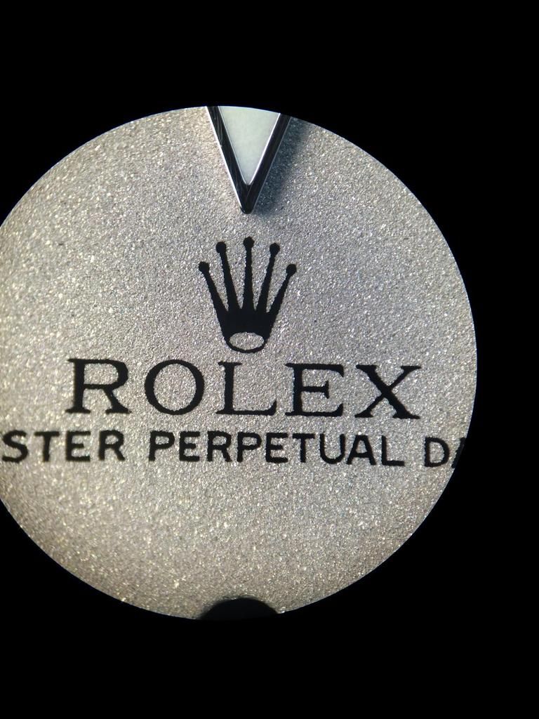
The Triangle looks very nice in all Details.
The Index Lines, Crown (all Prints) are really nice and Perfect.

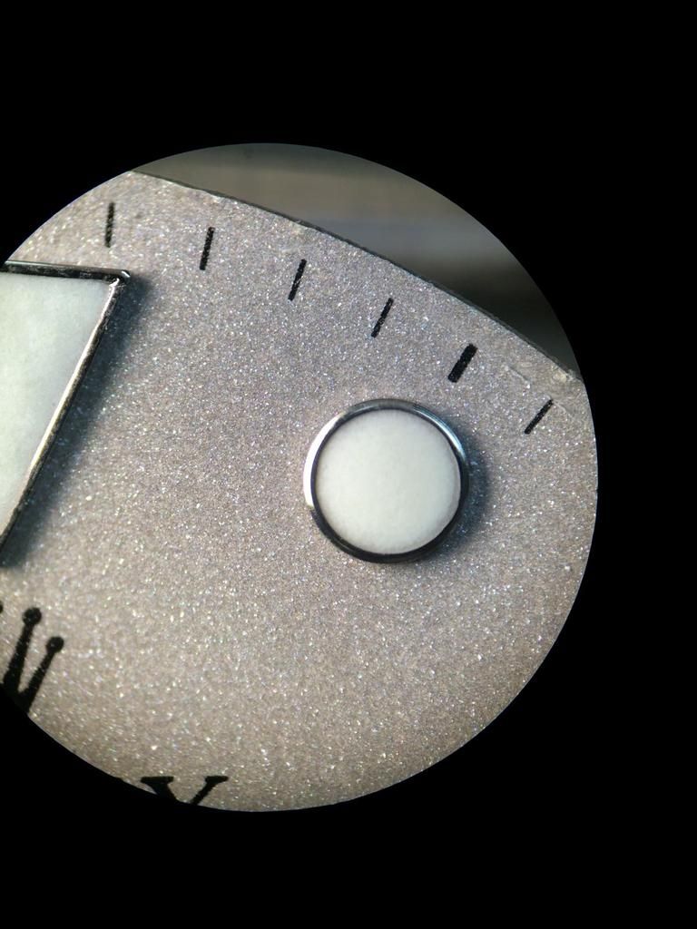
The Rims of the GEN are sooooo nice!
I wish any Rep Factory would revise this!
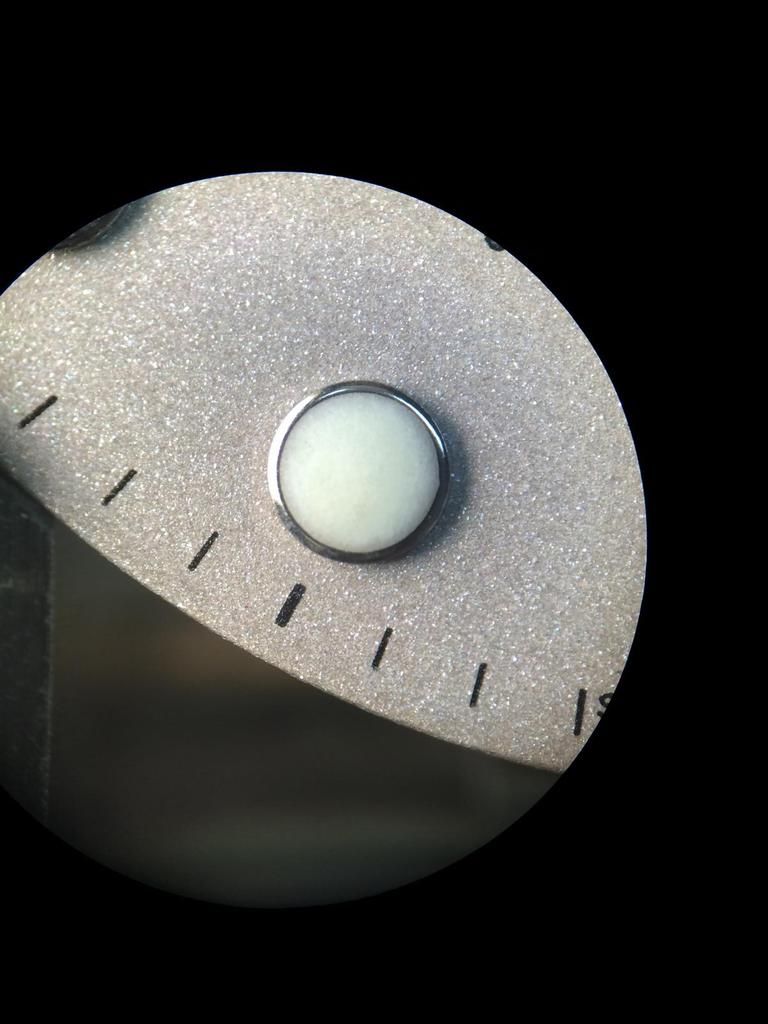
If you Compare all Rep Dots that are out, you´ll see that the Dots are not rounded inside.
Check the next upcoming Pics on the Rep Dials. If they would do an improvement on the Rims the most Dials would look directley minimum 30% better.

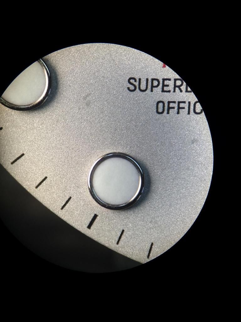
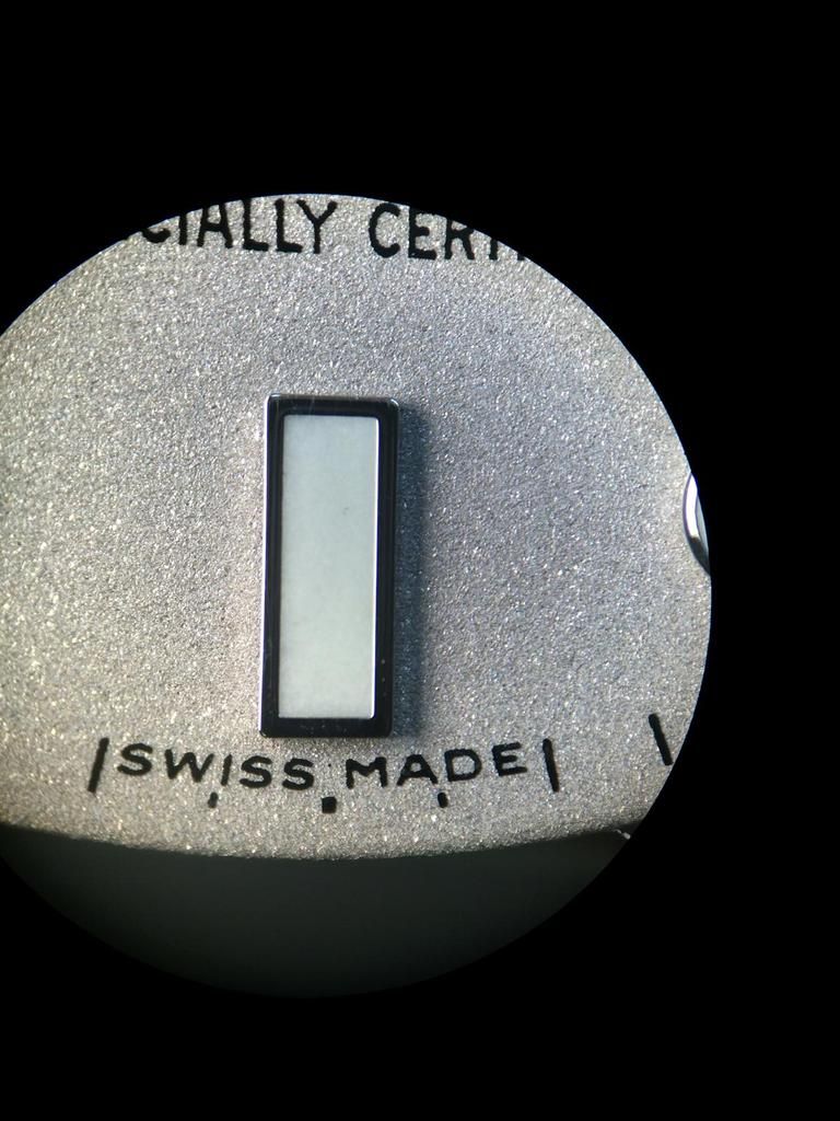
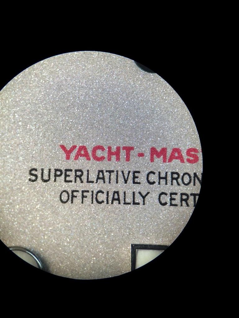
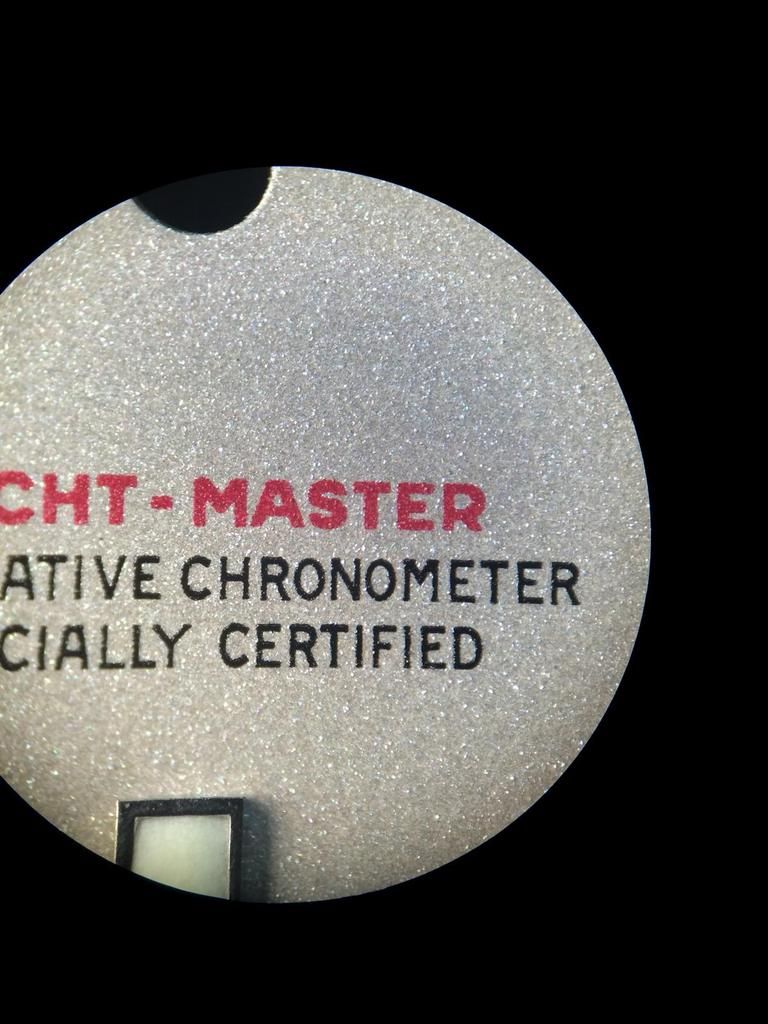
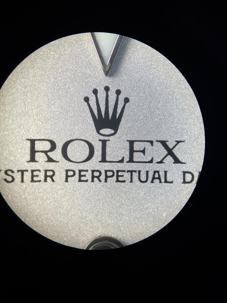
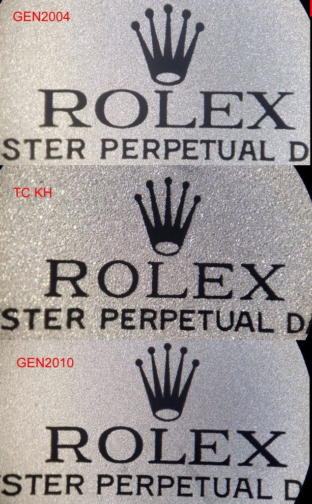
Nothing more to say?!
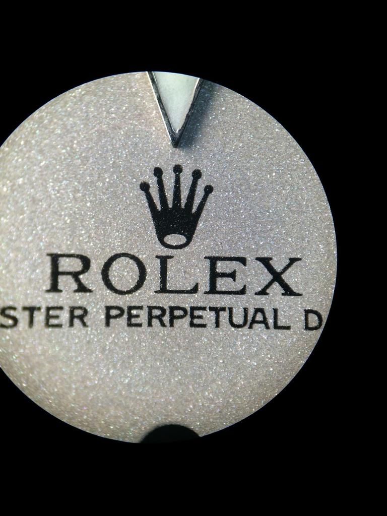
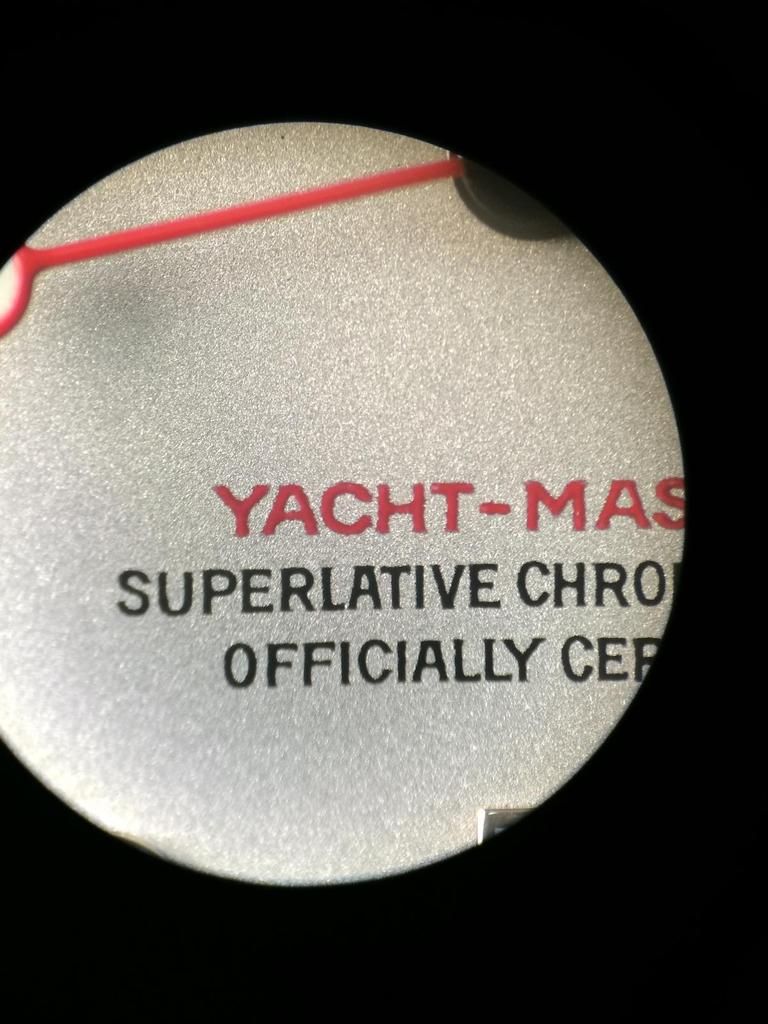
Absolut Perfect Print... But the Rep Prints are get better and better... And with the Naked Eye you won´t notice much differents.


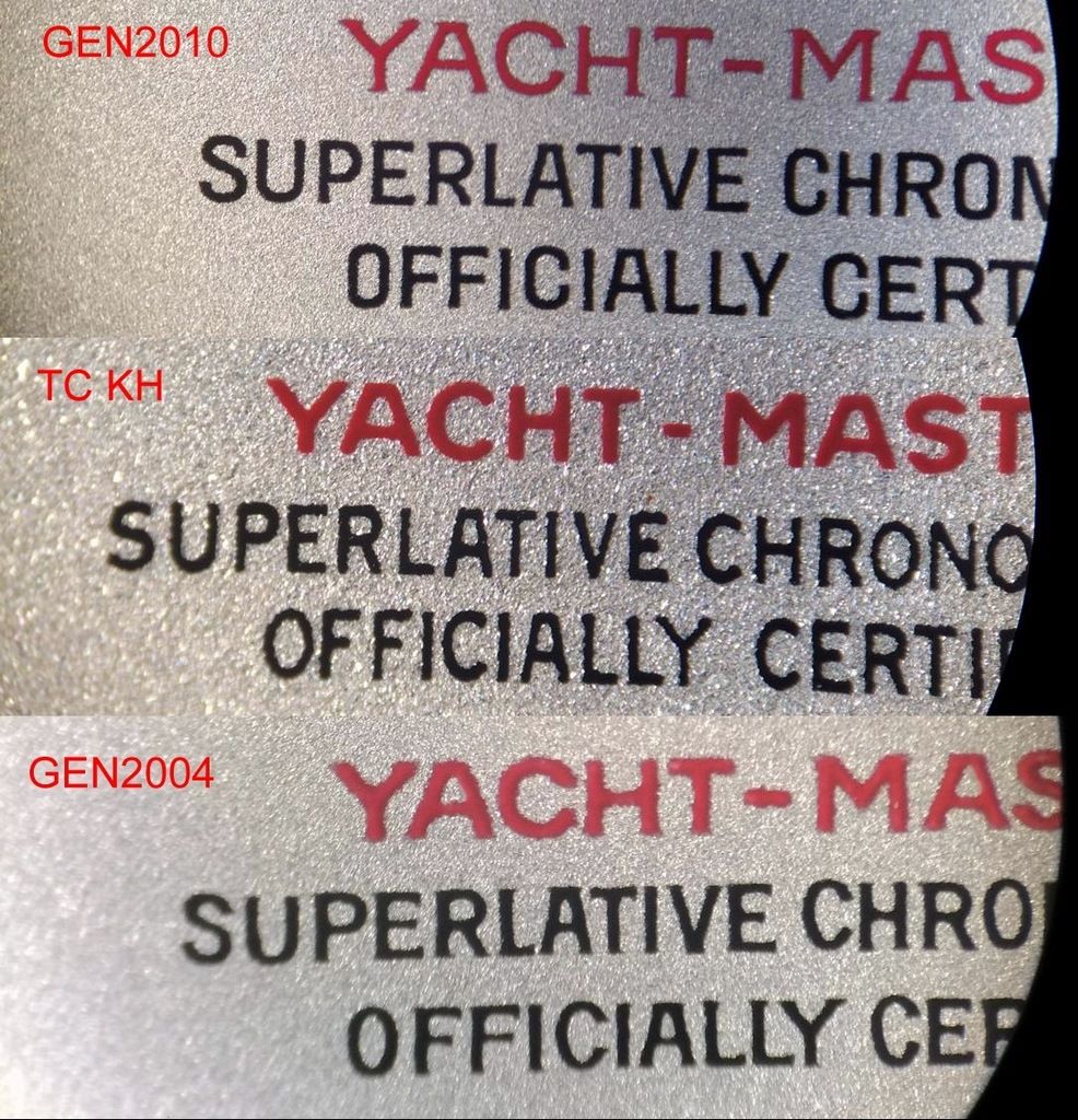
See the Yacht-Master Print... Did you guys notice?
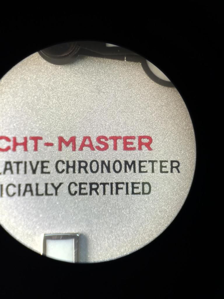
The Print on the newer Dials have change... The Typo is now Sarif... Look at every letter.


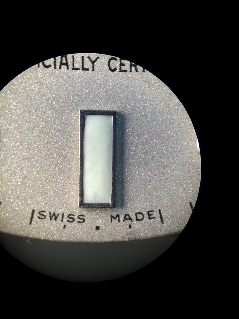
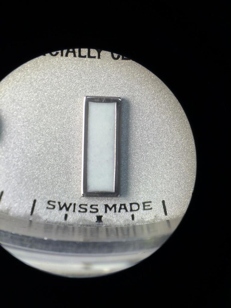
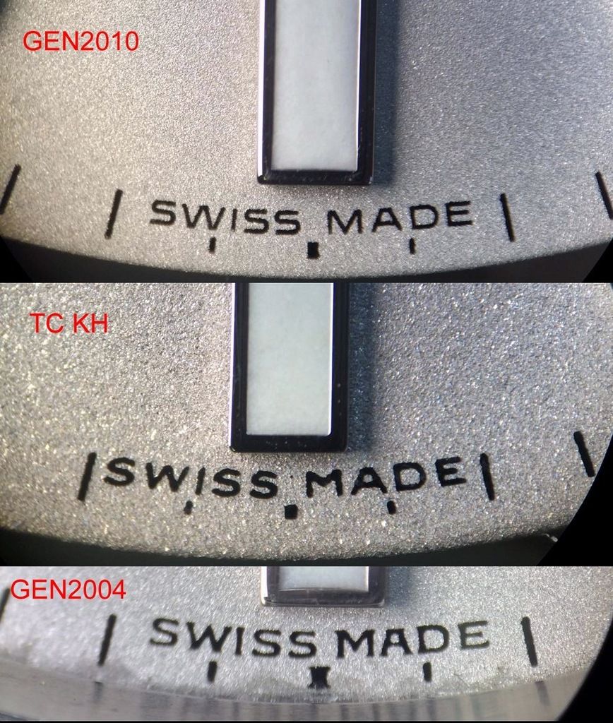
The SWISS MADE Print is now a little finer and there is more Space btw the S and M

And an Rim again... The Rim´s on the newer Dials have changed also... The Rims are much thicker!
The Indice Lines are normally Lines not like an I (Sarif)

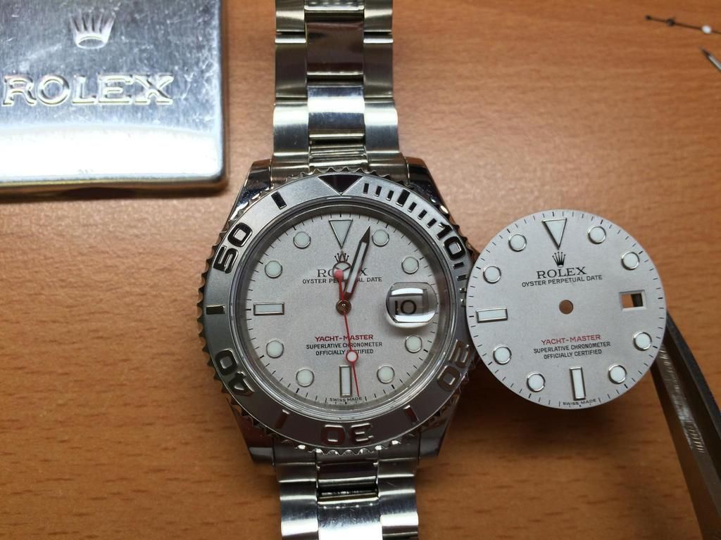
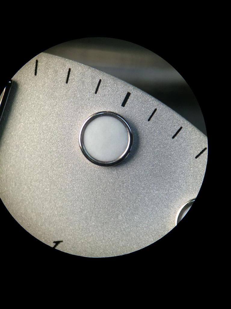
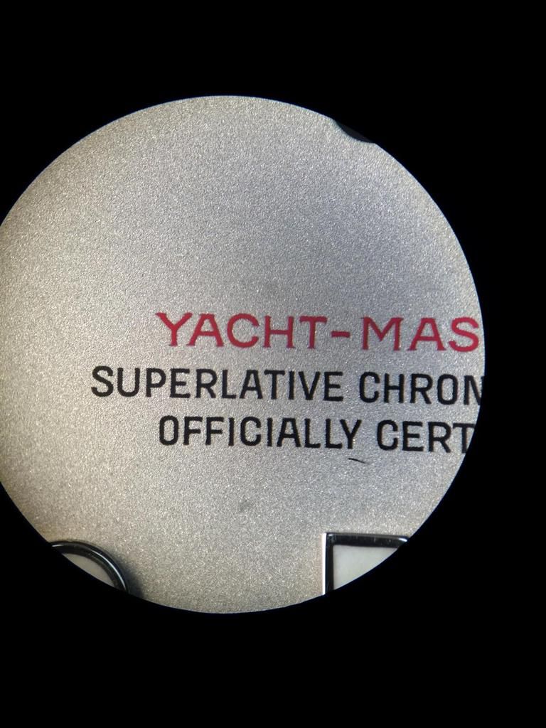
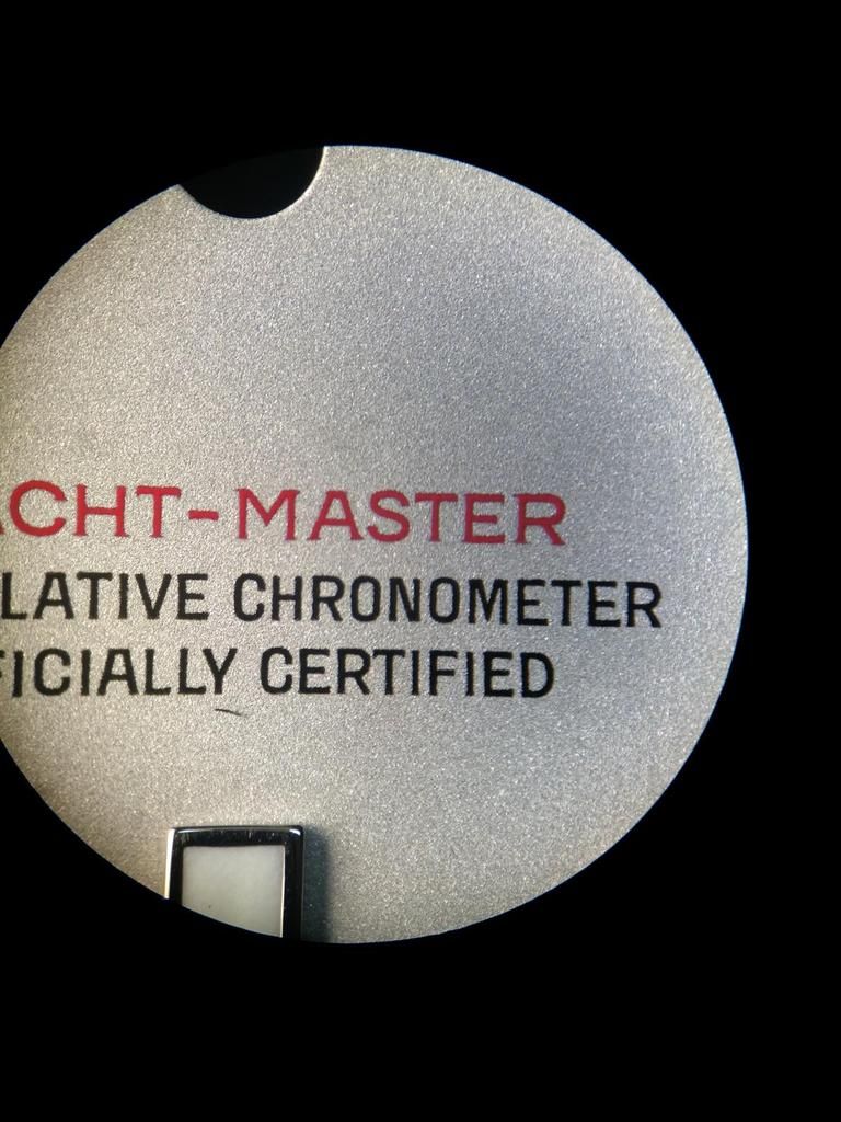
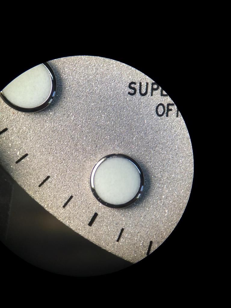
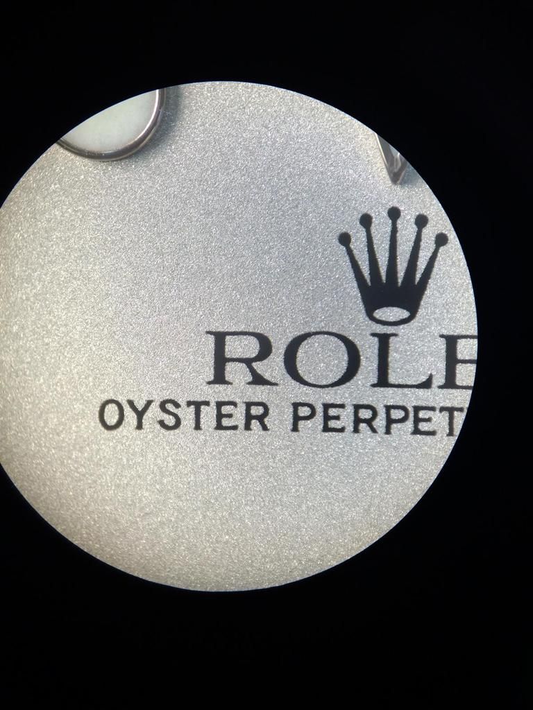
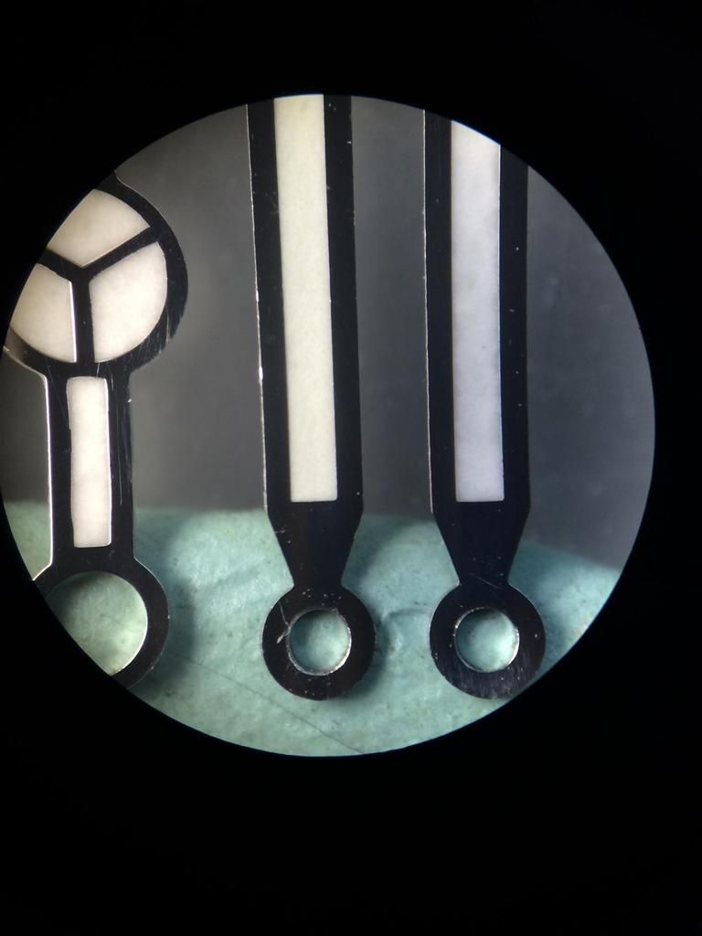
Ok so let us check the new TC KH Dial...
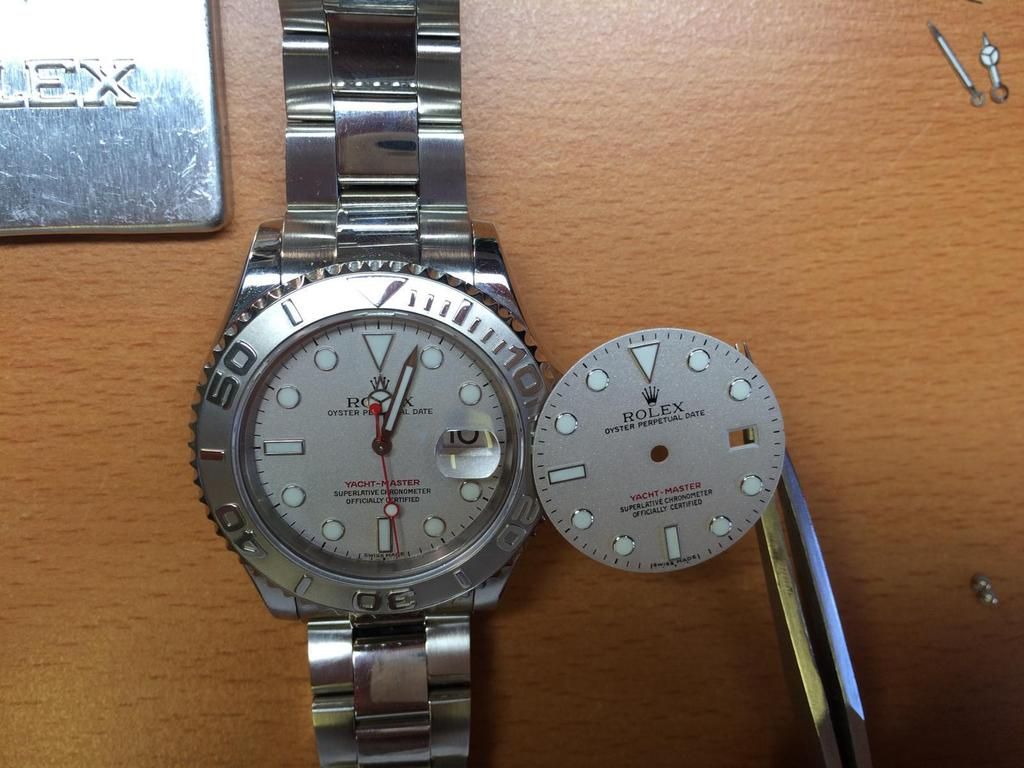
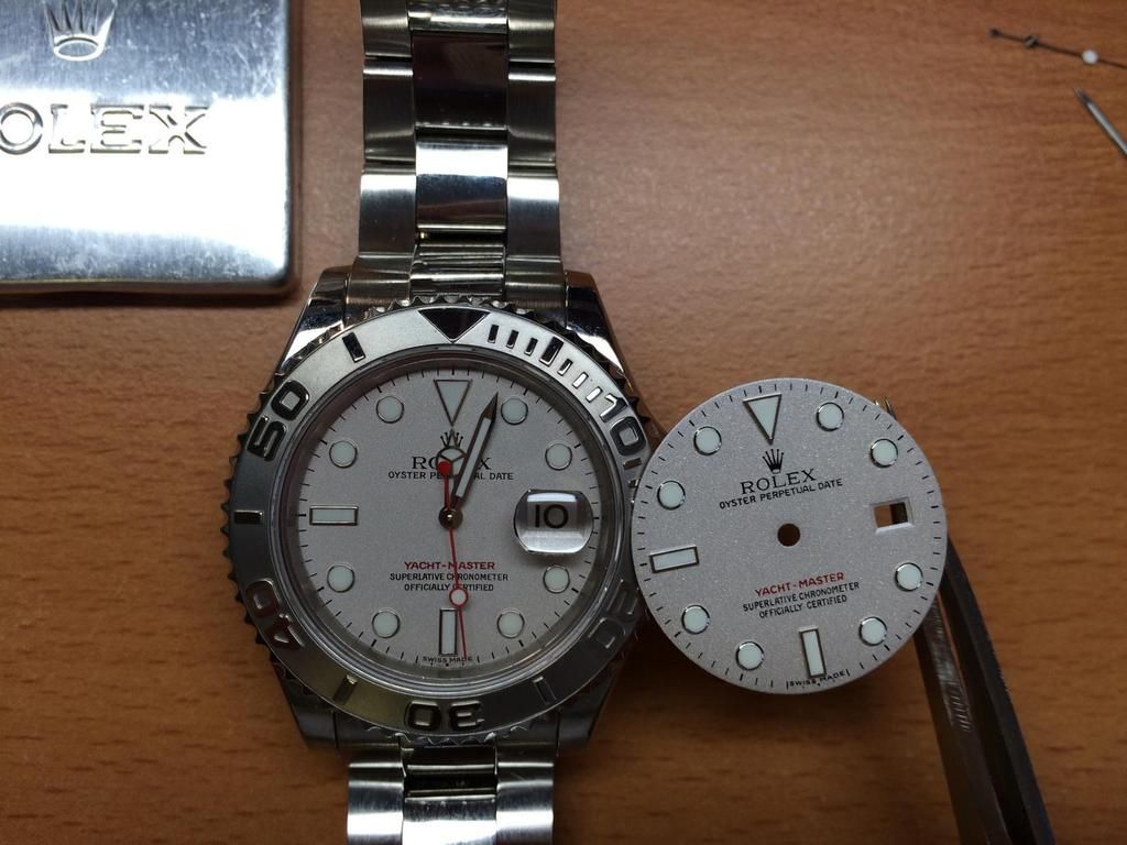
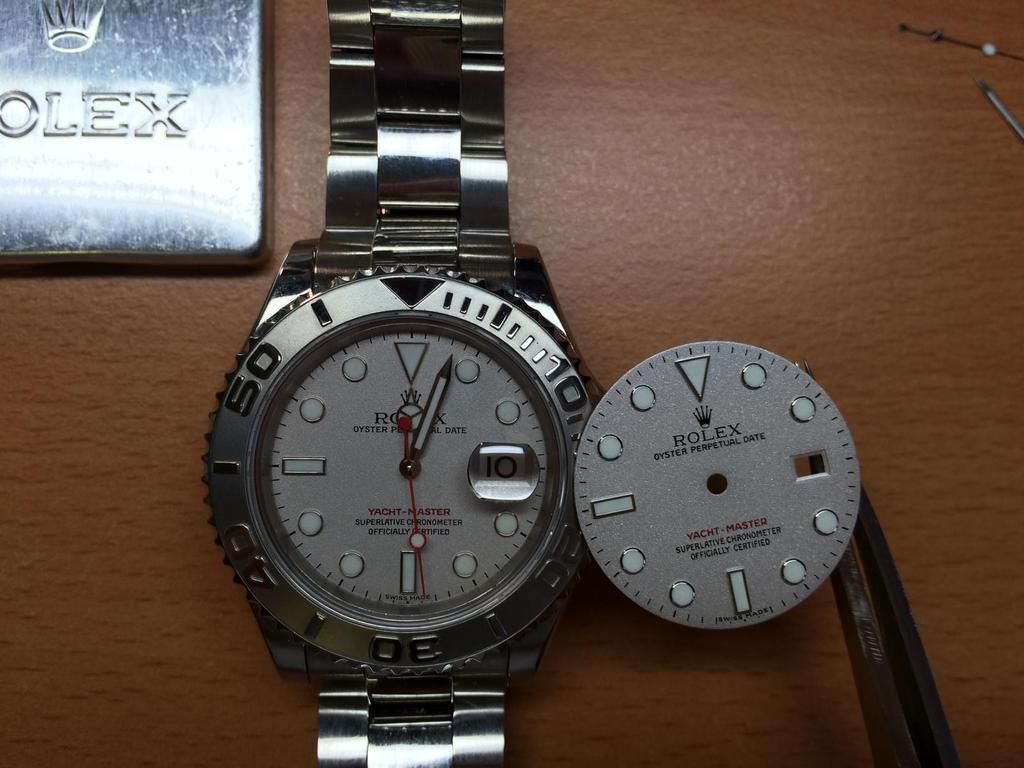
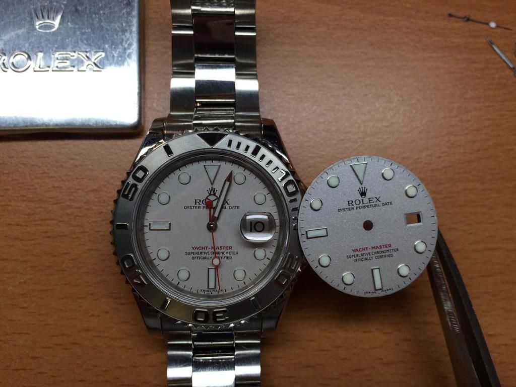
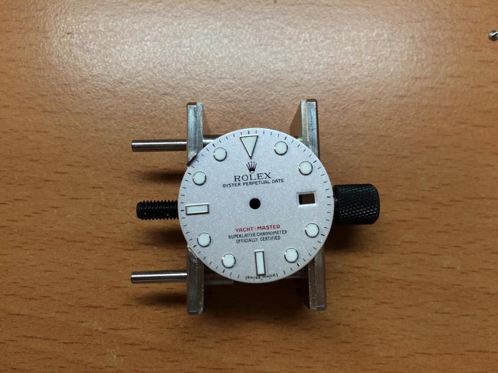
One thing that i haven´t measure! but i have notice as i have changed the Dial on the Movement Holder.
I haven´t change the size on the Holder, i had the Gen Dial in before and it wasn´t tighten in the Holder.
I could take the Dial so out!
As i would lay the Rep Dial in the Holder i saw the Rep Dial has an larger diameter. See Pic
only for info

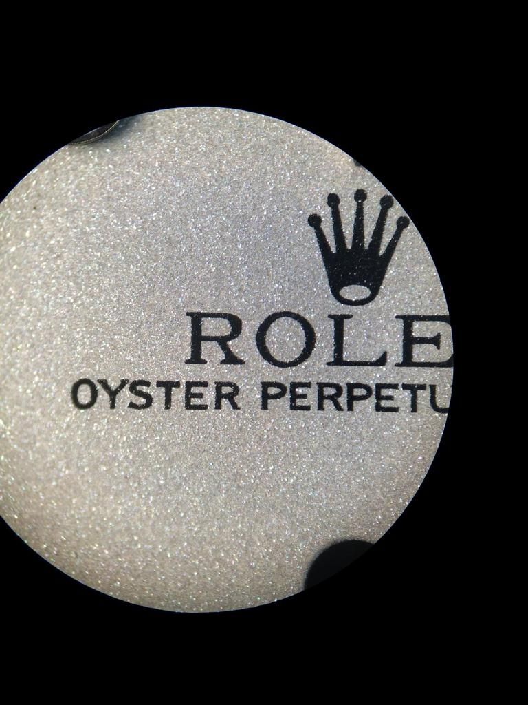
What we see directly is the different structure.
The structure under the Microscope looks like sand paper really really rough.
The Platinum Color of the KH is also more Brownish in the most Angles...
Same as on the older TC v1 Dial.
The Triangle is really nice! also the Plate of the Triangle, Dots and Rims is much much better as on the older Dials.
The Lume Especial the Daylight Lume has also updated! It´s not that pure White that the GEN have,
but it´s really close and much better as on the older Dials.

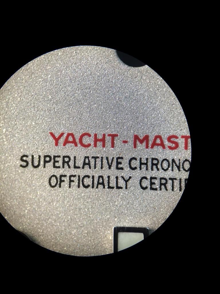
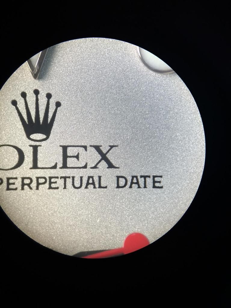
For this Rough structure the Print is very nice! the Crown isn´t 1:1 but i think this wouldn´t be noticable.


The Yacht-Master Print is really good now! The Color isn´t the same but the Print self is the best i saw on an YM Rep Dial.


The Dots are really nice! but you can see what i meant before. The inner circle of the Dot is sharp!
If the Factorys would do an Polish before they Plate the Dots, Rims, Sqaures etc it would be absolut Perfect.

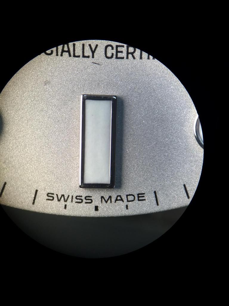
The Square is also really nice. The SWISS MADE is now better and fit to the older Series Dial.

Another Dot again, also here all Perfect. Only the Indice Lines are wrong!
That need an improvement... For Emulate the old Dial it need the I (sarif) look.
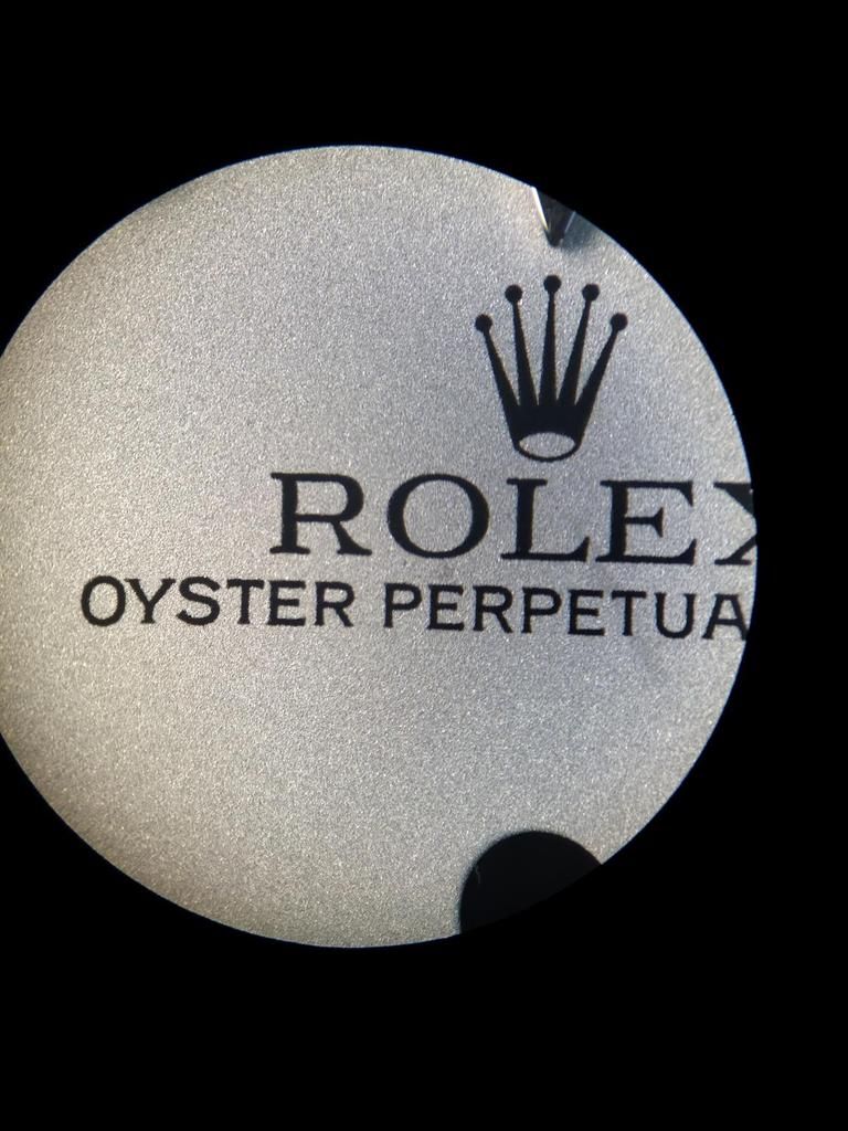
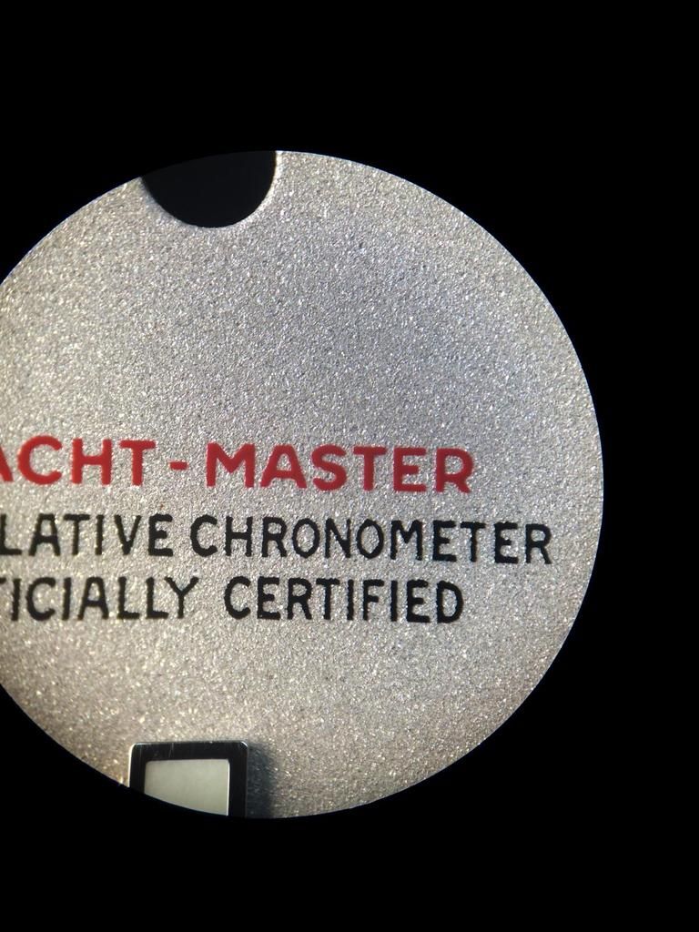
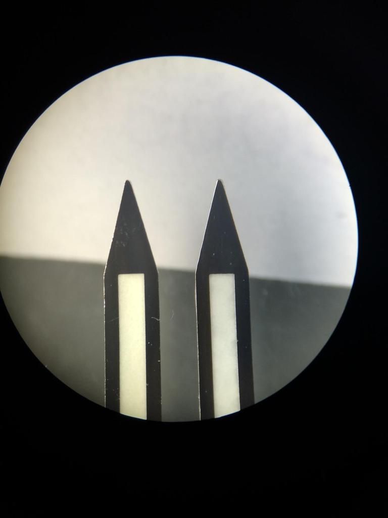
Ok let´s see the Old TC Dial again...

Hooooooly C...p what we saw all the Years as really Perfect and good?!??
I think it don´t need much words or?
The Triangle looks ahmmm yeah... think self!
Ok the structure is also Rough and the Platinum Color has much more Brownish Parts in as the KH Dial have.
The Lume Color of the Older TC Dials are Defenitley too Yellowish at the DayLight.

Hell yeah... We love all the Years an Fantasy Crown?!??
I think there is not much too say... The Crown and Print isn´t that nice as on the KH...


The Dots on the old was a little better in my eyes... But the Plate of the Dots etc wasn´t Perfect.
But if you look closer you´ll see the Inner Circle is more rounded.
Plate these dot new and i think it´s better as the new Dots

The Print of the Yacht-Master is too light in the Color and the Typo is too FAT...
But these we also know all the Years before.


The Squares of the Old Dial wasn´t the best... But what should we do??? We had no other things!! we must use what we got...
heheThe S and M Print has too much Distance... And Yes i know that there are was different Prints on the GEN too.
But no GEN Dial looks like that.

An Dot again... Here we see again that the older Dots are more rounded... After an Plate and Relume these Dots looks GEN like
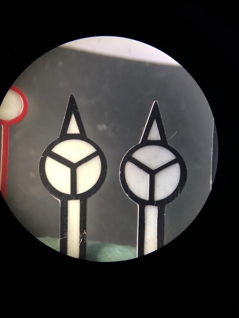
Ok let´s see the Older GEN2004 Dial

It´s the same as on the 2010 Dial... Structure is really really fine, and absolutley no Brownish Parts.
That makes the different as already said if you Plate with real Platinum or if you Paint with Color.
Trinagle, Print, Lume all Perfect.

The Crown is different. Print self Perfect.


The Dots of the older Dials are much smaller... If you look closer on the GEN Dots you will see the rounding in the
inner Circle.

The Yacht-Master Print self is nice as all Prints on the GEN Dials.
But the Typo self has changed with the Years as i already said. The older Dials have an Typical ARIAL Typo.
No Sarif Typo as the newer Dials.


The Squares are Perfect...
The SWISS MADE Print on these Dial is really close.
There is not much Space. But there was also Older Dials out with a little bit more Space.

Dot again... We see again the older Dots are smaller as the newer ones.
And we see the Full Hour Indiec have I (Sarif) Typo
These must be updated on the TC KH Dial
So that´s it so far from the Dial!!! I hope you had Fun till here?!??
we come to the final sprint...
The Hands...

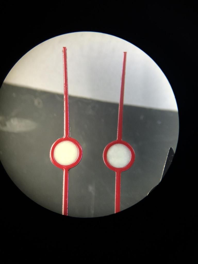
Minute Hands (Left TC v1, Right TC v2)
Only different we see at the bottom is the Lume Color
The newer TC Hands have updated Lume DayLight Color and match Perfect to the KH Dials.

At the Tip we see an improfement
The new Tip if much more Accurate. And the Plate on the newer Hands is also much better!
Same as on the Dial Dots, Rims, Squares etc.

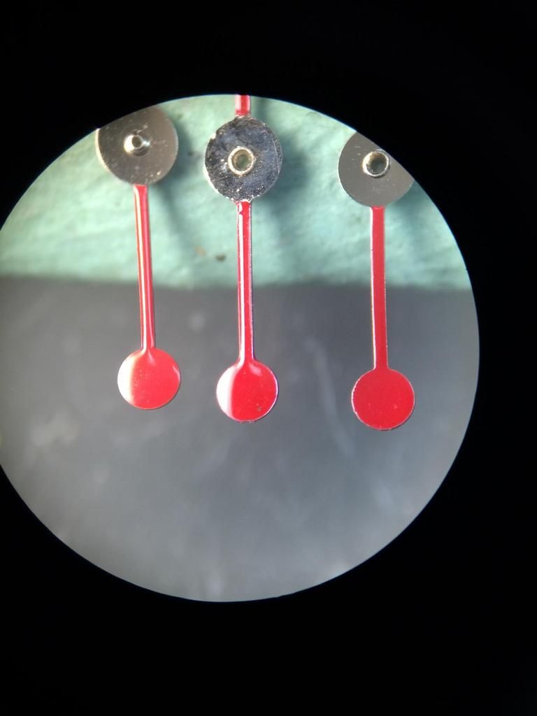
The same updates we have on the Hour Hands (Left TC v1, Right TC v2)

The Second Hands have changed too but it´s not sooooo noticable. (Left TC v1, Right TC v2)
Under Microscope you see the Details... Lume is updated too...
And the Red is now a little Darker as on the old Hand. The old Hand Color was in my eyes a little bit better.
But both are far away from the GEN.


Here we see the Second Hands from Left to Right
GEN, TCv1, TCv2
we see clearly both Colors are too dark.

Under Microscope
GEN, TCv1, TCv2


Minute Hands again Compared with the GEN
(Left TC v1, Middle TC v2 , Right GEN)
We don´t see any real different. I can tell you the only different from this is the side view.
The GEN has an much better Finish (Plate)

So the Tip of the GEN is a little bit more sharp but TCv2 is close
Also the cut out for the Lume is at the GEN a little little bit wider.

The Min Hand... (Left TC v1, Middle TC v2 , Right GEN)
The TCv2 Min hand is really good, the only flaw that all Rep Hands have on the Min hand is
the rounding in the Top Tip... Look closer to the Mercedes Star, at the out side circle.
It goes Perfect round also on the inner Tip.

A closer Pic
Ok Brothers and Sisters...
That´s it now...
I hope you had all Fun... And Rep Points are Welcome
heheSo let us make some Conclusion:
The TC YM KH Dial is one of the closest to the GEN YM Dials.
The overall Quality of the Dial is really really Great!
If TC maybe make in the near Future an new KH YM v2 Dial and it has a few little little improvements, i will call it Super Rep.
So for now this is the best Rep Dial (Watch) that you can get for $$$
If we see the Improvements btw the TCv1 and TC KH Dial there are Worlds...
So at the beginning i must say i was a little Skeptical
but now I'm really very impressed...
The KH Factory is one of the best Rep Factorys for Dials and Hands...
The Quality is AMAZING !!!
I hope TC will stay with them a long Time...
I can only say bravo TC very nice Work!
I hope that people appreciate it...
Here are some summaries:


Thanks for looking !!!
