-
Tired of adverts on RWI? - Subscribe by clicking HERE and PMing Trailboss for instructions and they will magically go away!
You are using an out of date browser. It may not display this or other websites correctly.
You should upgrade or use an alternative browser.
You should upgrade or use an alternative browser.
Can You Fix This Photo?
- Thread starter Q5?
- Start date
jesseharmon81
I'm Pretty Popular
- 17/6/10
- 1,201
- 1
- 0


crossbones
I'm Pretty Popular
- 3/6/10
- 1,458
- 1
- 0
donaldejose
I'm Pretty Popular
- 20/12/08
- 1,196
- 2
- 0
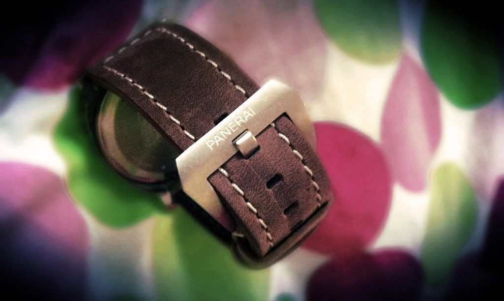
This is a tough one. The composition is bad. The white balance is off. There is too much noise in the image. There are too few pixels to work with. Not much can be done but I will try.

These changes were done with Microsoft Digital Image Pro 10 which dates back to 1997 and was last updated by Microsoft in 2004. I still use it because I am quick with it.
For those who are interested:
The first thing I did was to improve the composition. Rotating the watch and using a square format helped.
The second thing I did was to adjust the white balance to take the excessive yellow out from being shot under incandescent lights without using an incandescent setting.
The third thing I did was to lighten the image to get a few spots of pure white, such as that small white spot you see just to the left of the case.
The fourth thing I did was to use noise reduction to reduce the chromatic and luminent noise in the photo. This smoothed out the case back but also blurs the image slightly.
The fifth thing I did was to make the colors more pleasing (to me at least) and more pure by increasing color saturation and adjusting color balance. You can see I took some of the redishness out of the stitching.
The sixth thing I did was to use the sharpening function to give the image more "pop."
Anyway, those are my adjustments. I am sure others can do better.
This is an interesting thread. Not only does it show the different things that can be done.
It also shows our different "style" or "vision" or how we "see" it looking better.
When we make our adjustments to make it "better" that shows you what we each think is "better."
There can be many "betters," just as artists can paint one subject in different styles.
But I do think this is a tough image to start with. My congratulations to anyone who can make it look good.
- 16/11/08
- 7,543
- 135
- 0
This is an interesting thread. Not only does it show the different things that can be done.
It also shows our different "style" or "vision" or how we "see" it looking better.
I've also enjoyed seeing what each person has done with the pic (still waiting for the shark to show up though).
I was thinking that it might be helpful if Q5 would tell us what he doesn't like about the picture, and what he would like to see improved. I can't do it (unless what he's hoping to see is a teddy bear cloned into the pic), but I'm wondering if he would like to see something more realistic? More artistic? Or is the sky the limit, and he just wants to see change?
- 29/3/09
- 15,272
- 10
- 38
I just cat seem to get the correct color of the strap to show up. I'll try with a different camera and try the same pic tonight.
Thanks to all who contributed. I like them all.
This is another one I took with my phone.

I'll fire up Digital Image Pro and see if I can copy Donalds adjustments.")
Thanks to all who contributed. I like them all.
This is another one I took with my phone.
I'll fire up Digital Image Pro and see if I can copy Donalds adjustments.
elephantriter
Getting To Know The Place
- 7/3/11
- 43
- 0
- 0
Q5---may i suggest you place that bikini clad snorkeler into your picture to give it a nice improvement. i love that little video!
donaldejose
I'm Pretty Popular
- 20/12/08
- 1,196
- 2
- 0
Most of the "adjustments" I made should be able to be made on almost any photo editor. Window's Vista Window's Photo Gallery could make many of those adjustments and Photoshop could make a lot more.
Some of what I did is a definite "improvement" and other parts are just "personal taste."
Some of what I did is a definite "improvement" and other parts are just "personal taste."
donaldejose
I'm Pretty Popular
- 20/12/08
- 1,196
- 2
- 0
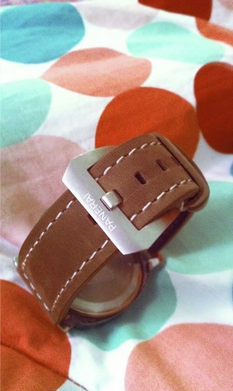
Q5?: I don't understand you. Are you deliberately trying to take bad photos with just a cell phone or is this really the best you can do? You really need a better camera. See the other threads in this section.
First, your cell phone camera is inadequate to create a file size that can be worked with in any reasonable way. There are not enough pixels to "adjust" without the lines becoming jagged due to huge pixels. You need a better "camera" than the one contained in your cell phone.
Second. the colors in your images are off. This could be another function of an inadequate cell phone camera which does not do a white balance thus giving your photos a color cast from whatever light is falling on the watch.
Third, you need to learn (or do) some basic post processing.
Here is what I did with your last image following basically the same order as I did with the prior image.
Your Original:
My "adjustments."

The bottom line is that you are not giving us enough to work with in the basic image you provide. You need to start with a better camera. It is hard to do much with a cell phone file size.
First, your cell phone camera is inadequate to create a file size that can be worked with in any reasonable way. There are not enough pixels to "adjust" without the lines becoming jagged due to huge pixels. You need a better "camera" than the one contained in your cell phone.
Second. the colors in your images are off. This could be another function of an inadequate cell phone camera which does not do a white balance thus giving your photos a color cast from whatever light is falling on the watch.
Third, you need to learn (or do) some basic post processing.
Here is what I did with your last image following basically the same order as I did with the prior image.
Your Original:
My "adjustments."
The bottom line is that you are not giving us enough to work with in the basic image you provide. You need to start with a better camera. It is hard to do much with a cell phone file size.
Deadbear77
I'm Pretty Popular
- 7/6/11
- 1,376
- 5
- 0
Just curious, what can be do with this picture?

I'd like to see what is possible after the picture is taken.
Here is my try
Sent from my iPad using my fingers
A competent tradesman never blames his tools - he buys the right ones to begin with
I understand what deadbear is saying - I thought this was all just a bit of fun .... BTW as I have felt compelled to point out numerous times ... I am a bloke with a nice camera - I am NO photographer!
My brother could drop a camera and take a better picture than me.
But he is a bus driver and I am an award winning, internationally published designer ... he owns his house, two cars, a nice bike, a caravan and has a happy life.
Me? I'm broke
- 29/3/09
- 15,272
- 10
- 38
Okay, here is what I could do with my original photo.

Now for my next attempt..... :lol:

Big size http://i659.photobucket.com/albums/uu318/trinityrfc/SAM_12432.jpg
I edited it to this....

Now for my next attempt..... :lol:
Big size http://i659.photobucket.com/albums/uu318/trinityrfc/SAM_12432.jpg
I edited it to this....
- 18/2/11
- 1,382
- 83
- 48

donaldejose
I'm Pretty Popular
- 20/12/08
- 1,196
- 2
- 0
I see some value appearing in this thread. A few conclusions or general principles can be deduced.
First, focus your mind on the real subject of the photo. Ask yourself what is important in this photo? What is the subject? What am I trying to show? What do I want to "pop" for the viewer? Then, eliminate as much of the extraneous stuff in the frame by cropping it out. The background is just some context for the subject. Don't include more than you need. An example is the lume shot. Crop out blank space and you have a stronger photo. Another example is the Pam buckle. If that buckle was the real subject then Seriph produced the best photos.
Second, color. It can work for you or against you. Color works for you if a color in the watch creates "pop" and draws the viewers eye. Color works for you if the background colors complement the watch and are pleasing to the eye. Color works against you if the whole photo has an abnormal color cast (unless you are intending to create some sort of special effect like a blue cast for night time or a warm cast for sunset) or if background colors distract your eye from the real subject of your photo. Examples are the two Pam shots. Correct the color casts and you have stronger photos. Keep the color dots to a minimum and they don't distract your eye as much.
Third, don't use cell phones and expect to obtain quality photos. I understand there is a new generation of cell phone cameras that are quite good. People have said iPhone images can be good but the few I have seen are not good for post processing. Nokia is just starting to market the Nokia 808 with PureView that does seem to be able to take very good images. I don't know how close it will focus. But most cell phones just are not going to be able to take good images of watches which you can post process as we have been doing in this thread.