- 20/12/08
- 1,196
- 2
- 0
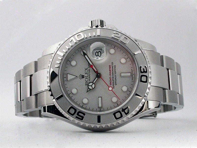
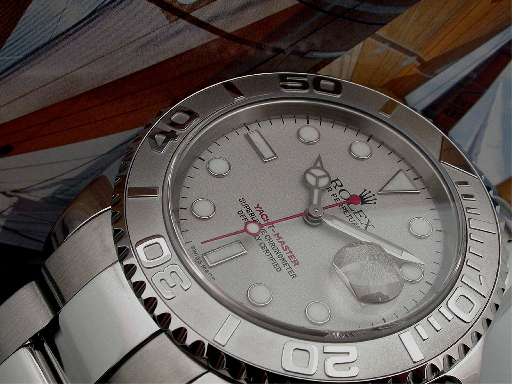
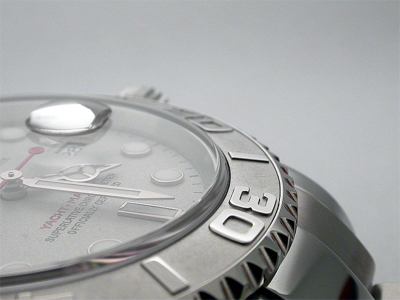
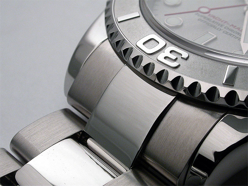
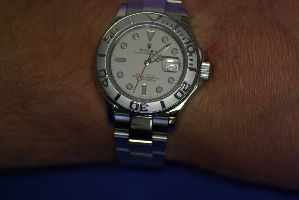
I know the BKLM YM is expensive but it is so visually accurate that it could cost twice what he charges and still be a good deal because it is small fraction of the visually identical gen.
It seems hard to justify buying a gen YM, TT or LV when we have BKLM's available to us. Just look at the three theads I started and notice no one with a gen of any of these watches could point out any visual "flaws" in BKLM's products.
Soooooo, you better sign up, wait and get them while they are still available. I don't think production will continue indefinitely.

.JPG)

.JPG)
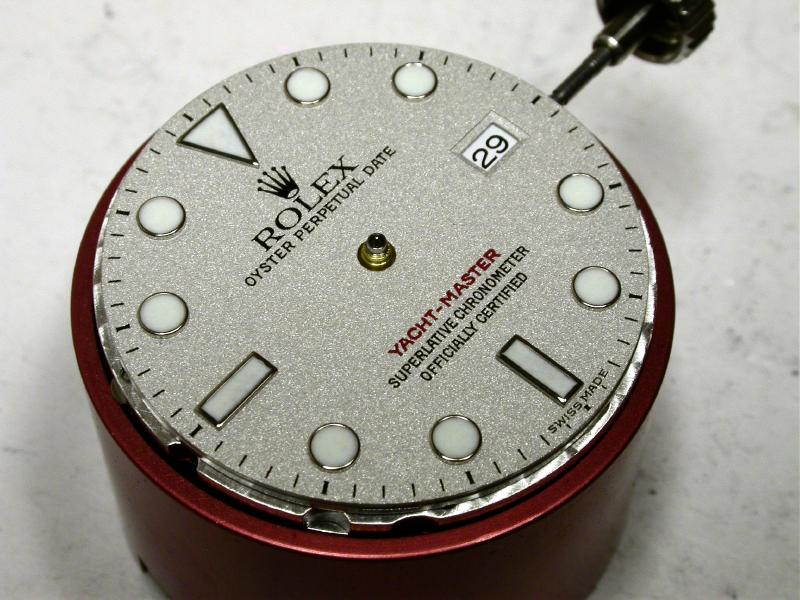
") It doesn't even make a difference, as I'm fairly sure the gen has variance amongst its production numbers either way.
It doesn't even make a difference, as I'm fairly sure the gen has variance amongst its production numbers either way.


